Building a chat interface sounds simple at first.
A message list.
A text input.
Maybe a conversation sidebar.
Then you actually start building it.
Suddenly you’re dealing with typing indicators, delivery receipts, message states, attachments, user presence, and edge cases like reconnecting after network drops. Even something as basic as scroll behavior—when to auto-scroll, when not to—turns out to be non-trivial.
The UI layer alone becomes a system of its own.
For React developers, building a react chat interface often means stitching together dozens of components, managing real-time state, and handling interactions that users expect to feel instant and seamless.
And that’s before you think about theming, layout responsiveness, or features.
So most teams reach for a react chat UI kit or prebuilt components to speed things up.
But even then, you're still:
Assembling components manually
Wiring them together
Configuring behavior
Writing UI glue code
Before you even see something usable.
This tutorial walks through a faster path.
Instead of building your UI piece by piece, you’ll use CometChat’s UI Kit Builder to visually configure your chat interface and export production-ready React code.
By the end, you’ll have a fully functional react chat app UI ready to integrate into your project.
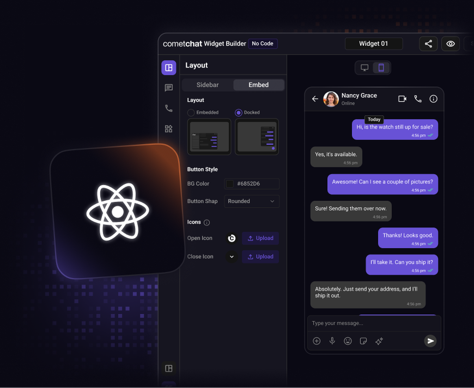
What is the CometChat UI kit builder?
The CometChat UI Kit Builder is a visual, low-code tool that lets you configure and generate a complete chat interface using production-ready react chat components.
Instead of manually assembling components, you design your chat UI through a visual interface and export ready-to-use React code.
Under the hood, the Builder uses the same tested UI components that power production applications. You’re not working with mockups or prototypes, you’re configuring real components that are already built to handle messaging, state management, and UI interactions.
This changes how you approach building a react messaging UI.
Instead of starting with code, you start with the interface.
With the Builder, you can:
Choose chat layouts
Toggle messaging and calling features
Customize themes and branding
Preview changes in real time
The result is a fully configured chat interface that can be dropped directly into your React application.
Why use the visual chat builder?
Most developers follow a familiar workflow when building a chat UI in React:
Install a UI kit
Import individual components
Wire them together
Configure features
Customize styles
It works, but it takes time, and you don’t see a working interface until fairly late in the process.
The Builder flips that workflow.
Instead of writing UI first, you:
Design → Configure → Export → Integrate
That shift has a few practical advantages:
Faster setup: You don’t need to manually assemble multiple components just to get a working layout.
Controlled feature toggles: Enable or disable features like reactions, media sharing, or mentions without editing component logic.
Live UI preview: See exactly how your chat interface behaves before writing a single line of UI code.
Better collaboration: Share a working interface with teammates or stakeholders instead of static mockups.
Exportable React code: Everything you configure becomes production-ready code—not a locked UI layer.
In practice, this means going from idea to a working chat interface in hours instead of days.
Step 1: Choose a Chat Layout
Start by selecting a layout that fits your product.
Most chat interfaces are built from a combination of:
Conversation list
Active message view
Message composer
Optional user info or detail panels
The layout determines how users navigate between conversations and messages.
Common patterns include:
Two-panel layout
[ Conversations ] [ Active Chat ]
Three-panel layout
[ Conversations ] [ Active Chat ] [ User Info ]
In the builder interface, layouts can be selected directly and previewed instantly.
This allows you to quickly experiment with different chat structures before committing to one.
Step 2: Configure Chat and Calling Features
Once your layout is set, the next step is configuring what your chat interface actually does.
Modern chat isn’t just about sending text, it’s a combination of real-time interactions that users expect to work seamlessly.
Core messaging features include:
1:1 conversations
Group chats
Message reactions
Typing indicators
Delivery and read receipts
Media and file sharing
Mentions and tagging
These are powered by CometChat’s real-time infrastructure, which handles message delivery, synchronization, and presence across devices.
Optional engagement features:
Polls
Custom message types
Message editing and deletion
Instead of wiring these into individual components, the Builder lets you enable or disable them through simple toggles.
This ensures your exported UI only includes the features you actually need, no extra configuration required later.
Step 3: Customize Theme and Branding
Your chat UI should feel like part of your product, not something bolted on.
The Builder allows you to customize:
Colors: Primary and secondary colors used across chat components.
Typography: Fonts and text styles for messages, headers, and UI elements.
Component styling: Spacing, borders, backgrounds, and visual structure.
Instead of overriding styles across multiple components, you configure everything in one place.
This makes it much easier to align the chat UI with your existing design system.
Step 4: Export the React Code
Once your UI is configured, you can export the React code that powers it.
The exported code includes:
Configured UI components
Feature settings
Layout structure
Theme configuration
Because this is built on top of CometChat’s React UI kit, the output follows a production-ready component architecture.
You’re not exporting static UI, you’re exporting a working chat interface.
How the Export Works
The exported package is designed to plug directly into your React application and typically includes:
Chat UI components
Configuration files
Theme setup
Required imports
From here, integration is straightforward.
Step 5: Integrate the Chat UI into Your React App
After exporting, you can integrate the chat UI into your React project.
Install dependencies
Star by installing the required CometChat packages.
Import the exported components
Add the generated chat components into your application.
Initialize the CometChat SDK
Before rendering the UI, initialize the SDK.
Render the Chat Interface
Finally, render the chat UI inside your app.
Once initialized, the chat interface will automatically connect to CometChat’s messaging infrastructure.
That includes real-time messaging, message synchronization, and user presence.
From visual design to working chat
Building chat traditionally means assembling UI components piece by piece—handling layouts, message rendering, state management, and real-time updates.
The CometChat UI Kit Builder simplifies that entire workflow.
Instead of stitching everything together manually, you:
Design the interface visually
Configure features
Export working React code
For teams under pressure to ship quickly, this is a much faster path.
You still retain full control over the UI and behavior, but without the heavy setup.
And as your product evolves, you can extend or customize the UI using the underlying components and APIs.
That’s the real advantage of this approach.
It gets you from idea → interface → working chat significantly faster.
Try the CometChat UI Kit Builder.

Shrinithi Vijayaraghavan
Creative Storytelling , CometChat