Overview
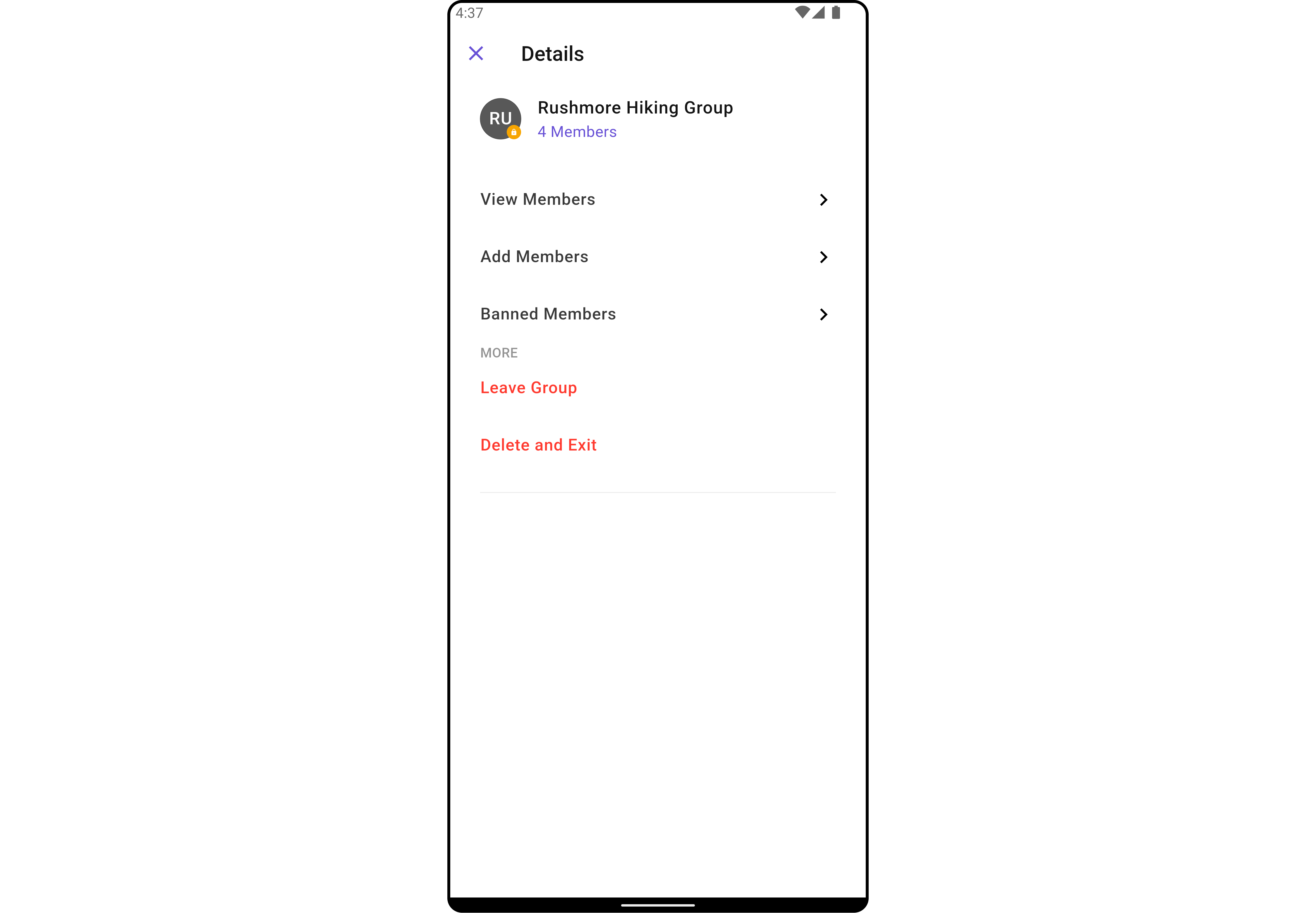
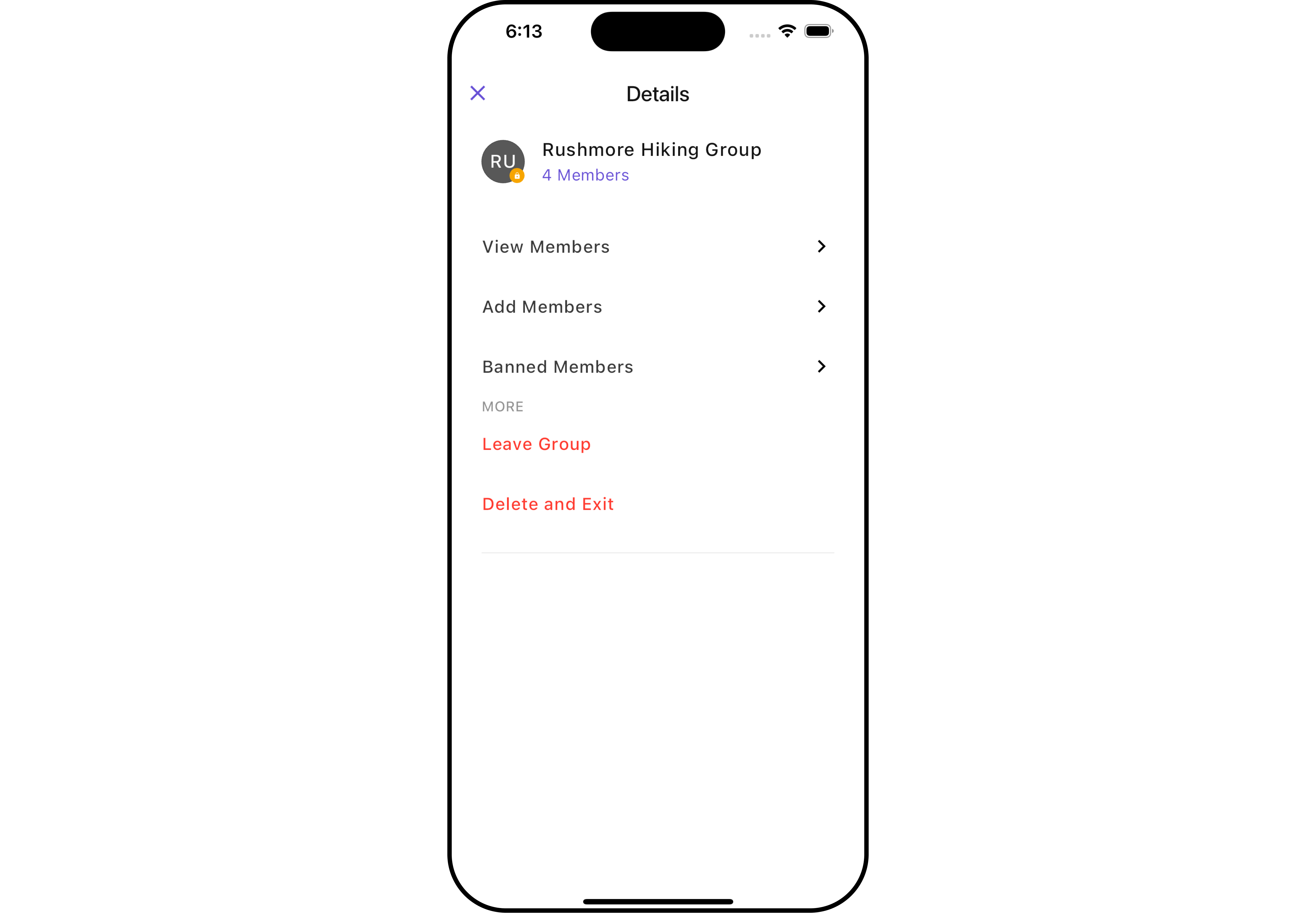
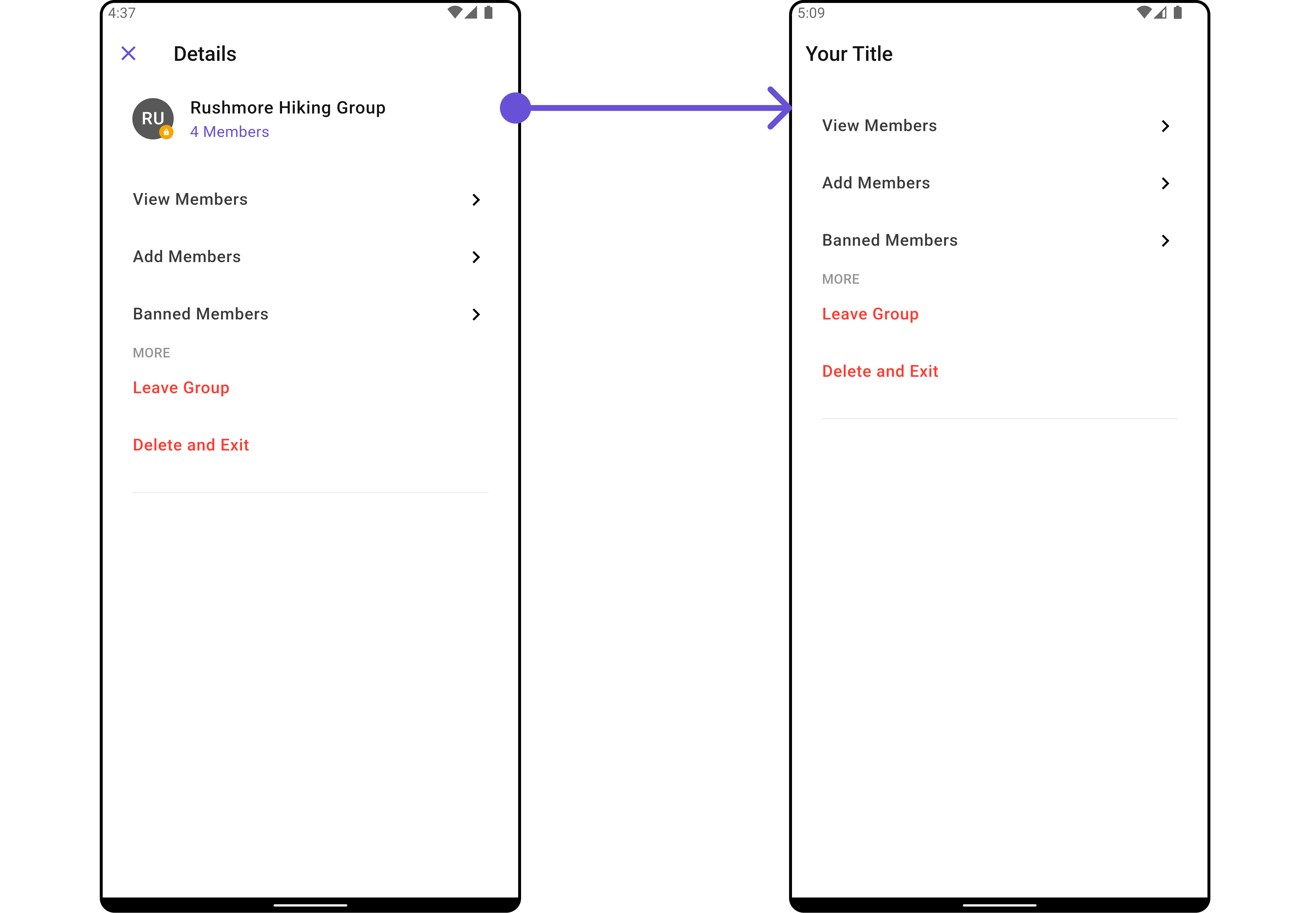
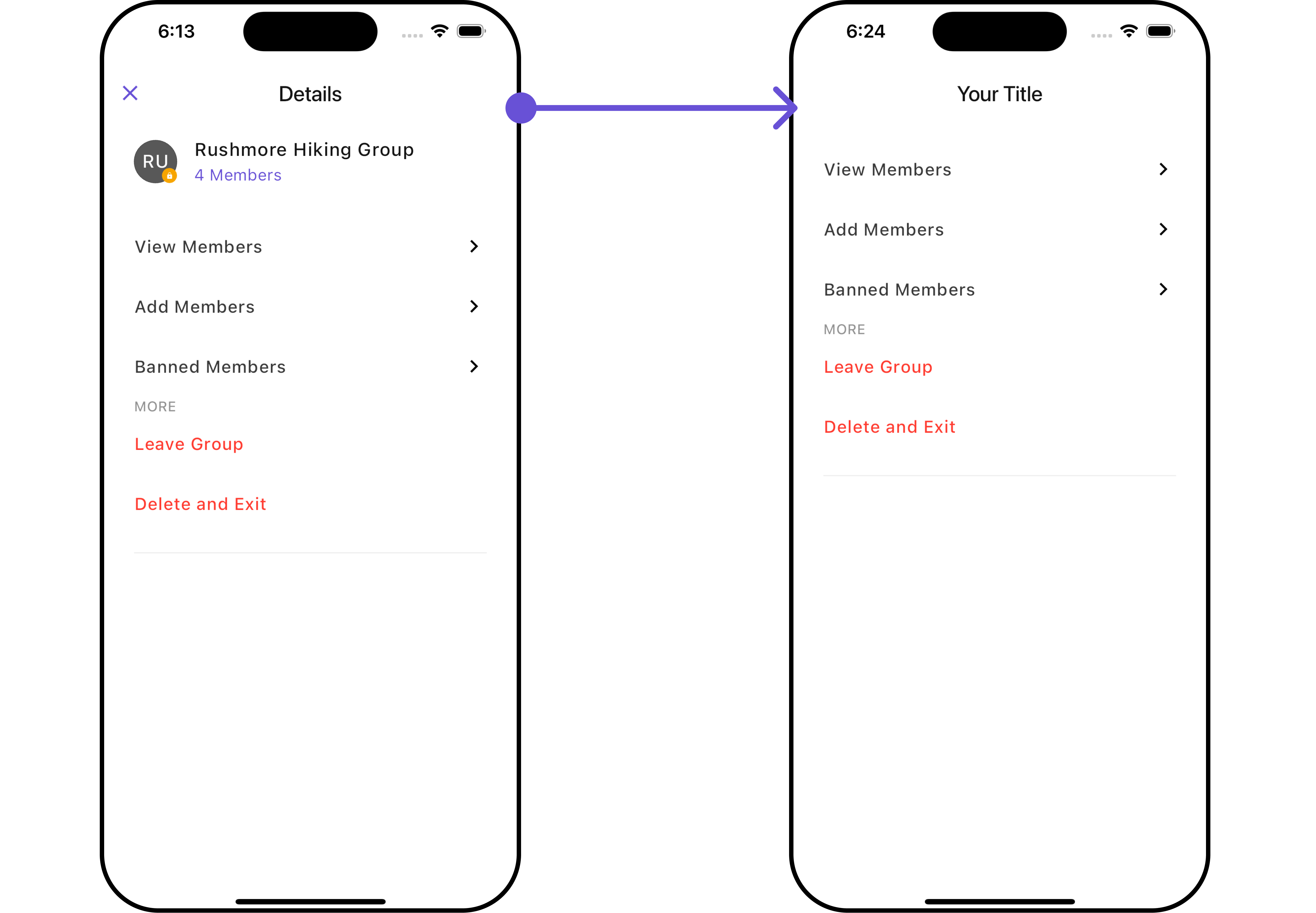
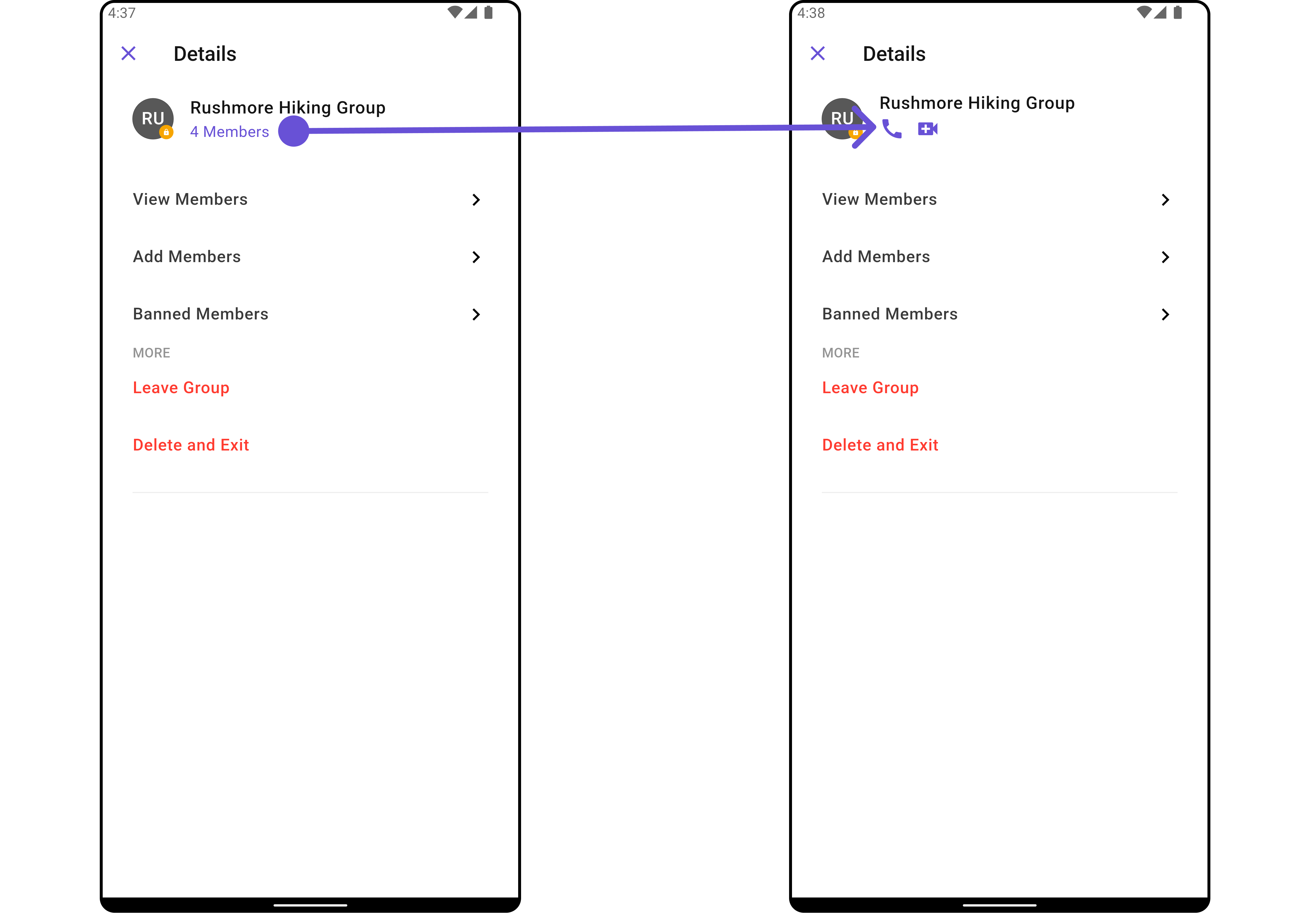
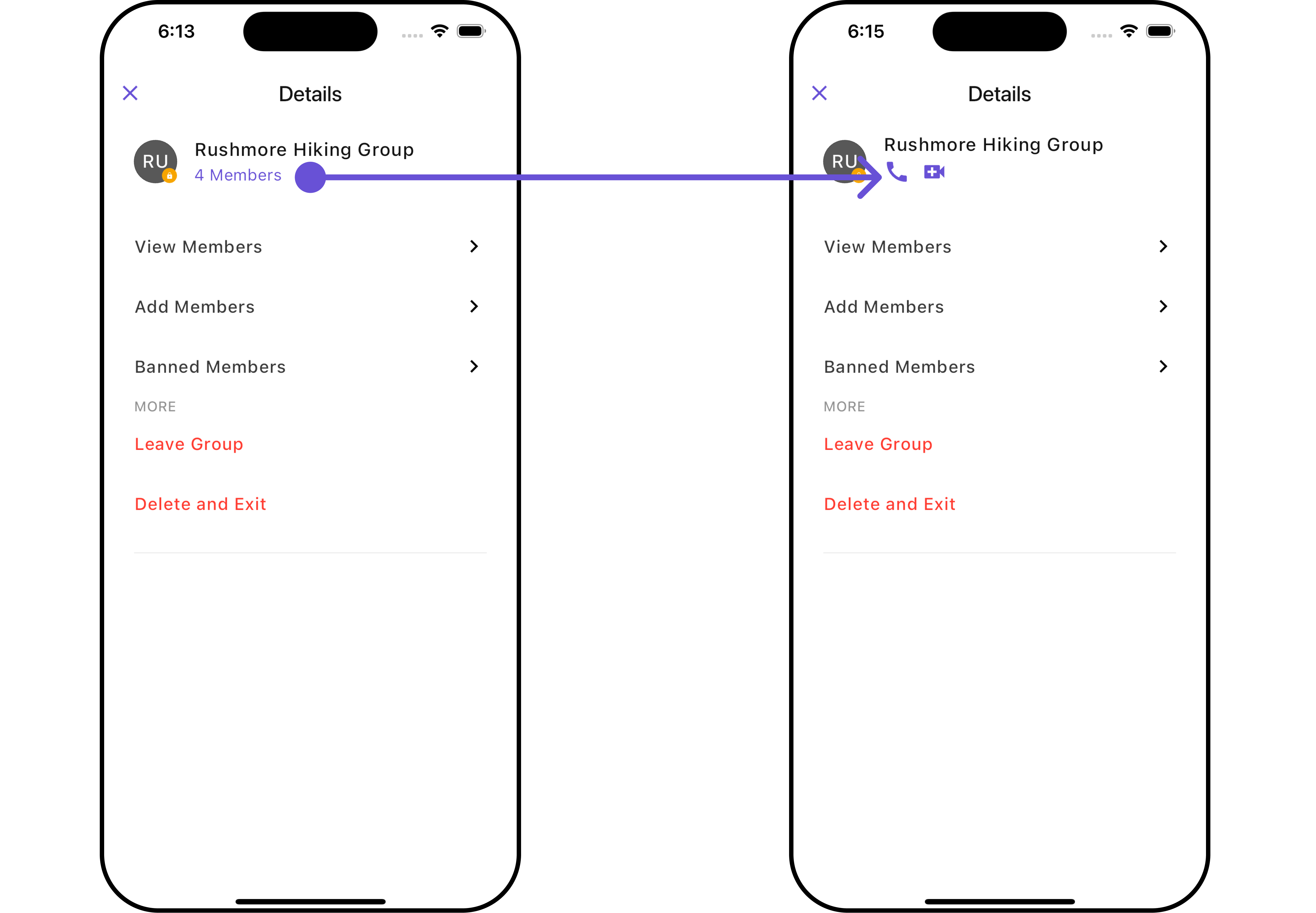
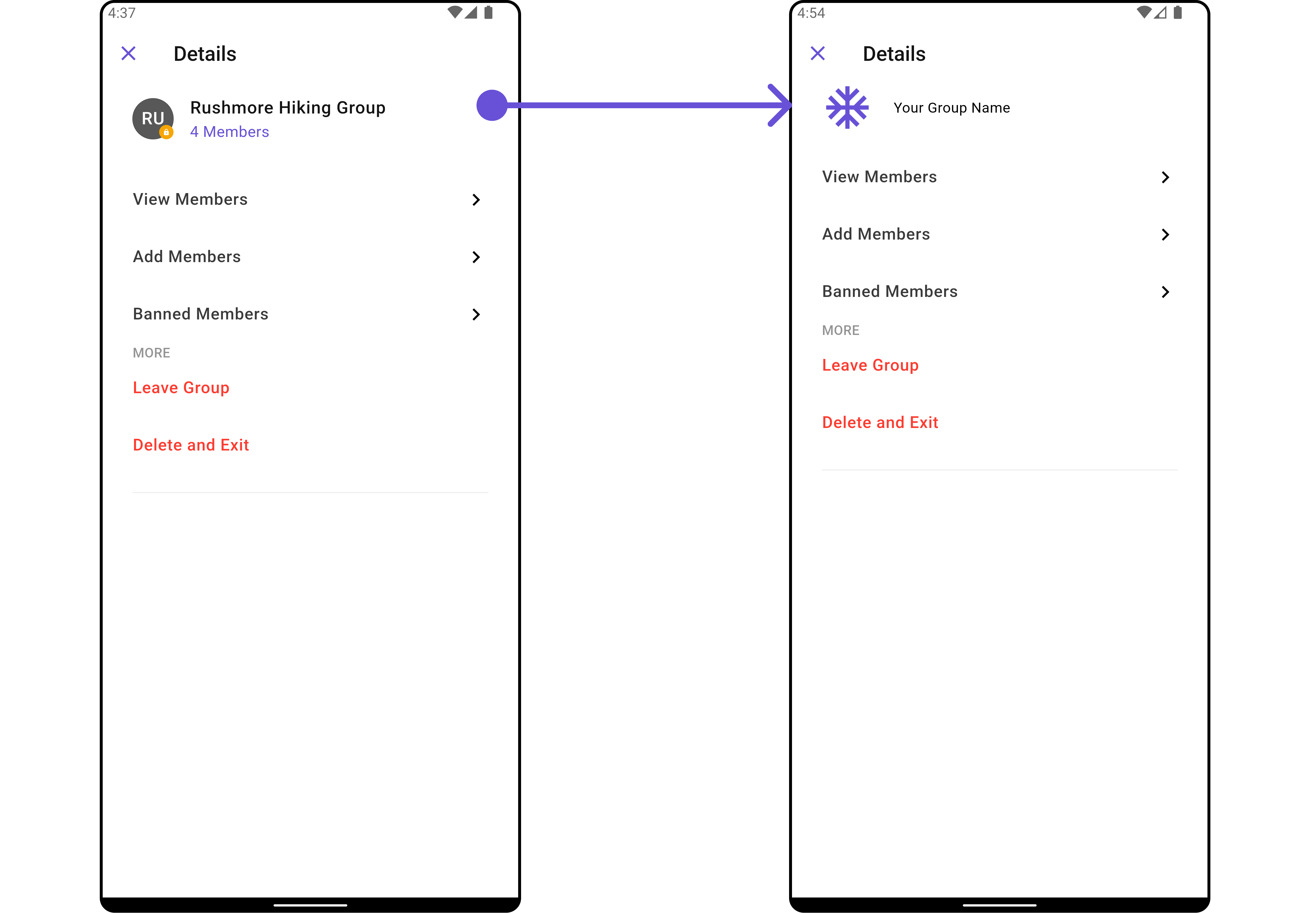
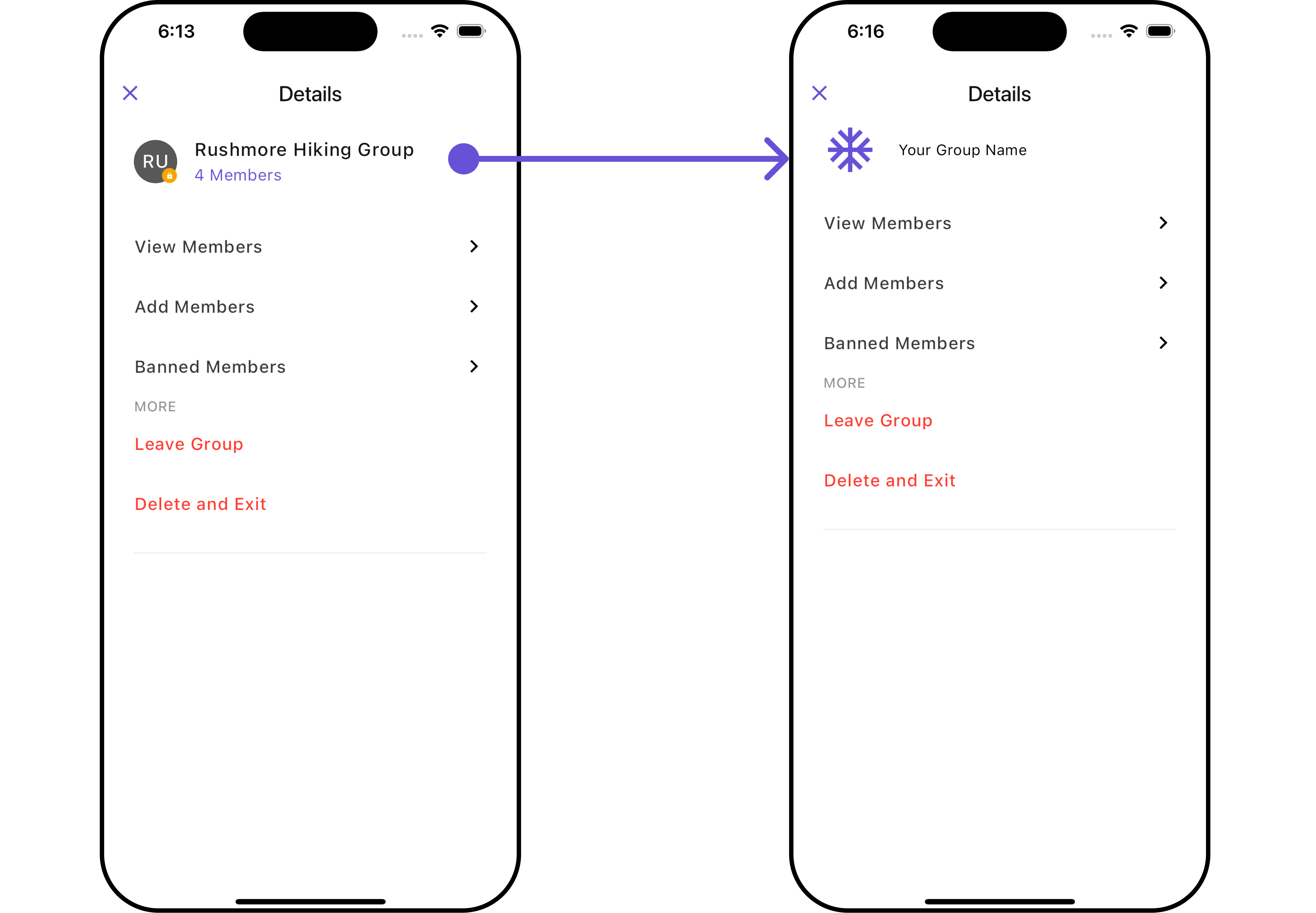
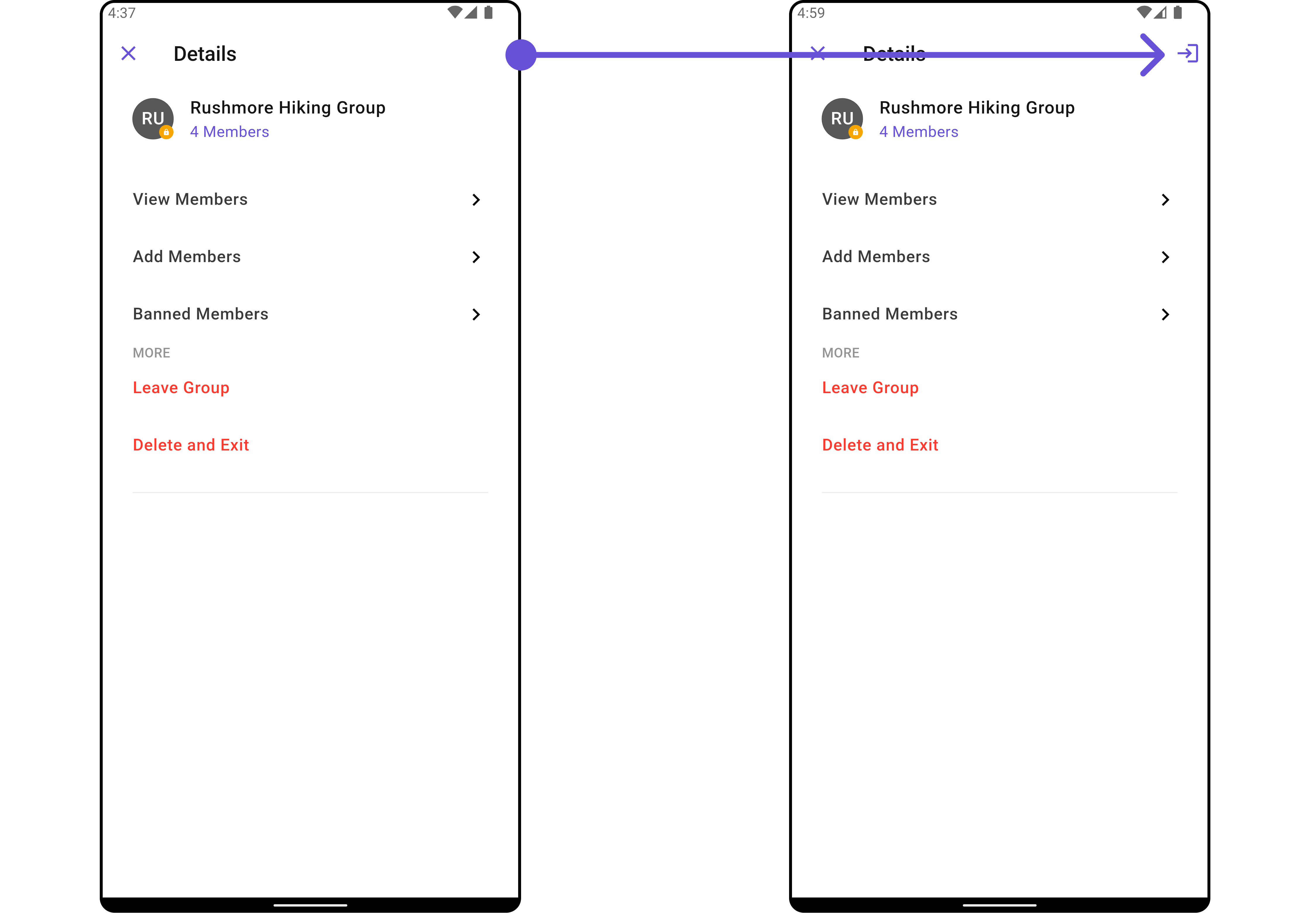
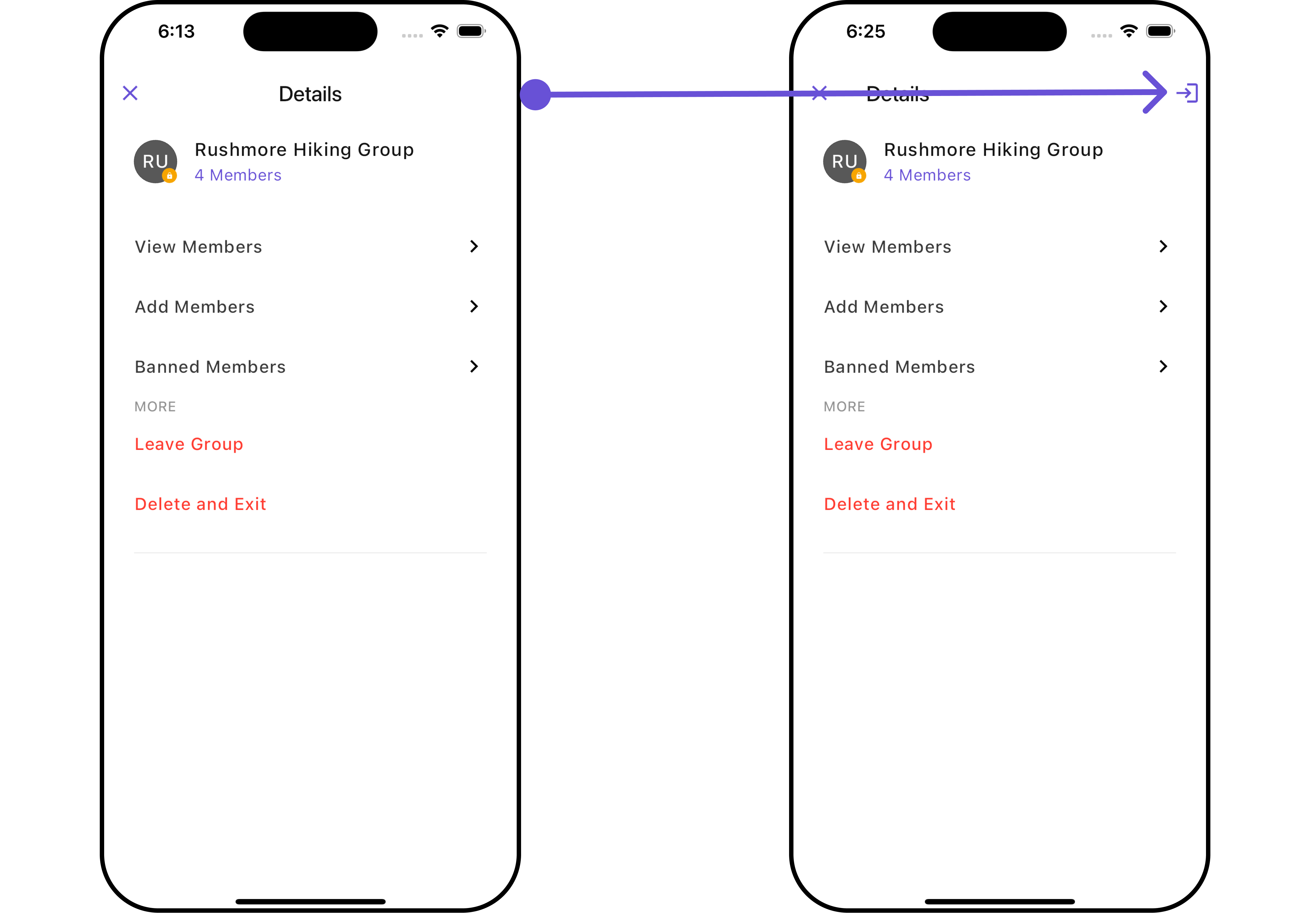
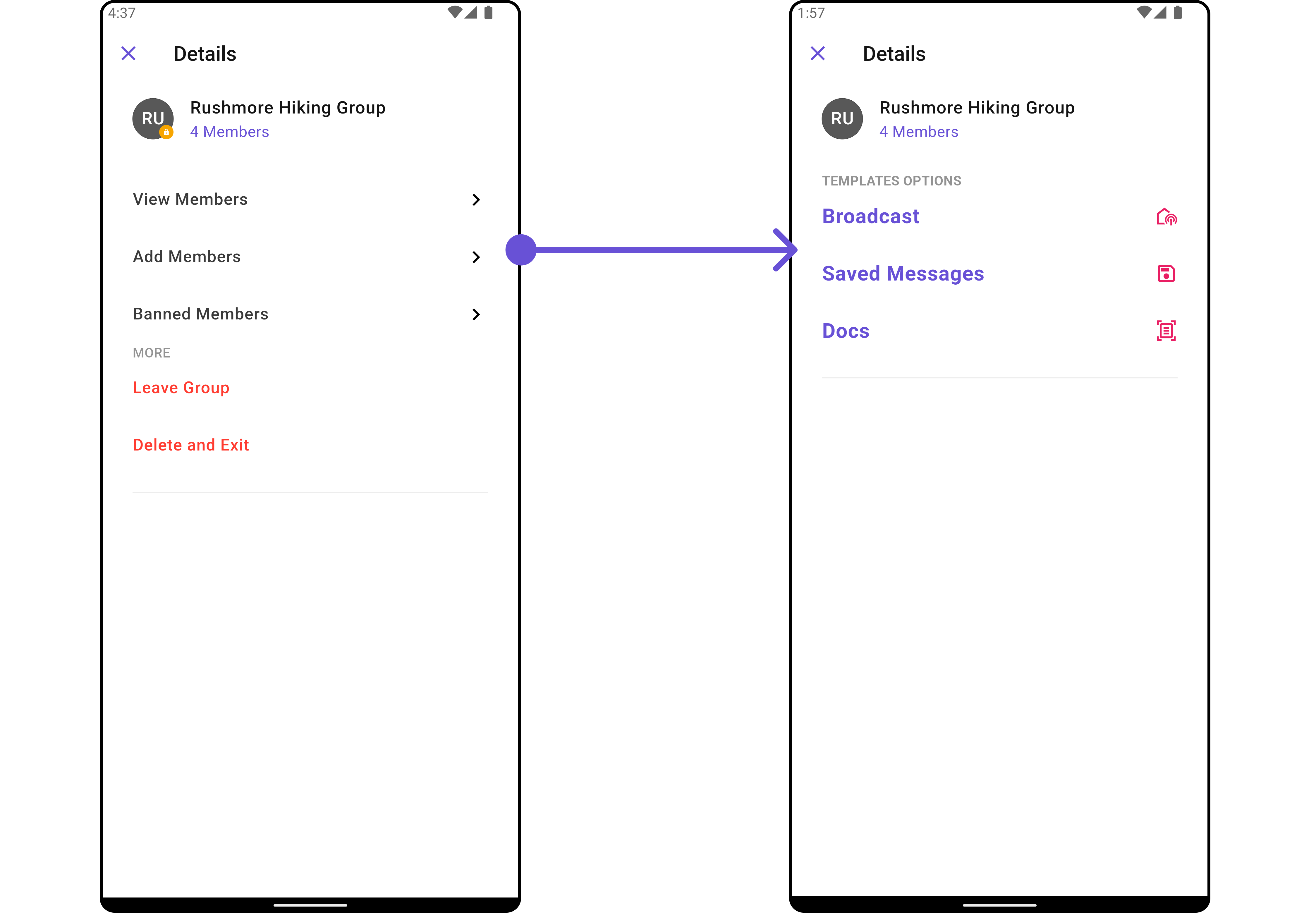
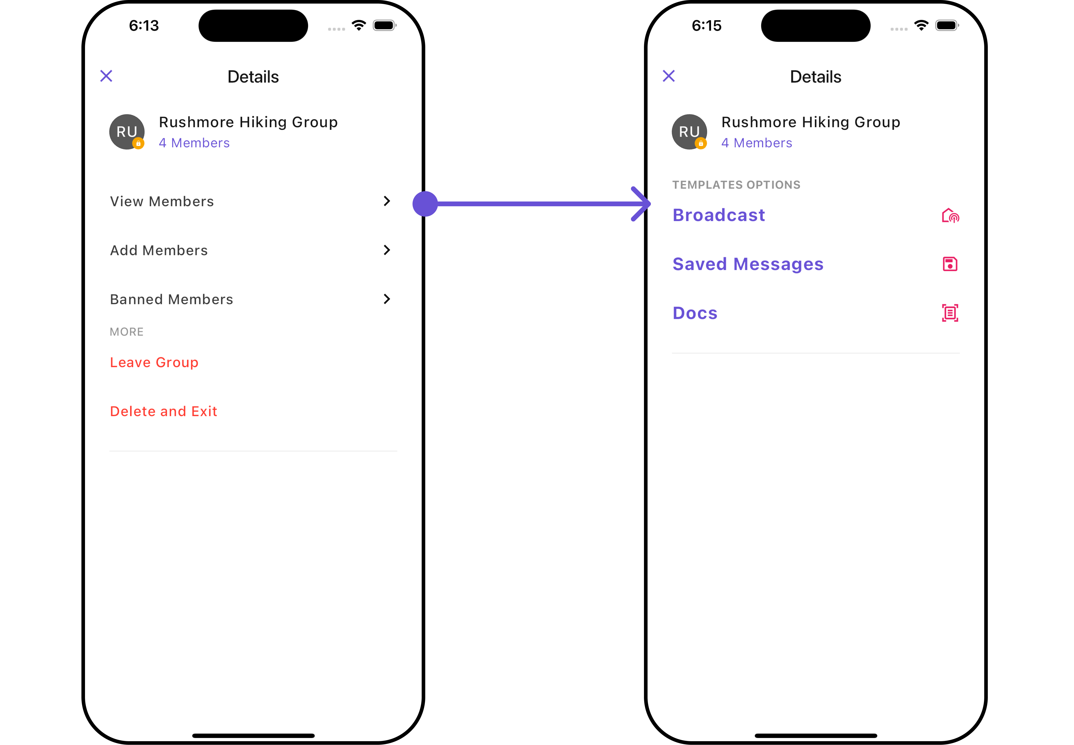
CometChatDetails is a Composite Widget that provides additional information and settings related to a specific group.
The details screen includes the following elements and functionalities:
- Group Information: It displays details about the user. This includes his/her profile picture, name, status, and other relevant information.
- Group Chat Features: It provides additional functionalities for managing the group. This includes options to add or remove participants, assign roles or permissions, and view group-related information.
- Group Actions: This offers actions related to the group, such as leaving the group, or deleting the group.
- Android
- iOS
CometChatDetails Widget is composed of the following BaseWidgets:
| Widgets | Description |
|---|---|
| CometChatListBase | CometChatListBase serves as a container widget equipped with a title (navigationBar), search functionality (search-bar), background settings, and a container for embedding a list view. |
Usage
Integration
CometChatDetails, as a widget, offers flexible integration options, allowing it to be launched directly via button clicks or any user-triggered action. Additionally, it seamlessly integrates into tab view controllers. With banned members, users gain access to a wide range of parameters and methods for effortless customization of its user interface.
You can launch CometChatDetails directly using Navigator.push , or you can define it as a widget within the build method of your State class.
1. Using Navigator to Launch CometChatDetails
- Dart
2. Embedding CometChatDetails as a Widget in the build Method
- Dart
Actions
Actions dictate how a widget functions. They are divided into two types: Predefined and User-defined. You can override either type, allowing you to tailor the behavior of the widget to fit your specific needs.1. onBack
Enhance your application’s functionality by leveraging theonBack feature. This capability allows you to customize the behavior associated with navigating back within your app. Utilize the provided code snippet to override default behaviors and tailor the user experience according to your specific requirements.
- Dart
2. onError
You can customize this behavior by using the provided code snippet to override theonError and improve error handling.
- Dart
Filters
Filters allow you to customize the data displayed in a list within a Widget. You can filter the list based on your specific criteria, allowing for a more customized. Filters can be applied using RequestBuilders of Chat SDK.CometChatDetails widget does not have available filters.
Events
Events are emitted by aWidget. By using event you can extend existing functionality. Being global events, they can be applied in Multiple Locations and are capable of being Added or Removed.
Events emitted by the Group Details widget is as follows.
| Events | Description |
|---|---|
ccGroupDeleted() | This will get triggered when the logged in user deletes a group |
ccGroupLeft() | This will get triggered when the logged in user leaves a group |
ccGroupMemberScopeChanged() | This will get triggered when the logged in user changes the scope of another group member |
ccGroupMemberBanned() | This will get triggered when the logged in user bans a group member from the group |
ccGroupMemberKicked() | This will get triggered when the logged in user kicks another group member from the group |
ccGroupMemberUnbanned() | This will get triggered when the logged in user unbans a user banned from the group |
ccGroupMemberJoined() | This will get triggered when the logged in user joins a group |
ccGroupMemberAdded() | This will get triggered when the logged in user add new members to the group |
ccOwnershipChanged | This will get triggered when the logged in user transfer the ownership of their group to some other member |
- Dart
Customization
To fit your app’s design requirements, you can customize the appearance of the Details widget. We provide exposed methods that allow you to modify the experience and behavior according to your specific needs.Style
Using Style you can customize the look and feel of the widget in your app, These parameters typically control elements such as the color, size, shape, and fonts used within the widget.1. Details Style
You can set theDetailsStyle to the CometChatDetails Widget to customize the styling.
- Dart
- Android
- iOS
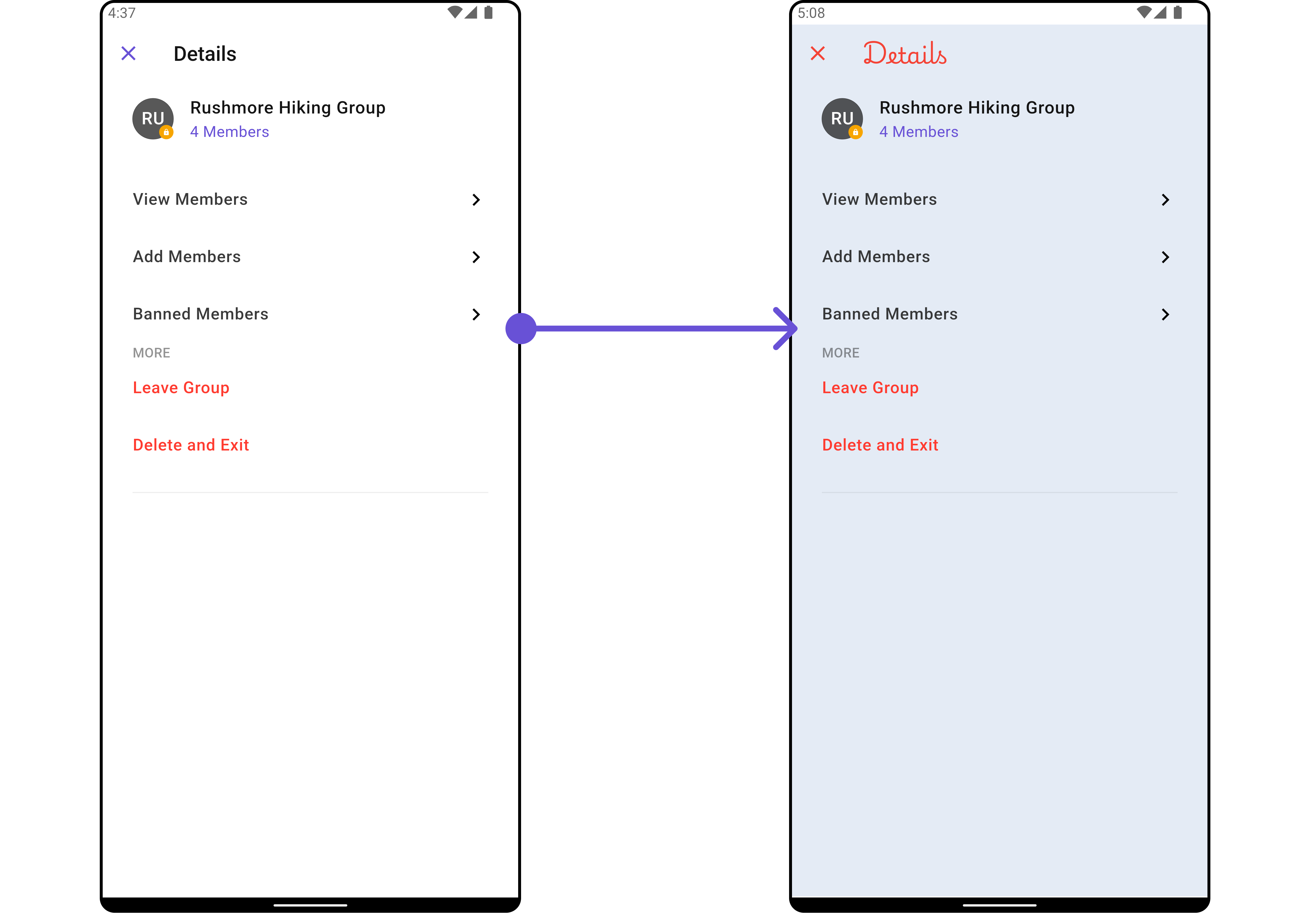
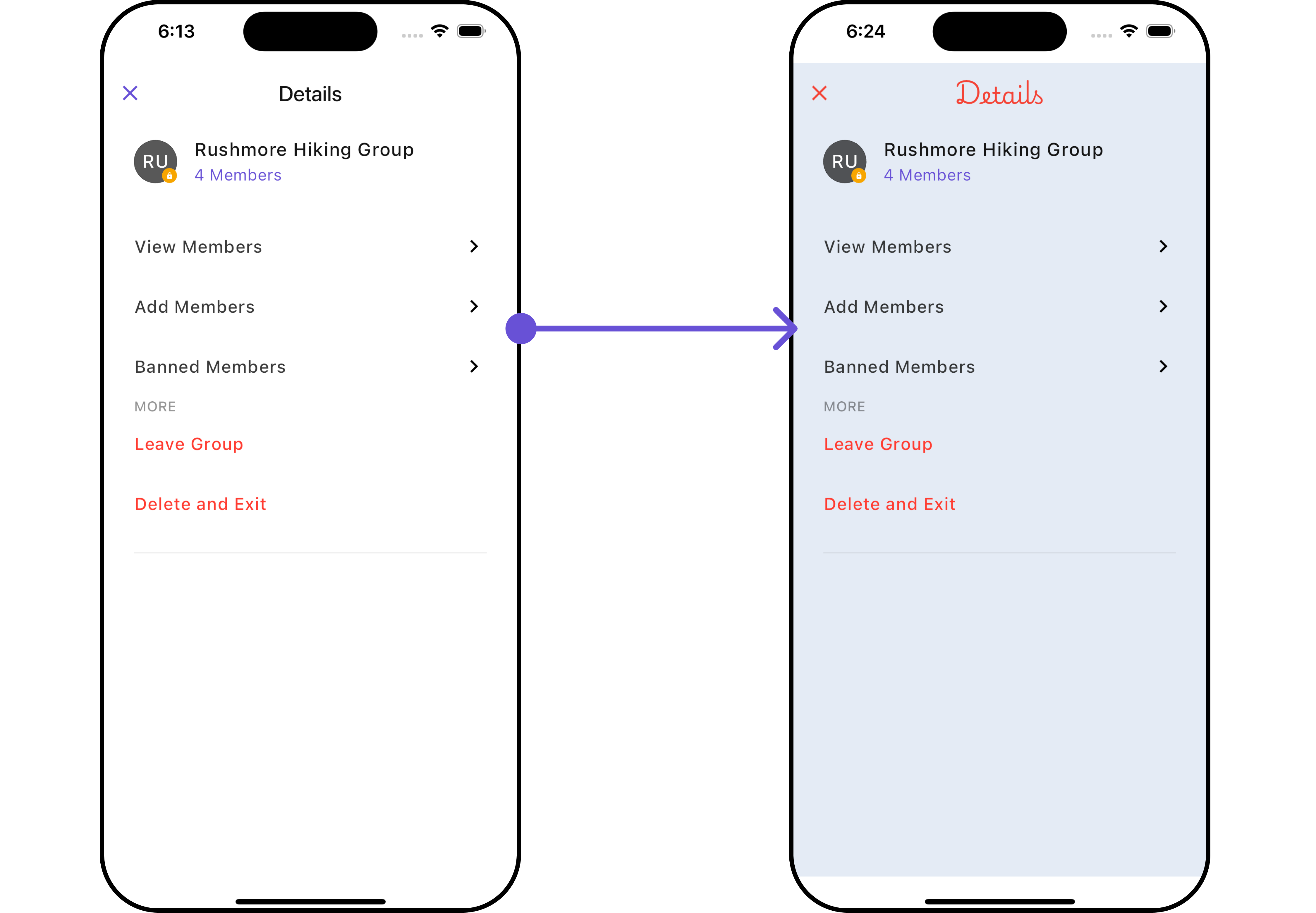
DetailsStyle
| Property | Description | Code |
|---|---|---|
| Title Style | Provides styling for title text | titleStyle: TextStyle? |
| Close Icon Tint | Provide color to close button | closeIconTint: Color? |
| Private Group Icon Background | Provides background color for status indicator if group is private | privateGroupIconBackground: Color? |
| Protected Group Icon Background | Provides background color for status indicator if group is protected | protectedGroupIconBackground: Color? |
| Online Status Color | Set online status color | onlineStatusColor: Color? |
| Width | Width of the widget | width: double? |
| Height | Height of the widget | height: double? |
| Background | Background color of the widget | background: Color? |
| Gradient | Gradient of the widget | gradient: Gradient? |
| Border | Border of the widget | border: Border? |
2. Avatar Style
To apply customized styles to theAvatar widget in the Group Members Widget, you can use the following code snippet. For further insights on Avatar Styles refer
- Dart
3. StatusIndicator Style
To apply customized styles to the Status Indicator widget in the Group Member Widget, You can use the following code snippet. For further insights on Status Indicator Styles refer- Dart
4. ListItem Style
To apply customized styles to the ListItem widget in theCometChatDetails widget, you can use the following code snippet. For further insights on List Item Styles refer
- Dart
5. LeaveGroupDialog Style
To apply customized styles to the Leave Group Dialog in theCometChatDetails Widget, you can use the following code snippet.
- Dart
Functionality
These are a set of small functional customizations that allow you to fine-tune the overall experience of the widget. With these, you can change text, set custom icons, and toggle the visibility of UI elements.- Dart
- Android
- iOS
CometChatDetails
| Property | Description | Code |
|---|---|---|
| Group | Group object for which the details are to be shown | group: Group? |
| Title | Title for the details screen | title: String? |
| Show Close Button | Toggles visibility for close button | showCloseButton: bool? |
| Close Button Icon | Icon for the close button | closeButtonIcon: Icon? |
| Disable Users Presence | Controls visibility of status indicator | disableUsersPresence: bool? |
| Hide Profile | Hides view profile for users | hideProfile: bool? |
| Protected Group Icon | Icon for protected group status indicator | protectedGroupIcon: Widget? |
| Private Group Icon | Icon for private group status indicator | privateGroupIcon: Widget? |
| Theme | Custom theme for the details screen | theme: CometChatTheme? |
Advanced
For advanced-level customization, you can set custom views to the widget. This lets you tailor each aspect of the widget to fit your exact needs and application aesthetics. You can create and define your own widget and then incorporate those into the widget.SubtitleView
You can customize your Subtitle View to meet your specific preferences and needs.- Dart
- Dart
- Android
- iOS
CustomProfileView 🛑
You can customize your Profile View to meet your specific preferences and needs.- Dart
- Dart
- Android
- iOS
AppBarOptions
You can set the CustomappBarOptions to the CometChatDetails widget.
- Dart
widget
- Dart
- Android
- iOS
Template and Options
TheCometChatDetailsOption is the class providing structure for options to be shown for group members
- Dart
Option
CometChatDetailsOption defines the structure for sections of options available in the CometChatDetails
| Property | Description | Code |
|---|---|---|
| Custom View | Custom view to options | customView: Widget? |
| Tail View | Tail widget for detail option | tail: Widget? |
| Height | Height for options | height: double? |
| On Click | Function triggered on click, takes user, group, section, and state as parameters | onClick: Function(User? user, Group? group, String section, CometChatDetailsControllerProtocol state)? |
| Id | Identifier for the option | id: String |
| Title | Title for the option | title: String? |
| Icon | Icon for the option | icon: String? |
| Package Name | Package name for the option | packageName: String? |
| Title Style | Style for the title | titleStyle: TextStyle? |
CometChatDetailsTemplate offers a structure for organizing information in the CometChatDetails widget. It serves as a blueprint, defining how group-related details are presented. This structure allows for customization and organization within the CometChat interface.
- Dart
Template
CometChatDetailsTemplate defines the structure for sections of options available in the CometChatDetails
| Property | Description | Code |
|---|---|---|
| Id | Unique identifier for every CometChatDetailsTemplate | id: String |
| Options | Function which returns list of CometChatDetailsOption for every CometChatDetailsTemplate | options: List<CometChatDetailsOption> Function(User? user, Group? group, BuildContext? context, CometChatTheme? theme)? |
| Title | Title of CometChatDetailsTemplate | title: String? |
| Title Style | Style of title of CometChatDetailsTemplate | titleStyle: TextStyle? |
| Section Separator Color | Color of section separator | sectionSeparatorColor: Color? |
| Hide Section Separator | Boolean which decides whether to hide section separator or not | hideSectionSeparator: bool? |
| Item Separator Color | Color of item separator | itemSeparatorColor: Color? |
| Hide Item Separator | Boolean which decides whether to hide item separator or not | hideItemSeparator: bool? |
- Dart
- Android
- iOS
Configurations
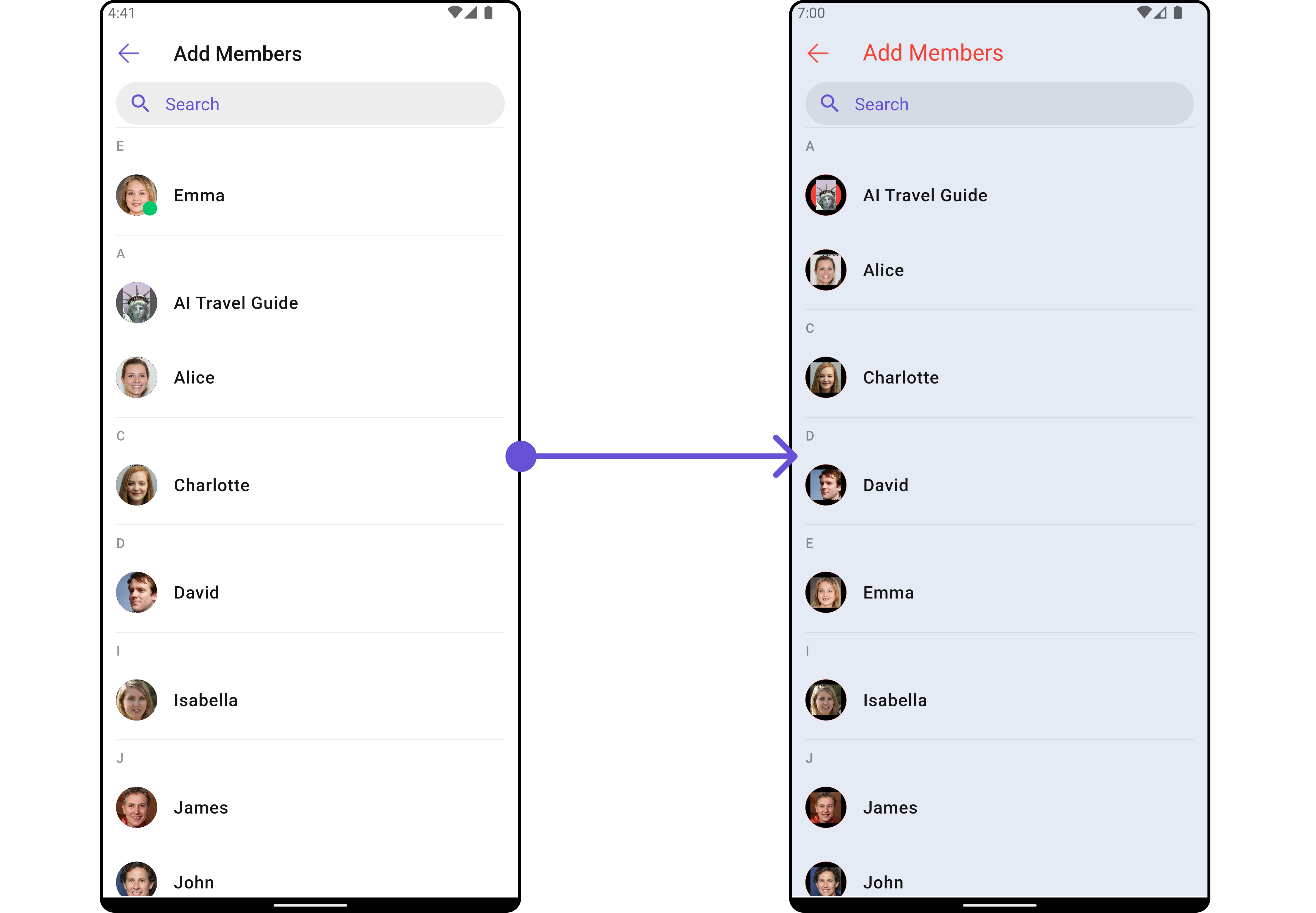
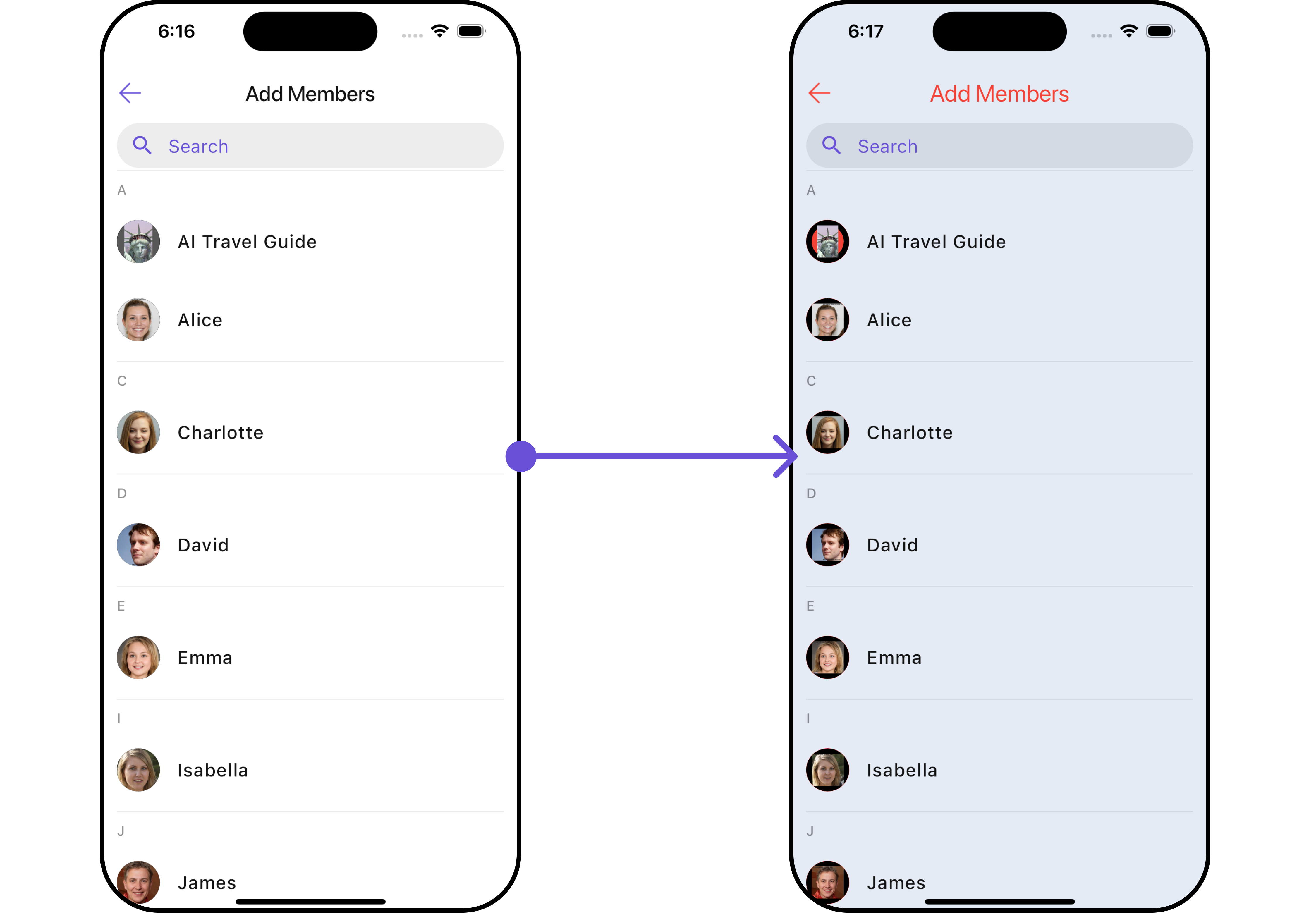
Configurations offer the ability to customize the properties of each widget within a Composite Widget. CometChatDetails hasAdd Members, Banned Members, Transfer Ownership and Group Members widget. Hence, each of these widgets will have its individual Configuration.
Group Members
You can customize the properties of the Group Members widget by making use of theGroupMembersConfiguration. You can accomplish this by employing the GroupMembersConfiguration as demonstrated below:
- Dart
GroupMembersConfiguration can be found under Group Members. Properties marked with the 🛑 symbol are not accessible within the Configuration Object.
Example
Let’s say you want to change the style of the Group Member subwidget and, in addition, you only want to hide search bar and separator.
You can modify the style using the groupMemberStyle property, hide the separator using hideSeparator property and hide the search bar using hideSearch property.
- Dart
Add Members
You can customize the properties of the Add Members widget by making use of theAddMembersConfiguration. You can accomplish this by employing the AddMembersConfiguration as demonstrated below:
- Dart
AddMembersConfiguration can be found under Add Members. Properties marked with the 🛑 symbol are not accessible within the Configuration Object.
Example
Let’s say you want to change the style of the Add Members subwidget and, in addition, you only want to show the back button.
You can modify the style using the ListItemStyle property and AvatarStyle property
- Dart
- Android
- iOS
Banned Members
You can customize the properties of the Banned Members widget by making use of theBannedMembersConfiguration. You can accomplish this by employing the BannedMembersConfiguration as demonstrated below:
- Dart
BannedMembersConfiguration can be found under Banned Members. Properties marked with the 🛑 symbol are not accessible within the Configuration Object.
Example
Let’s say you want to change the style of the Banned Members subwidget and, in addition, you only want to show the back button.
You can modify the style using the ListItemStyle property and AvatarStyle property
- Dart
Transfer Ownership
You can customize the properties of the Transfer Ownership widget by making use of theTransferOwnershipConfiguration. You can accomplish this by employing the TransferOwnershipConfiguration as demonstrated below:
- Dart
TransferOwnershipConfiguration can be found under Transfer Ownership. Properties marked with the 🛑 symbol are not accessible within the Configuration Object.
Example Let’s say you want to change the style of the Transfer Ownership subwidget and, in addition, you only want to show the back button.
You can modify the style using the ListItemStyle property and AvatarStyle property
- Dart