Overview
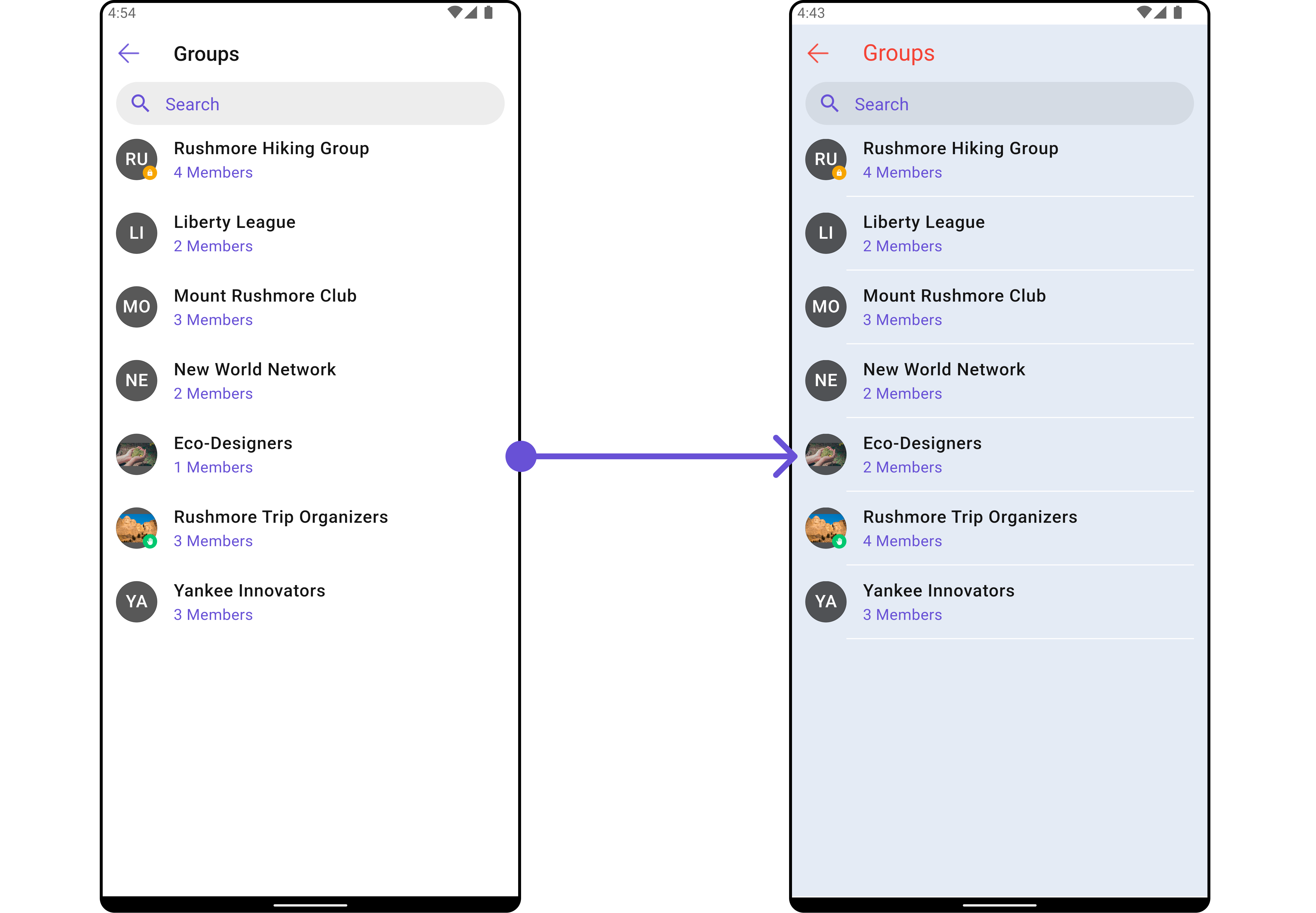
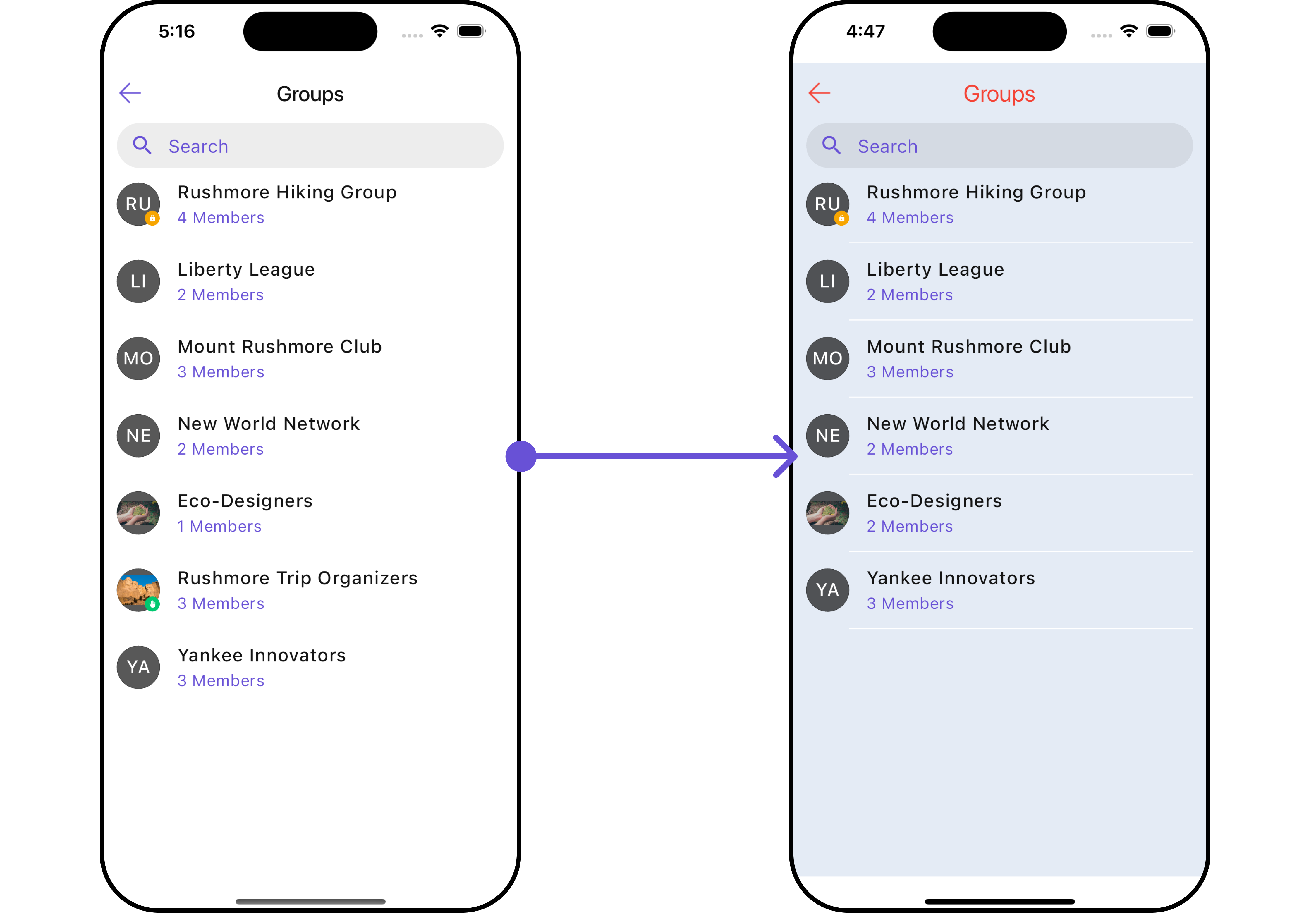
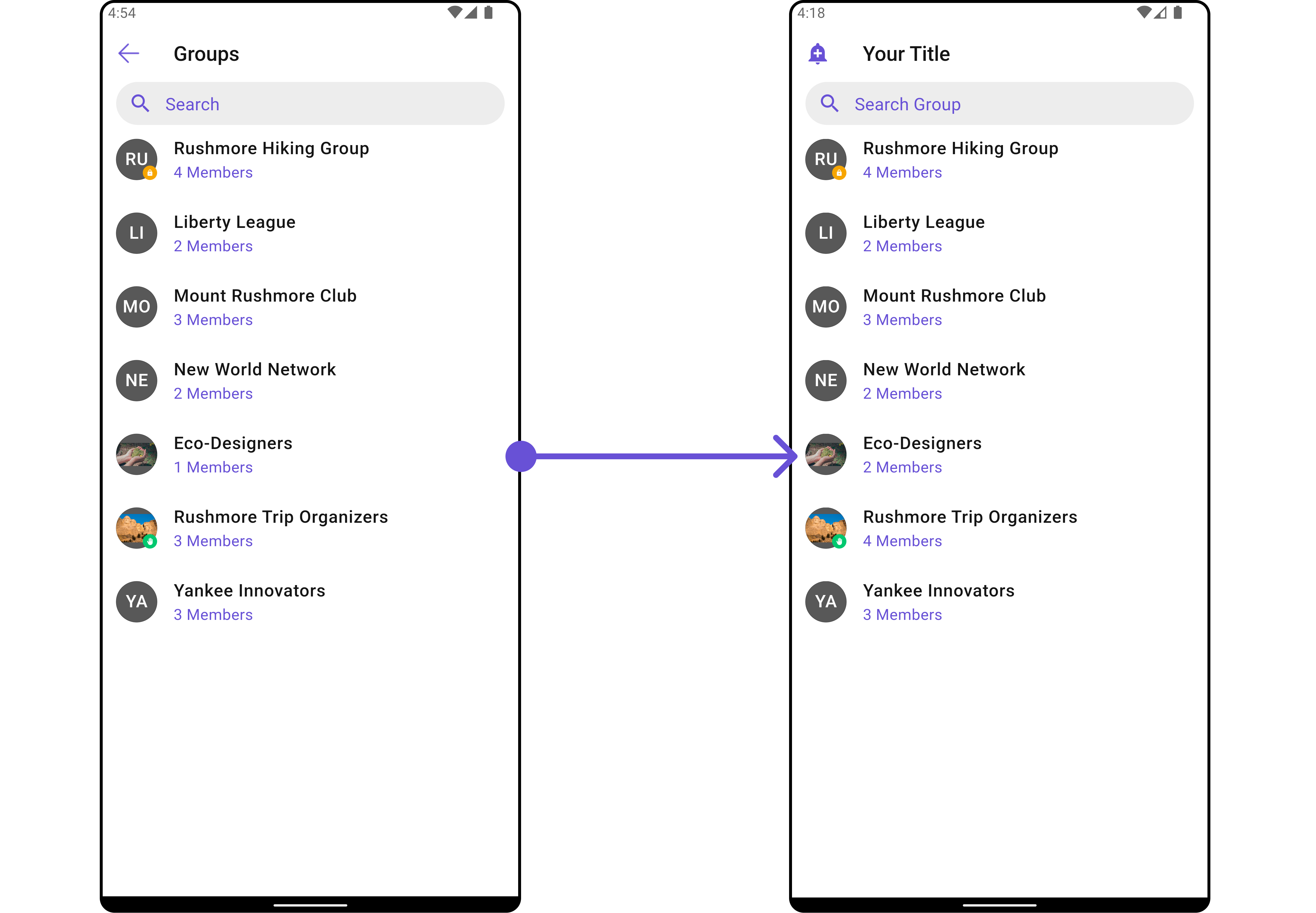
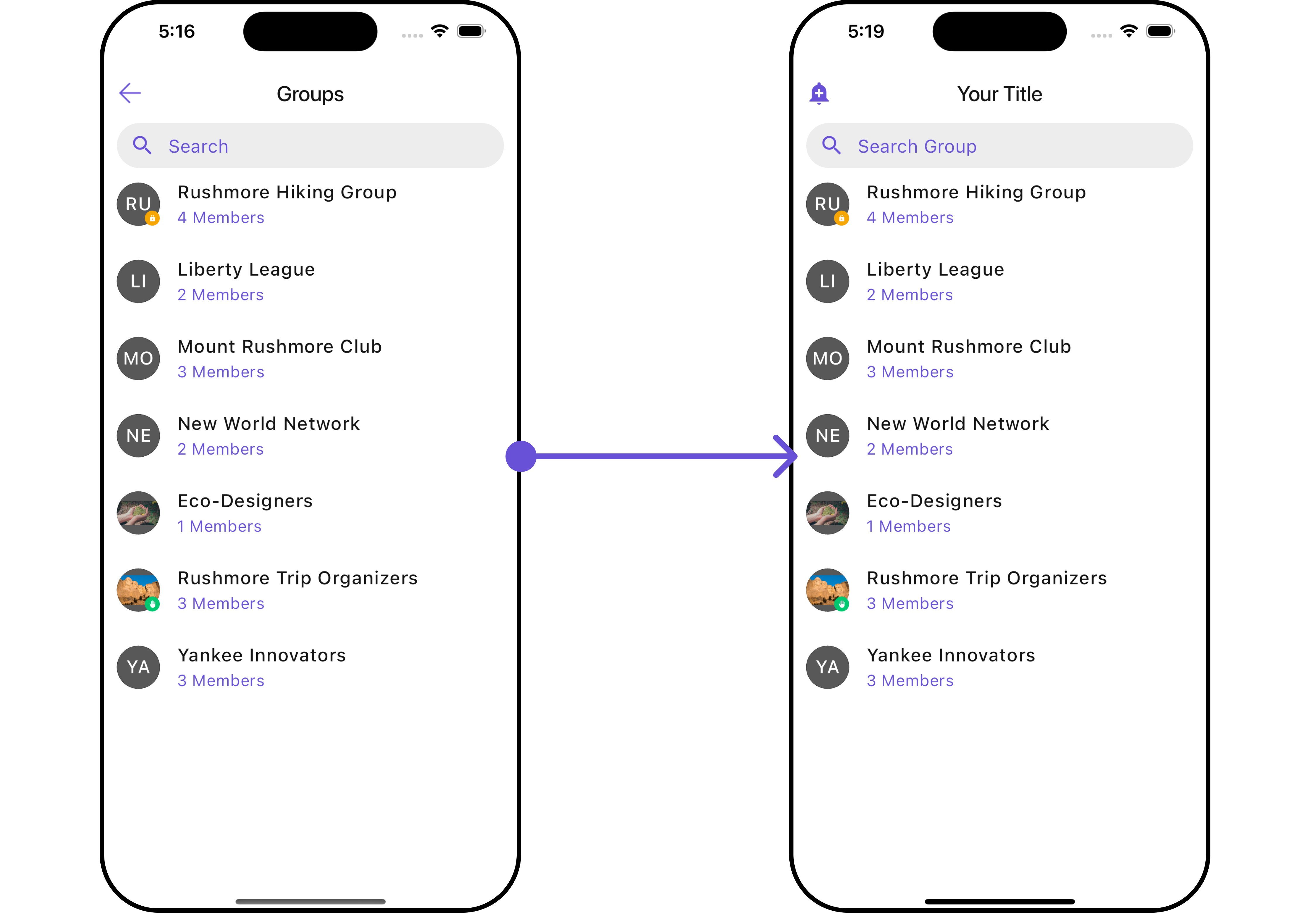
CometChatGroups functions as a standalone Widget designed to create a screen displaying a list of groups, with the added functionality of enabling users to search for specific groups. Acting as a container widget, CometChatGroups encapsulates and formats the CometChatListBase and CometChatGroupList widgets without introducing any additional behavior of its own.
- Android
- iOS
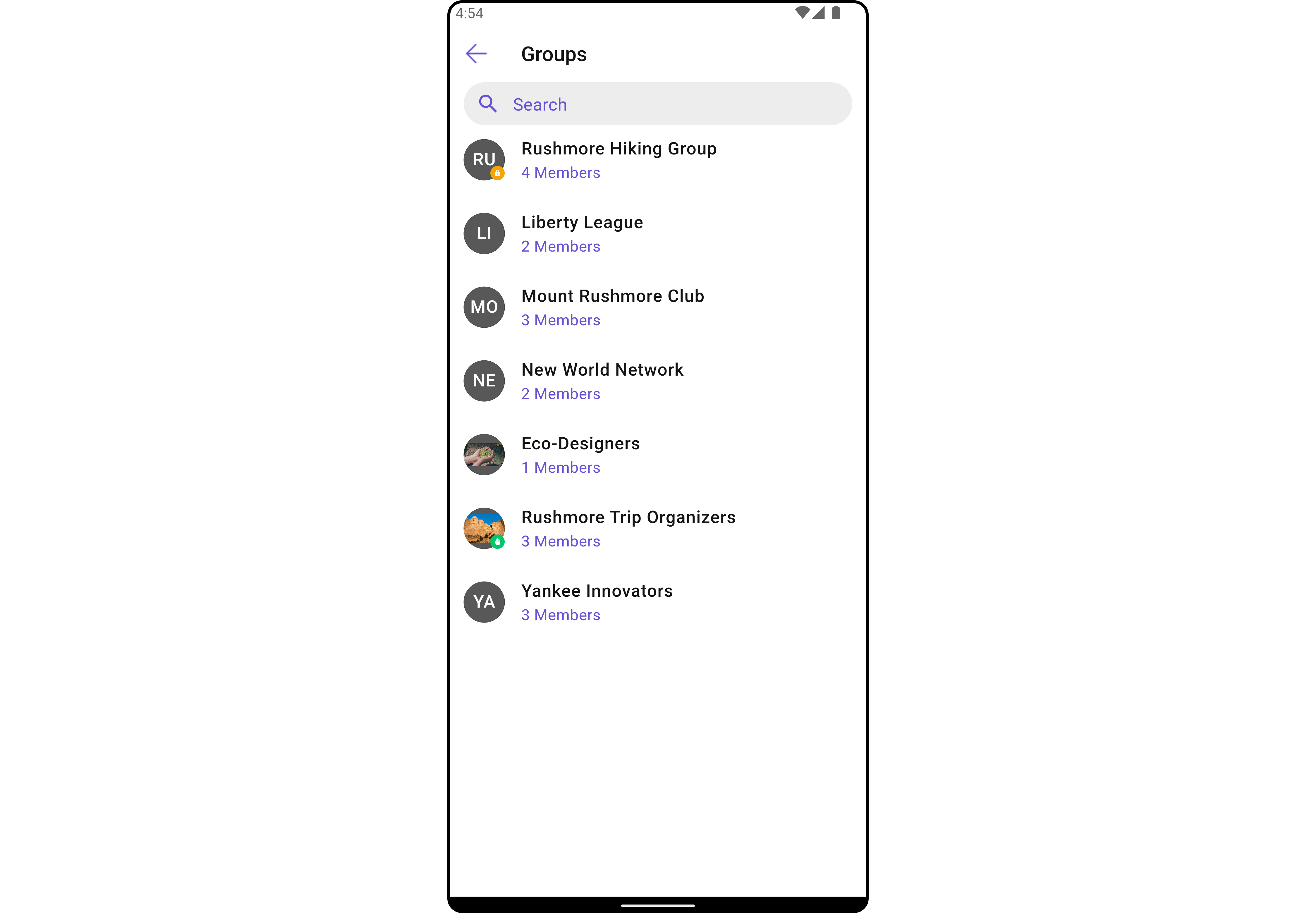
CometChatGroups widget is composed of the following BaseWidget:
| Widgets | Description |
|---|---|
| CometChatListBase | CometChatListBase serves as a container widget equipped with a title (navigationBar), search functionality (search-bar), background settings, and a container for embedding a list view. |
| CometChatListItem | This widget renders information extracted from a Group object onto a tile, featuring a title, subtitle, leading view, and trailing view. |
Usage
Integration
AsCometChatGroups is a custom widget, it can be launched directly by user actions such as button clicks or other interactions.
You can launch CometChatGroups directly using Navigator.push, or you can define it as a widget within the build method of your State class.
1. Using Navigator to Launch CometChatGroups
- Dart
2. Embedding CometChatGroups as a Widget in the build Method
- Dart
Actions
Actions dictate how a widget functions. They are divided into two types: Predefined and User-defined. You can override either type, allowing you to tailor the behavior of the widget to fit your specific needs.1. onItemTap
This method proves valuable when users seek to override onItemTap functionality within CometChatGroups, empowering them with greater control and customization options. TheonItemTap action doesn’t have a predefined behavior. You can override this action using the following code snippet.
- Dart
2. onBack
Enhance your application’s functionality by leveraging theonBack feature. This capability allows you to customize the behavior associated with navigating back within your app. Utilize the provided code snippet to override default behaviors and tailor the user experience according to your specific requirements.
- Dart
3. onError
You can customize this behavior by using the provided code snippet to override theonError and improve error handling.
- Dart
4. onItemLongPress
This method becomes invaluable when users seek to override long-click functionality within CometChatGroups, offering them enhanced control and flexibility in their interactions. TheonItemLongPress action doesn’t have a predefined behavior. You can override this action using the following code snippet.
- Dart
5. onSelection
When theonSelection event is triggered, it furnishes the list of selected groups. This event can be invoked by any button or action within the interface. You have the flexibility to implement custom actions or behaviors based on the selected groups.
This action does not come with any predefined behavior. However, you have the flexibility to override this event and tailor it to suit your needs using the following code snippet.
- Dart
Filters
Filters allow you to customize the data displayed in a list within a Component. You can filter the list based on your specific criteria, allowing for a more customized. Filters can be applied using RequestBuilders of Chat SDK.1. GroupsRequestBuilder
The GroupsRequestBuilder enables you to filter and customize the group list based on available parameters in GroupsRequestBuilder. This feature allows you to create more specific and targeted queries when fetching groups. The following are the parameters available in GroupsRequestBuilder- Dart
| Property | Description | Code |
|---|---|---|
| Joined Only | Flag to include only joined groups. Defaults to false. | joinedOnly: bool |
| Limit | Number of results to limit the query. | limit: int |
| Search Keyword | Keyword for searching groups. | searchKeyword: String |
| Tags | Tags for filtering groups. | tags: List<String> |
| With Tags | Flag to include tags in the results. Defaults to false. | withTags: bool |
Events
Events are emitted by aCometChatGroups Widget. By using event you can extend existing functionality. Being global events, they can be applied in Multiple Locations and are capable of being Added or Removed.
The list of events emitted by the CometChatGroups widget is as follows.
| Events | Description |
|---|---|
ccGroupCreated | This gets triggered when the logged in user creates a group. |
ccGroupDeleted | This gets triggered when the logged in user deletes a group. |
ccGroupLeft | This gets triggered when the logged in user leaves a group. |
ccGroupMemberScopeChanged | This gets triggered when the logged in user changes the scope of another group member. |
ccGroupMemberBanned | This gets triggered when the logged in user bans a group member from the group. |
ccGroupMemberKicked | This gets triggered when the logged in user kicks another group member from the group. |
ccGroupMemberUnbanned | This gets triggered when the logged in user unbans a user banned from the group. |
ccGroupMemberJoined | This gets triggered when the logged in user joins a group. |
ccGroupMemberAdded | This gets triggered when the logged in user adds new members to the group. |
ccOwnershipChanged | This gets triggered when the logged in user transfers the ownership of their group to some other member. |
- Dart
your_screen.dart
Customization
To fit your app’s design requirements, you can customize the appearance of the groups widget. We provide exposed methods that allow you to modify the experience and behavior according to your specific needs.Style
Using Style you can customize the look and feel of the widget in your app, These parameters typically control elements such as the color, size, shape, and fonts used within the widget.1. Groups Style
Enhance yourCometChatGroups Widget by setting the GroupsStyle to customize its appearance.
- Dart
- Android
- iOS
GroupsStyle
| Property | Description | Code |
|---|---|---|
| Back Icon Tint | Provides color for the back icon | backIconTint: Color? |
| Empty Text Style | Provides styling for text to indicate group list is empty | emptyTextStyle: TextStyle? |
| Error Text Style | Provides styling for text to indicate some error has occurred | errorTextStyle: TextStyle? |
| Loading Icon Tint | Provides color to loading icon | loadingIconTint: Color? |
| Password Group Icon Background | Provides color to the icon for password protected group | passwordGroupIconBackground: Color? |
| Private Group Icon Background | Provides color to the icon for private group | privateGroupIconBackground: Color? |
| Search Background | Provides color for the search box | searchBackground: Color? |
| Search Border Color | Provides color for the border around the search box | searchBorderColor: Color? |
| Search Border Radius | Provides radius for the border around the search box | searchBorderRadius: double? |
| Search Border Width | Provides width to the border around the search box | searchBorderWidth: double? |
| Search Icon Tint | Provides color for the search icon | searchIconTint: Color? |
| Search Placeholder Style | Provides styling for the hint text inside the search box | searchPlaceholderStyle: TextStyle? |
| Search Text Style | Provides styling for text inside the search box | searchTextStyle: TextStyle? |
| Selection Icon Tint | Set selection icon color | selectionIconTint: Color? |
| Submit Icon Tint | Set submit icon tint | submitIconTint: Color? |
| Subtitle Text Style | Provides styling to the text in the subtitle | subtitleTextStyle: TextStyle? |
| Title Style | Provides styling for title text | titleStyle: TextStyle? |
2. Avatar Style
To apply customized styles to theAvatar widget in the CometChatGroups widget, you can use the following code snippet. For further insights on Avatar Styles refer
- Dart
3. StatusIndicator Style
To apply customized styles to the Status Indicator widget in theCometChatGroups widget, You can use the following code snippet. For further insights on Status Indicator Styles refer
- Dart
Functionality
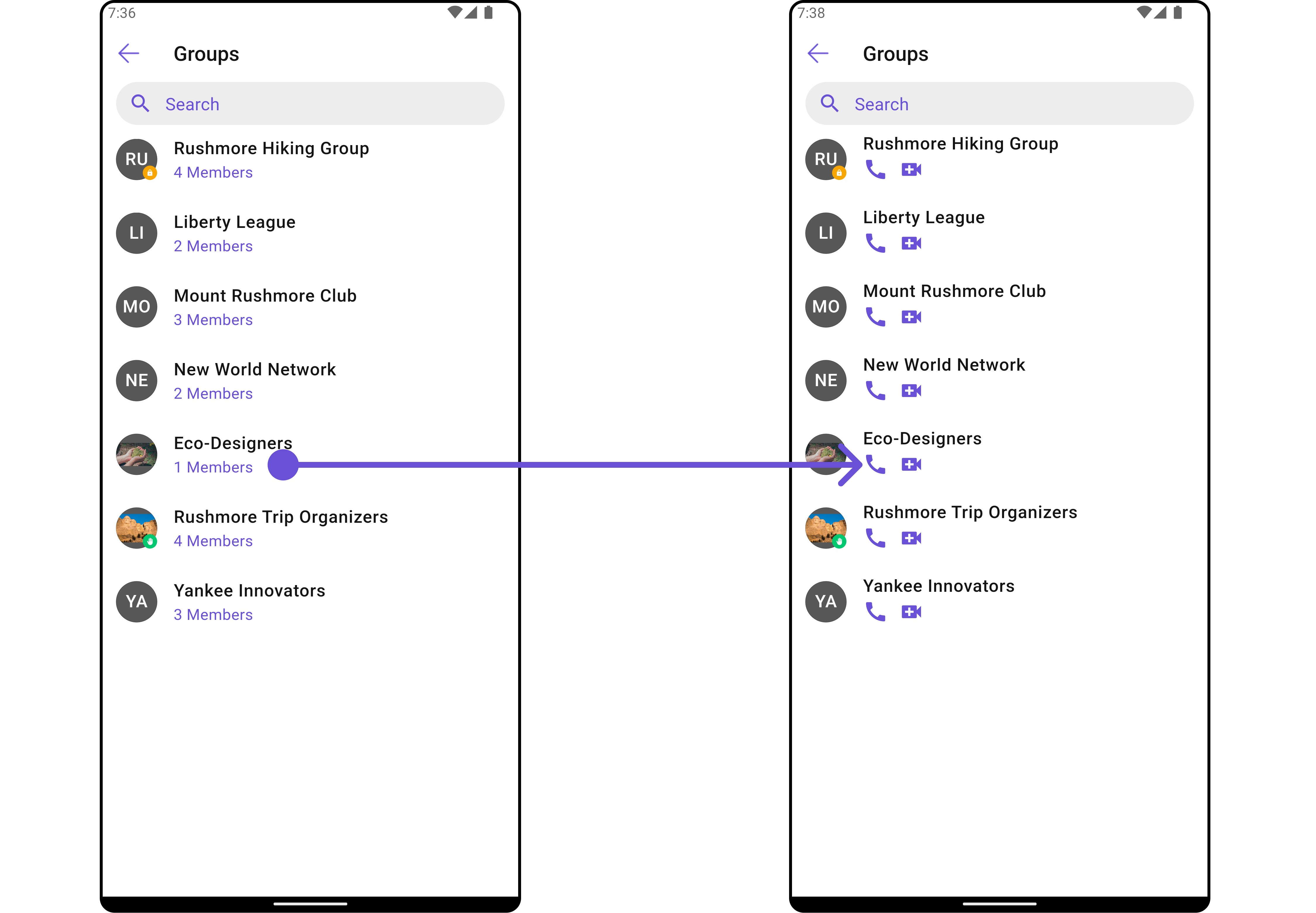
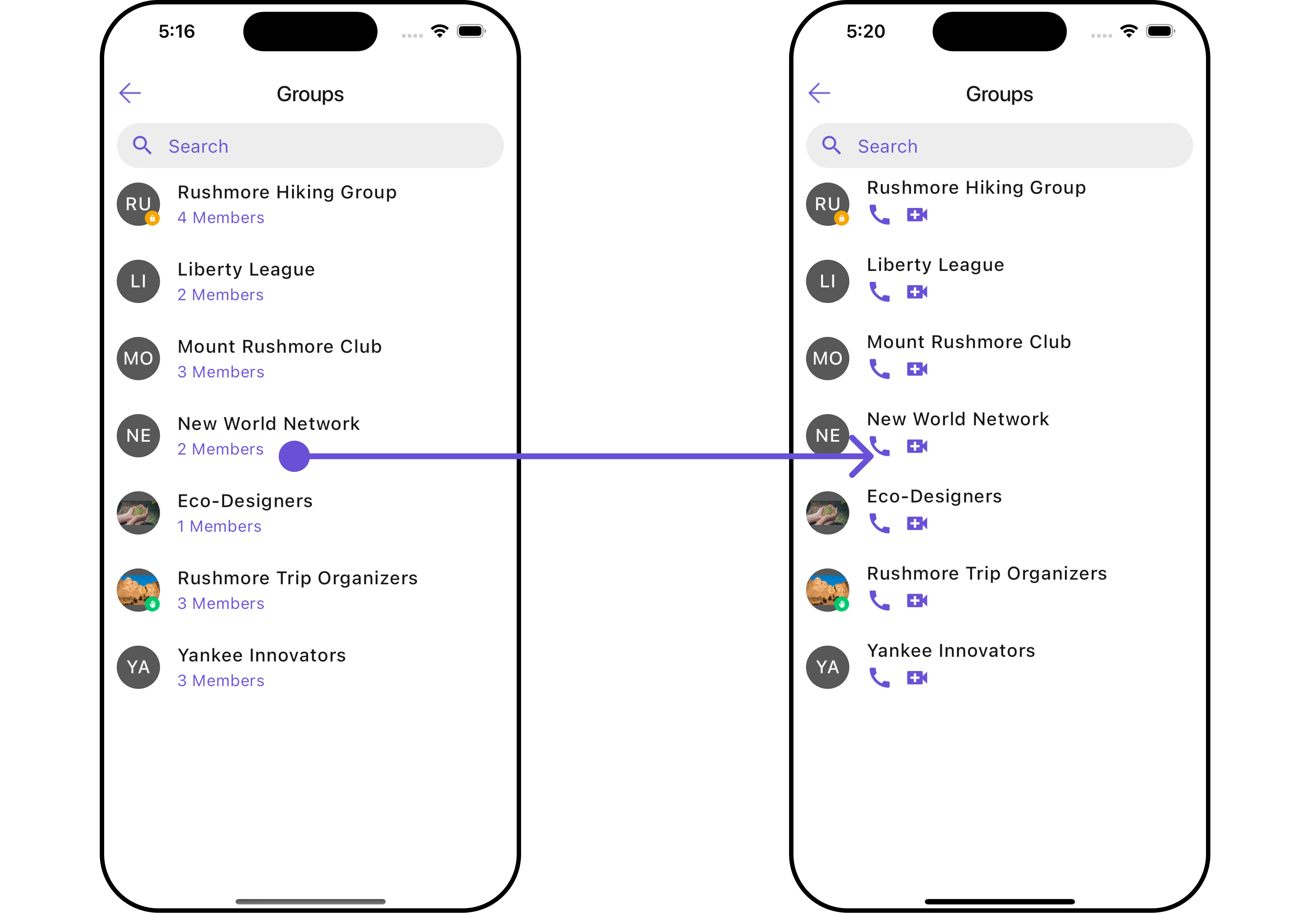
These are a set of small functional customizations that allow you to fine-tune the overall experience of the widget. With these, you can change text, set custom icons, and toggle the visibility of UI elements.- Android
- iOS
- Dart
- Android
- iOS
CometChatGroups
| Property | Description | Code |
|---|---|---|
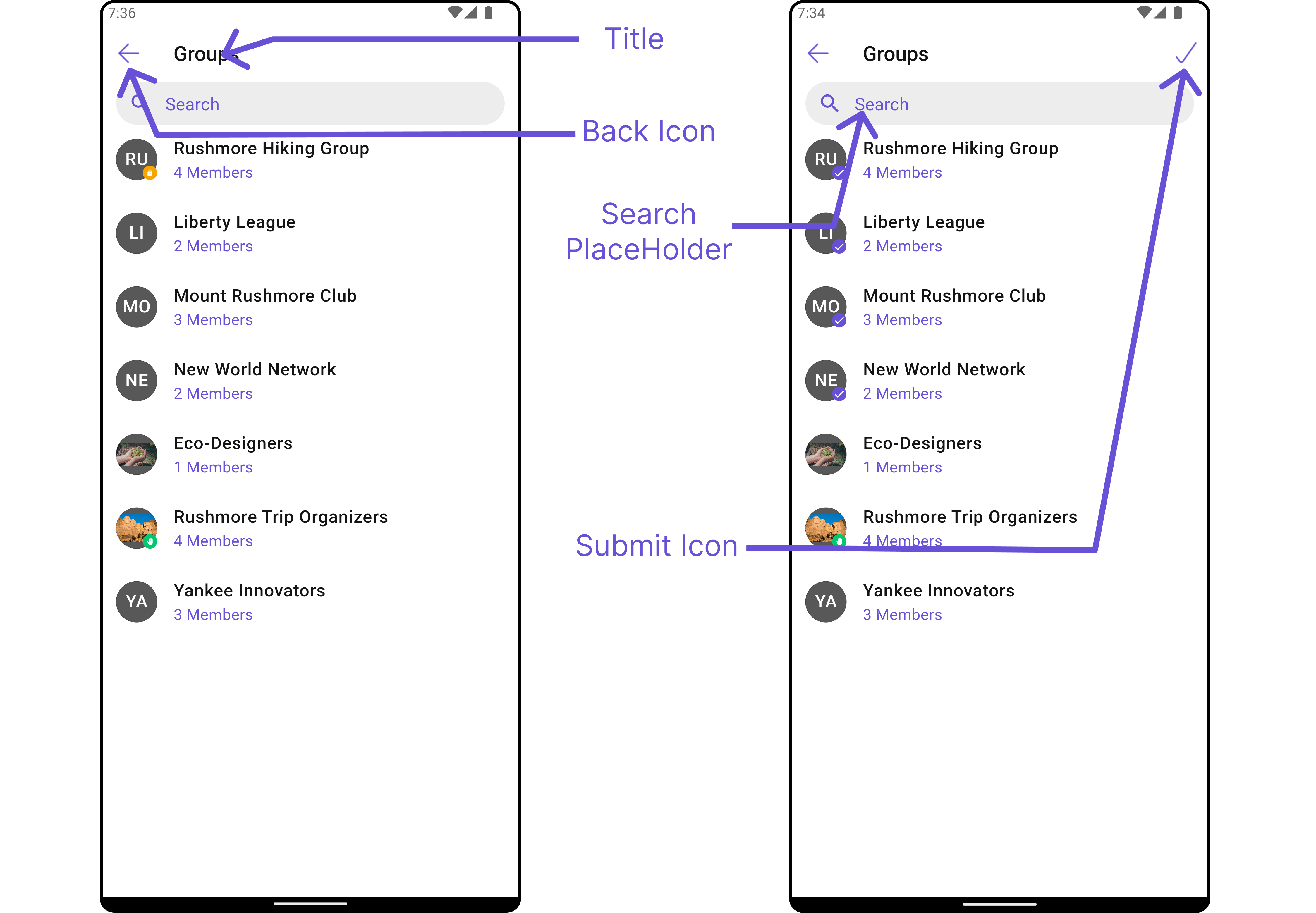
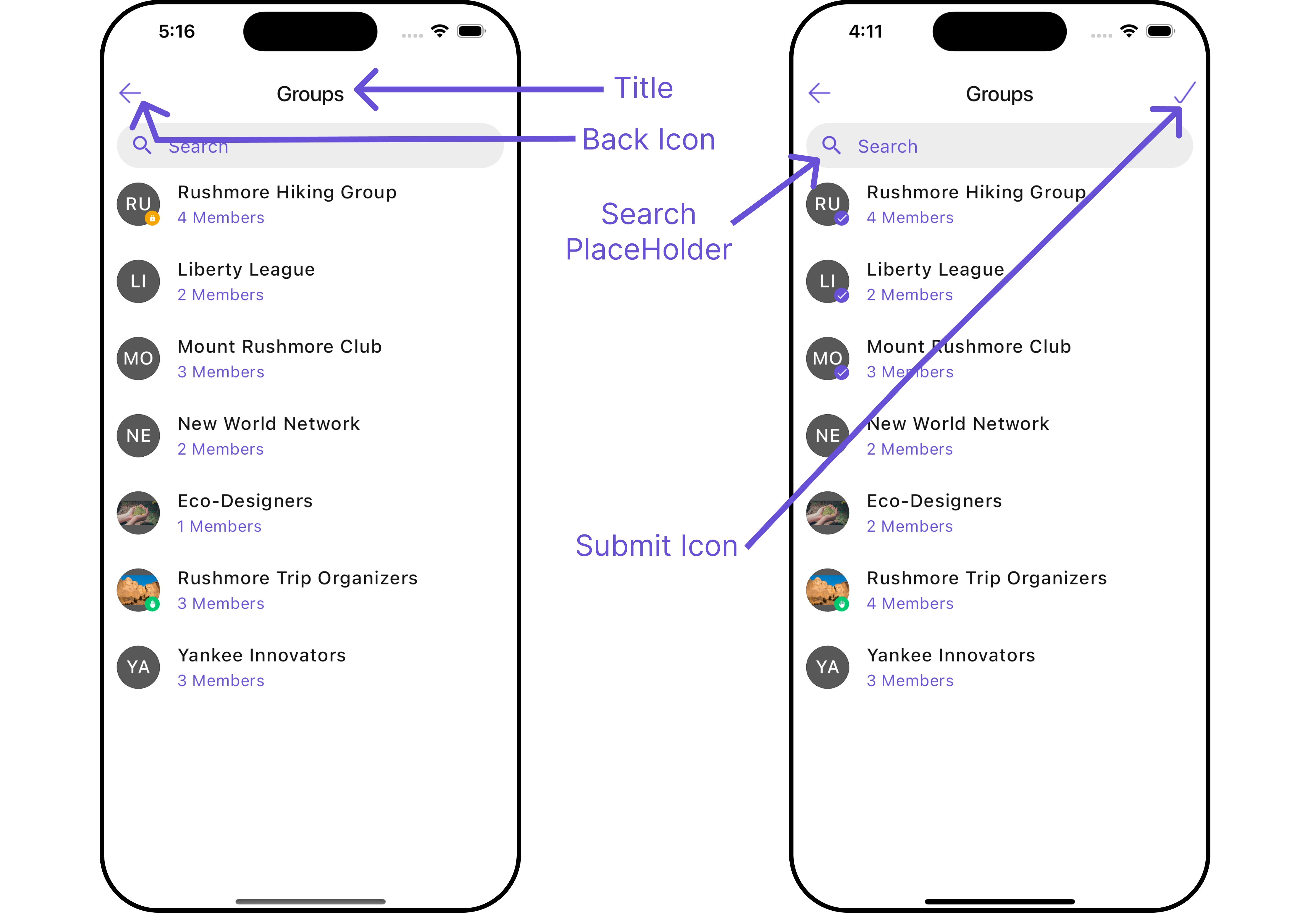
| Activate Selection | Lets the widget know if groups are allowed to be selected | activateSelection: ActivateSelection? |
| Back Button | Back button | backButton: Widget? |
| Controller | Sets controller for the list | controller: ScrollController? |
| Controller Tag | Group tag to create from, if this is passed it’s parent responsibility to close this | controllerTag: String? |
| Empty State Text | Text to be displayed when the list is empty | emptyStateText: String? |
| Error State Text | Text to be displayed when error occurs | errorStateText: String? |
| Hide Appbar | Toggle visibility for app bar | hideAppbar: bool? |
| Hide Error | Toggle visibility of error dialog | hideError: bool? |
| Hide Search | Switch on/off search input | hideSearch: bool |
| Hide Separator | hideSeparator: bool | |
| Password Group Icon | Sets icon in status indicator for password group | passwordGroupIcon: Widget? |
| Private Group Icon | Sets icon in status indicator for private group | privateGroupIcon: Widget? |
| Search Box Icon | Search icon | searchBoxIcon: Widget? |
| Search Placeholder | Placeholder text of search input | searchPlaceholder: String? |
| Selection Icon | Change selection icon | selectionIcon: Widget? |
| Selection Mode | Specifies mode groups module is opening in | selectionMode: SelectionMode? |
| Submit Icon | Override the default submit icon | submitIcon: Widget? |
| Theme | Can pass custom theme | theme: CometChatTheme? |
| Title | Sets title for the list | title: String? |
Advance
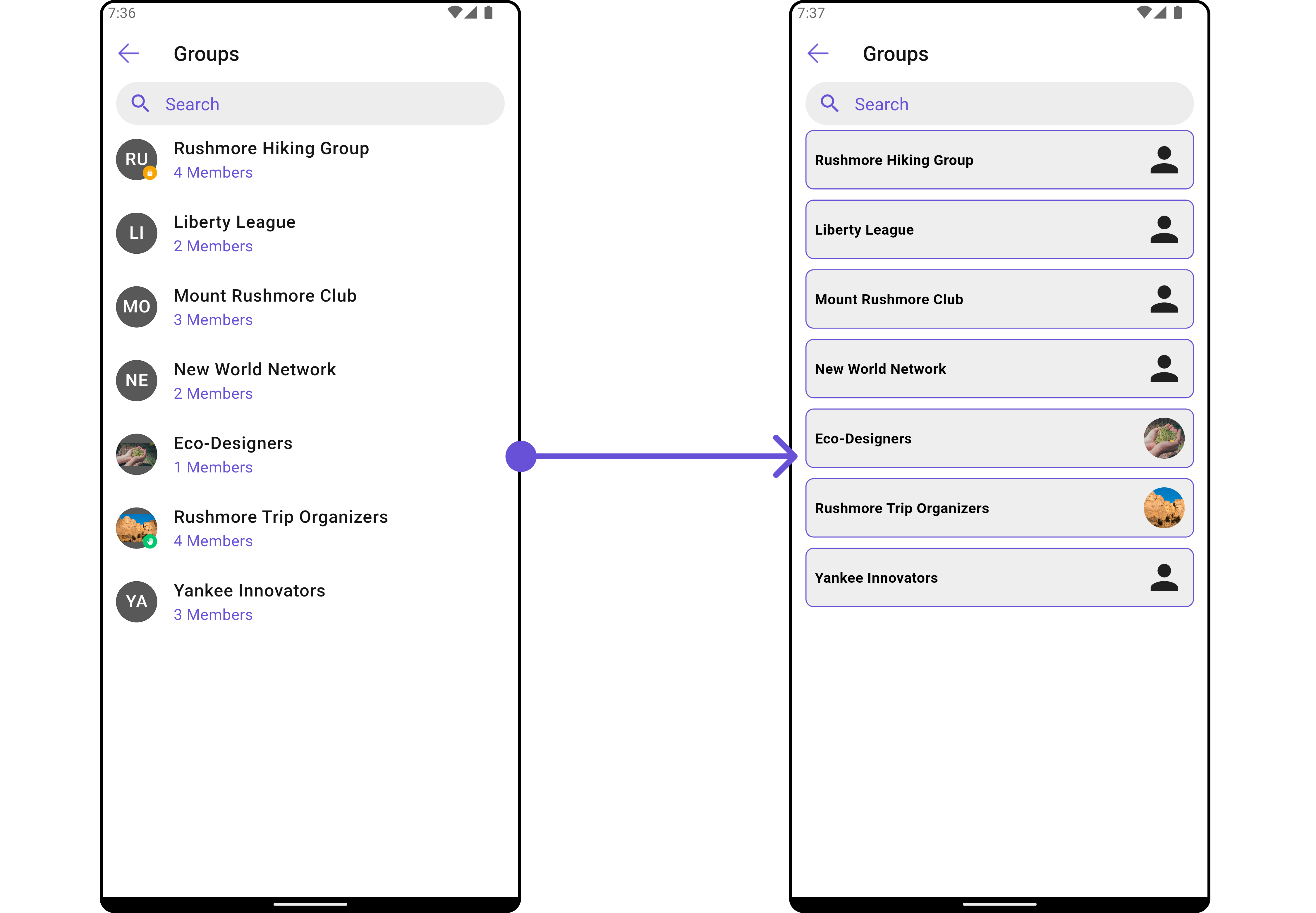
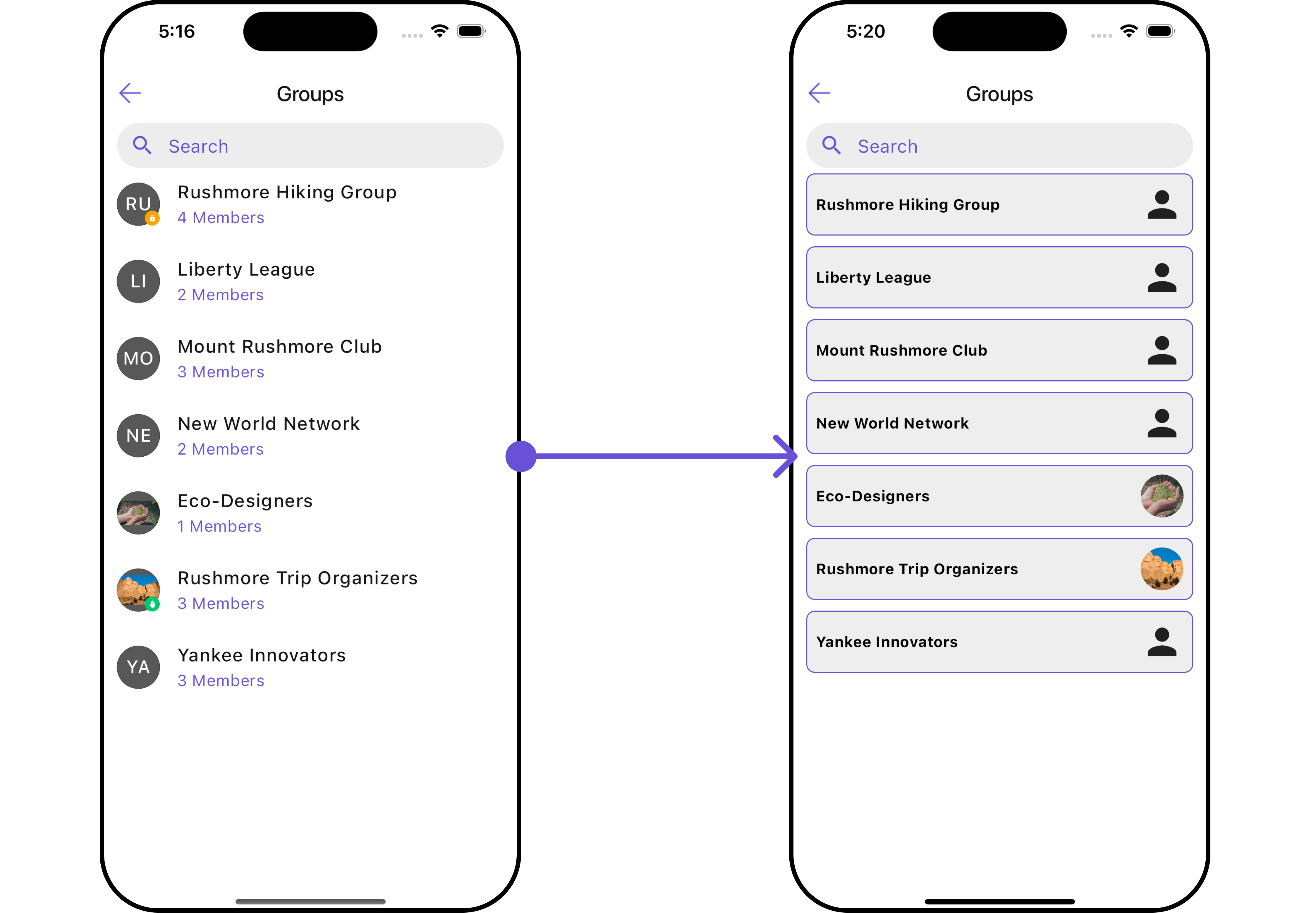
For advanced-level customization, you can set custom views to the widget. This lets you tailor each aspect of the widget to fit your exact needs and application aesthetics. You can create and define your own widget and then incorporate those into the widget.ListItemView
With this function, you can assign a custom ListItem to theCometChatGroups Widget.
- Dart
- Dart
custom_list_item.dart
- Dart
main.dart
- Android
- iOS
SubtitleView
You can customize the subtitle view for each item to meet your specific preferences and needs.- Dart
- Android
- iOS
AppBarOptions
You can set the CustomappBarOptions to the CometChatGroups widget.
- Dart
- Android
- iOS
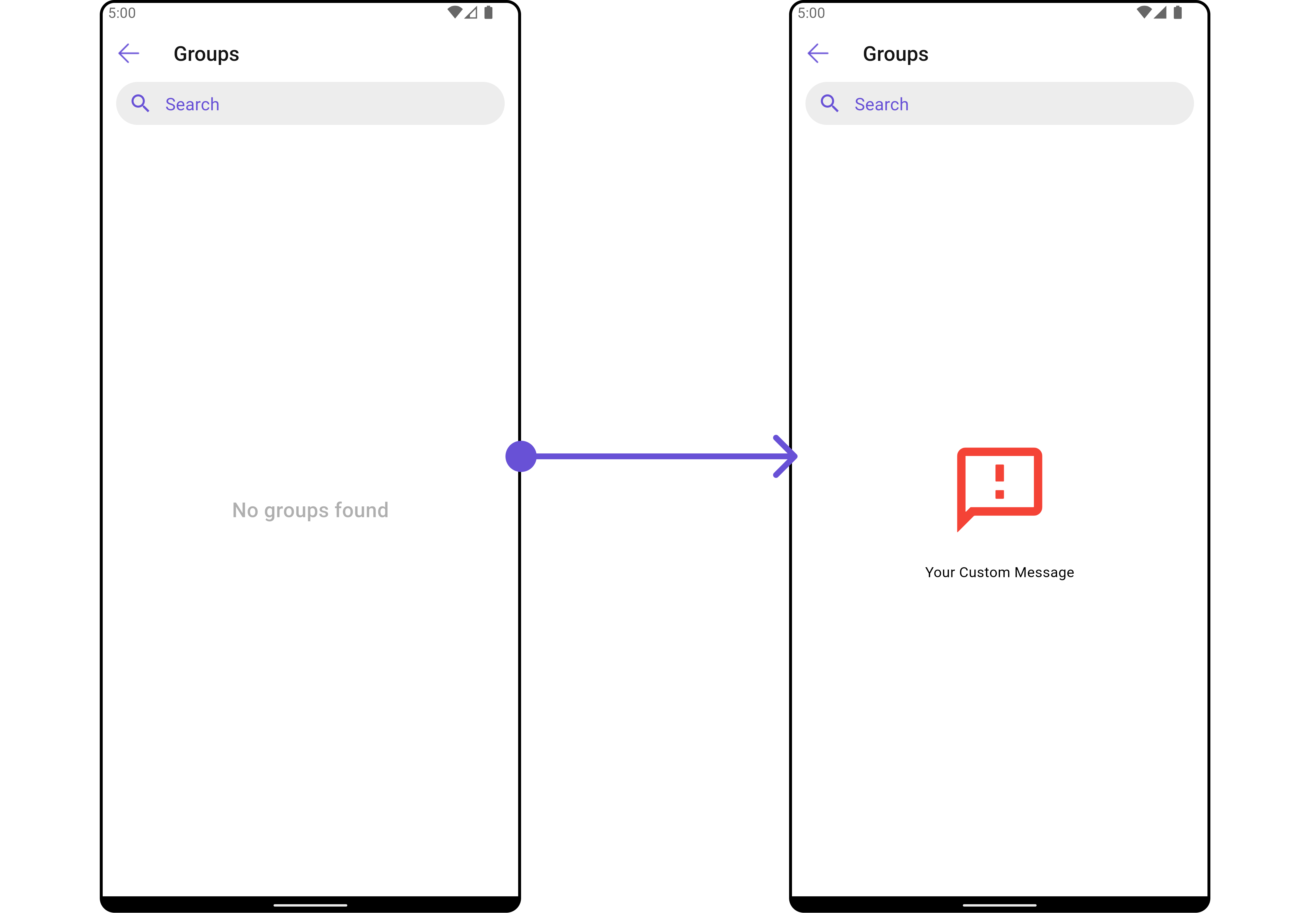
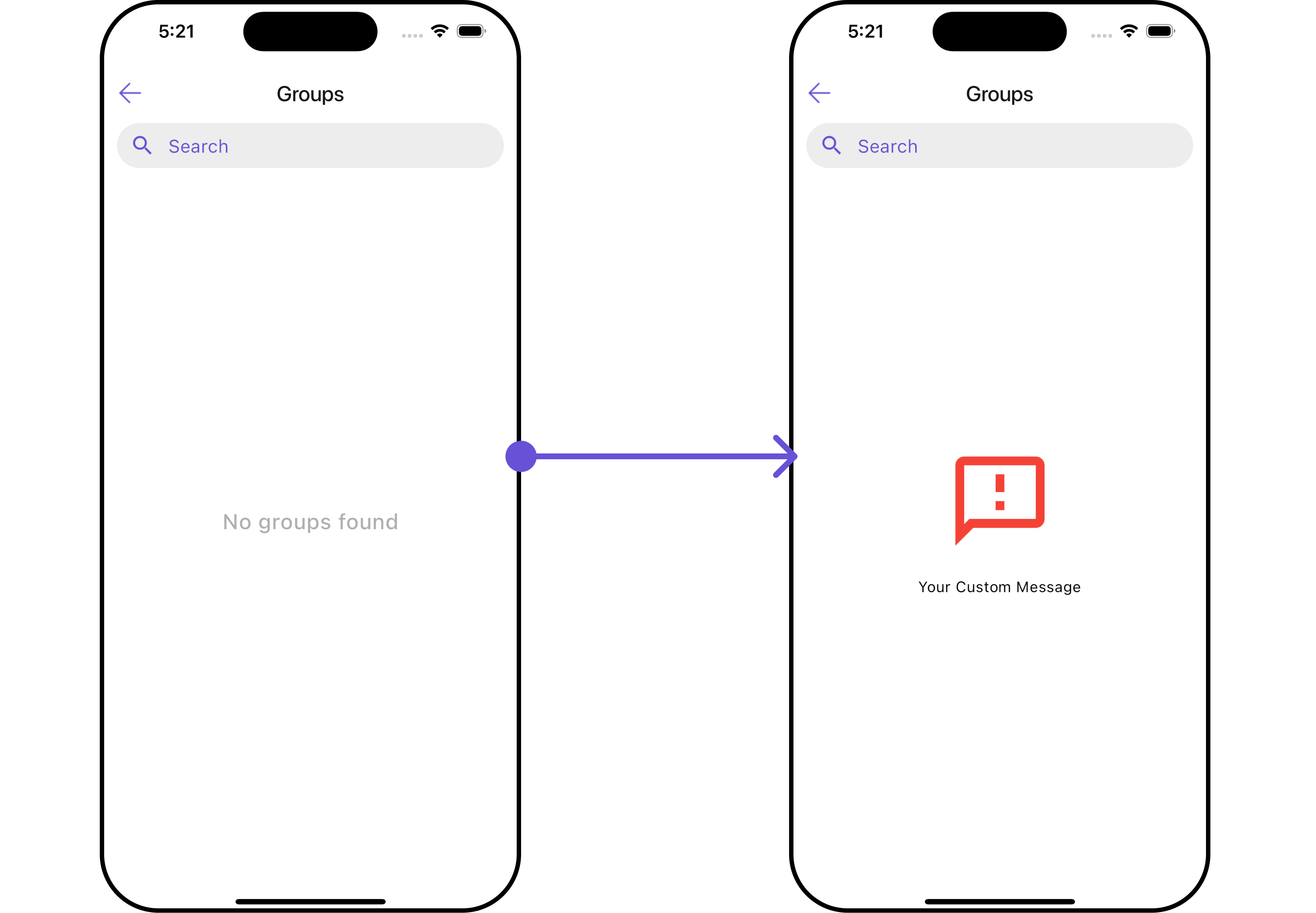
EmptyStateView
You can set a customEmptyStateView using emptyStateView to match the empty UI of your app.
- Dart
- Android
- iOS
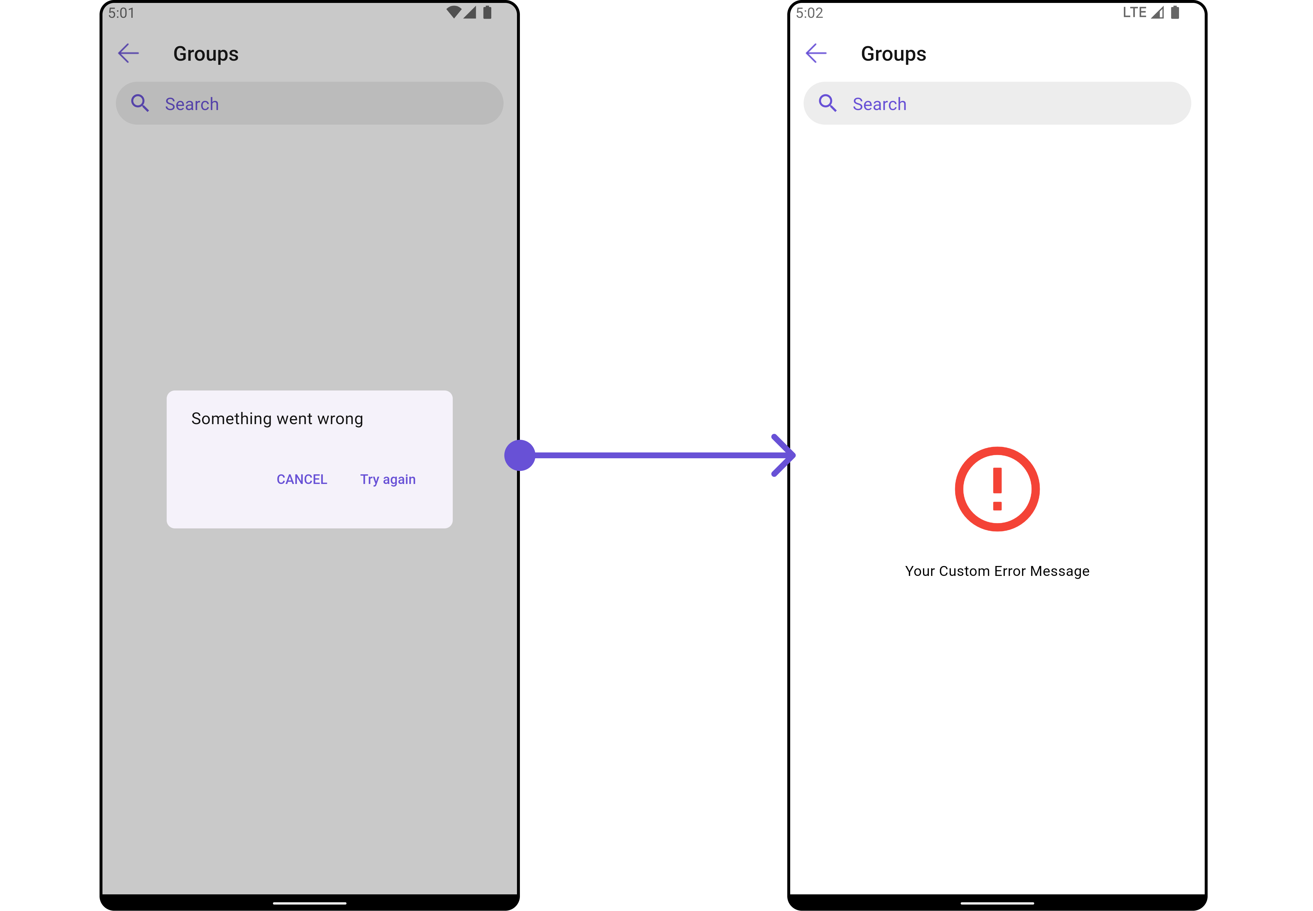
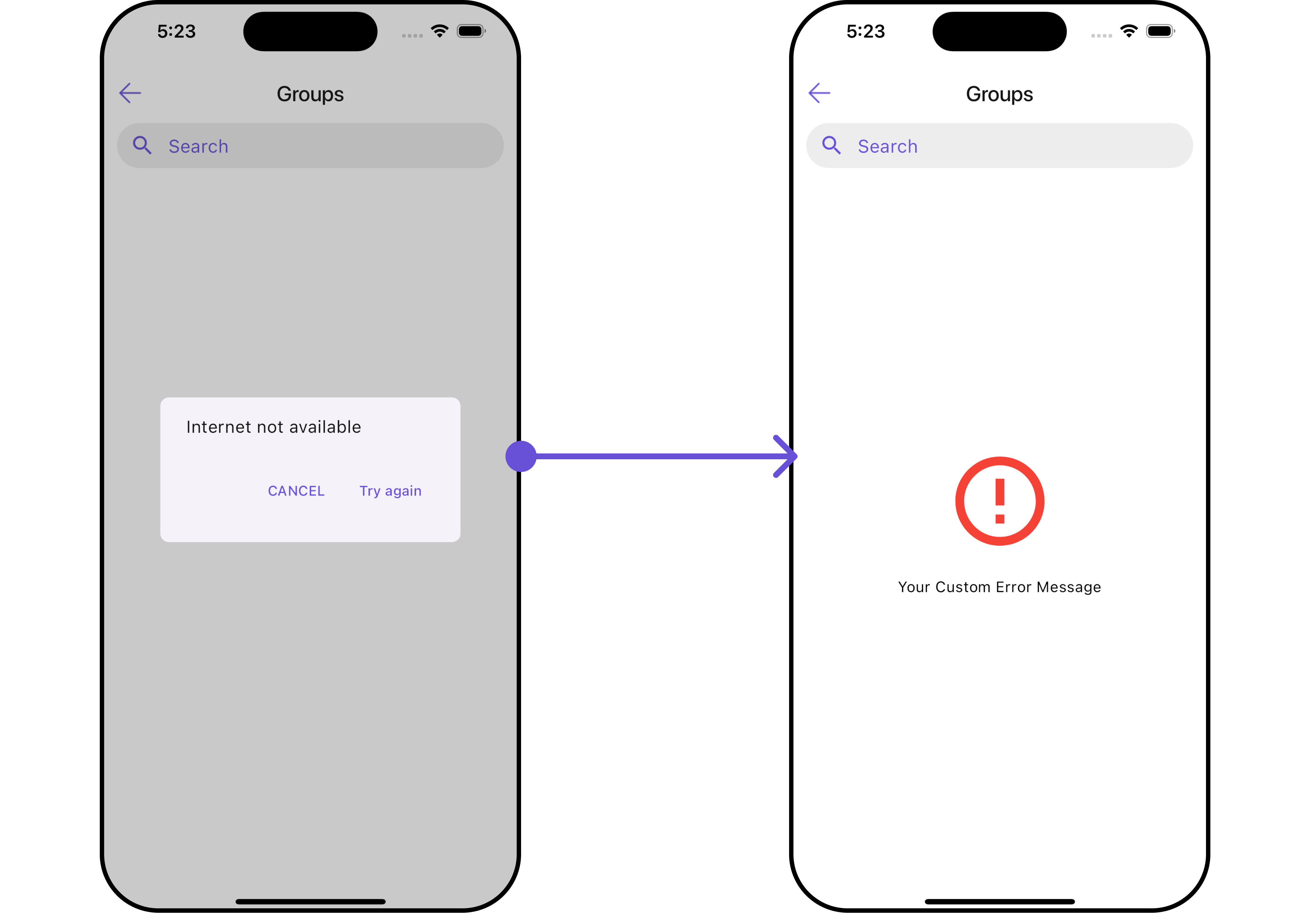
ErrorStateView
You can set a customErrorStateView using errorStateView to match the error UI of your app.
- Dart
- Android
- iOS
LoadingStateView
You can set a customLoadingStateView using loadingStateView to match the loading UI of your app.
- Dart
- Android
- iOS