Overview
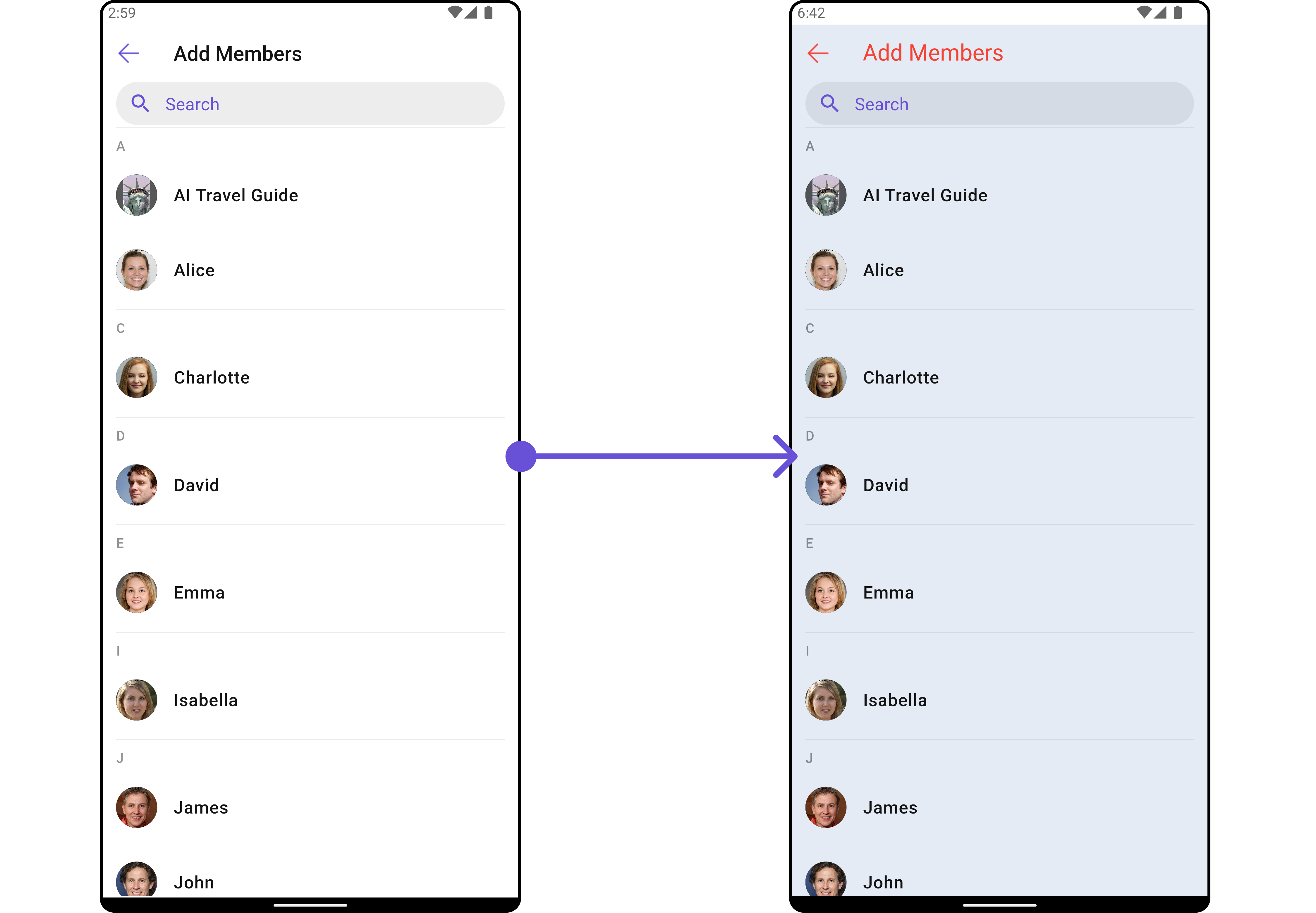
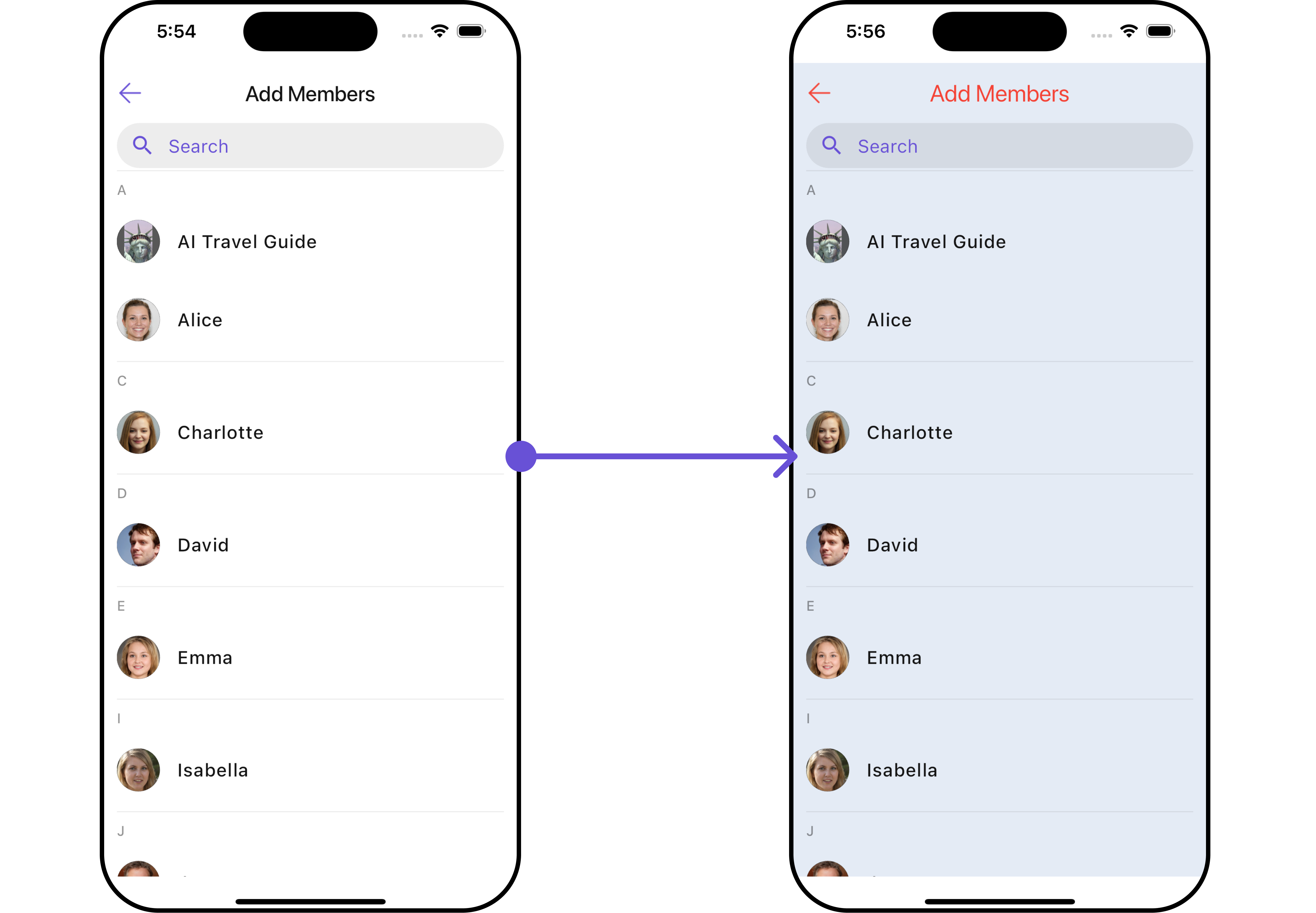
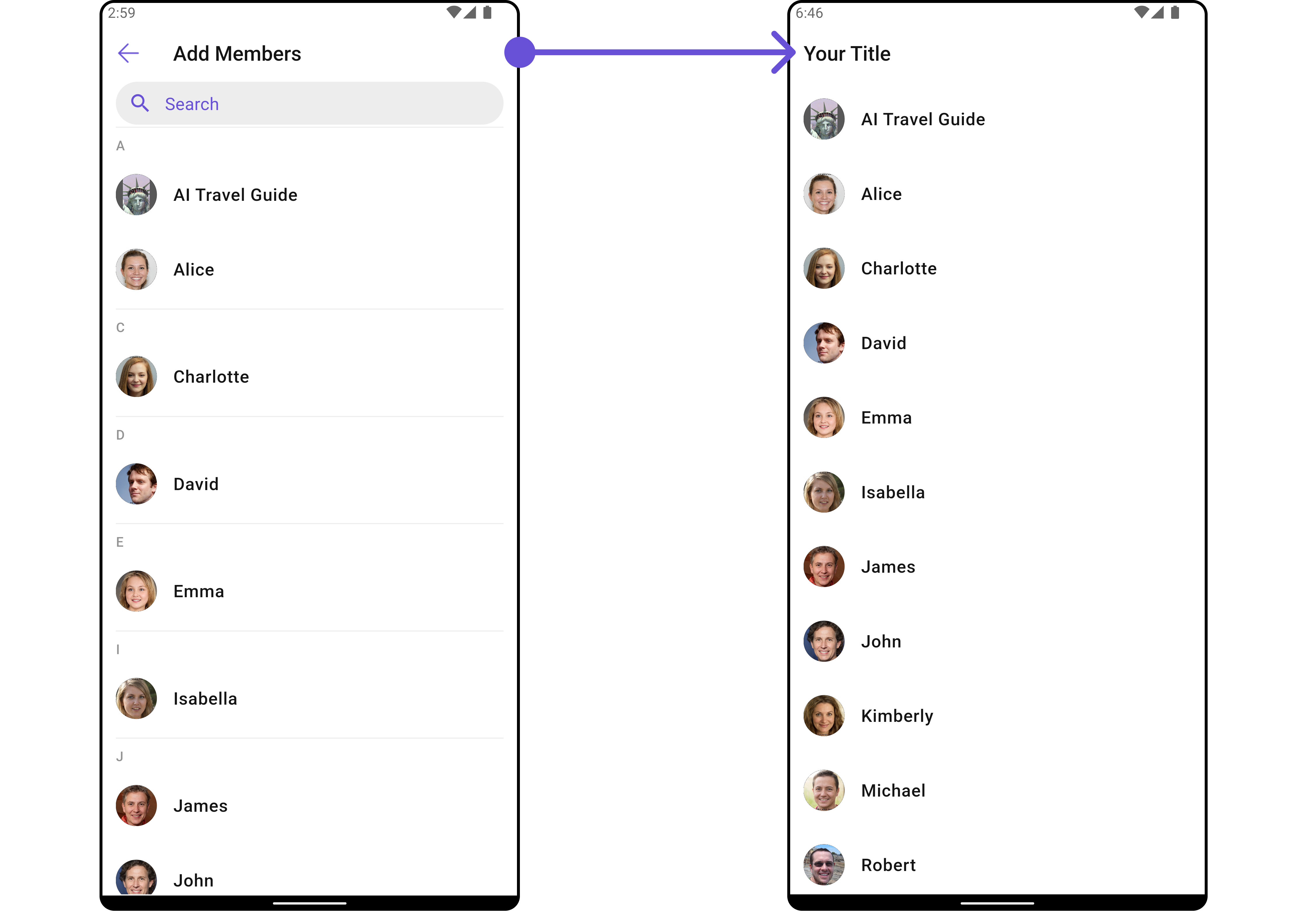
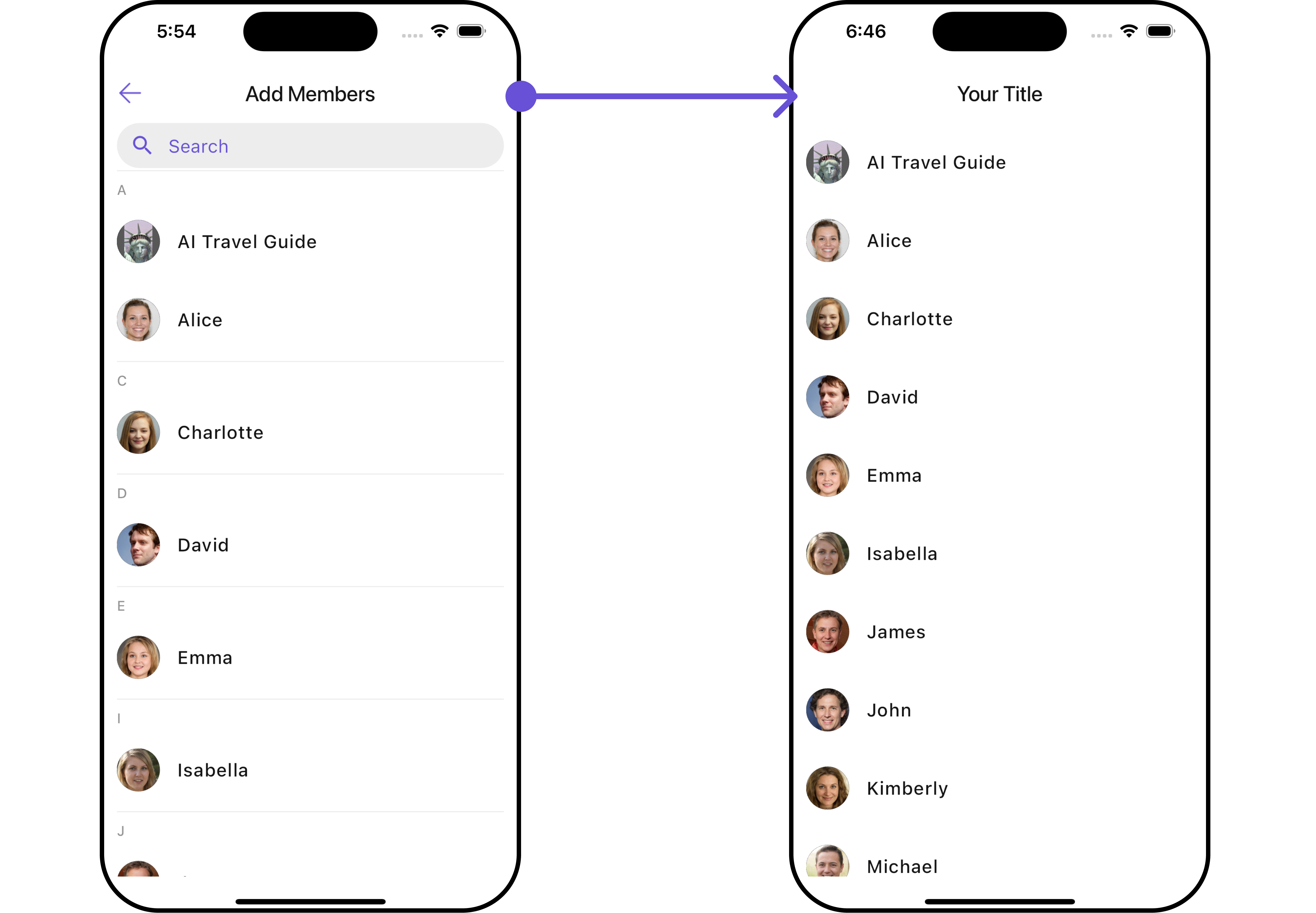
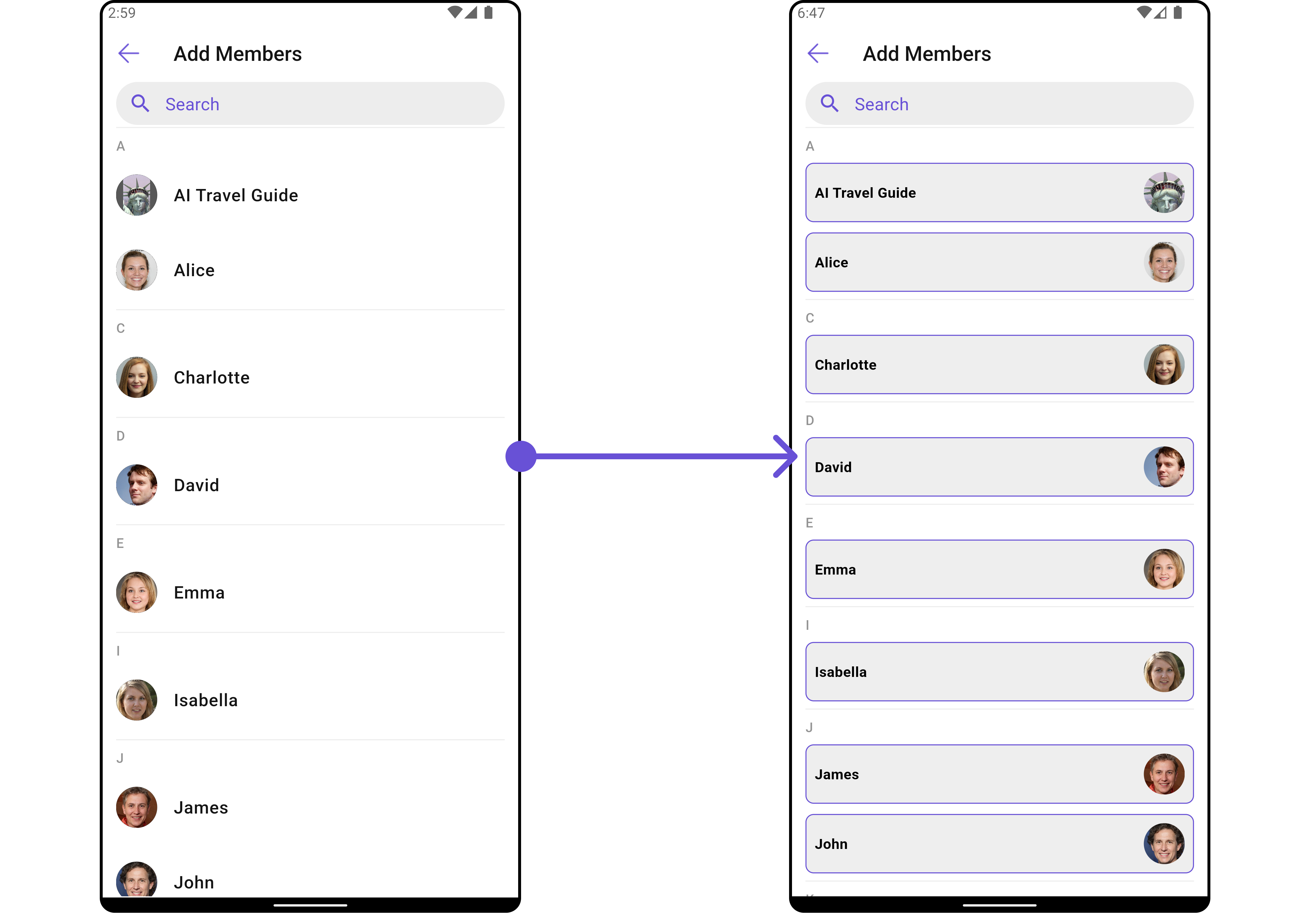
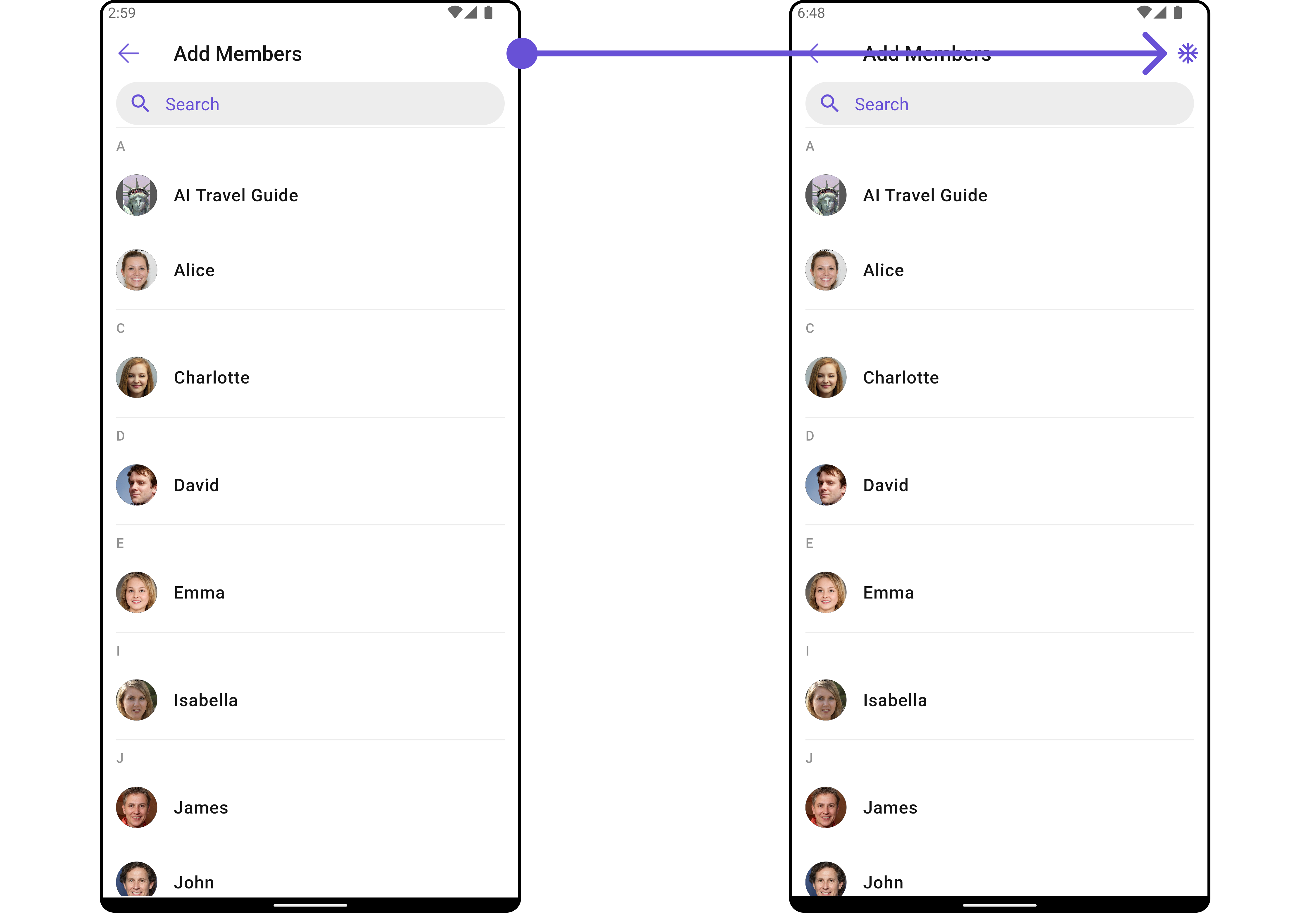
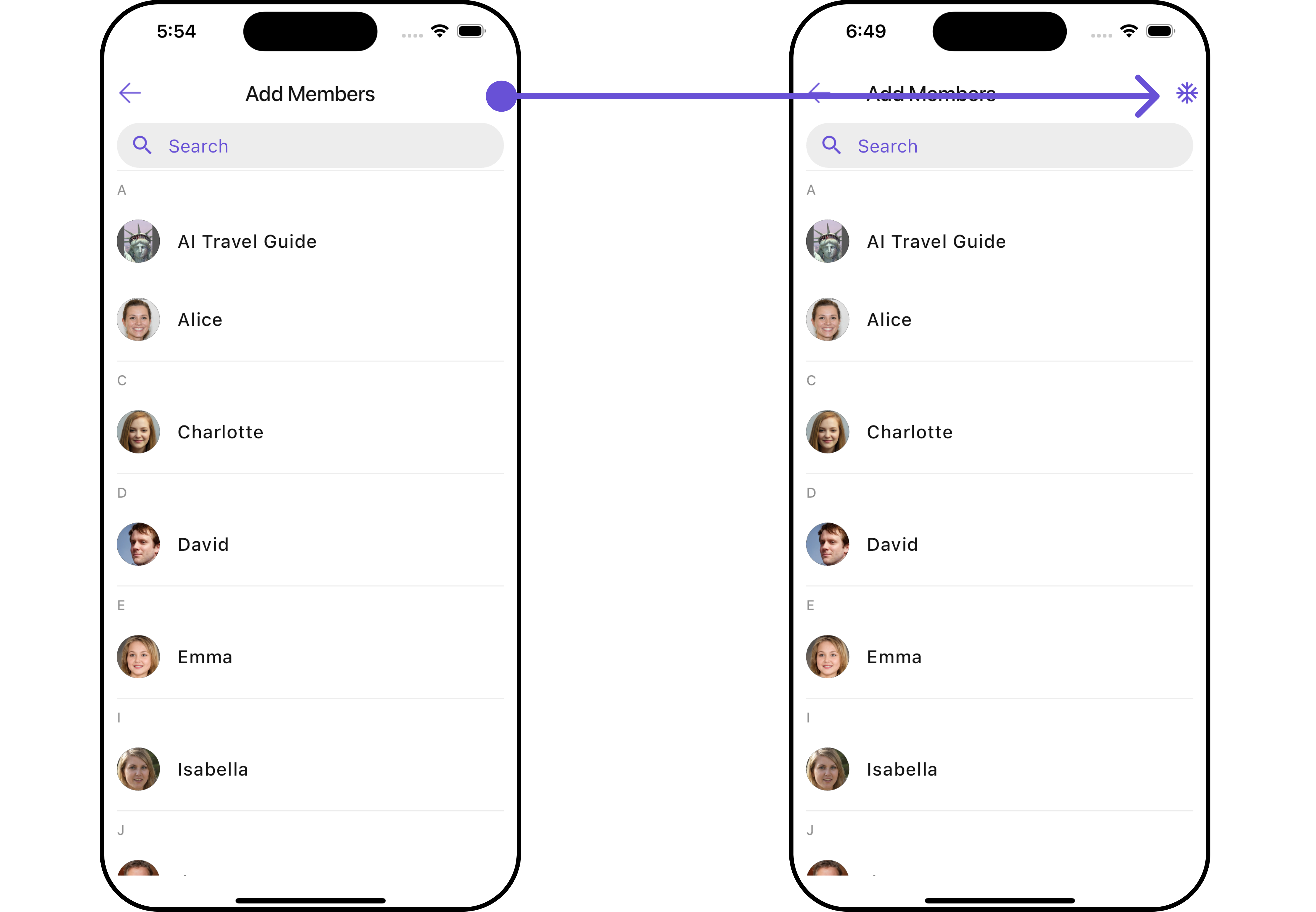
CometChatAddMembers is a Widget that empowers administrators or group owners with the ability to expand group membership by seamlessly adding new participants. This widget facilitates effortless management of group membership and enhances collaboration within the group’s discussions and activities. Administrators can meticulously select desired users to join the group, whether by targeted search or from a list of available users. Selected users receive notifications, streamlining the process of joining the group and ensuring smooth integration into the community.
- Android
- iOS
CometChatAddMembers widget is composed of the following BaseWidgets:
| Widgets | Description |
|---|---|
| CometChatUsers | CometChatUsers is a standalone widget that presents a user list and enables targeted user searches. As a container inheriting from CometChatListBase , it seamlessly incorporates the CometChatUserList widget. This setup streamlines user browsing and search capabilities, enhancing overall usability and facilitating efficient interactions. |
| CometChatListItem | This widget renders information extracted from a User object onto a tile, featuring a title, subtitle, leading view, and trailing view. experience, facilitating seamless navigation and interaction within the widget. |
Usage
Integration
CometChatAddMembers , as a Composite Widget, offers flexible integration options, allowing it to be launched directly via button clicks or any user-triggered action. Additionally, it seamlessly integrates into tab view controllers. With add members, users gain access to a wide range of parameters and methods for effortless customization of its user interface.
You can launch CometChatAddMembers directly using Navigator.push , or you can define it as a widget within the build method of your State class.
1. Using Navigator to Launch CometChatAddMembers
- Dart
2. Embedding CometChatAddMembers as a Widget in the build Method
- Dart
Actions
Actions dictate how a widget functions. They are divided into two types: Predefined and User-defined. You can override either type, allowing you to tailor the behavior of the widget to fit your specific needs.1. onBack
Enhance your application’s functionality by leveraging theonBack feature. This capability allows you to customize the behavior associated with navigating back within your app. Utilize the provided code snippet to override default behaviors and tailor the user experience according to your specific requirements.
- Dart
2. onError
You can customize this behavior by using the provided code snippet to override theonError and improve error handling.
- Dart
3. onSelection
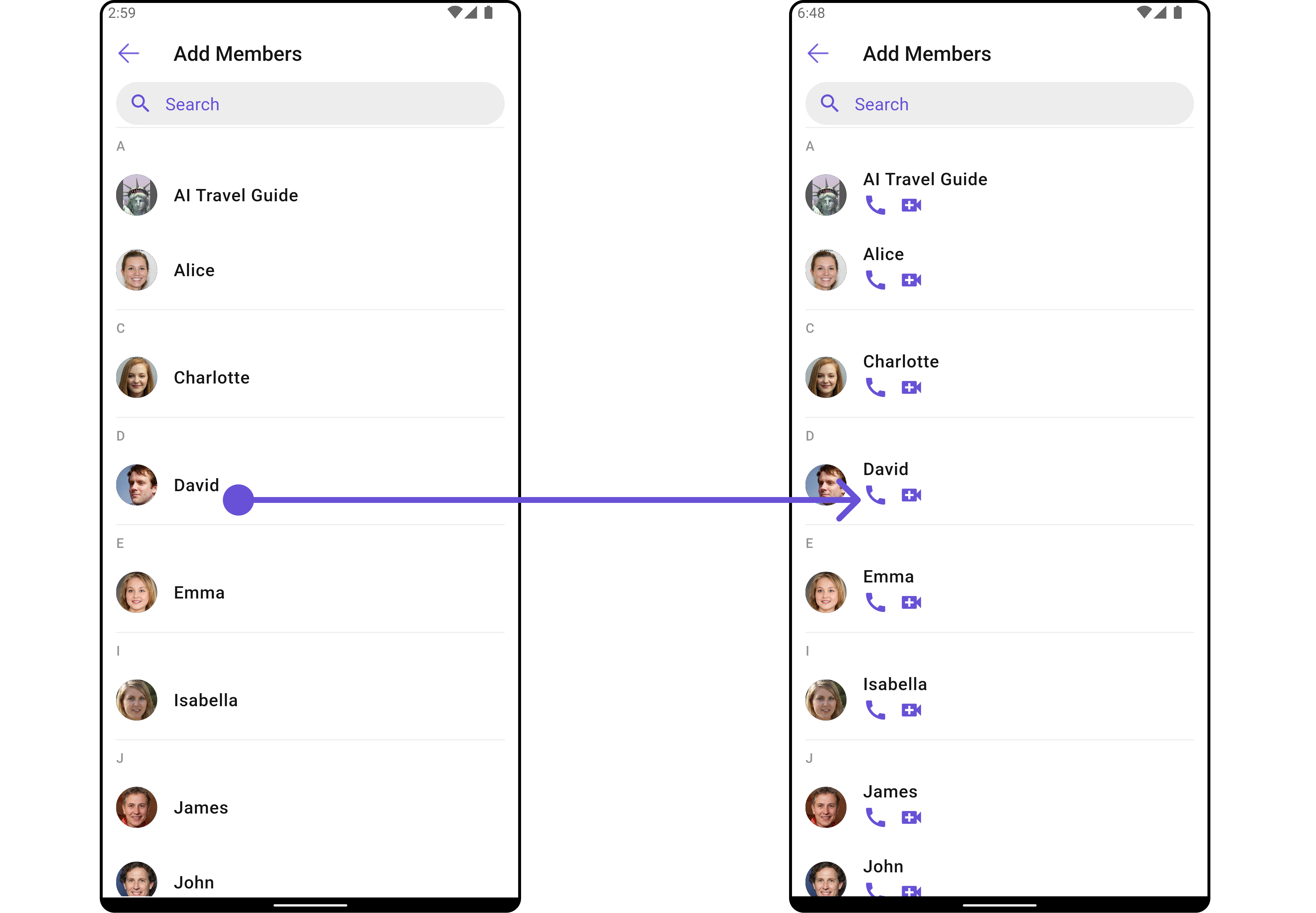
When theonSelection event is triggered, it furnishes the list of selected users. This event can be invoked by any button or action within the interface. You have the flexibility to implement custom actions or behaviors based on the selected users.
This action does not come with any predefined behavior. However, you have the flexibility to override this event and tailor it to suit your needs using the following code snippet.
- Dart
Filters
Filters allow you to customize the data displayed in a list within aWidget . You can filter the list based on your specific criteria, allowing for a more customized. Filters can be applied using RequestBuilders of Chat SDK.
1. UsersRequestBuilder
The UsersRequestBuilder enables you to filter and customize the group list based on available parameters in UsersRequestBuilder. This feature allows you to create more specific and targeted queries when fetching users. The following are the parameters available in UsersRequestBuilder| Property | Description | Code |
|---|---|---|
| Friends Only | Indicates if the request is limited to friends. | friendsOnly: bool? |
| Hide Blocked Users | Whether to hide blocked users in the request. | hideBlockedUsers: bool? |
| Limit | Maximum number of users to fetch. | limit: int? |
| Role | Specific role of the users to fetch. | role: String? |
| Roles | List of roles for the users. | roles: List<String>? |
| Search Keyword | Keyword for searching users. | searchKeyword: String? |
| Tags | List of tags associated with the users. | tags: List<String>? |
| Uids | List of user IDs. | uids: List<String>? |
| User Status | Status of the user. | userStatus: String? |
| With Tags | Whether to include users with specific tags. | withTags: bool? |
- Dart
2. UsersProtocol
TheUsersProtocol uses UsersRequestBuilder enables you to filter and customize the search list based on available parameters in UsersRequestBuilder. This feature allows you to keep uniformity between the displayed User List and searched User List.
Example
- Dart
custom_protocol.dart
- Dart
main.dart
Events
Events are emitted by aWidget . By using event you can extend existing functionality. Being global events, they can be applied in Multiple Locations and are capable of being Added or Removed.
Events emitted by the Join Group widget is as follows.
| Event | Description |
|---|---|
| ccGroupMemberAdded | Triggers when a user added to a group successfully |
- Dart
your_screen.dart
Customization
To fit your app’s design requirements, you can customize the appearance of the Groups widget. We provide exposed methods that allow you to modify the experience and behavior according to your specific needs.Style
Using Style you can customize the look and feel of the widget in your app, These parameters typically control elements such as the color, size, shape, and fonts used within the widget.1. AddMembers Style
To apply customized styles to theCometChatAddMembers widget in the Group Member Widget, you can use the following code snippet.
- Dart
- Android
- iOS
AddMembersStyle
| Property | Description | Code |
|---|---|---|
| Back Icon Tint | Tint color for the back icon. | backIconTint: Color? |
| Background | Background color or decoration. | background: Decoration? |
| Border | Border of the widget. | border: Border? |
| Border Radius | Radius of the widget’s border. | borderRadius: BorderRadius? |
| Close Icon Tint | Tint color for the close icon. | closeIconTint: Color? |
| Empty State Text Style | Style for the empty state text. | emptyStateTextStyle: TextStyle? |
| Error State Text Style | Style for the error state text. | errorStateTextStyle: TextStyle? |
| Gradient | Gradient used for the widget’s background. | gradient: Gradient? |
| Height | Height of the widget. | height: double? |
| Placeholder Style | Style for the placeholder text. | placeholderStyle: TextStyle? |
| Search Background | Background color or decoration for the search. | searchBackground: Decoration? |
| Search Border Color | Color of the search field’s border. | searchBorderColor: Color? |
| Search Border Radius | Radius of the search field’s border. | searchBorderRadius: BorderRadius? |
| Search Border Width | Width of the search field’s border. | searchBorderWidth: double? |
| Search Icon Tint | Tint color for the search icon. | searchIconTint: Color? |
| Search Style | Style for the search text. | searchStyle: TextStyle? |
| Selection Icon Tint | Tint color for the selection icon. | selectionIconTint: Color? |
| Submit Icon Tint | Tint color for the submit icon. | submitIconTint: Color? |
| Title Style | Style for the title text. | titleStyle: TextStyle? |
| Width | Width of the widget. | width: double? |
2. Avatar Style
To apply customized styles to theAvatar widget in the CometChatAddMembers Widget, you can use the following code snippet. For further insights on Avatar Styles refer
- Dart
3. StatusIndicator Style
To apply customized styles to the Status Indicator widget in theCometChatAddMembers Widget, You can use the following code snippet. For further insights on Status Indicator Styles refer
- Dart
4. ListItem Style
To apply customized styles to theListItemStyle in the CometChatAddMembers Widget, you can use the following code snippet. For further insights on List Item Styles refer
- Dart
Functionality
These are a set of small functional customizations that allow you to fine-tune the overall experience of the widget. With these, you can change text, set custom icons, and toggle the visibility of UI elements.- Dart
- Android
- iOS
CometChatAddMembers
| Property | Description | Code |
|---|---|---|
| Back Button | Custom widget for the back button. | backButton: Widget? |
| Disable Users Presence | Option to disable displaying users’ presence. | disableUsersPresence: bool? |
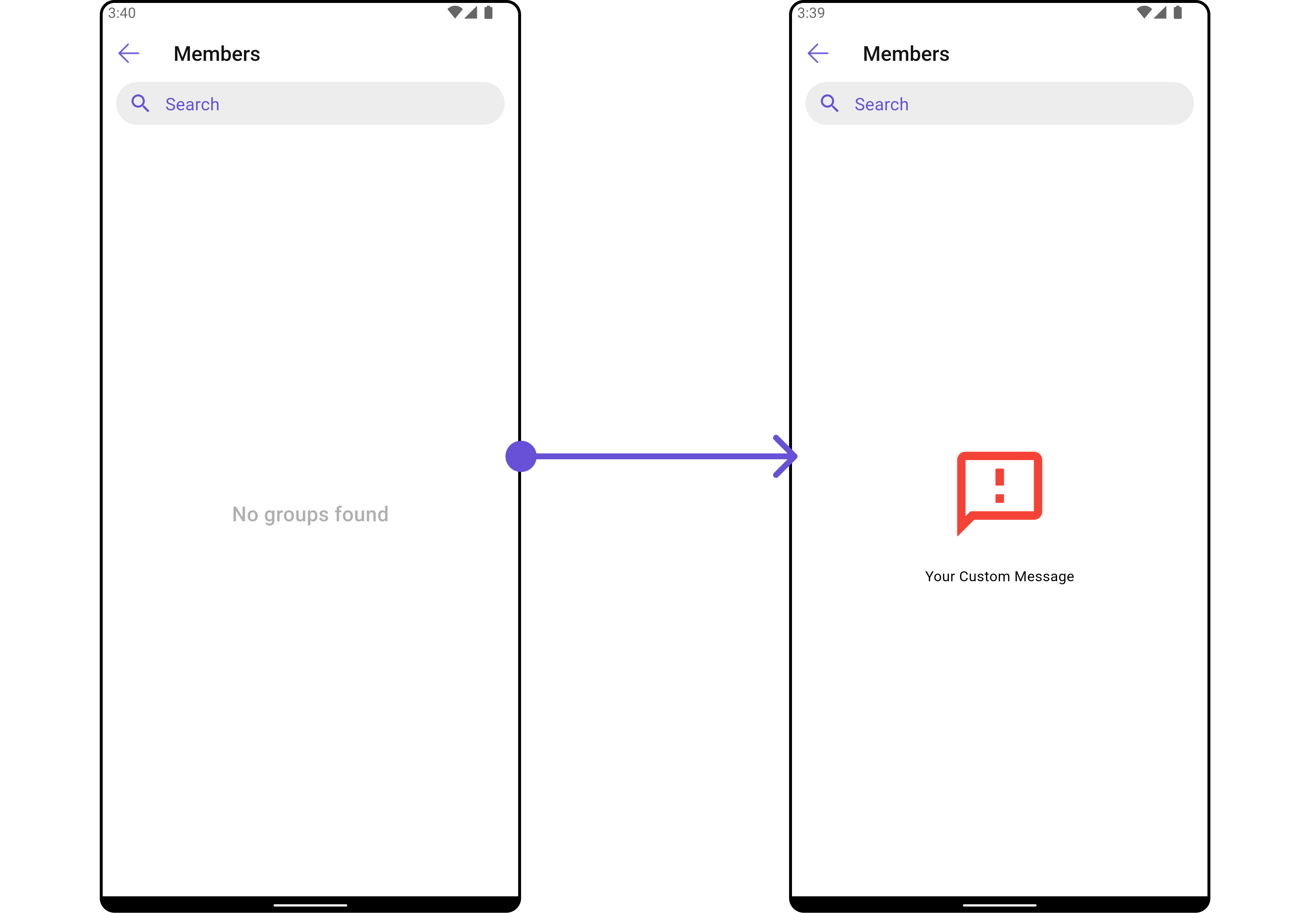
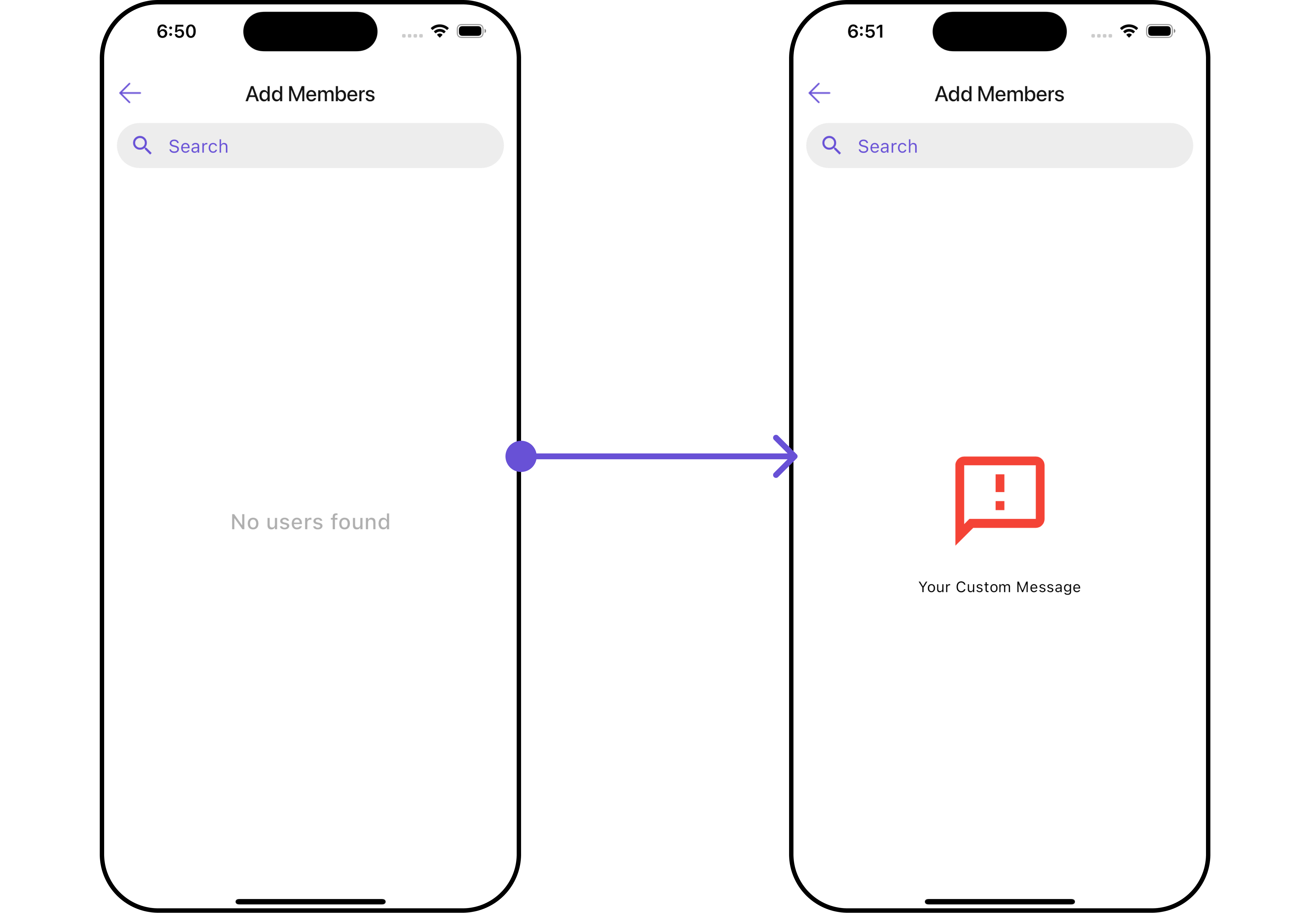
| Empty State Text | Text to display when there are no members. | emptyStateText: String? |
| Error State Text | Text to display when there is an error. | errorStateText: String? |
| Hide Error | Option to hide error messages. | hideError: bool? |
| Hide Search | Option to hide the search bar. | hideSearch: bool |
| Hide Separator | Option to hide item separators in the list. | hideSeparator: bool? |
| Search Icon | Custom widget for the search icon. | searchIcon: Widget? |
| Search Placeholder | Placeholder text for the search bar. | searchPlaceholder: String? |
| Selection Icon | Custom widget for the selection icon. | selectionIcon: Widget? |
| Show Back Button | Option to show or hide the back button. | showBackButton: bool |
| Submit Icon | Custom widget for the submit icon. | submitIcon: Widget? |
| Title | Title text for the widget. | title: String? |
Advanced
For advanced-level customization, you can set custom views to the widget. This lets you tailor each aspect of the widget to fit your exact needs and application aesthetics. You can create and define your own widget and then incorporate those into the widget. TheCometChatAddMembers widget does not provide additional functionalities beyond this level of customization.
ListItemView
With this function, you can assign a custom ListItem to theCometChatAddMembers Widget.
- Dart
widget
custom_list_item.dart for more complex or unique list items.
- Dart
custom_list_item.dart
- Dart
main.dart
- Android
- iOS
SubtitleView
You can customize the subtitle view for each item to meet your specific preferences and needs.- Dart
widget
- Dart
main.dart
- Android
- iOS
AppBarOptions
You can set the CustomappBarOptions to the CometChatAddMembers widget.
- Dart
widget
- Dart
- Android
- iOS
EmptyStateView
You can set a customEmptyStateView using emptyStateView to match the error widget of your app.
- Dart
widget
- Dart
main.dart
- Android
- iOS
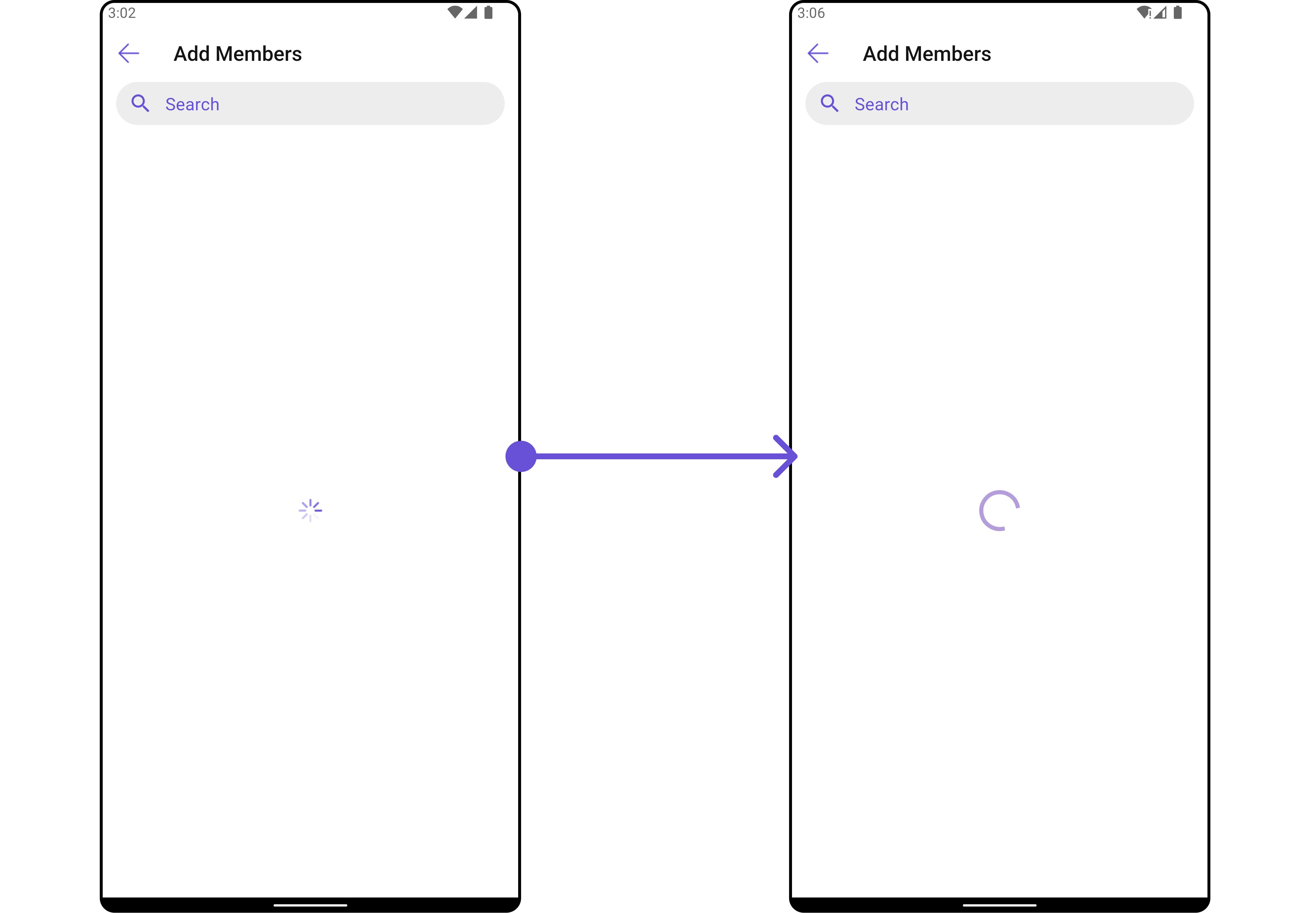
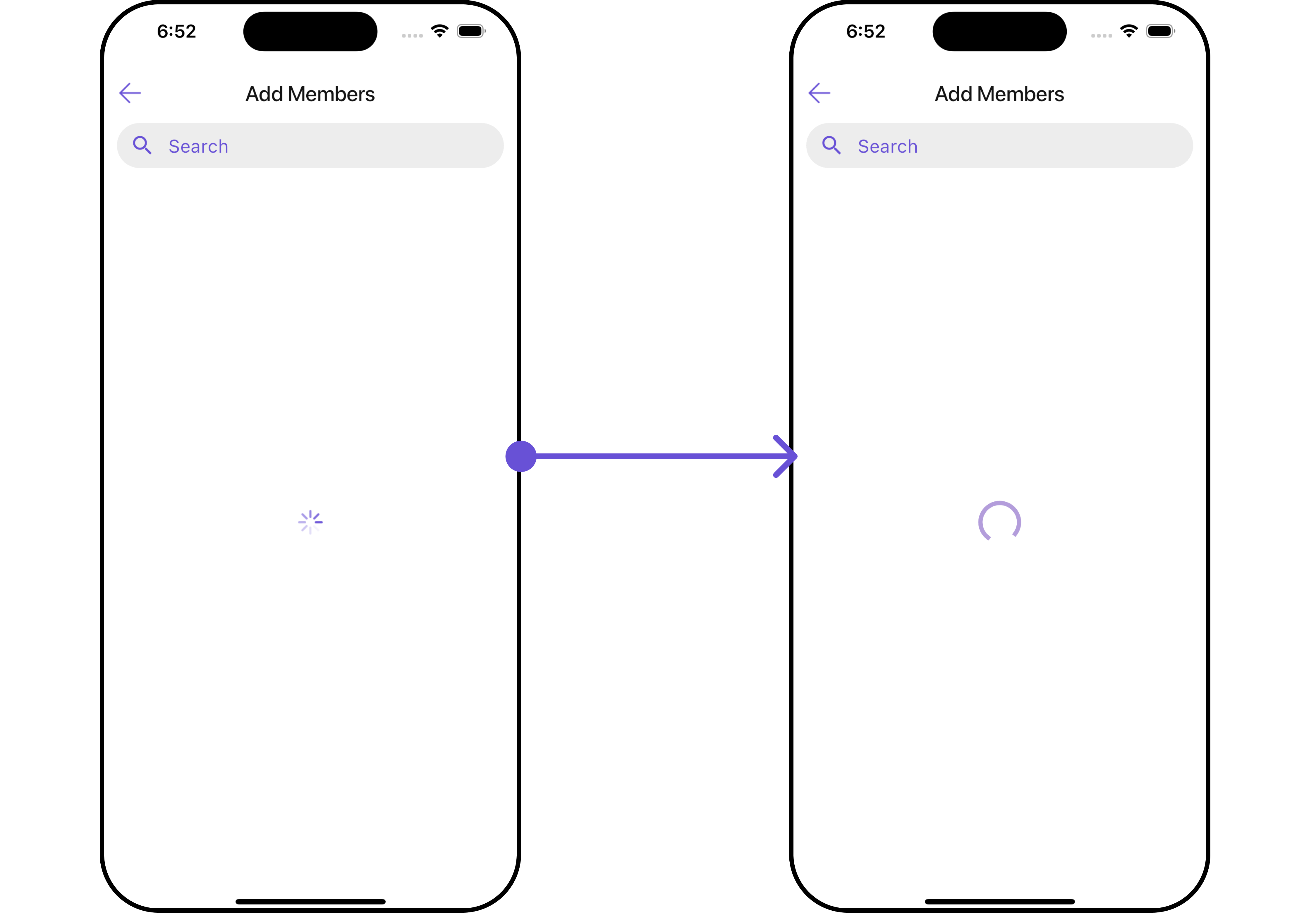
LoadingStateView
You can set a custom loader widget usingloadingStateView to match the loading UI of your app.
- Dart
widget
- Dart
main.dart
- Android
- iOS
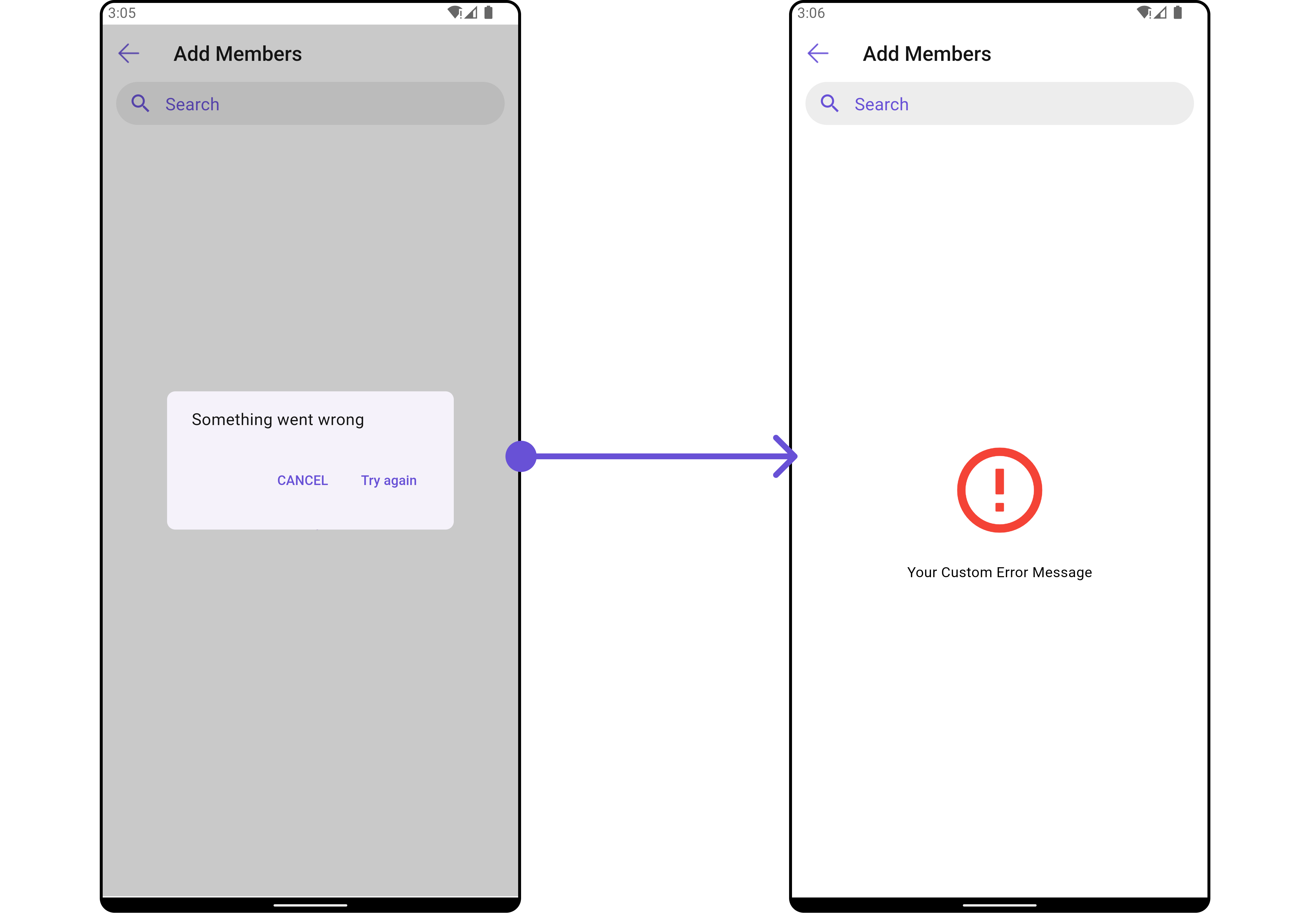
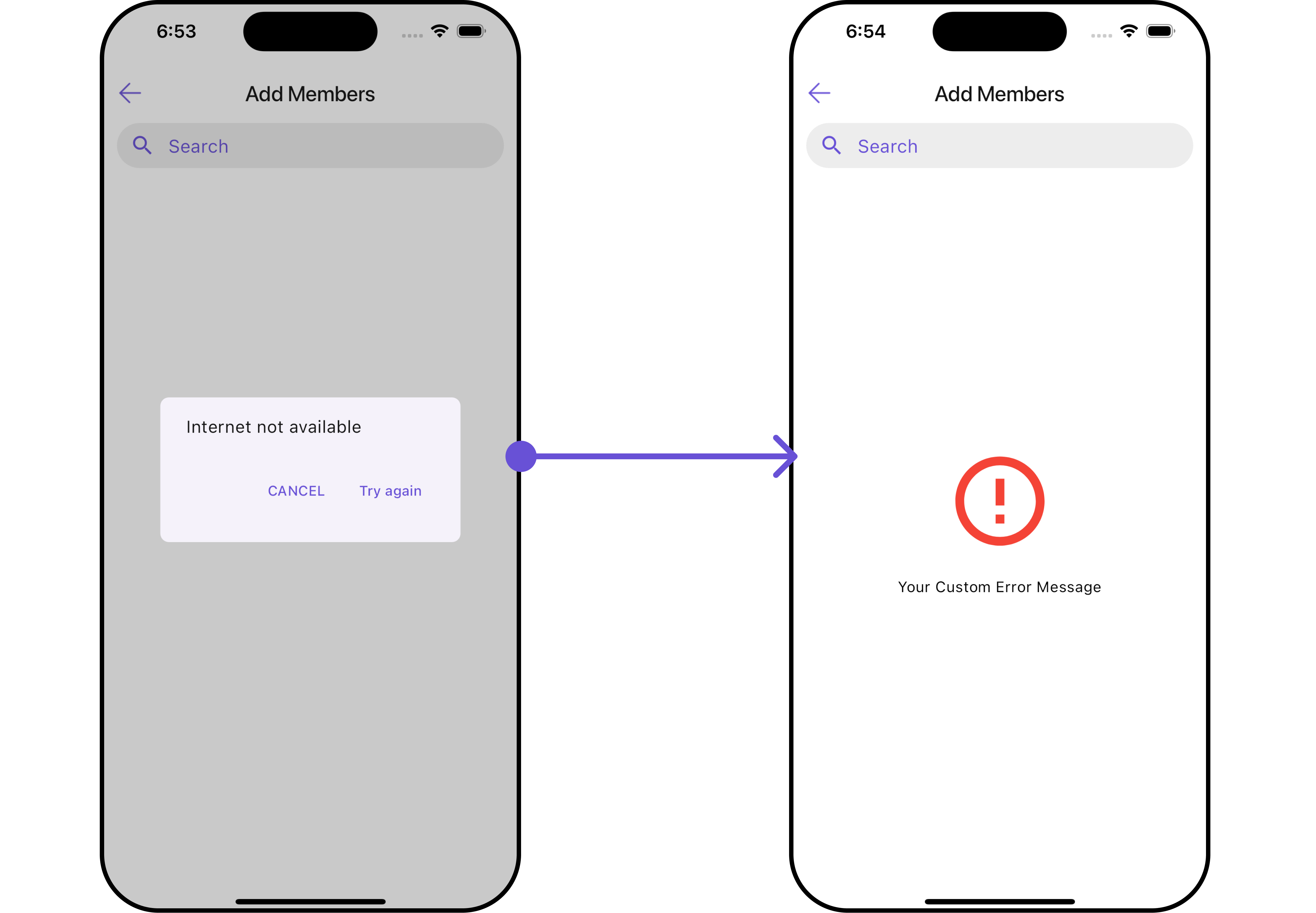
ErrorStateView
You can set a customErrorStateView using errorStateView to match the error UI of your app.
- Dart
widget
- Dart
main.dart
- Android
- iOS