Overview
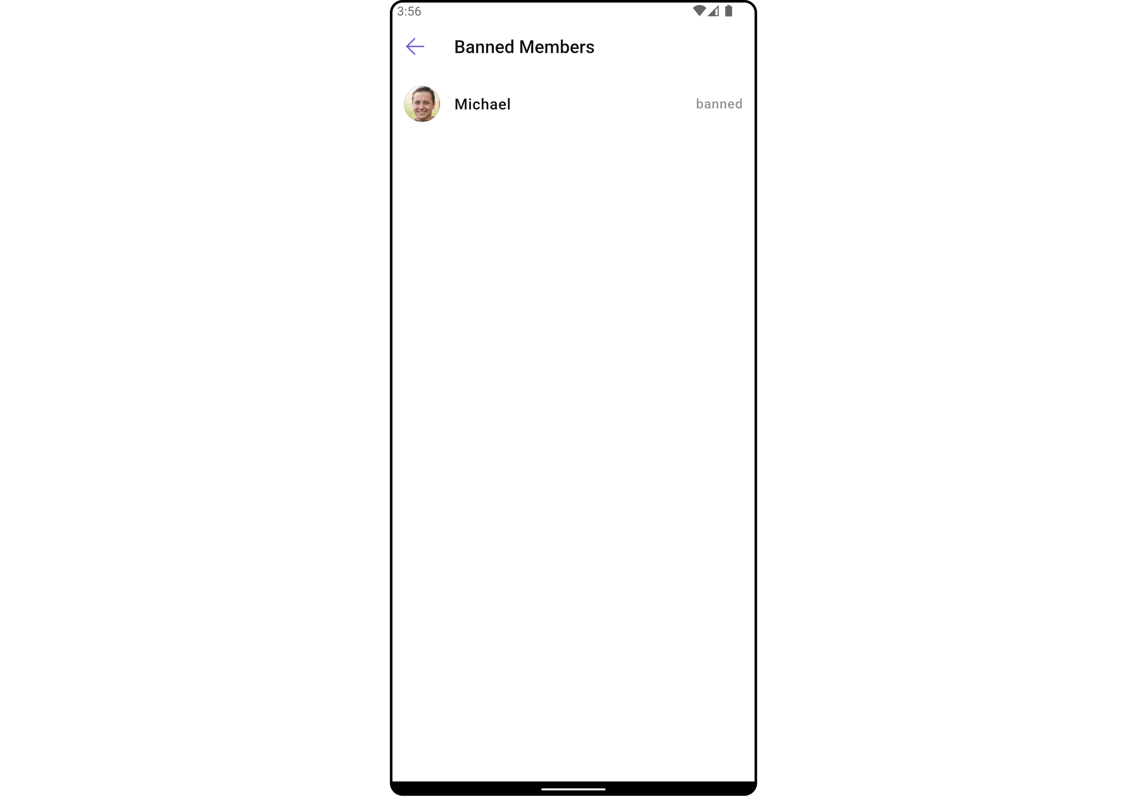
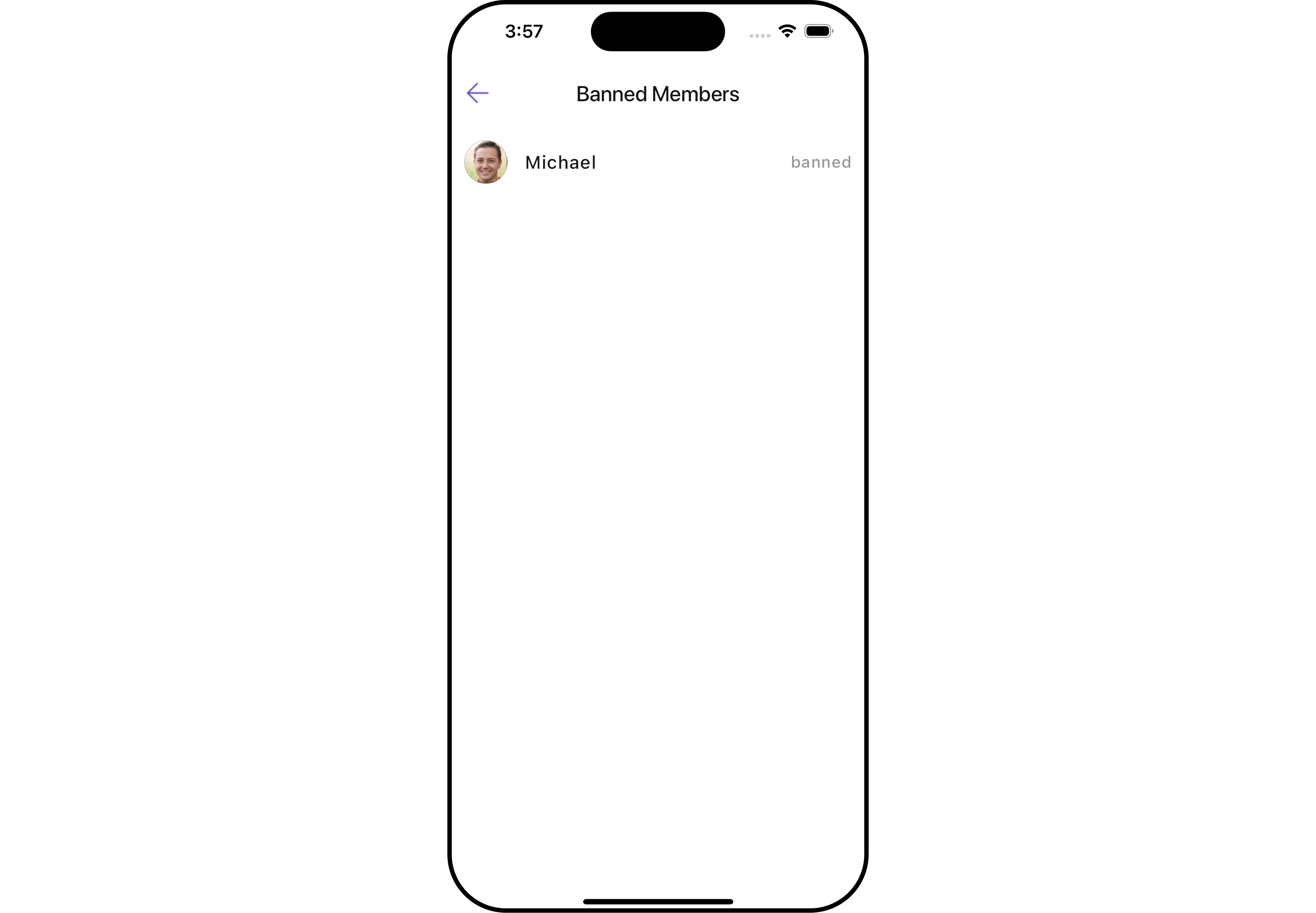
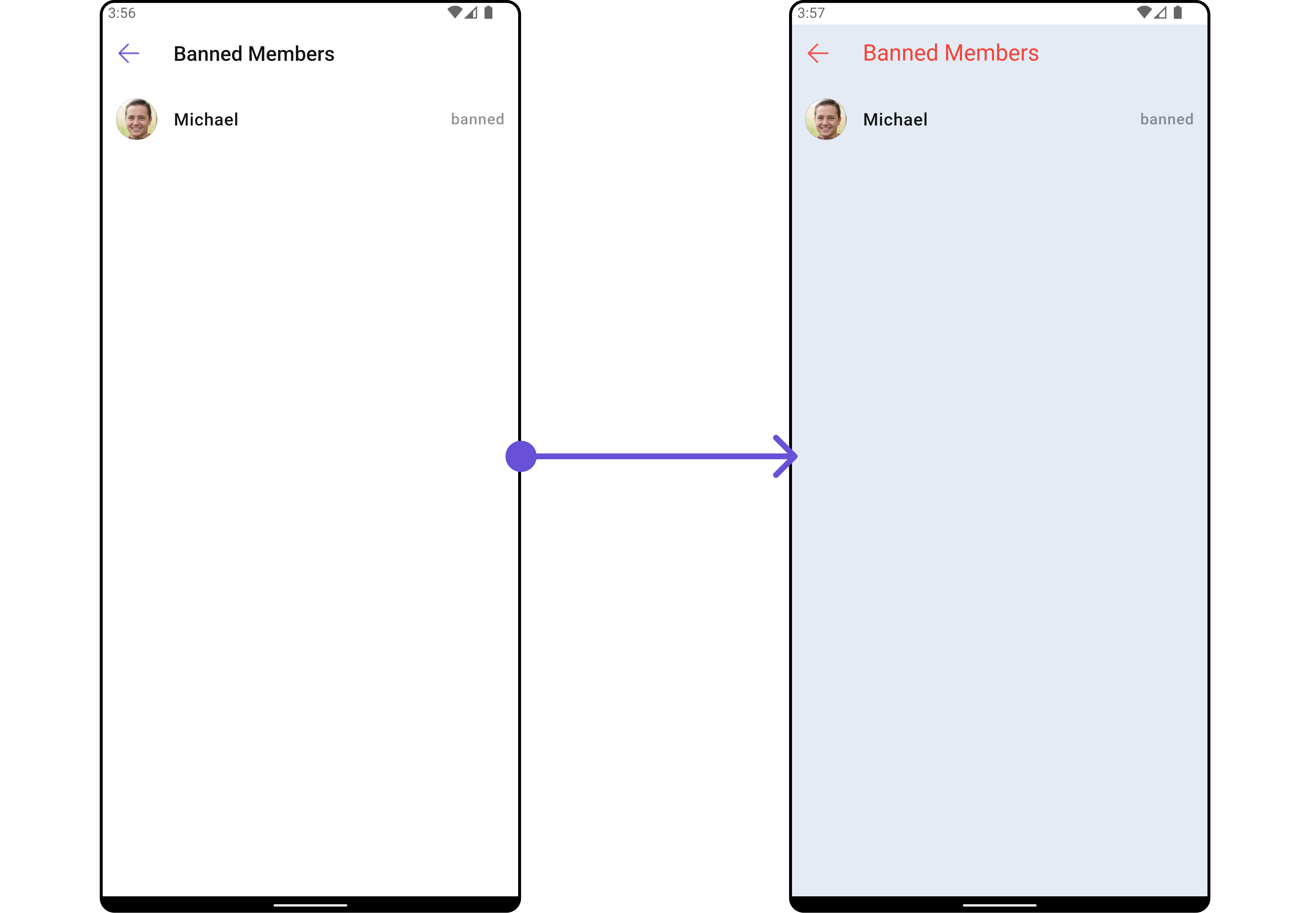
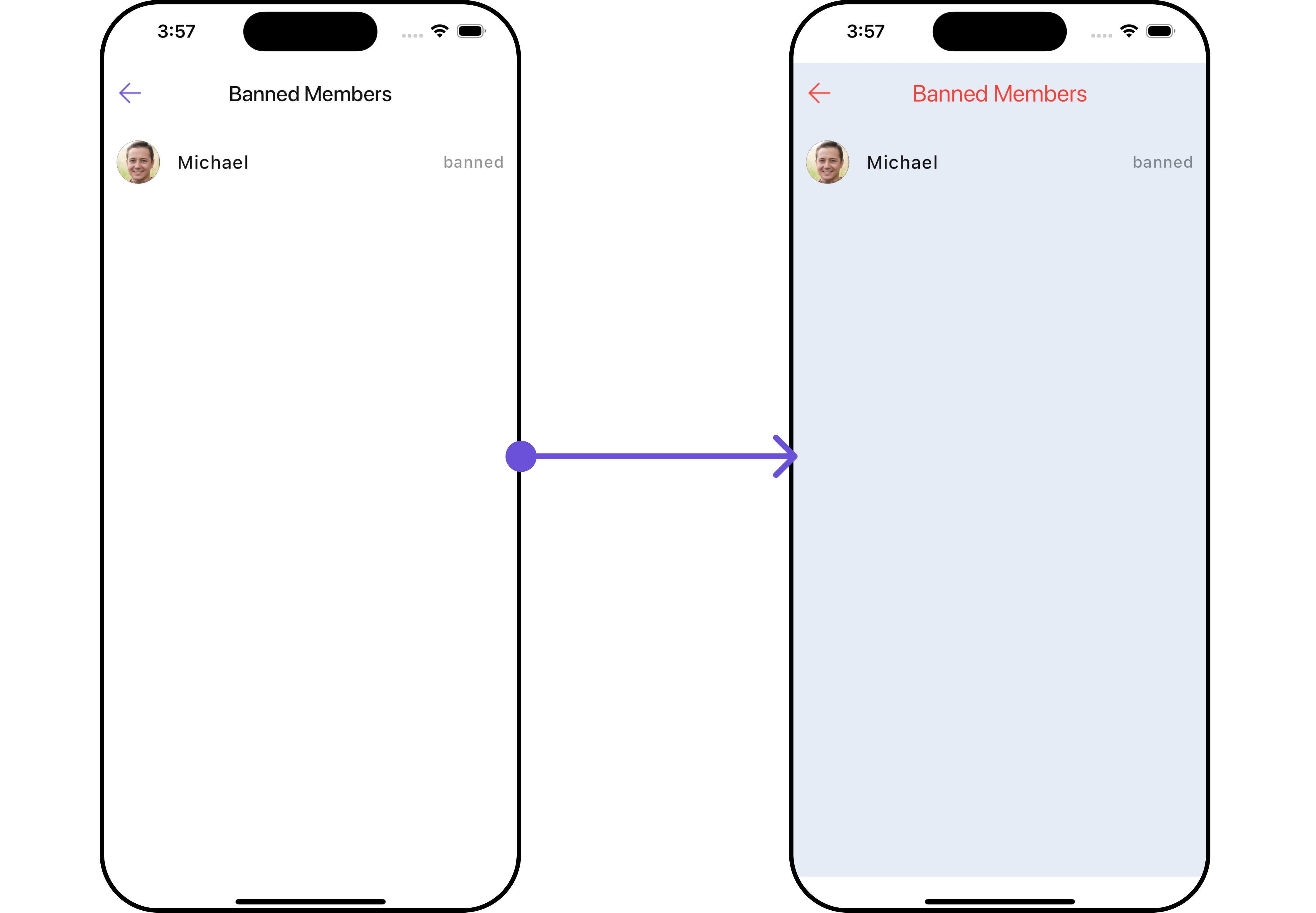
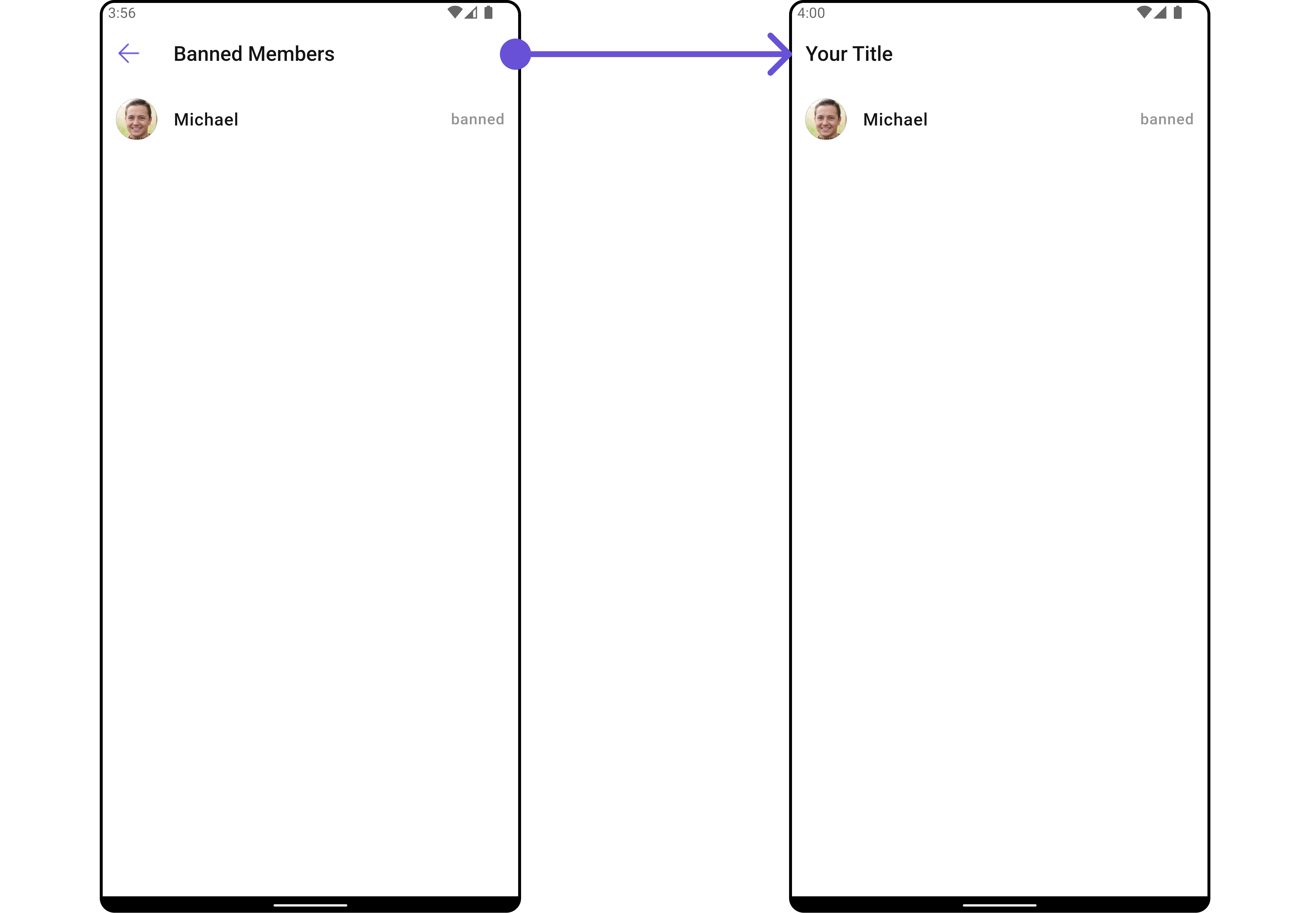
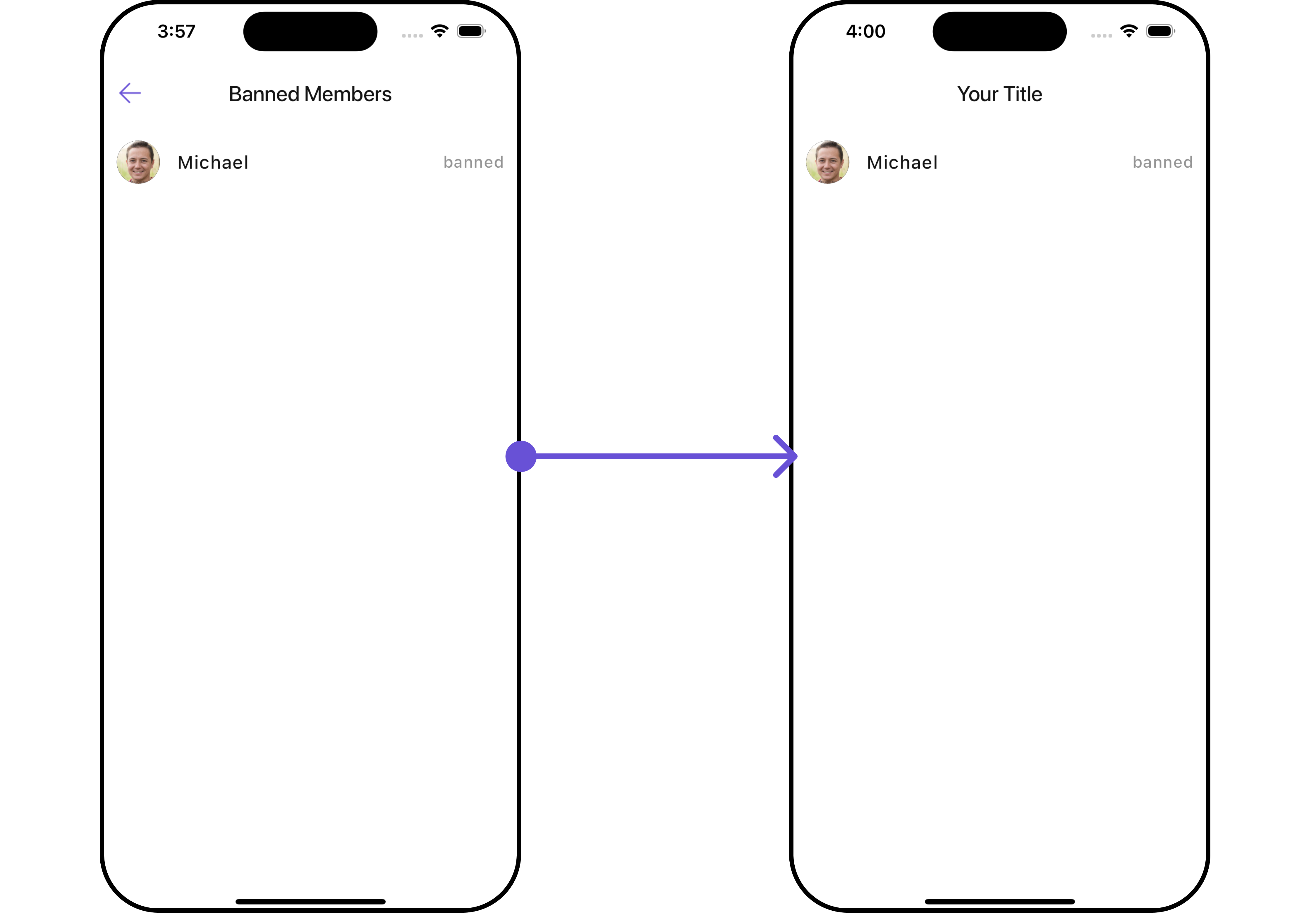
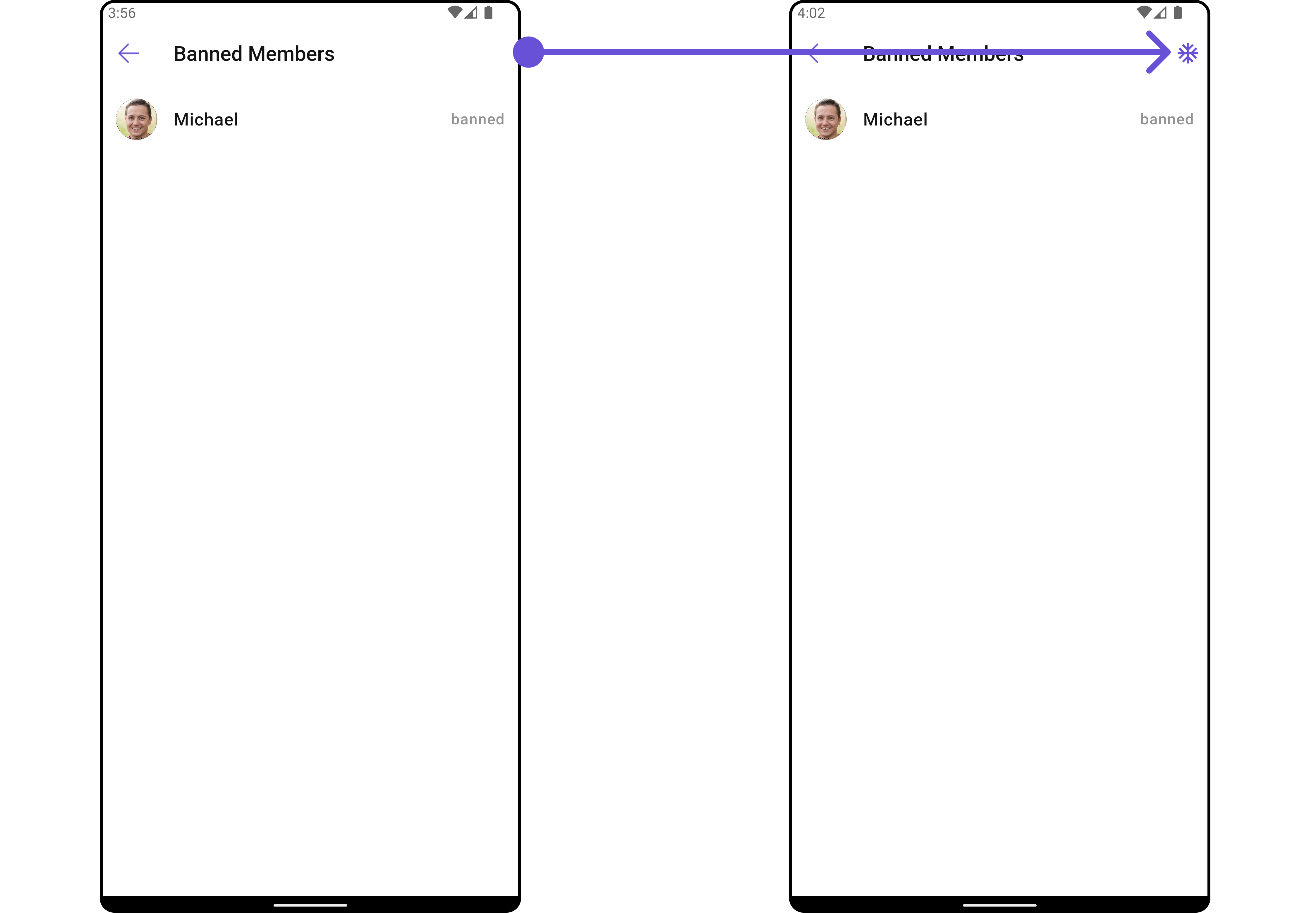
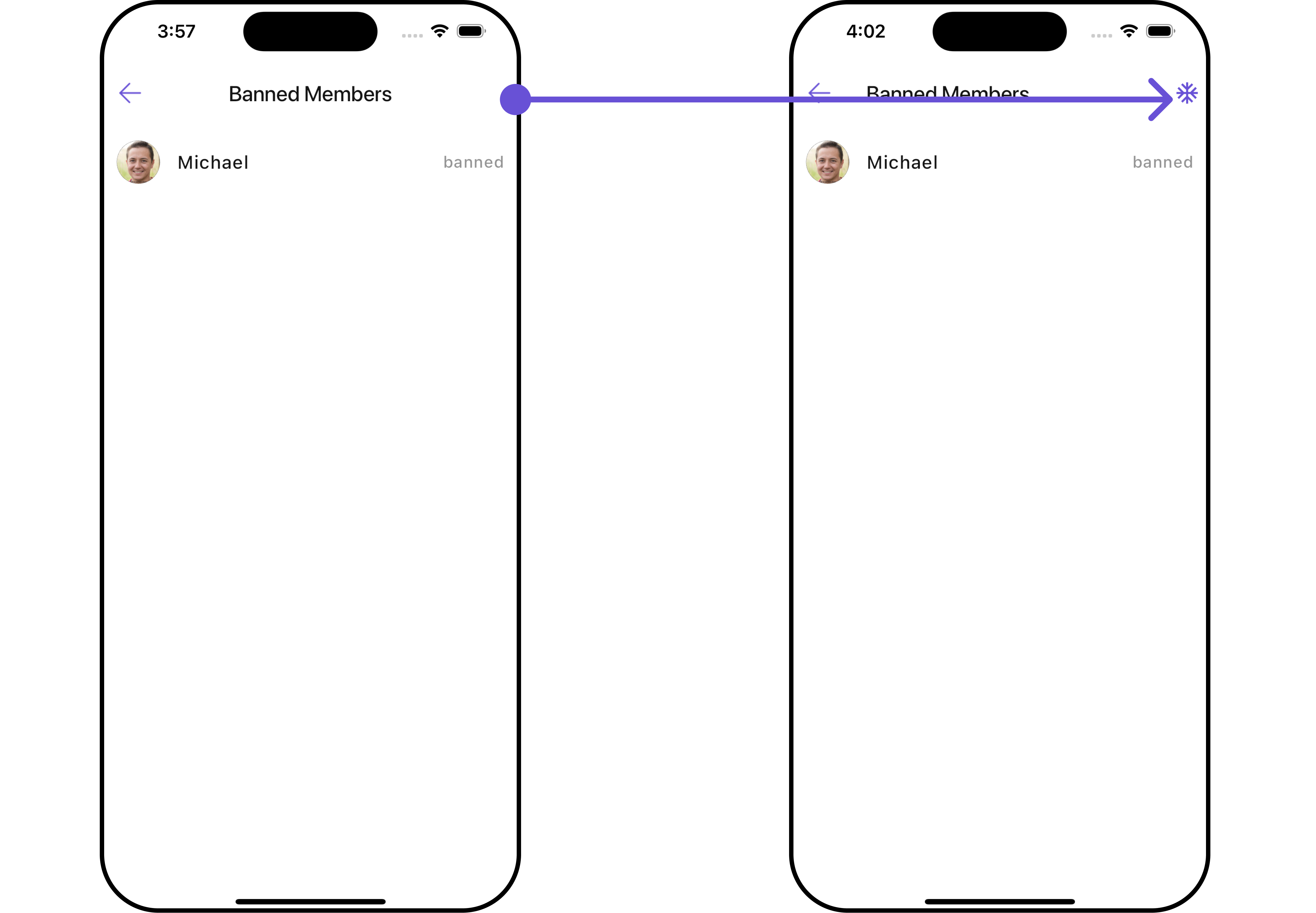
CometChatBannedMembers is a crucial Widget that showcases users who have been restricted from participating in specific groups or conversations. Once banned, users lose access to content and discussions within the affected group. Administrators or owners wield the authority to ban members from groups they oversee, enabling them to monitor user activity and behavior closely. With CometChatBannedMembers, administrators can take swift and appropriate actions to maintain group integrity and uphold community standards.
- Android
- iOS
BannedMembers Widget is composed of the following BaseWidgets:
| Widgets | Description |
|---|---|
| CometChatListBase | CometChatListBase serves as a container Widget equipped with a title (navigationBar), search functionality (search-bar), background settings, and a container for embedding a list view. |
| CometChatListItem | This Widget renders information extracted from a User object onto a tile, featuring a title, subtitle, leading view, and trailing view. |
Usage
Integration
CometChatBannedMembers , as a Composite Widget, offers flexible integration options, allowing it to be launched directly via button clicks or any user-triggered action. Additionally, it seamlessly integrates into tab view controllers. With banned members, users gain access to a wide range of parameters and methods for effortless customization of its user interface.
You can launch CometChatBannedMembers directly using Navigator.push , or you can define it as a widget within the build method of your State class.
1. Using Navigator to Launch CometChatBannedMembers
- Dart
2. Embedding CometChatBannedMembers as a Widget in the build Method
- Dart
Actions
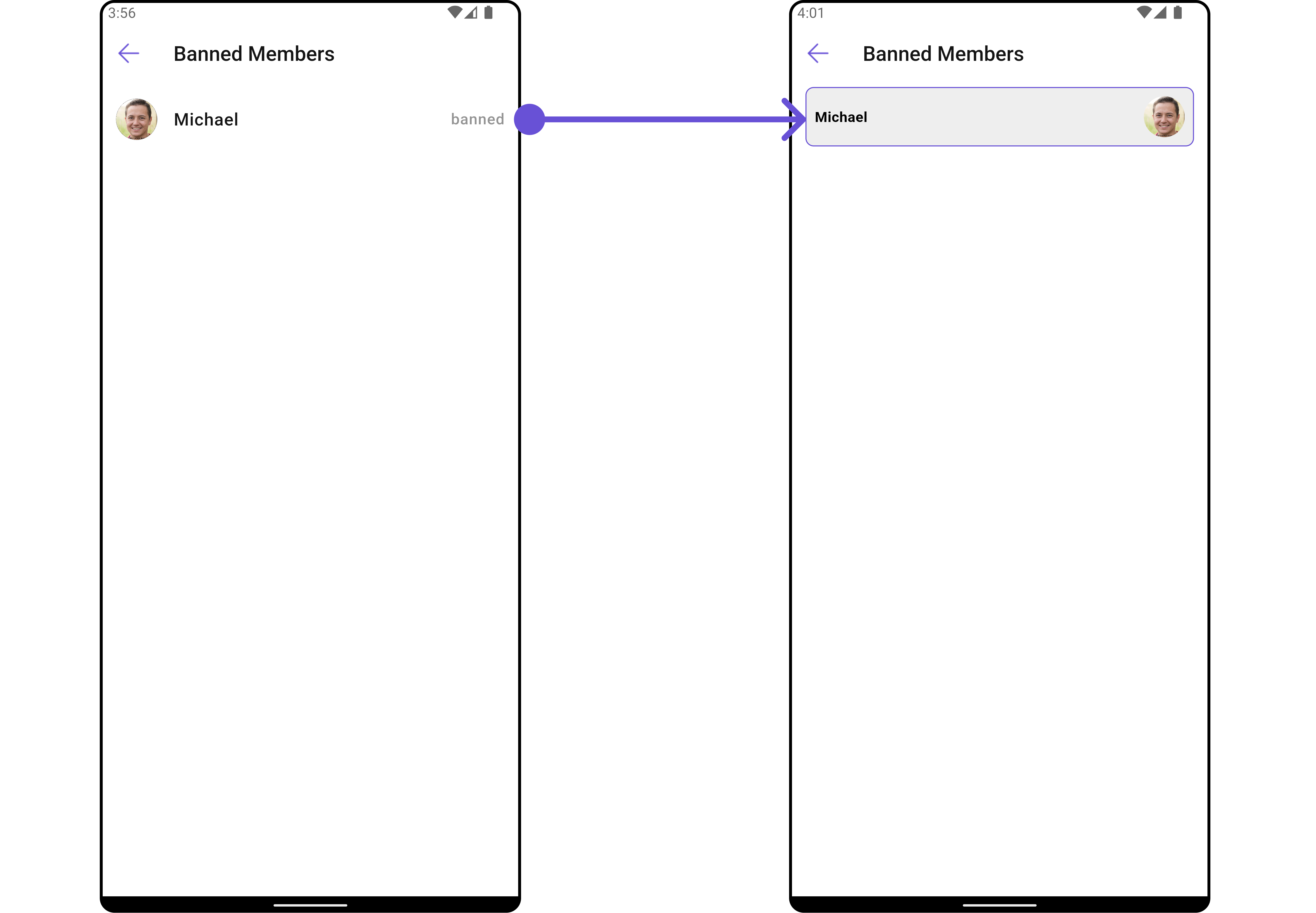
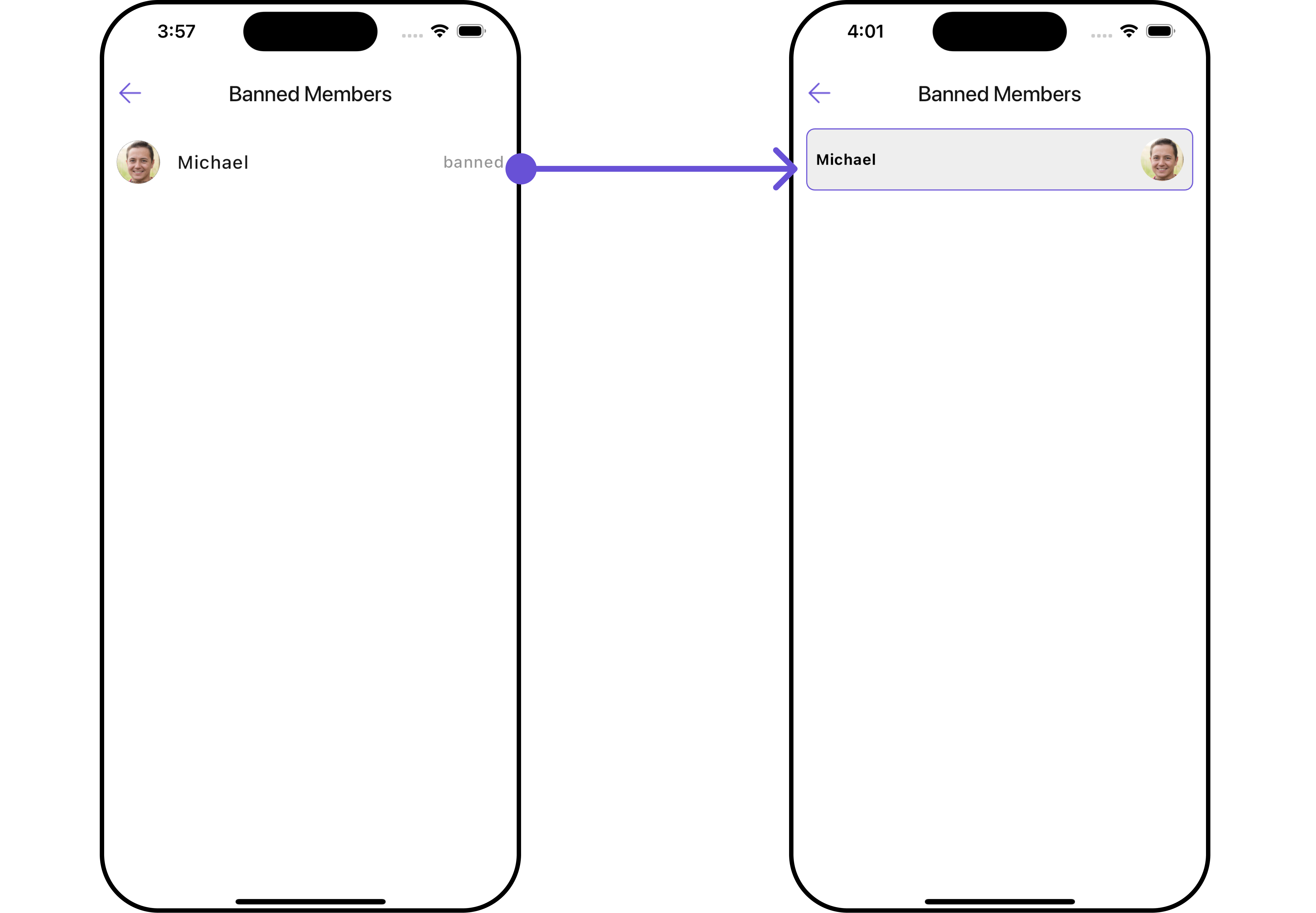
Actions dictate how a Widget functions. They are divided into two types: Predefined and User-defined. You can override either type, allowing you to tailor the behavior of the Widget to fit your specific needs.1. onItemTap
This method proves valuable when users seek to override onItemClick functionality withinCometChatBannedMembers , empowering them with greater control and customization options.
The onItemTap action doesn’t have a predefined behavior. You can override this action using the following code snippet.
- Dart
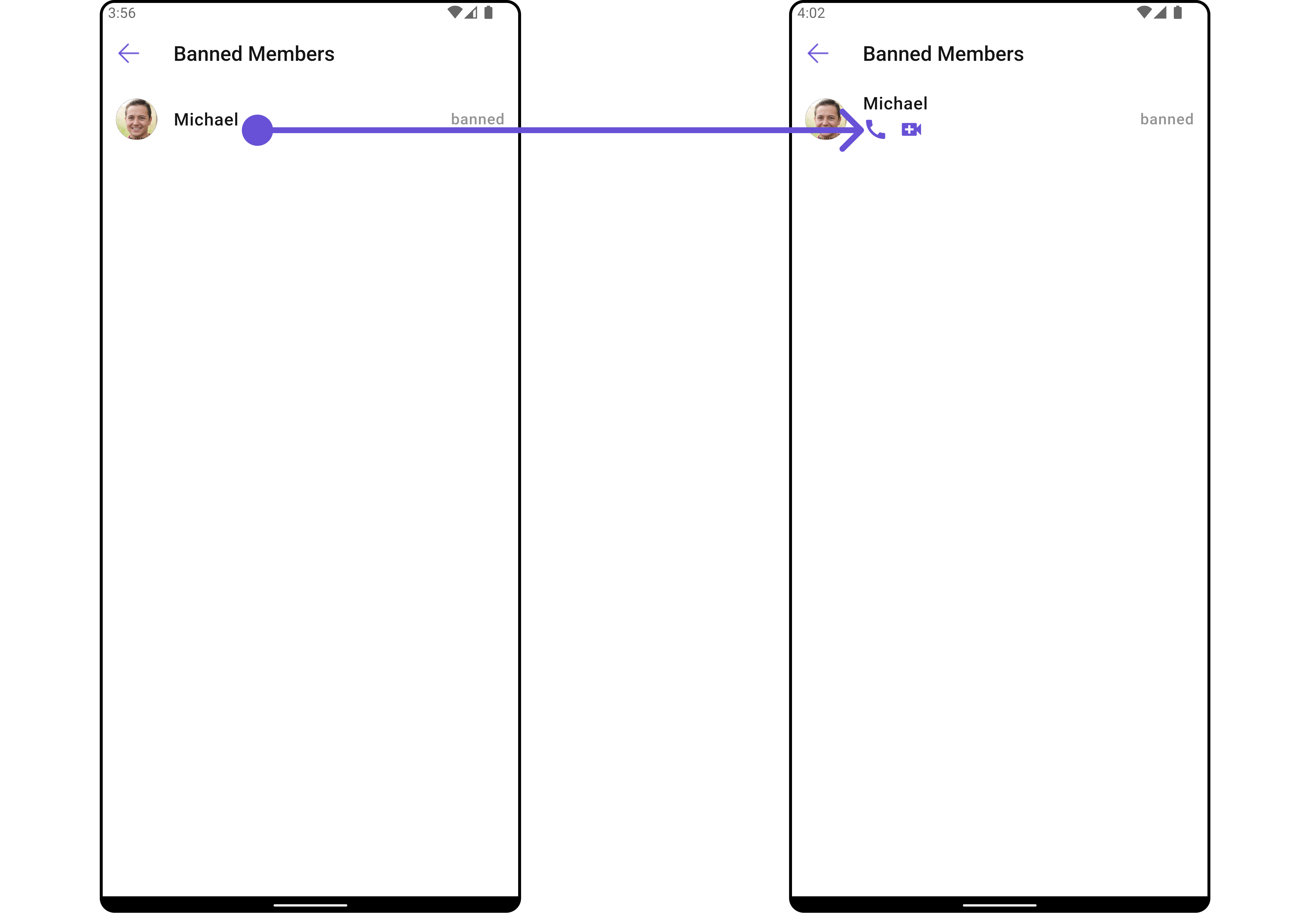
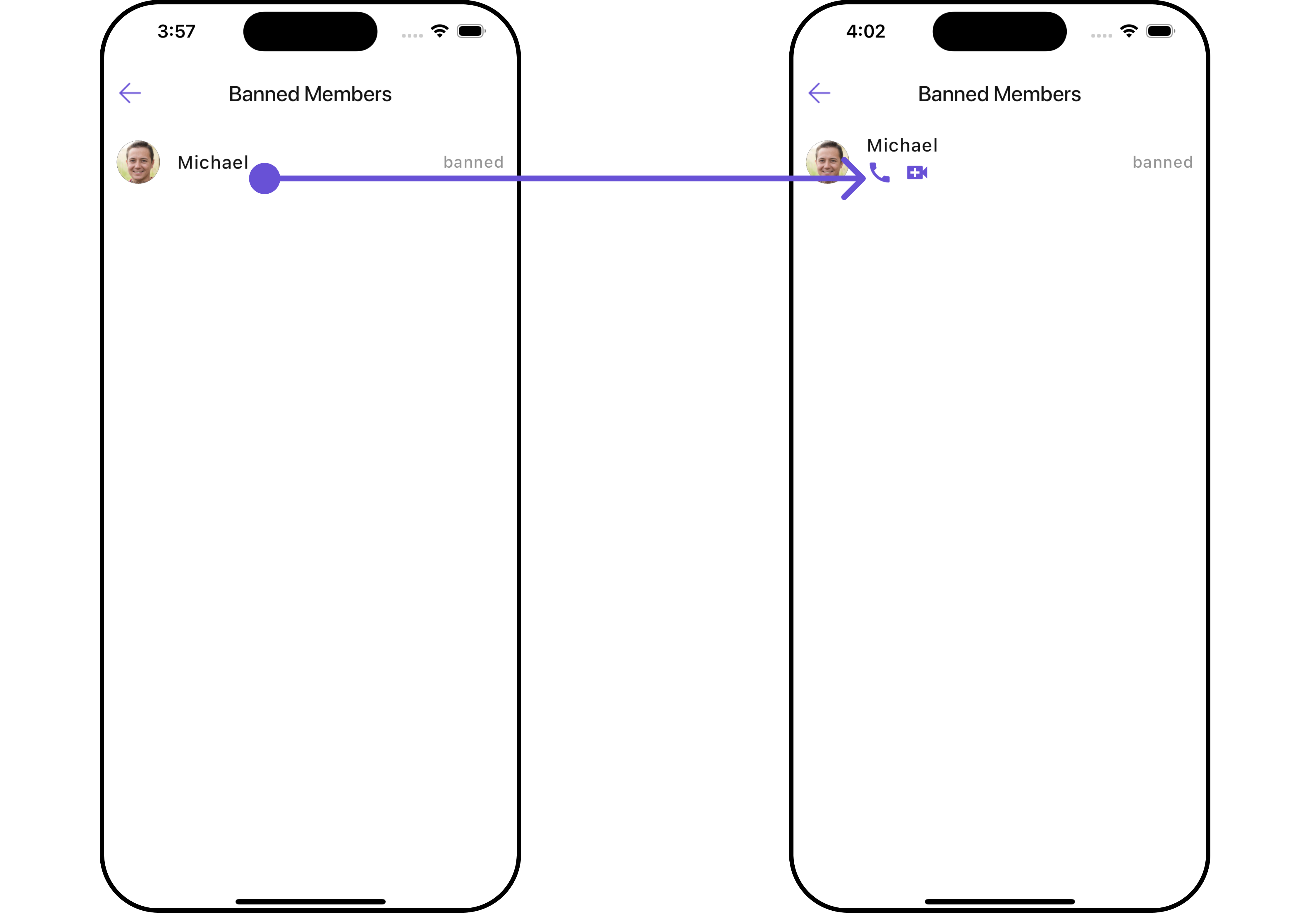
2. onItemLongPress
This method becomes invaluable when users seek to override long-click functionality withinCometChatBannedMembers , offering them enhanced control and flexibility in their interactions.
The onItemLongPress action doesn’t have a predefined behavior. You can override this action using the following code snippet.
- Dart
3. onBack
Enhance your application’s functionality by leveraging theonBack feature. This capability allows you to customize the behavior associated with navigating back within your app. Utilize the provided code snippet to override default behaviors and tailor the user experience according to your specific requirements.
- Dart
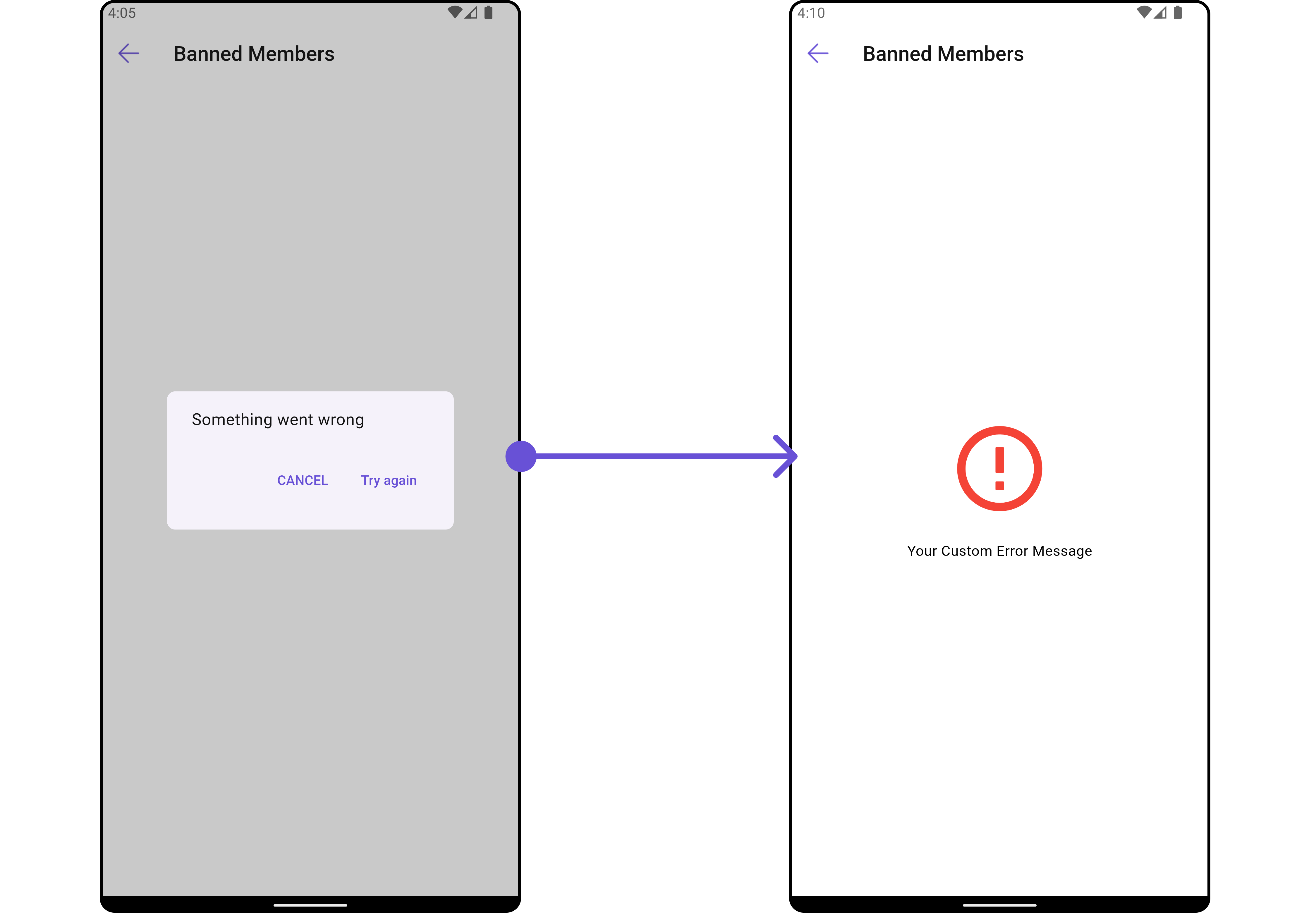
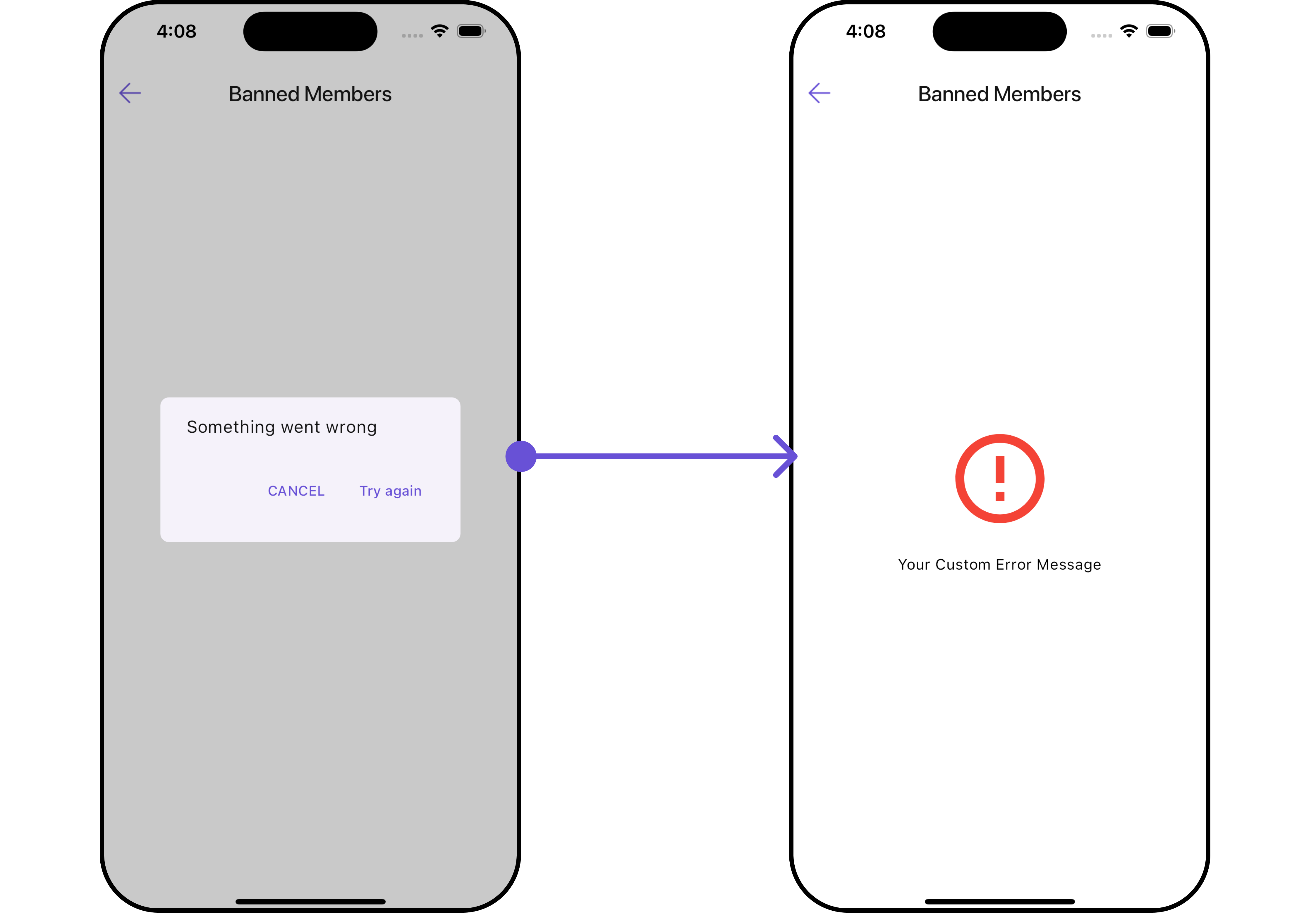
4. onError
You can customize this behavior by using the provided code snippet to override theonError and improve error handling.
- Dart
5. onSelection
When theonSelection event is triggered, it furnishes the list of selected members. This event can be invoked by any button or action within the interface. You have the flexibility to implement custom actions or behaviors based on the selected members.
This action does not come with any predefined behavior. However, you have the flexibility to override this event and tailor it to suit your needs using the following code snippet.
- Dart
Filters
Filters allow you to customize the data displayed in a list within a Widget. You can filter the list based on your specific criteria, allowing for a more customized. Filters can be applied using RequestBuilders of Chat SDK.1. BannedGroupMembersRequestBuilder
TheBannedGroupMembersRequestBuilder enables you to filter and customize the Banned Members list based on available parameters in BannedGroupMembersRequestBuilder. This feature allows you to create more specific and targeted queries when fetching banned members. The following are the parameters available in BannedGroupMembersRequestBuilder
| Property | Description | Code |
|---|---|---|
| Guid | Group ID for the group whose banned members are to be fetched. | guid: String |
| Limit | Number of results to limit the query. | limit: int? |
| Search Keyword | Keyword for searching. | searchKeyword: String? |
- Dart
2. CustomBannedMembersProtocol
TheCustomBannedMembersProtocol uses BannedGroupMembersRequestBuilder enables you to filter and customize the search list based on available parameters in BannedMembersRequestBuilder.
This feature allows you to keep uniformity between the displayed Banned Members list and searched Banned Members.
Example
- Dart
custom_protocol.dart
- Dart
main.dart
Events
Events are emitted by aWidget . By using event you can extend existing functionality. Being global events, they can be applied in Multiple Locations and are capable of being Added or Removed.
Events emitted by the Join Group Widget is as follows.
| Event | Description |
|---|---|
| ccGroupMemberBanned | This method is triggered when the logged-in user successfully bans a user from the group. |
| ccGroupMemberUnBanned | This method triggers when the logged-in user successfully unbans a previously banned user from the group. |
- Dart
your_screen.dart
Customization
To fit your app’s design requirements, you can customize the appearance of the Groups Widget. We provide exposed methods that allow you to modify the experience and behavior according to your specific needs.Style
Using Style you can customize the look and feel of the Widget in your app, These parameters typically control elements such as the color, size, shape, and fonts used within the Widget.1. BannedMembers Style 🛑
You can set theBannedMembersStyle to the CometChatBannedMembers Widget to customize the styling.
- Dart
- Android
- iOS
| Property | Description | Code |
|---|---|---|
| Back Icon Tint | Tint color for the back icon. | backIconTint: Color? |
| Background | Background color or decoration. | background: Decoration? |
| Border | Border of the Widget. | border: Border? |
| Border Radius | Radius of the Widget’s border. | borderRadius: BorderRadius? |
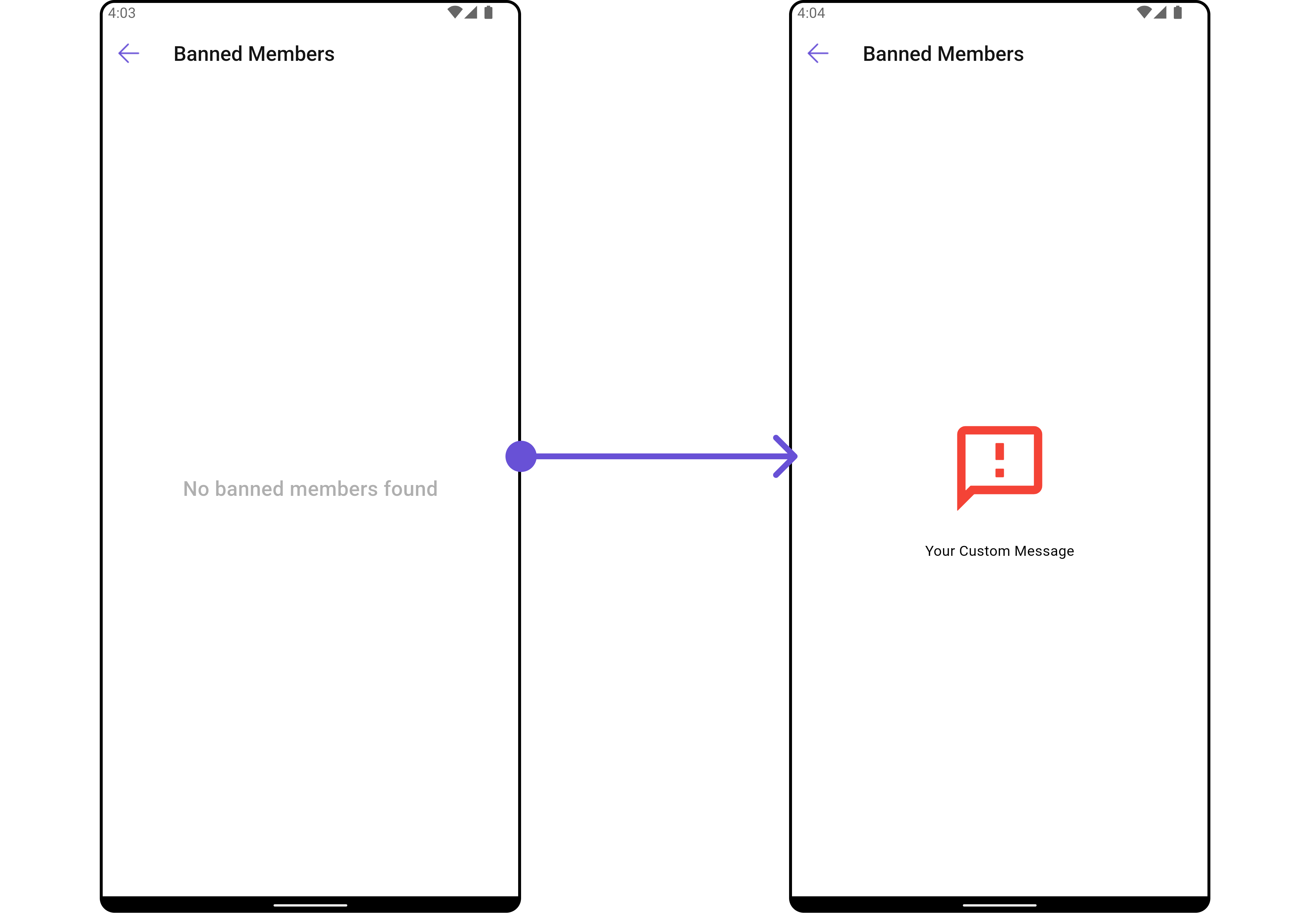
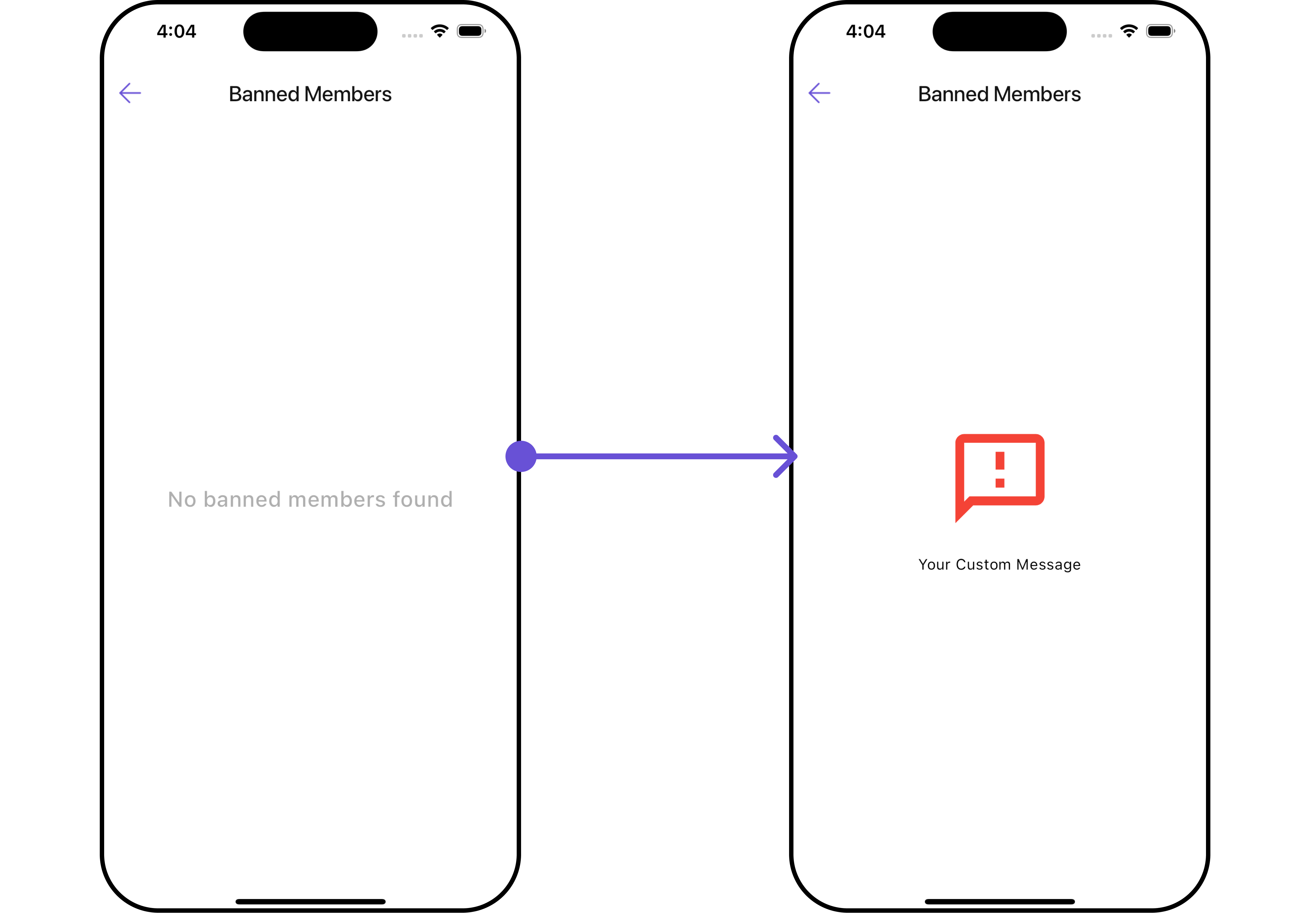
| Empty Text Style | Style for the text displayed when there are no banned members. | emptyTextStyle: TextStyle? |
| Error Text Style | Style for the text displayed when there is an error. | errorTextStyle: TextStyle? |
| Gradient | Gradient used for the Widget’s background. | gradient: Gradient? |
| Height | Height of the Widget. | height: double? |
| Loading Icon Tint | Tint color for the loading icon. | loadingIconTint: Color? |
| Online Status Color | Color indicating online status. | onlineStatusColor: Color? |
| Search Background | Background color or decoration for the search field. | searchBackground: Decoration? |
| Search Border Color | Color of the search field’s border. | searchBorderColor: Color? |
| Search Border Radius | Radius of the search field’s border. | searchBorderRadius: BorderRadius? |
| Search Border Width | Width of the search field’s border. | searchBorderWidth: double? |
| Search Icon Tint | Tint color for the search icon. | searchIconTint: Color? |
| Search Placeholder Style | Style for the placeholder text in the search field. | searchPlaceholderStyle: TextStyle? |
| Search Style | Style for the search text. | searchStyle: TextStyle? |
| Section Header Text Style | Style for the section header text. | sectionHeaderTextStyle: TextStyle? |
| Tail Text Style | Style for the text displayed at the end of the list. | tailTextStyle: TextStyle? |
| Title Style | Style for the title text. | titleStyle: TextStyle? |
| Width | Width of the Widget. | width: double? |
2. Avatar Style
To apply customized styles to theAvatar Widget in the Banned Members Widget, you can use the following code snippet. For further insights on Avatar Styles refer
- Dart
3. StatusIndicator Style
To apply customized styles to the Status Indicator widget in theCometChatBannedMembers Widget, You can use the following code snippet. For further insights on Status Indicator Styles refer
- Dart
4. ListItem Style
To apply customized styles to theListItemStyle in the CometChatBannedMembers Widget, you can use the following code snippet. For further insights on List Item Styles refer
- Dart
Functionality
These are a set of small functional customizations that allow you to fine-tune the overall experience of the Widget. With these, you can change text, set custom icons, and toggle the visibility of UI elements.- Dart
- Android
- iOS
CometChatBannedMembers
| Property | Description | Code |
|---|---|---|
| Back Button | Back button widget | backButton: Widget? |
| Disable Users Presence | Controls visibility of status indicator | disableUsersPresence: bool |
| Empty State Text | Text to be displayed when the list is empty | emptyStateText: String? |
| Error State Text | Text to be displayed when error occur | errorStateText: String? |
| Hide Error | Toggle visibility of error dialog | hideError: bool? |
| Hide Search | Switch on/off search input | hideSearch: bool |
| Hide Separator | Toggle visibility of separator | hideSeparator: bool |
| Search Box Icon | Search icon widget | searchBoxIcon: Widget? |
| Search Placeholder | Placeholder text of search input | searchPlaceholder: String? |
| Show Back Button | Switch on/off back button | showBackButton: bool |
| Title | Sets title for the list | title: String? |
| Unban Icon Url | URL of the unban icon | unbanIconUrl: String? |
| Unban Icon Url Package Name | Package name of the unban icon URL | unbanIconUrlPackageName: String? |
Advance
For advanced-level customization, you can set custom views to the Widget. This lets you tailor each aspect of the Widget to fit your exact needs and application aesthetics. You can create and define your own widget and then incorporate those into the Widget.ListItemView
With this function, you can assign a custom ListItem to theCometChatBannedMembers Widget.
- Dart
widget
custom_list_item.dart for more complex or unique list items.
- Dart
custom_list_item.dart
- Dart
main.dart
- Android
- iOS
SubtitleView
You can customize the subtitle view for each item to meet your specific preferences and needs.- Dart
widget
- Dart
main.dart
- Android
- iOS
AppBarOptions
You can set the CustomappBarOptions to the CometChatBannedMembers widget.
- Dart
widget
- Dart
- Android
- iOS
EmptyStateView
You can set a customEmptyStateView using emptyStateView to match the error widget of your app.
- Dart
widget
- Dart
main.dart
- Android
- iOS
LoadingStateView
You can set a custom loader widget usingloadingStateView to match the loading UI of your app.
- Dart
widget
- Dart
main.dart
- Android
- iOS
ErrorStateView
You can set a customErrorStateView using errorStateView to match the error UI of your app.
- Dart
widget
- Dart
main.dart
- Android
- iOS