Overview
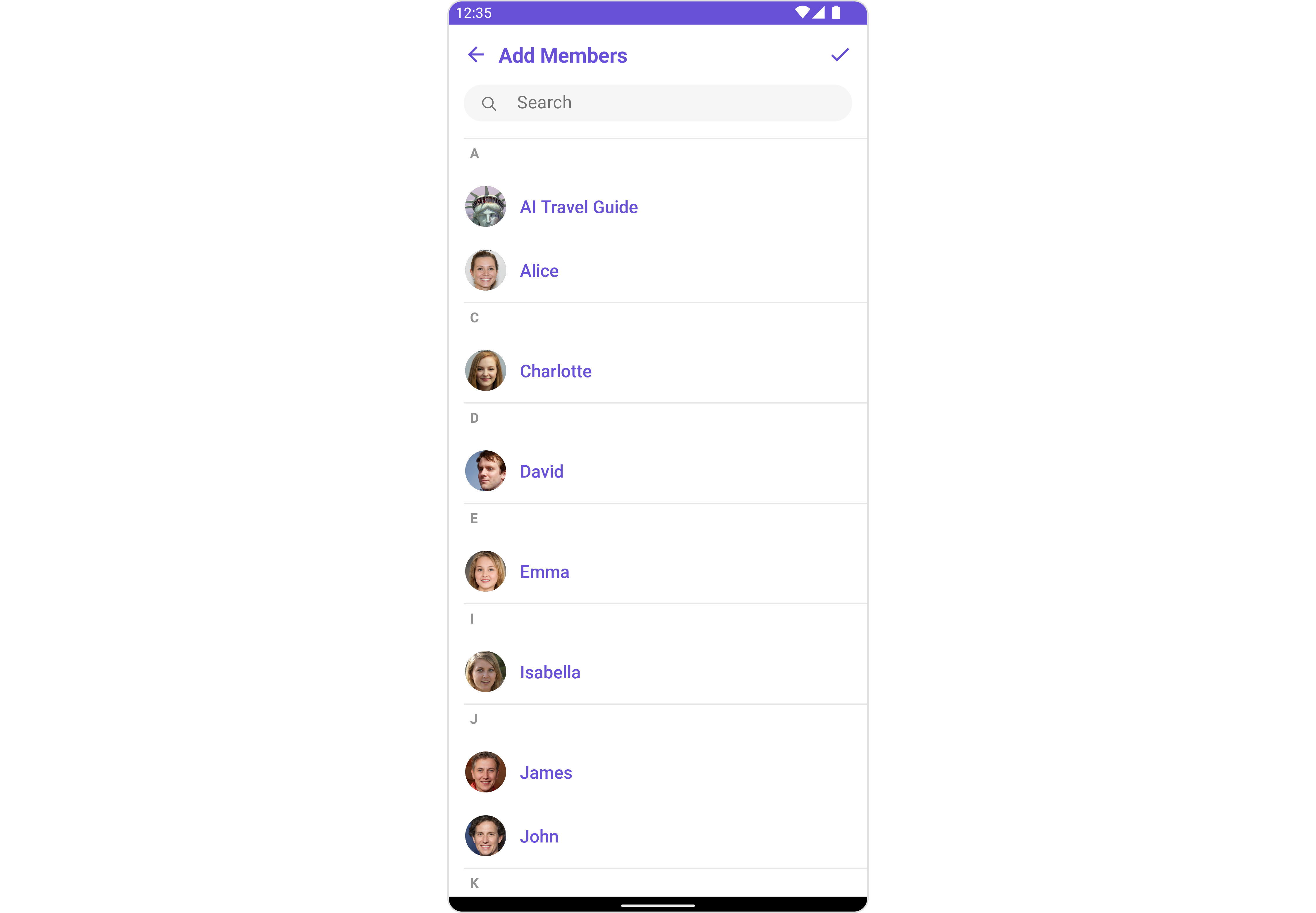
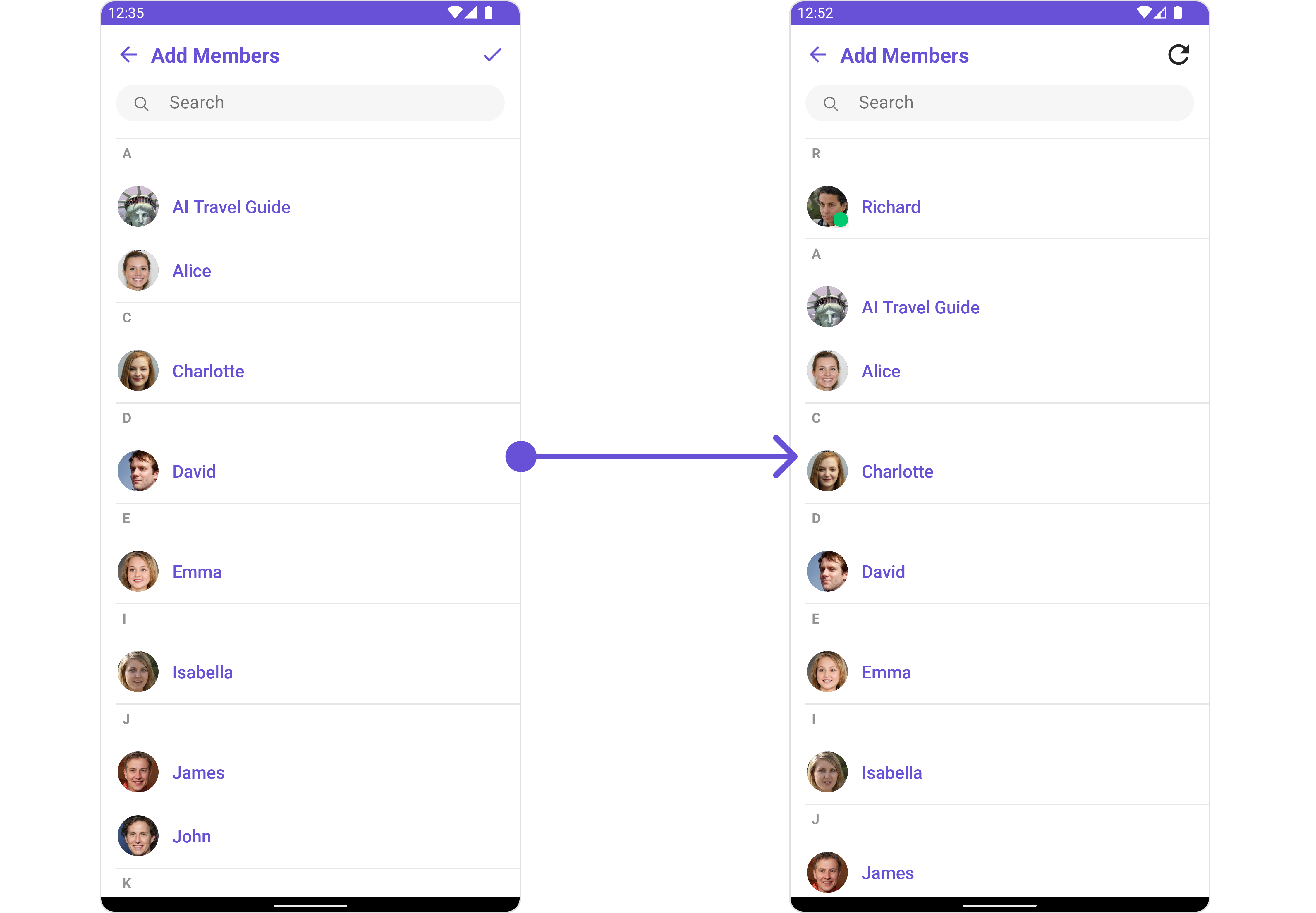
CometChatAddMembers is a Component that empowers administrators or group owners with the ability to expand group membership by seamlessly adding new participants. This component facilitates effortless management of group membership and enhances collaboration within the group’s discussions and activities. Administrators can meticulously select desired users to join the group, whether by targeted search or from a list of available users. Selected users receive notifications, streamlining the process of joining the group and ensuring smooth integration into the community.
CometChatAddMembers component is composed of the following BaseComponents:
| Components | Description |
|---|---|
| CometChatUsers | CometChatUsers is a standalone component that presents a user list and enables targeted user searches. As a container inheriting from CometChatListBase, it seamlessly incorporates the CometChatUserList component. This setup streamlines user browsing and search capabilities, enhancing overall usability and facilitating efficient interactions. |
| CometChatListItem | This component renders information extracted from a User object onto a tile, featuring a title, subtitle, leading view, and trailing view. experience, facilitating seamless navigation and interaction within the component. |
Usage
Integration
CometChatAddMembers, as a Composite Component, offers flexible integration options, allowing it to be launched directly via button clicks or any user-triggered action. Additionally, it seamlessly integrates into tab view controllers. With add members, users gain access to a wide range of parameters and methods for effortless customization of its user interface.
The following code snippet exemplifies how you can seamlessly integrate the GroupMembers component into your application.
- XML
- Java
- Kotlin
Actions
Actions dictate how a component functions. They are divided into two types: Predefined and User-defined. You can override either type, allowing you to tailor the behavior of the component to fit your specific needs.1. SetOnItemClick
This method proves valuable when users seek to override onItemClick functionality within CometChatAddMembers, empowering them with greater control and customization options. ThesetOnItemClick action doesn’t have a predefined behavior. You can override this action using the following code snippet.
- Java
- Kotlin
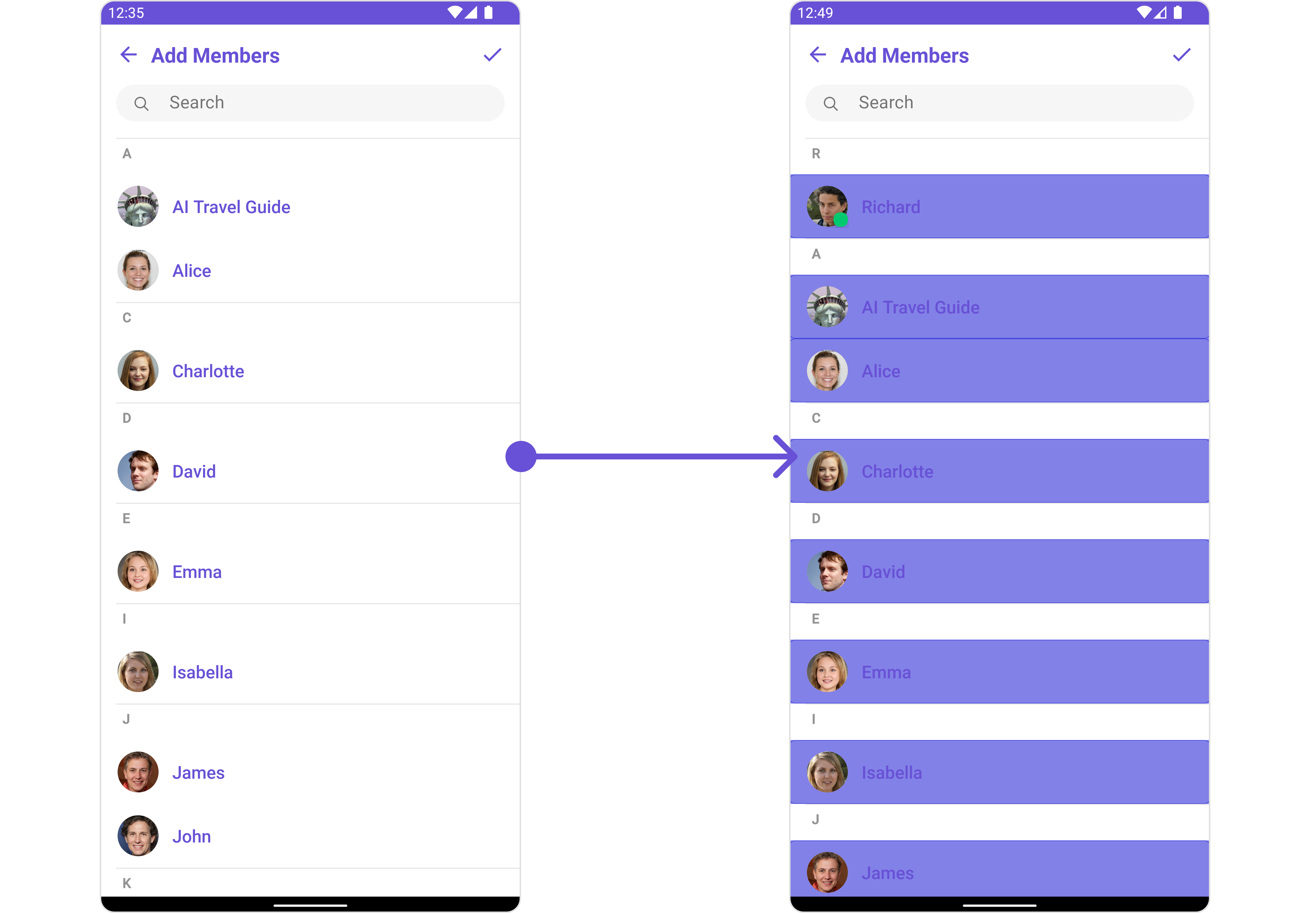
2. OnSelection
TheOnSelection event is triggered upon the completion of a selection in SelectionMode. It does not have a default behavior. However, you can override its behavior using the following code snippet.
- Java
- Kotlin
YourActivity.java
3. SetOnError
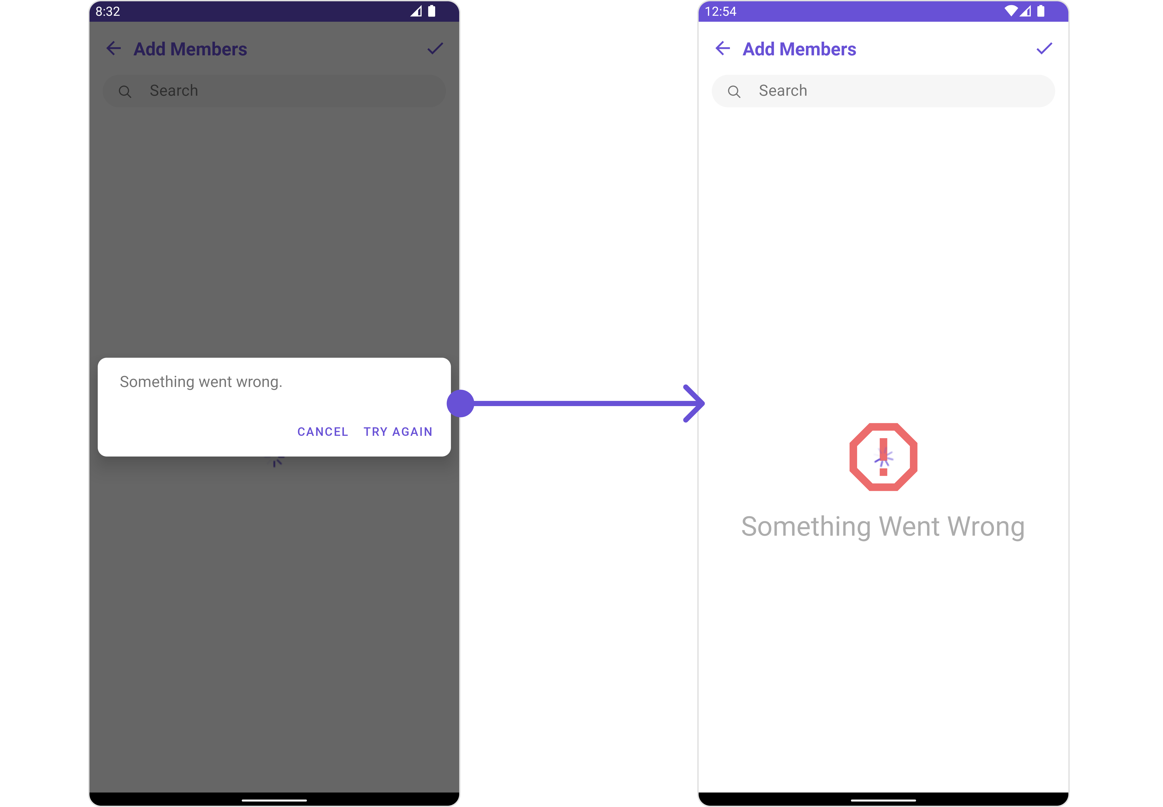
You can customize this behavior by using the provided code snippet to override theOn Error and improve error handling.
- Java
- Kotlin
4. AddOnBackPressListener
You can customize this behavior by using the provided code snippet to override theaddOnBackPressListener and improve error handling.
- Java
- Kotlin
Filters
Filters allow you to customize the data displayed in a list within aComponent. You can filter the list based on your specific criteria, allowing for a more customized. Filters can be applied using RequestBuilders of Chat SDK.
1. UsersRequestBuilder
The UsersRequestBuilder enables you to filter and customize the group list based on available parameters in UsersRequestBuilder. This feature allows you to create more specific and targeted queries when fetching users. The following are the parameters available in UsersRequestBuilder| Property | Description | Code |
|---|---|---|
| Limit | Configure the maximum number of groups to fetch in a single request, optimizing pagination for smoother navigation. | .setLimit(Int) |
| Search Keyword | Employed to retrieve groups that match the provided string, facilitating precise searches. | .setSearchKeyword(String) |
| Tags | Used for fetching users containing the passed tags. | .setTags(List<String>) |
| Roles | Used for fetching users containing the passed roles. | .setRoles(List<String>) |
| UIDs | Used for fetching users containing the passed UIDs. | .setUIDs(List<String>) |
| User Status | Used for fetching users by their status online or offline. | .setUserStatus(String) |
- Java
- Kotlin
2. SearchRequestBuilder
The SearchRequestBuilder uses UsersRequestBuilder enables you to filter and customize the search list based on available parameters in UsersRequestBuilder. This feature allows you to keep uniformity between the displayed User List and searched User List. Example- Java
- Kotlin
Events
Events are emitted by aComponent. By using event you can extend existing functionality. Being global events, they can be applied in Multiple Locations and are capable of being Added or Removed.
Events emitted by the Join Group component is as follows.
| Event | Description |
|---|---|
| ccGroupMemberAdded | Triggers when a user added to a group successfully |
- Java
- Kotlin
- Java
- Kotlin
Customization
To fit your app’s design requirements, you can customize the appearance of the Groups component. We provide exposed methods that allow you to modify the experience and behavior according to your specific needs.Style
Using Style you can customize the look and feel of the component in your app, These parameters typically control elements such as the color, size, shape, and fonts used within the component.1. AddMembers Style
To apply customized styles to theAddMembers component in the Group Member Component, you can use the following code snippet.
- Java
- Kotlin
AddMembersStyle
| Methods | Type | Description |
|---|---|---|
| Background | @ColorInt int | Used to set the background color |
| Border Width | int | Used to set border |
| Border Color | @ColorInt int | Used to set border color |
| Corner Radius | float | Used to set border radius |
| Background | Drawable | Used to set background Drawable |
| Title Appearance | @StyleRes int | Used to customise the appearance of the title in the app bar |
| Back Icon Tint | @ColorInt int | Used to set the color of the back icon in the app bar |
| Search Background | @ColorInt int | Used to set the background color of the search box |
| Search Border Radius | int | Used to set the border radius of the search box |
| Search Icon Tint | @ColorInt int | Used to set the color of the search icon in the search box |
| Search Border Width | int | Used to set the border width of the search box |
| Search Text Appearance | @StyleRes int | Used to set the style of the text in the search box |
| Loading Icon Tint | @ColorInt int | Used to set the color of the icon shown while the list of group members is being fetched |
| Empty Text Appearance | @StyleRes int | Used to set the style of the response text shown when fetchig the list of group members has returned an empty list |
| Error Text Appearance | @StyleRes int | Used to set the style of the response text shown in case some error occurs while fetching the list of group members |
| Online Status Color | @ColorInt int | Used to set the color of the status indicator shown if a group member is online |
| Separator Color | @ColorInt int | Used to set the color of the divider separating the group member items |
| Section Header TextAppearance | @StyleRes int | Used to customise the appearance of the section header text. |
| Section Header TextColor | @ColorInt int | Used to set the color of the section header text. |
2. Avatar Style
To apply customized styles to theAvatar component in the Group Member Component, you can use the following code snippet. For further insights on Avatar Styles refer
- Java
- Kotlin
3. StatusIndicator Style
To apply customized styles to the Status Indicator component in the Group Member Component, You can use the following code snippet. For further insights on Status Indicator Styles refer- Java
- Kotlin
4. ListItem Style
To apply customized styles to theList Item component in the Group Member Component, you can use the following code snippet. For further insights on List Item Styles refer
- Java
- Kotlin
Functionality
These are a set of small functional customizations that allow you to fine-tune the overall experience of the component. With these, you can change text, set custom icons, and toggle the visibility of UI elements.- Java
- Kotlin
CometChatAddMembers
| Property | Description | Code | | --------------------------- | ----------------------------------------------------------------------------------------------------------------------------------------------- | ------------------------------------------------ | --- | | Group | The group to which the users selected will be added. A required parameter. | .setGroup(Group) | | Title | Used to set title in the app bar | .setTitle(String) | | Style | Used to set styling properties | .setStyle(AddMembersStyle) | | Avatar Style | Used to customise the Avatar of the group member | .setAvatarStyle(AvatarStyle) | | Status Indicator Style | Used to customise the status indicator shown if a group member is online | .setStatusIndicatorStyle(StatusIndicatorStyle) | | Search Placeholder Text | Used to set search placeholder text | .setSearchPlaceholderText(String) | | Back Icon | Used to set back button icon | .backIcon(@DrawableRes int res) | | Show Back Button | Used to toggle visibility for back button | .showBackButton(boolean) | | Search Box Icon | Used to set search Icon in the search field | .setSearchBoxIcon(@DrawableRes int res) | | Hide Search | Used to toggle visibility for search box | .hideSearch(boolean) | | Hide Error | Used to hide error on fetching users and failing to add selected users to the group. | .hideError(boolean) | | Hide Separator | Used to hide the divider separating the user items | .hideSeparator(boolean) | | Hide Section Separator | Used to hide the text separating grouped user items | .hideSectionSeparator(boolean) | | Disable Users Presence | Used to control visibility of user indicator shown if user is online | .disableUsersPresence(boolean) | | Selection Icon | Used to override the default selection complete icon | .setSelectionIcon(@DrawableRes int res) | | Submit Icon | Used to override the default selection complete icon | .setSubmitIcon(@DrawableRes int res) | | Selection Mode | Used to set the number of users that can be selected. By default it is SelectionMode.multiple. SelectionMode can be single, multiple or none. | .setSelectionMode(SelectionMode) | |
Advanced
For advanced-level customization, you can set custom views to the component. This lets you tailor each aspect of the component to fit your exact needs and application aesthetics. You can create and define your own views, layouts, and UI elements and then incorporate those into the component. TheAdd Members component does not provide additional functionalities beyond this level of customization.
SetListItemView
With this function, you can assign a custom ListItem to the Conversations Component.- Java
- Kotlin
item_list.xml for more complex or unique list items.
Once this layout file is made, you would inflate it inside the createView() method of the UsersViewHolderListener. The inflation process prepares the layout for use in your application:
Following this, you would use the bindView() method to initialize and assign values to your individual views. This could include setting text on TextViews, images on ImageViews, and so on based on the properties of the Group object:
item_list.xml
- Java
- Kotlin
YourActivity.java
SetSubTitleView
You can customize the subtitle view for each conversation item to meet your requirements- Java
- Kotlin
subtitle_layout.xml for more complex or unique list items.
Once this layout file is made, you would inflate it inside the createView() method of the UsersViewHolderListener. The inflation process prepares the layout for use in your application:
Following this, you would use the bindView() method to initialize and assign values to your individual views. This could include setting text on TextViews, images on ImageViews, and so on based on the properties of the Group object:
subtitle_layout.xml
- Java
- Kotlin
YourActivity.java
SetTailView
Used to generate a custom trailing view for the GroupList item. You can add a Tail view using the following method.- Java
- Kotlin
tail_view_layout.xml for more complex or unique list items.
Once this layout file is made, you would inflate it inside the createView() method of the UsersViewHolderListener. The inflation process prepares the layout for use in your application:
Following this, you would use the bindView() method to initialize and assign values to your individual views. This could include setting text on TextViews, images on ImageViews, and so on based on the properties of the Group object:
tail_view_layout.xml
- Java
- Kotlin
YourActivity.java
SetMenu
You can set the Custom Menu view to add more options to the Groups component.- Java
- Kotlin
view_menu.xml as a custom view file. Which we will inflate and pass to .setMenu().
view_menu.xml
setMenu. You can get the child view reference and can handle click actions.
- Java
- Kotlin
YourActivity.java
SetLoadingStateView
You can set a custom loader view usingsetLoadingStateView to match the loading view of your app.
- Java
- Kotlin
ContentLoadingProgressBar to loading_view_layout.xml. You can choose any view you prefer. This view should be inflated and passed to the setLoadingStateView() method.
loading_view_layout.xml
- Java
- Kotlin
YourActivity.java
SetEmptyStateView
You can set a customEmptyStateView using setEmptyStateView to match the empty view of your app.
- Java
- Kotlin
empty_view_layout.xml. You can choose any view you prefer. This view should be inflated and passed to the setEmptyStateView() method.
empty_view_layout.xml
- Java
- Kotlin
YourActivity.java
SetErrorStateView
You can set a customErrorStateView using setErrorStateView to match the error view of your app.
- Java
- Kotlin
error_state_view_layout.xml. You can choose any view you prefer. This view should be inflated and passed to the setErrorStateView() method.
error_state_view_layout.xml
- Java
- Kotlin
YourActivity.java