AI Integration Quick Reference
AI Integration Quick Reference
Where It Fits
CometChatUsers is a contact list component. It renders all available users and emits the selected CometChat.User via onItemClick. Wire it to CometChatMessageHeader, CometChatMessageList, and CometChatMessageComposer to build a standard two-panel chat layout.

Minimal Render
.cometchat-users
Filtering Users
Pass aCometChat.UsersRequestBuilder to usersRequestBuilder. Pass the builder instance — not the result of .build().
Filter Recipes
| Recipe | Code |
|---|---|
| Friends only | new CometChat.UsersRequestBuilder().friendsOnly(true) |
| Online users only | new CometChat.UsersRequestBuilder().setStatus("online") |
| Limit to 15 per page | new CometChat.UsersRequestBuilder().setLimit(15) |
| Search by keyword | new CometChat.UsersRequestBuilder().setSearchKeyword("alice") |
| Hide blocked users | new CometChat.UsersRequestBuilder().hideBlockedUsers(true) |
| Filter by roles | new CometChat.UsersRequestBuilder().setRoles(["admin", "moderator"]) |
| Filter by tags | new CometChat.UsersRequestBuilder().setTags(["vip"]) |
| Specific UIDs | new CometChat.UsersRequestBuilder().setUIDs(["uid1", "uid2"]) |
searchRequestBuilder can be passed to filter the search list independently from the main list.
Refer to UsersRequestBuilder for the full builder API.
Actions and Events
Callback Props
onItemClick
Fires when a user row is tapped. Primary navigation hook — set the active user and render the message view.onSelect
Fires when a user is checked/unchecked in selection mode. RequiresselectionMode to be set.
onEmpty
Fires when the user list fetch returns zero results.onError
Fires on internal errors (network failure, auth issue, SDK exception).Global UI Events
The component subscribes toCometChatUserEvents internally:
| Event | Internal behavior |
|---|---|
CometChatUserEvents.ccUserBlocked | Updates the blocked user in the list |
CometChatUserEvents.ccUserUnblocked | Updates the unblocked user in the list |
CometChatUsers does not emit any custom UI events.
SDK Events (Real-Time, Automatic)
The component listens to these SDK events internally. No manual attachment needed unless additional side effects are required.| SDK Listener | Internal behavior |
|---|---|
onUserOnline | Updates the user’s status dot to online |
onUserOffline | Updates the user’s status dot to offline |
In React 18 StrictMode,
useEffect runs twice on mount in development. The component handles listener cleanup internally, but any additional listeners added alongside the component need cleanup in the useEffect return function to avoid duplicate event handling.Custom View Slots
Each slot replaces a section of the default UI. Slots that accept a user parameter receive theCometChat.User object for that row.
| Slot | Signature | Replaces |
|---|---|---|
itemView | (user: CometChat.User) => JSX.Element | Entire list item row |
leadingView | (user: CometChat.User) => JSX.Element | Avatar / left section |
titleView | (user: CometChat.User) => JSX.Element | Name / title text |
subtitleView | (user: CometChat.User) => JSX.Element | Subtitle text |
trailingView | (user: CometChat.User) => JSX.Element | Right section |
headerView | JSX.Element | Entire header bar |
loadingView | JSX.Element | Loading spinner |
emptyView | JSX.Element | Empty state |
errorView | JSX.Element | Error state |
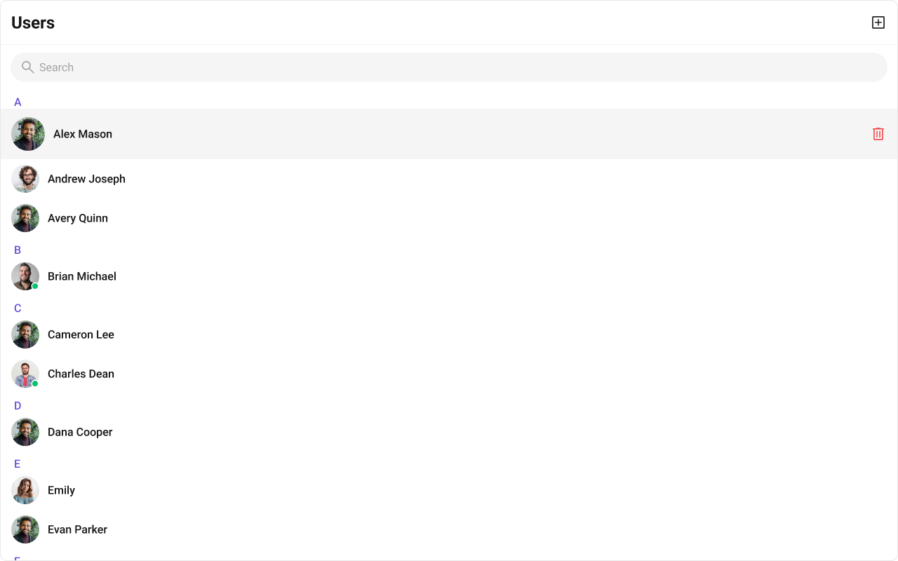
options | (user: CometChat.User) => CometChatOption[] | Context menu / hover actions |
itemView
Replace the entire list item row. Default: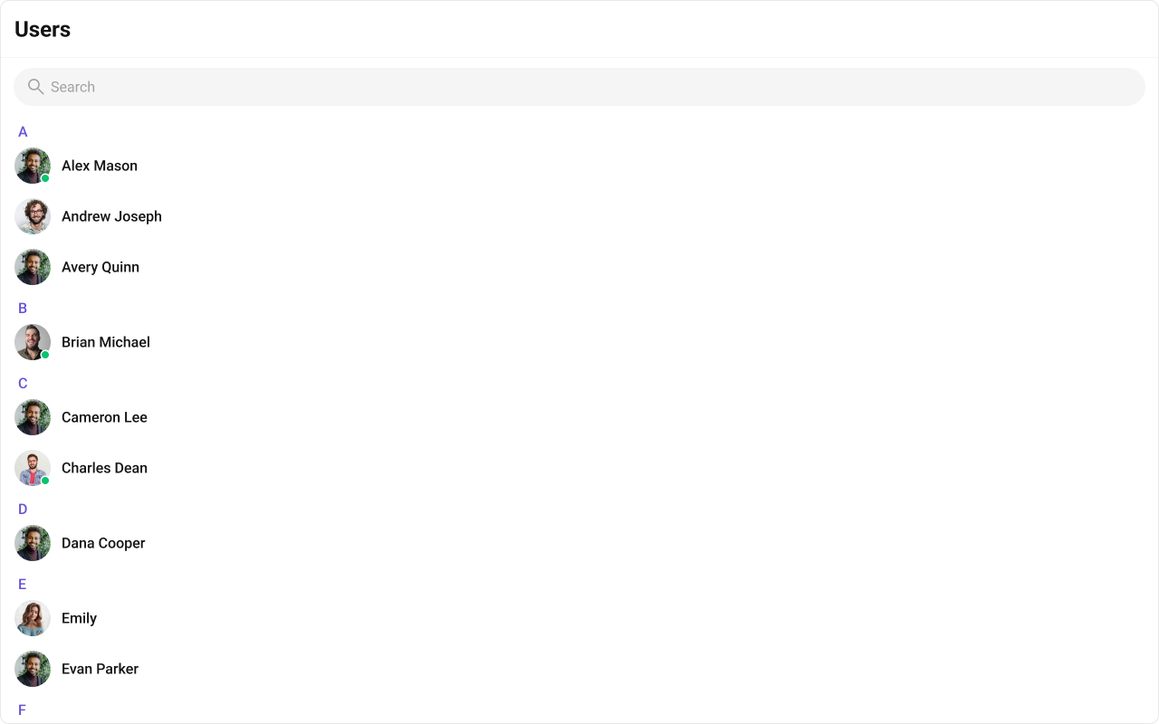
- TypeScript
- CSS
leadingView
Replace the avatar / left section.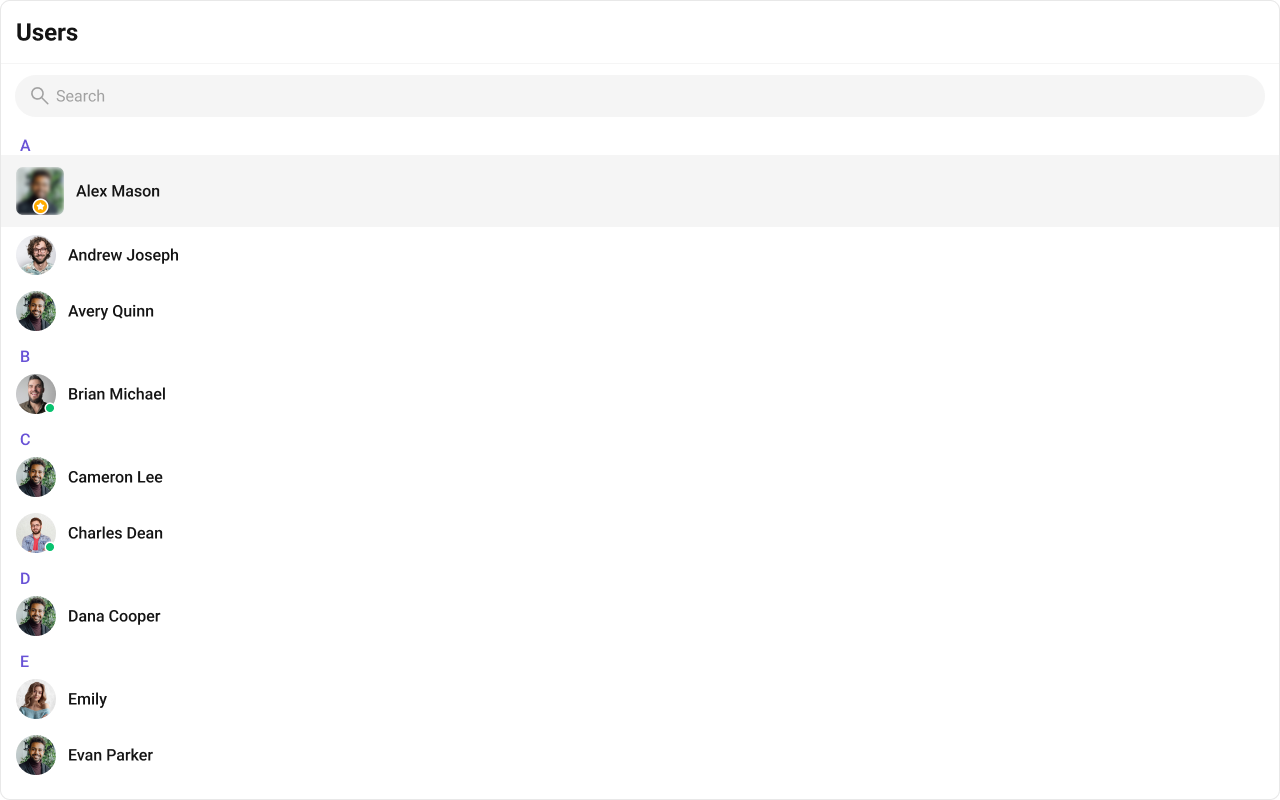
- TypeScript
- CSS
trailingView
Replace the right section.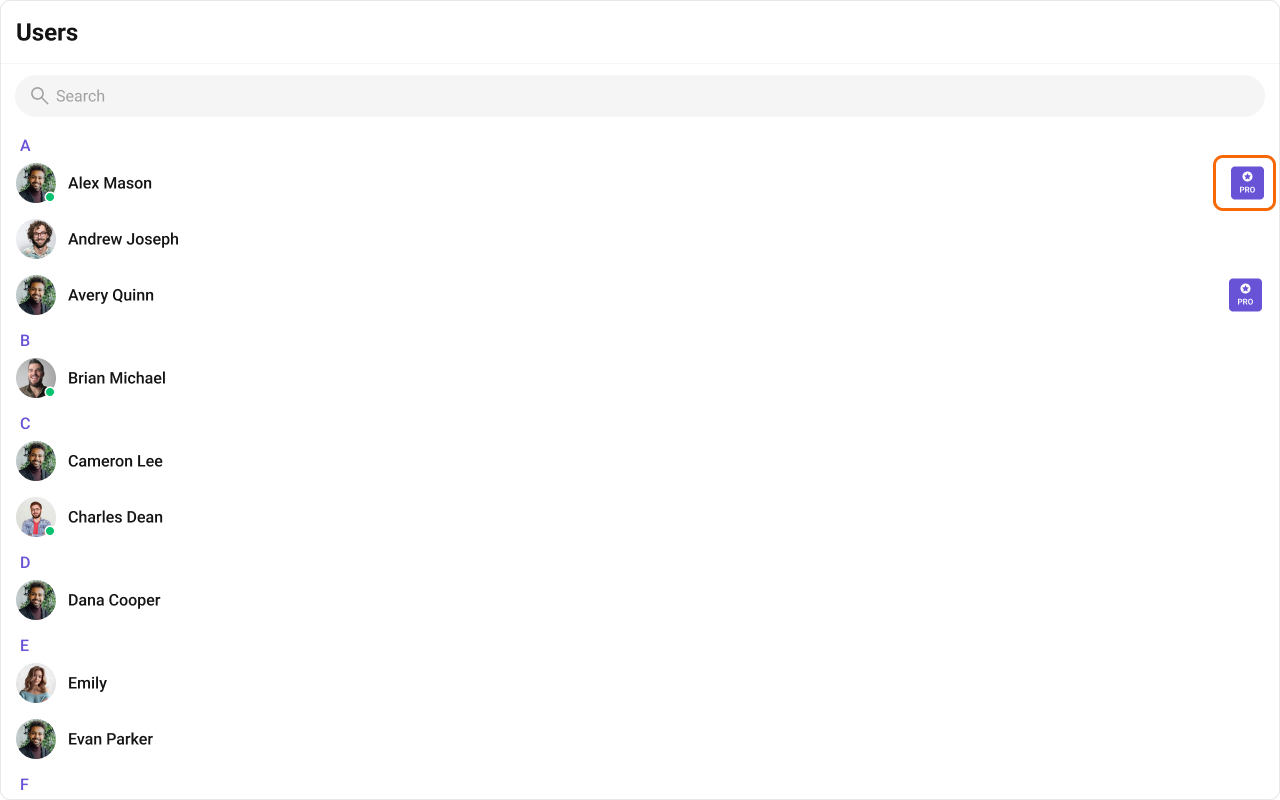
- TypeScript
- CSS
titleView
Replace the name / title text. Role badge inline example.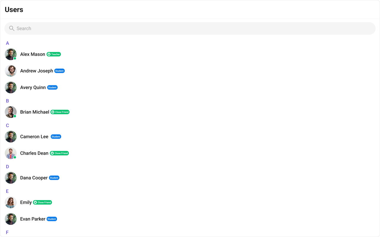
- TypeScript
- CSS
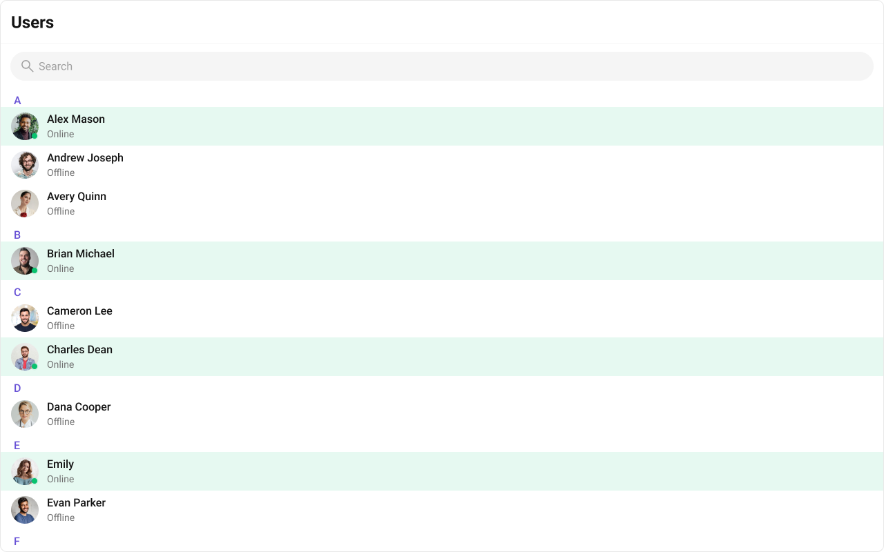
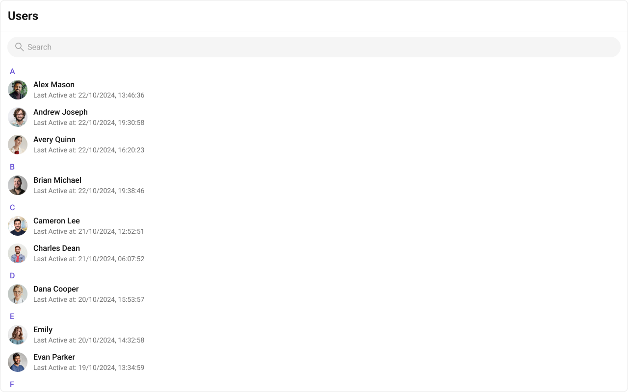
subtitleView
Replace the subtitle text for each user. Default: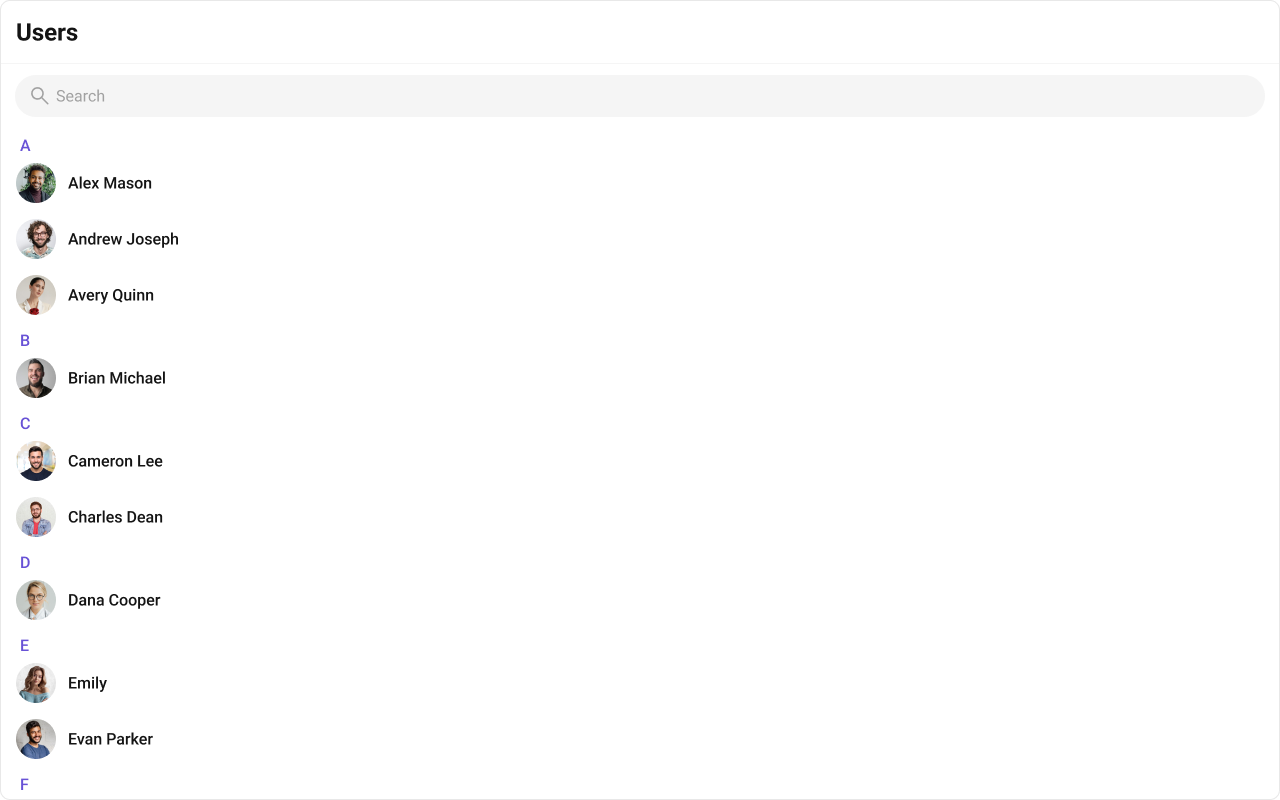
- TypeScript
- CSS
headerView
Replace the entire header bar.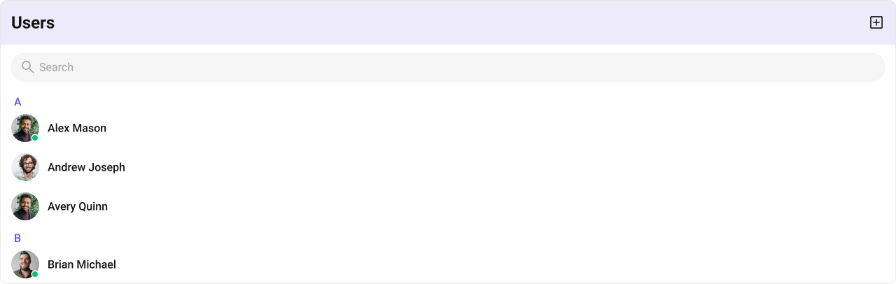
- TypeScript
- CSS
options
Replace the context menu / hover actions on each user item. Default: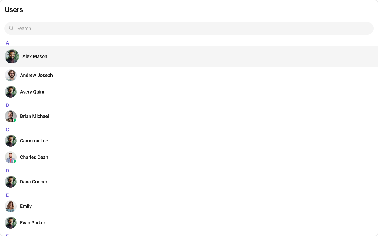
- TypeScript
- CSS
Common Patterns
Custom empty state with CTA
Friends-only list with search
Multi-select with preview strip
Hide all chrome — minimal list
CSS Architecture
The component uses CSS custom properties (design tokens) defined in@cometchat/chat-uikit-react/css-variables.css. The cascade:
- Global tokens (e.g.,
--cometchat-primary-color,--cometchat-background-color-01) are set on the.cometchatroot wrapper. - Component CSS (
.cometchat-users) consumes these tokens viavar()with fallback values. - Overrides target
.cometchat-usersdescendant selectors in a global stylesheet.
CometChatUsers exist on the same page, wrap the component in a container and scope selectors:
Key Selectors
| Target | Selector |
|---|---|
| Root | .cometchat-users |
| List item | .cometchat-users__list-item |
| Active item | .cometchat-users__list-item-active .cometchat-list-item |
| Online status | .cometchat-users__list-item-online .cometchat-list-item__status |
| Avatar | .cometchat-users__list-item .cometchat-avatar |
| Leading view | .cometchat-users__list-item .cometchat-list-item__leading-view |
| Body | .cometchat-users .cometchat-list-item__body |
| Empty state | .cometchat-users__empty-state-view |
| Error state | .cometchat-users__error-state-view |
| Shimmer loading | .cometchat-users__shimmer |
| Shimmer item | .cometchat-users__shimmer-item |
| Shimmer avatar | .cometchat-users__shimmer-item-avatar |
| Shimmer title | .cometchat-users__shimmer-item-title |
| Selected preview | .cometchat-users__selected-preview |
| Selected chip | .cometchat-users__selected-preview-chip |
| Chip name | .cometchat-users__selected-preview-chip-name |
| Chip close button | .cometchat-users__selected-preview-chip-close-button |
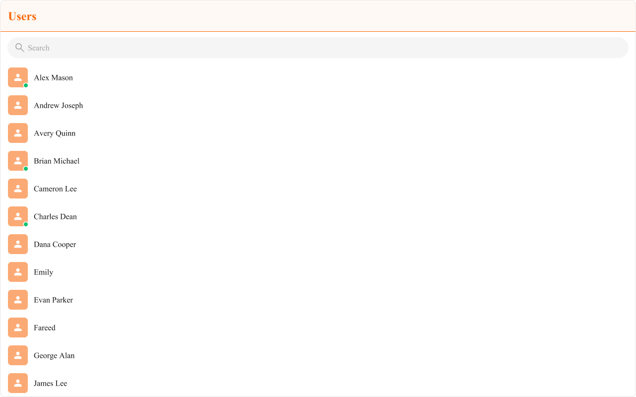
Example: Brand-themed users
Customization Matrix
| What to change | Where | Property/API | Example |
|---|---|---|---|
| Override behavior on user interaction | Component props | on<Event> callbacks | onItemClick={(u) => setActive(u)} |
| Filter which users appear | Component props | usersRequestBuilder | usersRequestBuilder={new CometChat.UsersRequestBuilder().friendsOnly(true)} |
| Toggle visibility of UI elements | Component props | hide<Feature> / show<Feature> boolean props | hideSearch={true} |
| Replace a section of the list item | Component props | <slot>View render props | itemView={(user) => <div>...</div>} |
| Change colors, fonts, spacing | Global CSS | Target .cometchat-users class | .cometchat-users .cometchat-avatar { border-radius: 8px; } |
Props
All props are optional unless noted.activeUser
Highlights the specified user in the list.| Type | CometChat.User |
| Default | undefined |
disableLoadingState
Disables the loading state while fetching users.| Type | boolean |
| Default | false |
emptyView
Custom component displayed when there are no users.| Type | JSX.Element |
| Default | Built-in empty state |
errorView
Custom component displayed when an error occurs.| Type | JSX.Element |
| Default | Built-in error state |
hideError={true}.
headerView
Custom component rendered as the entire header bar.| Type | JSX.Element |
| Default | Built-in header with title and search |
hideError
Hides the default and custom error views.| Type | boolean |
| Default | false |
errorView if set.
hideSearch
Hides the default search bar.| Type | boolean |
| Default | false |
hideUserStatus
Hides the online/offline status indicator.| Type | boolean |
| Default | false |
itemView
Custom renderer for the entire list item row.| Type | (user: CometChat.User) => JSX.Element |
| Default | Built-in list item |
leadingView
Custom renderer for the avatar / left section.| Type | (user: CometChat.User) => JSX.Element |
| Default | Built-in avatar |
loadingView
Custom component displayed during the loading state.| Type | JSX.Element |
| Default | Built-in shimmer |
onEmpty
Callback fired when the user list is empty.| Type | () => void |
| Default | undefined |
onError
Callback fired when the component encounters an error.| Type | ((error: CometChat.CometChatException) => void) | null |
| Default | undefined |
onItemClick
Callback fired when a user row is clicked.| Type | (user: CometChat.User) => void |
| Default | undefined |
onSelect
Callback fired when a user is selected/deselected. RequiresselectionMode to be set.
| Type | (user: CometChat.User, selected: boolean) => void |
| Default | undefined |
options
Custom context menu / hover actions for each user item.| Type | (user: CometChat.User) => CometChatOption[] |
| Default | undefined |
searchKeyword
Pre-fills the search and filters the user list.| Type | string |
| Default | "" |
searchRequestBuilder
Request builder with search parameters to fetch users.| Type | CometChat.UsersRequestBuilder |
| Default | undefined |
sectionHeaderKey
The property on the user object used to extract the section header character.| Type | keyof CometChat.User |
| Default | getName |
showSectionHeader={true}.
selectionMode
Enables single or multi-select checkboxes on list items.| Type | SelectionMode |
| Default | SelectionMode.none |
onSelect to capture selections.
showScrollbar
Shows the scrollbar in the user list.| Type | boolean |
| Default | false |
showSectionHeader
Displays alphabetical section headers (A, B, C…).| Type | boolean |
| Default | true |
showSelectedUsersPreview
Shows a preview strip of selected users whenselectionMode is multiple.
| Type | boolean |
| Default | false |
subtitleView
Custom renderer for the subtitle text.| Type | (user: CometChat.User) => JSX.Element |
| Default | undefined |
titleView
Custom renderer for the name / title text.| Type | (user: CometChat.User) => JSX.Element |
| Default | Built-in title |
trailingView
Custom renderer for the right section.| Type | (user: CometChat.User) => JSX.Element |
| Default | Built-in trailing view |
usersRequestBuilder
Controls which users load and in what order.| Type | CometChat.UsersRequestBuilder |
| Default | SDK default (30 per page) |
.build().
Events
CometChatUsers does not emit custom UI events. It subscribes to:
| Event | Payload | Internal behavior |
|---|---|---|
CometChatUserEvents.ccUserBlocked | CometChat.User | Updates blocked user in list |
CometChatUserEvents.ccUserUnblocked | CometChat.User | Updates unblocked user in list |
CSS Selectors
| Target | Selector |
|---|---|
| Root | .cometchat-users |
| Hide scrollbar variant | .cometchat-users-hide-scrollbar |
| List item | .cometchat-users__list-item |
| Active item | .cometchat-users__list-item-active .cometchat-list-item |
| Online status indicator | .cometchat-users__list-item-online .cometchat-list-item__status |
| Avatar | .cometchat-users__list-item .cometchat-avatar |
| Leading view | .cometchat-users__list-item .cometchat-list-item__leading-view |
| Body | .cometchat-users .cometchat-list-item__body |
| Empty state | .cometchat-users__empty-state-view |
| Empty state icon | .cometchat-users__empty-state-view-icon |
| Empty state title | .cometchat-users__empty-state-view-body-title |
| Empty state description | .cometchat-users__empty-state-view-body-description |
| Error state | .cometchat-users__error-state-view |
| Error state icon | .cometchat-users__error-state-view-icon |
| Error state title | .cometchat-users__error-state-view-body-title |
| Error state description | .cometchat-users__error-state-view-body-description |
| Shimmer loading | .cometchat-users__shimmer |
| Shimmer item | .cometchat-users__shimmer-item |
| Shimmer avatar | .cometchat-users__shimmer-item-avatar |
| Shimmer title | .cometchat-users__shimmer-item-title |
| Selected preview | .cometchat-users__selected-preview |
| Selected preview container | .cometchat-users__selected-preview-container |
| Selected chip | .cometchat-users__selected-preview-chip |
| Chip avatar | .cometchat-users__selected-preview-chip .cometchat-avatar |
| Chip name | .cometchat-users__selected-preview-chip-name |
| Chip close button | .cometchat-users__selected-preview-chip-close-button |