Documentation Index
Fetch the complete documentation index at: https://www.cometchat.com/docs/llms.txt
Use this file to discover all available pages before exploring further.
AI Integration Quick Reference
AI Integration Quick Reference
Where It Fits
CometChatSearch is a standalone search panel that searches across conversations and messages simultaneously. It renders filter chips, conversation results, and message results in a unified interface. Wire onConversationClicked and onMessageClicked to navigate to the selected result.
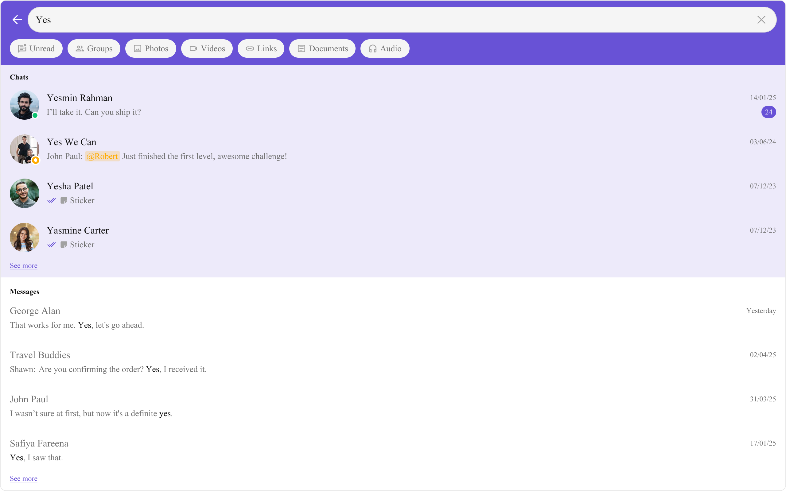
Minimal Render
.cometchat-search
Filtering Search Results
Search Scope
Control which entities are searched usingsearchIn with CometChatSearchScope.
Search Filters
Control which filter chips appear usingsearchFilters with CometChatSearchFilter.
Request Builders
PassConversationsRequestBuilder and MessagesRequestBuilder to customize the underlying SDK queries.
Scoped Search (User or Group)
Limit search to a specific user or group conversation usinguid or guid.
Actions and Events
Callback Props
onConversationClicked
Fires when a conversation is clicked in search results.onMessageClicked
Fires when a message is clicked in search results.onBack
Fires when the back button is clicked.onError
Fires on internal errors during search.Global UI Events
TheCometChatSearch component does not emit any custom UI events.
SDK Events (Real-Time, Automatic)
The component does not attach SDK listeners. Search is on-demand, not real-time.Custom View Slots
The component exposes separate view slots for conversation results and message results. All per-item slots receive their respective data object.| Slot | Signature | Replaces |
|---|---|---|
conversationItemView | (conversation: CometChat.Conversation) => JSX.Element | Entire conversation list item |
conversationLeadingView | (conversation: CometChat.Conversation) => JSX.Element | Conversation avatar |
conversationTitleView | (conversation: CometChat.Conversation) => JSX.Element | Conversation title |
conversationSubtitleView | (conversation: CometChat.Conversation) => JSX.Element | Conversation subtitle |
conversationTrailingView | (conversation: CometChat.Conversation) => JSX.Element | Conversation trailing section |
conversationOptions | (conversation: CometChat.Conversation) => CometChatOption[] | Conversation context menu |
messageItemView | (message: CometChat.BaseMessage) => JSX.Element | Entire message list item |
messageLeadingView | (message: CometChat.BaseMessage) => JSX.Element | Message avatar |
messageTitleView | (message: CometChat.BaseMessage) => JSX.Element | Message title |
messageSubtitleView | (message: CometChat.BaseMessage) => JSX.Element | Message subtitle |
messageTrailingView | (message: CometChat.BaseMessage) => JSX.Element | Message trailing section |
initialView | JSX.Element | Initial state before search |
loadingView | JSX.Element | Loading state |
emptyView | JSX.Element | Empty results state |
errorView | JSX.Element | Error state |
messageItemView
Replace the entire message list item in search results.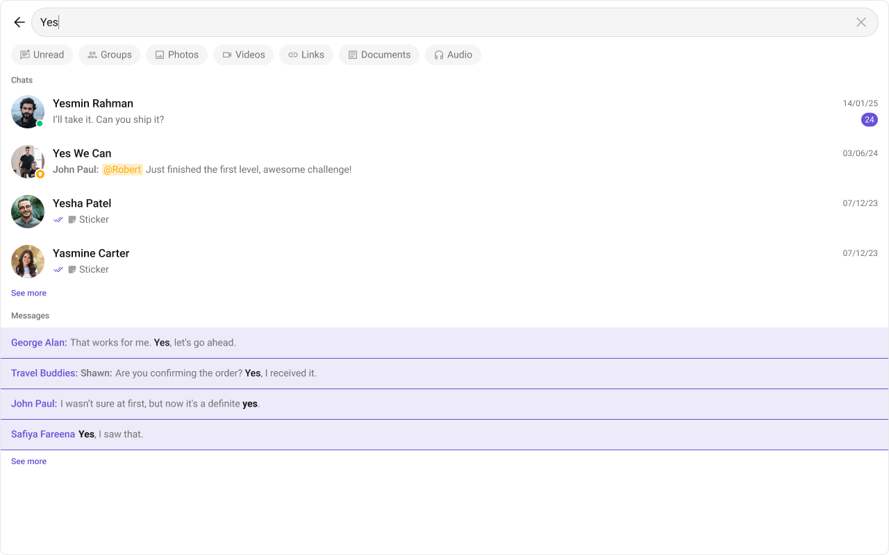
- TypeScript
- CSS
messageLeadingView
Replace the message avatar / left section.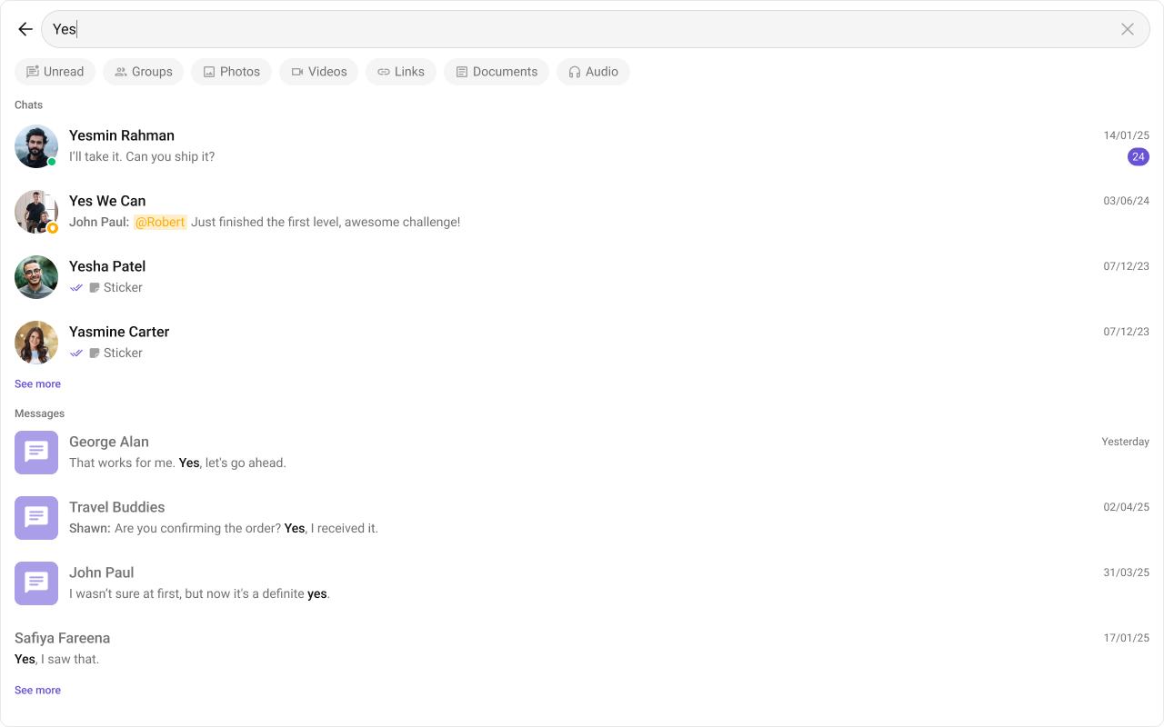
- TypeScript
- CSS
messageTitleView
Replace the message title text.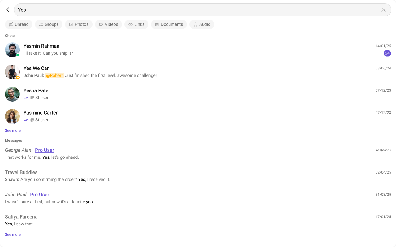
- TypeScript
- CSS
messageSubtitleView
Replace the message subtitle text.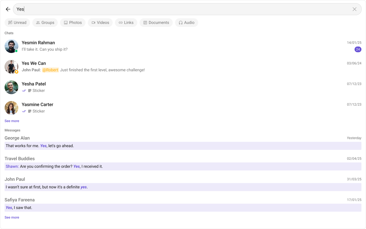
- TypeScript
- CSS
messageTrailingView
Replace the message right section.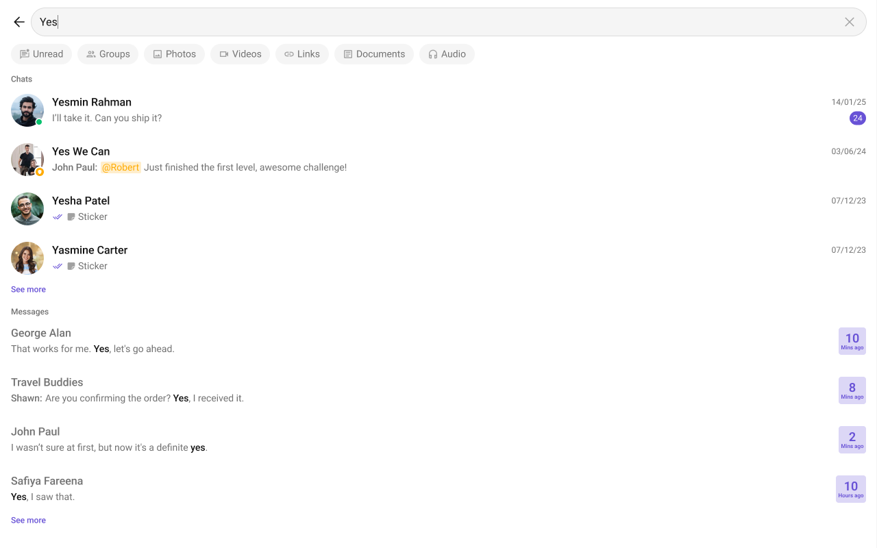
- TypeScript
- CSS
messageSentAtDateTimeFormat
Customize the message timestamp format using aCalendarObject.
Common Patterns
Messages-only search
Photos and videos filter only
Search within a specific group
CSS Architecture
The component uses CSS custom properties (design tokens) defined in@cometchat/chat-uikit-react/css-variables.css. The cascade:
- Global tokens set on the
.cometchatroot wrapper. - Component CSS (
.cometchat-search) consumes these tokens viavar(). - Overrides target
.cometchat-searchdescendant selectors.
Key Selectors
| Target | Selector |
|---|---|
| Root | .cometchat-search |
| Header | .cometchat-search__header |
| Search input | .cometchat-search__input |
| Back button | .cometchat-search__back-button |
| Clear button | .cometchat-search__input-clear-button |
| Filter bar | .cometchat-search__body-filters |
| Filter chip | .cometchat-search__body-filter |
| Active filter chip | .cometchat-search__body-filter-active |
| Results container | .cometchat-search__results |
| Conversations section | .cometchat-search__conversations |
| Messages section | .cometchat-search__messages |
| Message list item | .cometchat-search-messages__list-item |
| Initial view | .cometchat-search__initial-view |
| Empty view | .cometchat-search__empty-view |
| Error view | .cometchat-search__error-view |
| Shimmer loading | .cometchat-search__shimmer |
| See more button (conversations) | .cometchat-search-conversations__see-more |
| See more button (messages) | .cometchat-search-messages__see-more |
| Text highlight | .cometchat-search .cometchat-text-highlight |
Example: Themed search
Customization Matrix
| What to change | Where | Property/API | Example |
|---|---|---|---|
| Handle result clicks | Component props | onConversationClicked / onMessageClicked | onMessageClicked={(msg) => navigate(msg)} |
| Control search scope | Component props | searchIn | searchIn={[CometChatSearchScope.Messages]} |
| Control filter chips | Component props | searchFilters / initialSearchFilter | searchFilters={[CometChatSearchFilter.Photos]} |
| Scope to user/group | Component props | uid / guid | uid="user_id" |
| Customize SDK queries | Component props | conversationsRequestBuilder / messagesRequestBuilder | conversationsRequestBuilder={builder} |
| Replace result items | Component props | View slot props | messageItemView={(msg) => <div>...</div>} |
| Change colors, fonts, spacing | Global CSS | Target .cometchat-search class | .cometchat-search__header { background: red; } |
Props
All props are optional. Sorted alphabetically.conversationItemView
Custom renderer for the entire conversation list item in search results.| Type | (conversation: CometChat.Conversation) => JSX.Element |
| Default | Built-in list item |
conversationLeadingView
Custom renderer for the conversation avatar / left section.| Type | (conversation: CometChat.Conversation) => JSX.Element |
| Default | Built-in avatar |
conversationOptions
Custom context menu actions for conversation items.| Type | ((conversation: CometChat.Conversation) => CometChatOption[]) | null |
| Default | undefined |
conversationsRequestBuilder
Controls which conversations appear in search results.| Type | CometChat.ConversationsRequestBuilder |
| Default | SDK default with search keyword |
conversationSubtitleView
Custom renderer for the conversation subtitle.| Type | (conversation: CometChat.Conversation) => JSX.Element |
| Default | Built-in subtitle |
conversationTitleView
Custom renderer for the conversation title.| Type | (conversation: CometChat.Conversation) => JSX.Element |
| Default | Built-in title |
conversationTrailingView
Custom renderer for the conversation trailing section.| Type | (conversation: CometChat.Conversation) => JSX.Element |
| Default | Built-in trailing view |
emptyView
Custom component displayed when no search results are found.| Type | JSX.Element |
| Default | Built-in empty state |
errorView
Custom component displayed when an error occurs.| Type | JSX.Element |
| Default | Built-in error state |
guid
Limits search to messages in a specific group.| Type | string |
| Default | undefined |
hideBackButton
Hides the back button.| Type | boolean |
| Default | false |
hideGroupType
Hides the group type icon in conversation results.| Type | boolean |
| Default | false |
hideReceipts
Hides message read/delivery receipt indicators.| Type | boolean |
| Default | false |
hideUserStatus
Hides the online/offline status indicator.| Type | boolean |
| Default | false |
initialSearchFilter
The filter active by default on load.| Type | CometChatSearchFilter |
| Default | undefined |
initialView
Custom component displayed before the user enters a search query.| Type | JSX.Element |
| Default | Built-in initial state |
loadingView
Custom component displayed during search loading.| Type | JSX.Element |
| Default | Built-in shimmer |
messageItemView
Custom renderer for the entire message list item in search results.| Type | (message: CometChat.BaseMessage) => JSX.Element |
| Default | Built-in list item |
messageLeadingView
Custom renderer for the message avatar / left section.| Type | (message: CometChat.BaseMessage) => JSX.Element |
| Default | Built-in leading view |
messageSentAtDateTimeFormat
Format for message timestamps.| Type | CalendarObject |
| Default | Component default |
messagesRequestBuilder
Controls which messages appear in search results.| Type | CometChat.MessagesRequestBuilder |
| Default | SDK default with search keyword |
messageSubtitleView
Custom renderer for the message subtitle.| Type | (message: CometChat.BaseMessage) => JSX.Element |
| Default | Built-in subtitle |
messageTitleView
Custom renderer for the message title.| Type | (message: CometChat.BaseMessage) => JSX.Element |
| Default | Built-in title |
messageTrailingView
Custom renderer for the message trailing section.| Type | (message: CometChat.BaseMessage) => JSX.Element |
| Default | Built-in trailing view |
onBack
Callback fired when the back button is clicked.| Type | () => void |
| Default | () => {} |
onConversationClicked
Callback fired when a conversation is clicked in search results.| Type | (conversation: CometChat.Conversation, searchKeyword?: string) => void |
| Default | undefined |
onError
Callback fired when the component encounters an error.| Type | (error: CometChat.CometChatException) => void |
| Default | undefined |
onMessageClicked
Callback fired when a message is clicked in search results.| Type | (message: CometChat.BaseMessage, searchKeyword?: string) => void |
| Default | undefined |
searchFilters
Filters rendered in the search filter bar.| Type | CometChatSearchFilter[] |
| Default | All available filters |
searchIn
Scopes to search in.| Type | CometChatSearchScope[] |
| Default | [CometChatSearchScope.All] |
textFormatters
Custom text formatters for message content.| Type | CometChatTextFormatter[] |
| Default | [] |
uid
Limits search to messages with a specific user.| Type | string |
| Default | undefined |
Events
TheCometChatSearch component does not emit any custom UI events.
CSS Selectors
| Target | Selector |
|---|---|
| Root | .cometchat-search |
| Header | .cometchat-search__header |
| Search input | .cometchat-search__input |
| Back button | .cometchat-search__back-button |
| Clear button | .cometchat-search__input-clear-button |
| Filter bar | .cometchat-search__body-filters |
| Filter chip | .cometchat-search__body-filter |
| Active filter chip | .cometchat-search__body-filter-active |
| Results container | .cometchat-search__results |
| Conversations section | .cometchat-search__conversations |
| Conversation list item | .cometchat-search__conversations-list-item |
| Active conversation item | .cometchat-search__conversations-list-item-active .cometchat-list-item |
| Conversation subtitle | .cometchat-search__conversations-subtitle |
| Conversation trailing view | .cometchat-search__conversations-trailing-view |
| Conversation badge count | .cometchat-search__conversations-trailing-view-badge-count |
| Messages section | .cometchat-search__messages |
| Message list item | .cometchat-search-messages__list-item |
| Message subtitle | .cometchat-search-messages__subtitle-text |
| Message trailing view | .cometchat-search-messages__trailing-view |
| Date separator | .cometchat-search-messages__date-separator |
| See more (conversations) | .cometchat-search-conversations__see-more |
| See more (messages) | .cometchat-search-messages__see-more |
| Text highlight | .cometchat-search .cometchat-text-highlight |
| Initial view | .cometchat-search__initial-view |
| Empty view | .cometchat-search__empty-view |
| Error view | .cometchat-search__error-view |
| Shimmer loading | .cometchat-search__shimmer |
| Online status | .cometchat-search__conversations-list-item-online .cometchat-list-item__status |
| Password group | .cometchat-search__conversations-list-item-password .cometchat-list-item__status |
| Private group | .cometchat-search__conversations-list-item-private .cometchat-list-item__status |