AI Integration Quick Reference
AI Integration Quick Reference
Where It Fits
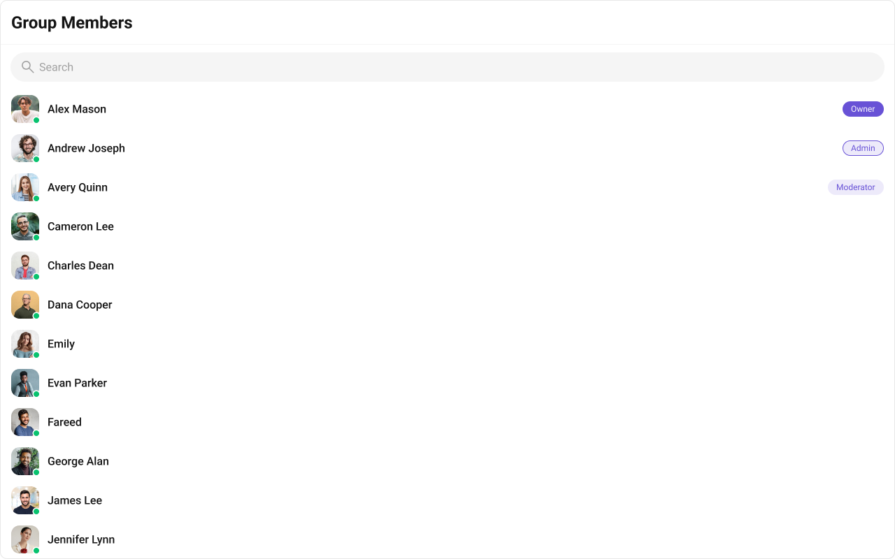
CometChatGroupMembers is a panel component that renders the member list for a specific group. It requires a group prop and provides built-in member management actions (kick, ban, scope change) based on the logged-in user’s role. Typically rendered alongside the message view in a group chat layout.

Minimal Render
.cometchat-group-members
Filtering Group Members
Pass aCometChat.GroupMembersRequestBuilder to groupMemberRequestBuilder. Pass the builder instance — not the result of .build().
Filter Recipes
| Recipe | Code |
|---|---|
| Limit to 10 per page | new CometChat.GroupMembersRequestBuilder("GUID").setLimit(10) |
| Search by keyword | new CometChat.GroupMembersRequestBuilder("GUID").setSearchKeyword("john") |
| Admins and moderators only | new CometChat.GroupMembersRequestBuilder("GUID").setScopes(["admin", "moderator"]) |
searchRequestBuilder prop accepts a separate GroupMembersRequestBuilder for filtering when the search bar is active.
Refer to GroupMembersRequestBuilder for the full builder API.
Actions and Events
Callback Props
onItemClick
Fires when a member row is tapped.onSelect
Fires when a member is checked/unchecked in multi-select mode. RequiresselectionMode to be set.
onEmpty
Fires when the member list has no data to display.onError
Fires on internal errors (network failure, auth issue, SDK exception).Global UI Events
CometChatGroupEvents emits events subscribable from anywhere in the application. The component both emits and subscribes to these events.
Events emitted by this component:
| Event | Fires when | Payload |
|---|---|---|
ccGroupMemberKicked | A member is kicked | IGroupMemberKickedBanned |
ccGroupMemberBanned | A member is banned | IGroupMemberKickedBanned |
ccGroupMemberScopeChanged | A member’s scope changes | IGroupMemberScopeChanged |
| Event | Internal behavior |
|---|---|
ccGroupMemberKicked | Removes the kicked member from the list |
ccGroupMemberBanned | Removes the banned member from the list |
ccGroupMemberScopeChanged | Updates the member’s scope in the list |
ccGroupMemberAdded | Appends newly added members to the list |
SDK Events (Real-Time, Automatic)
The component listens to these SDK events internally. No manual attachment needed unless additional side effects are required.| SDK Listener | Internal behavior |
|---|---|
onGroupMemberScopeChanged | Updates the member’s scope in the list |
onGroupMemberKicked | Removes the kicked member from the list |
onGroupMemberBanned | Removes the banned member from the list |
onMemberAddedToGroup | Appends the new member to the list |
onGroupMemberLeft | Removes the member who left from the list |
onGroupMemberJoined | Appends the joined member to the list |
onUserOnline / onUserOffline | Updates the member’s online/offline status (disabled when hideUserStatus={true}) |
In React 18 StrictMode,
useEffect runs twice on mount in development. The component handles listener cleanup internally, but any additional listeners added alongside the component need cleanup in the useEffect return function to avoid duplicate event handling.Custom View Slots
Each slot replaces a section of the default UI. Slots that accept a member parameter receive theCometChat.GroupMember object for that row.
| Slot | Signature | Replaces |
|---|---|---|
itemView | (groupMember: CometChat.GroupMember) => JSX.Element | Entire list item row |
leadingView | (groupMember: CometChat.GroupMember) => JSX.Element | Avatar / left section |
titleView | (groupMember: CometChat.GroupMember) => JSX.Element | Name / title text |
subtitleView | (groupMember: CometChat.GroupMember) => JSX.Element | Subtitle text |
trailingView | (groupMember: CometChat.GroupMember) => JSX.Element | Right section (scope badge / actions) |
headerView | JSX.Element | Entire header bar |
loadingView | JSX.Element | Loading spinner |
emptyView | JSX.Element | Empty state |
errorView | JSX.Element | Error state |
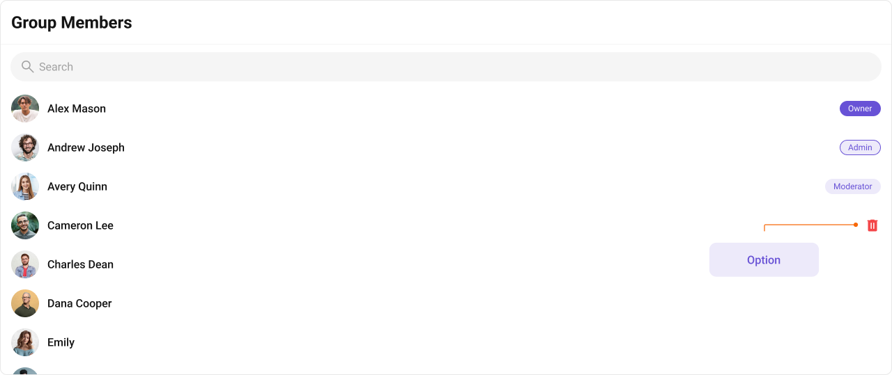
options | (group: CometChat.Group, groupMember: CometChat.GroupMember) => CometChatOption[] | Context menu / hover actions |
itemView
Replace the entire list item row. Default:
- TypeScript
- CSS
subtitleView
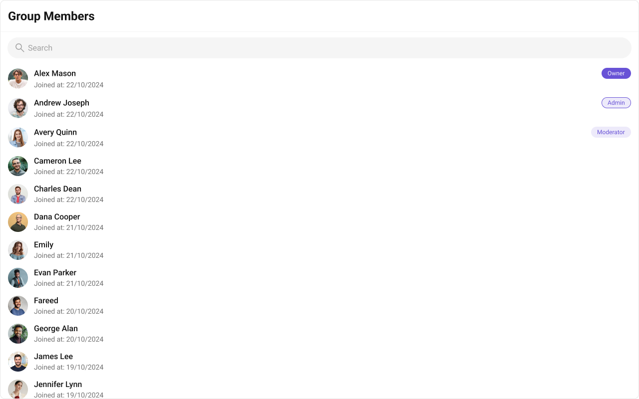
Replace the subtitle text. Joined date example. Default: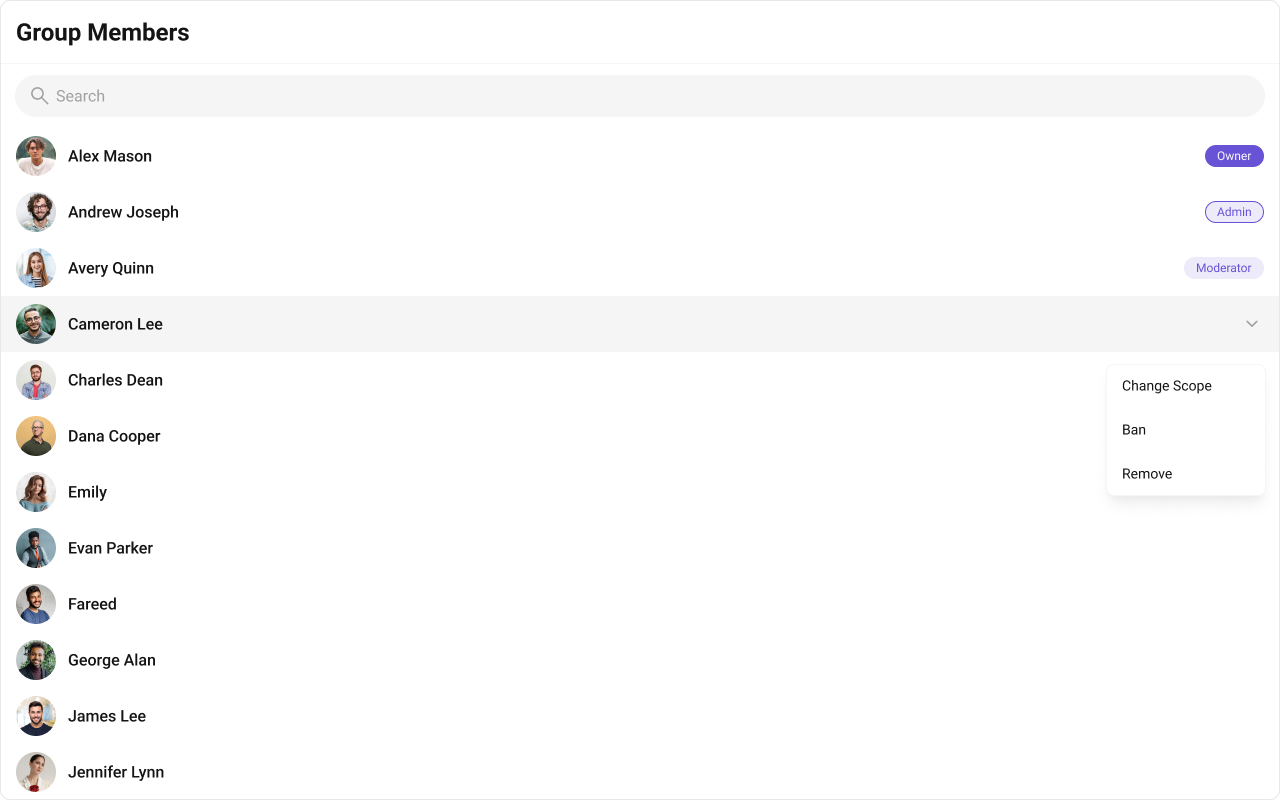
- TypeScript
- CSS
trailingView
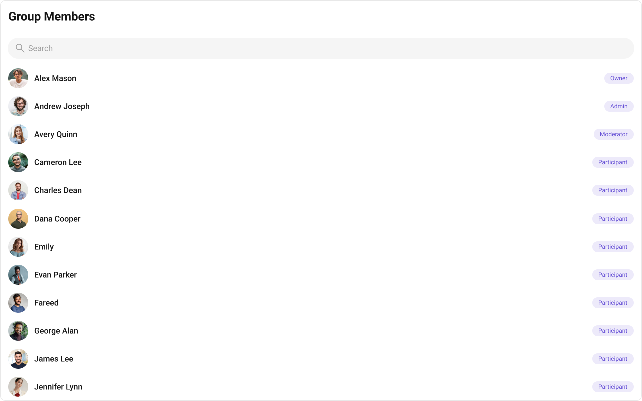
Replace the right section. Scope tag example. Default:
- TypeScript
- CSS
headerView
Replace the entire header bar.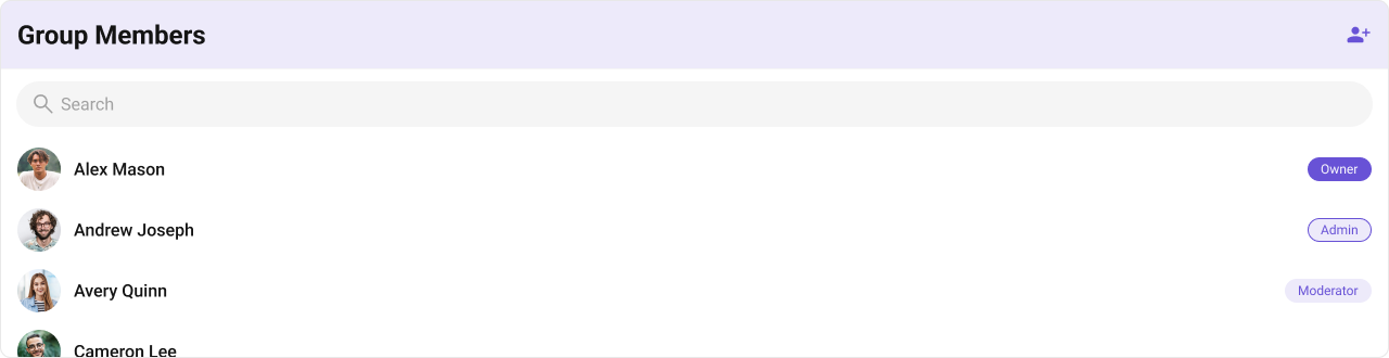
- TypeScript
- CSS
options
Replace the context menu / hover actions on each member item. Theoptions callback receives both the group and the member.
- TypeScript
- CSS
Common Patterns
Hide member management actions
Admins and moderators only
Minimal chrome
CSS Architecture
The component uses CSS custom properties (design tokens) defined in@cometchat/chat-uikit-react/css-variables.css. The cascade:
- Global tokens (e.g.,
--cometchat-primary-color,--cometchat-background-color-01) are set on the.cometchatroot wrapper. - Component CSS (
.cometchat-group-members) consumes these tokens viavar()with fallback values. - Overrides target
.cometchat-group-membersdescendant selectors in a global stylesheet.
Key Selectors
| Target | Selector |
|---|---|
| Root | .cometchat-group-members |
| Header title | .cometchat-group-members .cometchat-list__header-title |
| List item | .cometchat-group-members .cometchat-list-item |
| Body title | .cometchat-group-members .cometchat-list-item__body-title |
| Trailing view | .cometchat-group-members .cometchat-list-item__trailing-view |
| Scope badge | .cometchat-group-members__trailing-view-options |
| Admin scope badge | .cometchat-group-members__trailing-view-options-admin |
| Owner scope badge | .cometchat-group-members__trailing-view-options-owner |
| Participant scope badge | .cometchat-group-members__trailing-view-options-participant |
| Online status | .cometchat-group-members__list-item-online .cometchat-list-item__status |
| Scope change dropdown | .cometchat-group-members .cometchat-menu-list__sub-menu |
| Empty state | .cometchat-group-members__empty-state-view |
| Error state | .cometchat-group-members__error-state-view |
| Shimmer loading | .cometchat-group-members__shimmer |
| Backdrop (modal) | .cometchat-group-members__backdrop |
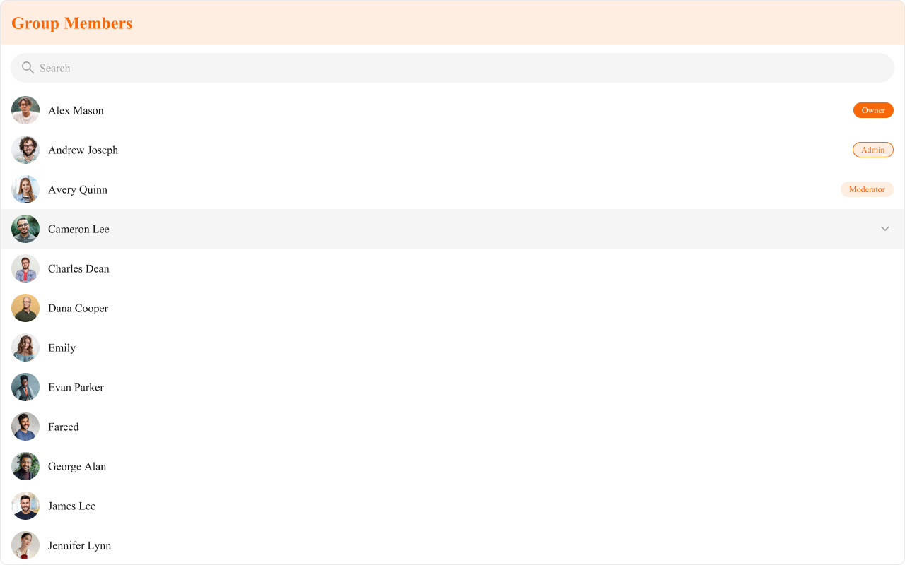
Example: Brand-themed group members
Customization Matrix
| What to change | Where | Property/API | Example |
|---|---|---|---|
| Override behavior on user interaction | Component props | on<Event> callbacks | onItemClick={(m) => openProfile(m)} |
| Filter which members appear | Component props | groupMemberRequestBuilder | groupMemberRequestBuilder={new CometChat.GroupMembersRequestBuilder("GUID").setScopes(["admin"])} |
| Toggle visibility of UI elements | Component props | hide<Feature> boolean props | hideKickMemberOption={true} |
| Replace a section of the list item | Component props | <slot>View render props | subtitleView={(m) => <div>{m.getScope()}</div>} |
| Change colors, fonts, spacing | Global CSS | Target .cometchat-group-members class | .cometchat-group-members .cometchat-avatar { border-radius: 8px; } |
Props
All props are optional unless noted otherwise.disableLoadingState
Skips the loading spinner when re-fetching.| Type | boolean |
| Default | false |
emptyView
Custom component displayed when there are no members.| Type | JSX.Element |
| Default | Built-in empty state |
errorView
Custom component displayed when an error occurs.| Type | JSX.Element |
| Default | Built-in error state |
hideError={true}.
group
The group whose members are fetched and displayed. Required.| Type | CometChat.Group |
| Default | — |
groupMemberRequestBuilder
Controls which members load and in what order.| Type | CometChat.GroupMembersRequestBuilder |
| Default | SDK default (30 per page) |
.build().
headerView
Custom component rendered as the entire header bar.| Type | JSX.Element |
| Default | Built-in header with title |
hideBanMemberOption
Hides the option to ban a member from the group.| Type | boolean |
| Default | false |
hideError
Hides the default and custom error views.| Type | boolean |
| Default | false |
hideKickMemberOption
Hides the option to kick a member from the group.| Type | boolean |
| Default | false |
hideScopeChangeOption
Hides the option to change the scope of a group member.| Type | boolean |
| Default | false |
hideSearch
Hides the default search bar.| Type | boolean |
| Default | false |
hideUserStatus
Hides the user’s online/offline status indicator.| Type | boolean |
| Default | false |
itemView
Custom renderer for the entire list item row.| Type | (groupMember: CometChat.GroupMember) => JSX.Element |
| Default | Built-in list item |
leadingView
Custom renderer for the avatar / left section.| Type | (groupMember: CometChat.GroupMember) => JSX.Element |
| Default | Built-in avatar |
loadingView
Custom component displayed during the loading state.| Type | JSX.Element |
| Default | Built-in shimmer |
onEmpty
Callback fired when the member list is empty.| Type | () => void |
| Default | undefined |
onError
Callback fired when the component encounters an error.| Type | ((error: CometChat.CometChatException) => void) | null |
| Default | undefined |
onItemClick
Callback fired when a member row is clicked.| Type | (groupMember: CometChat.GroupMember) => void |
| Default | undefined |
onSelect
Callback fired when a member is selected/deselected. RequiresselectionMode to be set.
| Type | (groupMember: CometChat.GroupMember, selected: boolean) => void |
| Default | undefined |
options
Custom context menu / hover actions for each member item.| Type | (group: CometChat.Group, groupMember: CometChat.GroupMember) => CometChatOption[] |
| Default | undefined |
searchKeyword
Pre-fills the search and filters the member list.| Type | string |
| Default | "" |
searchRequestBuilder
Controls filtering when the search bar is active.| Type | CometChat.GroupMembersRequestBuilder |
| Default | undefined |
selectionMode
Enables single or multi-select checkboxes on list items.| Type | SelectionMode |
| Default | SelectionMode.none |
showScrollbar
Shows the scrollbar in the member list.| Type | boolean |
| Default | false |
subtitleView
Custom renderer for the subtitle text.| Type | (groupMember: CometChat.GroupMember) => JSX.Element |
| Default | Built-in subtitle |
titleView
Custom renderer for the name / title text.| Type | (groupMember: CometChat.GroupMember) => JSX.Element |
| Default | Built-in title |
trailingView
Custom renderer for the right section (scope badge / actions).| Type | (groupMember: CometChat.GroupMember) => JSX.Element |
| Default | Built-in trailing view |
Events
| Event | Payload | Fires when |
|---|---|---|
CometChatGroupEvents.ccGroupMemberKicked | IGroupMemberKickedBanned | Member kicked |
CometChatGroupEvents.ccGroupMemberBanned | IGroupMemberKickedBanned | Member banned |
CometChatGroupEvents.ccGroupMemberScopeChanged | IGroupMemberScopeChanged | Member scope changed |
CometChatGroupEvents.ccGroupMemberAdded | IGroupMemberAdded | Members added |
Subject instances. Subscribe with .subscribe(), unsubscribe with the returned subscription’s .unsubscribe().
CSS Selectors
| Target | Selector |
|---|---|
| Root | .cometchat-group-members |
| Header title | .cometchat-group-members .cometchat-list__header-title |
| List item | .cometchat-group-members .cometchat-list-item |
| Body title | .cometchat-group-members .cometchat-list-item__body-title |
| Trailing view | .cometchat-group-members .cometchat-list-item__trailing-view |
| Scope badge | .cometchat-group-members__trailing-view-options |
| Admin scope badge | .cometchat-group-members__trailing-view-options-admin |
| Owner scope badge | .cometchat-group-members__trailing-view-options-owner |
| Participant scope badge | .cometchat-group-members__trailing-view-options-participant |
| Online status | .cometchat-group-members__list-item-online .cometchat-list-item__status |
| Scope change dropdown | .cometchat-group-members .cometchat-menu-list__sub-menu |
| Scope change list | .cometchat-group-members .cometchat-menu-list__sub-menu-list |
| Empty state | .cometchat-group-members__empty-state-view |
| Empty state title | .cometchat-group-members__empty-state-view-body-title |
| Error state | .cometchat-group-members__error-state-view |
| Error state title | .cometchat-group-members__error-state-view-body-title |
| Shimmer loading | .cometchat-group-members__shimmer |
| Backdrop | .cometchat-group-members__backdrop |