AI Integration Quick Reference
AI Integration Quick Reference
Overview
CometChatAIAssistantChat is an AI agent chat interface. It renders a full chat experience with streaming responses, suggested message pills, tool calling support, and a conversation history sidebar. Pass a CometChat.User representing the AI assistant and the component handles the rest — message threading, streaming display, and composer integration.
Live Preview — interact with the default AI assistant chat.Open in Storybook ↗
The component handles:
- Streaming AI responses with configurable speed
- Suggested message pills (from props or user metadata)
- Tool calling via
aiAssistantTools - Conversation history sidebar
- New chat creation
- Custom header views
Usage
Flat API
With Tool Calling
With Custom Header
Full Layout Example
Actions and Events
Callback Props
| Prop | Signature | Fires when |
|---|---|---|
onSendButtonClick | (message: CometChat.BaseMessage) => void | User sends a message |
onBackButtonClicked | () => void | Back button is clicked |
onCloseButtonClicked | () => void | Close button is clicked |
onError | ((error: CometChat.CometChatException) => void) | null | SDK error occurs |
Events Emitted
UI events this component publishes:| Event | Payload | Fires when |
|---|---|---|
ui:compose/text | { text } | Suggestion pill clicked (sets text in composer) |
Events Received
None.SDK Listeners (Automatic)
None directly — the component usesCometChatMessageList internally which handles SDK listeners for message updates. The AI streaming is handled via CometChat.addAIAssistantListener.
Customization
View Props
Use view props to replace sections of the default UI while keeping the component’s behavior intact:| Slot | Signature | Replaces |
|---|---|---|
emptyChatImageView | ReactNode | AI avatar/icon in empty state |
emptyChatGreetingView | ReactNode | Greeting message in empty state |
emptyChatIntroMessageView | ReactNode | Intro message in empty state |
emptyView | ReactNode | Entire empty state (replaces default greeting) |
loadingView | ReactNode | Loading shimmer |
errorView | ReactNode | Error state |
headerItemView | ReactNode | Entire header (replaces default) |
headerTitleView | ReactNode | Header title |
headerSubtitleView | ReactNode | Header subtitle |
headerLeadingView | ReactNode | Header avatar area |
headerTrailingView | ReactNode | Header trailing section |
headerAuxiliaryButtonView | ReactNode | Header auxiliary buttons (New Chat + History) |
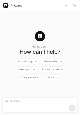
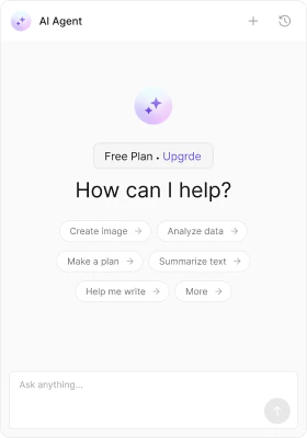
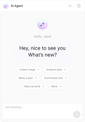
emptyChatImageView
emptyChatGreetingView
- TypeScript
- CSS
emptyChatIntroMessageView
- TypeScript
- CSS
CSS Styling
Override design tokens on the component selector:Props
user is required. All other props are optional.
user
The AI assistant user entity. This is the CometChat user that represents the AI agent.| Type | CometChat.User |
| Default | REQUIRED |
streamingSpeed
Milliseconds between text chunks during streaming display.| Type | number |
| Default | 30 |
aiAssistantTools
Tool handlers for AI function calls. Maps tool names to handler functions.| Type | CometChatAIAssistantTools |
| Default | undefined |
loadLastAgentConversation
Auto-load the most recent conversation with the AI assistant on mount.| Type | boolean |
| Default | false |
hideSuggestedMessages
Hide the suggestion pills in the empty chat state.| Type | boolean |
| Default | false |
suggestedMessages
Custom suggestion texts displayed as pills in the empty state. Overrides suggestions from user metadata.| Type | string[] |
| Default | [] (falls back to user metadata suggestedMessages) |
emptyChatImageView
Custom image/icon view for the empty chat state.| Type | ReactNode |
| Default | Built-in AI avatar |
emptyChatGreetingView
Custom greeting message view for the empty chat state.| Type | ReactNode |
| Default | User’s greetingMessage metadata or display name |
emptyChatIntroMessageView
Custom intro message view for the empty chat state.| Type | ReactNode |
| Default | User’s introductoryMessage metadata or “I am here to assist you!“ |
hideChatHistory
Hide the chat history sidebar button in the header.| Type | boolean |
| Default | false |
hideNewChat
Hide the “New Chat” button in the header.| Type | boolean |
| Default | false |
showBackButton
Show the back button in the header.| Type | boolean |
| Default | false |
showCloseButton
Show the close button in the header.| Type | boolean |
| Default | false |
onBackButtonClicked
Callback when the back button is clicked.| Type | () => void |
| Default | undefined |
onCloseButtonClicked
Callback when the close button is clicked.| Type | () => void |
| Default | undefined |
onSendButtonClick
Callback when a message is sent to the AI assistant.| Type | (message: CometChat.BaseMessage) => void |
| Default | undefined |
emptyView
Custom empty state view. Replaces the entire default greeting (image + greeting + intro + suggestions).| Type | ReactNode |
| Default | Built-in greeting with suggestions |
loadingView
Custom loading view.| Type | ReactNode |
| Default | Built-in loading state |
errorView
Custom error view.| Type | ReactNode |
| Default | Built-in error state |
onError
Callback when an SDK error occurs.| Type | ((error: CometChat.CometChatException) => void) | null |
| Default | null |
className
Additional CSS class name applied to the root element.| Type | string |
| Default | undefined |
parentMessageId
Load a specific conversation thread by parent message ID.| Type | number |
| Default | undefined |
headerItemView
Custom view that replaces the entire header.| Type | ReactNode |
| Default | Built-in CometChatMessageHeader |
headerTitleView
Custom title view for the header.| Type | ReactNode |
| Default | AI user’s display name |
headerSubtitleView
Custom subtitle view for the header.| Type | ReactNode |
| Default | Built-in subtitle |
headerLeadingView
Custom leading view (avatar area) for the header.| Type | ReactNode |
| Default | AI user’s avatar |
headerTrailingView
Custom trailing view for the header.| Type | ReactNode |
| Default | undefined |
headerAuxiliaryButtonView
Custom auxiliary button view for the header. Replaces the default New Chat + History buttons.| Type | ReactNode |
| Default | Built-in New Chat + History buttons |
CSS Selectors
| Target | Selector |
|---|---|
| Root container | .cometchat-ai-assistant-chat |
| Header | .cometchat-ai-assistant-chat__header |
| Body | .cometchat-ai-assistant-chat__body |
| Empty state | .cometchat-ai-assistant-chat__empty-state |
| Empty state icon | .cometchat-ai-assistant-chat__empty-state-icon |
| Greeting message | .cometchat-ai-assistant-chat__empty-state-greeting-message |
| Intro message | .cometchat-ai-assistant-chat__empty-state-intro-message |
| Suggested messages | .cometchat-ai-assistant-chat__empty-state-suggested-messages |
Next Steps
Message List
Display messages in a conversation
Message Composer
Compose and send messages
Theming
Customize colors, fonts, and spacing