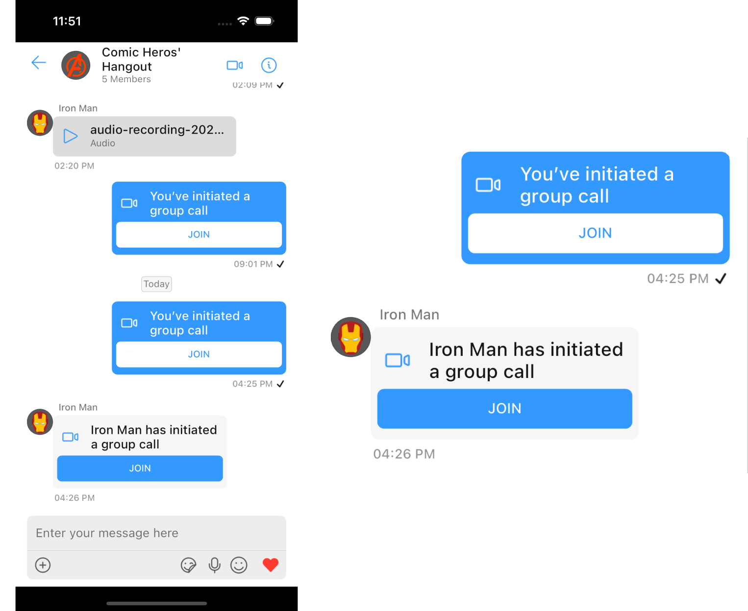
CometChatCallBubble is a widget that displays the call information and a button to join a direct call.
If CometChatMessages has been launched for a Group only the video call button will be present in the CometChatMessageHeader, pressing on which shall navigate the user to the CometChatOngoingCall Widget and a CustomMessage will be sent in the background with details for other group members to join the call, this CustomMessage will be displayed on the CometChatMessageList using this CometChatCallBubble.
Usage
CometChatCallBubble can be used as a child Widget for a Container or SizedBox or along with other children Widgets in a Row or Column.
- Dart
Properties
| Property | Type | Description |
|---|---|---|
| icon | Widget | icon to show in the leading view of the bubble |
| title | String | the title to be displayed |
| buttonText | String | the text to be displayed on the button |
| onTap | Function(BuildContext) | onTap can be used to execute some tasks by tapping the button |
| callBubbleStyle | CallBubbleStyle | a CallBubbleStyle object will be used to customize the appearance of the widget |
| alignment | BubbleAlignment | alignment will be used to align the widget to determine the appropriate background color and text color |
| theme | CometChatTheme | used to set custom theme |
callBubbleStyle
ACallBubbleStyle object will be used to customize the appearance of the widget
| Property | Type | Description |
|---|---|---|
| titleStyle | TextStyle | sets the style for the text shown in the title of the CometChatCallBubble |
| subtitleStyle | TextStyle | sets the style for the text shown in the subtitle of the CometChatCallBubble |
| buttonTextStyle | TextStyle | sets the style for the text shown on the button of the CometChatCallBubble |
| buttonBackground | Color | sets the color of the join call button of the call bubble |
| iconTint | Color | sets the color for the icon shown in the leading view of the CometChatCallBubble |
| background | Color | sets the background color of the CometChatCallBubble |
| width | double | used to set width |
| height | double | used to set height |
| gradient | Gradient | used to set a gradient background |
| border | BoxBorder | used to set border |
| borderRadius | double | used to set corner radius |
- Dart