Overview
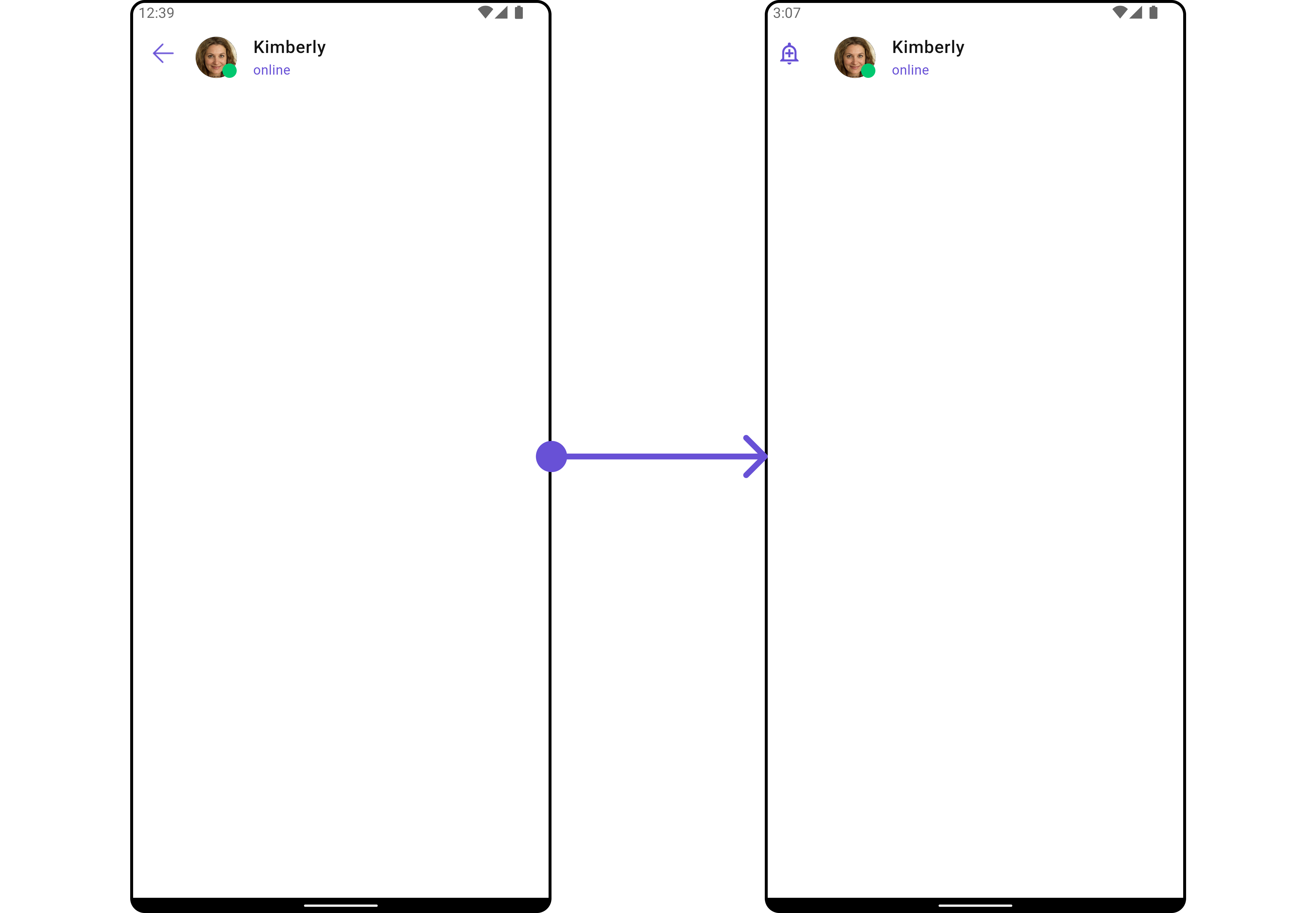
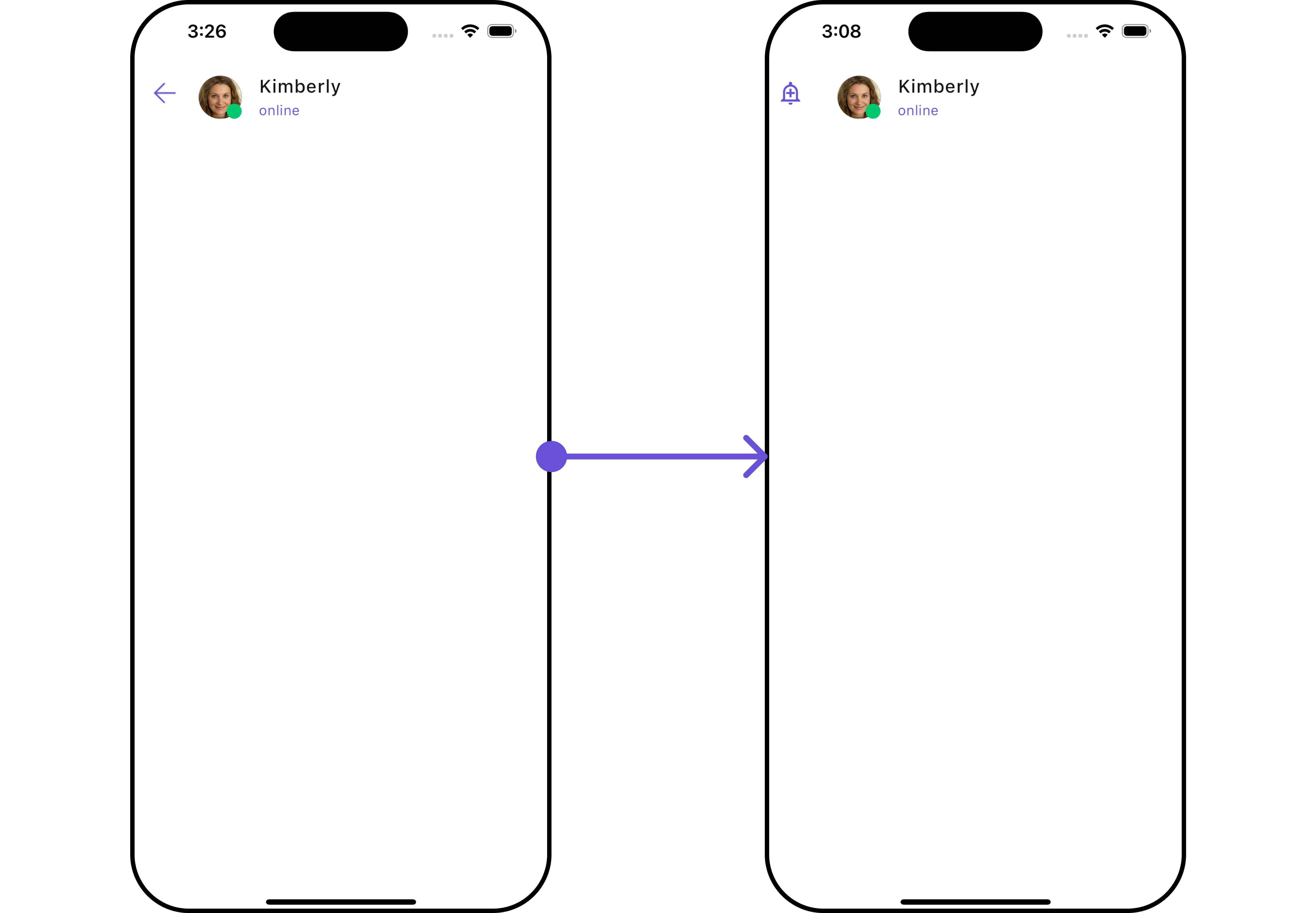
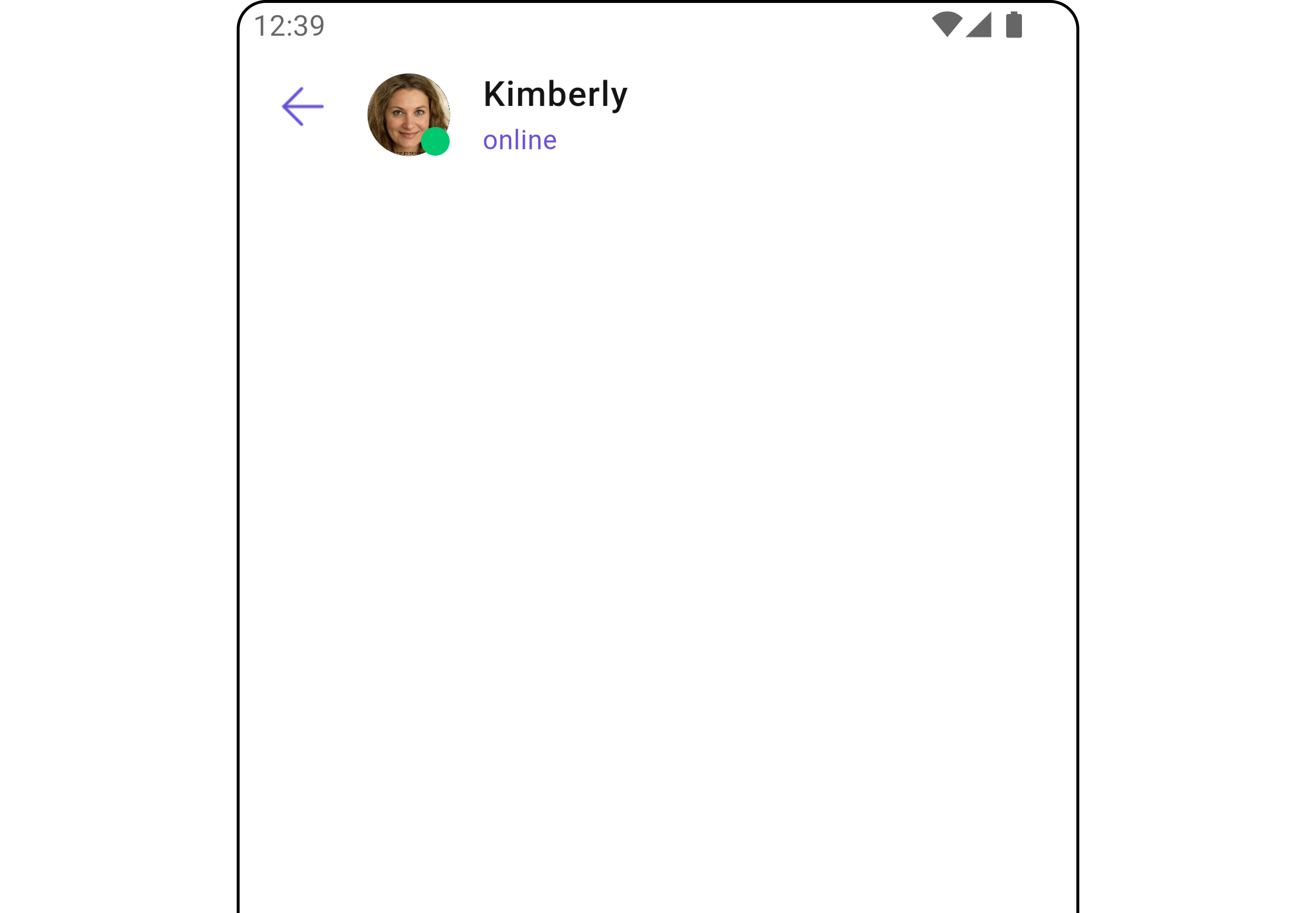
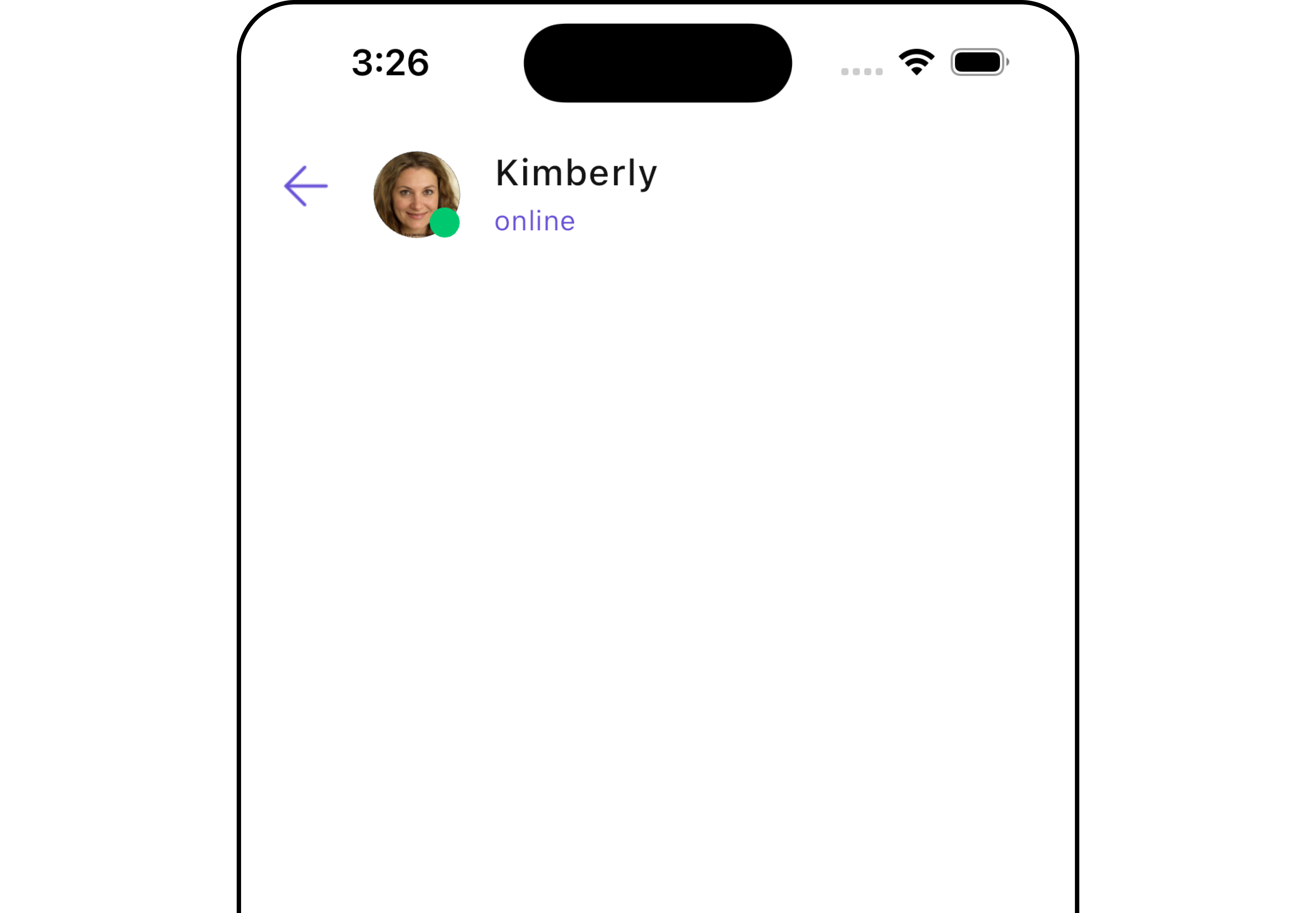
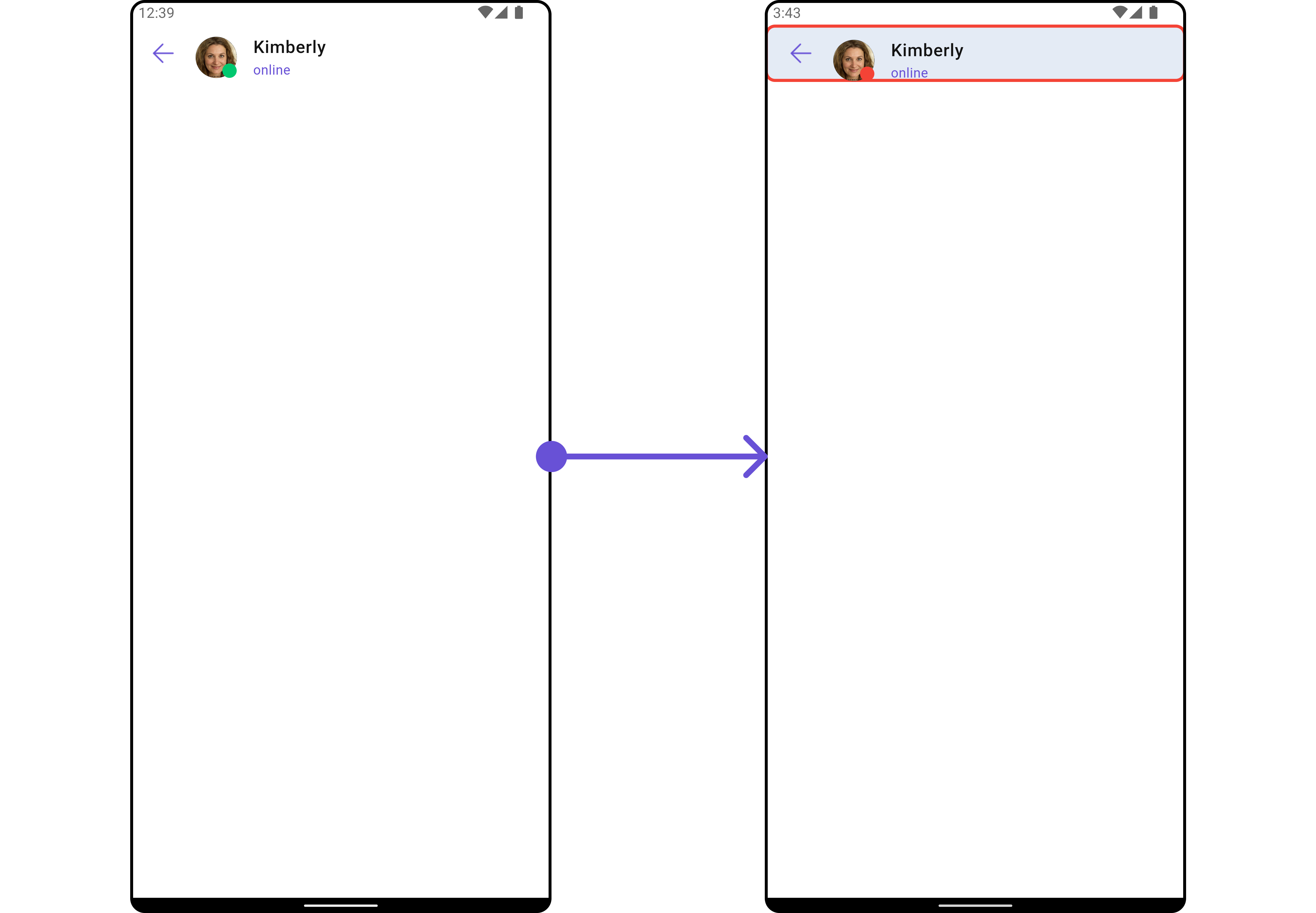
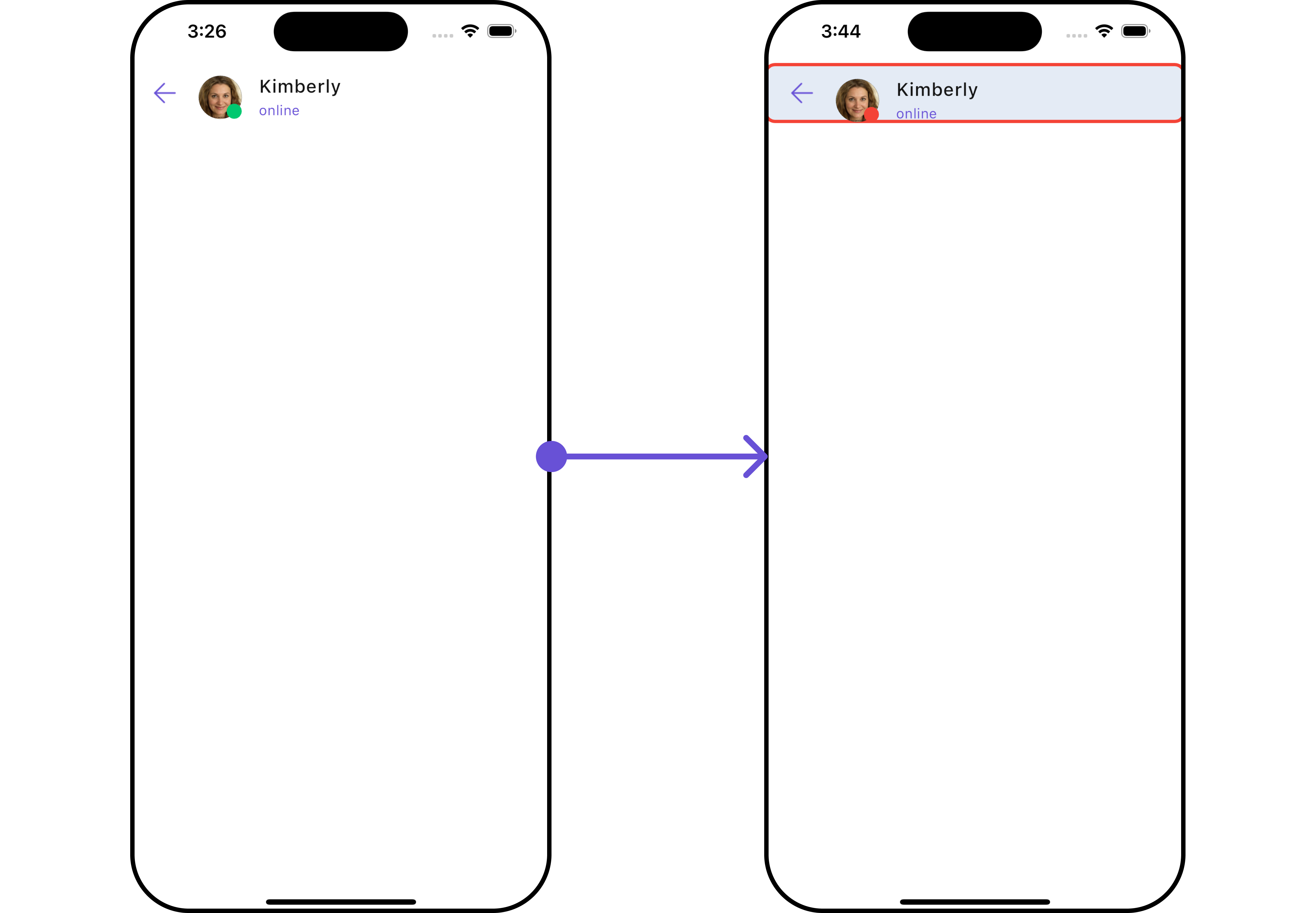
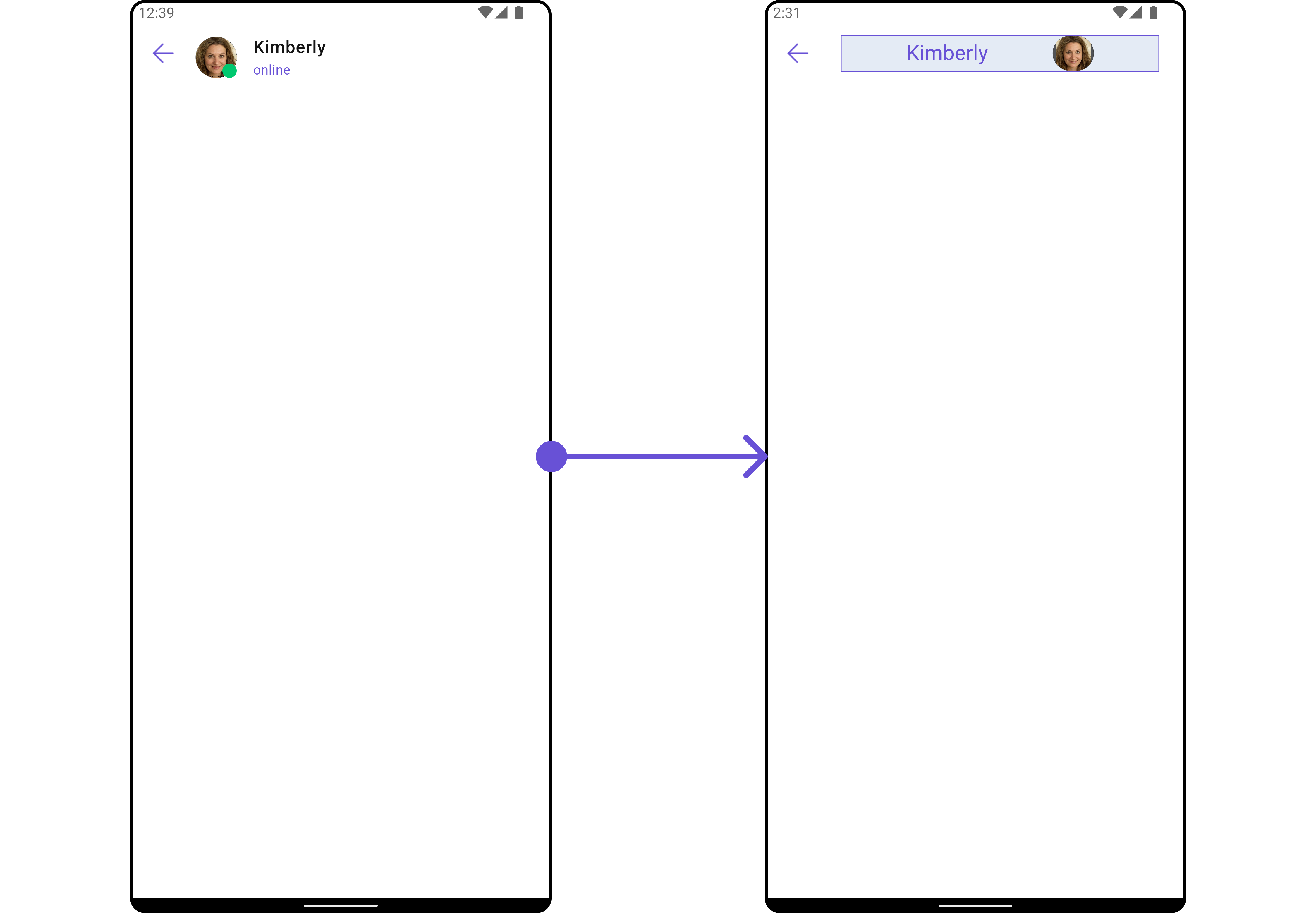
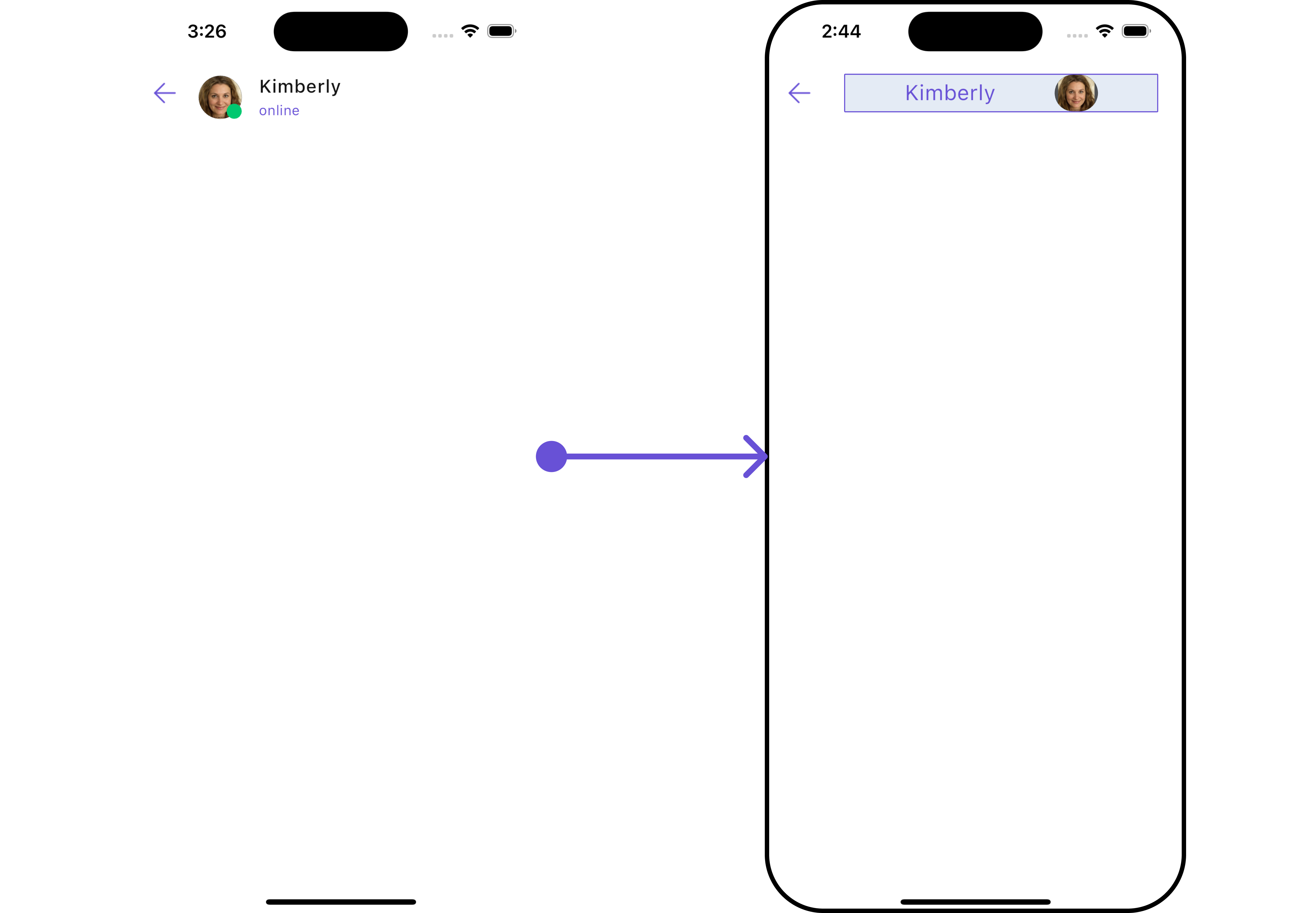
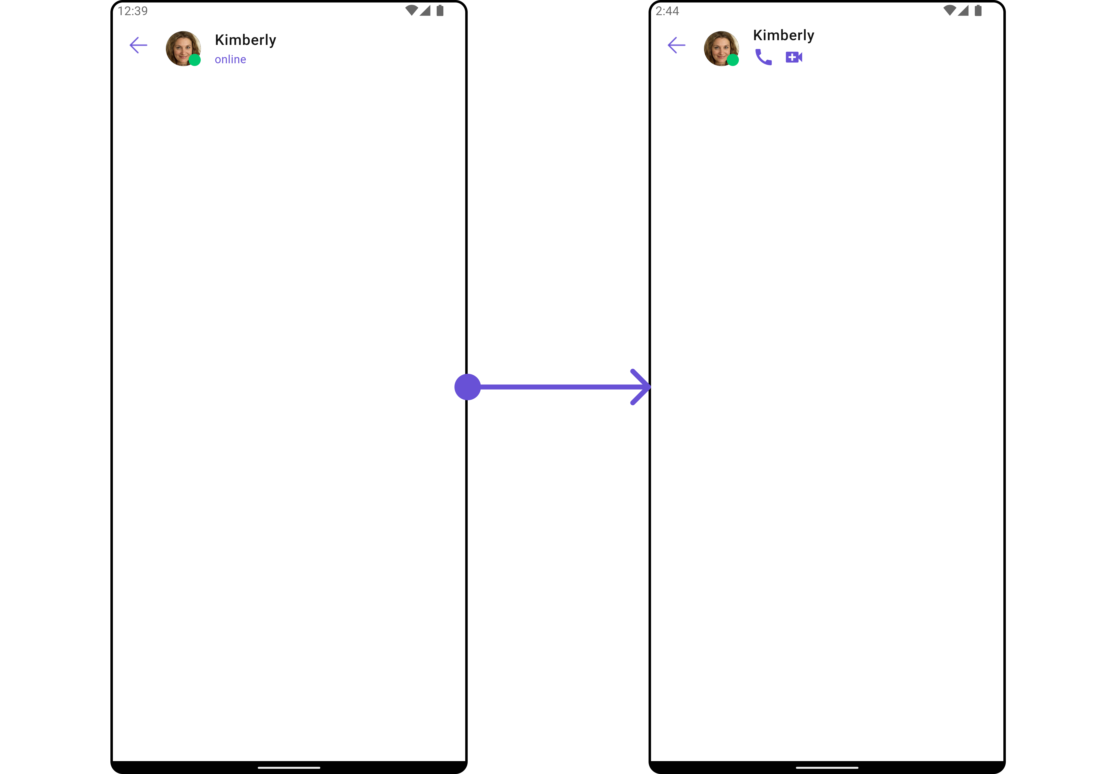
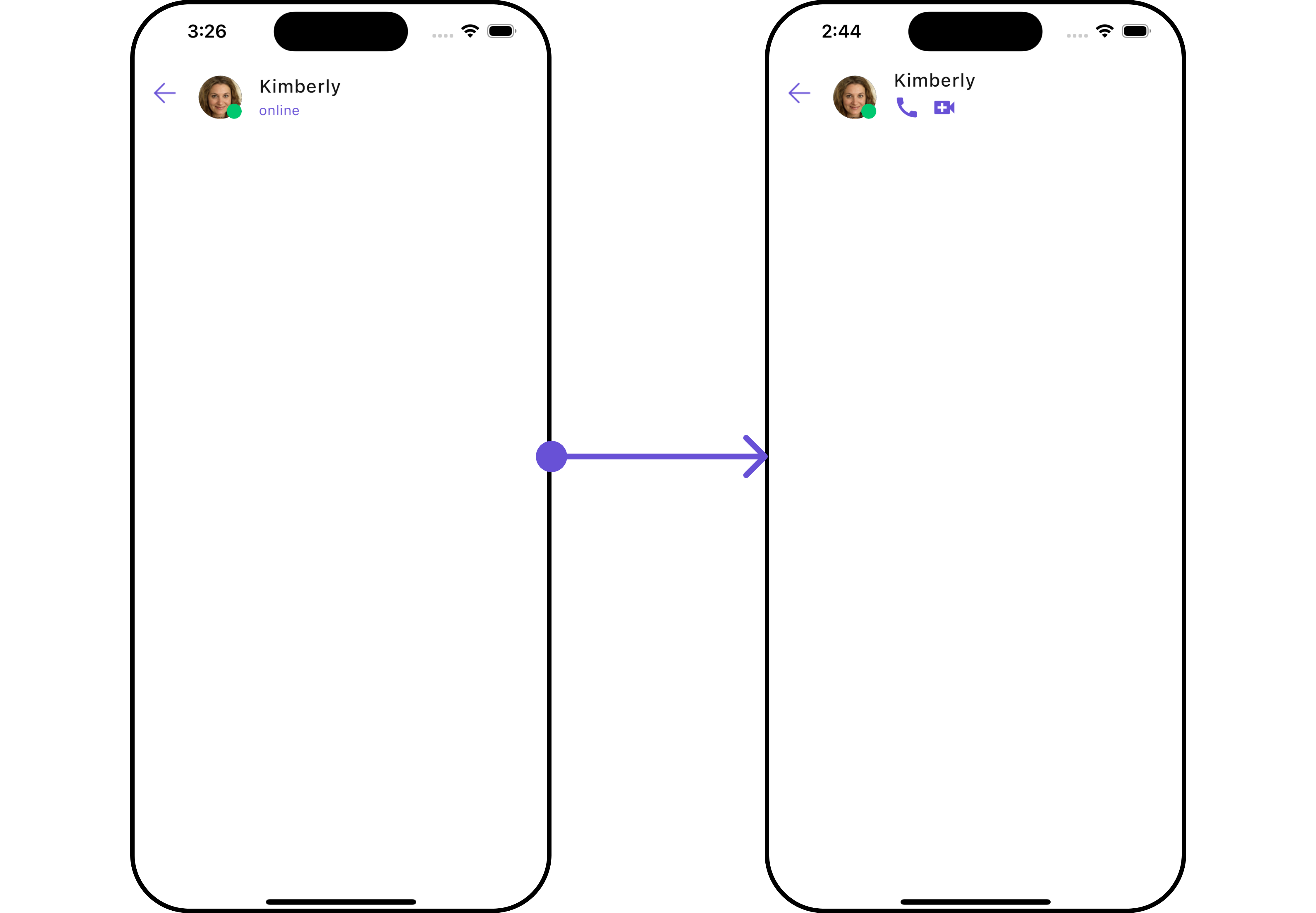
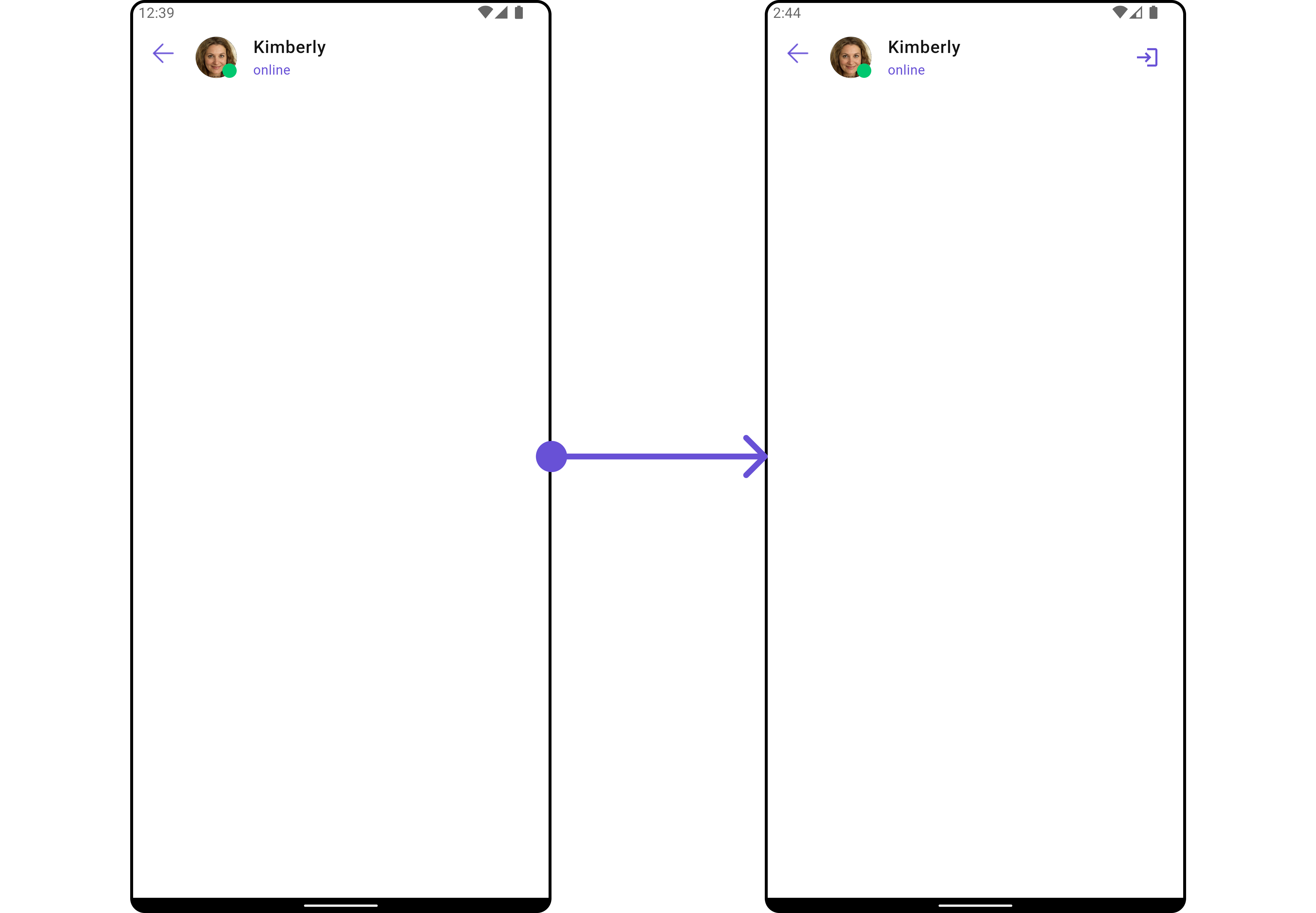
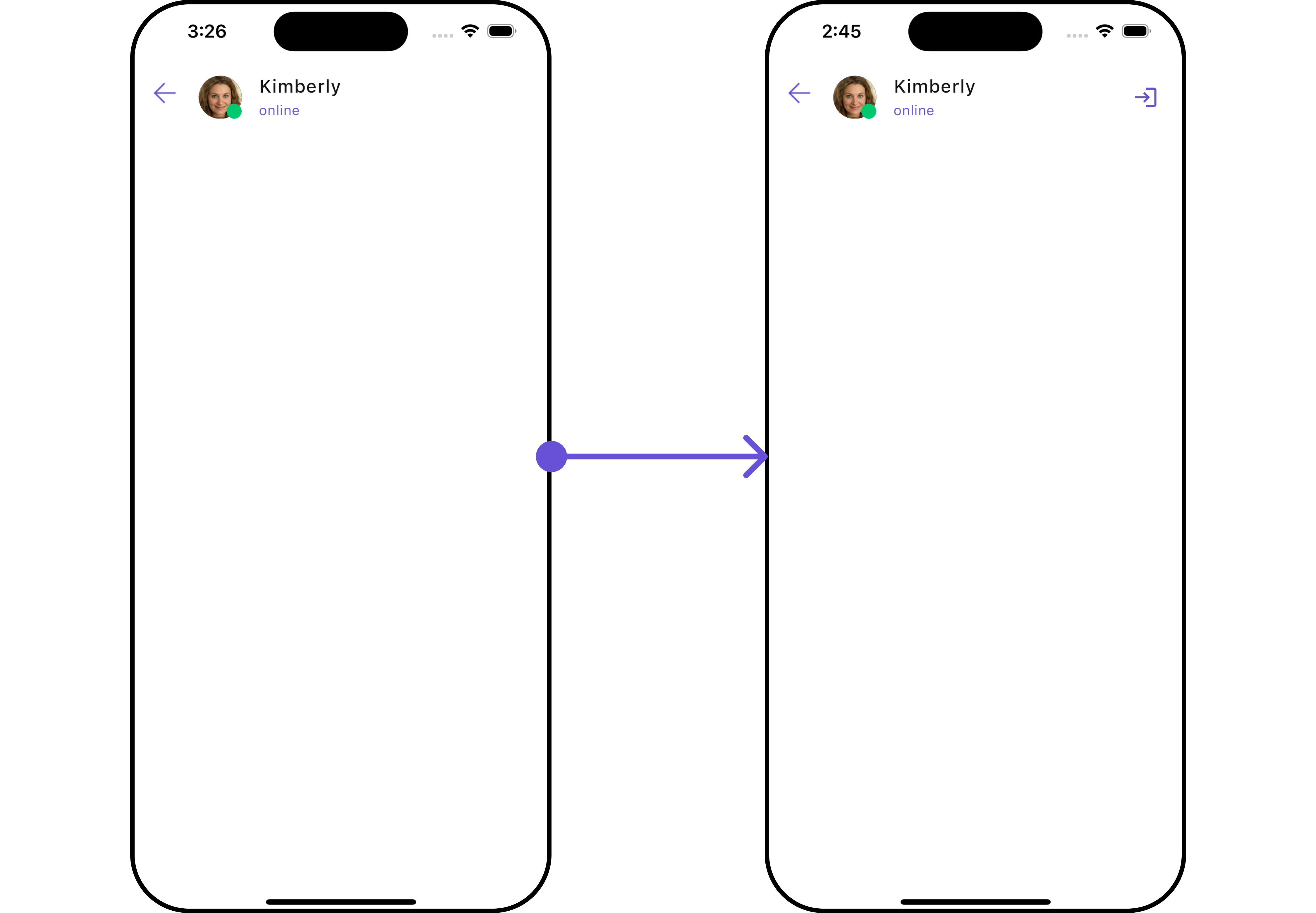
CometChatMessageHeader is a Widget that showcases the User or Group details in the toolbar. Furthermore, it also presents a typing indicator and a back navigation button for ease of use.
- Android
- iOS
CometChatMessageHeader is comprised of the following components:
| Components | Description |
|---|---|
| ListItem Widget | This component’s widget consists of avatar, status indicator , title, and subtitle. The fields are then mapped with the SDK’s user, group class. |
| Back Button | BackButton that allows users to navigate back from the current activity or screen to the previous one |
Usage
Integration
You can launchCometChatMessageHeader directly using Navigator.push, or you can define it as a widget within the build method of your State class.
1. Using Navigator to Launch CometChatMessageHeader
- Dart
2. Embedding CometChatMessageHeader as a Widget in the build Method
- Dart
Actions
Actions dictate how a widget functions. They are divided into two types: Predefined and User-defined. You can override either type, allowing you to tailor the behavior of the widget to fit your specific needs.1. onBack
Enhance your application’s functionality by leveraging theonBack feature. This capability allows you to customize the behavior associated with navigating back within your app. Utilize the provided code snippet to override default behaviors and tailor the user experience according to your specific requirements.
- Dart
Filters
Filters allow you to customize the data displayed in a list within aWidget. You can filter the list based on your specific criteria, allowing for a more customized. Filters can be applied using RequestBuilders of Chat SDK.
The CometChatMessageHeader widget does not have any exposed filters.
Customization
To fit your app’s design requirements, you can customize the appearance of the conversation widget. We provide exposed methods that allow you to modify the experience and behavior according to your specific needs.Style
Using Style you can customize the look and feel of the widget in your app, These parameters typically control elements such as the color, size, shape, and fonts used within the widget.1. MessageHeader Style
To customize the appearance, you can assign aMessageHeaderStyle object to the CometChatMessageHeader widget.
- Dart
- Android
- iOS
MessageHeaderStyle are as follows:
| Property | Description | Code |
|---|---|---|
| Back Button Icon Tint | Provides color to back button | backButtonIconTint: Color? |
| Background | Background inherited from BaseStyles | background |
| Border | Border inherited from BaseStyles | border |
| Border Radius | Border radius inherited from BaseStyles | borderRadius |
| Gradient | Gradient inherited from BaseStyles | gradient |
| Height | Height inherited from BaseStyles | height |
| Online Status Color | Sets online status color | onlineStatusColor: Color? |
| Subtitle Text Style | Text style for setting subtitle text | subtitleTextStyle: TextStyle? |
| Typing Indicator Text Style | Text style for setting typing indicator text | typingIndicatorTextStyle: TextStyle? |
| Width | Width inherited from BaseStyles | width |
2. Avatar Style
If you want to apply customized styles to theAvatar widget within the CometChatMessageHeader Widget, you can use the following code snippet. For more information you can refer Avatar Styles.
- Dart
3. ListItem Style
If you want to apply customized styles to theList Item widget within the CometChatMessageHeader Widget, you can use the following code snippet. For more information, you can refer ListItem Styles.
- Dart
4. StatusIndicator Style
If you want to apply customized styles to theStatus Indicator widget within the CometChatMessageHeader Widget, you can use the following code snippet. For more information you can refer StatusIndicator Styles.
- Dart
Functionality
These are a set of small functional customizations that allow you to fine-tune the overall experience of the widget. With these, you can change text, set custom icons, and toggle the visibility of UI elements. Here is a code snippet demonstrating how you can customize the functionality of the Message Header widget.- Dart
- Android
- iOS
| Property | Description | Code |
|---|---|---|
| Back Button | Widget for the back button | backButton |
| Disable Typing | Whether typing indicator is disabled | disableTyping: bool |
| Disable User Presence | Whether user presence is disabled | disableUserPresence |
| Group | Group object to be displayed | group |
| Hide Back Button | Whether to hide the back button | hideBackButton |
| Private Group Icon | Icon for private groups | privateGroupIcon |
| Protected Group Icon | Icon for protected groups | protectedGroupIcon |
| Theme | Theme to be applied | theme |
| User | User object to be displayed | user |
Advanced
For advanced-level customization, you can set custom views to the widget. This lets you tailor each aspect of the widget to fit your exact needs and application aesthetics. You can create and define your own widget and then incorporate those into the widget.ListItemView
TheCometChatMessageHeader widget consists of a ListItemView. You can customize the ListItem according to your requirements by using the .setListItemView method.
- Dart
- Dart
custom_list_item.dart
- Dart
main.dart
- Android
- iOS
SubtitleView
You can customize the subtitle widget for each item to meet your specific preferences and needs.- Dart
- Android
- iOS
AppBarOptions
You can set the CustomappBarOptions to the CometChatMessageHeader widget.
- Dart
- Android
- iOS
BackIcon
You can customize the Back Icon according to your specific requirements by using the.backButton method.
- Dart
- Android
- iOS