Overview
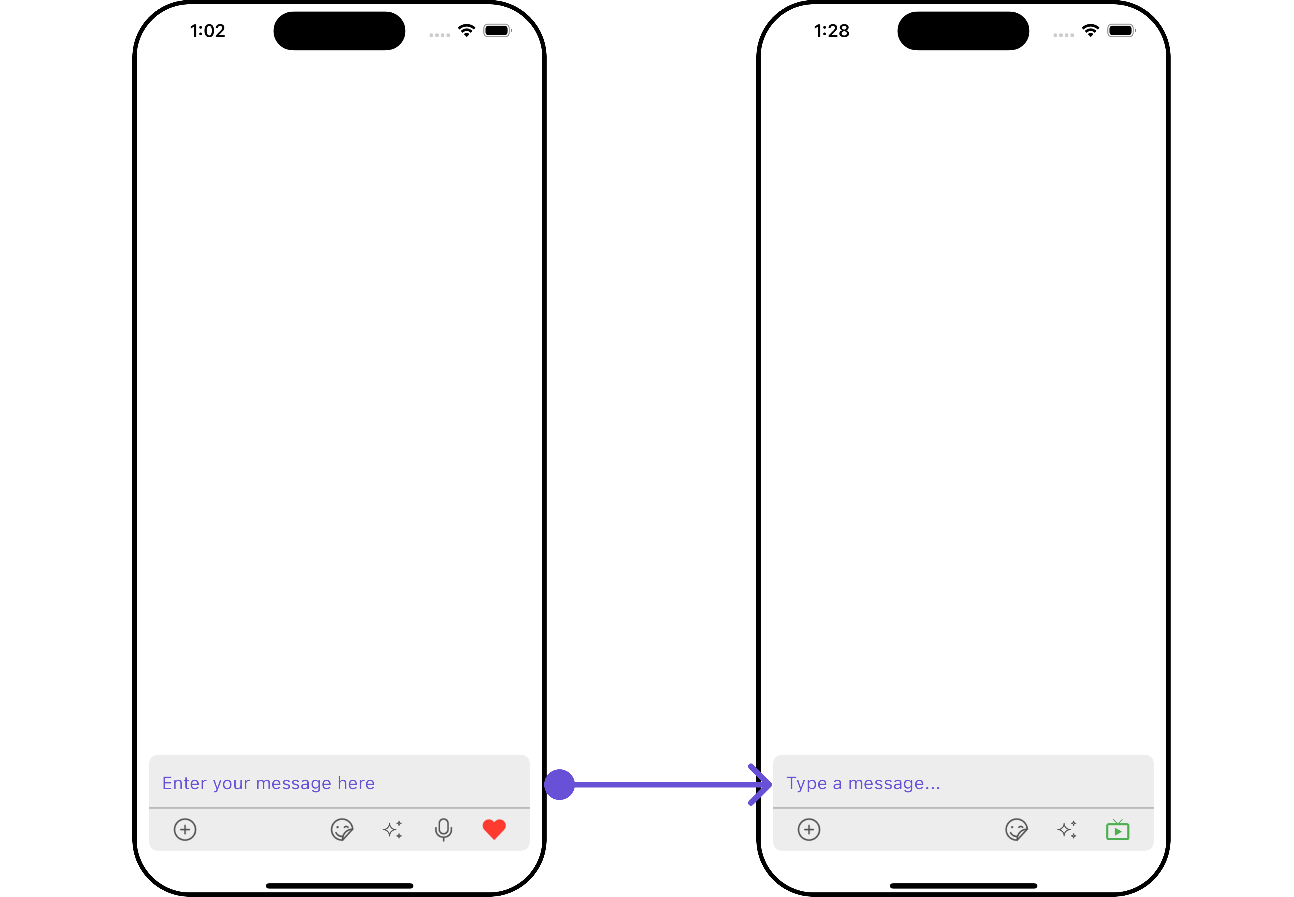
CometChatMessageComposer is a Widget that enables users to write and send a variety of messages, including text, image, video, and custom messages.
Features such as Live Reaction, Attachments, and Message Editing are also supported by it.
CometChatMessageComposer is comprised of the following Base Widgets:
| Base Widgets | Description |
|---|---|
| MessageInput | This provides a basic layout for the contents of this component, such as the TextField and buttons |
| ActionSheet | The ActionSheet widget presents a list of options in either a list or grid mode, depending on the user’s preference |
Usage
Integration
You can launchCometChatMessageComposer directly using Navigator.push, or you can define it as a widget within the build method of your State class.
1. Using Navigator to Launch CometChatMessageComposer
- Dart
2. Embedding CometChatMessageComposer as a Widget in the build Method
- Dart
Actions
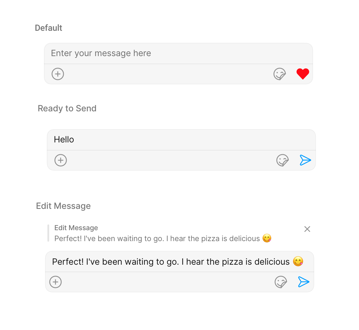
Actions dictate how a widget functions. They are divided into two types: Predefined and User-defined. You can override either type, allowing you to tailor the behavior of the widget to fit your specific needs.1. OnSendButtonClick
TheOnSendButtonClick event gets activated when the send message button is clicked. It has a predefined function of sending messages entered in the composer EditText. However, you can overide this action with the following code snippet.
- Dart
2. onChange
This action handles changes in the value of text in the input field of the CometChatMessageComposer widget.- Dart
3. onError
This action doesn’t change the behavior of the widget but rather listens for any errors that occur in the MessageList widget.- Dart
Filters
CometChatMessageComposer widget does not have any available filters.
Events
Events are emitted by aWidget. By using event you can extend existing functionality. Being global events, they can be applied in Multiple Locations and are capable of being Added or Removed.
The CometChatMessageComposer Widget does not emit any events of its own.
Customization
To fit your app’s design requirements, you can customize the appearance of theCometChatMessageComposer widget. We provide exposed methods that allow you to modify the experience and behavior according to your specific needs.
Style
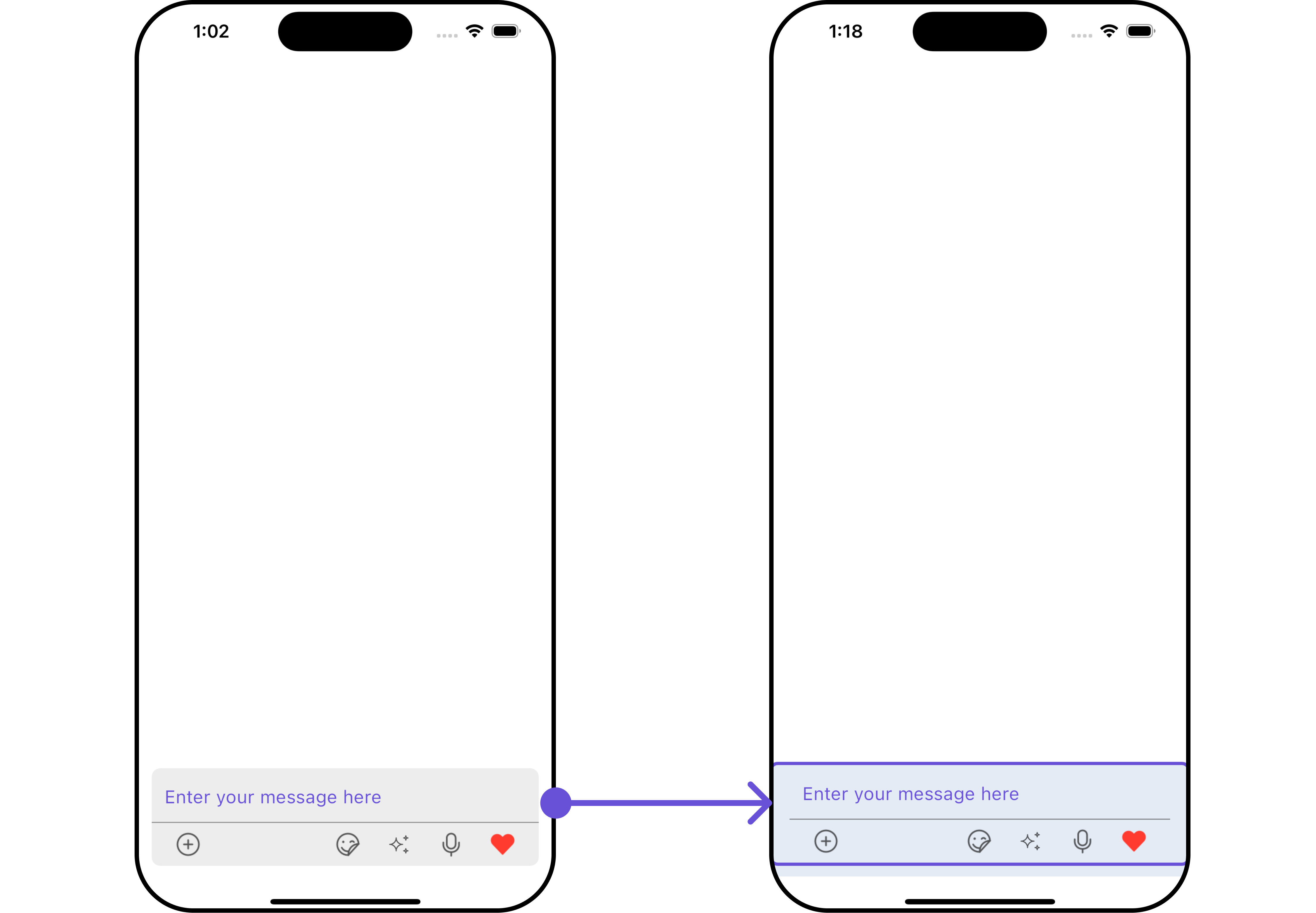
Using Style you can customize the look and feel of the widget in your app, These parameters typically control elements such as the color, size, shape, and fonts used within the widget.1. CometChatMessageComposer Style
To modify the styling, you can apply the MessageComposerStyle to the CometChatMessageComposer Widget using the messageComposerStyle method.
- Dart
- Android
- iOS
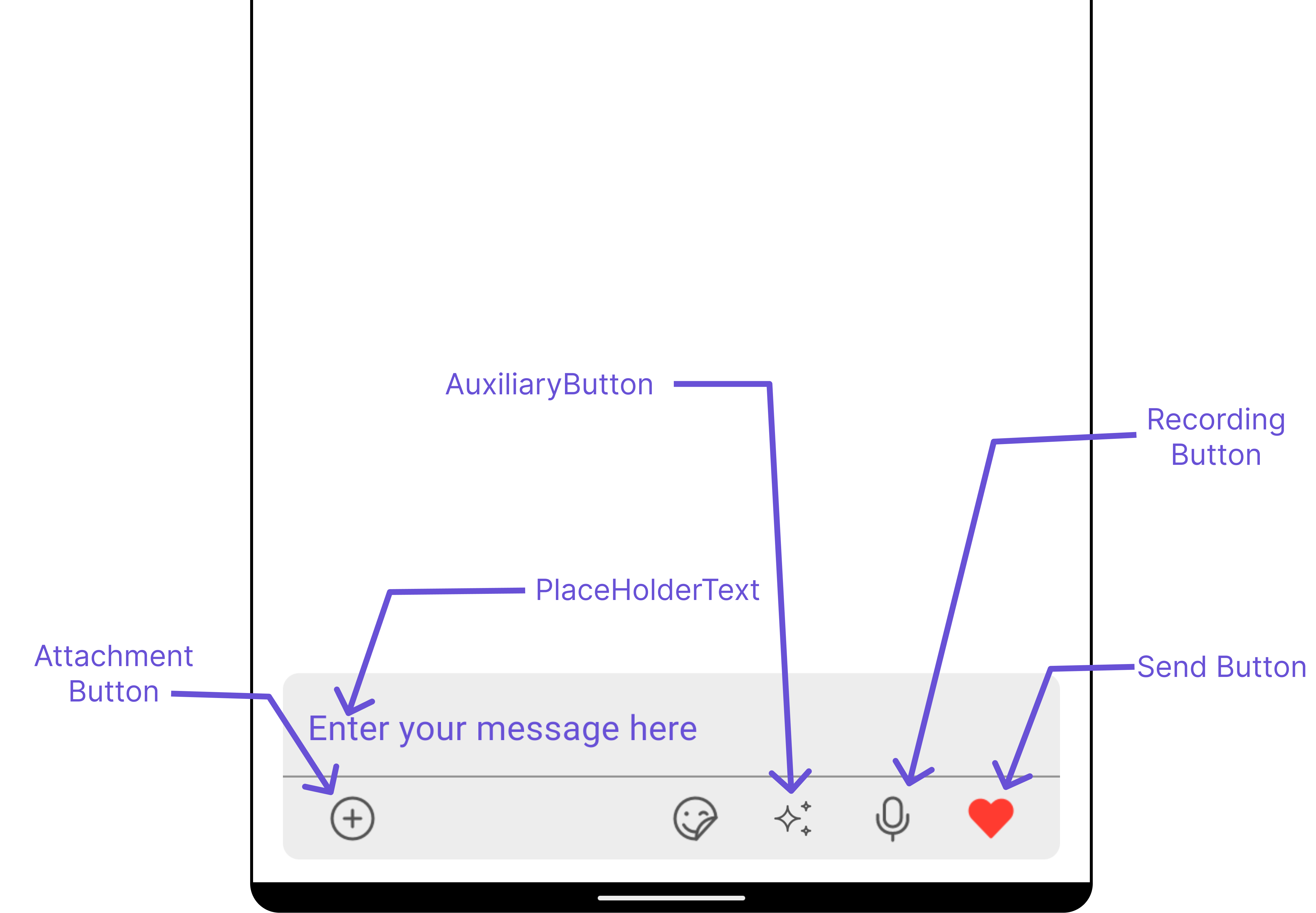
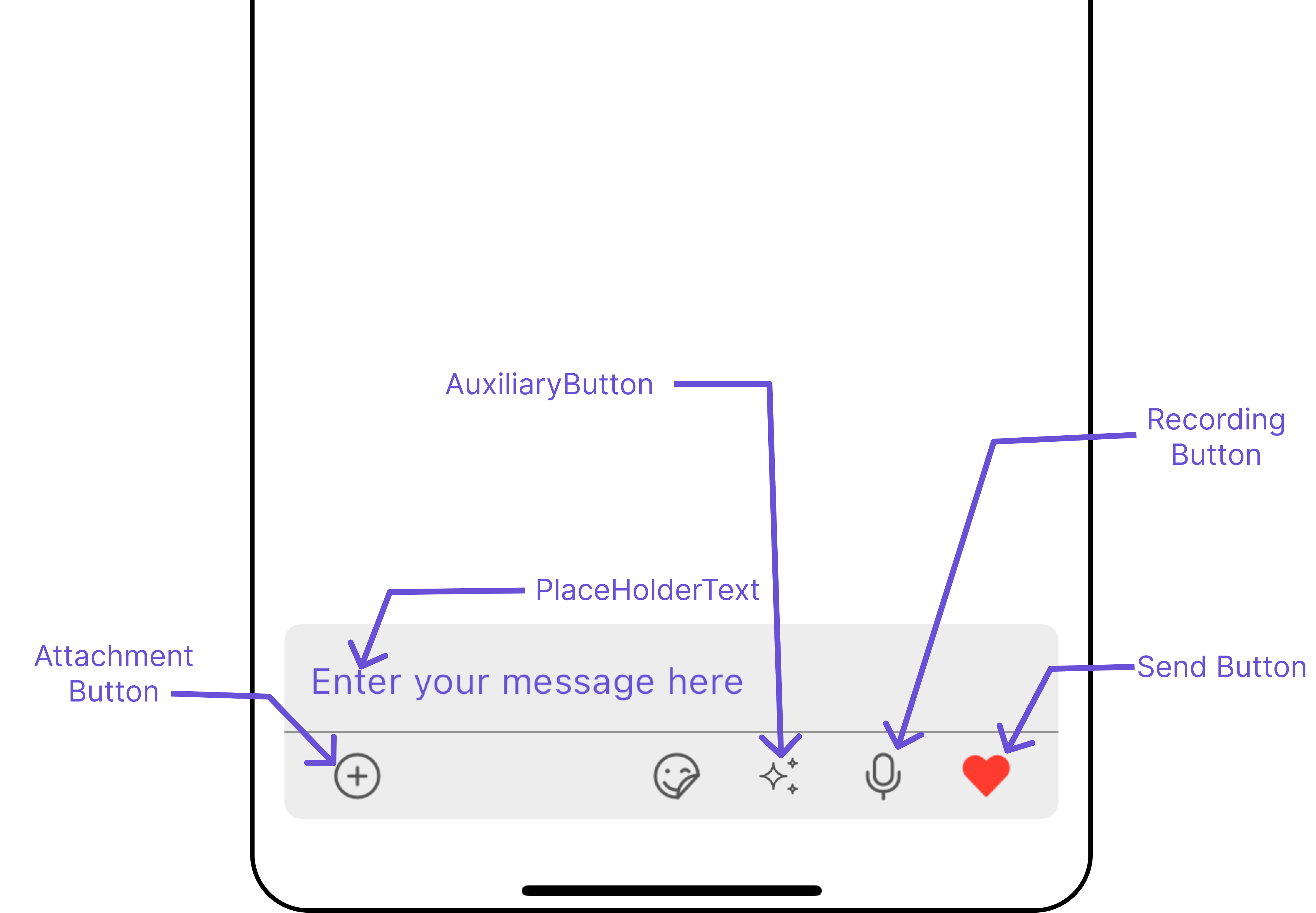
The following properties are exposed by MessageComposerStyle:
| Property | Description | Code |
|---|---|---|
| Ai Icon Tint | Sets the tint color for the AI icon. | aiIconTint: Color? |
| Attachment Icon Tint | Sets the tint color for the attachment icon. | attachmentIconTint: Color? |
| Background | Sets the background color of the message composer. | background: Color? |
| Border | Sets the border properties of the message composer. | border: Border? |
| Border Radius | Sets the border radius of the message composer. | borderRadius: BorderRadius? |
| Close Icon Tint | Sets the tint color for the close icon. | closeIconTint: Color? |
| Content Padding | Sets the padding around the content. | contentPadding: EdgeInsets? |
| Divider Tint | Sets the tint color for the divider. | dividerTint: Color? |
| Gradient | Sets the gradient applied to the message composer. | gradient: Gradient? |
| Height | Sets the height of the message composer. | height: double? |
| Input Background | Sets the background color of the input field. | inputBackground: Color? |
| Input Gradient | Sets the gradient applied to the input field. | inputGradient: Gradient? |
| Input Text Style | Sets the text style for the input field. | inputTextStyle: TextStyle? |
| Message Input Padding | Sets the padding around the message input field. | messageInputPadding: EdgeInsets? |
| Placeholder Text Style | Sets the text style for the placeholder text. | placeholderTextStyle: TextStyle? |
| Send Button Icon | Sets the icon for the send button. | sendButtonIcon: Icon? |
| Send Button Icon Tint | Sets the tint color for the send button icon. | sendButtonIconTint: Color? |
| Voice Recording Icon Tint | Sets the tint color for the voice recording icon. | voiceRecordingIconTint: Color? |
| Width | Sets the width of the message composer. | width: double? |
2. MediaRecorder Style
To customize the styles of the MediaRecorder widget within theCometChatMessageComposer Widget, use the mediaRecorderStyle. For more details, please refer to MediaRecorder styles.
- Dart
3. AI Options Style
To customize the styles of the AI Options widget within theCometChatMessageComposer Widget, use the aiOptionStyle.
- Dart
Functionality
These are a set of small functional customizations that allow you to fine-tune the overall experience of the widget. With these, you can change text, set custom icons, and toggle the visibility of UI elements.- Android
- iOS
- Dart
- Android
- iOS
| Property | Description | Code |
|---|---|---|
| Ai Icon | Sets the AI icon. | aiIcon: Icon? |
| Ai Icon Url | Sets the URL for the AI icon. | aiIconURL: String? |
| Attachment Icon | Sets the icon for attachments. | attachmentIcon: Icon? |
| Attachment Icon Url | Sets the URL for the attachment icon. | attachmentIconURL: String? |
| Attachment Options | Sets the options for attachment actions. | attachmentOptions: ComposerActionsBuilder? |
| Auxiliary Buttons Alignment | Sets the alignment for auxiliary buttons. | auxiliaryButtonsAlignment: Alignment? |
| Custom Sound For Message | Sets the custom sound for messages. | customSoundForMessage: String? |
| Delete Icon | Sets the icon for the delete action. | deleteIcon: Icon? |
| Disable Mentions | Disables mentions in the message composer. | disableMentions: bool? |
| Disable Sound For Messages | Disables sound notifications for messages. | disableSoundForMessages: bool |
| Disable Typing Events | Disables typing events. | disableTypingEvents: bool |
| Live Reaction Icon | Sets the icon for live reactions. | liveReactionIcon: Icon? |
| Live Reaction Icon Url | Sets the URL for the live reaction icon. | liveReactionIconURL: String? |
| Max Line | Sets the maximum number of lines for the input field. | maxLine: int? |
| Pause Icon | Sets the icon for the pause action. | pauseIcon: Icon? |
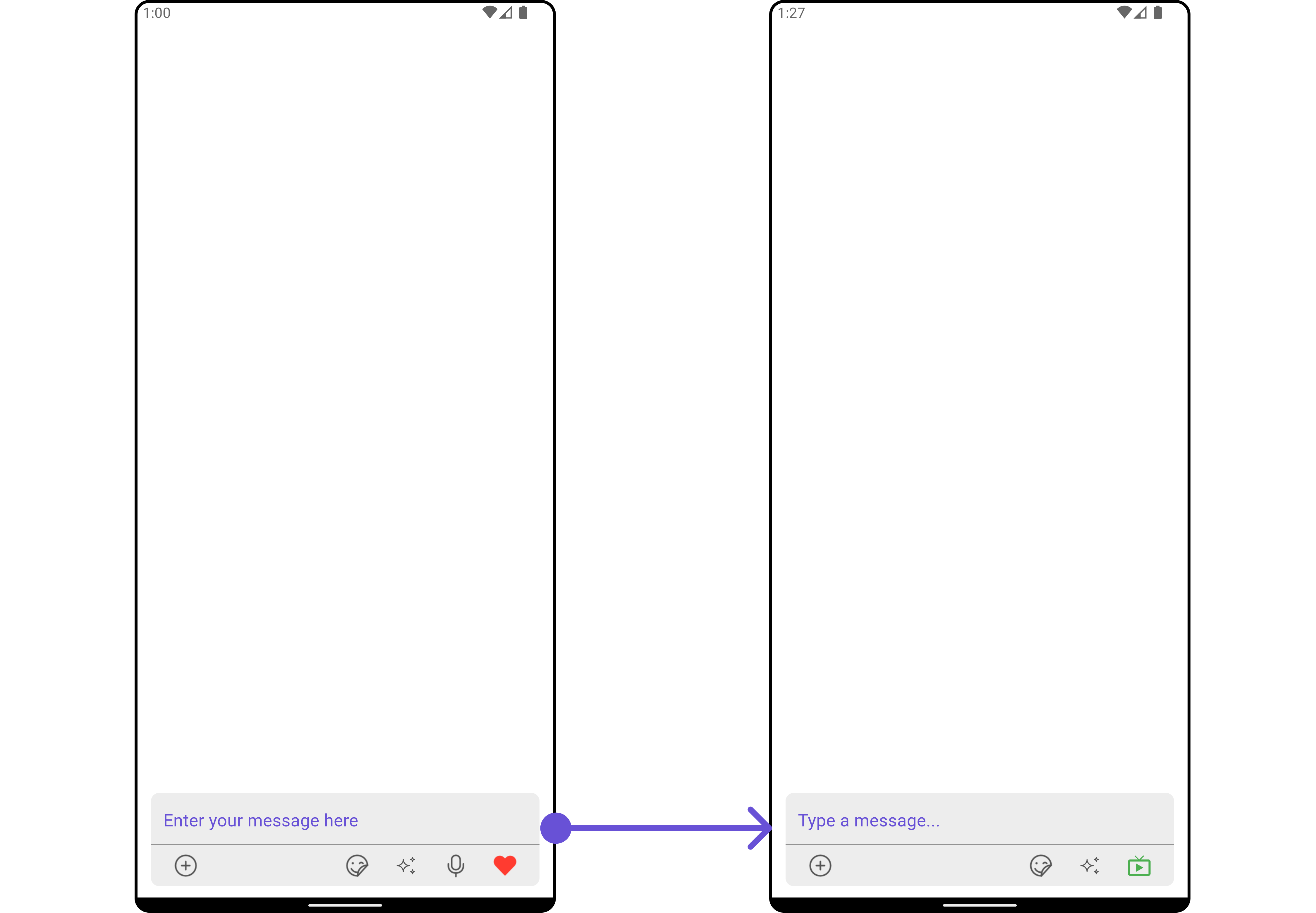
| Placeholder Text | Sets the placeholder text for the input field. | placeholderText: String? |
| Play Icon | Sets the icon for the play action. | playIcon: Icon? |
| Record Icon | Sets the icon for the record action. | recordIcon: Icon? |
| Stop Icon | Sets the icon for the stop action. | stopIcon: Icon? |
| Submit Icon | Sets the icon for the submit action. | submitIcon: Icon? |
| Text | Sets the initial text for the input field. | text: String? |
Advanced
For advanced-level customization, you can set custom widgets to the widget. This lets you tailor each aspect of the widget to fit your exact needs and application aesthetics. You can create and define your widgets and then incorporate those into the widget.TextFormatters
Assigns the list of text formatters. If the provided list is not null, it sets the list. Otherwise, it assigns the default text formatters retrieved from the data source. To configure the existing Mentions look and feel check out CometChatMentionsFormatter Example Here is the complete example for reference:- Dart
- Android
- iOS
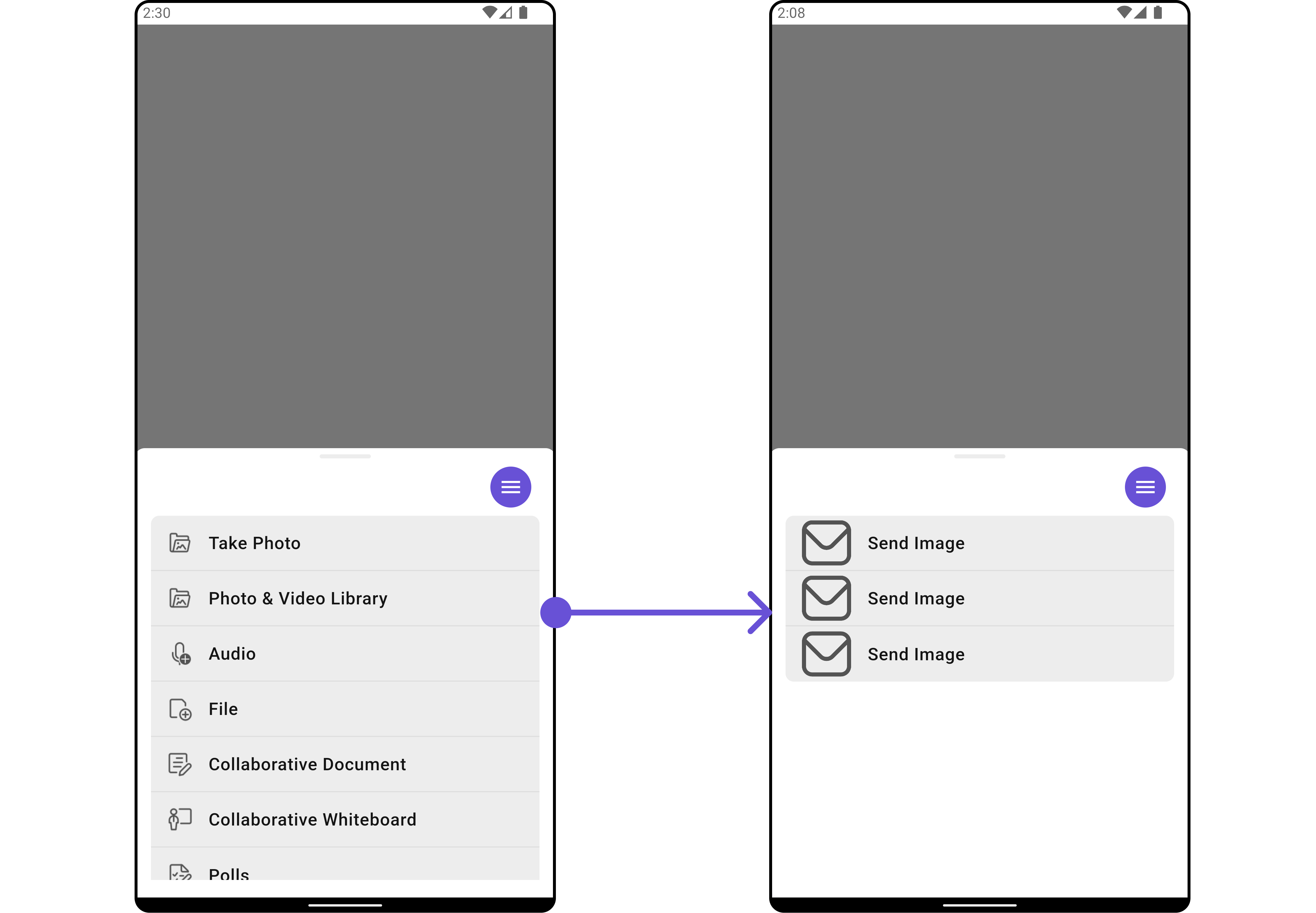
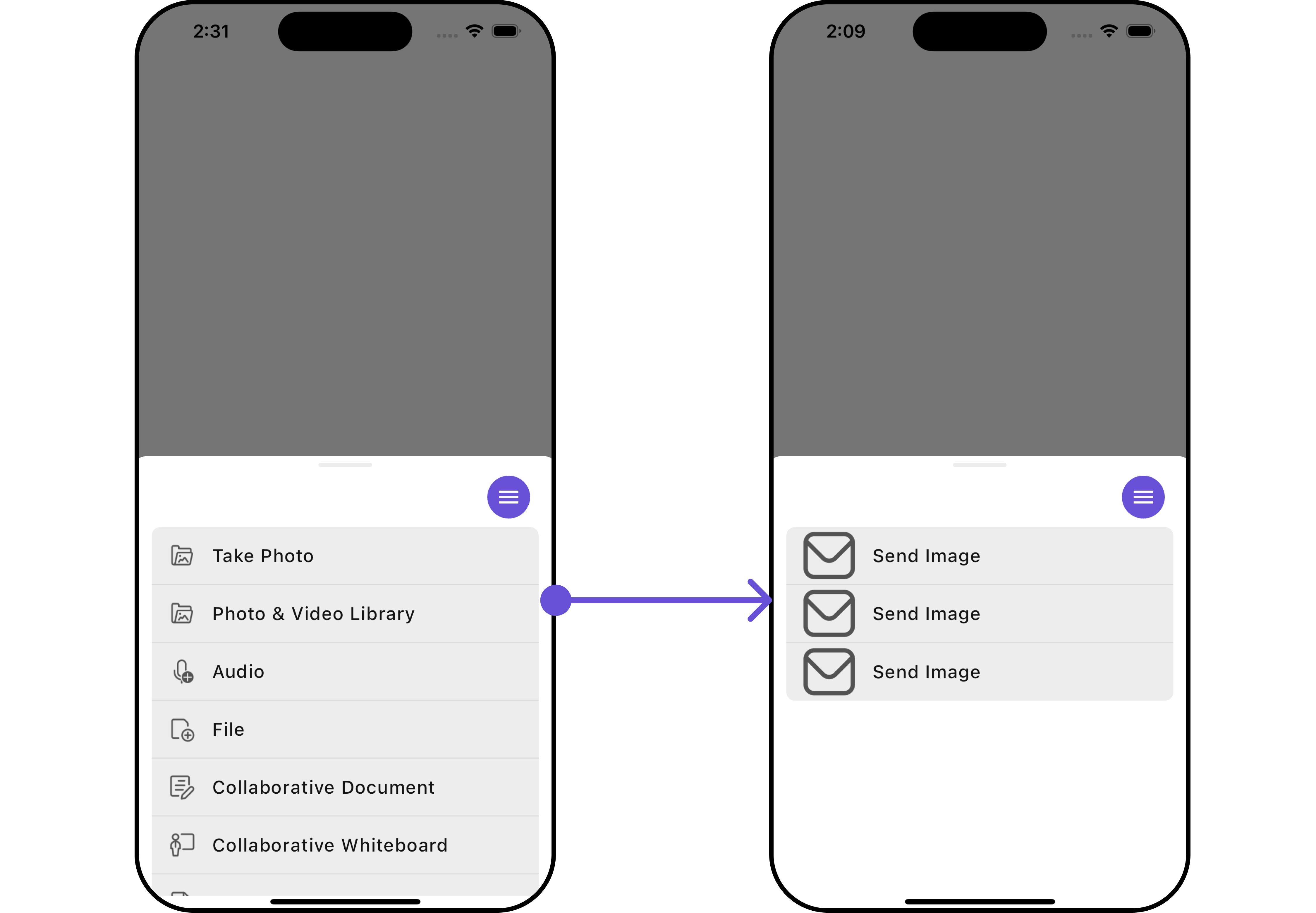
AttachmentOptions
By usingattachmentOptions, you can set a list of custom MessageComposerActions for the CometChatMessageComposer Widget. This will override the existing list of MessageComposerActions.
Example
Here is the complete example for reference:
- Dart
- Android
- iOS
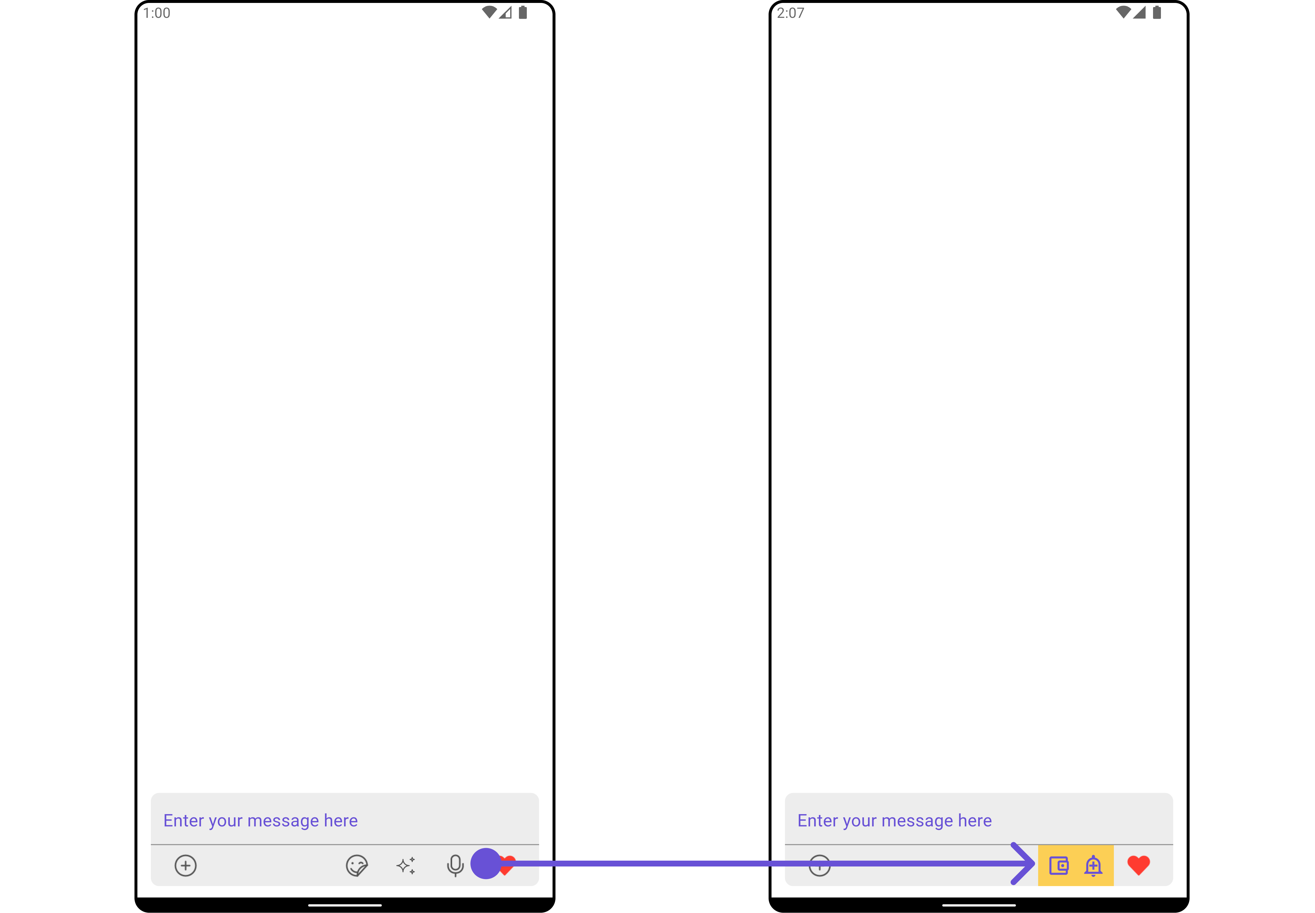
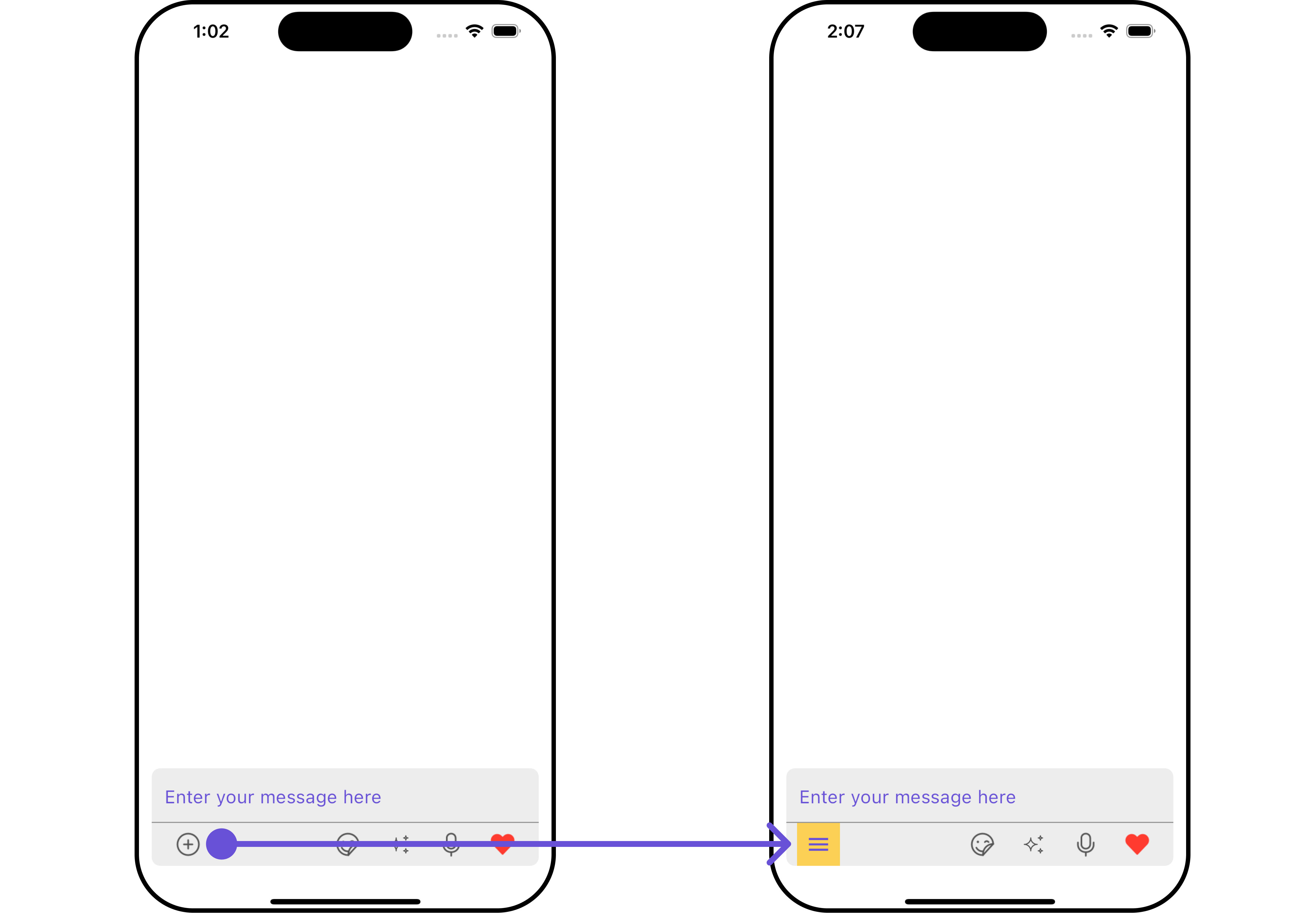
AuxiliaryButton Widget
You can insert a custom widget into theCometChatMessageComposer widget to add additional functionality using the following method.
Example
Here is the complete example for reference:
- Dart
- Android
- iOS
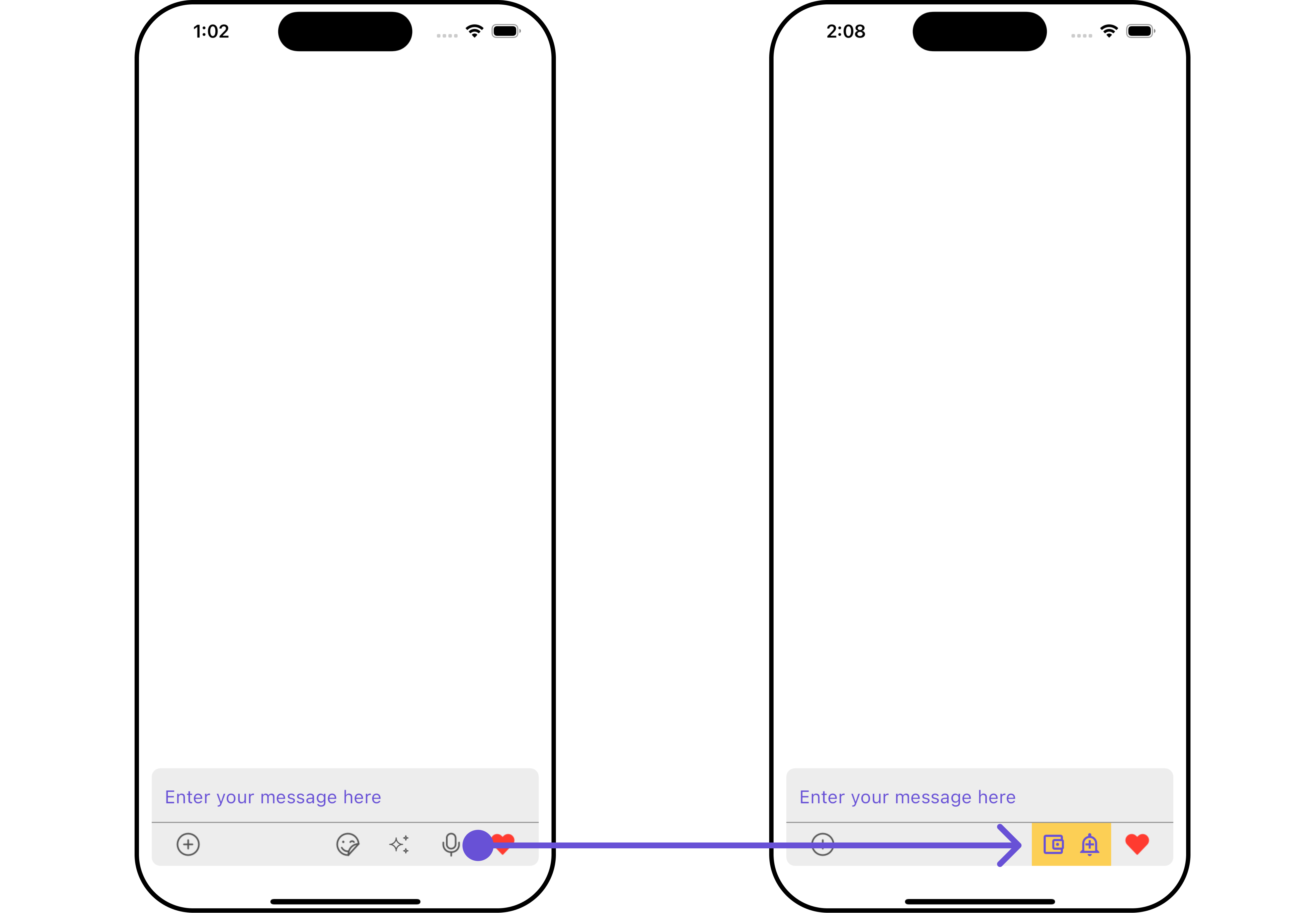
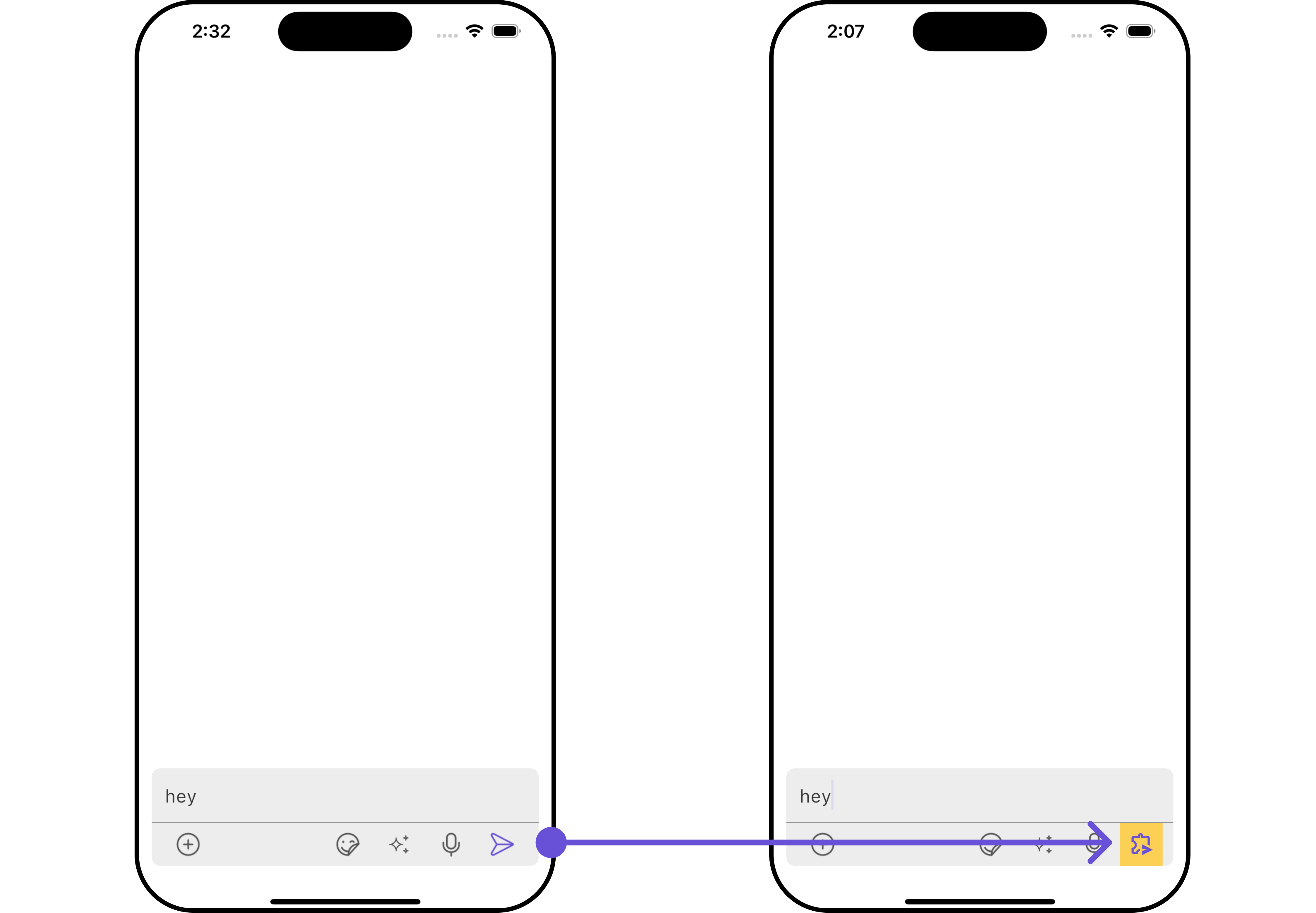
SecondaryButton Widget
You can add a custom widget into the SecondaryButton widget for additional functionality using the below method. Example Here is the complete example for reference:- Dart
- Android
- iOS
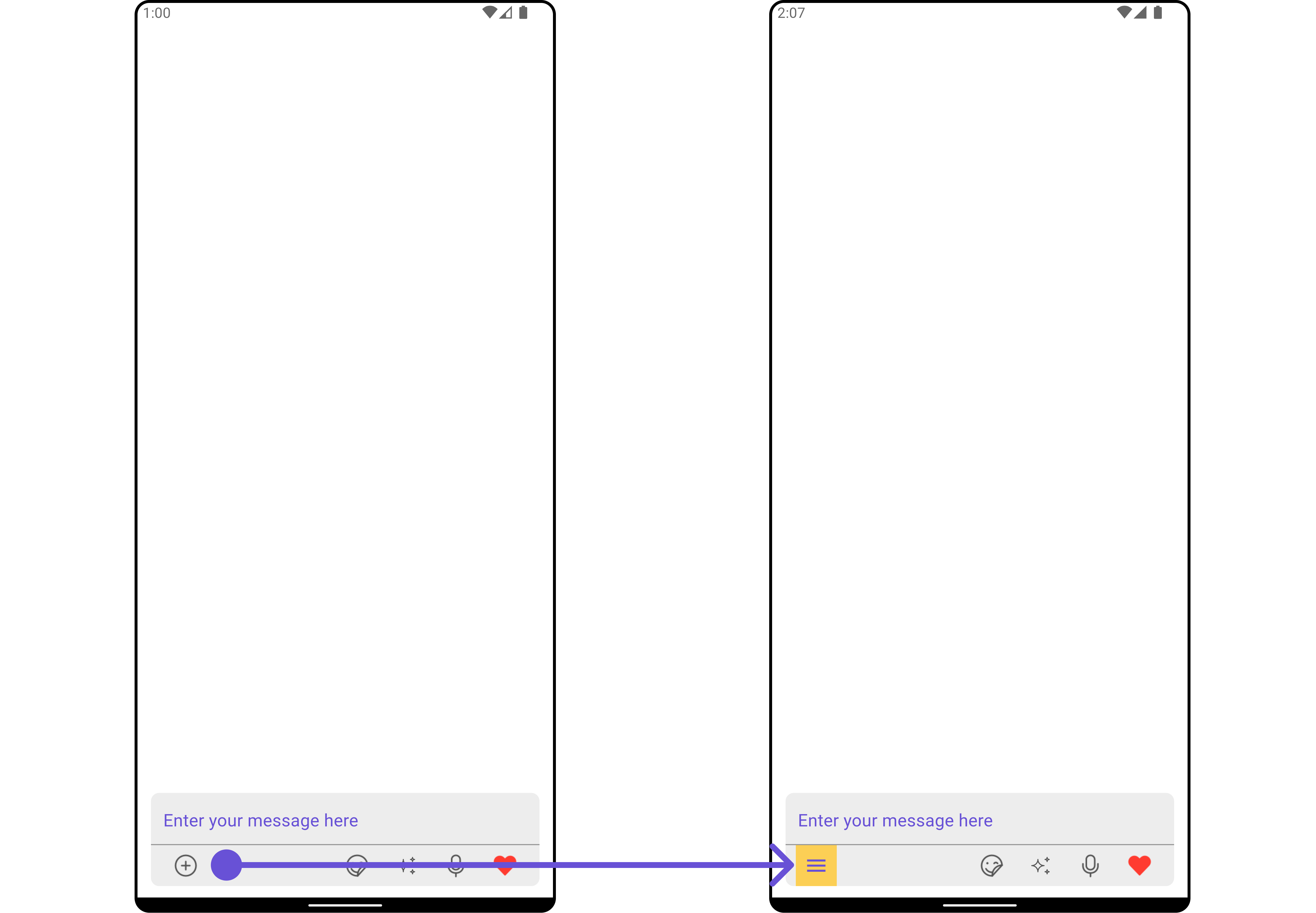
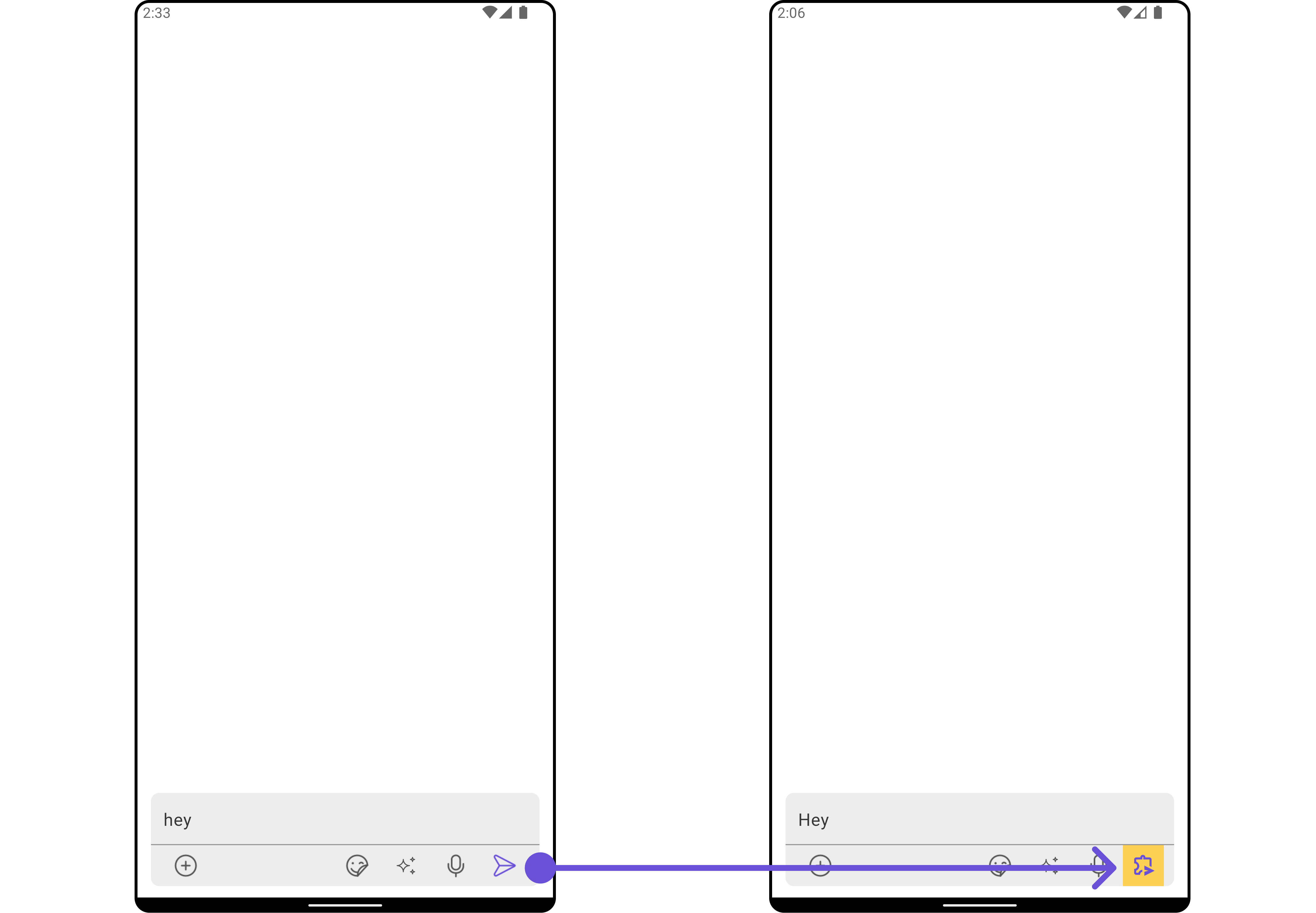
SendButton Widget
You can set a custom widget in place of the already existing send button widget. Using the following method. Example Here is the complete example for reference:- Dart
- Android
- iOS
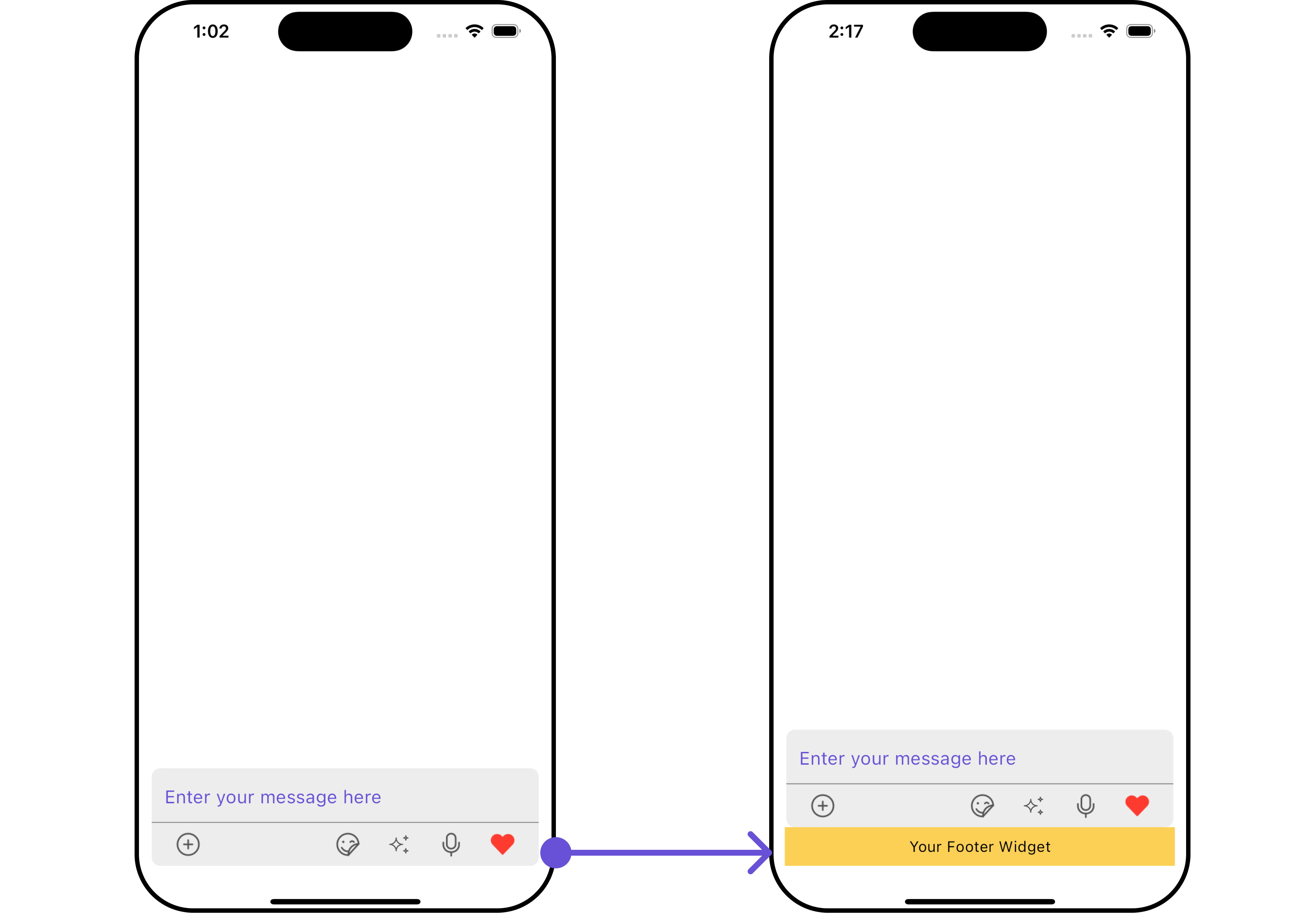
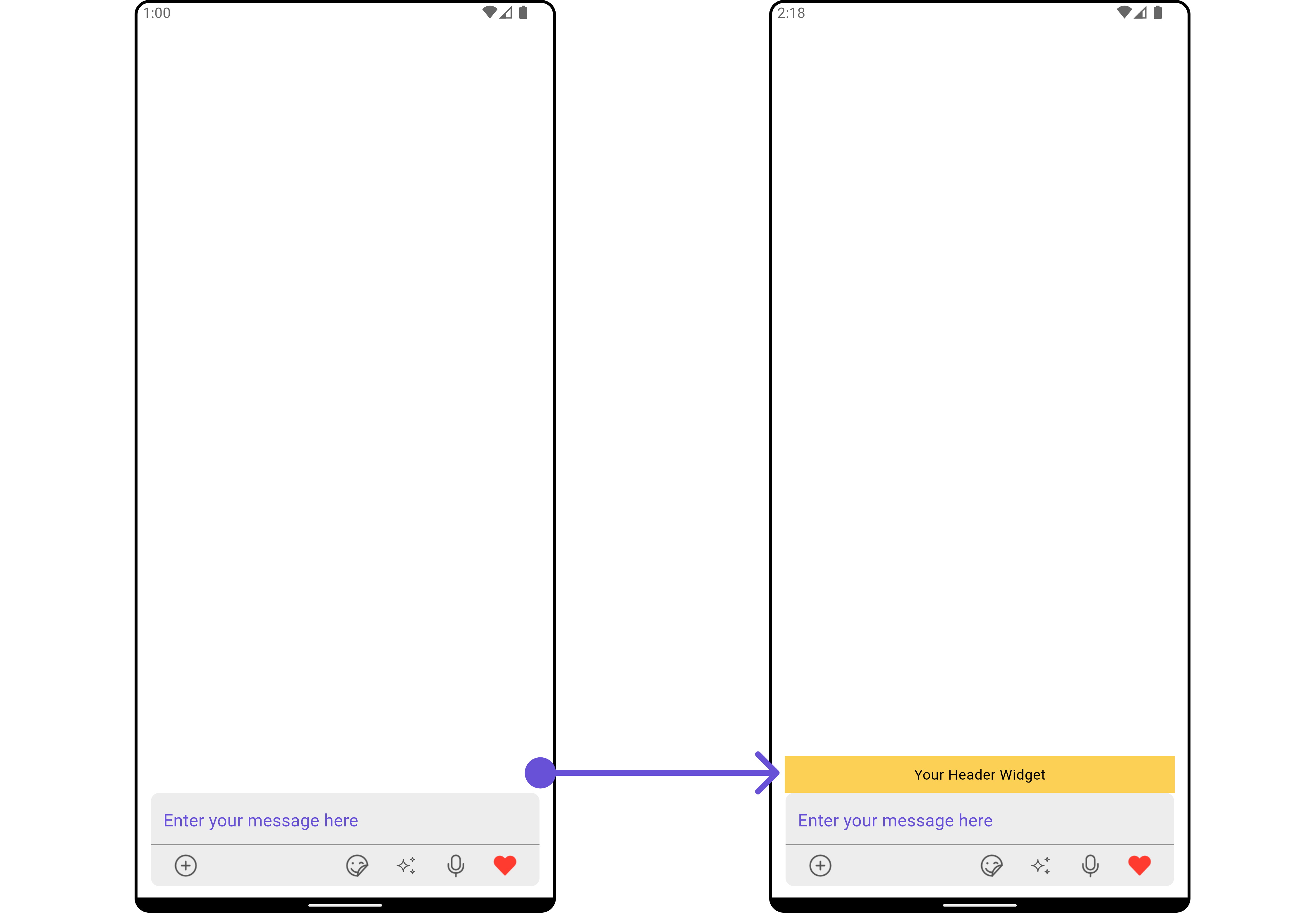
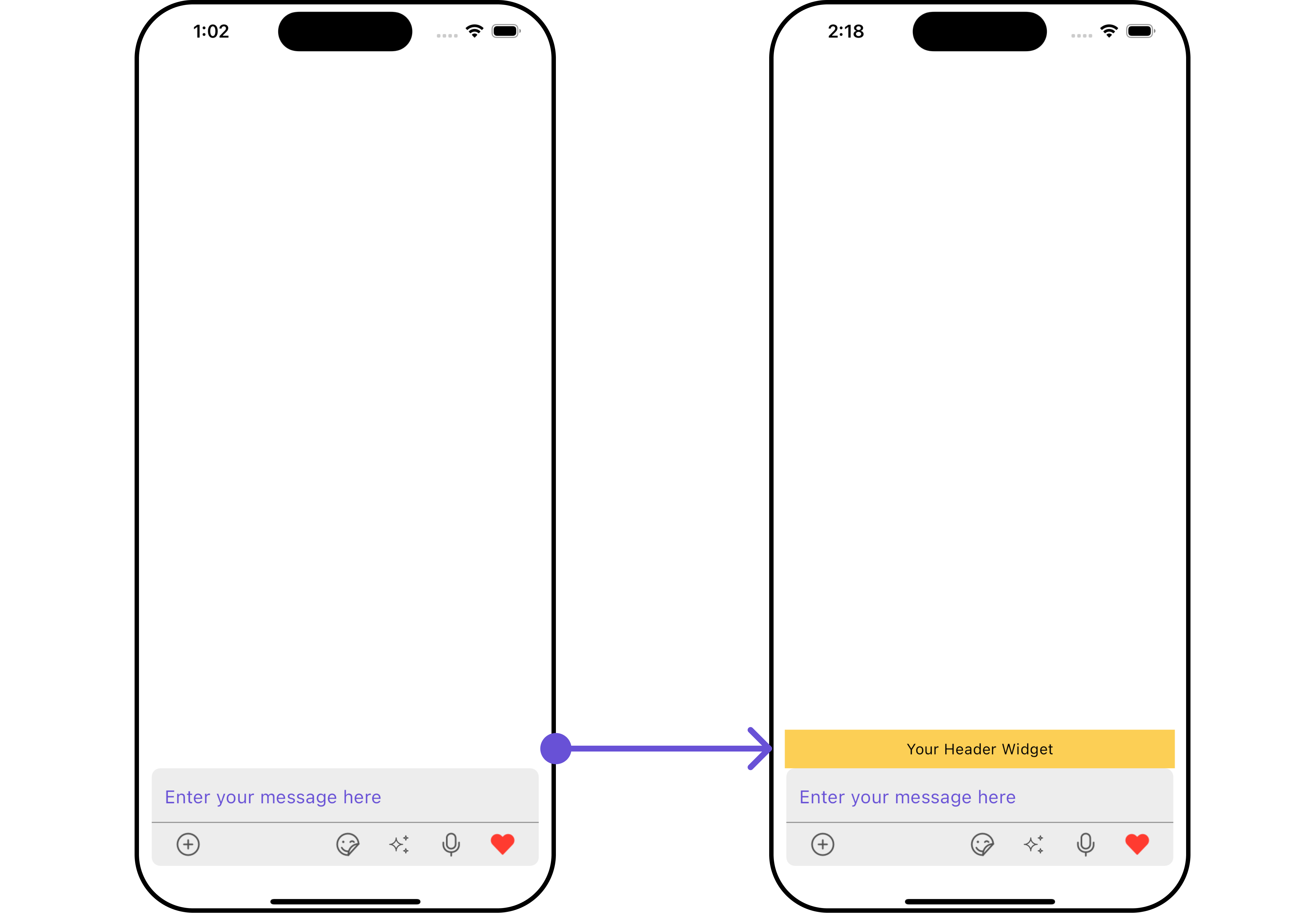
Header Widget
You can set custom headerView to theCometChatMessageComposer widget using the following method
Example
Here is the complete example for reference:
- Dart
- Android
- iOS
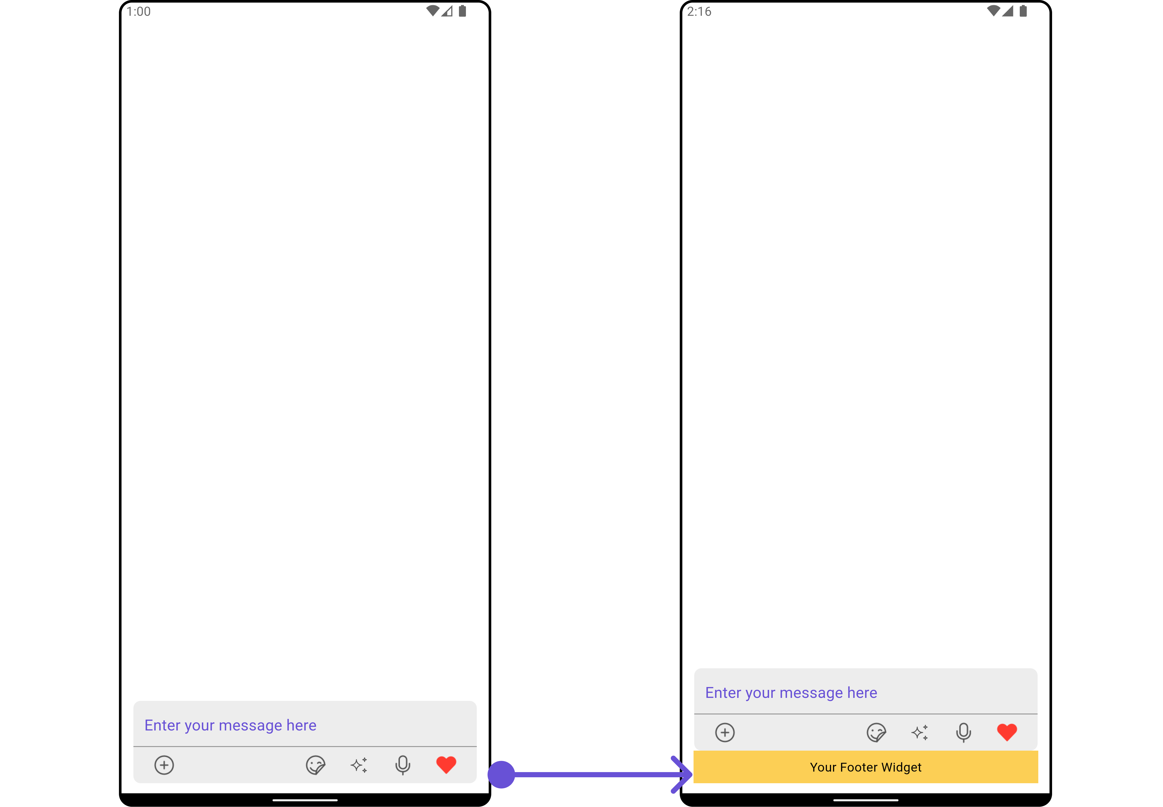
Footer Widget
You can set a custom footer widget to theCometChatMessageComposer widget using the following method:
Example
Here is the complete example for reference:
- Dart
- Android
- iOS