AI Integration Quick Reference
AI Integration Quick Reference
Where It Fits
CometChatMessageComposer is an input component. It renders the message input area and sends messages to the active conversation. Wire it with CometChatMessageHeader and CometChatMessageList to build a complete messaging layout.
- Kotlin
- Java
ChatActivity.kt
Quick Start
Add the component to your layout XML:layout_activity.xml

CometChatUIKit.init(), a user logged in, and the cometchat-chat-uikit-android dependency added.
To add programmatically in an Activity:
- Kotlin
- Java
YourActivity.kt
- Kotlin
- Java
YourFragment.kt
Actions and Events
Callback Methods
setOnSendButtonClick
Fires when the send button is tapped. Primary hook — override to intercept or replace the default message-sending logic.
- Kotlin
- Java
YourActivity.kt
What this does: Replaces the default send-button behavior. When a user taps the send button, your custom lambda executes instead of the built-in message sending logic.
setOnError
Fires on internal errors (network failure, auth issue, SDK exception).
- Kotlin
- Java
YourActivity.kt
What this does: Registers an error listener. If the component encounters an error, your callback receives the CometChatException.
setOnTextChangedListener
Fires whenever the message input’s text value changes, enabling dynamic text handling.
- Kotlin
- Java
YourActivity.kt
What this does: Registers aCometChatTextWatcherthat fires callbacks when the text in the composer input field changes. UseonTextChangedfor real-time character tracking,beforeTextChangedfor pre-change state, andafterTextChangedfor post-change processing.
- Verify: After setting an action callback, trigger the corresponding user interaction (tap send, type text) and confirm your custom logic executes instead of the default behavior.
Global UI Events (CometChatMessageEvents)
The MessageComposer component does not emit any events of its own. However, message-related events can be observed viaCometChatMessageEvents from other components in the messaging flow.
SDK Events
The MessageComposer component does not attach SDK listeners directly. Typing indicators are managed internally whendisableTypingEvents is false (default).
Functionality
Small functional customizations such as toggling visibility of UI elements and configuring composer behavior.| Method | Type | Default | Description |
|---|---|---|---|
setAttachmentButtonVisibility | int | View.VISIBLE | Toggles visibility for the attachment button |
setVoiceNoteButtonVisibility | int | View.VISIBLE | Toggles visibility for the voice note recording button |
setSendButtonVisibility | int | View.VISIBLE | Toggles visibility for the send button |
setStickersButtonVisibility | int | View.VISIBLE | Toggles visibility for the stickers button |
setAuxiliaryButtonVisibility | int | View.VISIBLE | Toggles visibility for the auxiliary button area (AI, stickers) |
setImageAttachmentOptionVisibility | int | View.VISIBLE | Controls whether image attachments are allowed |
setCameraAttachmentOptionVisibility | int | View.VISIBLE | Controls whether camera attachments are allowed |
setVideoAttachmentOptionVisibility | int | View.VISIBLE | Controls whether video attachments are allowed |
setAudioAttachmentOptionVisibility | int | View.VISIBLE | Controls whether audio attachments are allowed |
setFileAttachmentOptionVisibility | int | View.VISIBLE | Controls whether file attachments are allowed |
setPollAttachmentOptionVisibility | int | View.VISIBLE | Controls whether polls can be shared |
setCollaborativeDocumentOptionVisibility | int | View.VISIBLE | Controls whether collaborative documents can be shared |
setCollaborativeWhiteboardOptionVisibility | int | View.VISIBLE | Controls whether collaborative whiteboards can be shared |
disableTypingEvents | boolean | false | Disables or enables typing indicator events |
disableSoundForMessages | boolean | false | Toggles sound for outgoing messages |
setDisableMentions | boolean | false | Disables mentions in text; removes CometChatMentionsFormatter instances |
setMaxLine | int | SDK default | Maximum lines allowed in the input field |
setPlaceHolderText | String | SDK default | Sets the placeholder text in the message input field |
- Verify: After calling a visibility method, confirm the corresponding UI element is shown or hidden.
Custom View Slots
Each slot replaces a section of the default composer UI.| Slot | Method | Replaces |
|---|---|---|
| Header view | setHeaderView(View) | Custom view above the text input area |
| Footer view | setFooterView(View) | Custom view below the text input area |
| Send button | setSendButtonView(View) | Default send button |
| Auxiliary button | setAuxiliaryButtonView(View) | Auxiliary button area (stickers, AI) |
| Attachment options | setAttachmentOptions(List<CometChatMessageComposerAction>) | Default attachment options |
| AI options | setAIOptions(Function4) | Default AI options |
| Text formatters | setTextFormatters(List<CometChatTextFormatter>) | Default text formatters |
| Suggestion list item | setSuggestionListItemView(SuggestionListViewHolderListener) | Default suggestion list item view |
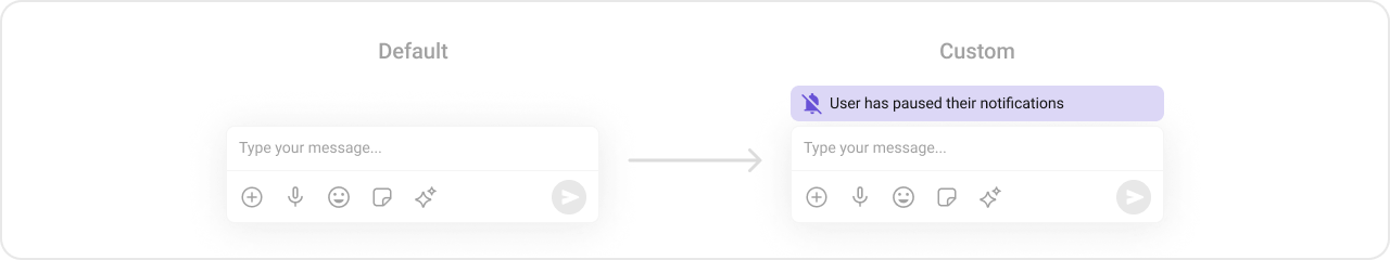
setHeaderView
Sets a custom view above the text input area.
- Kotlin
- Java
What this does: Sets a custom View as the header of the composer. The header view renders above the text input area.
Example with a “Notes” card header:
custom_header_layout.xml layout:
custom_header_layout.xml
- Kotlin
- Java
setFooterView
Sets a custom view below the text input area.
- Kotlin
- Java
What this does: Sets a custom View as the footer of the composer. The footer view renders below the text input area.
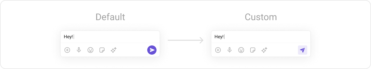
setSendButtonView
Replaces the default send button with a custom view.
- Kotlin
- Java
What this does: Replaces the default send button with your custom View. The custom view takes over the send button position in the composer.
Custom send button example:
drawable/custom_send_button.xml
- Kotlin
- Java
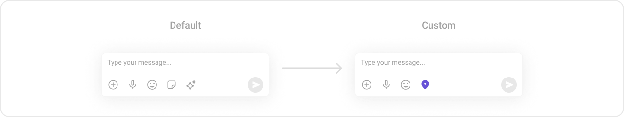
setAuxiliaryButtonView
Replaces the auxiliary button area. The default auxiliary area provides sticker and AI functionality.
The MessageComposer uses the AuxiliaryButton for sticker functionality. If you override it with
setAuxiliaryButtonView(), retrieve the default auxiliary buttons via CometChatUIKit.getDataSource().getAuxiliaryOption() and include them in your custom layout to preserve sticker/AI buttons.- Kotlin
- Java
- Kotlin
- Java
What this does: Creates a horizontalLinearLayoutcontaining the default auxiliary buttons (retrieved viaCometChatUIKit.getDataSource().getAuxiliaryOption()) and a customImageView. The combined layout replaces the default auxiliary button area, preserving the existing sticker/AI buttons while adding a custom button.
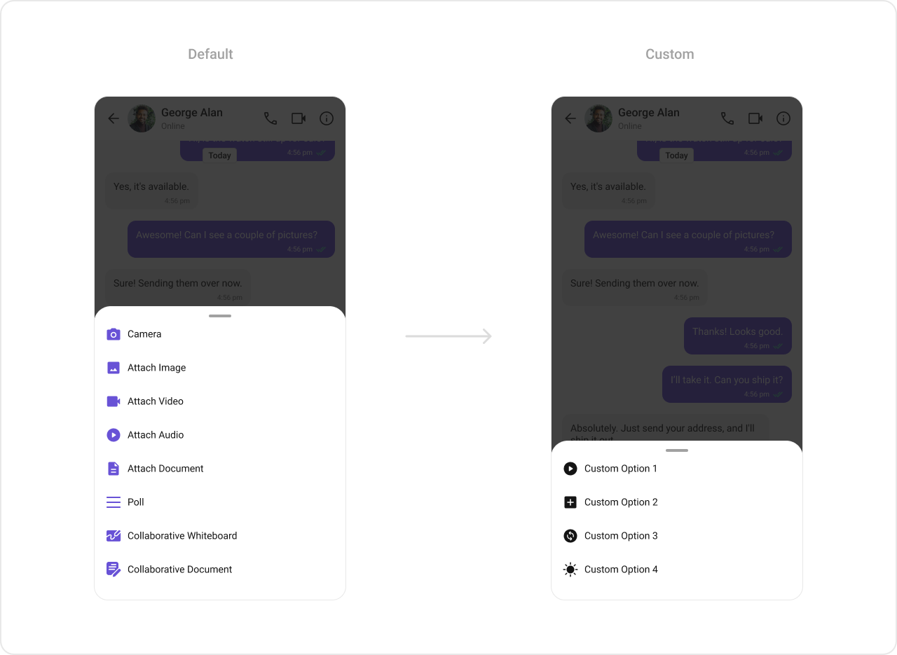
setAttachmentOptions
Replaces the default attachment options with a custom list of CometChatMessageComposerAction objects.
- Kotlin
- Java
- Kotlin
- Java
What this does: Creates four custom CometChatMessageComposerAction objects, each with a title, icon, and click handler. The list replaces the default attachment options (camera, image, video, audio, file, poll, etc.) with these four custom actions.
setAIOptions
Replaces the default AI options with a custom provider function.
- Kotlin
- Java
What this does: Registers a function that returns a list of CometChatMessageComposerAction objects for the AI options sheet. The function receives the current context, user, group, and ID map.
setTextFormatters
Assigns a list of text formatters. If the provided list is not null, it sets the list. Otherwise, it assigns the default text formatters. To configure the existing Mentions look and feel check out CometChatMentionsFormatter.
themes.xml
- Kotlin
- Java
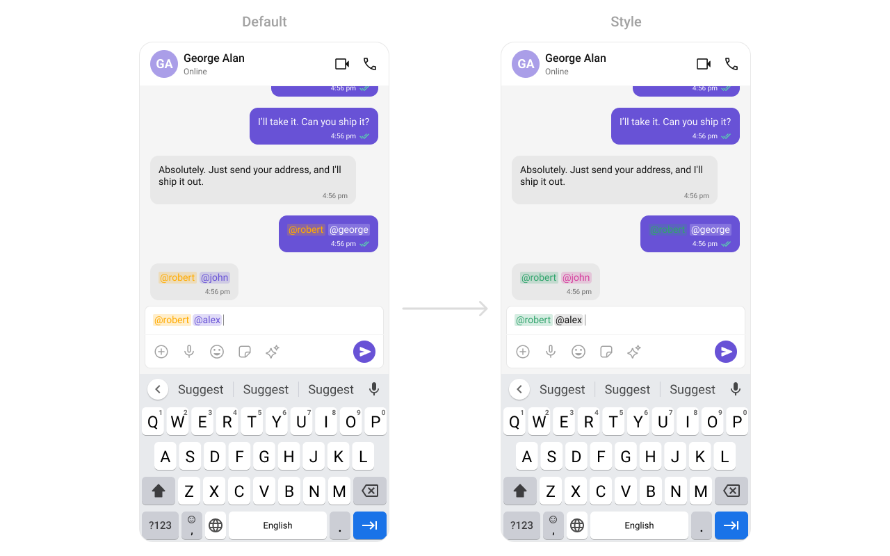
What this does: Creates aCometChatMentionsFormatter, applies the custom mentions style to it, adds it to a list of text formatters, and sets that list on theCometChatMessageComposer. Mentions in the composer input will render with the custom colors and text appearance.
setSuggestionListItemView
Replaces the default suggestion list item view with a custom view holder listener.
- Kotlin
- Java
What this does: Registers a SuggestionListViewHolderListener that provides a custom view for each item in the suggestion list (e.g., mentions dropdown).
- Verify: After setting any custom view slot, confirm the custom view renders in the correct position within the composer, and the data binding populates correctly.
Common Patterns
Text-only composer
- Kotlin
- Java
Custom attachment options only
- Kotlin
- Java
Disable voice recording
- Kotlin
- Java
Prefilled composer with disabled typing events
- Kotlin
- Java
Advanced Methods
setUser / setGroup
Associates the composer with a specific conversation. Use setUser for one-on-one and setGroup for group conversations.
- Kotlin
- Java
setParentMessageId
Sets the parent message ID for threaded replies. When set, messages sent from the composer are sent as replies to the specified parent message.
- Kotlin
- Java
setInitialComposerText
Sets predefined text in the composer input field.
- Kotlin
- Java
getText / getProcessedText
Returns the current text from the composer. getText returns the raw text, while getProcessedText returns text with formatting (mentions, etc.) applied.
- Kotlin
- Java
Internal Access
These methods provide direct access to internal components for advanced use cases.| Method | Returns | Description |
|---|---|---|
getComposerViewModel() | MessageComposerViewModel | The ViewModel managing composer state |
getMessageInput() | CometChatMessageInput | The internal message input component |
getView() | LinearLayout | The root view of the composer |
getAdditionParameter() | AdditionParameter | Additional parameters for the composer |
getUser() | User | The currently set user |
getGroup() | Group | The currently set group |
Use these only when the standard API is insufficient. Directly manipulating the ViewModel or internal views may conflict with the component’s internal state management.
Style
The component uses XML theme styles. Define a custom style with parentCometChatMessageComposerStyle in themes.xml, then apply with setStyle().

themes.xml:
themes.xml
- Kotlin
- Java
Programmatic Style Properties
In addition to XML theme styles, the component exposes programmatic setters for fine-grained control:| Method | Type | Description |
|---|---|---|
setBackgroundColor | @ColorInt int | Background color of the component |
setCornerRadius | int | Corner radius of the component |
setComposeBoxBackgroundColor | @ColorInt int | Background color of the compose box |
setComposeBoxStrokeWidth | @Dimension int | Stroke width of the compose box border |
setComposeBoxStrokeColor | @ColorInt int | Stroke color of the compose box border |
setComposeBoxCornerRadius | @Dimension int | Corner radius of the compose box |
setComposeBoxBackgroundDrawable | Drawable | Custom background drawable for the compose box |
setSeparatorColor | @ColorInt int | Color of the separator line |
setAttachmentIcon | Drawable | Custom attachment icon drawable |
setAttachmentIconTint | @ColorInt int | Tint color for the attachment icon |
setVoiceRecordingIcon | Drawable | Custom voice recording icon drawable |
setVoiceRecordingIconTint | @ColorInt int | Tint color for the voice recording icon |
setAIIcon | Drawable | Custom AI icon drawable |
setAIIconTint | @ColorInt int | Tint color for the AI icon |
setActiveSendButtonDrawable | Drawable | Drawable for the active send button |
setInactiveSendButtonDrawable | Drawable | Drawable for the inactive send button |
setActiveStickerIcon | Drawable | Drawable for the active sticker icon |
setActiveStickerIconTint | @ColorInt int | Tint for the active sticker icon |
setInactiveStickerIcon | Drawable | Drawable for the inactive sticker icon |
setInactiveStickerIconTint | @ColorInt int | Tint for the inactive sticker icon |
setMessageInputStyle | @StyleRes int | Style for the message input field |
setMentionsStyle | @StyleRes int | Style for mentions rendering |
setMediaRecorderStyle | @StyleRes int | Style for the media recorder |
setSuggestionListStyle | @StyleRes int | Style for the suggestion list |
setAttachmentOptionSheetStyle | @StyleRes int | Style for the attachment option sheet |
setAIOptionSheetStyle | @StyleRes int | Style for the AI option sheet |
Edit Preview Style Properties
When editing a message, a preview appears above the input. These properties control its appearance:| Method | Type | Description |
|---|---|---|
setEditPreviewTitleTextAppearance | @StyleRes int | Text appearance for the edit preview title |
setEditPreviewTitleTextColor | @ColorInt int | Text color for the edit preview title |
setEditPreviewMessageTextAppearance | @StyleRes int | Text appearance for the edit preview message |
setEditPreviewMessageTextColor | @ColorInt int | Text color for the edit preview message |
setEditPreviewBackgroundColor | @ColorInt int | Background color for the edit preview |
setEditPreviewCornerRadius | @Dimension int | Corner radius for the edit preview |
setEditPreviewStrokeColor | @ColorInt int | Stroke color for the edit preview |
setEditPreviewStrokeWidth | @Dimension int | Stroke width for the edit preview |
setEditPreviewCloseIcon | Drawable | Close icon for the edit preview |
setEditPreviewCloseIconTint | @ColorInt int | Tint for the edit preview close icon |
Customization Matrix
| What to change | Where | Property/API | Example |
|---|---|---|---|
| Override send button behavior | Activity/Fragment | setOnSendButtonClick | setOnSendButtonClick(sendButtonClick) |
| Listen for text changes | Activity/Fragment | setOnTextChangedListener | setOnTextChangedListener(textWatcher) |
| Handle errors | Activity/Fragment | setOnError | setOnError(onError) |
| Target user | Activity/Fragment | setUser(User) | .setUser(user) |
| Target group | Activity/Fragment | setGroup(Group) | .setGroup(group) |
| Thread replies | Activity/Fragment | setParentMessageId(long) | .setParentMessageId(parentMessage.getId()) |
| Attachment button visibility | Activity/Fragment | setAttachmentButtonVisibility(int) | .setAttachmentButtonVisibility(View.GONE) |
| Voice note button visibility | Activity/Fragment | setVoiceNoteButtonVisibility(int) | .setVoiceNoteButtonVisibility(View.GONE) |
| Send button visibility | Activity/Fragment | setSendButtonVisibility(int) | .setSendButtonVisibility(View.GONE) |
| Stickers button visibility | Activity/Fragment | setStickersButtonVisibility(int) | .setStickersButtonVisibility(View.GONE) |
| Auxiliary button visibility | Activity/Fragment | setAuxiliaryButtonVisibility(int) | .setAuxiliaryButtonVisibility(View.GONE) |
| Image attachment option | Activity/Fragment | setImageAttachmentOptionVisibility(int) | .setImageAttachmentOptionVisibility(View.GONE) |
| Camera attachment option | Activity/Fragment | setCameraAttachmentOptionVisibility(int) | .setCameraAttachmentOptionVisibility(View.GONE) |
| Video attachment option | Activity/Fragment | setVideoAttachmentOptionVisibility(int) | .setVideoAttachmentOptionVisibility(View.GONE) |
| Audio attachment option | Activity/Fragment | setAudioAttachmentOptionVisibility(int) | .setAudioAttachmentOptionVisibility(View.GONE) |
| File attachment option | Activity/Fragment | setFileAttachmentOptionVisibility(int) | .setFileAttachmentOptionVisibility(View.GONE) |
| Poll attachment option | Activity/Fragment | setPollAttachmentOptionVisibility(int) | .setPollAttachmentOptionVisibility(View.GONE) |
| Collaborative document option | Activity/Fragment | setCollaborativeDocumentOptionVisibility(int) | .setCollaborativeDocumentOptionVisibility(View.GONE) |
| Collaborative whiteboard option | Activity/Fragment | setCollaborativeWhiteboardOptionVisibility(int) | .setCollaborativeWhiteboardOptionVisibility(View.GONE) |
| Typing events | Activity/Fragment | disableTypingEvents(boolean) | .disableTypingEvents(true) |
| Outgoing message sound | Activity/Fragment | disableSoundForMessages(boolean) | .disableSoundForMessages(true) |
| Custom outgoing message sound | Activity/Fragment | setCustomSoundForMessages(int) | .setCustomSoundForMessages(R.raw.custom_sound) |
| Predefined text | Activity/Fragment | setInitialComposerText(String) | .setInitialComposerText("Hello!") |
| Max input lines | Activity/Fragment | setMaxLine(int) | .setMaxLine(5) |
| Placeholder text | Activity/Fragment | setPlaceHolderText(String) | .setPlaceHolderText("Type a message...") |
| Disable mentions | Activity/Fragment | setDisableMentions(boolean) | .setDisableMentions(true) |
| Auxiliary button alignment | Activity/Fragment | setAuxiliaryButtonAlignment(AuxiliaryButtonsAlignment) | .setAuxiliaryButtonAlignment(alignment) |
| Header view | Activity/Fragment | setHeaderView(View) | See setHeaderView code above |
| Footer view | Activity/Fragment | setFooterView(View) | See setFooterView code above |
| Send button view | Activity/Fragment | setSendButtonView(View) | See setSendButtonView code above |
| Auxiliary button view | Activity/Fragment | setAuxiliaryButtonView(View) | See setAuxiliaryButtonView code above |
| Attachment options (replace) | Activity/Fragment | setAttachmentOptions(List) | See setAttachmentOptions code above |
| AI options (replace) | Activity/Fragment | setAIOptions(Function4) | See setAIOptions code above |
| Text formatters | Activity/Fragment | setTextFormatters(List) | See setTextFormatters code above |
| Suggestion list item view | Activity/Fragment | setSuggestionListItemView(listener) | See setSuggestionListItemView code above |
| Attachment icon tint | themes.xml | cometchatMessageComposerAttachmentIconTint | <item name="cometchatMessageComposerAttachmentIconTint">#F76808</item> |
| Voice recording icon tint | themes.xml | cometchatMessageComposerVoiceRecordingIconTint | <item name="cometchatMessageComposerVoiceRecordingIconTint">#F76808</item> |
| Active sticker icon tint | themes.xml | cometchatMessageComposerActiveStickerIconTint | <item name="cometchatMessageComposerActiveStickerIconTint">#F76808</item> |
| Inactive sticker icon tint | themes.xml | cometchatMessageComposerInactiveStickerIconTint | <item name="cometchatMessageComposerInactiveStickerIconTint">#F76808</item> |
| AI icon tint | themes.xml | cometchatMessageComposerAIIconTint | <item name="cometchatMessageComposerAIIconTint">#F76808</item> |
| Active send button drawable | themes.xml | cometchatMessageComposerActiveSendButtonDrawable | <item name="cometchatMessageComposerActiveSendButtonDrawable">@drawable/active_send_button</item> |
| Apply a custom style | Activity/Fragment | setStyle(int styleRes) | cometChatMessageComposer.setStyle(R.style.CustomMessageComposerStyle); |
| Mentions text style | themes.xml | CometChatMessageComposerMentionsStyle | <item name="cometchatMentionTextColor">#000000</item> |
| Compose box background | Activity/Fragment | setComposeBoxBackgroundColor(int) | .setComposeBoxBackgroundColor(Color.WHITE) |
| Compose box stroke | Activity/Fragment | setComposeBoxStrokeColor(int) | .setComposeBoxStrokeColor(Color.GRAY) |
| Separator color | Activity/Fragment | setSeparatorColor(int) | .setSeparatorColor(Color.LTGRAY) |
| Edit preview style | Activity/Fragment | setEditPreview* methods | See Style section above |
Next Steps
Message Header
Display user/group info in the toolbar
Message List
Display messages in a conversation
Conversations
Browse recent conversations
Theming
Customize colors, fonts, and styles