AI Integration Quick Reference
AI Integration Quick Reference
Where It Fits
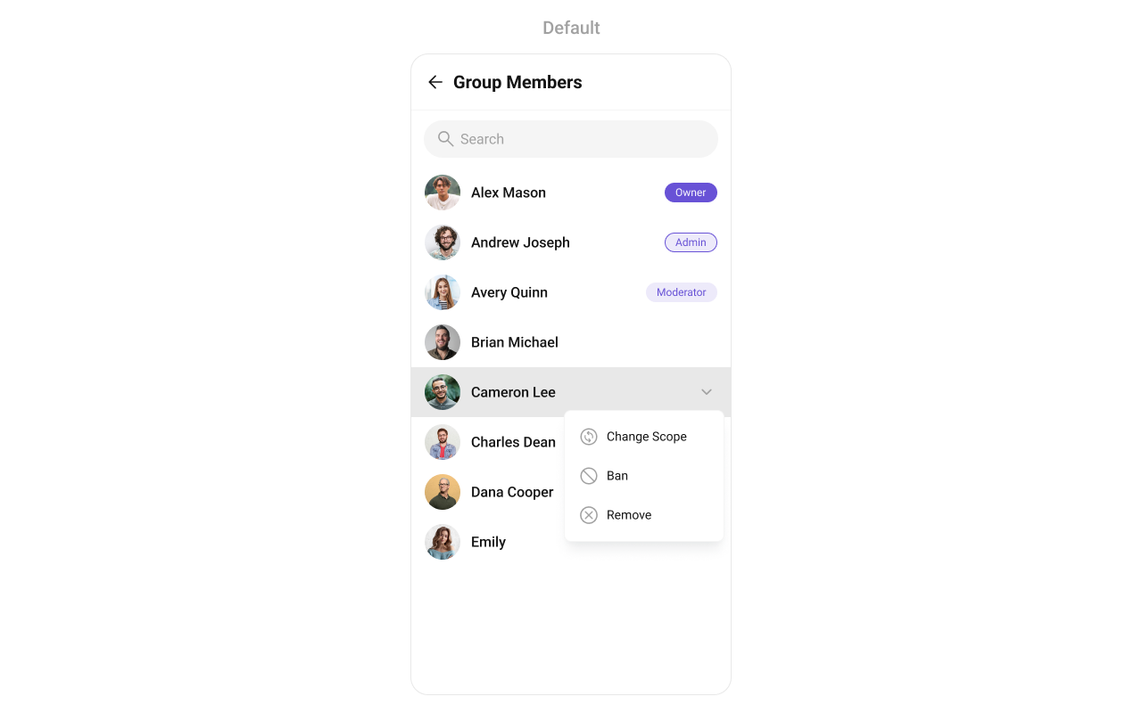
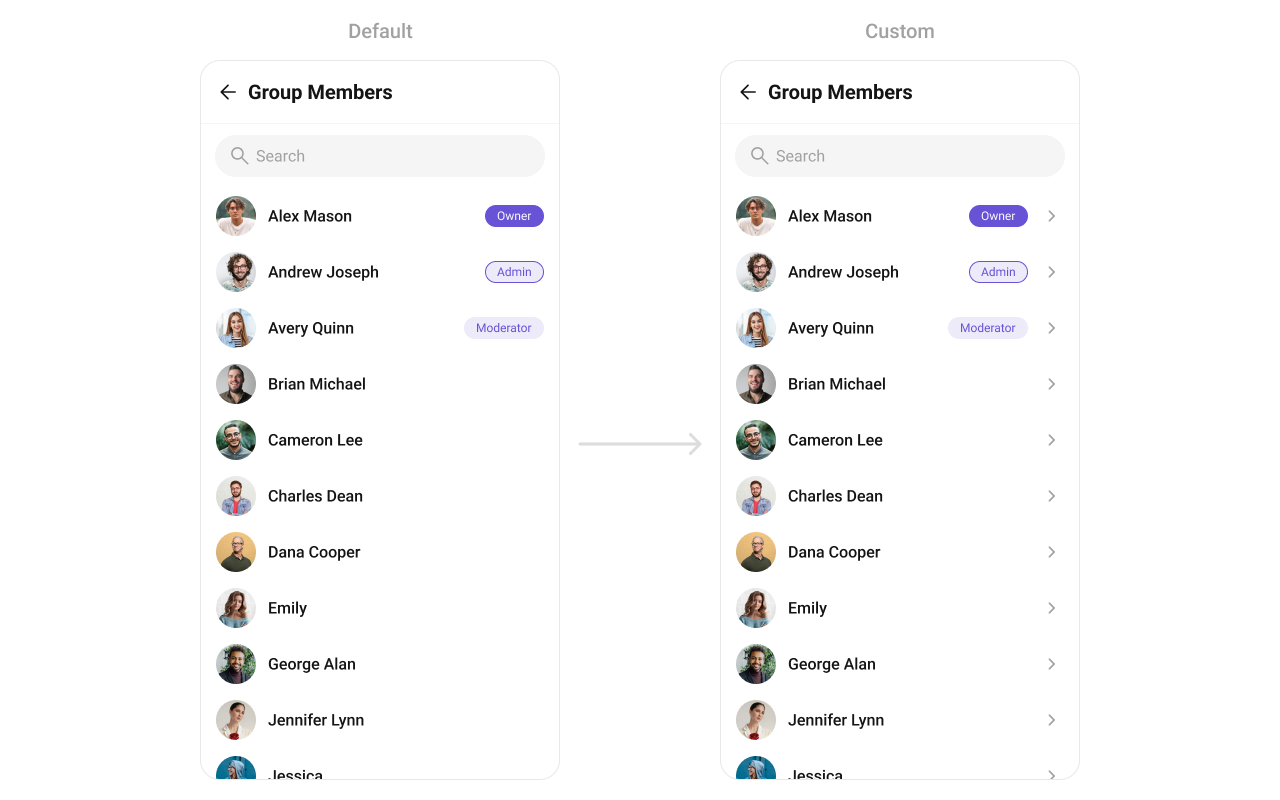
CometChatGroupMembers is a list component. It renders all members of a specific group and emits the selected GroupMember via setOnItemClick. It requires a Group object set via setGroup() before it can load data. Wire it to CometChatMessageHeader, CometChatMessageList, and CometChatMessageComposer to build a group messaging layout.
- Kotlin
- Java
GroupChatActivity.kt
Quick Start
Add the component to your layout XML:layout_activity.xml
CometChatUIKit.init(), a user logged in, the cometchat-chat-uikit-android dependency added, and a valid Group object with a group ID (GUID).
Set the Group object in your Activity or Fragment:
- Kotlin
- Java
YourActivity.kt
What this does: Creates aOr add programmatically in an Activity:Groupobject with a group ID and name, then passes it to theCometChatGroupMemberscomponent. The component fetches and displays all members of that group.
- Kotlin
- Java
YourActivity.kt
- Kotlin
- Java
YourFragment.kt
Filtering Group Members
Pass aGroupMembersRequest.GroupMembersRequestBuilder to setGroupMembersRequestBuilder. Pass the builder instance — not the result of .build().
- Kotlin
- Java
Filter Recipes
| Recipe | Code |
|---|---|
| Limit to 10 per page | builder.setLimit(10) |
| Search by keyword | builder.setSearchKeyword("john") |
| Filter by scopes | builder.setScopes(Arrays.asList("admin", "moderator")) |
| Admins only | builder.setScopes(Arrays.asList("admin")) |
| Moderators only | builder.setScopes(Arrays.asList("moderator")) |
| Participants only | builder.setScopes(Arrays.asList("participant")) |
The component uses infinite scroll — the next page loads as the user scrolls to the bottom.
Search Request Builder
UsesetSearchRequestBuilder to customize the search list separately from the main list:
- Kotlin
- Java
What this does: Creates a GroupMembersRequestBuilder with a group ID, limit, and search keyword, then applies it as the search request builder. When the user searches, the component uses this builder to filter results.
Actions and Events
Callback Methods
setOnItemClick
Fires when a group member row is tapped. Primary navigation hook — set the active member and render the message view.
- Kotlin
- Java
YourActivity.kt
What this does: Replaces the default item-click behavior. When a user taps a group member, your custom lambda executes instead of the built-in navigation.
setOnItemLongClick
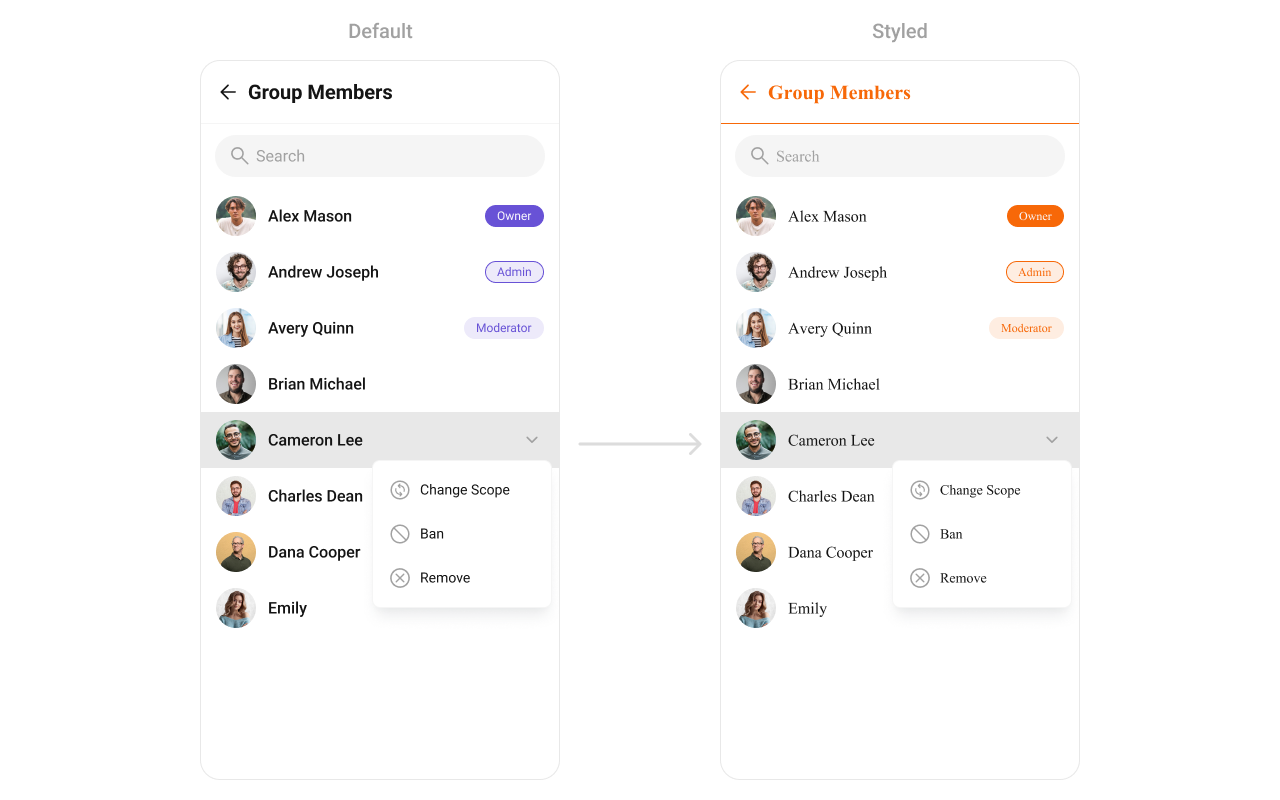
Fires when a group member row is long-pressed. Use for additional actions like kick, ban, or change scope.
- Kotlin
- Java
YourActivity.kt
setOnBackPressListener
Fires when the user presses the back button in the app bar. Default: navigates to the previous activity.
- Kotlin
- Java
YourActivity.kt
setOnSelection
Fires when a group member is checked/unchecked in multi-select mode. Requires setSelectionMode to be set.
- Kotlin
- Java
YourActivity.kt
setOnError
Fires on internal errors (network failure, auth issue, SDK exception).
- Kotlin
- Java
YourActivity.kt
setOnLoadMore
Fires when the list is successfully fetched and loaded.
- Kotlin
- Java
YourActivity.kt
setOnEmpty
Fires when the list is empty, enabling custom handling such as showing a placeholder.
- Kotlin
- Java
YourActivity.kt
- Verify: After setting an action callback, trigger the corresponding user interaction (tap, long-press, back, select) and confirm your custom logic executes instead of the default behavior.
Global UI Events
CometChatGroupEvents emits events subscribable from anywhere in the application. Add a listener and remove it when no longer needed.
| Event | Fires when | Payload |
|---|---|---|
ccGroupMemberBanned | A group member is banned from the group | Action, User, User, Group |
ccGroupMemberKicked | A group member is kicked from the group | Action, User, User, Group |
ccGroupMemberScopeChanged | A group member’s scope is changed | Action, User, String, String, Group |
ccGroupMemberAdded | Members are added to the group | List<Action>, List<User>, Group, User |
ccGroupMemberUnBanned | A group member is unbanned | Action, User, User, Group |
ccOwnershipChanged | Group ownership is transferred | Group, GroupMember |
- Kotlin
- Java
Add Listener
What this does: Registers a global event listener tagged with "LISTENER_TAG". When a group member is kicked, banned, or has their scope changed, the corresponding callback fires with the action details, affected user, and group information.
SDK Events (Real-Time, Automatic)
The component listens to these SDK events internally. No manual attachment needed unless additional side effects are required.| SDK Listener | Internal behavior |
|---|---|
onGroupMemberJoined | Adds the new member to the list |
onGroupMemberLeft | Removes the member from the list |
onGroupMemberKicked | Removes the kicked member from the list |
onGroupMemberBanned | Removes the banned member from the list |
onGroupMemberScopeChanged | Updates the member’s scope in the list |
onMemberAddedToGroup | Adds the new member to the list |
onUserOnline | Updates online status indicator for the member |
onUserOffline | Updates offline status indicator for the member |
Automatic: group membership changes and user presence changes update the list in real time.
Functionality
Small functional customizations such as toggling visibility of UI elements and configuring selection modes.| Methods | Description | Code |
|---|---|---|
setGroup | Sets the group whose members need to be fetched. Required for the component to function. | .setGroup(group); |
setBackIconVisibility | Toggles visibility for the back button in the app bar | .setBackIconVisibility(View.VISIBLE); |
setToolbarVisibility | Toggles visibility for the toolbar in the app bar | .setToolbarVisibility(View.GONE); |
setLoadingStateVisibility | Hides the loading state while fetching members | .setLoadingStateVisibility(View.GONE); |
setErrorStateVisibility | Hides the error state on fetching members | .setErrorStateVisibility(View.GONE); |
setEmptyStateVisibility | Hides the empty state on fetching members | .setEmptyStateVisibility(View.GONE); |
setSeparatorVisibility | Controls visibility of separators in the list view | .setSeparatorVisibility(View.GONE); |
setUserStatusVisibility | Controls visibility of the online status indicator | .setUserStatusVisibility(View.GONE); |
setSearchBoxVisibility | Controls visibility of the search box in the toolbar | .setSearchBoxVisibility(View.GONE); |
setSelectionMode | Determines the selection mode (single or multiple) | .setSelectionMode(UIKitConstants.SelectionMode.MULTIPLE); |
setSearchKeyword | Programmatically triggers a search with the given keyword | .setSearchKeyword("anything"); |
setTitleText | Sets a custom title in the toolbar | .setTitleText("Members"); |
setKickMemberOptionVisibility | Toggles visibility for the kick member option in the long-press menu | .setKickMemberOptionVisibility(View.GONE); |
setBanMemberOptionVisibility | Toggles visibility for the ban member option in the long-press menu | .setBanMemberOptionVisibility(View.GONE); |
setScopeChangeOptionVisibility | Toggles visibility for the scope change option in the long-press menu | .setScopeChangeOptionVisibility(View.GONE); |
excludeOwner | When true, excludes the group owner from the member list | .excludeOwner(true); |
- Verify: After calling a visibility method, confirm the corresponding UI element is shown or hidden.
Custom View Slots
Each slot replaces a section of the default UI. Slots that accept aGroupMember parameter receive the group member object for that row via the GroupMembersViewHolderListeners pattern (createView + bindView).
| Slot | Method | Replaces |
|---|---|---|
| Leading view | setLeadingView(GroupMembersViewHolderListeners) | Avatar / left section |
| Title view | setTitleView(GroupMembersViewHolderListeners) | Name / title text |
| Subtitle view | setSubtitleView(GroupMembersViewHolderListeners) | Subtitle text below name |
| Trailing view | setTrailingView(GroupMembersViewHolderListeners) | Right section |
| Item view | setItemView(GroupMembersViewHolderListeners) | Entire list item row |
| Loading view | setLoadingStateView(@LayoutRes int) | Loading spinner |
| Empty view | setEmptyStateView(@LayoutRes int) | Empty state |
| Error view | setErrorStateView(@LayoutRes int) | Error state |
| Overflow menu | setOverflowMenu(View) | Toolbar menu |
| Options (replace) | setOptions(Function3) | Long-press context menu (replaces defaults) |
| Options (append) | addOptions(Function3) | Long-press context menu (appends to defaults) |
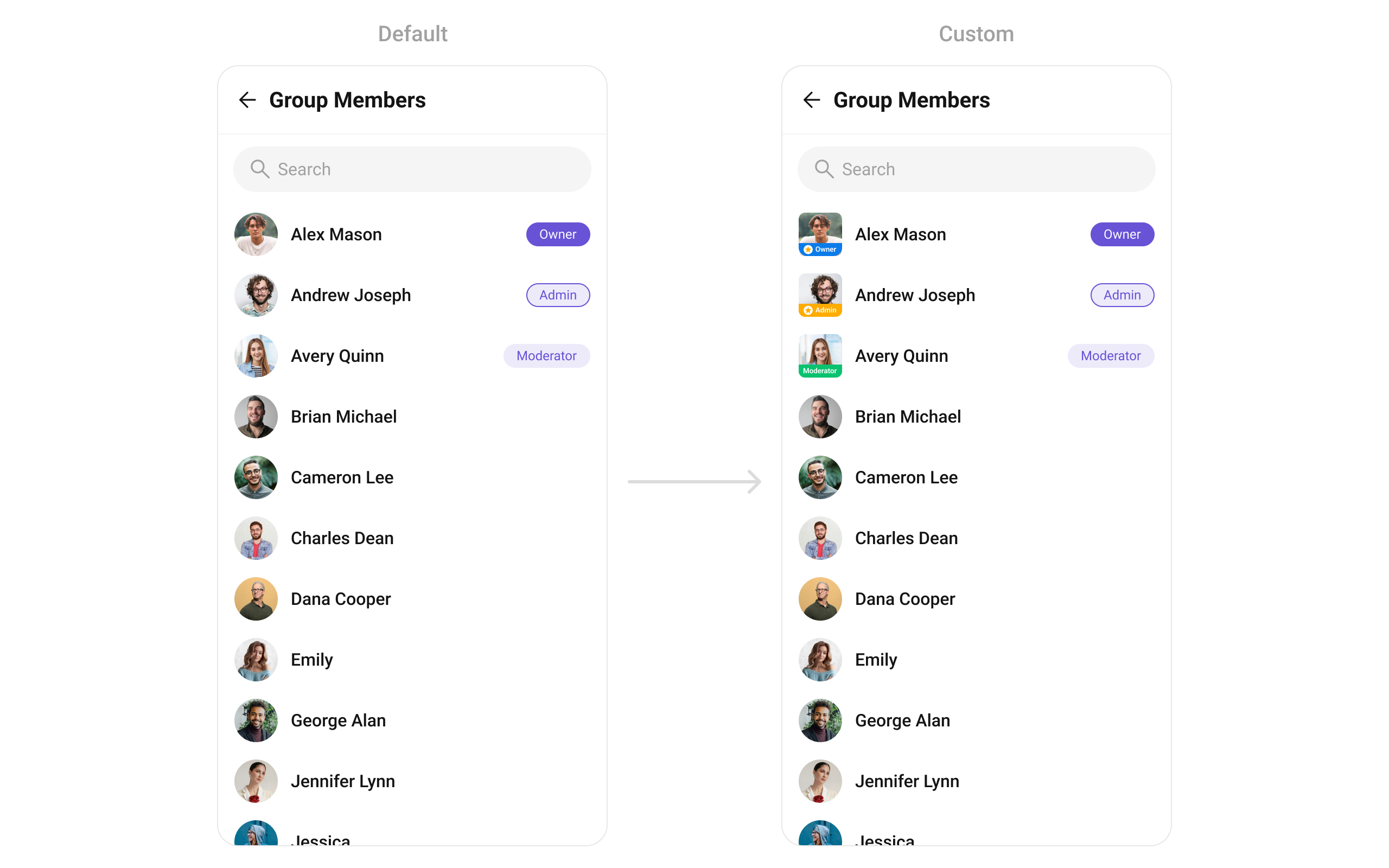
setLeadingView
Replace the avatar / left section.
- Kotlin
- Java
What this does: Registers aScope badge avatar example:GroupMembersViewHolderListenersthat provides a custom view for the leading (left) area of each group member item.createViewinflates your layout, andbindViewpopulates it with group member data.
custom_title_view.xml:
custom_title_view.xml
What this does: Defines a custom leading view layout with a CometChatAvatar and a role badge view that can display different backgrounds based on the member’s scope (admin, moderator, participant).
- Kotlin
- Java
YourActivity.kt
What this does: Inflates a custom leading view layout and populates it with the group member’s avatar and a role-based badge. If the member is an admin, the badge shows themarketing_headdrawable; if a moderator,sr_manager; if a participant,content_manager; otherwise,team_member. The view is sized to 40dp × 40dp.
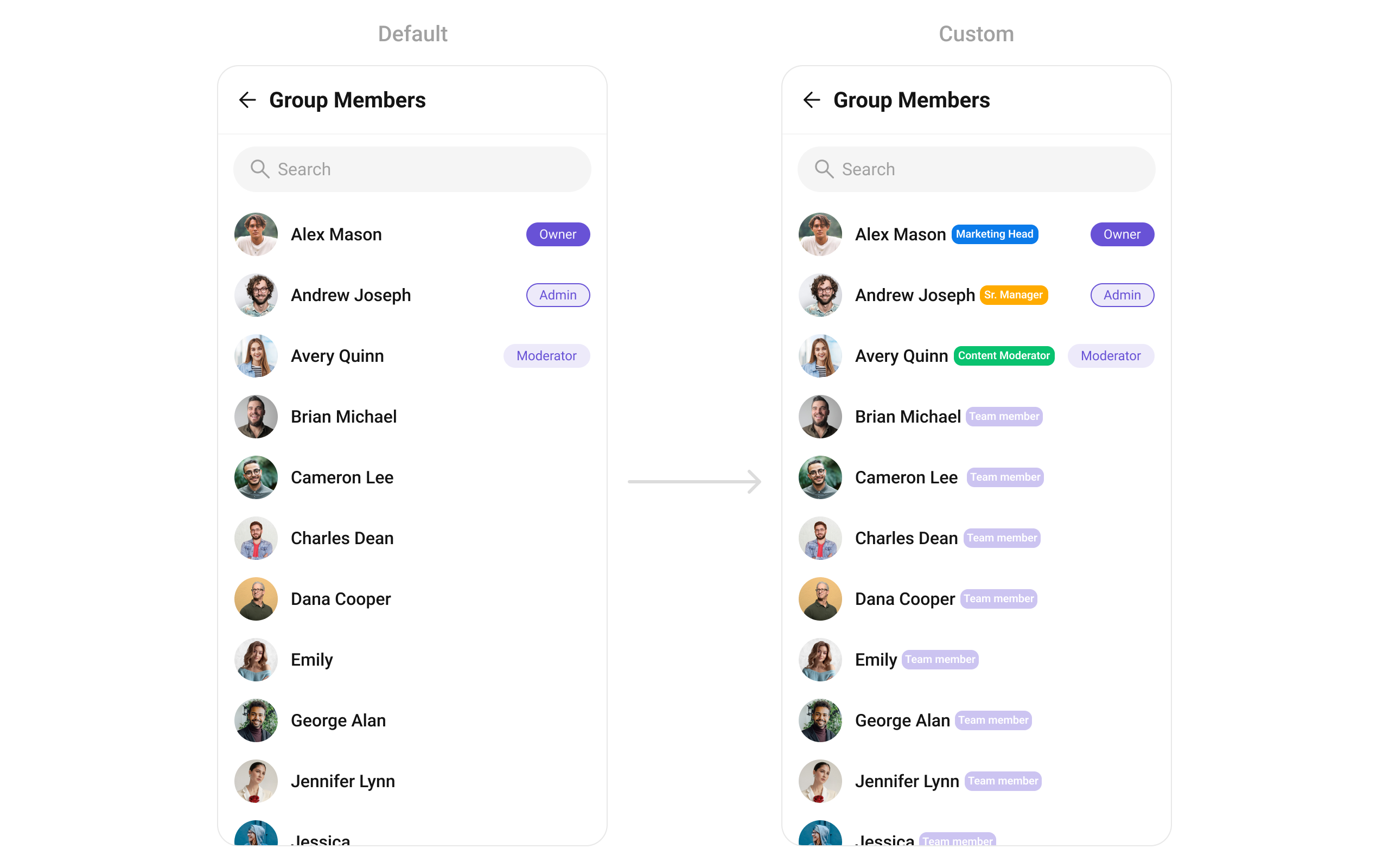
setTitleView
Replace the name / title text.
- Kotlin
- Java
custom_title_view.xml:
custom_title_view.xml
What this does: Defines a custom title view layout with aTextViewfor the member name and aViewfor the role badge, arranged horizontally.
- Kotlin
- Java
YourActivity.kt
What this does: Inflates a custom title view layout and populates it with the group member’s name and a role-based badge. The badge background changes based on the member’s scope:marketing_headfor admin,sr_managerfor moderator,content_managerfor participant, andteam_memberfor others.
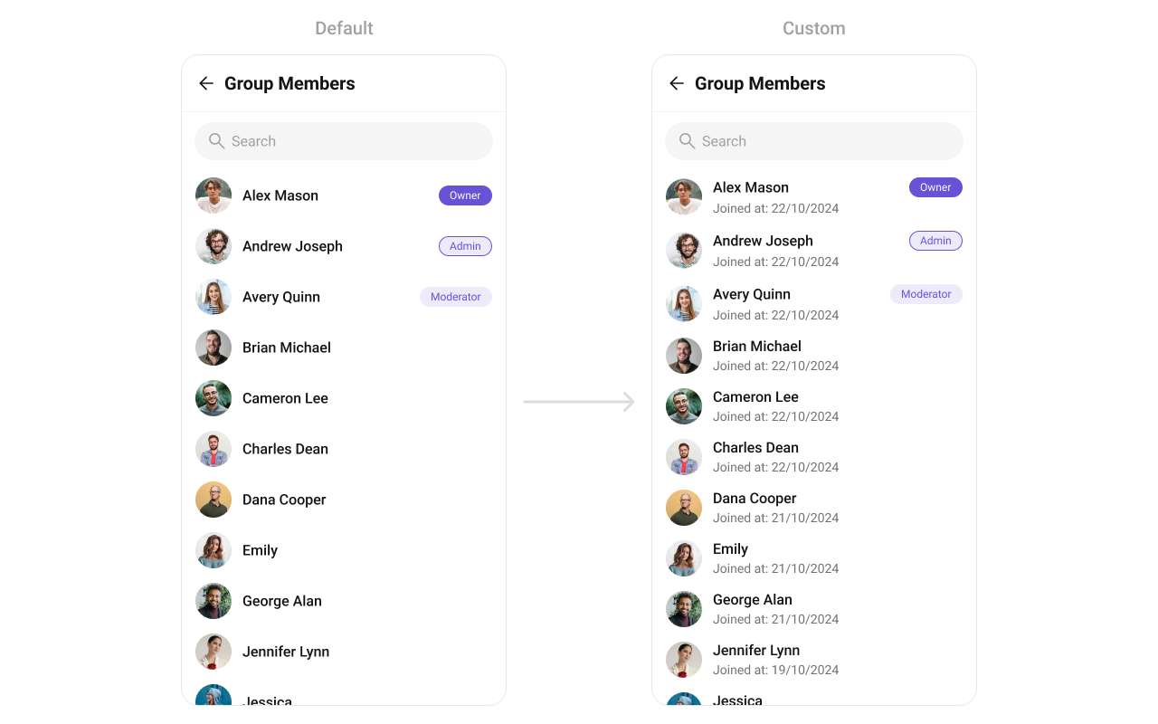
setSubtitleView
Replace the subtitle text below the member’s name.
- Kotlin
- Java
- Kotlin
- Java
YourActivity.kt
What this does: Creates aTextViewas the subtitle view and populates it with the group member’s join date formatted as “dd/MM/yyyy, HH:mm:ss”. ThejoinedAttimestamp is multiplied by 1000 to convert from seconds to milliseconds.
setTrailingView
Replace the right section of each group member item.
- Kotlin
- Java
custom_tail_view.xml:
custom_tail_view.xml
What this does: Defines a custom trailing view layout with aMaterialCardViewcontaining aTextViewthat displays the member’s scope as a colored badge.
- Kotlin
- Java
YourActivity.kt
What this does: Inflates a custom trailing view that displays a scope badge for each group member. The badge background uses the extended primary color, the text shows the member’s scope, and the badge is only visible for participants (hidden for admins, moderators, and owners).
setItemView
Replace the entire list item row.
- Kotlin
- Java
item_list.xml:
item_list.xml
What this does: Defines a custom list item layout with two TextView elements: one for the member name and one for the subtitle (scope), arranged vertically.
- Kotlin
- Java
YourActivity.kt
What this does: Inflates a custom list item layout and populates it with the group member’s name and scope. Each list item shows the member name in the primary text style and their scope (admin, moderator, participant) in the secondary text style.
setOptions
Replace the long-press context menu entirely.
- Kotlin
- Java
addOptions
Append to the long-press context menu without removing defaults.
- Kotlin
- Java
setLoadingStateView
Sets a custom loading view displayed when data is being fetched.
- Kotlin
- Java
setEmptyStateView
Configures a custom view displayed when there are no group members in the list.
- Kotlin
- Java
setErrorStateView
Defines a custom error state view that appears when an issue occurs while loading group members.
- Kotlin
- Java
setOverflowMenu
Replace the toolbar overflow menu.
- Kotlin
- Java
What this does: Creates an ImageView with an add icon and sets it as the overflow menu in the group members toolbar. This provides a quick action button for adding new members.
- Verify: After setting any custom view slot, confirm the custom view renders in the correct position within the group member list item, and the data binding populates correctly for each member.
Common Patterns
Hide all chrome — minimal list
- Kotlin
- Java
Admins-only list
- Kotlin
- Java
Exclude group owner
- Kotlin
- Java
Hide kick/ban/scope options
- Kotlin
- Java
Advanced Methods
Programmatic Selection
selectGroupMember
Programmatically selects or deselects a group member. Works with both SINGLE and MULTIPLE selection modes.
- Kotlin
- Java
InSINGLEmode, selecting a new member replaces the previous selection. InMULTIPLEmode, calling this on an already-selected member deselects it (toggle behavior).
getSelectedGroupMembers
Returns the list of currently selected GroupMember objects.
- Kotlin
- Java
Selected Group Members List
When using multi-select mode, a horizontal list of selected group members can be shown above the main list.| Method | Type | Description |
|---|---|---|
setSelectedGroupMembersListVisibility | int (View.VISIBLE / View.GONE) | Show or hide the selected members strip |
setSelectedGroupMemberAvatarStyle | @StyleRes int | Avatar style for selected member chips |
setSelectedGroupMemberItemTextColor | @ColorInt int | Text color for selected member names |
setSelectedGroupMemberItemTextAppearance | @StyleRes int | Text appearance for selected member names |
setSelectedGroupMemberItemRemoveIcon | Drawable | Icon for the remove button on each chip |
setSelectedGroupMemberItemRemoveIconTint | @ColorInt int | Tint color for the remove icon |
Search Input Customization
The built-in search box can be customized programmatically:| Method | Type | Description |
|---|---|---|
setSearchInputTextColor | @ColorInt int | Text color of the search input |
setSearchInputPlaceHolderTextColor | @ColorInt int | Placeholder text color |
setSearchInputIcon | Drawable | Leading icon in the search box |
setSearchInputIconTint | @ColorInt int | Tint for the leading icon |
setSearchInputEndIcon | Drawable | Trailing icon in the search box |
setSearchInputEndIconTint | @ColorInt int | Tint for the trailing icon |
setSearchInputStrokeWidth | @Dimension int | Stroke width of the search box border |
setSearchInputStrokeColor | @ColorInt int | Stroke color of the search box border |
setSearchInputBackgroundColor | @ColorInt int | Background color of the search box |
setSearchInputCornerRadius | @Dimension int | Corner radius of the search box |
setSearchInputTextAppearance | @StyleRes int | Text appearance of the search input |
Internal Access
These methods provide direct access to internal components for advanced use cases.| Method | Returns | Description |
|---|---|---|
getBinding() | CometchatGroupMembersListViewBinding | The ViewBinding for the component’s root layout |
getViewModel() | GroupMembersViewModel | The ViewModel managing group member data and state |
getAdapter() | GroupMembersAdapter | The adapter powering the RecyclerView |
setAdapter(GroupMembersAdapter) | void | Replaces the default adapter with a custom one |
getRecyclerView() | RecyclerView | The RecyclerView displaying the member list |
Use these only when the standard API is insufficient. Directly manipulating the adapter or ViewModel may conflict with the component’s internal state management.
Style
The component uses XML theme styles. Define a custom style with parentCometChatGroupMembersStyle in themes.xml, then apply with setStyle().
themes.xml
- Kotlin
- Java
What this does: Applies theTo know more such attributes, visit the attributes file.CustomGroupMembersStyletheme to theCometChatGroupMemberscomponent, changing the avatar, separator, title text, and back icon appearance.
Programmatic Style Properties
In addition to XML theme styles, the component exposes programmatic setters for fine-grained control:| Method | Type | Description |
|---|---|---|
setBackgroundColor | @ColorInt int | Background color of the component |
setBackIconTint | @ColorInt int | Tint color for the back icon |
setBackIcon | Drawable | Custom back icon drawable |
setTitleTextColor | @ColorInt int | Title text color in the toolbar |
setTitleTextAppearance | @StyleRes int | Title text appearance in the toolbar |
setItemTitleTextColor | @ColorInt int | Text color for member item titles |
setItemTitleTextAppearance | @StyleRes int | Text appearance for member item titles |
setSeparatorColor | @ColorInt int | Color of list item separators |
setSeparatorHeight | @Dimension int | Height of list item separators |
setCornerRadius | @Dimension int | Corner radius of the component |
setEmptyStateTitleTextColor | @ColorInt int | Title text color for the empty state |
setEmptyStateTitleTextAppearance | @StyleRes int | Title text appearance for the empty state |
setEmptyStateSubtitleTextColor | @ColorInt int | Subtitle text color for the empty state |
setEmptyStateSubtitleTextAppearance | @StyleRes int | Subtitle text appearance for the empty state |
setErrorStateTitleTextColor | @ColorInt int | Title text color for the error state |
setErrorStateTitleTextAppearance | @StyleRes int | Title text appearance for the error state |
setErrorStateSubtitleTextColor | @ColorInt int | Subtitle text color for the error state |
setErrorStateSubtitleTextAppearance | @StyleRes int | Subtitle text appearance for the error state |
setAvatarStyle | @StyleRes int | Style for member avatars |
setStatusIndicatorStyle | @StyleRes int | Style for online/offline status indicators |
Checkbox Style Properties (Selection Mode)
When usingSINGLE or MULTIPLE selection mode, checkboxes appear on each item:
| Method | Type | Description |
|---|---|---|
setCheckBoxStrokeWidth | @Dimension int | Stroke width of the checkbox border |
setCheckBoxCornerRadius | @Dimension int | Corner radius of the checkbox |
setCheckBoxStrokeColor | @ColorInt int | Stroke color of the checkbox border |
setCheckBoxBackgroundColor | @ColorInt int | Background color of unchecked checkbox |
setCheckBoxCheckedBackgroundColor | @ColorInt int | Background color of checked checkbox |
setSelectIcon | Drawable | Icon shown when checkbox is checked |
setSelectIconTint | @ColorInt int | Tint for the checkbox select icon |
setDiscardSelectionIcon | Drawable | Icon for the discard selection button |
setDiscardSelectionIconTint | @ColorInt int | Tint for the discard selection icon |
setSubmitSelectionIcon | Drawable | Icon for the submit selection button |
setSubmitSelectionIconTint | @ColorInt int | Tint for the submit selection icon |
Customization Matrix
| What to change | Where | Property/API | Example |
|---|---|---|---|
| Override behavior on member interaction | Activity/Fragment | setOn<Event> callbacks | setOnItemClick((v, pos, m) -> { ... }) |
| Filter which members appear | Activity/Fragment | setGroupMembersRequestBuilder | setGroupMembersRequestBuilder(builder) |
| Customize search results | Activity/Fragment | setSearchRequestBuilder | setSearchRequestBuilder(builder) |
| Toggle visibility of UI elements | Activity/Fragment | set<Feature>Visibility(int) | setUserStatusVisibility(View.GONE) |
| Replace a section of the list item | Activity/Fragment | set<Slot>View | setLeadingView(listener) |
| Change colors, fonts, spacing | themes.xml | CometChatGroupMembersStyle | <item name="cometchatGroupMembersSeparatorColor">#F76808</item> |
| Avatar style (corner radius, background) | themes.xml | cometchatGroupMembersAvatarStyle | <item name="cometchatAvatarStrokeRadius">8dp</item> |
| Apply a custom style | Activity/Fragment | setStyle(int styleRes) | cometchatGroupMembers.setStyle(R.style.CustomGroupMembersStyle); |
| Set the group | Activity/Fragment | setGroup(Group) | .setGroup(group); |
| Back button visibility | Activity/Fragment | setBackIconVisibility(int) | .setBackIconVisibility(View.VISIBLE); |
| Toolbar visibility | Activity/Fragment | setToolbarVisibility(int) | .setToolbarVisibility(View.GONE); |
| Error state visibility | Activity/Fragment | setErrorStateVisibility(int) | .setErrorStateVisibility(View.GONE); |
| Empty state visibility | Activity/Fragment | setEmptyStateVisibility(int) | .setEmptyStateVisibility(View.GONE); |
| Loading state visibility | Activity/Fragment | setLoadingStateVisibility(int) | .setLoadingStateVisibility(View.GONE); |
| Separator visibility | Activity/Fragment | setSeparatorVisibility(int) | .setSeparatorVisibility(View.GONE); |
| User online status visibility | Activity/Fragment | setUserStatusVisibility(int) | .setUserStatusVisibility(View.GONE); |
| Selection mode (single/multiple) | Activity/Fragment | setSelectionMode(SelectionMode) | .setSelectionMode(UIKitConstants.SelectionMode.MULTIPLE); |
| Search keyword | Activity/Fragment | setSearchKeyword(String) | .setSearchKeyword("anything"); |
| Search box visibility | Activity/Fragment | setSearchBoxVisibility(int) | .setSearchBoxVisibility(View.GONE); |
| Custom toolbar title | Activity/Fragment | setTitleText(String) | .setTitleText("Members"); |
| Long-press options (replace) | Activity/Fragment | setOptions(Function3) | See setOptions code above |
| Long-press options (append) | Activity/Fragment | addOptions(Function3) | See addOptions code above |
| Loading view | Activity/Fragment | setLoadingStateView(int) | .setLoadingStateView(R.layout.your_loading_view); |
| Empty view | Activity/Fragment | setEmptyStateView(int) | .setEmptyStateView(R.layout.your_empty_view); |
| Error view | Activity/Fragment | setErrorStateView(int) | .setErrorStateView(R.layout.your_error_view); |
| Leading view (avatar area) | Activity/Fragment | setLeadingView(GroupMembersViewHolderListeners) | See setLeadingView code above |
| Title view | Activity/Fragment | setTitleView(GroupMembersViewHolderListeners) | See setTitleView code above |
| Subtitle view | Activity/Fragment | setSubtitleView(GroupMembersViewHolderListeners) | See setSubtitleView code above |
| Trailing view | Activity/Fragment | setTrailingView(GroupMembersViewHolderListeners) | See setTrailingView code above |
| Entire list item | Activity/Fragment | setItemView(GroupMembersViewHolderListeners) | See setItemView code above |
| Overflow menu | Activity/Fragment | setOverflowMenu(View) | cometchatGroupMembers.setOverflowMenu(view); |
| Kick member option visibility | Activity/Fragment | setKickMemberOptionVisibility(int) | .setKickMemberOptionVisibility(View.GONE); |
| Ban member option visibility | Activity/Fragment | setBanMemberOptionVisibility(int) | .setBanMemberOptionVisibility(View.GONE); |
| Scope change option visibility | Activity/Fragment | setScopeChangeOptionVisibility(int) | .setScopeChangeOptionVisibility(View.GONE); |
| Exclude group owner | Activity/Fragment | excludeOwner(boolean) | .excludeOwner(true); |
| Programmatic selection | Activity/Fragment | selectGroupMember(GroupMember, SelectionMode) | .selectGroupMember(member, SelectionMode.SINGLE); |
| Selected members strip | Activity/Fragment | setSelectedGroupMembersListVisibility(int) | .setSelectedGroupMembersListVisibility(View.VISIBLE); |
| Internal adapter access | Activity/Fragment | getAdapter() / setAdapter() | Advanced use only |
Next Steps
Groups
Browse and search available groups
Users
Browse and search available users
Conversations
Browse recent conversations
Message List
Display messages in a conversation