Overview
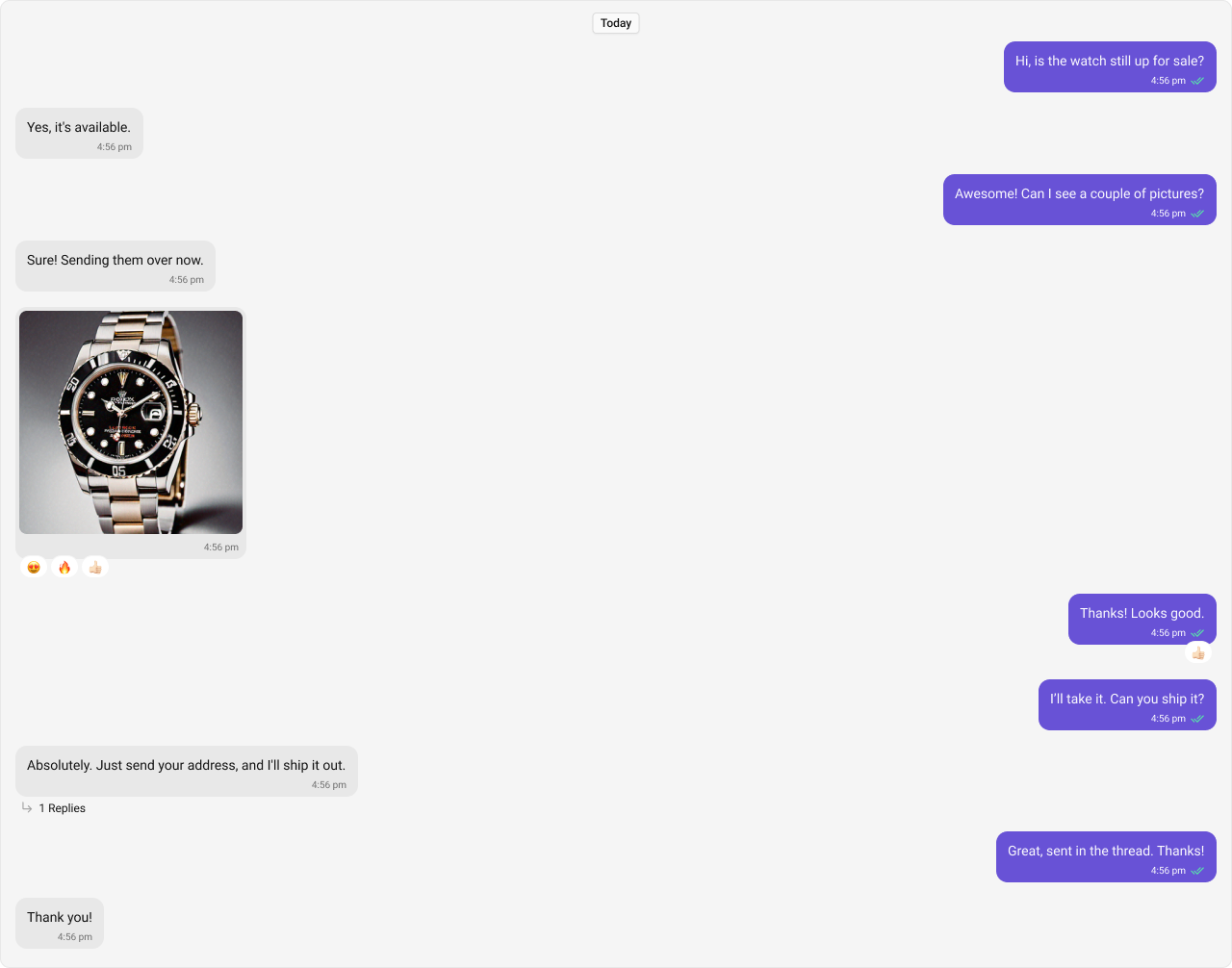
MessageList is a composite component that displays a list of messages and effectively manages real-time operations. It includes various types of messages such as Text Messages, Media Messages, Stickers, and more.
Usage
Integration
The following code snippet illustrates how you can directly incorporate the MessageList component into your Application.- MessageListDemo.tsx
- App.tsx
Actions
Actions dictate how a component functions. They are divided into two types: Predefined and User-defined. You can override either type, allowing you to tailor the behavior of the component to fit your specific needs.1. onThreadRepliesClick
onThreadRepliesClick is triggered when you click on the threaded message bubble. The onThreadRepliesClick action doesn’t have a predefined behavior. You can override this action using the following code snippet.
- TypeScript
- JavaScript
2. onError
This action doesn’t change the behavior of the component but rather listens for any errors that occur in the MessageList component.- TypeScript
- JavaScript
3. onReactionClick
onReactionClick is triggered when you click on the reaction item of the message bubble. The onReactionClick action doesn’t have a predefined behavior. You can override this action using the following code snippet.
- TypeScript
- JavaScript
4. onReactionListItemClick
onReactionListItemClick is triggered when you click on the reaction list item of the reaction list. The onReactionListItemClick action doesn’t have a predefined behavior. You can override this action using the following code snippet.
- TypeScript
- JavaScript
Filters
1. Messages Request Builder
You can adjust theMessagesRequestBuilder in the MessageList Component to customize your message list. Numerous options are available to alter the builder to meet your specific needs. For additional details on MessagesRequestBuilder, please visit MessagesRequestBuilder.
In the example below, we are applying a filter to the messages based on a search substring and for a specific user. This means that only messages that contain the search term and are associated with the specified user will be displayed
- TypeScript
- JavaScript
The following parameters in messageRequestBuilder will always be altered inside the message list
- UID
- GUID
2. Reactions Request Builder
You can adjust theReactionsRequestBuilder in the MessageList Component to customize and fetch the reactions for the messages. Numerous options are available to alter the builder to meet your specific needs.
- TypeScript
- JavaScript
Events
Events are emitted by aComponent. By using event you can extend existing functionality. Being global events, they can be applied in Multiple Locations and are capable of being Added or Removed.
The list of events emitted by the Message List component is as follows.
| Event | Description |
|---|---|
| ccOpenChat | this event alerts the listeners if the logged-in user has opened a user or a group chat. |
| ccMessageEdited | Triggers whenever a loggedIn user edits any message from the list of messages .it will have three states such as: inProgress, success and error. |
| ccMessageDeleted | Triggers whenever a loggedIn user deletes any message from the list of messages. |
| ccActiveChatChanged | This event is triggered when the user navigates to a particular chat window. |
| ccMessageRead | Triggers whenever a loggedIn user reads any message. |
CometChatMessageEvents Listener’s
- TypeScript
- JavaScript
Removing
CometChatMessageEvents Listener’s
- TypeScript
- JavaScript
Customization
To fit your app’s design requirements, you can customize the appearance of the Message List component. We provide exposed properties that allow you to modify the experience and behavior according to your specific needs.Style
You can set the css to the MessageList Component Component to customize the styling. Example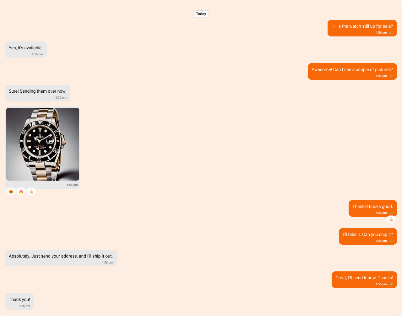
- TypeScript
- CSS
Functionality
These are a set of small functional customizations that allow you to fine-tune the overall experience of the component. With these, you can change text, set custom icons, and toggle the visibility of UI elements.- TypeScript
- JavaScript
Below is a list of customizations along with corresponding code snippets
| Property | Description | Code |
|---|---|---|
| Hide Date Separator | Hides the visibility of the date separator in the message list. | hideDateSeparator={true} |
| Hide Sticky Date | Hides the sticky date header in the message list. | hideStickyDate={true} |
| Hide Receipts | Hides the visibility of receipts in the message list. | hideReceipts={true} |
| Hide Error | Hides the default & custom error view passed in the errorView prop. | hideError={true} |
| Hide Reply In Thread Option | Hides the option to reply to messages in a thread. | hideReplyInThreadOption={true} |
| Hide Translate Message Option | Hides the option to translate messages. | hideTranslateMessageOption={true} |
| Hide Edit Message Option | Hides the option to edit messages. | hideEditMessageOption={true} |
| Hide Delete Message Option | Hides the option to delete messages. | hideDeleteMessageOption={true} |
| Hide Reaction Option | Hides the option to react to messages. | hideReactionOption={true} |
| Hide Message Privately Option | Hides the option to message a user privately. | hideMessagePrivatelyOption={true} |
| Hide Copy Message Option | Hides the option to copy messages. | hideCopyMessageOption={true} |
| Hide Message Info Option | Hides the option to view message information. | hideMessageInfoOption={true} |
| Hide Avatar | Hides avatars for messages. | hideAvatar={true} |
| Hide Group Action Messages | Hides group action messages. | hideGroupActionMessages={true} |
| Hide Conversation Starters | Hides the visibility of the conversation starters in the message list. | hideConversationStarters={true} |
| Hide Smart Replies | Hides the visibility of the smart replies in the message list. | hideSmartReplies={true} |
| Show Scrollbar | Controls the visibility of the scrollbar in the list. | showScrollbar={true} |
| Parent Message ID | Unique identifier of the parent message for displaying threaded conversations. | parentMessageId={1234} |
| User | A CometChat.User object representing the participant of the chat. | user={chatUser} |
| Group | A CometChat.Group object representing the group whose chat messages are displayed. | group={chatGroup} |
| Message Alignment | Specifies the alignment of messages in the list (e.g., left, right). | messageAlignment={MessageListAlignment.left} |
| Scroll To Bottom On New Messages | Automatically scrolls the message list to the bottom when a new message arrives. | scrollToBottomOnNewMessages={true} |
| Quick Options Count | Specifies how many message options are visible in the main menu by default. | quickOptionsCount={3} |
| Disable Sound For Messages | Disables the sound effect when new messages arrive. | disableSoundForMessages={true} |
| Custom Sound For Messages | Specifies a custom sound file to play when new messages arrive. | customSoundForMessages="sound.mp3" |
| Smart Replies Keywords | Sets the keywords on which the smart replies should be triggered in the message list. | smartRepliesKeywords={['why', 'how']} |
| Smart Replies Delay Duration | Sets the delay duration (in milliseconds) before smart replies are shown. | smartRepliesDelayDuration={5000} |
| Empty View | Custom empty state view to display when there are no messages. | emptyView={<EmptyState />} |
| Error View | A custom view displayed when there are no messages. | errorView={<ErrorComponent />} |
| Loading View | A custom view displayed while messages are being fetched. | loadingView={<LoadingSpinner />} |
Advanced
For advanced-level customization, you can set custom views to the component. This lets you tailor each aspect of the component to fit your exact needs and application aesthetics. You can create and define your views, layouts, and UI elements and then incorporate those into the component.Templates
CometChatMessageTemplate is a pre-defined structure for creating message views that can be used as a starting point or blueprint for creating message views often known as message bubbles. For more information, you can refer to CometChatMessageTemplate. You can set message Templates to MessageList by using the following code snippet.- TypeScript
- JavaScript
DatePattern
You can customize the date pattern of the message list separator using theDatePattern prop. Choose from predefined options like time, DayDate, DayDateTime, or DateTime.
- TypeScript
- JavaScript
TimePattern
You can modify the date pattern to your requirement using TimePattern. Choose from predefined options liketime, DayDate, DayDateTime, or DateTime.
TimePatterns describes a specific format or arrangement used to represent dates in a human-readable form.
| Name | Description |
|---|---|
| time | Date format displayed in the format hh:mm a |
| DayDate | Date format displayed in the following format.1) If timestamp < 24hrs display “Today” |
- If timestamp < 48hrs display “Yesterday”
- If timestamp < 7days display “EEE” i.e , SUNDAY
- else display “d MMM, yyyy” | | DayDateTime | Date format displayed in the following format.1) If timestamp < 24hrs display “hh:mm a”
- If timestamp < 48hrs display “Yesterday”
- If timestamp < 7days display “EEE” i.e SUNDAY
- else display “dd MM yyyy” |
- TypeScript
- JavaScript
Headerview
You can set custom headerView to the Message List component using the following method. The customized chat interface is displayed below.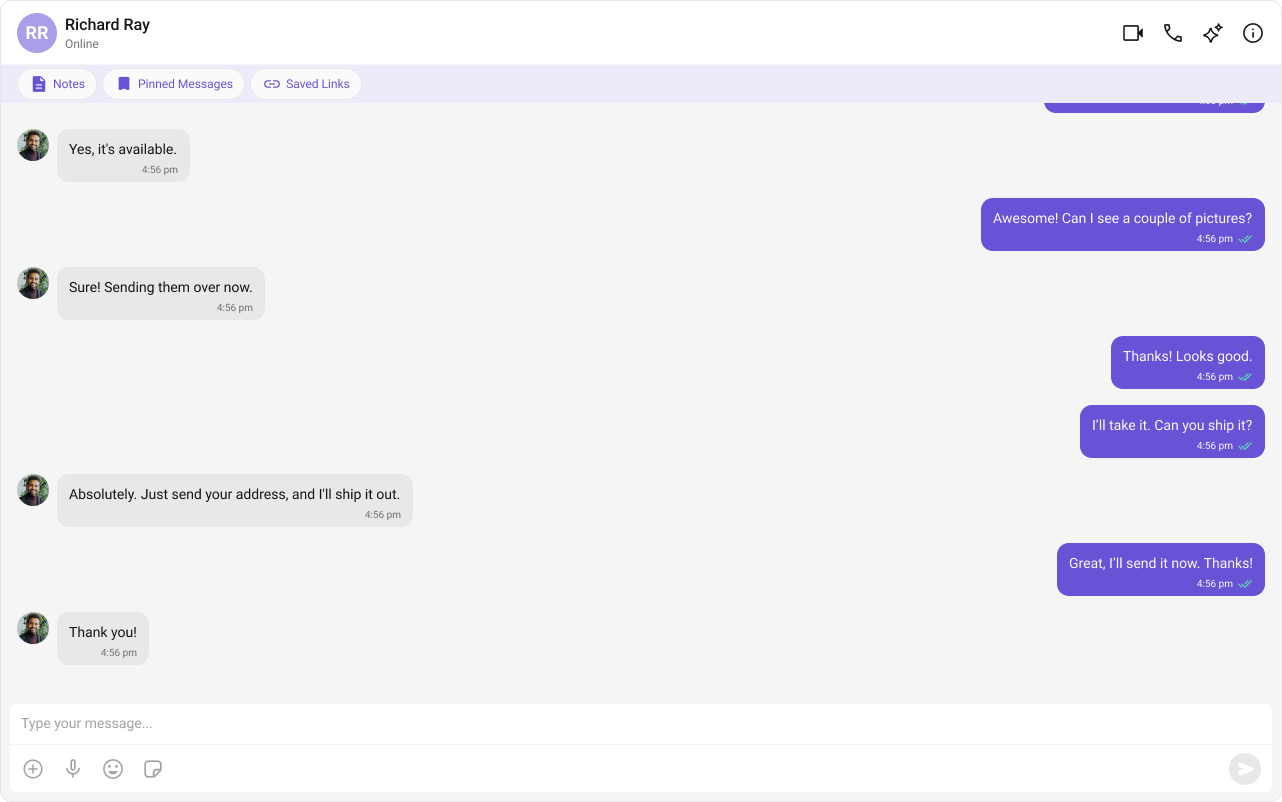
- TypeScript
- JavaScript
- CSS
FooterView
You can set custom footerview to the Message List component using the following method. The customized chat interface is displayed below.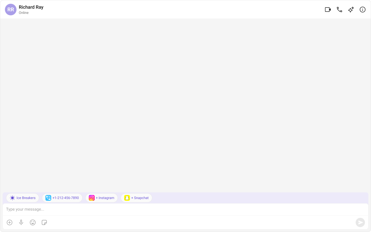
- TypeScript
- JavaScript
- CSS
TextFormatters
Assigns the list of text formatters. If the provided list is not null, it sets the list. Otherwise, it assigns the default text formatters retrieved from the data source. To configure the existing Mentions look and feel check out CometChatMentionsFormatter- ShortCutFormatter.ts
- Dialog.tsx
- MessageListDemo.tsx