Overview
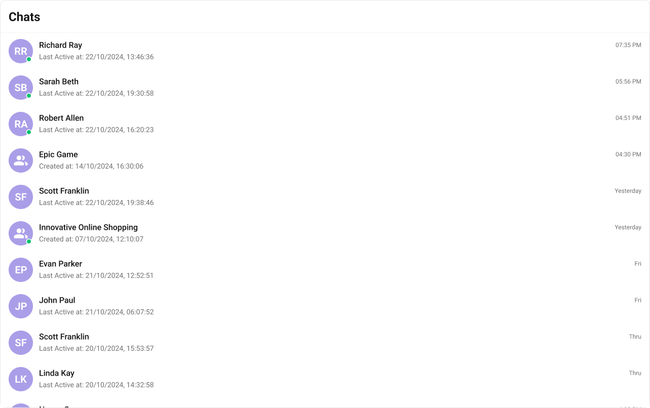
The Conversations is a Component, that shows all conversations related to the currently logged-in user. This component lists the most recent or latest conversations or contacts with whom you have exchanged messages. It provides a convenient way to quickly access and resume conversations with the people you have been in contact with recently.
Usage
Integration
- ConversationsDemo.tsx
- App.tsx
Actions
Actions dictate how a component functions. They are divided into two types: Predefined and User-defined. You can override either type, allowing you to tailor the behavior of the component to fit your specific needs.1. OnItemClick
OnItemClick is triggered when you click on a ListItem of the Conversations component. The OnItemClick action doesn’t have a predefined behavior. You can override this action using the following code snippet.
- ConversationsDemo.tsx
2. OnSelect
TheOnSelect event is triggered upon the completion of a selection in SelectionMode. It does not have a default behavior. However, you can override its behavior using the following code snippet.
- ConversationsDemo.tsx
3. OnError
This action doesn’t change the behavior of the component but rather listens for any errors that occur in the Conversations component.- ConversationsDemo.tsx
Filters
You can setConversationsRequestBuilder in the Conversations Component to filter the conversation list. You can modify the builder as per your specific requirements with multiple options available to know more refer to ConversationRequestBuilder.
You can set filters using the following parameters.
- Conversation Type: Filters on type of Conversation,
UserorGroups - Limit: Number of conversations fetched in a single request.
- WithTags: Filter on fetching conversations containing tags
- Tags: Filters on specific
Tag - UserTags: Filters on specific User
Tag - GroupTags: Filters on specific Group
Tag
- ConversationsDemo.tsx
Events
Events are emitted by aComponent. By using event you can extend existing functionality. Being global events, they can be applied in Multiple Locations and are capable of being Added or Removed.
- Add Listener
- Remove Listener
Customization
To fit your app’s design requirements, you can customize the appearance of the conversation component. We provide exposed methods that allow you to modify the experience and behavior according to your specific needs.Style
Using CSS you can customize the look and feel of the component in your app like the color, size, shape, and fonts.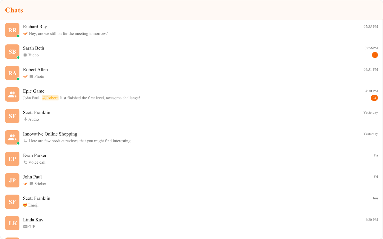
- TypeScript
- CSS
Functionality
These are a set of small functional customizations that allow you to fine-tune the overall experience of the component. With these, you can change text, set custom icons, and toggle the visibility of UI elements.- ConversationsDemo.tsx
| Property | Description | Code |
|---|---|---|
| Hide Receipts | Disables the display of message read receipts. If set to true, the receipt status of the sent message won’t be displayed. | hideReceipts={false} |
| Hide Error | Hides the default and the custom error view passed in the errorView prop. | hideError={true} |
| Hide Delete Conversation | Hides the delete conversation option in the default context menu. | hideDeleteConversation={false} |
| Hide User Status | Hides the user’s online/offline status indicator. | hideUserStatus={true} |
| Hide Group Type | Hides the group type icon. | hideGroupType={false} |
| Show Scrollbar | Controls the visibility of the scrollbar in the list. | showScrollbar={true} |
| Active Conversation | Specifies the conversation to highlight in the list. | activeConversation={activeConversation} |
| Selection Mode | Determines the selection mode for the component. | selectionMode={SelectionMode.multiple} |
| Disable Sound For Messages | Used to Disable sound for incoming messages. | disableSoundForMessages={false} |
| Custom Sound For Messages | Custom audio sound for incoming messages. | customSoundForMessages="Your custom sound url" |
| Loading View | A custom component to display during the loading state. | loadingView={<>Custom Loading View</>} |
| Empty View | A custom component to display when there are no conversations available. | emptyView={<>Custom Empty View</>} |
| Error View | A custom component to display when an error occurs. | errorView={<>Custom Error View</>} |
Advanced
For advanced-level customization, you can set custom views to the component. This lets you tailor each aspect of the component to fit your exact needs and application aesthetics. You can create and define your views, layouts, and UI elements and then incorporate those into the component.ItemView
With this function, you can assign a custom ListItem to the Conversations Component. Shown below is the default chat interface.
- TypeScript
- CSS
LeadingView
The customized chat interface is displayed below.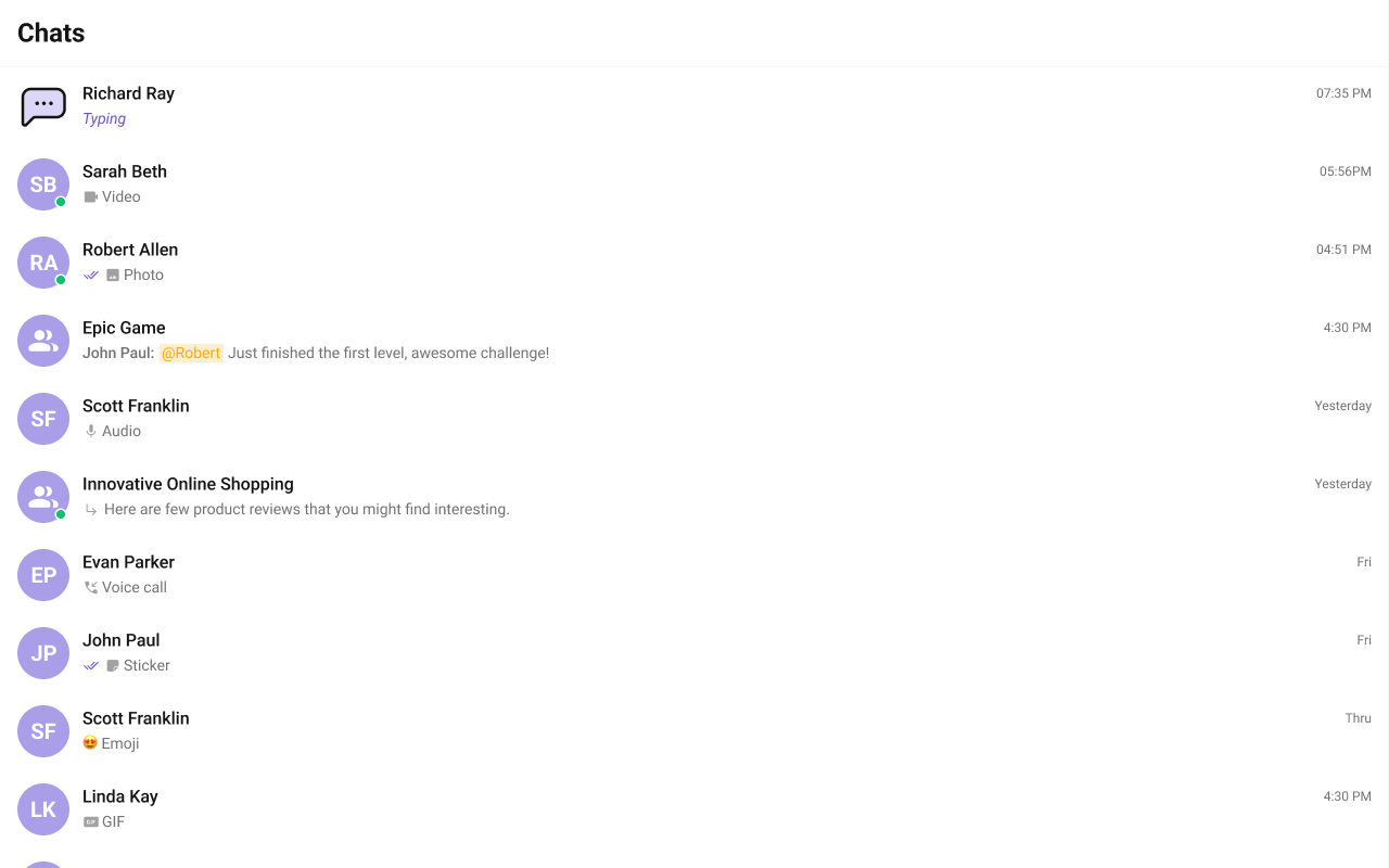
- TypeScript
TrailingView
The customized chat interface is displayed below.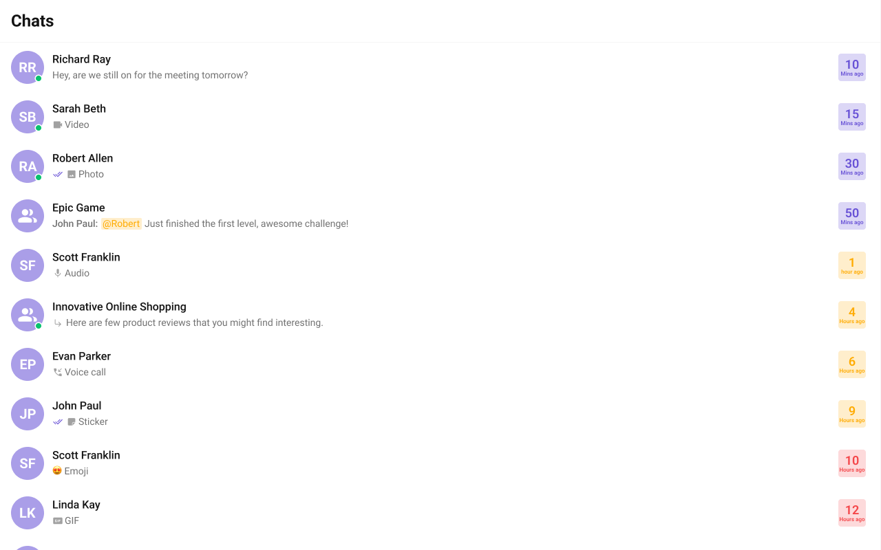
- TypeScript
- CSS
TextFormatters
Assigns the list of text formatters. If the provided list is not null, it sets the list. Otherwise, it assigns the default text formatters retrieved from the data source. To configure the existing Mentions look and feel check out CometChatMentionsFormatter- ShortCutFormatter.ts
- Dialog.tsx
- ConversationDemo.tsx
Header View
You can set the Custom Header view to add more options to the Conversations component. The customized chat interface is displayed below.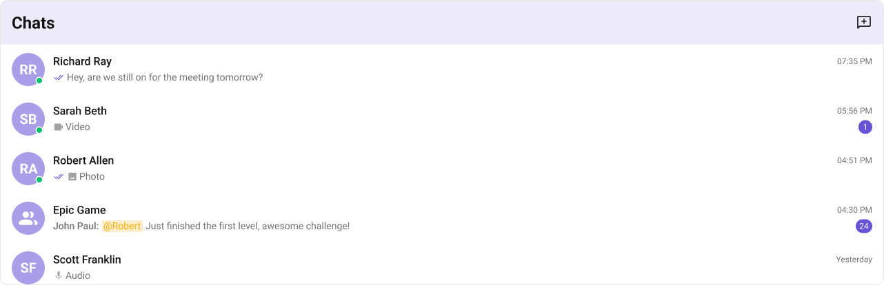
- TypeScript
- CSS
DatePattern
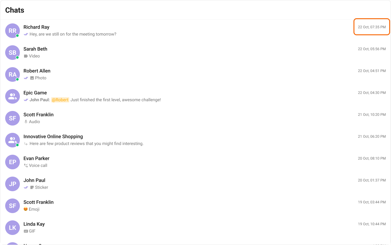
You can modify the date pattern to your requirement using DatePattern. datePattern formats date and time values according to a predefined standard, enhancing consistency and clarity in their presentation. Shown below is the default chat interface.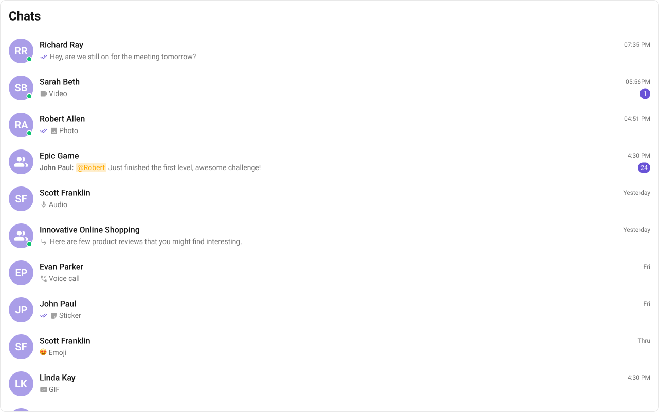
- TypeScript
| Name | Description |
|---|---|
| time | Date format displayed in the format hh:mm a |
| DayDate | Date format displayed in the following format. 1) If timestamp < 24hrs display “Today” 2) If timestamp < 48hrs display “Yesterday” 3) If timestamp < 7days display “EEE” i.e , SUNDAY 4) else display “d MMM, yyyy” |
| DayDateTime | Date format displayed in the following format.1) If timestamp < 24hrs display “hh:mm a” 2) If timestamp < 48hrs display “Yesterday” 3) If timestamp < 7days display “EEE” i.e SUNDAY 4) else display “dd MM yyyy” |
TitleView
The customized chat interface is displayed below.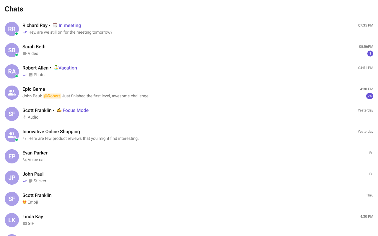
- TypeScript
- CSS
SubtitleView
You can customize the subtitle view for each conversation item to meet your requirements. Shown below is the default chat interface.
- TypeScript
- CSS
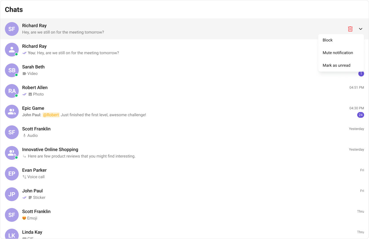
Options
A function that returns a list of actions available when hovering over a conversation item. Shown below is the default chat interface.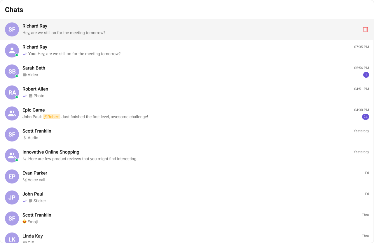
- TypeScript
- CSS
Structure of CometChatOption
| Name | Description |
|---|---|
| id | Unique identifier for each option. |
| title | Heading text for each option. |
| iconURL | Sets the asset URL of the icon for each option. |
| onClick | Method to be invoked when user clicks on each option. |