

Overview
Angular message bubbles are styled with plain CSS. Every bubble exposes BEM-style class names (.cometchat-<name>-bubble__<element>) that you can target from your global
stylesheet, and the colors, typography, and radii they use come from the theme variables
described in Theming.
There are no style inputs to pass — you override the selectors below.
Media messages always render with the multi-attachment bubbles. Which bubble handles a
given message is decided by
CometChatMessageBubble
and is not configurable.Where Each Bubble’s Styles Live
Four of the five multi-attachment bubbles delegate their rendering to the single-attachment bubble underneath, so you style them through that component’s classes.CometChatAudiosBubble is the exception — it draws its own player rows and has its own
stylesheet.
Shared Batch Width
Every batched media bubble resolves to one shared width so a batch reads as a single visual block. Set--cometchat-multi-attachment-width to change it — it defaults to
400px.
Incoming vs Outgoing
The modifier used for direction is not consistent across bubbles — match the row for the exact class you are styling. The two audio classes differ, so watch those two rows:Message Bubbles
Image Bubble
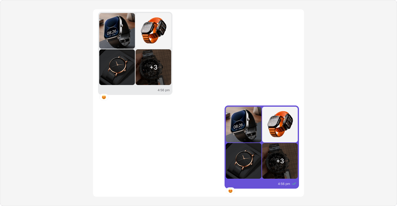
CometChatImagesBubble renders a message’s image attachments as one grouped bubble, with
the layout chosen automatically from the attachment count (single, grid, 2×2). When there
are more images than visible cells, the last cell shows a +N overflow overlay;
clicking any cell opens the fullscreen gallery, and an optional caption renders below the
grid. It delegates rendering to cometchat-image-bubble and adds the shared batch width.
Video Bubble
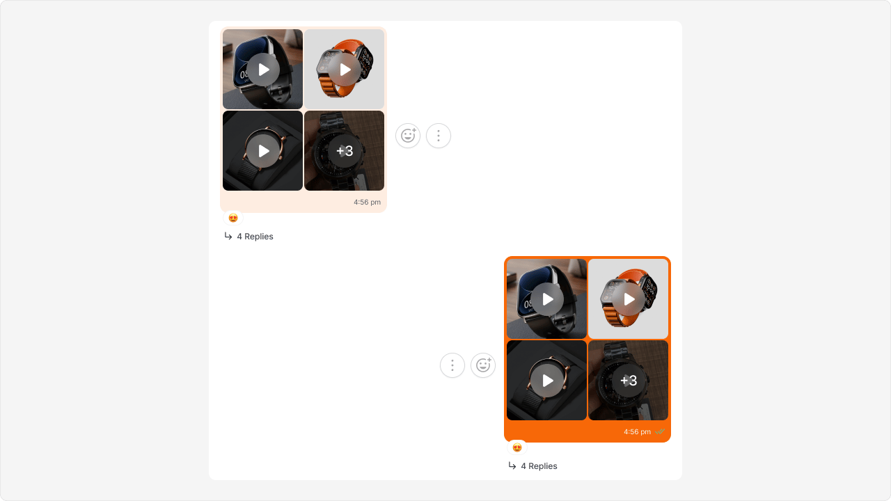
CometChatVideosBubble renders a message’s video attachments as a thumbnail grid — each
cell showing a poster with a centered play overlay and a duration badge, plus a +N
overflow overlay when there are more videos than visible cells. Clicking a cell opens
fullscreen playback. It delegates rendering to cometchat-video-bubble and adds the
shared batch width.
Audio Bubble
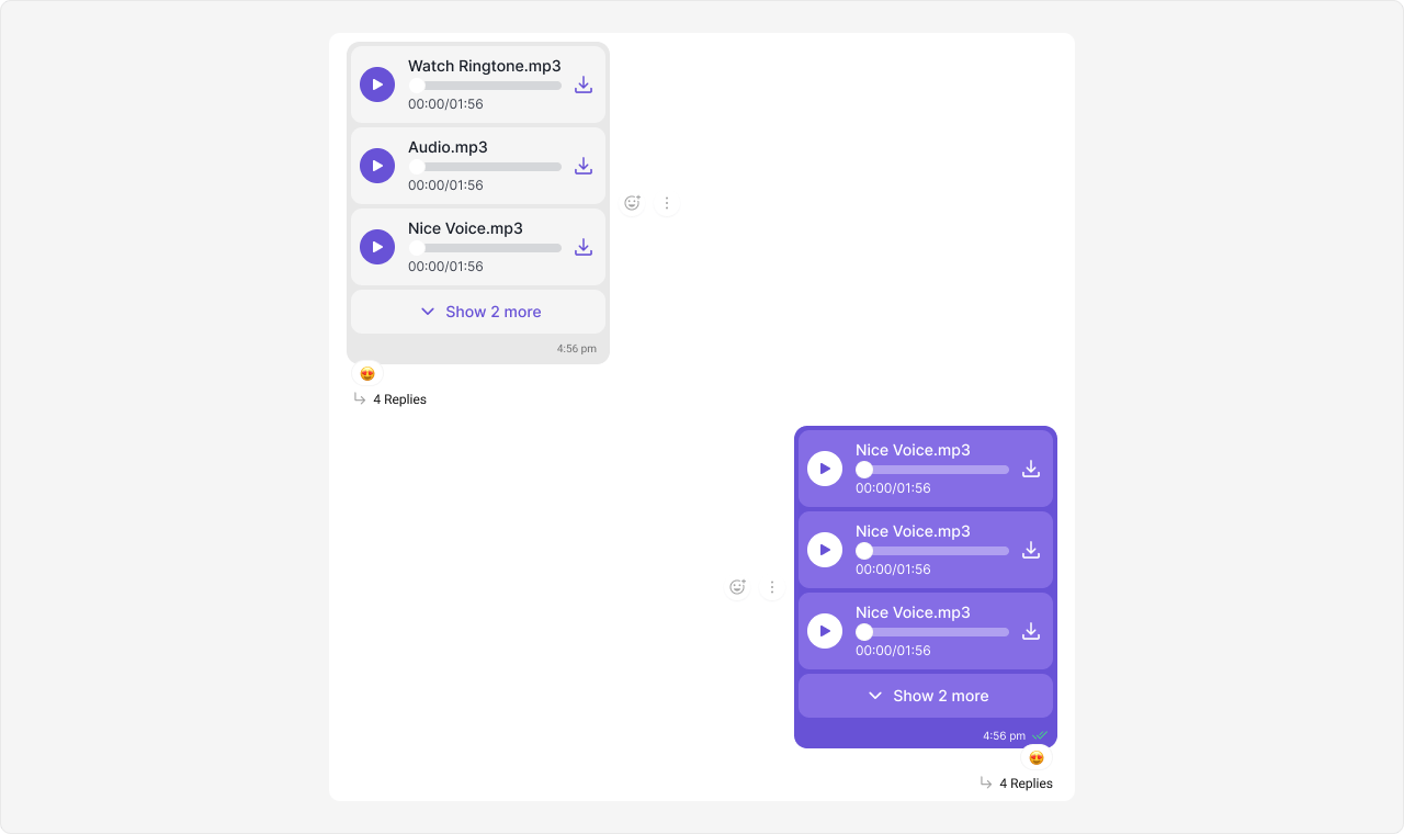
CometChatAudiosBubble renders a message’s attached audio files as a stack of inline
player rows, each with a file name, seekable scrubber, duration, and download control. The
list collapses after three rows behind a Show N more toggle. Unlike the other media
bubbles it is custom-rendered — it does not delegate, and draws its own player rows.
The caption is rendered with a nested cometchat-text-bubble.
File Bubble
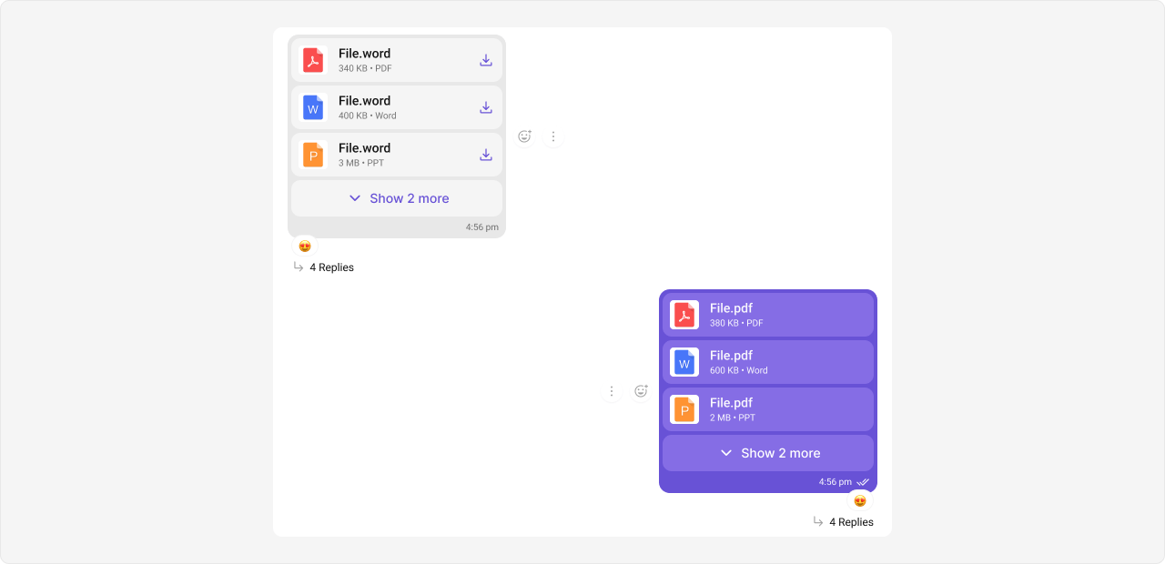
CometChatFilesBubble renders a message’s generic file attachments as a connected stack
of file cards, each showing the file name, size, type, and a download control. Longer
lists collapse behind a Show N more toggle. It delegates rendering to
cometchat-file-bubble and adds the shared batch width.
Voice Note Bubble
CometChatVoiceNoteBubble renders audio messages recorded with the composer’s voice
recorder, giving them the waveform playback UI (play/pause, seekable progress, elapsed and
total time). It exists as a distinct component so routing can pick it over the Audio
Bubble, based on the message metadata — an audio message is treated as a voice note only
when it carries the tag. It delegates rendering to cometchat-audio-bubble.
Voice notes render with the same waveform player UI as the single-attachment
cometchat-audio-bubble component they
delegate to, so no separate screenshot is shown here.Related
- Theming
- Message Bubble — routes each message type to the bubbles above
- Message List — renders the bubbles and groups a batch
- Message Composer — stages and sends multiple attachments