Overview
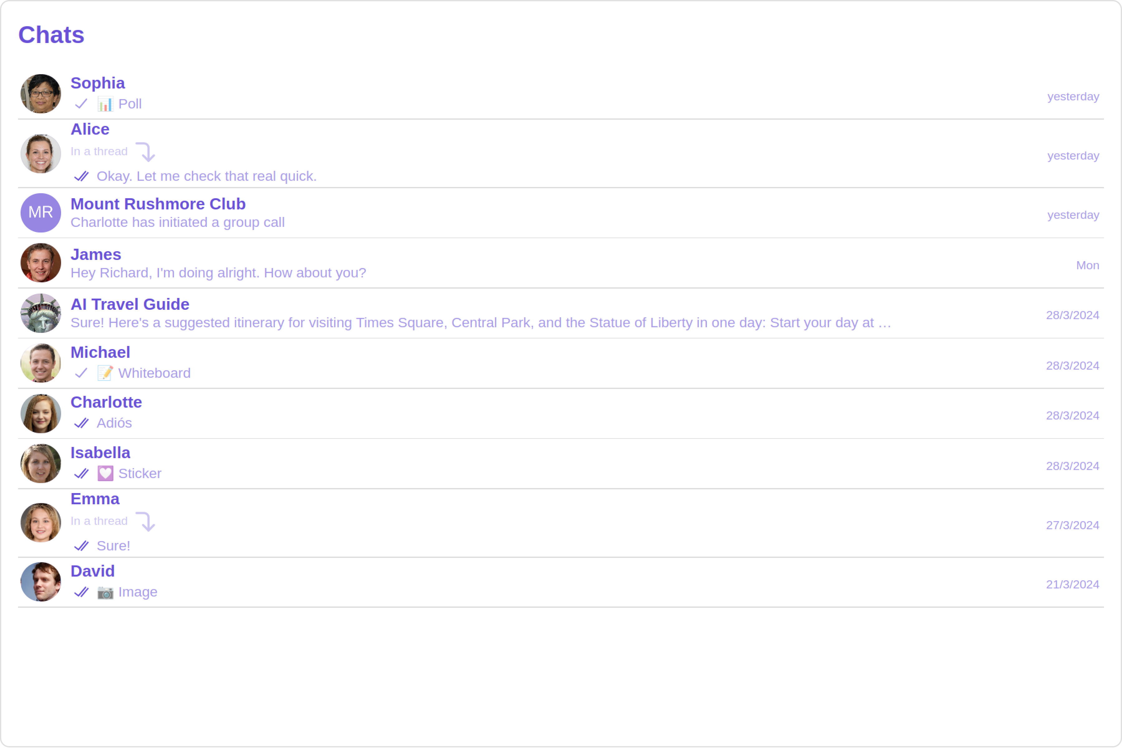
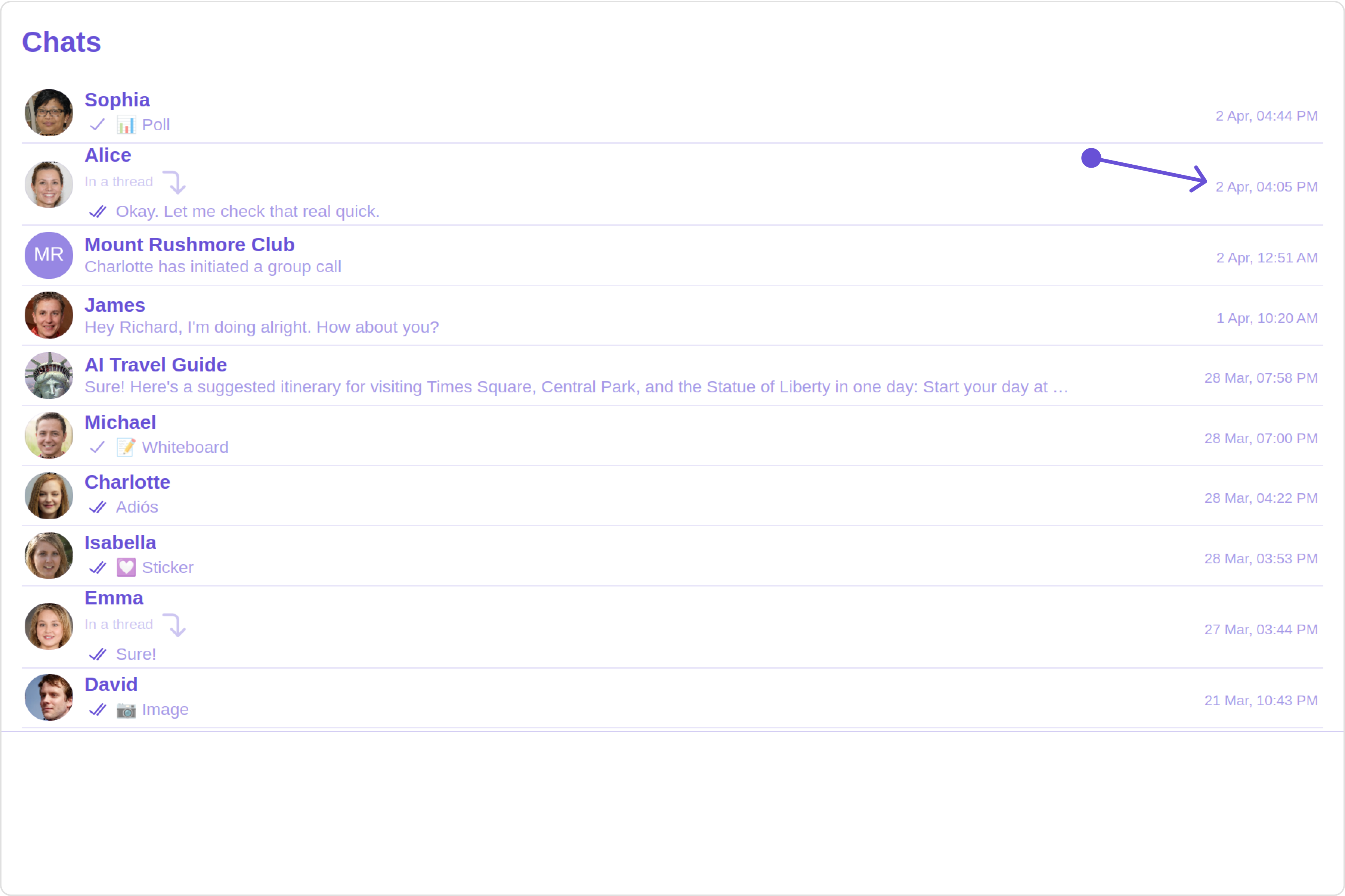
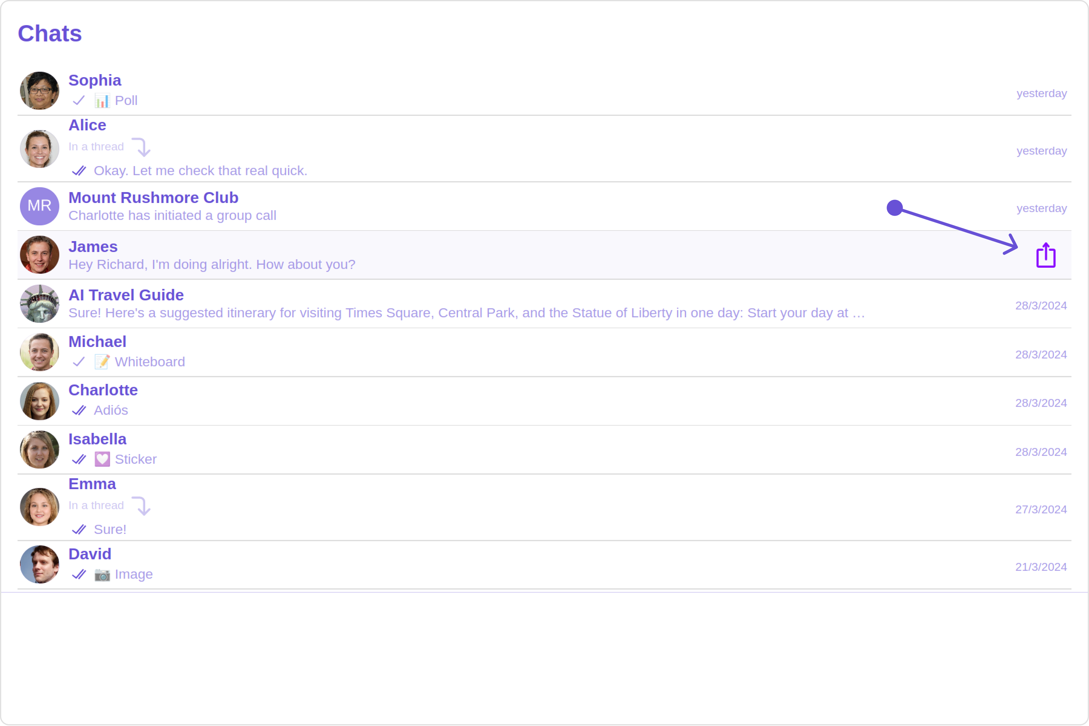
The Conversations is a Component, That shows all conversations related to the currently logged-in user, This component lists the most recent or latest conversations or contacts with whom you have exchanged messages. It provides a convenient way to quickly access and resume conversations with the people you have been in contact with recently.
Usage
Integration
- ConversationsDemo.tsx
- App.tsx
Actions
Actions dictate how a component functions. They are divided into two types: Predefined and User-defined. You can override either type, allowing you to tailor the behavior of the component to fit your specific needs.1. OnItemClick
OnItemClick is triggered when you click on a ListItem of the Conversations component. The OnItemClick action doesn’t have a predefined behavior. You can override this action using the following code snippet.
- ConversationsDemo.tsx
2. OnSelect
TheOnSelect event is triggered upon the completion of a selection in SelectionMode. It does not have a default behavior. However, you can override its behavior using the following code snippet.
- ConversationsDemo.tsx
3. OnError
This action doesn’t change the behavior of the component but rather listens for any errors that occur in the Conversations component.- ConversationsDemo.tsx
Filters
You can setConversationsRequestBuilder in the Conversations Component to filter the conversation list. You can modify the builder as per your specific requirements with multiple options available to know more refer to ConversationRequestBuilder.
You can set filters using the following parameters.
- Conversation Type: Filters on type of Conversation,
UserorGroups - Limit: Number of conversations fetched in a single request.
- WithTags: Filter on fetching conversations containing tags
- Tags: Filters on specific
Tag - UserTags: Filters on specific User
Tag - GroupTags: Filters on specific Group
Tag
- ConversationsDemo.tsx
Events
Events are emitted by aComponent. By using event you can extend existing functionality. Being global events, they can be applied in Multiple Locations and are capable of being Added or Removed.
- Add Listener
- Remove Listener
Customization
To fit your app’s design requirements, you can customize the appearance of the conversation component. We provide exposed methods that allow you to modify the experience and behavior according to your specific needs.Style
Using Style you can customize the look and feel of the component in your app, These parameters typically control elements such as the color, size, shape, and fonts used within the component.1. Conversation Style
You can set theConversationsStyle to the Conversations Component to customize the styling.
- ConversationsDemo.tsx
| Name | Description |
|---|---|
| width | Sets the width of the component |
| height | Sets the height of the component |
| border | Sets the border of the component |
| borderRadius | Sets the border radius of the component |
| background | Sets all background style properties at once, such as color, image, origin and size, or repeat method. Reference link |
| boxShadow | Adds shadow effects around the component. |
| titleTextFont | Sets all the different properties of font for the heading text. Reference link |
| titleTextColor | Sets the foreground color of heading text. |
| loadingIconTint | Sets the tint or color applied to the loading indicator icon of the component |
| emptyStateTextFont | Sets all the different properties of font for the placeholder text. Reference link |
| emptyStateTextColor | Sets the foreground color of placeholder text displayed in the component. |
| errorStateTextFont | Sets all the different properties of font for the error message. Reference link |
| errorStateTextColor | Sets the foreground color of error message displayed in the component. |
| lastMessageTextFont | Sets all the different properties of font for the last message. Reference link |
| lastMessageTextColor | Sets the foreground color of the last message. |
| typingIndictorTextFont | Sets all the different properties of font for the typing indicator text. Reference link |
| typingIndictorTextColor | Sets the foreground color of typing indicator text |
| threadIndicatorTextFont | Sets all the different properties of font for the thread indicator text. Reference link |
| threadIndicatorTextColor | Sets the foreground color of thread indicator text. |
| onlineStatusColor | Sets the color of the status indicator representing the user’s online status |
| privateGroupIconBackground | Sets the background of the status indicator representing private groups. |
| passwordGroupIconBackground | Sets the background of the status indicator representing password protected groups. |
2. Avatar Style
To apply customized styles to theAvatar component in the Conversations Component, you can use the following code snippet. For more information, visit Avatar Styles.
- ConversationsDemo.tsx
3. StatusIndicator Style
To apply customized styles to the Status Indicator component in theConversations Component, you can use the following code snippet. For more information, visit Status Indicator Styles.
- ConversationsDemo.tsx
4. Date Style
To apply customized styles to theDate component in the Conversations Component, you can use the following code snippet. For more information, visit Date Styles.
- ConversationsDemo.tsx
5. Badge Style
To apply customized styles to theBadge component in the Conversations Component, you can use the following code snippet. For more information, visit Badge Styles.
- ConversationsDemo.tsx
6. Receipt Style
To apply customized styles to thereceipt component in the Conversations Component, you can use the following code snippet. For more information, visit Receipts.
- ConversationsDemo.tsx
7. Backdrop Style
To apply customized styles to theBackdrop component in the Conversations Component, you can use the following code snippet, you can use the following code snippet. For more information, visit Backdrop Styles.
- ConversationsDemo.tsx
8. Delete Conversation Dialog Style
To apply customized styles to thedelete dialog component in the Conversations Component, you can use the following code snippet. For more information, visit Delete dialog Styles.
- ConversationsDemo.tsx
9. LisItem Style
To apply customized styles to theListItemStyle component in the Conversations Component, you can use the following code snippet. For more information, visit List Item.
- ConversationsDemo.tsx
Functionality
These are a set of small functional customizations that allow you to fine-tune the overall experience of the component. With these, you can change text, set custom icons, and toggle the visibility of UI elements.- ConversationsDemo.tsx
| Property | Description | Code |
|---|---|---|
| Title | Used to set custom title in the app bar. | title="Your Custom Title" |
| EmptyState Text | Used to set a custom text response when fetching the conversations has returned an empty list | emptyStateText="Your Custom Empty State text" |
| Selection Mode | Used to set a custom text response when fetching the conversations has returned an empty list | selectionMode={SelectionMode.multiple} |
| PasswordGroup Icon | Used to set icon shown in place of status indicator for password protected group | passwordGroupIcon="https://icon.svg" |
| privateGroupIcon | Used to set icon shown in place of status indicator for private group | privateGroupIcon="https://icon.svg" |
| SentIcon | Used to customize the receipt icon shown in the subtitle of the conversation item if hideReceipt is false and if the status of the last message in the conversation is sent | sentIcon="your custom sent icon" |
| Delivered Icon | Used to customize the receipt icon shown in the subtitle of the conversation item if hideReceipt is false and if the status of the last message in the conversation is delivered | deliveredIcon="your custom delivered icon" |
| Read Icon | Used to customize the receipt icon shown in the subtitle of the conversation item if hideReceipt is false and if the status of the last message in the conversation is read | readIcon="your custom read icon" |
| errorIcon | Asset URL for the error state indicating that an error has occurred when the message was in transit. | errorIcon="your custom error icon" |
| Hide Error | Used to hide error on fetching conversations | hideError={true} |
| Hide Separator | Used to control visibility of Separators in the list view | hideSeparator={true} |
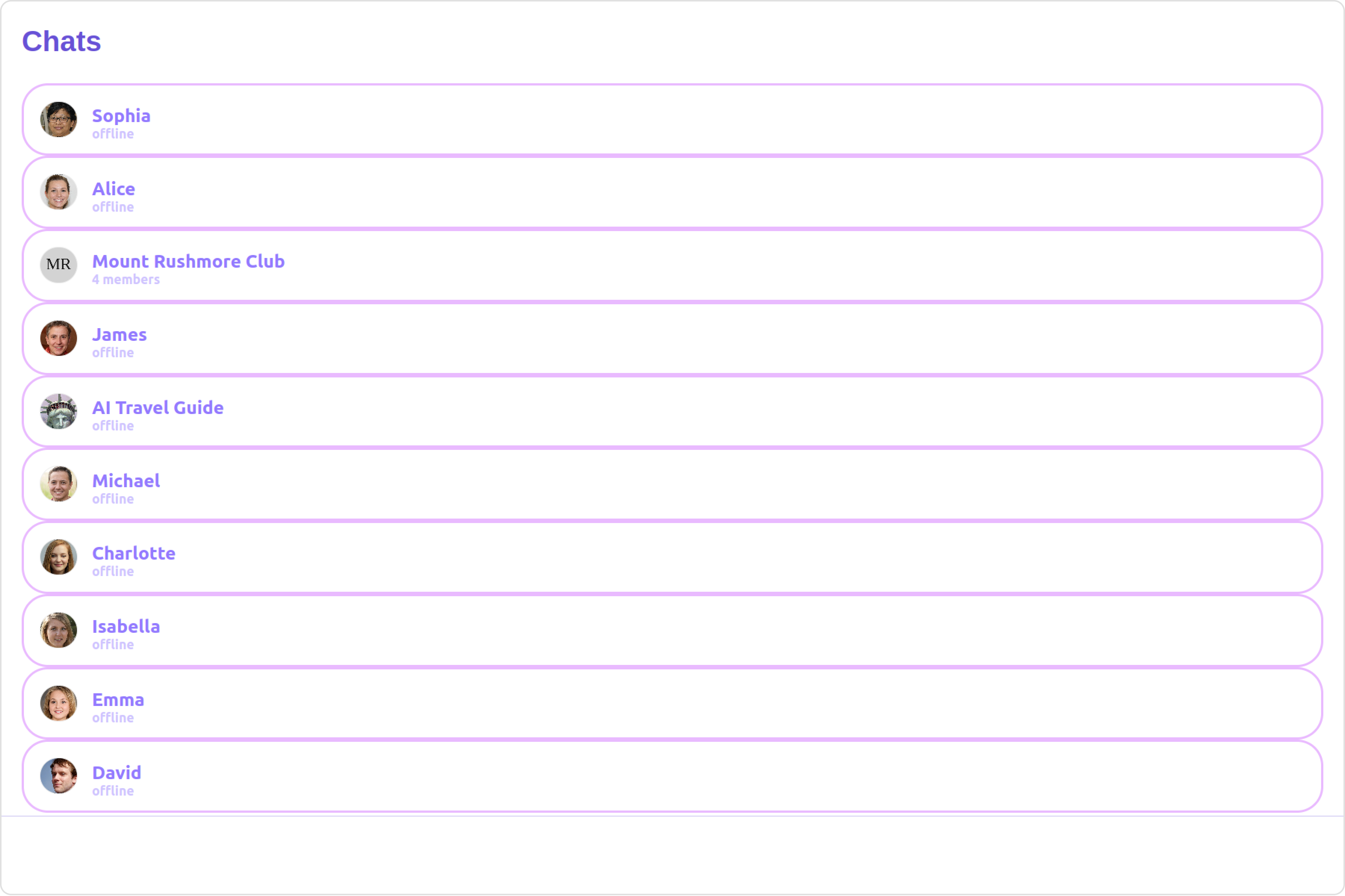
| Disable UsersPresence | Used to control visibility of status indicator shown if user is online | disableUsersPresence={true} |
| Hide Receipt | Used to control the visibility of read receipts without affecting the functionality of marking messages as read and delivered | hideReceipt={false} |
| Disable Typing | Used to toggle visibility of typing indicator | disableTyping={true} |
| Disable Mentions | Sets whether mentions in text should be disabled. Processes the text formatters If there are text formatters available and the disableMentions flag is set to true, it removes any formatters that are instances of CometChatMentionsFormatter. | disableMentions={true} |
| disableSoundForMessages | When set to true, the component will not produce sound for all incoming messages.indicator | disableSoundForMessages={true} |
| customSoundForMessages | mp3 file asset of your choice. | customSoundForMessages="your custom sound for messages" |
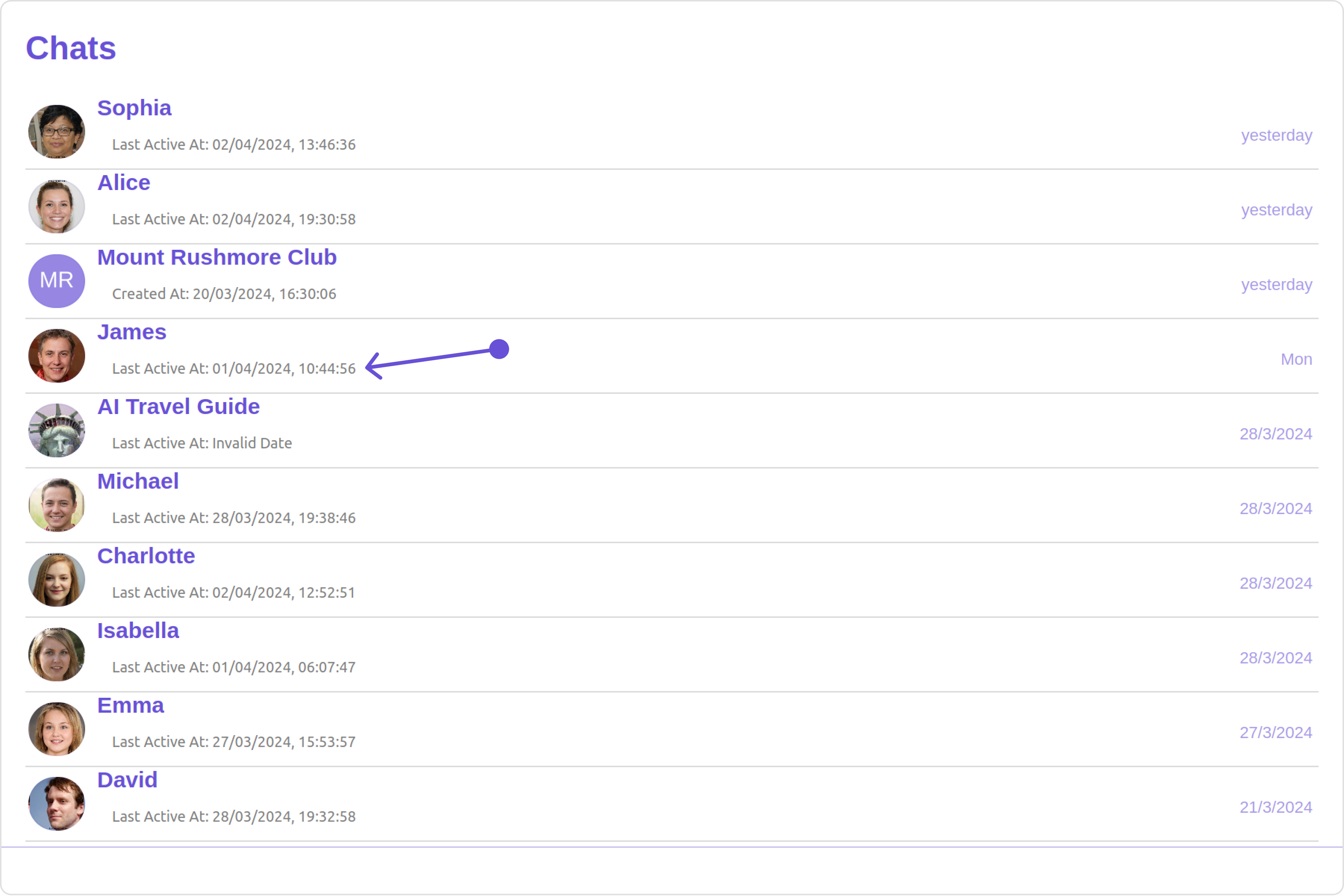
| activeConversation report | Used to set the active conversation | activeConversation={activeConversation} |
Advanced
For advanced-level customization, you can set custom views to the component. This lets you tailor each aspect of the component to fit your exact needs and application aesthetics. You can create and define your views, layouts, and UI elements and then incorporate those into the component.ListItemView
With this function, you can assign a custom ListItem to the Conversations Component.- JavaScript
- TypeScript
getListItemView function as follows:
- JavaScript
- TypeScript
TextFormatters
Assigns the list of text formatters. If the provided list is not null, it sets the list. Otherwise, it assigns the default text formatters retrieved from the data source. To configure the existing Mentions look and feel check out CometChatMentionsFormatter- ShortCutFormatter.ts
- Dialog.tsx
- ConversationDemo.tsx
Menus
You can set the Custom Menu view to add more options to the Conversations component.- JavaScript
- TypeScript
getMenus function as follows:
- JavaScript
- TypeScript
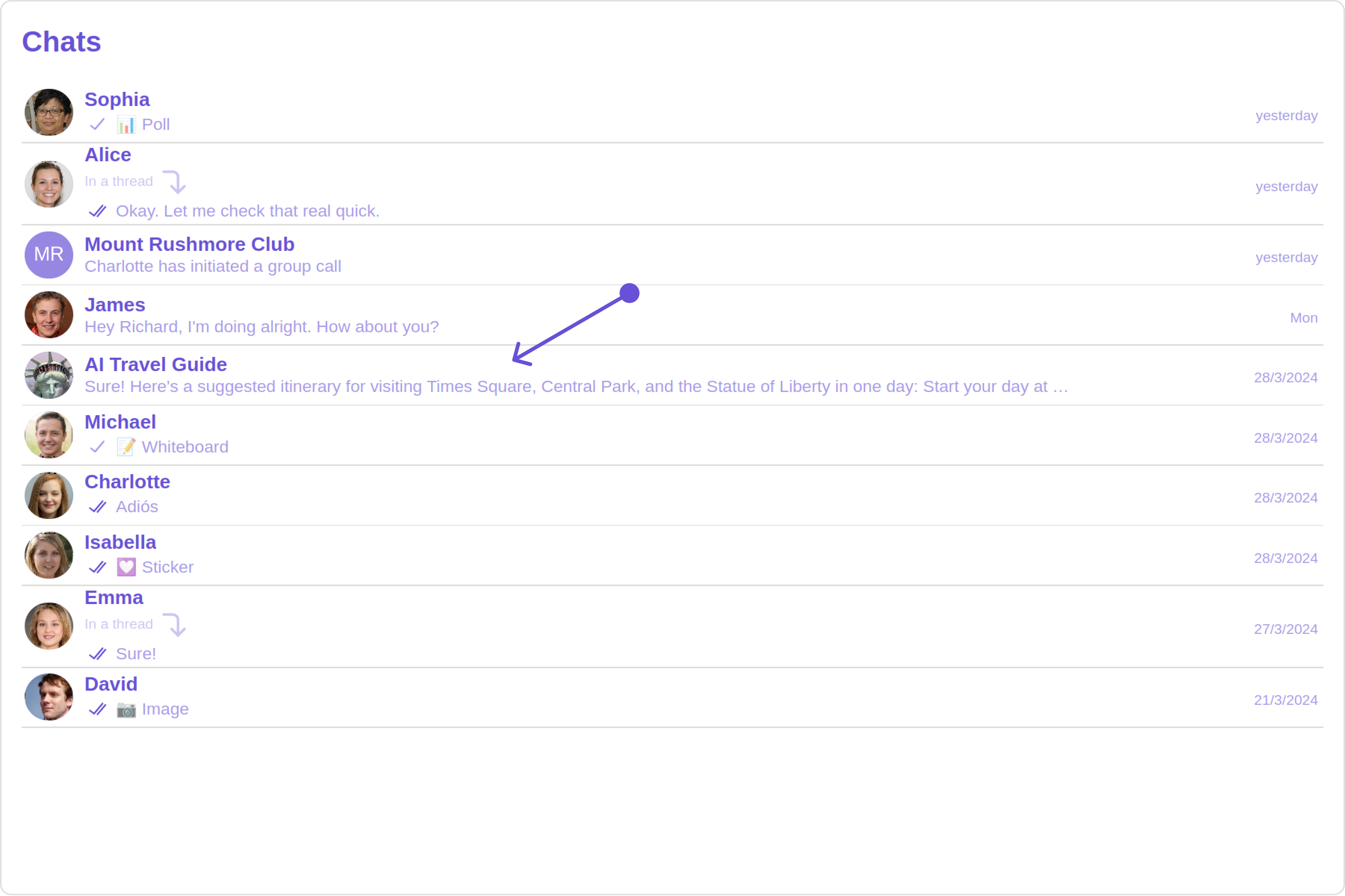
DatePattern
You can modify the date pattern to your requirement using DatePattern. datePattern formats date and time values according to a predefined standard, enhancing consistency and clarity in their presentation. DatePatterns describes a specific format or arrangement used to represent dates in a human-readable form.| Name | Description |
|---|---|
time | Date format displayed in the format hh:mm a |
DayDate | Date format displayed as: 1) If timestamp < 24hrs: “Today” 2) If timestamp < 48hrs: “Yesterday” 3) If timestamp < 7 days display “EEE” i.e , SUNDAY 4) else display “d MMM, yyyy” |
DayDateTime | Date format displayed as: 1) If timestamp < 24hrs: “hh:mm a” 2) If timestamp < 48hrs: “Yesterday” 3) If timestamp < 7 days display “EEE” i.e SUNDAY 4) else display “dd MM yyyy” |
- JavaScript
- TypeScript
SubtitleView
You can customize the subtitle view for each conversation item to meet your requirements- JavaScript
- TypeScript
getSubtitleView function as follows:
- JavaScript
- TypeScript
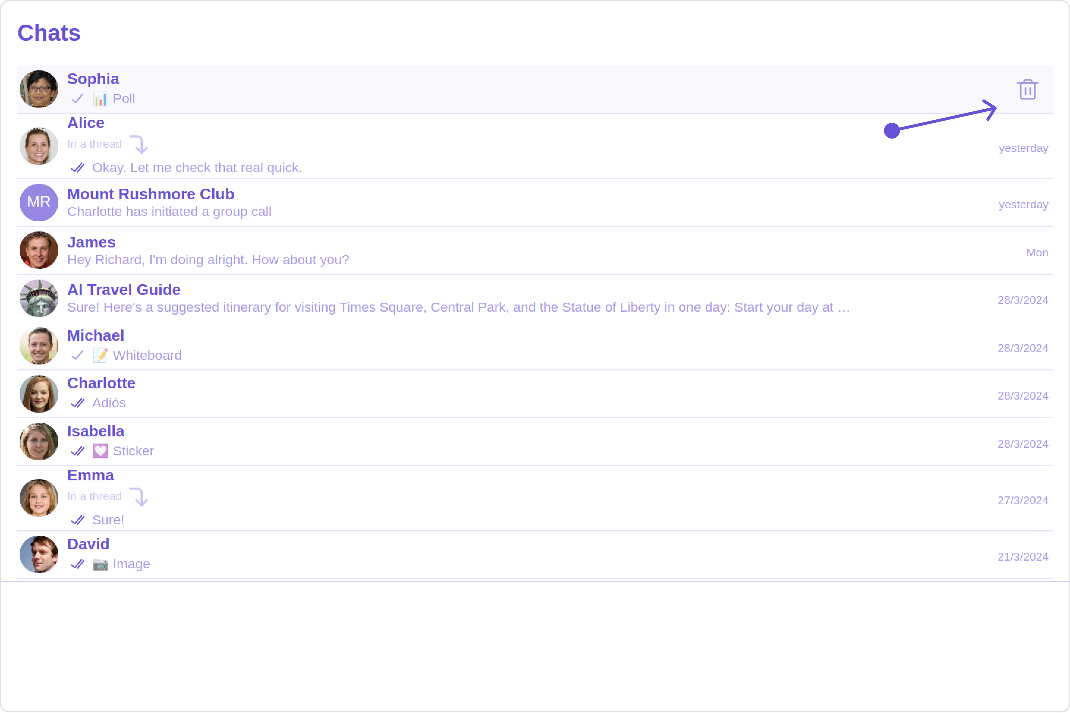
Options
User-defined actions which appears for each conversation on mouseover.Structure of CometChatOption
| Name | Description |
|---|---|
| id | Unique identifier for each option |
| title | Heading text for each option |
| titleFont | Sets all the different properties of font for the option text. Reference link |
| titleColor | Sets the foreground color of option text |
| iconURL | Sets the asset URL of the icon for each option |
| iconTint | Sets the tint or color applied to each option |
| backgroundColor | Sets the background color of each option |
| onClick | Method to be invoked when user clicks on each option |
- JavaScript
- TypeScript
LoadingStateView
You can set a custom loader view usingloadingStateView to match the loading view of your app.
- JavaScript
- TypeScript
getLoadingStateView function as follows:
- JavaScript
- TypeScript
ErrorStateView
You can set a customErrorStateView to match the error view of your app.
- JavaScript
- TypeScript
getErrorStateView function as follows:
- JavaScript
- TypeScript