Overview
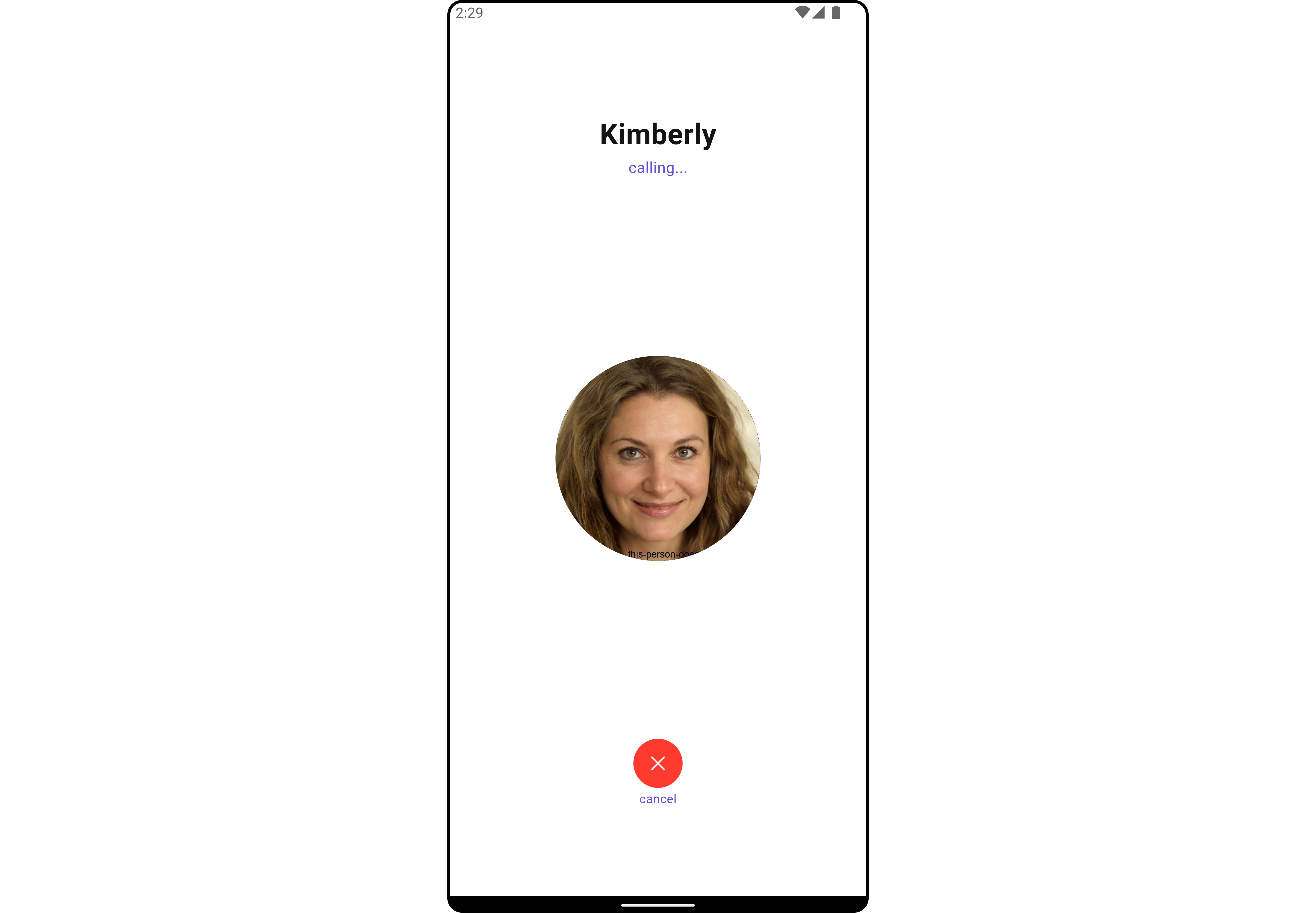
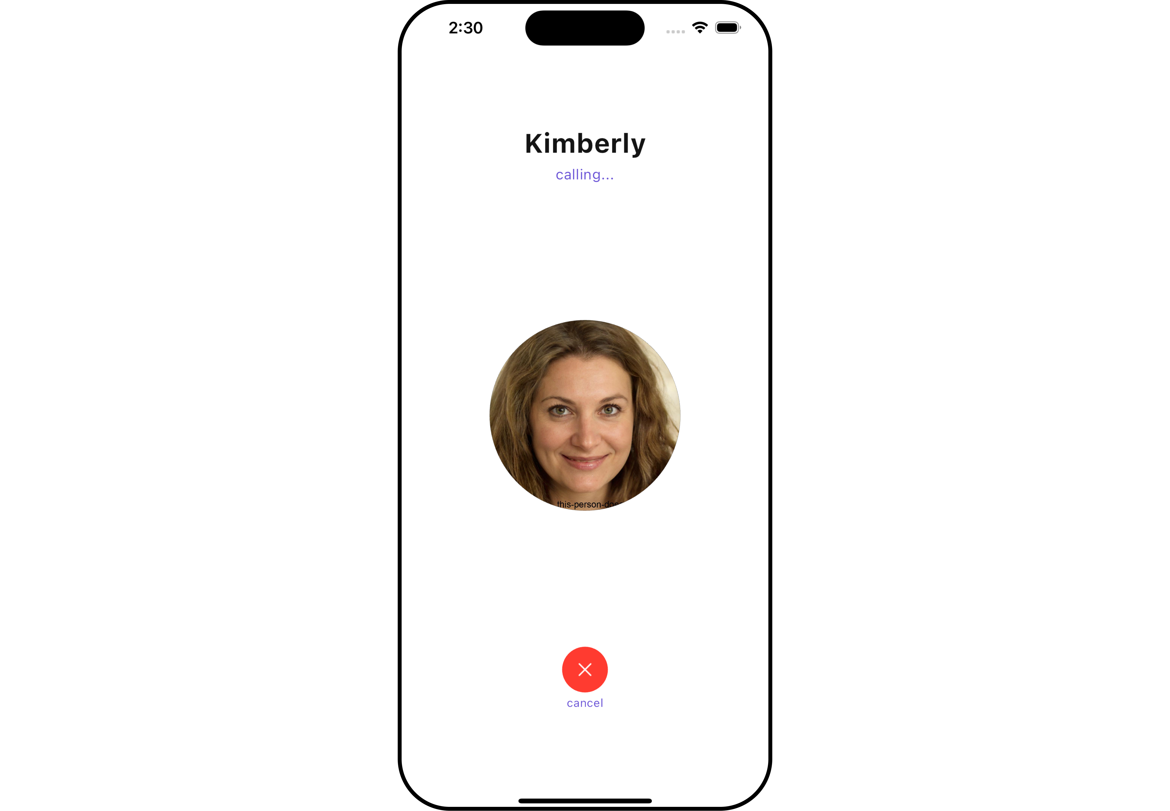
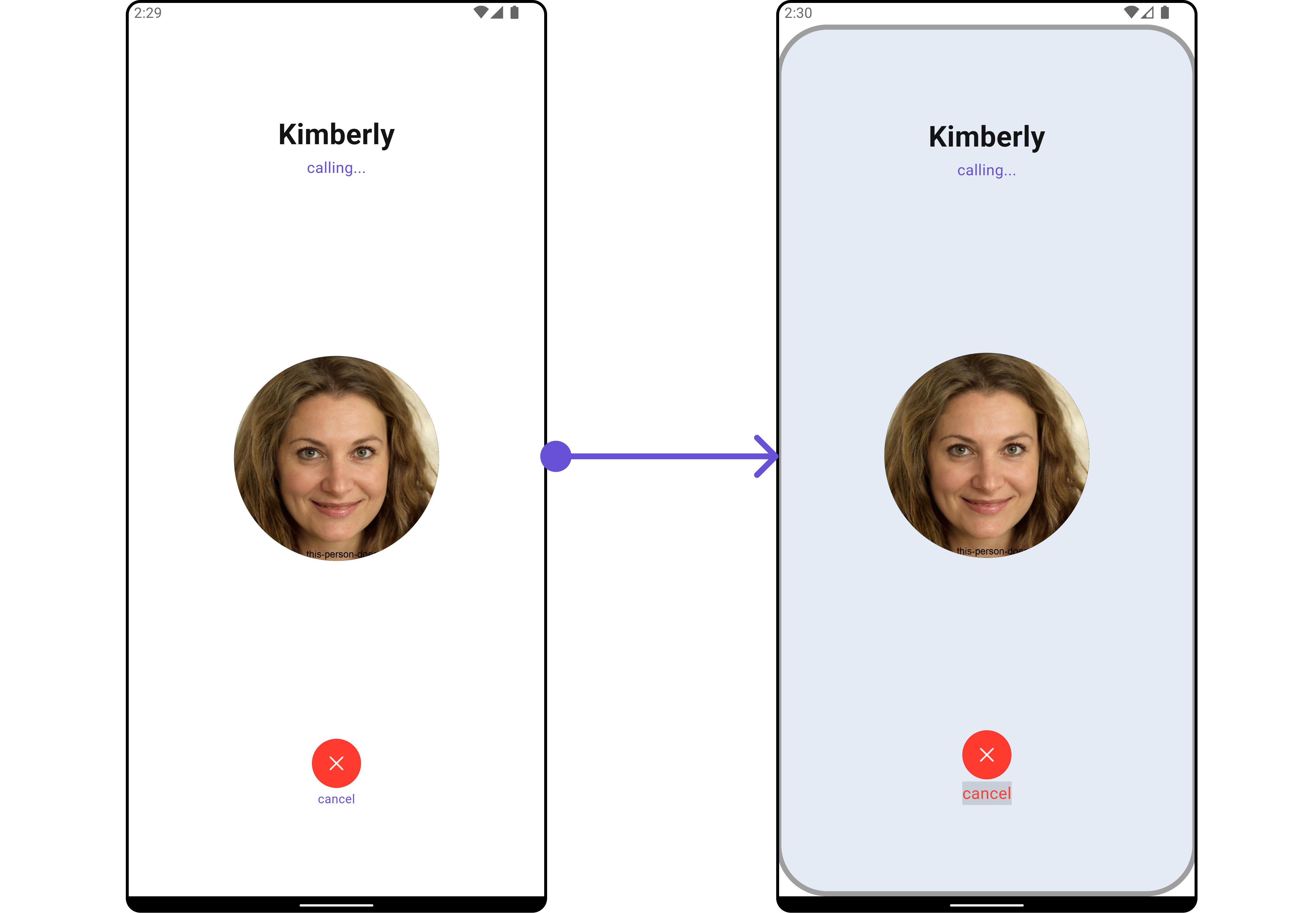
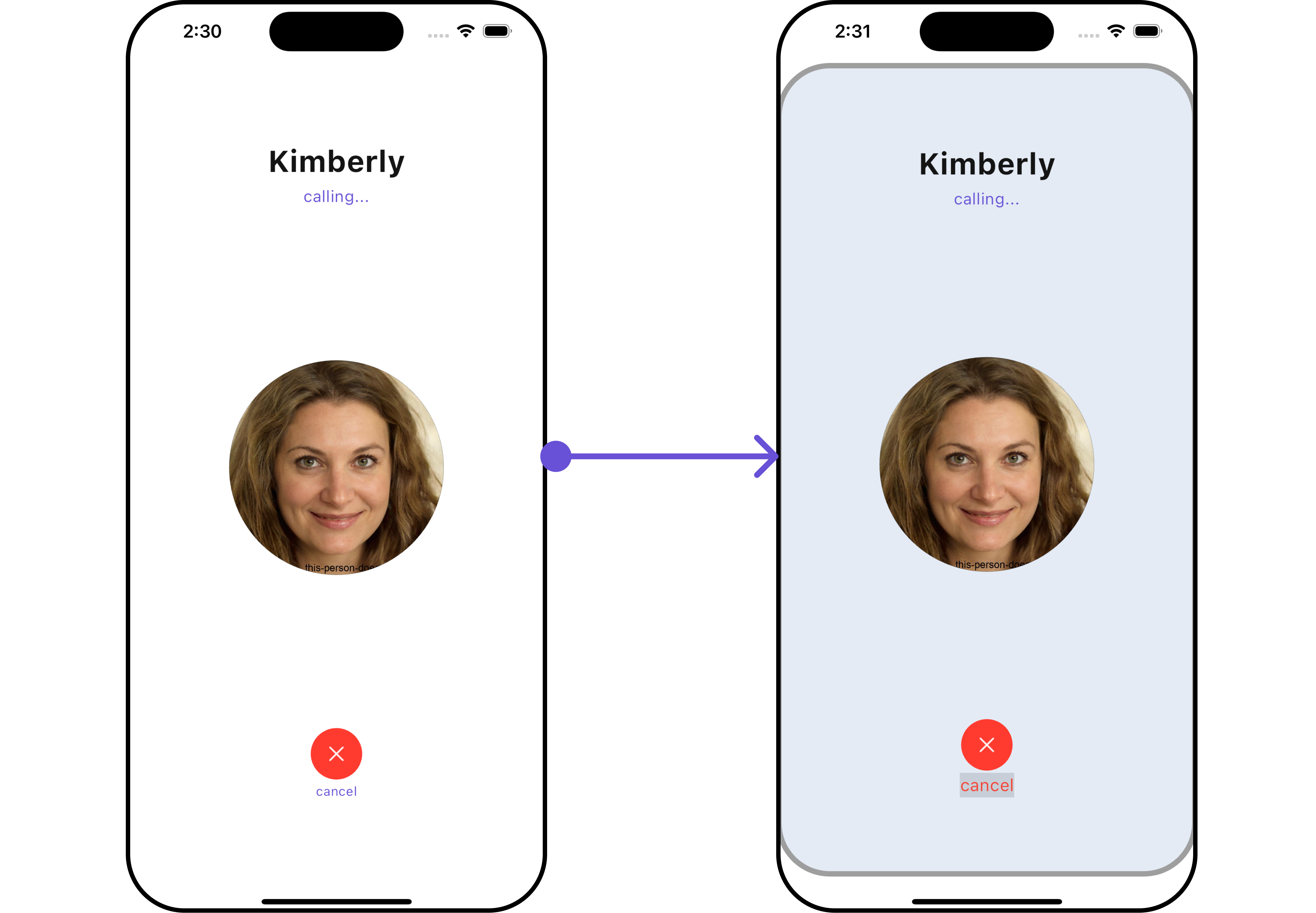
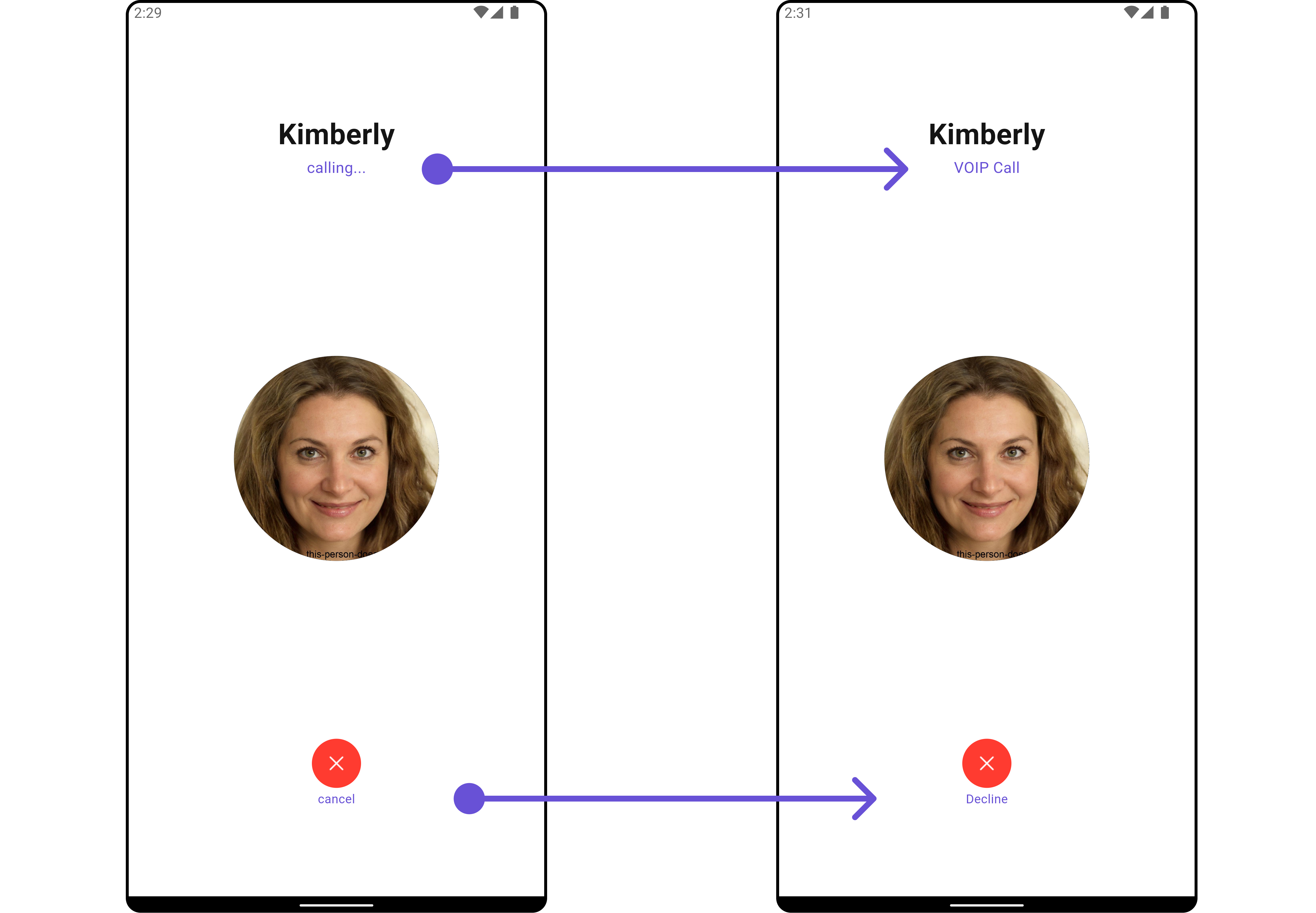
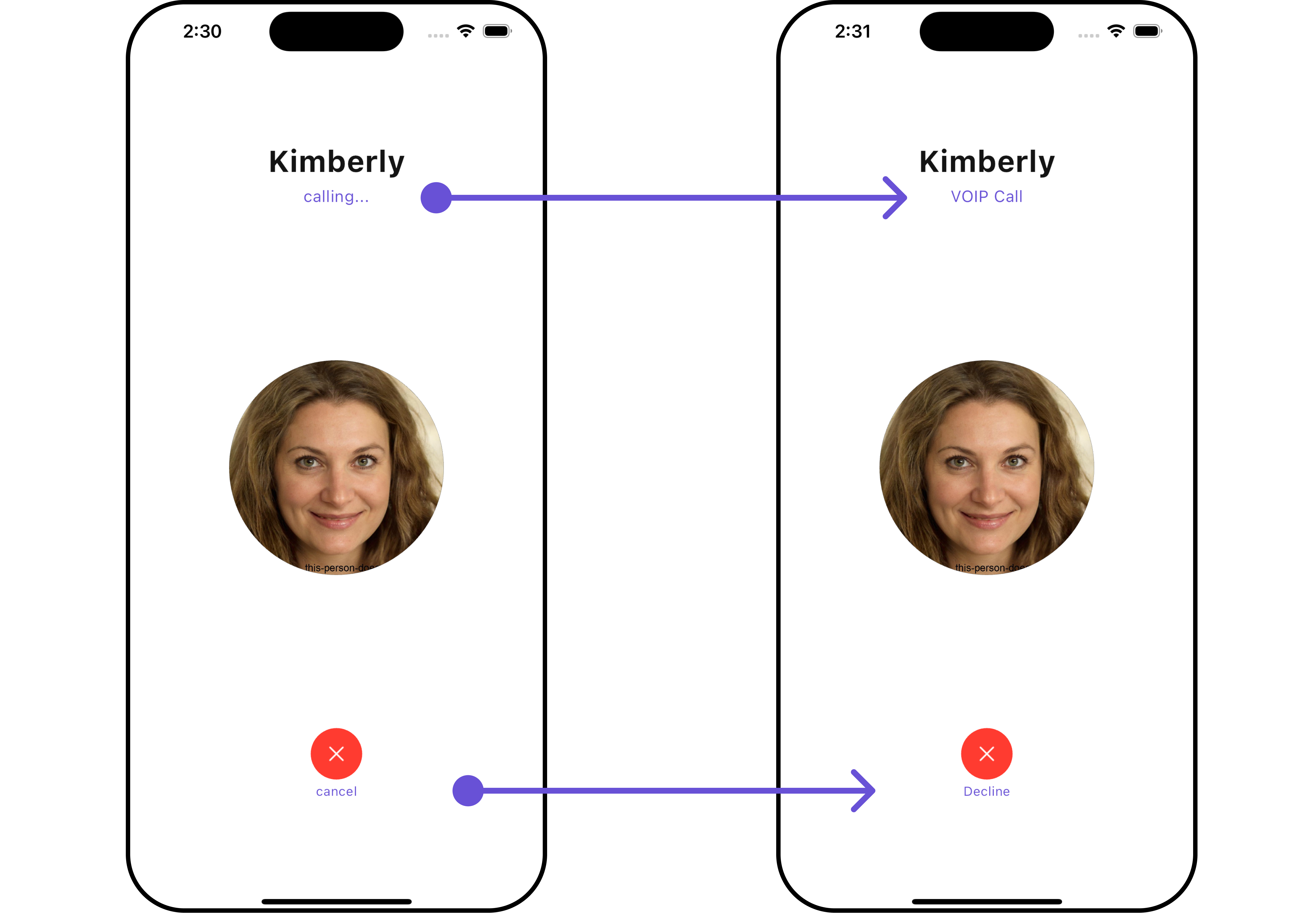
TheCometChatOutgoingCall Widget is a visual representation of a user-initiated call, whether it’s a voice or video call. It serves as an interface for managing outgoing calls, providing users with essential options to control the call experience. This Widget typically includes information about the call recipient, call controls for canceling the call, and feedback on the call status, such as indicating when the call is in progress.
- Android
- iOS
CometChatOutgoingCall directly using Navigator.push, or you can define it as a widget within the build method of your State class.
1. Using Navigator to Launch CometChatOutgoingCall
- Dart
2. Embedding CometChatOutgoingCall as a Widget in the build Method
- Dart
Actions
Actions dictate how a component functions. They are divided into two types: Predefined and User-defined. You can override either type, allowing you to tailor the behavior of the component to fit your specific needs.1. onDecline
TheonDecline action is typically triggered when the call is ended, carrying out default actions. However, with the following code snippet, you can effortlessly customize or override this default behavior to meet your specific needs.
- Dart
2. onError
You can customize this behavior by using the provided code snippet to override theonError and improve error handling.
- Dart
Filters
Filters allow you to customize the data displayed in a list within a Widget. You can filter the list based on your specific criteria, allowing for a more customized. Filters can be applied using RequestBuilders of Chat SDK. TheCometChatOutgoingCall Widget does not have any exposed filters.
Events
Events are emitted by aWidget. By using event you can extend existing functionality. Being global events, they can be applied in Multiple Locations and are capable of being Added or Removed.
Events emitted by the Outgoing call Widget are as follows.
| Event | Description |
|---|---|
| ccCallAccepted | Triggers when the outgoing call is accepted. |
| ccCallRejected | Triggers when the outgoing call is rejected. |
- Dart
Customization
To fit your app’s design requirements, you can customize the appearance of the conversation widget. We provide exposed methods that allow you to modify the experience and behavior according to your specific needs.Style
Using Style you can customize the look and feel of the widget in your app, These parameters typically control elements such as the color, size, shape, and fonts used within the widget.1. OutgoingCall Style
You can customize the appearance of theOutgoingCallStyle Widget by applying the OutgoingCallStyle to it using the following code snippet.
Example
Here is the complete example for reference:
- Dart
- Android
- iOS
OutgoingCallStyle
| Property | Description | Code |
|---|---|---|
| Background | Sets the background color of the outgoing call style. | background: Color? |
| Border | Sets the border properties of the outgoing call style. | border: BoxBorder? |
| Border Radius | Sets the border radius of the outgoing call style. | borderRadius: double? |
| Decline Button Text Style | Sets the text style for the decline button. | declineButtonTextStyle: TextStyle? |
| Gradient | Sets the gradient applied to the outgoing call style. | gradient: Gradient? |
| Height | Sets the height of the outgoing call style. | height: double? |
| Width | Sets the width of the outgoing call style. | width: double? |
2. Avatar Styles
To apply customized styles to theAvatar widget in the CometChatIncomingCall Widget, you can use the following code snippet. For further insights on Avatar Styles refer
Example
Here is the complete example for reference:
- Dart
3. Button Style
You can customize the appearance of the Decline Button Widget by applying thebuttonStyle to it using the following code snippet.
Example
Here is the complete example for reference:
- Dart
Functionality
These are a set of small functional customizations that allow you to fine-tune the overall experience of the widget. With these, you can change text, set custom icons, and toggle the visibility of UI elements. Example In this example, we’re enhancing the interface by customizing the decline button icons. By setting custom icons for decline buttons, users can enjoy a more visually appealing and personalized experience. This level of customization allows developers to tailor the user interface to match the overall theme and branding of their application. Example Here is the example for reference:- Dart
- Android
- iOS
| Property | Description | Code |
|---|---|---|
| Custom Sound For Calls | Sets the custom sound for outgoing calls. | customSoundForCalls: String? |
| Custom Sound For Calls Package | Sets the package for the custom sound for outgoing calls. | customSoundForCallsPackage: String? |
| Decline Button Icon Url | Sets the URL for the decline button icon. | declineButtonIconUrl: String? |
| Decline Button Icon Url Package | Sets the package for the decline button icon URL. | declineButtonIconUrlPackage: String? |
| Decline Button Text | Sets the text for the decline button. | declineButtonText: String? |
| Disable Sound For Calls | Disables sound for outgoing calls. | disableSoundForCalls: bool? |
| Subtitle | Sets the subtitle for the outgoing call screen. | subtitle: String? |
Advanced
For advanced-level customization, you can set custom widgets to the widget. This lets you tailor each aspect of the widget to fit your exact needs and application aesthetics. You can create and define your widgets, layouts, and UI elements and then incorporate those into the widget. TheCometChatOutgoingCall widget does not provide additional functionalities beyond this level of customization.