Overview
The Conversations is a Component, That shows all conversations related to the currently logged-in user,
Usage
Integration
There are multiple ways in which you can use Conversations in your app. Layout File: To use Conversations in your `layout_activity.xml, use the following code snippet.layout_activity.xml
- Activity: To use Conversations in your Activity, use the following code snippet.
- Java
- Kotlin
YourActivity.java
- Fragment: To use
Conversationsin yourFragment, use the following code snippet.
- Java
- Kotlin
YourFragment.java
Actions
Actions dictate how a component functions. They are divided into two types: Predefined and User-defined. You can override either type, allowing you to tailor the behavior of the component to fit your specific needs.1. ItemClickListener
ItemClickListener is triggered when you click on a ListItem of the Conversations component. The ItemClickListener action doesn’t have a predefined behavior. You can override this action using the following code snippet.
- Java
- Kotlin
YourActivity.java
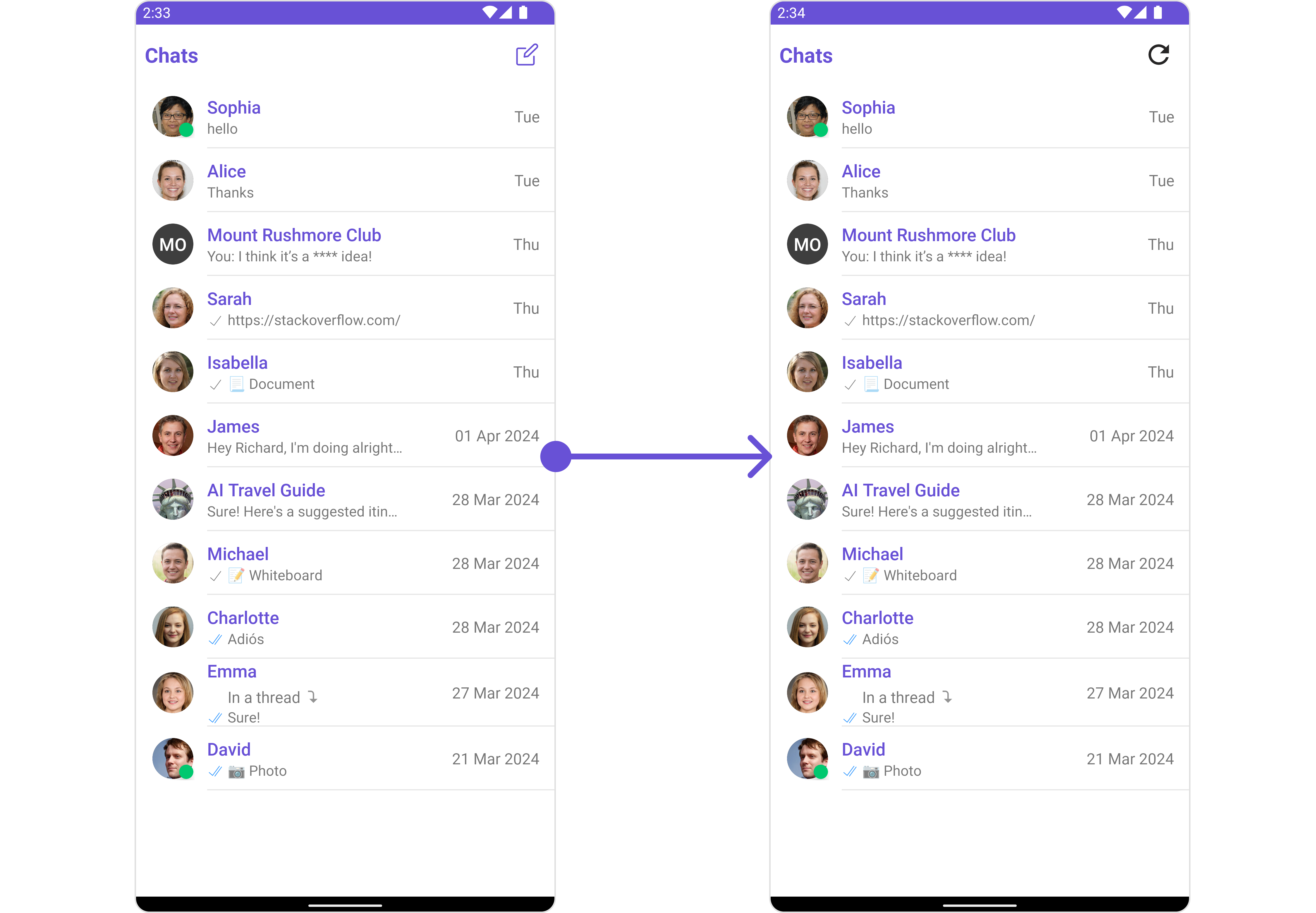
2. OnBackPressListener
OnBackPressListener is triggered when you press the back button in the app bar. It has a predefined behavior; when clicked, it navigates to the previous activity. However, you can override this action using the following code snippet.
- Java
- Kotlin
YourActivity.java
3. OnSelection
TheOnSelection event is triggered upon the completion of a selection in SelectionMode. It does not have a default behavior. However, you can override its behavior using the following code snippet.
- Java
- Kotlin
YourActivity.java
4. OnError
This action doesn’t change the behavior of the component but rather listens for any errors that occur in the Conversations component.- Java
- Kotlin
YourActivity.java
Filters
You can setConversationsRequestBuilder in the Conversations Component to filter the conversation list. You can modify the builder as per your specific requirements with multiple options available to know more refer to ConversationRequestBuilder.
You can set filters using the following parameters.
- Conversation Type: Filters on type of Conversation,
UserorGroups - Limit: Number of conversations fetched in a single request.
- WithTags: Filter on fetching conversations containing tags
- Tags: Filters on specific
Tag - UserTags: Filters on specific User
Tag - GroupTags: Filters on specific Group
Tag
- Java
- Kotlin
YourActivity.java
Events
Events are emitted by aComponent. By using event you can extend existing functionality. Being global events, they can be applied in Multiple Locations and are capable of being Added or Removed.
1. ConversationDeleted
This event will be emitted when the user deletes a conversation- Java
- Kotlin
Add Listener
Customization
To fit your app’s design requirements, you can customize the appearance of the conversation component. We provide exposed methods that allow you to modify the experience and behavior according to your specific needs.Style
Using Style you can customize the look and feel of the component in your app, These parameters typically control elements such as the color, size, shape, and fonts used within the component.1. Conversation Style
You can set theConversationsStyle to the Conversations Component to customize the styling.
- Java
- Kotlin
| Property | Description | Code |
|---|---|---|
| Background Color | Used to set the background color | setBackground(@color init) |
| Background Drawable | Used to set background Drawable | setBackground(@drawable int) |
| Border Width | Used to set border width | setBorderWidth(int) |
| Border Color | Used to set border color | setBorderColor(@color ini) |
| Corner Radius | Used to set border radius | setCornerRadius(float) |
| Title Appearance | Used to customise the appearance of the title in the app bar | setTitleAppearance(@style int) |
| BackIcon Tint | Used to set the color of the back icon in the app bar | setBackIconTint(@color int) |
| OnlineStatus Color | Used to set the color of the status indicator shown if a member is online | setOnlineStatusColor(@color int) |
| Separator Color | Used to set the color of the divider separating the group member items | setSeparatorColor(@color int) |
| LastMessageText Appearance | Used to set the style of the text for the last message | setLastMessageTextAppearance(@style int) |
| ThreadIndicatorText Appearance | Used to set the style of the text for the thread indicator | setThreadIndicatorTextAppearance(@style int) |
| ErrorText Color | Used to set the color of the text for the error Text. | setErrorTextColor(@color int) |
| LastMessageText Color | Used to set the color of the text for the last message. | setLastMessageTextColor(@color int) |
| TypingIndicatorTextColor | Used to set the color of the typing indicator text. | setLastMessageTextColor(@color int) |
| LastMessageText Color | Used to set the color of the text for the last message. | setLastMessageTextColor(@color int) |
| ThreadIndicatorText Color | Used to set the color of thread indicator text | setThreadIndicatorTextColor(@color int) |
2. Avatar Style
To apply customized styles to theAvatar component in the Conversations Component, you can use the following code snippet. For more information, visit Avatar Styles.
- Java
- Kotlin
3. StatusIndicator Style
To apply customized styles to the Status Indicator component in theConversations Component, you can use the following code snippet. For more information, visit Indicator Styles.
- Java
- Kotlin
4. Date Style
To apply customized styles to theDate component in the Conversations Component, you can use the following code snippet. For more information, visit Date Styles.
- Java
- Kotlin
5. Badge Style
To apply customized styles to theBadge component in the Conversations Component, you can use the following code snippet. For more information, visit Badge Styles.
- Java
- Kotlin
6. LisItem Style
To apply customized styles to theListItemStyle component in the Conversations Component, you can use the following code snippet. For more information, visit List Item Styles.
- Java
- Kotlin
Functionality
These are a set of small functional customizations that allow you to fine-tune the overall experience of the component. With these, you can change text, set custom icons, and toggle the visibility of UI elements.
- Java
- Kotlin
| Property | Description | Code |
|---|---|---|
| Title | Used to set custom title in the app bar. | .setTitle("Your Custom Title") |
| EmptyState Text | Used to set a custom text response when fetching the conversations has returned an empty list | .emptyStateText("Your Custom Title") |
| Selection Mode | Used to set a custom text response when fetching the conversations has returned an empty list | .setSelectionMode(UIKitConstants.SelectionMode.MULTIPLE); |
| SearchPlaceholder Text | Used to set placeholder text for the search field | .setSearchPlaceholderText("YOUR_CUSTOM_PLACEHOLDER"); |
| ProtectedGroup Icon | Used to set icon shown in place of status indicator for password protected group | .setProtectedGroupIcon(getDrawable(R.drawable.your_icon)); |
| SearchBox Icon | Used to set search Icon in the search field | .setSearchBoxIcon(getDrawable(R.drawable.your_icon)); |
| SentIcon Icon | Used to customize the receipt icon shown in the subtitle of the conversation item if hideReceipt is false and if the status of the last message in the conversation is sent | .setSentIcon(getDrawable(R.drawable.your_icon)); |
| Delivered Icon | Used to customize the receipt icon shown in the subtitle of the conversation item if hideReceipt is false and if the status of the last message in the conversation is delivered | .setDeliveredIcon(getDrawable(R.drawable.your_icon)); |
| Read Icon | Used to customize the receipt icon shown in the subtitle of the conversation item if hideReceipt is false and if the status of the last message in the conversation is read | .setReadIcon(getDrawable(R.drawable.your_icon)) |
| Back Icon | used to set back button located in the app bar | .backIcon(getDrawable(R.drawable.your_back_icon)); |
| Show BackButton | Used to toggle visibility for back button in the app bar | .showBackButton(true); |
| Hide Search | Used to toggle visibility for search box | .hideSearch(false); |
| Hide Error | Used to hide error on fetching conversations | .hideError(false); |
| Hide Separator | Used to control visibility of Separators in the list view | .hideSeparator(false); |
| Disable UsersPresence | Used to control visibility of status indicator shown if user is online | .disableUsersPresence(false); |
| Hide Receipt | Used to hide receipts shown in the subtitle of the conversation item without disabling the functionality of marking messages as read and delivered. | .hideReceipt(false); |
| Disable Typing | Used to toggle visibility of typing indicator | .disableTyping(false); |
| Disable Mentions | Sets whether mentions in text should be disabled. Processes the text formatters If there are text formatters available and the disableMentions flag is set to true, it removes any formatters that are instances of CometChatMentionsFormatter. | .setDisableMentions(true); |
Advanced
For advanced-level customization, you can set custom views to the component. This lets you tailor each aspect of the component to fit your exact needs and application aesthetics. You can create and define your views, layouts, and UI elements and then incorporate those into the component.SetListItemView
With this function, you can assign a custom ListItem to the Conversations Component.- Java
- Kotlin
item_converation_list.xml as a custom layout file. Which we will inflate in setListItemView()
setListItemView you need to inflate the XML and initialize the views using the conversation objects.
- Java
- Kotlin
YourActivity.java
SetTextFormatters
Assigns the list of text formatters. If the provided list is not null, it sets the list. Otherwise, it assigns the default text formatters retrieved from the data source. To configure the existing Mentions look and feel check out MentionsFormatter Guide Example
- Java
- Kotlin
SetMenu
You can set the Custom Menu view to add more options to the Conversations component.- Java
- Kotlin
view_menu.xml as a custom view file. Which we will inflate and pass it to .setMenu.
view_menu.xml
setMenu. You can get the child view reference and can handle click actions.
- Java
- Kotlin
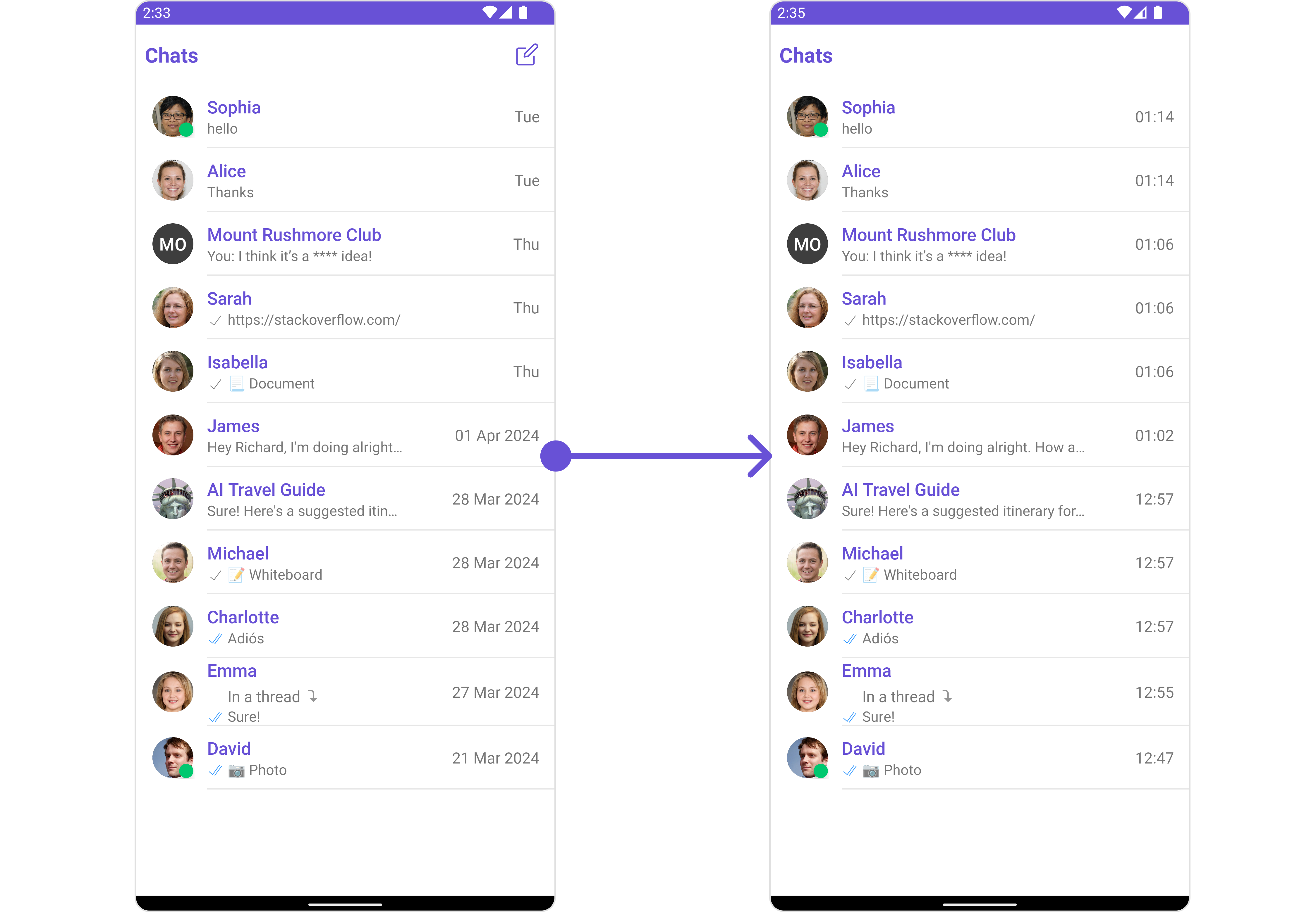
SetDatePattern
You can modify the date pattern to your requirement using .setDatePattern. This method accepts a function with a return type String. Inside the function, you can create your own pattern and return it as a String.- Java
- Kotlin
- Java
- Kotlin
SetSubtitleView
You can customize the subtitle view for each conversation item to meet your requirements- Java
- Kotlin

subtitle_layout.xml
- Java
- Kotlin
YourActivity.java
SetTail
used to generate a custom trailing view for the conversation item, by default it shows the time sent of the last message and the unread messages count- Java
- Kotlin
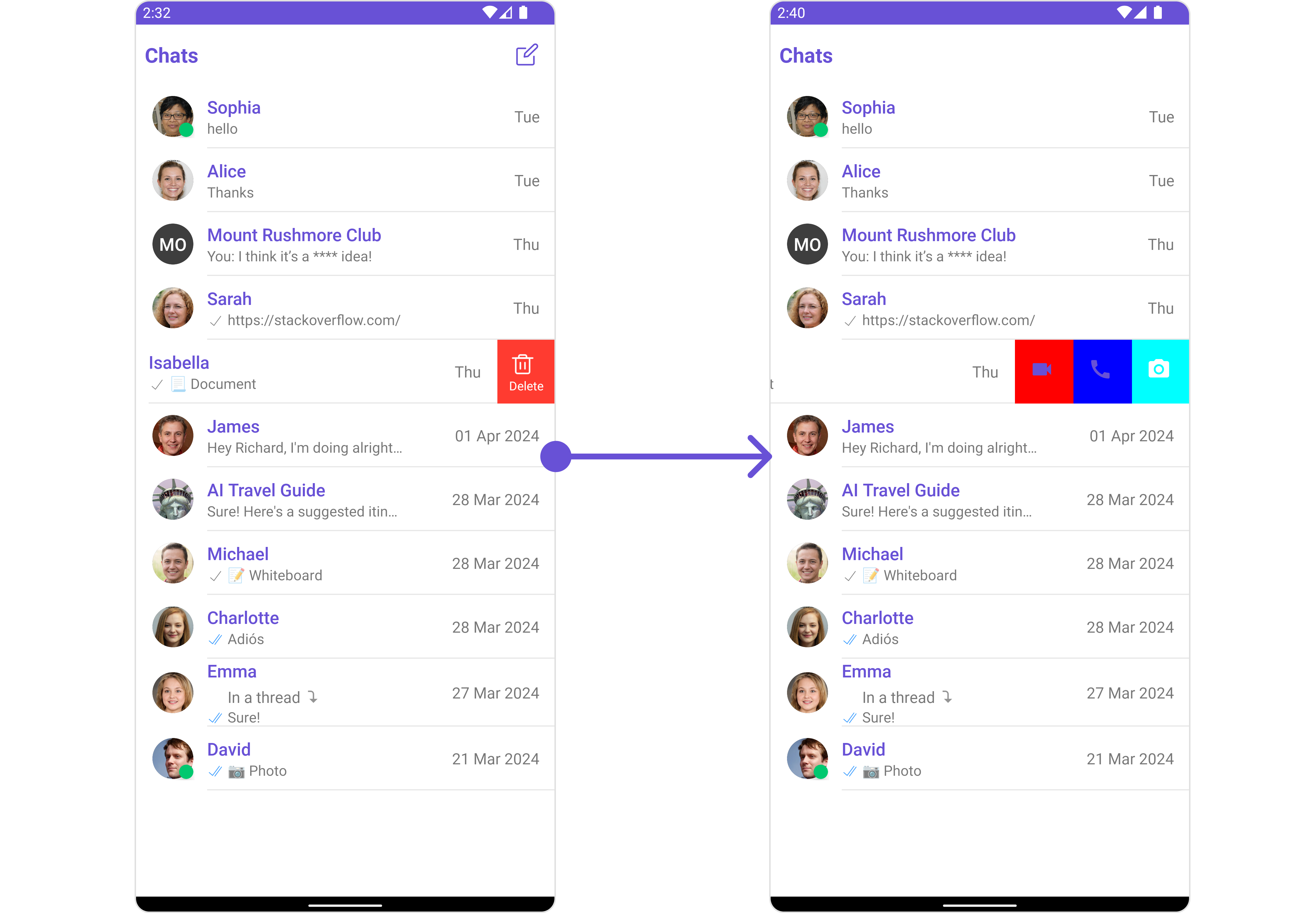
SetOptions
You can set a List of ‘CometChatOption’ for a conversation item to add your custom actions to the conversation. These options will be visible when swiping any conversation item.- Java
- Kotlin
- Java
- Kotlin
YourActivity.java
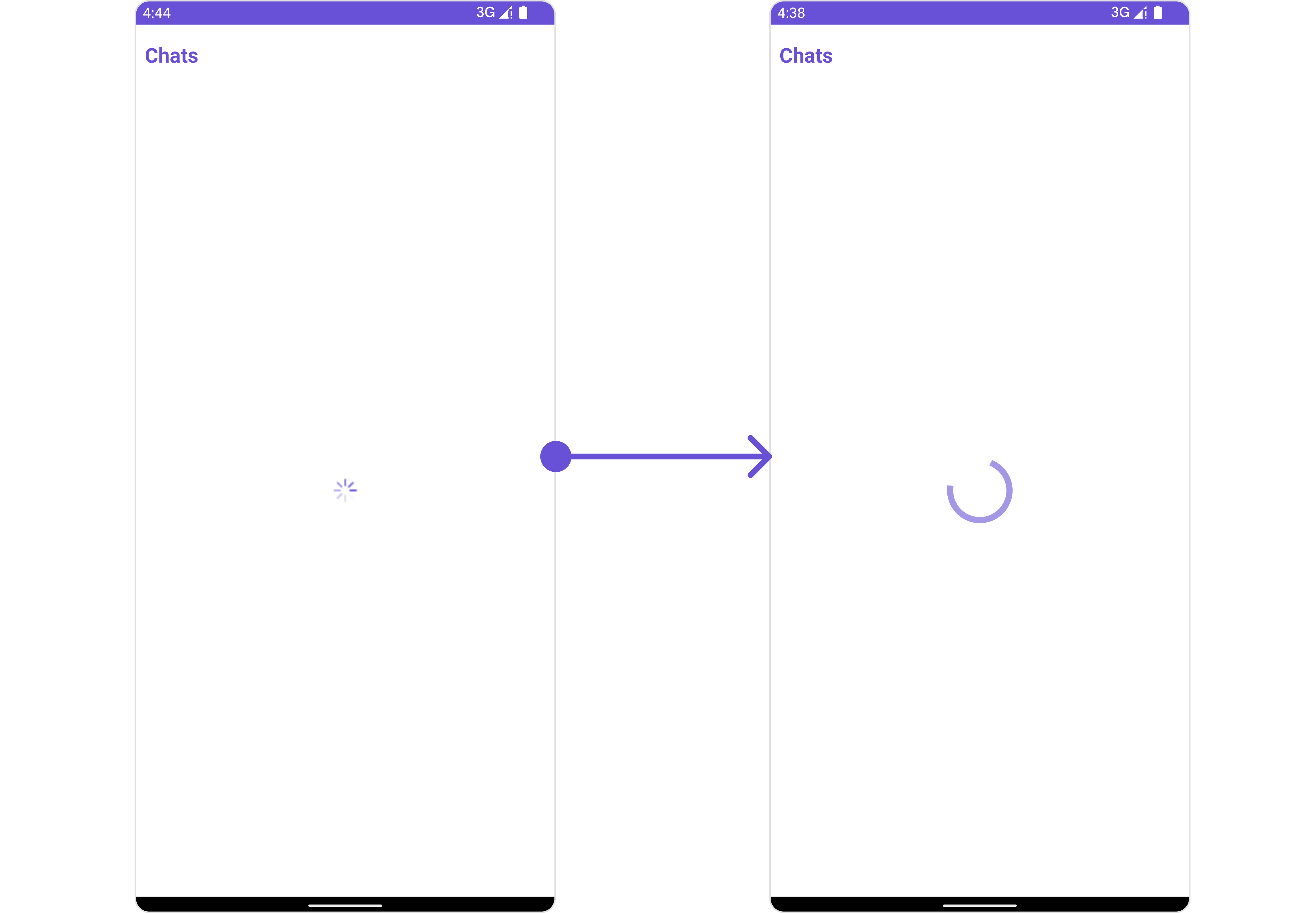
SetLoadingStateView
You can set a custom loader view usingsetLoadingStateView to match the loading view of your app.
- Java
- Kotlin
ContentLoadingProgressBar to loading_view_layout.xml. You can choose any view you prefer. This view should be inflated and passed to the setLoadingStateView() method.
loading_view_layout.xml
- Java
- Kotlin
YourActivity.java
SetErrorStateView
You can set a customErrorStateView using setEmptyStateView to match the error view of your app.
- Java
- Kotlin
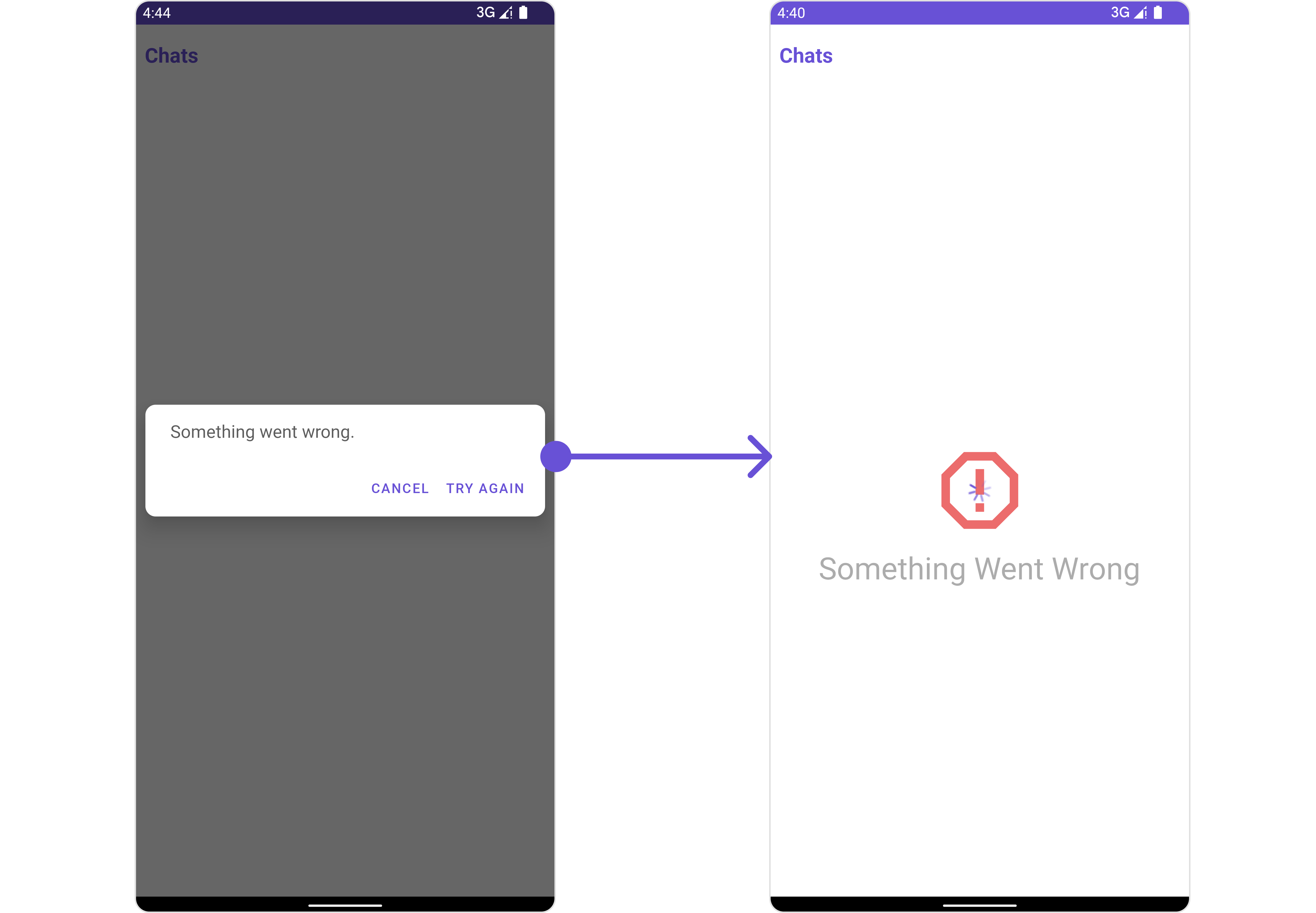
error_state_view_layout.xml. You can choose any view you prefer. This view should be inflated and passed to the setErrorStateView() method.
error_state_view_layout.xml
- Java
- Kotlin
YourActivity.java