AI Integration Quick Reference
AI Integration Quick Reference
Overview
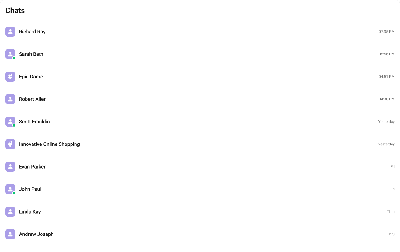
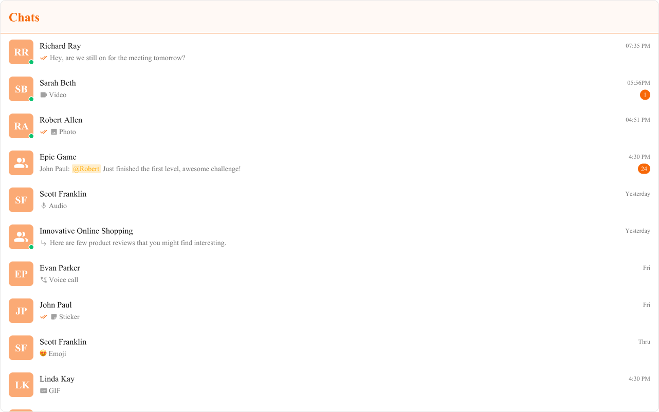
CometChatConversations is a sidebar list component. It renders recent conversations for the logged-in user and emits the selected CometChat.Conversation via onItemClick. Wire it to CometChatMessageHeader, CometChatMessageList, and CometChatMessageComposer to build a standard two-panel chat layout.
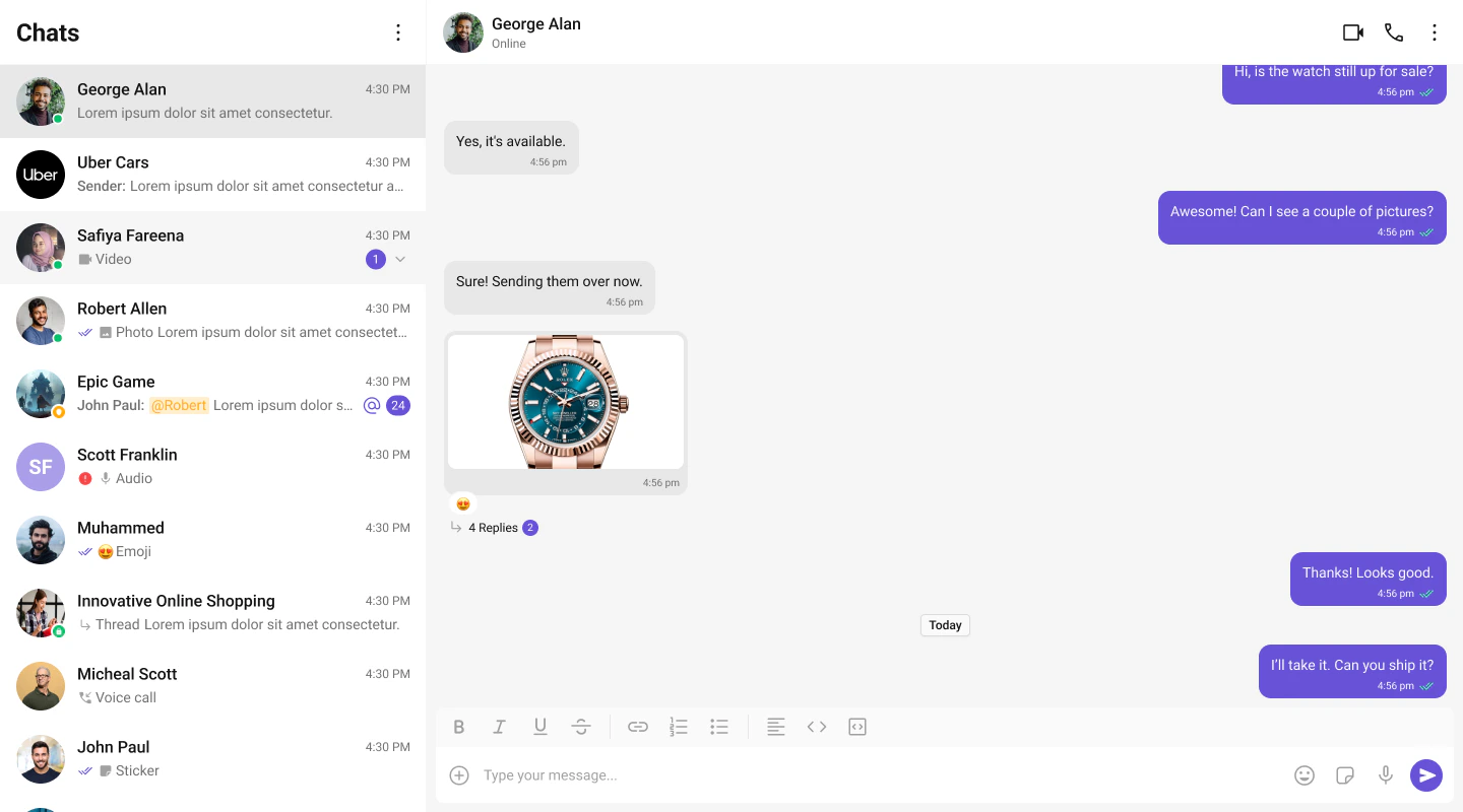
Live Preview — interact with the default conversations list.Open in Storybook ↗
The component handles:
- Paginated fetching with infinite scroll
- Real-time updates (new messages, typing indicators, presence changes)
- Search filtering
- Selection mode (single/multiple)
Usage
Flat API
Compound Composition
Full Layout Example
Filtering
Pass aCometChat.ConversationsRequestBuilder to conversationsRequestBuilder to control which conversations load. Pass the builder instance — not the result of .build().
Search
The component includes a built-in search bar. When the user types, it filters conversations client-side by name. For server-side search, pass asearchRequestBuilder:
CometChatSearch), pass onSearchBarClicked:
Filter Recipes
| Recipe | Code |
|---|---|
| Only 1-on-1 chats | new CometChat.ConversationsRequestBuilder().setConversationType("user") |
| Only group chats | new CometChat.ConversationsRequestBuilder().setConversationType("group") |
| Limit page size | new CometChat.ConversationsRequestBuilder().setLimit(10) |
| With tags | new CometChat.ConversationsRequestBuilder().setTags(["support"]) |
Actions and Events
Callback Props
| Prop | Signature | Fires when |
|---|---|---|
onItemClick | (conversation: CometChat.Conversation) => void | User clicks a conversation item |
onSelect | (conversation: CometChat.Conversation, selected: boolean) => void | Conversation selected/deselected (selection mode) |
onError | ((error: CometChat.CometChatException) => void) | null | SDK error occurs |
onEmpty | () => void | List is empty after initial fetch |
onSearchBarClicked | () => void | Search bar is clicked (makes input read-only) |
Events Emitted
UI events this component publishes:| Event | Payload | Fires when |
|---|---|---|
ui:conversation/deleted | { conversation } | User deletes a conversation |
Events Received
UI events this component subscribes to (published by other components):| Event | Payload | Behavior |
|---|---|---|
ui:message/sent | { message, status } | Moves conversation to top, updates last message, resets unread count |
ui:compose/edit | { message, status } | Updates the conversation’s last message |
ui:message/deleted | { message } | Updates the conversation’s last message |
ui:message/read | { message } | Resets unread count for that conversation |
ui:conversation/updated | { conversation } | Updates the conversation in the list |
ui:conversation/read | { conversationId } | Resets unread count by conversation ID |
ui:conversation/deleted | { conversation } | Removes the conversation from the list |
ui:group/created | { group } | Adds the new group conversation to the list |
ui:group/deleted | { group } | Removes the group conversation from the list |
ui:group/left | { group } | Removes the group conversation from the list |
ui:group/member-added | { group, members, messages } | Updates last message and moves to top |
ui:group/member-kicked | { group, member, message } | Updates last message and moves to top |
ui:group/member-banned | { group, member, message } | Updates last message and moves to top |
ui:group/member-unbanned | { group, member, message } | Updates last message and moves to top |
SDK Listeners (Automatic)
These SDK listeners are attached internally. The component updates its state automatically — no manual subscription needed:- Message listeners:
onTextMessageReceived,onMediaMessageReceived,onCustomMessageReceived,onInteractiveMessageReceived - Typing:
onTypingStarted,onTypingEnded - Receipts:
onMessagesDelivered,onMessagesRead - Presence:
onUserOnline,onUserOffline - Groups:
onGroupMemberJoined,onGroupMemberLeft,onGroupMemberKicked,onGroupMemberBanned,onMemberAddedToGroup
Customization
View Props
Use view props to replace sections of the default UI while keeping the component’s behavior intact:| Slot | Signature | Replaces |
|---|---|---|
itemView | (conversation) => ReactNode | Entire conversation row |
leadingView | (conversation) => ReactNode | Avatar section |
titleView | (conversation) => ReactNode | Conversation name |
subtitleView | (conversation) => ReactNode | Last message preview |
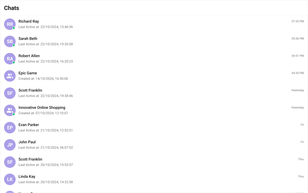
trailingView | (conversation) => ReactNode | Timestamp + unread badge |
headerView | ReactNode | Header area |
searchView | ReactNode | Search bar |
loadingView | ReactNode | Loading shimmer |
emptyView | ReactNode | Empty state |
errorView | ReactNode | Error state |
itemView
Replace the entire list item row. Default:
- TypeScript
- CSS
leadingView
Replace the avatar / left section. Typing-aware avatar example.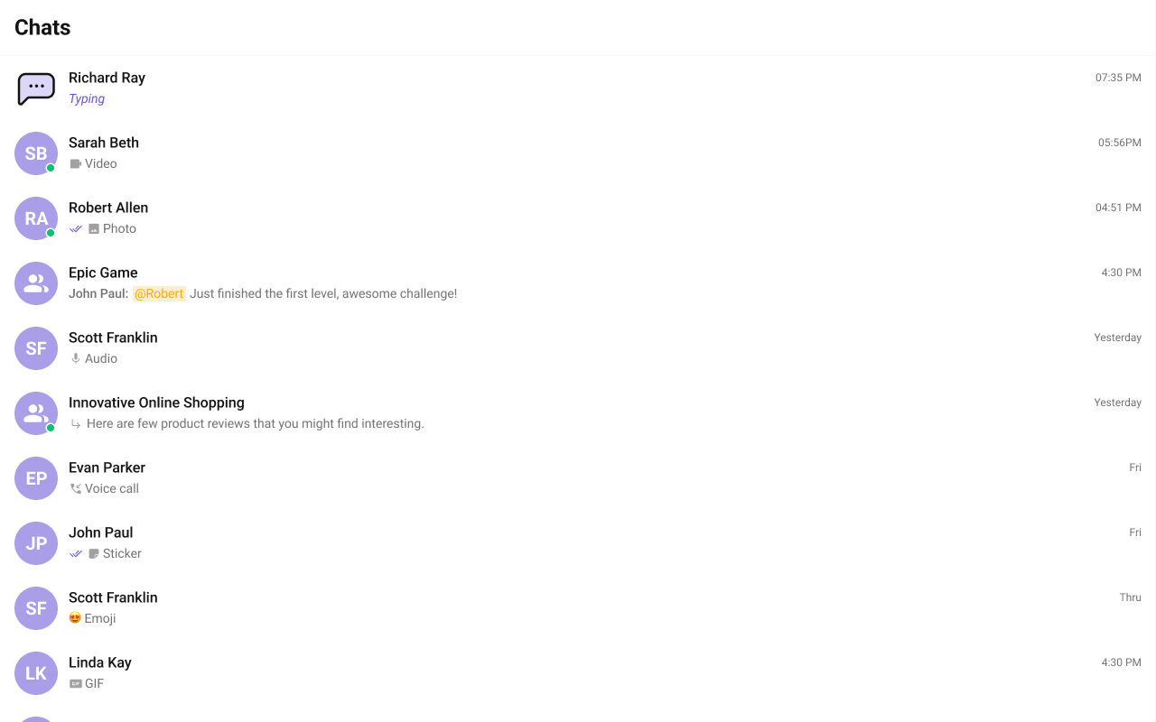
titleView
Replace the name / title text. Inline user status example.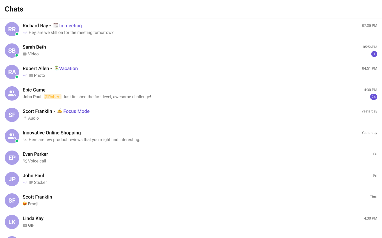
- TypeScript
- CSS
subtitleView
Replace the last message preview text. Default: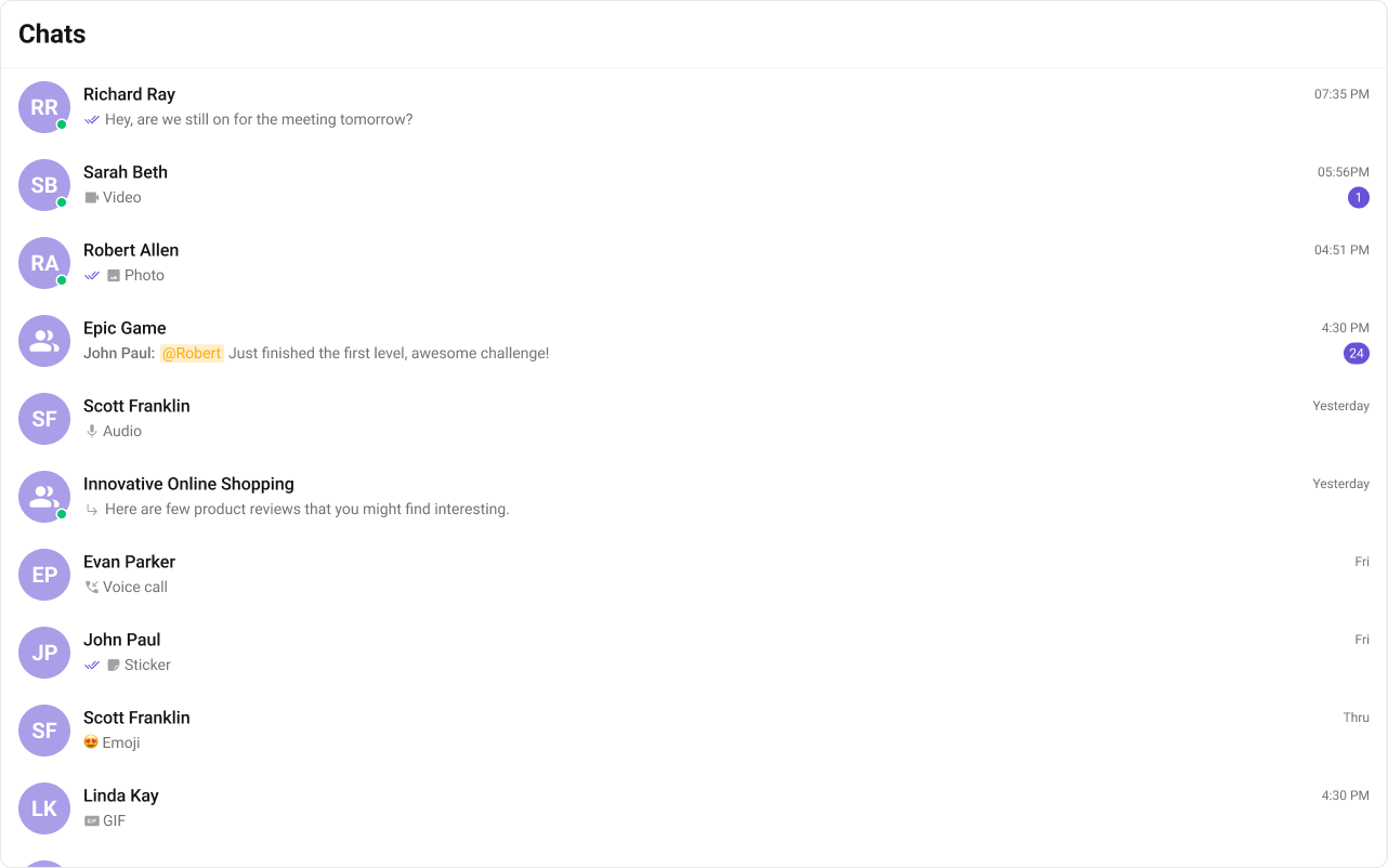
- TypeScript
- CSS
trailingView
Replace the timestamp / badge / right section. Relative time badge example.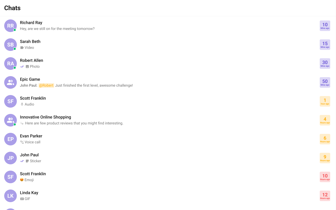
- TypeScript
- CSS
headerView
Replace the entire header bar.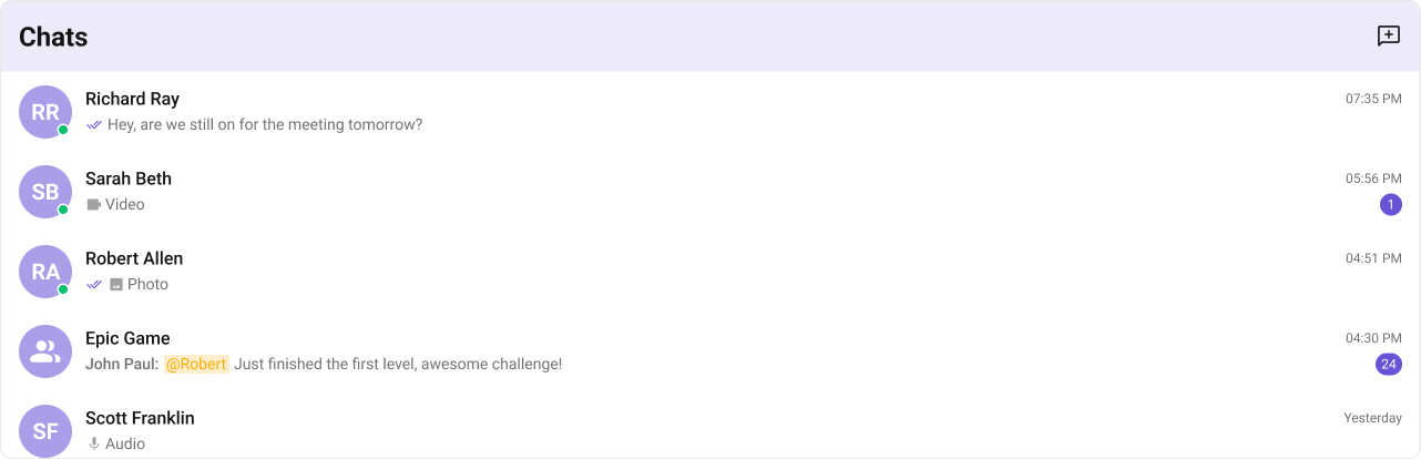
- TypeScript
- CSS
Compound Composition
For full layout control, use sub-components. Omit any sub-component to hide it:| Sub-component | Description | Props | Flat API equivalent |
|---|---|---|---|
Root | Context provider and container | All Root props + children | — |
List | Scrollable conversation list | itemView, className | itemView |
Item | Individual conversation row | leadingView, titleView, subtitleView, trailingView, className | Per-item view props |
Header | Header area | title, children | headerView |
SearchBar | Search input | placeholder, onClick | searchView |
EmptyState | Empty state | children | emptyView |
ErrorState | Error state | children | errorView |
LoadingState | Loading shimmer | children | loadingView |
CSS Styling
Override design tokens on the component selector:Props
All props are optional.View slot props (
headerView, searchView, loadingView, emptyView, errorView, itemView, leadingView, titleView, subtitleView, trailingView) are convenience props available only on the flat API. In compound composition mode, use the corresponding sub-components directly.conversationsRequestBuilder
Custom request builder for fetching conversations. Controls pagination, filtering, and sorting.| Type | CometChat.ConversationsRequestBuilder |
| Default | SDK default (limit 30) |
searchRequestBuilder
Custom request builder used specifically when the user searches. Separate from the main builder.| Type | CometChat.ConversationsRequestBuilder |
| Default | undefined |
searchKeyword
Initial search keyword to pre-filter conversations on mount.| Type | string |
| Default | undefined |
activeConversation
The currently active/highlighted conversation. The matching item receives an active visual state.| Type | CometChat.Conversation |
| Default | undefined |
lastMessageDateTimeFormat
Custom date/time format for the last message timestamp shown in each conversation item.| Type | CometChatDateFormatConfig |
| Default | { today: 'hh:mm A', yesterday: 'Yesterday', lastWeek: 'dddd', otherDays: 'DD/MM/YYYY' } |
hideReceipts
Hide message delivery/read receipts (double ticks) on conversation items.| Type | boolean |
| Default | false |
hideUserStatus
Hide the online/offline status indicator on user avatars.| Type | boolean |
| Default | false |
hideGroupType
Hide the group type indicator (public/private/password) on group conversation items.| Type | boolean |
| Default | false |
hideUnreadCount
Hide the unread message count badge.| Type | boolean |
| Default | false |
hideDeleteConversation
Hide the delete option in the conversation item’s context menu.| Type | boolean |
| Default | false |
showSearchBar
Whether to show the search bar. Set tofalse to hide it entirely.
| Type | boolean |
| Default | true |
showScrollbar
Show the native scrollbar on the conversation list.| Type | boolean |
| Default | false |
selectionMode
Enable selection mode for multi-select operations.| Type | 'none' | 'single' | 'multiple' |
| Default | 'none' |
disableSoundForMessages
Disable the notification sound when new messages arrive.| Type | boolean |
| Default | false |
customSoundForMessages
Custom sound URL to play when new messages arrive (replaces the built-in sound).| Type | string |
| Default | Built-in notification sound |
onItemClick
Callback when a conversation item is clicked.| Type | (conversation: CometChat.Conversation) => void |
| Default | undefined |
onSelect
Callback when a conversation is selected or deselected (only fires in selection mode).| Type | (conversation: CometChat.Conversation, selected: boolean) => void |
| Default | undefined |
onError
Callback when an SDK error occurs during fetch or real-time operations.| Type | ((error: CometChat.CometChatException) => void) | null |
| Default | null |
onEmpty
Callback when the conversation list is empty after the initial fetch completes.| Type | () => void |
| Default | undefined |
onSearchBarClicked
Callback when the search bar is clicked. When provided, the search input becomes read-only and acts as a trigger (useful for opening a global search component likeCometChatSearch).
| Type | () => void |
| Default | undefined |
CSS Architecture
The component uses CSS custom properties (design tokens) that are bundled with@cometchat/chat-uikit-react. The cascade:
- Global tokens (e.g.,
--cometchat-primary-color,--cometchat-background-color-01) are set on the.cometchatroot wrapper. - Component CSS (
.cometchat-conversations) consumes these tokens viavar()with fallback values. - Overrides target
.cometchat-conversationsdescendant selectors in a global stylesheet.
CometChatConversations exist on the same page, wrap the component in a container and scope selectors:
Key Selectors
| Target | Selector |
|---|---|
| Root | .cometchat-conversations |
| Header title | .cometchat-conversations .cometchat-list__header-title |
| List item | .cometchat-conversations .cometchat-list-item |
| Body title | .cometchat-conversations .cometchat-list-item__body-title |
| Avatar | .cometchat-conversations .cometchat-avatar |
| Avatar text | .cometchat-conversations .cometchat-avatar__text |
| Unread badge | .cometchat-conversations .cometchat-badge |
| Subtitle text | .cometchat-conversations .cometchat-conversations__subtitle-text |
| Status indicator | .cometchat-conversations .cometchat-status-indicator |
| Read receipts | .cometchat-conversations .cometchat-receipts-read |
| Active item | .cometchat-conversations__list-item-active .cometchat-list-item |
| Typing indicator | .cometchat-conversations__subtitle-typing |
| Trailing view | .cometchat-conversations__trailing-view |
Example: Brand-themed conversations
Customization Matrix
| What to change | Where | Property/API | Example |
|---|---|---|---|
| Override behavior on user interaction | Component props | on<Event> callbacks | onItemClick={(c) => setActive(c)} |
| Filter which conversations appear | Component props | conversationsRequestBuilder | conversationsRequestBuilder={new CometChat.ConversationsRequestBuilder().setLimit(10)} |
| Toggle visibility of UI elements | Component props | hide<Feature> boolean props | hideReceipts={true} |
| Replace a section of the list item | Component props | <slot>View render props | itemView={(conversation) => <div>...</div>} |
| Change colors, fonts, spacing | Global CSS | Target .cometchat-conversations class | .cometchat-conversations .cometchat-badge { background: #e5484d; } |
Next Steps
Users
Browse and select users for new conversations
Message List
Display messages for the selected conversation
Search
Search across conversations and messages
Theming
Customize colors, fonts, and spacing