Architecture
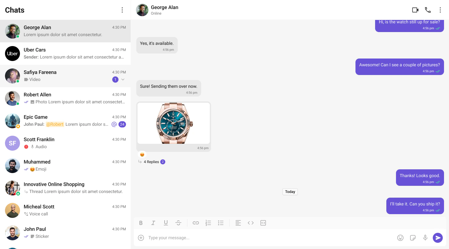
The UI Kit provides a set of independent, composable React components that wire together into complete chat layouts. A typical two-panel layout uses four core components:- CometChatConversations — sidebar listing recent conversations
- CometChatMessageHeader — toolbar showing avatar, name, status, and typing indicator
- CometChatMessageList — scrollable message feed with reactions, receipts, and threads
- CometChatMessageComposer — rich text input with attachments, mentions, and voice notes
CometChat.User or CometChat.Group object. Pass that object as a prop (user or group) to the message components. They handle SDK calls internally — the composer sends messages, the list receives them via real-time listeners.
All components must be rendered inside a <CometChatProvider> which initializes the SDK connection and provides shared context (theme, locale, events).
Flat API
Every feature component can be rendered in a single line. Pass props directly, the component handles its own layout internally.Compound Composition
For full layout control, use the compound pattern. Each feature component is a namespace with sub-components:- Root initializes state, fetches data, and provides context to children.
- Sub-components read from context and render when their state is active.
- Omit a sub-component to hide it, no boolean props needed.
- Add custom elements anywhere inside Root alongside the sub-components.
Component Categories
Components are organized into three categories:Feature Components
Feature components integrate with the CometChat SDK for data fetching, real-time events, and state management. They follow the compound pattern and support both flat and compound APIs. Feature components:- Own their data lifecycle (fetch, paginate, refresh)
- Subscribe to real-time SDK events (new messages, presence changes, typing indicators)
- Manage complex state via hooks and reducers
- Provide context to their sub-components
Base Components
Base components are pure UI building blocks with no SDK integration. They accept props and render UI — no network calls, no real-time events. Feature components compose these internally. Base components use a plain namespace object (compound sub-components) but don’t have the callable flat API shorthand. Examples: Avatar, Button, Date, ContextMenu, SearchBar, ConfirmDialog, Popover, MediaRecorder, MessageBubble, Reactions.Bubble Components (Plugins)
Message bubble components (TextBubble, ImageBubble, FileBubble, AudioBubble, VideoBubble, StickerBubble, PollBubble, etc.) are part of the Plugin system. Each plugin handles a specific message type and provides the bubble component that renders it. Bubble components are documented in the Plugins section alongside their parent plugin. See Plugins Overview for how to customize message rendering.Feature Components
All feature components are imported from@cometchat/chat-uikit-react.
Conversations and Lists
| Component | Purpose | Page |
|---|---|---|
CometChatConversations | Scrollable list of recent conversations with real-time updates | Conversations |
CometChatUsers | Searchable list of users with selection support | Users |
CometChatGroups | Searchable list of groups with selection support | Groups |
CometChatGroupMembers | List of group members with role-based actions | Group Members |
Messages
| Component | Purpose | Page |
|---|---|---|
CometChatMessageHeader | Toolbar with avatar, name, status, typing indicator, and call buttons | Message Header |
CometChatMessageList | Scrollable message feed with plugin-based bubble rendering | Message List |
CometChatMessageComposer | Rich text input with attachments, emoji, voice recording, and formatting | Message Composer |
CometChatMessageBubble | Message bubble container with alignment, receipts, options, and reactions | Message Bubble |
CometChatThreadHeader | Parent message bubble and reply count for threaded conversations | Thread Header |
CometChatMessageInformation | Message delivery and read receipt details panel | Message Information |
CometChatReactions | Reaction chips bar with reactor list popover | Reactions |
CometChatReactionList | Full reactor list with tabs and pagination | Reaction List |
CometChatActionBubble | Renders group action and call action system messages | Action Bubble |
Calling
| Component | Purpose | Page |
|---|---|---|
CometChatCallButtons | Voice and video call initiation buttons | Call Buttons |
CometChatIncomingCall | Incoming call notification with accept/decline | Incoming Call |
CometChatOutgoingCall | Outgoing call screen with cancel control | Outgoing Call |
CometChatCallLogs | Scrollable list of call history | Call Logs |
Search and AI
| Component | Purpose | Page |
|---|---|---|
CometChatSearch | Unified search across conversations and messages | Search |
CometChatAIAssistantChat | AI agent chat with streaming, suggestions, and history | AI Assistant |
Base Components
Base components are imported from@cometchat/chat-uikit-react. They don’t have individual doc pages — use the source types and Storybook for reference.
| Component | Purpose |
|---|---|
CometChatAvatar | User/group avatar with image and initials fallback |
CometChatButton | Styled button with icon, text, loading, and variant support |
CometChatCheckbox | Checkbox input with label and controlled/uncontrolled support |
CometChatChangeScope | Group member role/scope change selector |
CometChatConfirmDialog | Confirmation dialog with customizable message and buttons |
CometChatContextMenu | Options menu with top-row icons and overflow dropdown |
CometChatConversationStarter | AI-generated conversation starter suggestions as clickable pills |
CometChatConversationSummary | AI-generated conversation summary display |
CometChatDate | Formatted date/time display with temporal bucketing |
CometChatDownloadButton | Download button for file and media attachments |
CometChatEmojiKeyboard | Emoji picker with category tabs and search |
CometChatErrorBoundary | Error isolation wrapper with fallback UI and retry |
CometChatFlagMessageDialog | Modal dialog for reporting/flagging messages with reason selection |
CometChatFormattingToolbar | Rich text formatting toolbar (bold, italic, lists, links, code) |
CometChatFullScreenViewer | Full-screen image/media viewer with download |
CometChatLinkDialog | Dialog for inserting or editing hyperlinks |
CometChatLinkPopover | Popover for previewing and editing links inline |
CometChatListItem | Standardized list item with avatar, title, subtitle, and tail |
CometChatMediaRecorder | Audio recording with timer, preview, and submit |
CometChatModerationView | Content moderation indicator and action view |
CometChatPopover | Positioning utility component for popovers and dropdowns |
CometChatRadioButton | Radio button input with label support |
CometChatSearchBar | Search input with clear button and keyboard handling |
CometChatActionSheet | Bottom sheet with grouped action items |
CometChatSmartReplies | AI-powered reply suggestions as clickable chips |
CometChatThreadView | Inline thread reply indicator with reply count and unread dot |
CometChatToast | Toast notification for transient feedback messages |
CometChatTypingIndicator | Animated typing indicator with user attribution |
Component API Pattern
All components share a consistent API surface for customization.Actions (Callbacks)
Callback props fire on user interactions. Override them to customize behavior:Filters (RequestBuilder)
List components acceptRequestBuilder props to control which data loads:
.build().
View Props
View props replace the visual content inside a component slot while keeping the default behavior wired:CSS Styling
Components use CSS custom properties (design tokens). Override them on the.cometchat root or on component-specific selectors:
.cometchat-component-name__element--modifier.
Next Steps
Theming
Customize colors, fonts, and spacing with CSS variables
Plugins
Customize message rendering with the plugin system
Event System
Subscribe to real-time events across components
Guides
Task-oriented tutorials for common patterns