Importing the Stylesheet
To start theming, first, import the base stylesheet into your project. This stylesheet contains the default variables and styles for the chat UI.- App.css
Customization
Our theming provides various customization options through CSS variables. These variables cover colors, typography, spacing, and more.CSS Variables
Our theming provides various customization options through CSS variables. These variables cover colors, typography, spacing, and more.Updating CSS variables globally
To apply changes globally across the chat UI, simply override the CSS variables in the root of your stylesheet. This will apply the updated values across all components. Shown below is the default chat interface.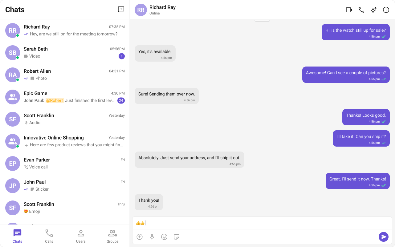
- App.tsx
- App.css
Updating CSS variables component wise
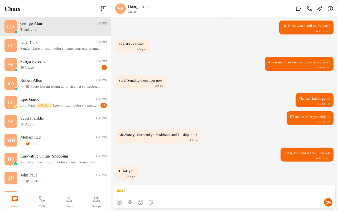
You can also apply specific variables to individual components. For example, if you want the message conversation avatar to differ from other elements, you can define these variables within the specific component’s CSS class. The customized chat interface is displayed below.
- App.css
CSS Overrides
If you need more control beyond CSS variables, you can use CSS overrides. These allow for detailed adjustments to the look and feel of each component by targeting the specific classes or elements within the chat UI.- App.css
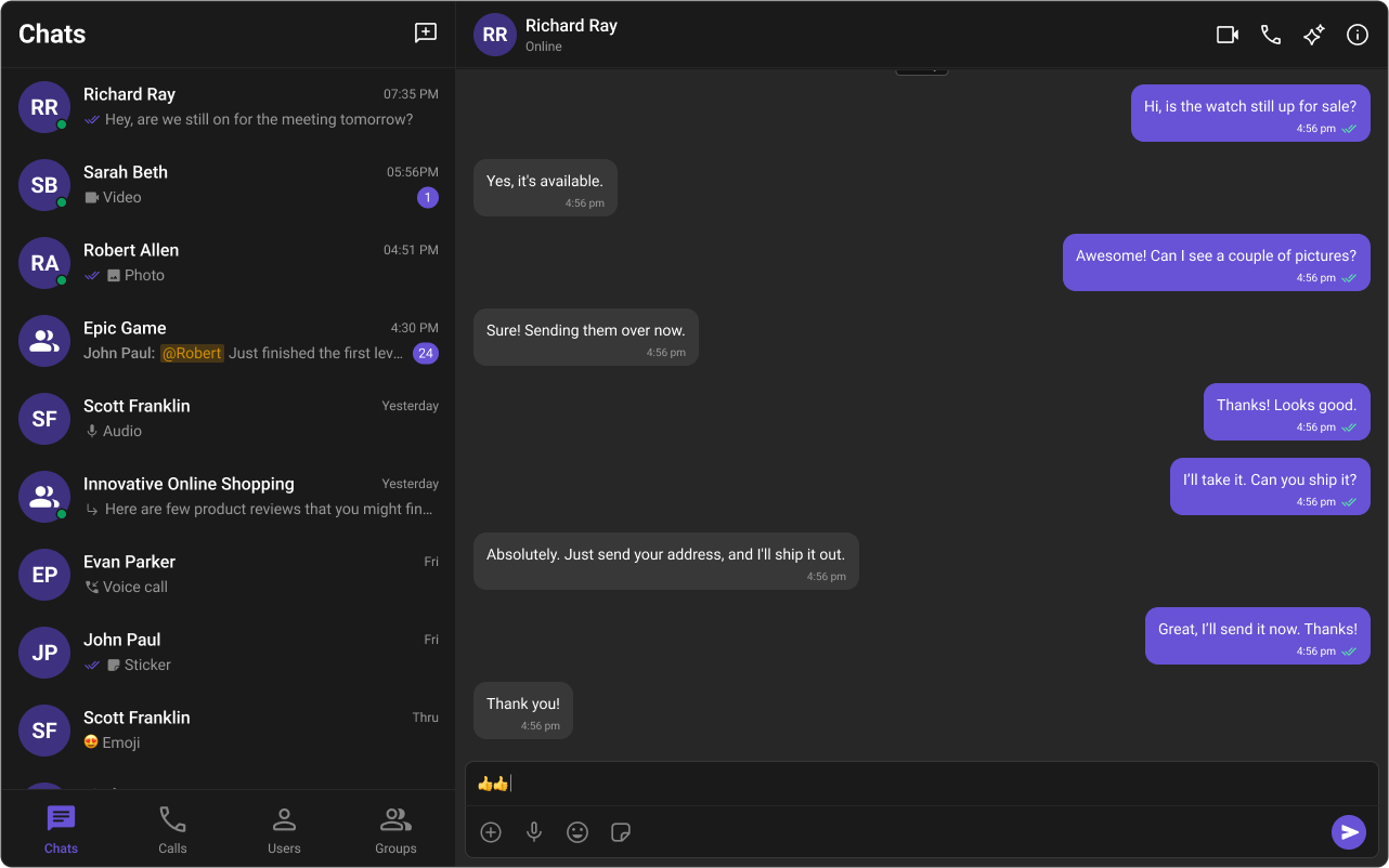
Dark & Light Theme
The Chat UI Kit supports both dark and light themes by default. You can toggle between these themes based on user preference or system settings.Switching Themes with CSS Variables
To enable dark mode, you can redefine the CSS variables under a dark theme class or media query. Here is the code to enable & toggle between dark & light mode.- App.tsx
Customising in Light & Dark theme
Here is how you can provide different color configurations for the dark and light themes: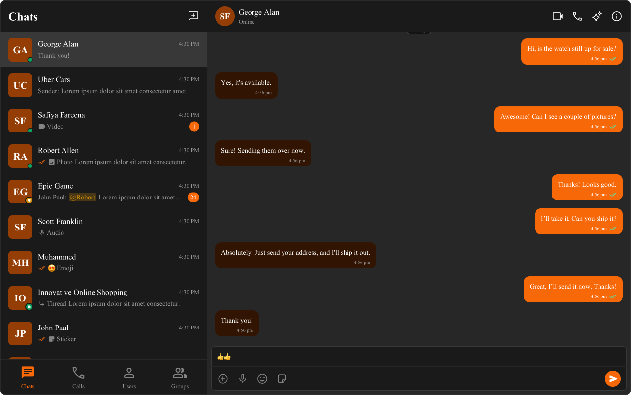
- App.css