Introduction
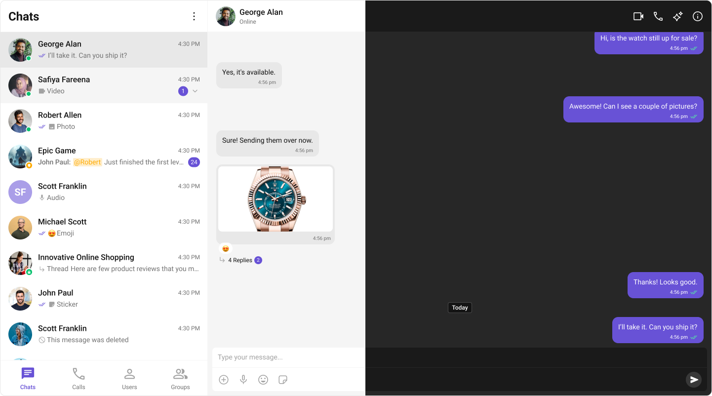
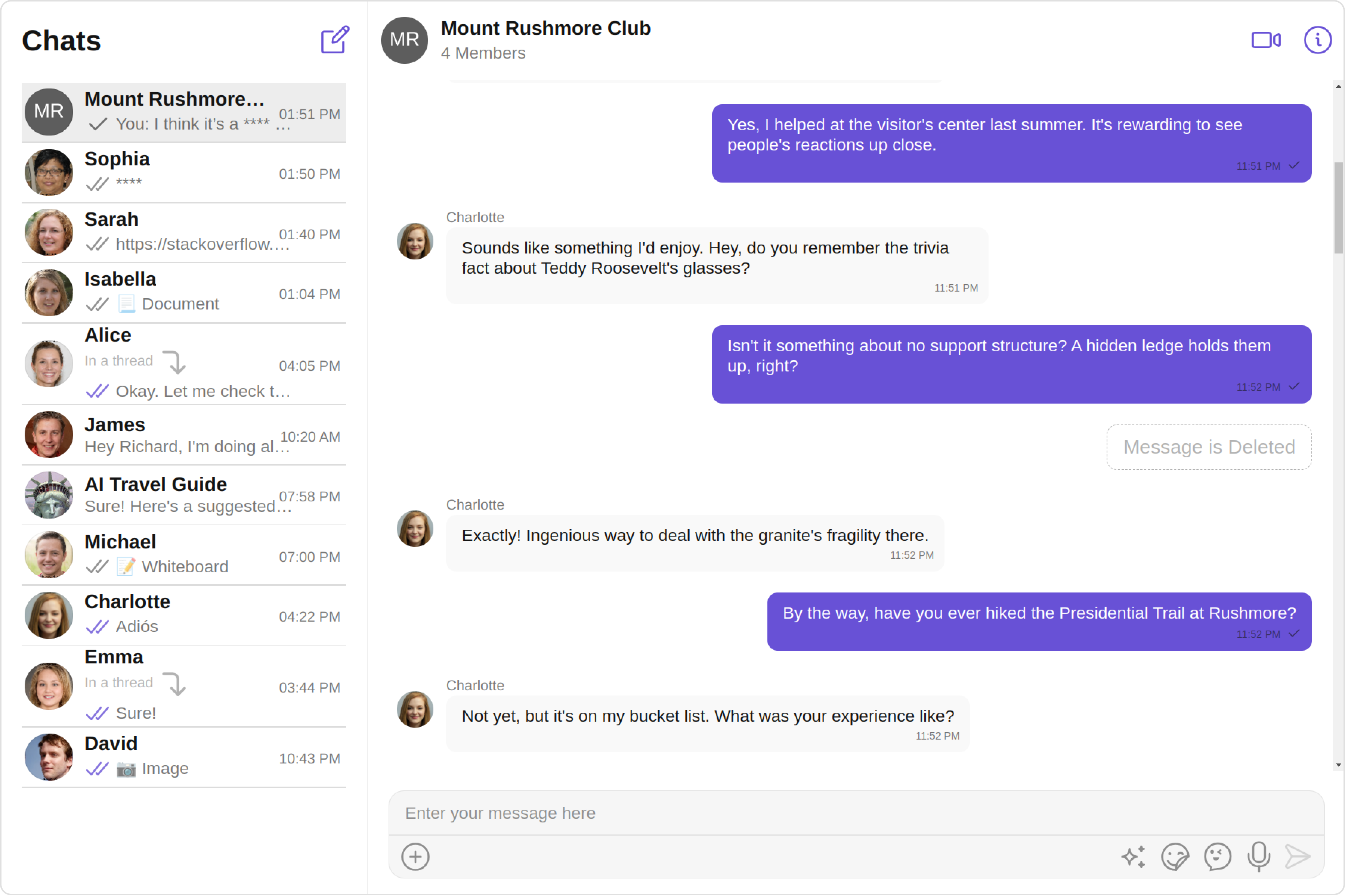
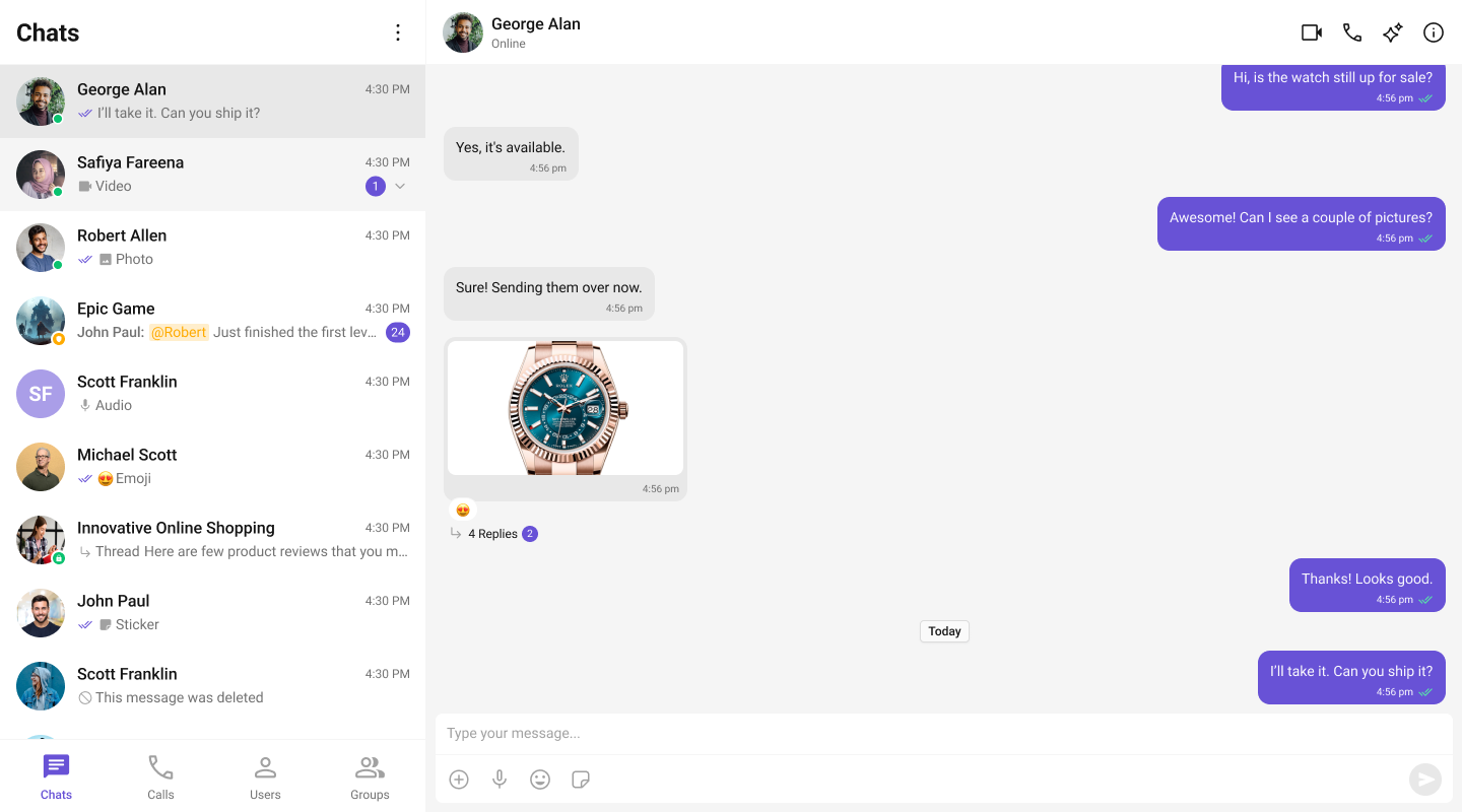
The CometChat v5 React UI Kit streamlines the integration of in-app chat functionality into your applications. Packed with prebuilt, modular UI components, it supports essential messaging features for both one-to-one and group conversations. With built-in theming options, including light and dark modes, customizable fonts, colors, and extensive configuration possibilities, developers can create chat experiences tailored to their application’s needs.
Integration
In v4, integration was straightforward due to the availability of composite components likeCometChatConversationsWithMessages. This single component provided end-to-end functionality, including listing conversations, handling conversation clicks, loading messages (message header, list, composer), displaying user or group details, and supporting threaded messages. Developers could achieve all these features with minimal setup. However, customization posed significant challenges. Customizing the UI or adding custom views required a deep understanding of the internal flow of the composite component. Additionally, configurations were a mix of custom view props, behavioural props, and style props, which often led to confusion. Styling deeply nested components also proved cumbersome, limiting the developer’s ability to make meaningful changes.

Conversations, Message Header, Message List, and Message Composer. This modular approach makes integration more flexible and easier to understand. Each component has a well-defined purpose, allowing developers to use them in ways that suit their specific requirements. The need for complex configurations has been eliminated, as developers can now customize behavior and styling directly via props or CSS. Styling has been significantly simplified, with every component carefully assigned thoughtful CSS class names, enabling developers to customize styles globally or at the component level effortlessly.
To support the transition from v4 to v5, CometChat has built a sample app that replicates the functionality of v4’s composite components. This sample app serves as a reference for developers looking to build additional features such as user/group details, call log details, threaded messages, and advanced messaging capabilities. By following this approach, developers can take full advantage of v5’s modular design while implementing complex functionality in an organized manner.

Learn how to build a complete messaging UI using the v5 UI Kit by following the step-by-step guide here.
Components
The v4 UI Kit provided composite components likeCometChatConversationsWithMessages, which offered end-to-end functionality. These components integrated features such as conversation lists, message views (header, list, composer), user/group details, and threaded messages into a single unit. However, customization of deeply nested components through configuration was challenging and resulted in a suboptimal developer experience.
| Components in v4 UI Kit: | ||
|---|---|---|
| CometChatConversationsWithMessages | CometChatUsersWithMessages | CometChatGroupsWithMessages |
| CometChatMessages | CometChatMessageHeader | CometChatMessageList |
| CometChatMessageComposer | CometChatThreadedMessages | CometChatConversations |
| CometChatUsers | CometChatGroups | CometChatContacts |
| CometChatDetails | CometChatGroupMembers | CometChatAddMembers |
| CometChatBannedMembers | CometChatTransferOwnership | CometChatMessageInformation |
| CometChatIncomingCall | CometChatOngoingCall | CometChatOutgoingCall |
| CometChatCallButtons | CometChatCallLogs | CometChatCallLogDetails |
| CometChatCallLogHistory | CometChatCallLogRecordings | CometChatCallLogParticipants |
| CometChatCallLogsWithDetails | CometChatUserMemberWrapper |
Conversations, Message Header, Message List, and Message Composer. Developers now need to stitch these components together to build the desired functionality. This change allows for greater flexibility and easier customization via props, significantly improving the developer experience while maintaining functionality.
| Components in v5 UI Kit: | ||
|---|---|---|
| CometChatConversations | CometChatUsers | CometChatGroups |
| CometChatGroupMembers | CometChatMessageHeader | CometChatMessageList |
| CometChatMessageComposer | CometChatThreadedMessagePreview | CometChatIncomingCall |
| CometChatOutgoingCall | CometChatCallButtons | CometChatCallLogs |
Theming
In v4, theming was managed using the CometChatTheme class, which included two key properties: Typography and Palette. The Palette property provided methods likesetAccent50(), setPrimary(), and setMode() for configuring colors and themes. The theming system relied heavily on React’s Context API, utilizing CometChatThemeProvider and CometChatThemeContext to retrieve and update theme settings. While Context is a core concept in React, it wasn’t the most intuitive or efficient approach for theming.
The reliance on Context for theming introduced several challenges. Customizing themes often required developers to consume the theme from the context and then explicitly update values programmatically, which added unnecessary complexity. For example, switching between light and dark modes required interacting with the theme’s context and invoking specific methods like setMode(). This process was less straightforward compared to the traditional approach of using CSS class names or data attributes to define themes dynamically. Furthermore, this method wasn’t as idiomatic to modern frontend development practices, where CSS-based theming provides simplicity, flexibility, and better alignment with browser capabilities.
App.tsx
For detailed guidance on theming and customizing colors in the CometChat React UI Kit, refer to the following resources:
- Theming Documentation: Guide to Theming
- Color Customization: Customizing Colors
Properties
In v5, the approach to props has been significantly refined to improve clarity and ease of use. All style-related props, previously used to customize components, have been replaced by a more efficient and native theming system based on CSS variables. This change ensures a seamless and flexible styling process without the need for verbose or redundant configuration within the component props. Configuration props, which were prominent in v4, have also been eliminated. With v5’s modular design, components are no longer nested, making such configurations unnecessary. Developers now have direct control over each component, reducing complexity and increasing flexibility in how components are used and styled. Custom view props have undergone a comprehensive overhaul to ensure consistency across all components. For example, components that are represented as list items or general items now share a uniform set of customizable props, enabling a standardized approach to customization. These props includeitemView, leadingView, trailingView, subtitleView & titleView. This consistent naming convention makes it easier for developers to understand and apply customizations across various components, streamlining the development process.
For a comprehensive overview of newly added, renamed, and removed properties, refer to the Property Changes Documentation.