

Overview
CometChatGroups functions as a standalone component designed to create a screen displaying a list of groups, with the added functionality of enabling users to search for specific groups. Acting as a container component, CometChatGroups encapsulates and formats the CometChatListBase and CometChatGroupList components without introducing any additional behavior of its own.
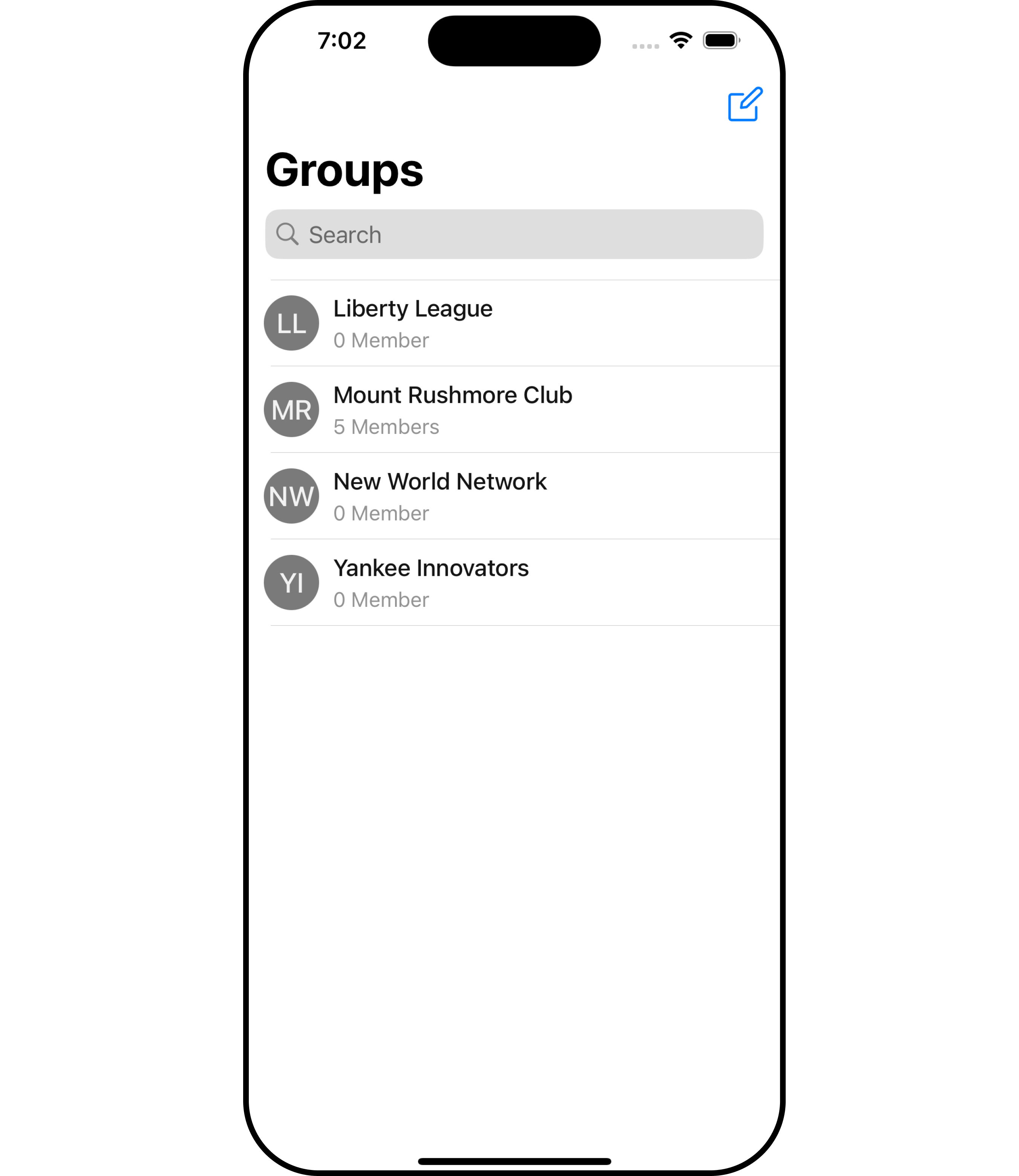
The
Groups component is composed of the following BaseComponents:
Usage
Integration
The following code snippet illustrates how you can can launch CometChatGroups.- Swift
If you are already using a navigation controller, you can use the
pushViewController function instead of presenting the view controller.Actions
Actions dictate how a component functions. They are divided into two types: Predefined and User-defined. You can override either type, allowing you to tailor the behavior of the component to fit your specific needs.1. SetOnItemClick
This method proves valuable when users seek to override onItemClick functionality within CometChatGroups, empowering them with greater control and customization options. ThesetOnItemClick action doesn’t have a predefined behavior. You can override this action using the following code snippet.
- Swift
2. SetOnItemLongClick
This method becomes invaluable when users seek to override long-click functionality within CometChatGroups, offering them enhanced control and flexibility in their interactions. ThesetOnItemLongClick action doesn’t have a predefined behavior. You can override this action using the following code snippet.
- Swift
3. SetOnError
You can customize this behavior by using the provided code snippet to override theOn Error and improve error handling.
- Swift
4. SetOnBack
Enhance your application’s functionality by leveraging theSetOnBack feature. This capability allows you to customize the behavior associated with navigating back within your app. Utilize the provided code snippet to override default behaviors and tailor the user experience according to your specific requirements.
- Swift
Filters
Filters allow you to customize the data displayed in a list within a Component. You can filter the list based on your specific criteria, allowing for a more customized. Filters can be applied using RequestBuilders of Chat SDK.1. GroupsRequestBuilder
The GroupsRequestBuilder enables you to filter and customize the group list based on available parameters in GroupsRequestBuilder. This feature allows you to create more specific and targeted queries when fetching groups. The following are the parameters available in GroupsRequestBuilder
Example
In the example below, we are applying a filter to the Group List based on only joined groups.
- Swift
2. SearchRequestBuilder
The SearchRequestBuilder uses GroupsRequestBuilder enables you to filter and customize the search list based on available parameters in GroupsRequestBuilder. This feature allows you to keep uniformity between the displayed Groups List and searched Group List. Example- Swift
Events
Events are emitted by aComponent. By using event you can extend existing functionality. Being global events, they can be applied in Multiple Locations and are capable of being Added or Removed.
The list of events emitted by the Groups component is as follows.
Adding
CometChatGroupsEvents Listener’s
- Add Listener
Emitting Group Events
CometChatGroupsEvents Listener’s
- Remove Listener
Customization
To fit your app’s design requirements, you can customize the appearance of the groups component. We provide exposed methods that allow you to modify the experience and behavior according to your specific needs.Style
Using Style you can customize the look and feel of the component in your app, These parameters typically control elements such as the color, size, shape, and fonts used within the component.1. Groups Style
Enhance your Groups Component by setting the GroupsStyle to customize its appearance.- Swift
2. Avatar Style
To apply customized styles to theAvatar component in the Groups Component, you can use the following code snippet. For further insights on Avatar Styles refer
- Swift
Swift
3. StatusIndicator Style
To apply customized styles to the Status Indicator component in the Groups Component, You can use the following code snippet. For further insights on Status Indicator Styles refer- Swift
4. ListItem Style
To apply customized styles to theListItemStyle component in the Groups Component, you can use the following code snippet. For further insights on ListItemStyle Styles refer
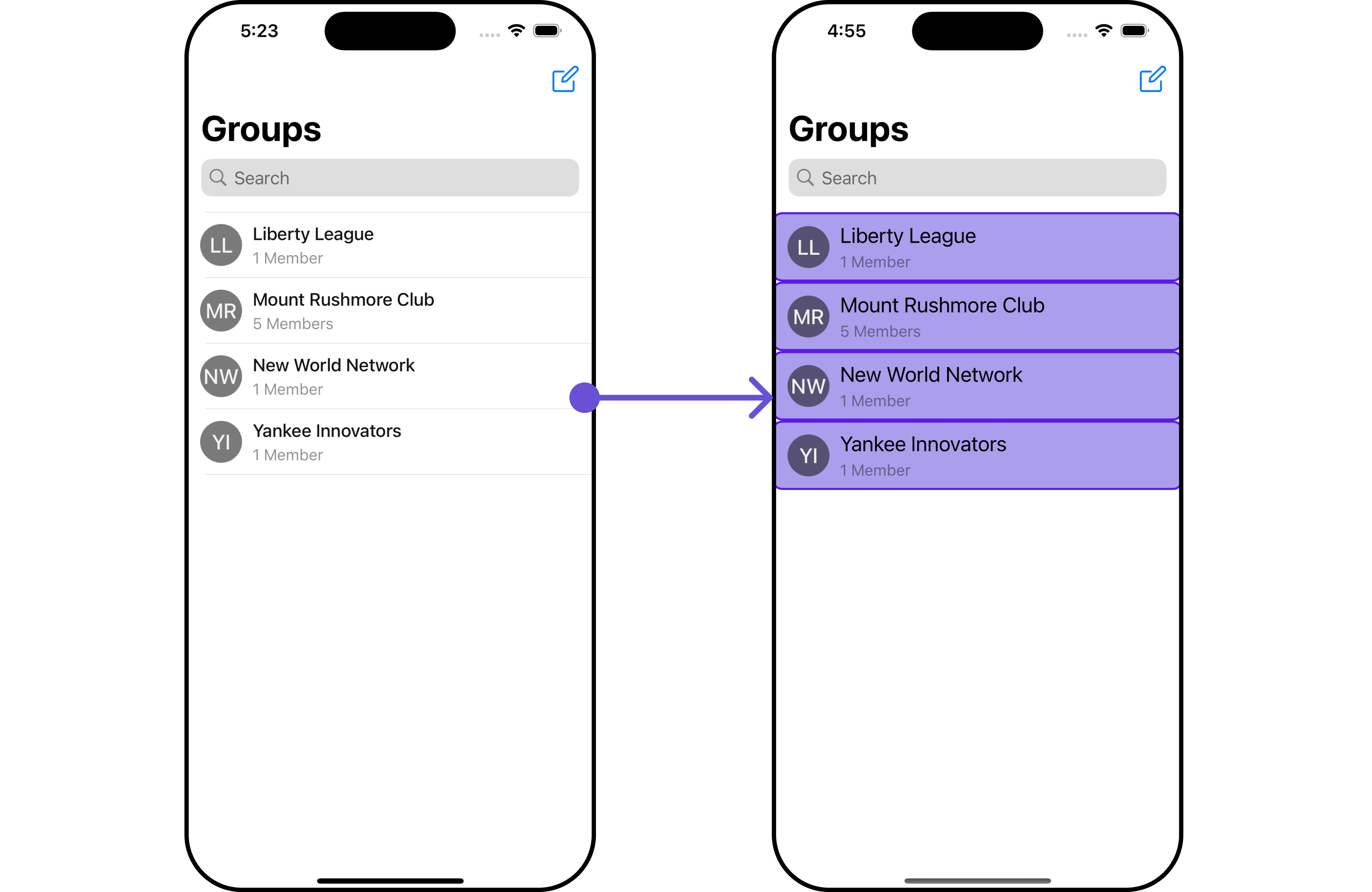
- Swift
Functionality
These are a set of small functional customizations that allow you to fine-tune the overall experience of the component. With these, you can change text, set custom icons, and toggle the visibility of UI elements.- Swift
If you are already using a navigation controller, you can use the pushViewController function instead of presenting the view controller.
Advanced
For advanced-level customization, you can set custom views to the component. This lets you tailor each aspect of the component to fit your exact needs and application aesthetics. You can create and define your views, layouts, and UI elements and then incorporate those into the component.ListItemView
Utilize this property to assign a custom ListItem to the Groups Component, allowing for enhanced customization and flexibility in its rendering.- Swift
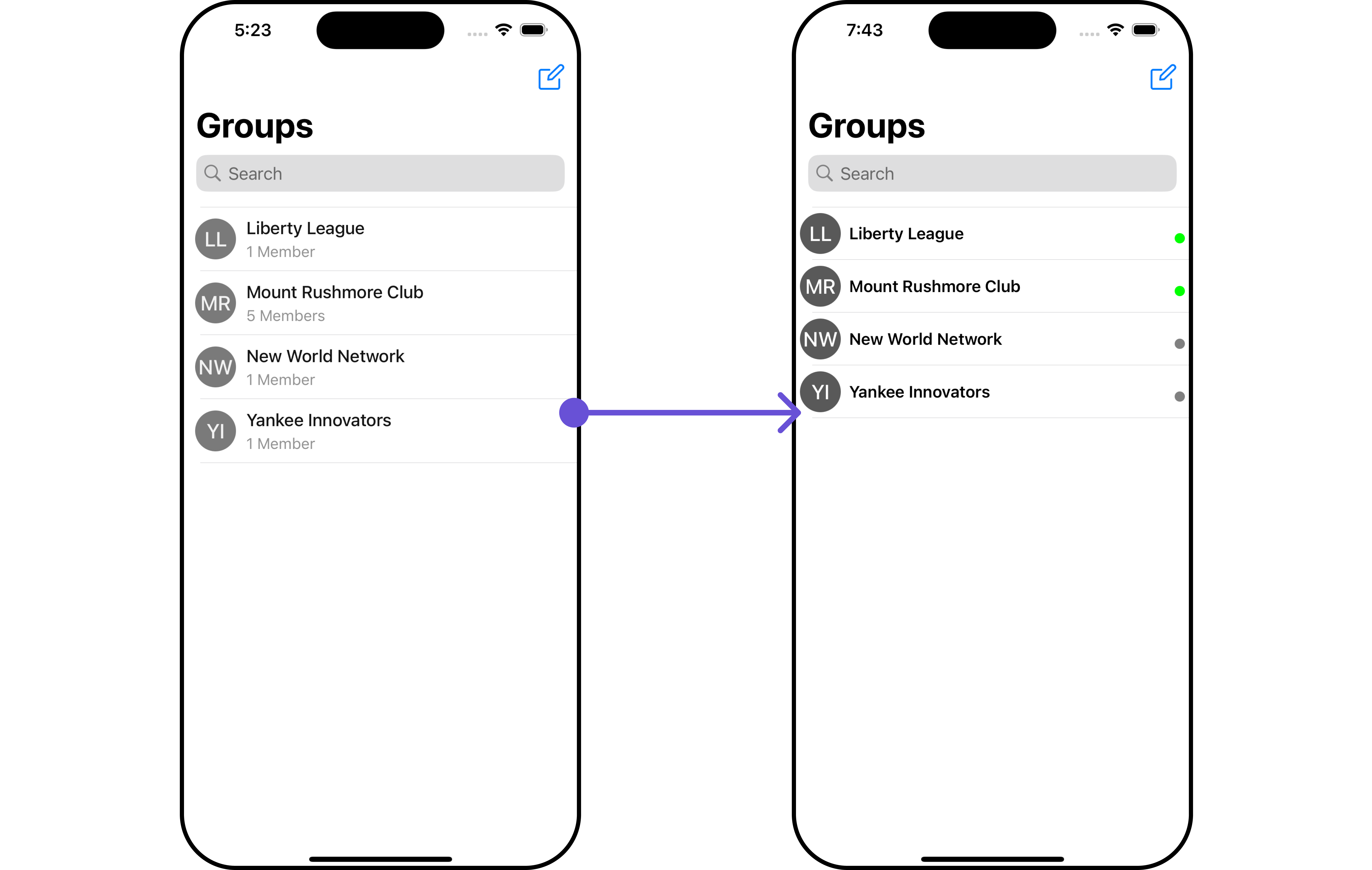
CustomListItemGroupView and pass it inside the setListItemView() method.
CustomListItemGroupView
- Swift
Ensure to pass and present
CometChatGroups. If a navigation controller is already in use, utilize the pushViewController function instead of directly presenting the view controller.SubtitleView
You can set your custom Subtitle view using the.setSubtitleView() method. But keep in mind, by using this you will override the default Subtitle view functionality.
- Swift
- You can customize the subtitle view for each group item to meet your requirements
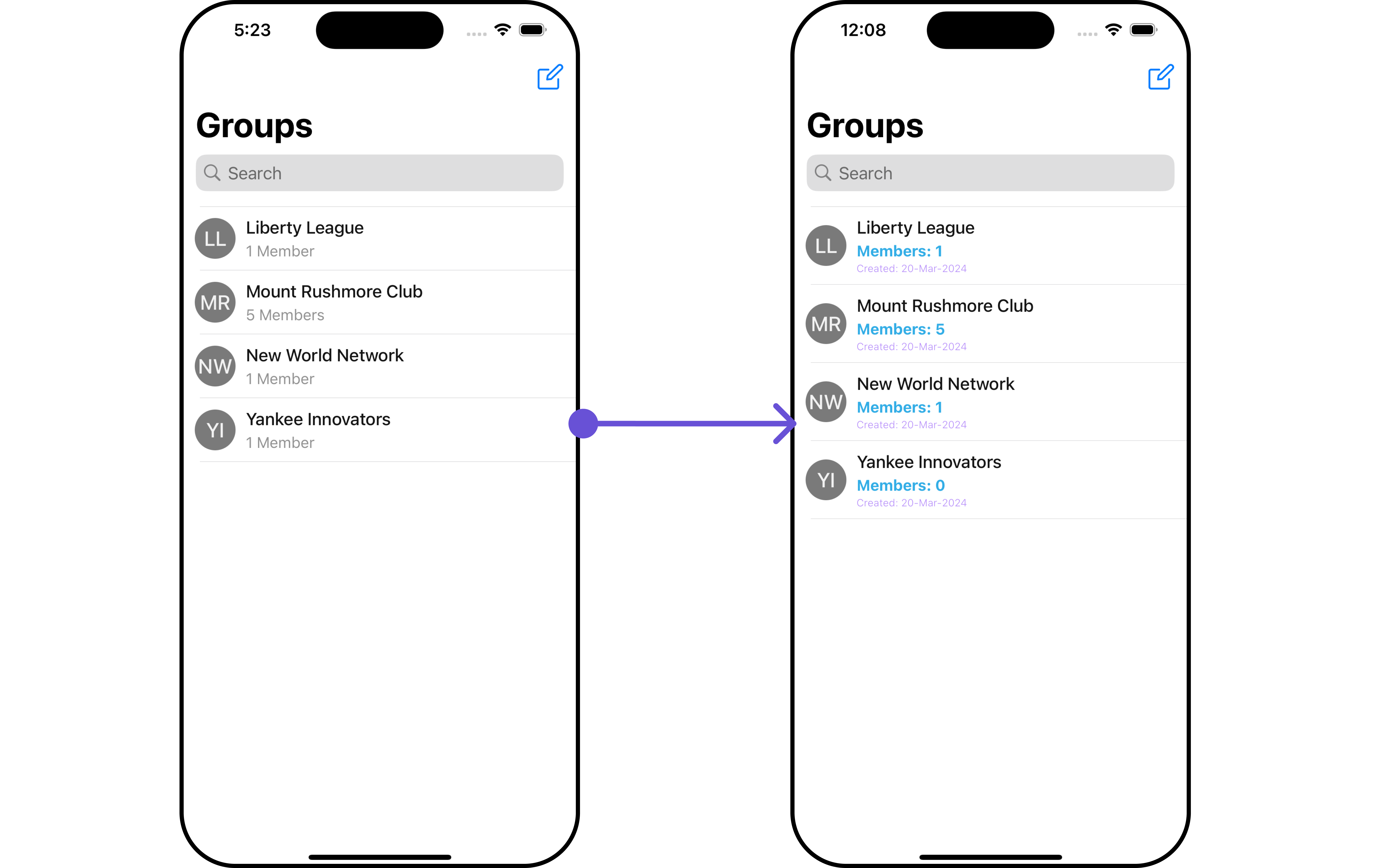
Custom_Subtitle_Group_Viewa UIView file.
Custom_Subtitle_Group_View
- Swift
Ensure to pass and present
CometChatGroups. If a navigation controller is already in use, utilize the pushViewController function instead of directly presenting the view controller.EmptyView report
You can set a custom EmptyView using.set(emptyView: UIView) to match the empty view of your app.
- Swift
Custom_Empty_State_GroupViewa UIView file.
- Swift
Ensure to pass and present
CometChatGroups. If a navigation controller is already in use, utilize the pushViewController function instead of directly presenting the view controller.ErrorView
You can set a custom ErrorView using.set(errorView: UIView) to match the error view of your app.
- Swift
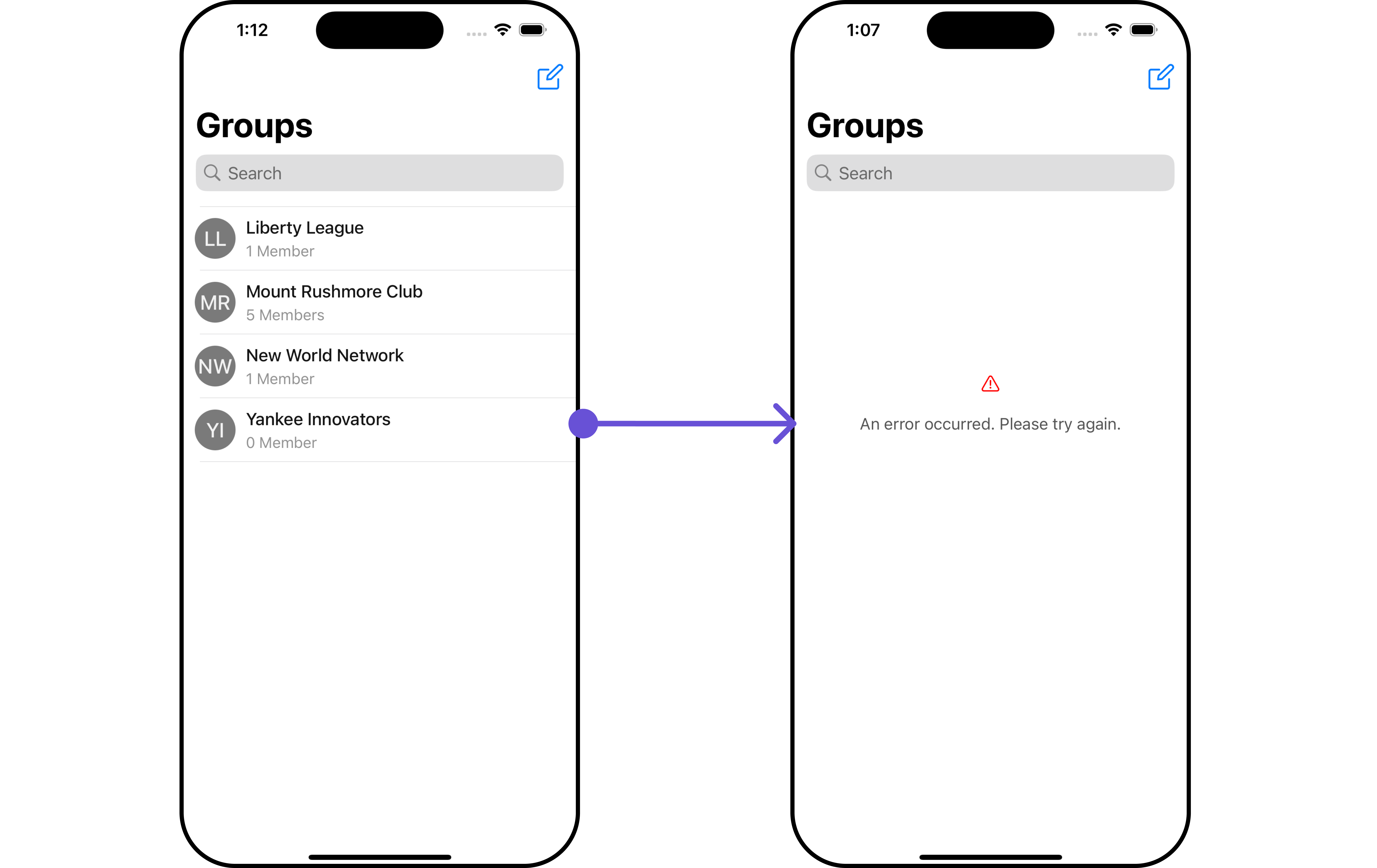
Custom_ErrorState_GroupView and pass it inside the .set(errorView: UIView) method.
Custom_ErrorState_GroupView
- Swift
Ensure to pass and present
CometChatGroups. If a navigation controller is already in use, utilize the pushViewController function instead of directly presenting the view controller.Menus
You can set the Custom Menus to add more options to the Groups component.- Swift
- You can customize the menus for groups to meet your requirements
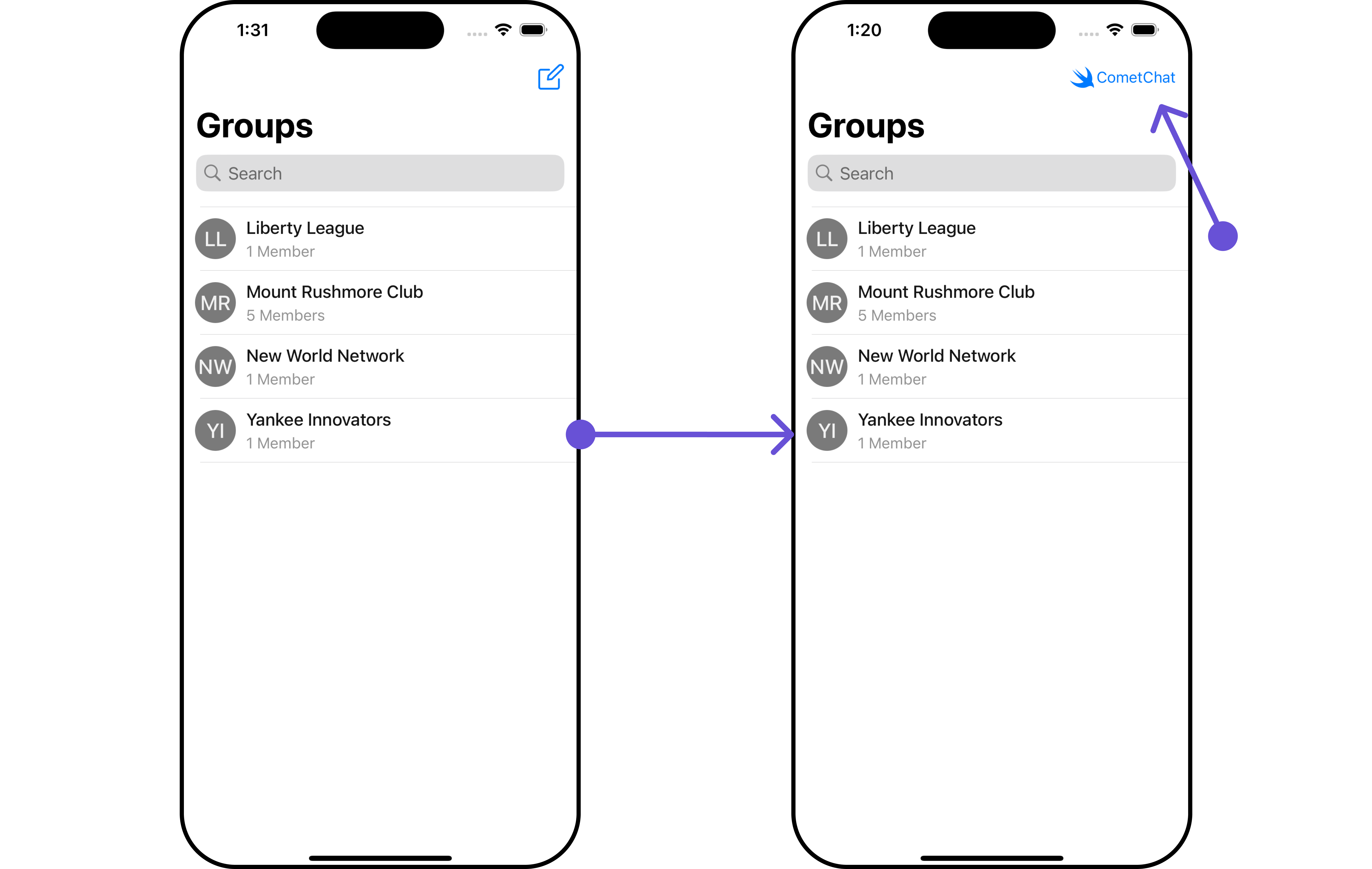
CometChatGroups, enhancing its interface with a personalized menu for a more user-friendly experience.
- Swift
Ensure to pass and present
CometChatGroups. If a navigation controller is already in use, utilize the pushViewController function instead of directly presenting the view controller.