Overview
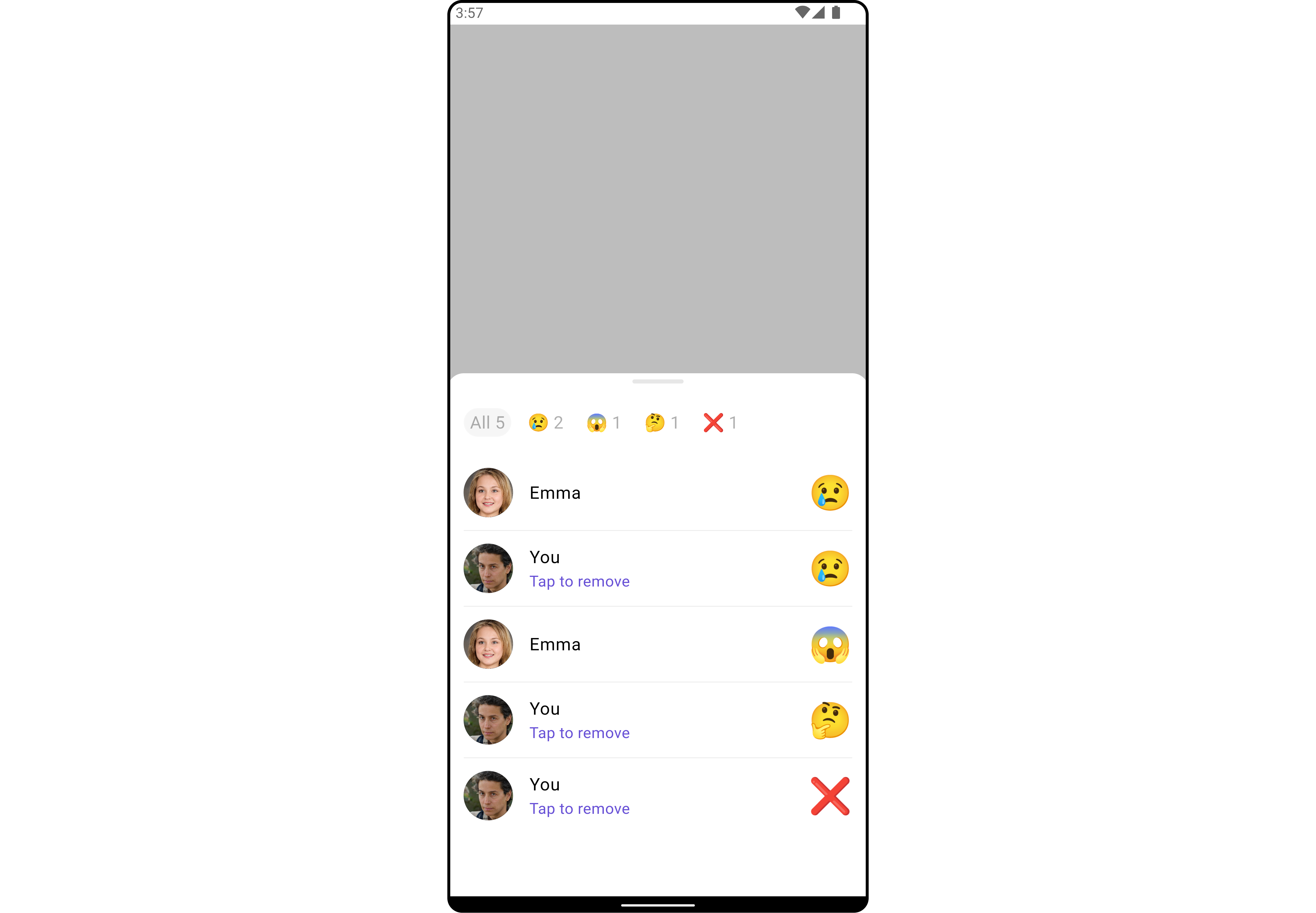
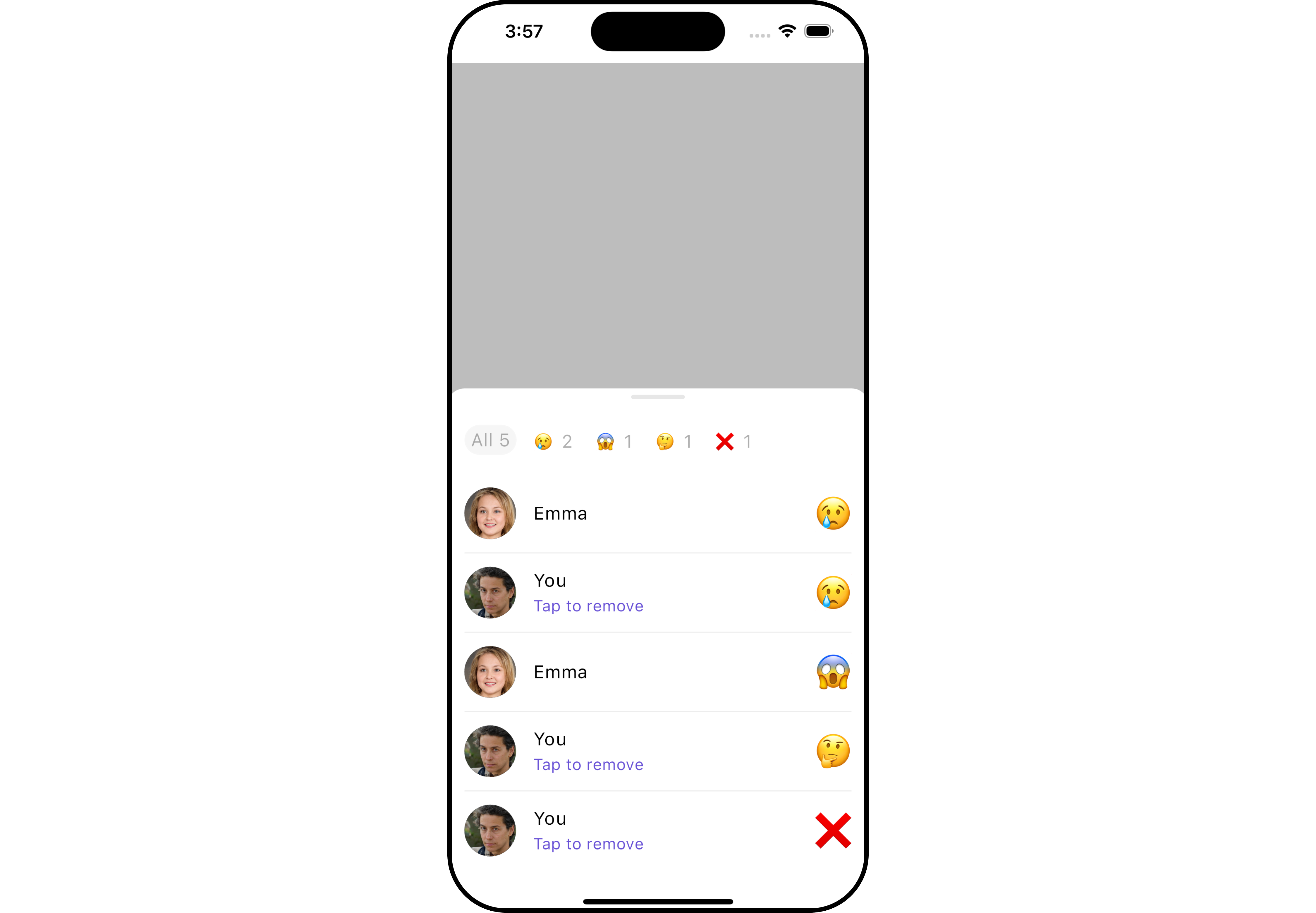
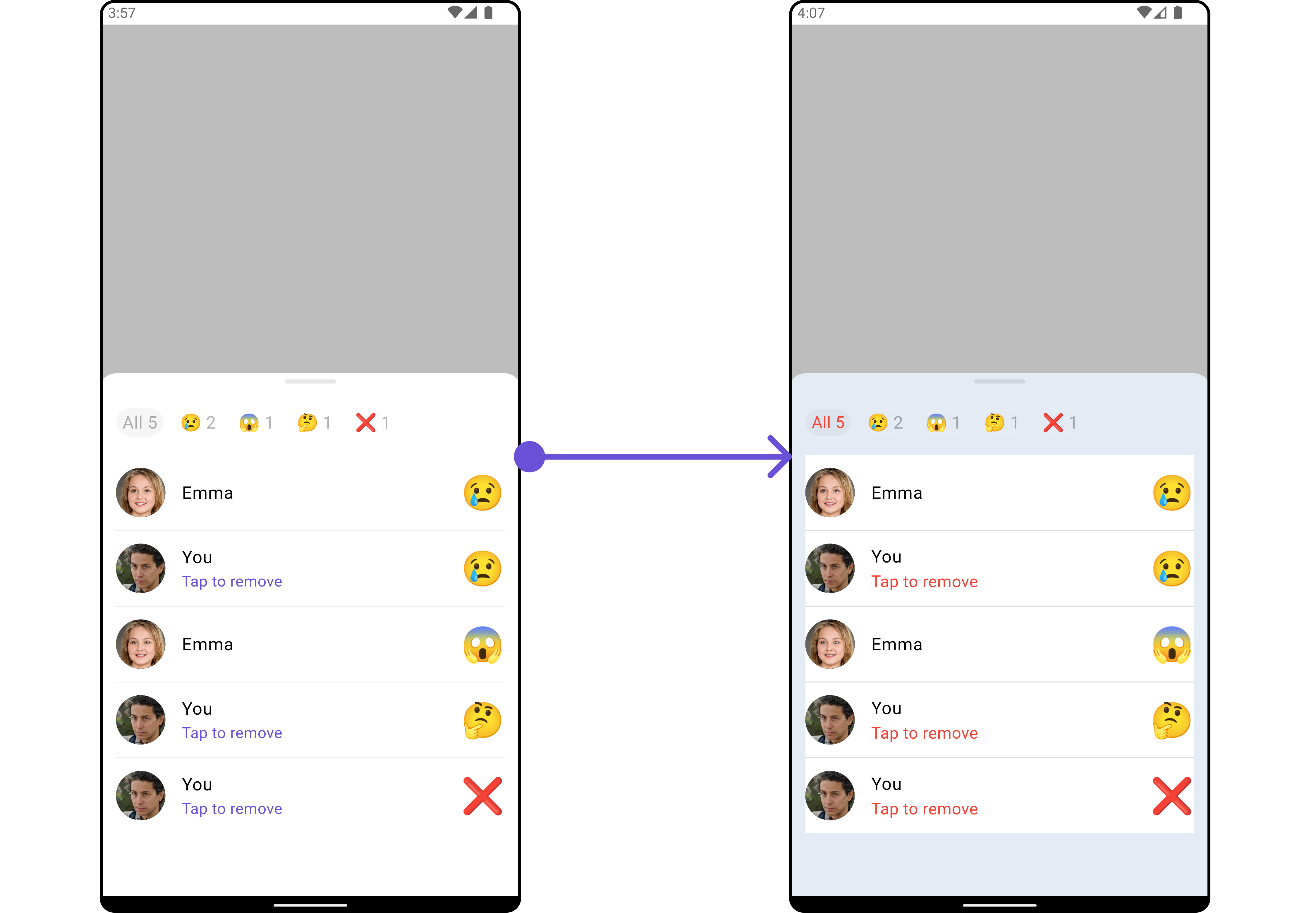
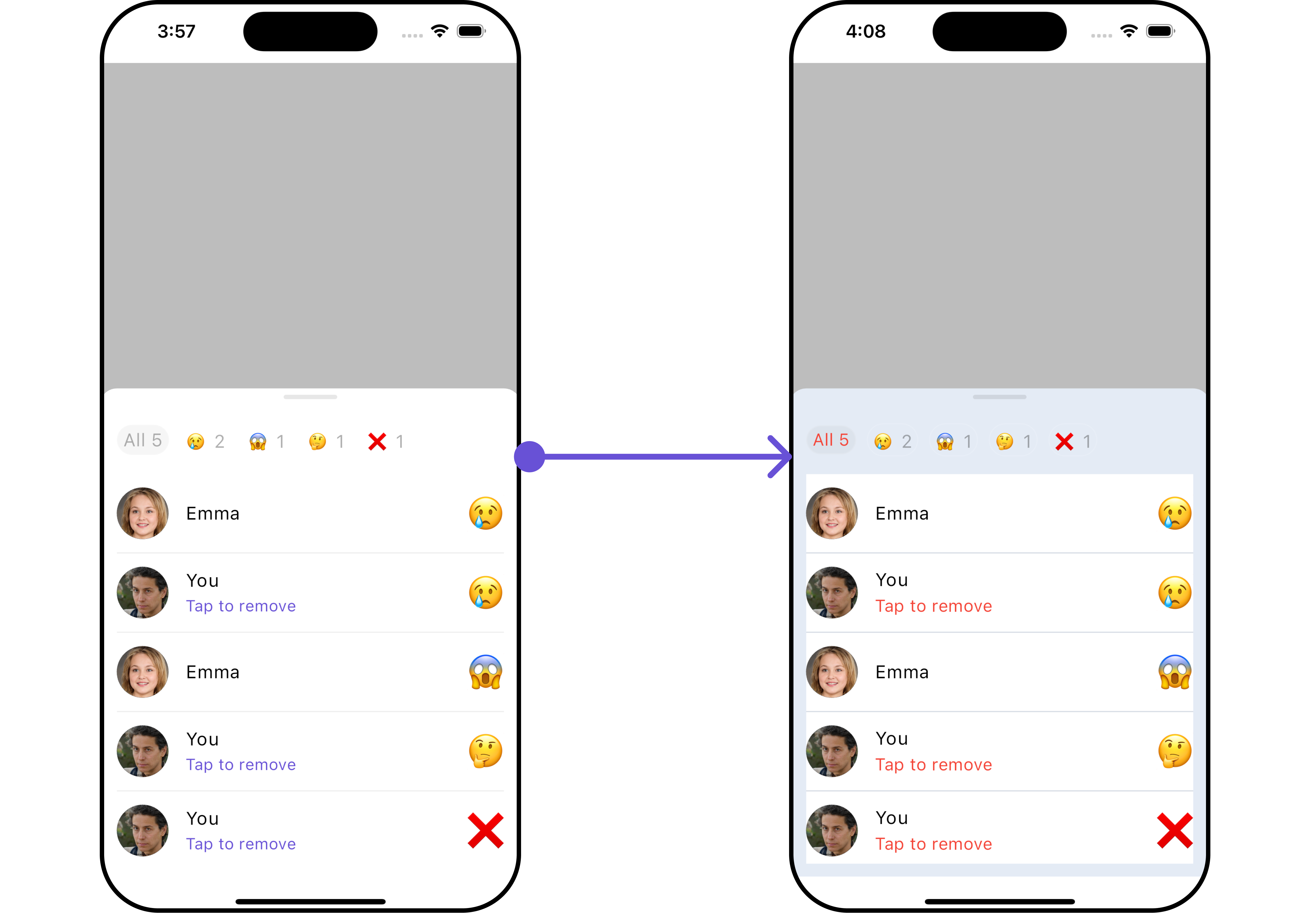
TheCometChatReactionListList widget is designed to manage and display reactions associated with messages. It offers a user-friendly interface for users to express their reactions to messages and provides options to remove reactions when necessary. The widget intelligently organizes reactions by emoji, giving a clear overview of the variety of reactions for a message along with details of who reacted with each emoji.
The widget consists of two distinct lists: one at the top with horizontal scrolling to display unique reactions and their counts, allowing users to select reactions for further details. The middle list shows selected reactions and the users who reacted to them.
Additionally, the interface seamlessly integrates functionality to remove reactions added by the logged-in user.
- Android
- iOS
Usage
Integration
CometChatReactionList is a widget that contains a list of reactions. It is commonly used within the CometChatMessageList, but it can be integrated into any widget. The widget requires a list of reactions (provided via the baseMessage) to function properly.
You can launch CometChatReactionList directly using Navigator.push, or you can define it as a widget within the build method of your State class.
1. Using Navigator to Launch CometChatReactionList
- Dart
2. Embedding CometChatReactionList as a Widget in the build Method
- Dart
Actions
Actions dictate how a widget functions. They are divided into two types: Predefined and User-defined. You can override either type, allowing you to tailor the behavior of the widget to fit your specific needs.1. onTap
TheonTap event is triggered when a user interacts with a reaction by pressing it, typically to indicate a response or provide feedback.
- Dart
Filters
Filters enable customization of the displayed data in awidget’s list by applying specific criteria. Using the ReactionsRequestBuilder in the Reaction List Widget, you can customize your reaction list based on various options to suit your requirements. For more information about ReactionsRequestBuilder, refer to the documentation on ReactionsRequestBuilder.
In the example below, we illustrate how to apply a filter to the reactions list, allowing you to specify a limit on the number of users who have reacted to a particular message.
- Dart
Events
Events are triggered by a widget, enabling you to enhance its functionality. These events are global in scope, making them applicable across multiple areas of your application, and they can be added or removed as required. TheCometChatReactionList widget does not provide any available events.
Customization
For customization aligned with your app’s design, you can adjust the appearance of the Reaction List widget using our accessible methods. These methods enable you to tailor the experience and behavior to suit your specific needs.Style
Through Style, you can customize the visual presentation of the widget in your app. This includes controlling elements such as color, size, shape, and fonts to achieve the desired look and feel.1. Reactions List Style
The ReactionsListStyle class encapsulates properties that facilitate customization of theCometChatReactionList widget’s visual appearance.
- Dart
- Android
- iOS
ReactionListStyle:
| Property | Description | Code |
|---|---|---|
| loadingIconTint | The color tint for the loading icon. | Color? loadingIconTint |
| emptyTextStyle | The text style for the empty state message. | TextStyle? emptyTextStyle |
| errorTextStyle | The text style for the error state message. | TextStyle? errorTextStyle |
| subtitleTextStyle | The text style for the subtitle. | TextStyle? subtitleTextStyle |
| allReactionsTextStyle | The text style for the “all reactions” message. | TextStyle? allReactionsTextStyle |
| width | The width of the reaction list container. | double? width |
| height | The height of the reaction list container. | double? height |
| background | The background color of the reaction list container. | Color? background |
| gradient | The gradient for the background of the reaction list container. | Gradient? gradient |
| border | The border of the reaction list container. | BoxBorder? border |
| borderRadius | The border radius of the reaction list container. | double? borderRadius |
2. Avatar Style
If you want to apply customized styles to theAvatar widget within the CometChatReactionList Widget, you can use the following code snippet. For more information you can refer Avatar Styles.
- Dart
3. ListItem Style
If you want to apply customized styles to theListItemStyle widget within the CometChatReactionList Widget, you can use the following code snippet. For more information, you can refer ListItem Styles.
- Dart
Functionality
These functional customizations provide ways to enhance the widget’s overall experience. They allow for text modification, custom icon setting, and UI element visibility toggling. TheCometChatReactionList widget does not offer any additional functionality.
Advanced
For advanced-level customization, you can set custom widgets to the widget. This lets you tailor each aspect of the widget to fit your exact needs and application aesthetics. You can create and define your widgets, layouts, and UI elements and then incorporate those into the widget.LoadingStateView
You can customize the loading state widget in yourCometChatReactionList by using the .loadingStateView method. This method allows you to set a custom loading widget that will be displayed while the reaction list is loading. It’s important to note that using this method will override the default loading state functionality of the widget.
- Dart
- Android
- iOS
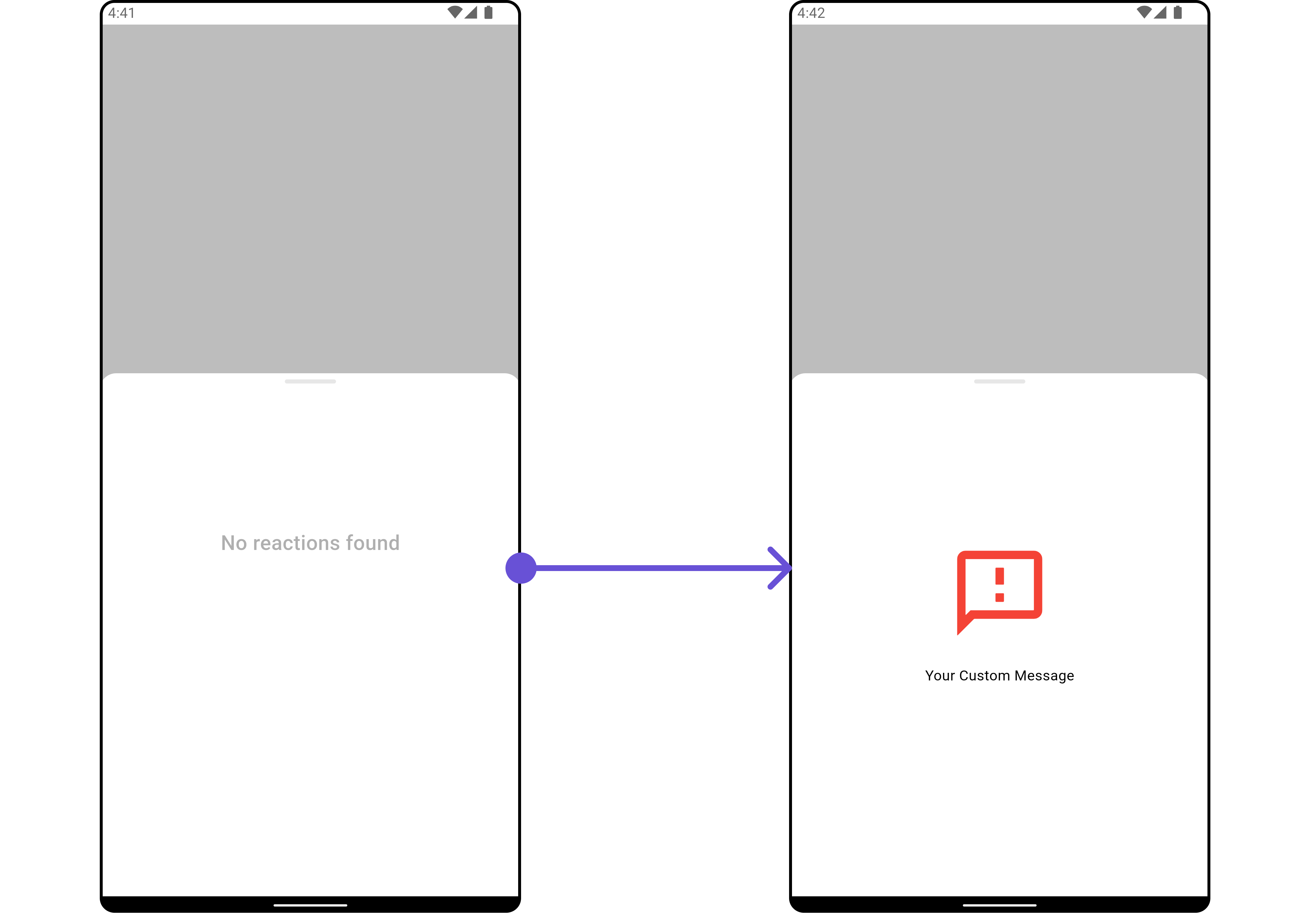
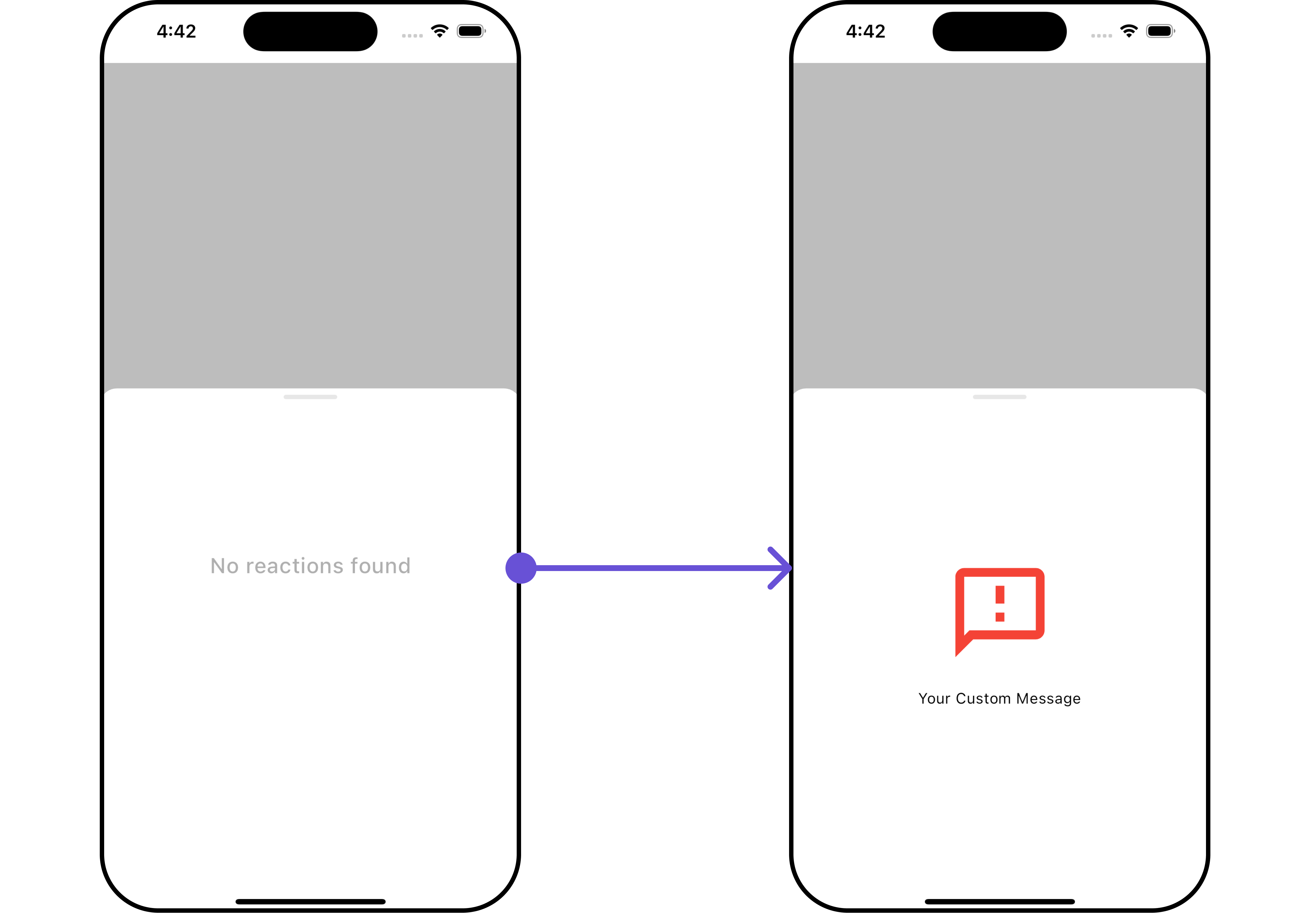
EmptyStateView
You can set a customEmptyStateView using emptyStateView to match the empty UI of your app.
- Dart
- Android
- iOS
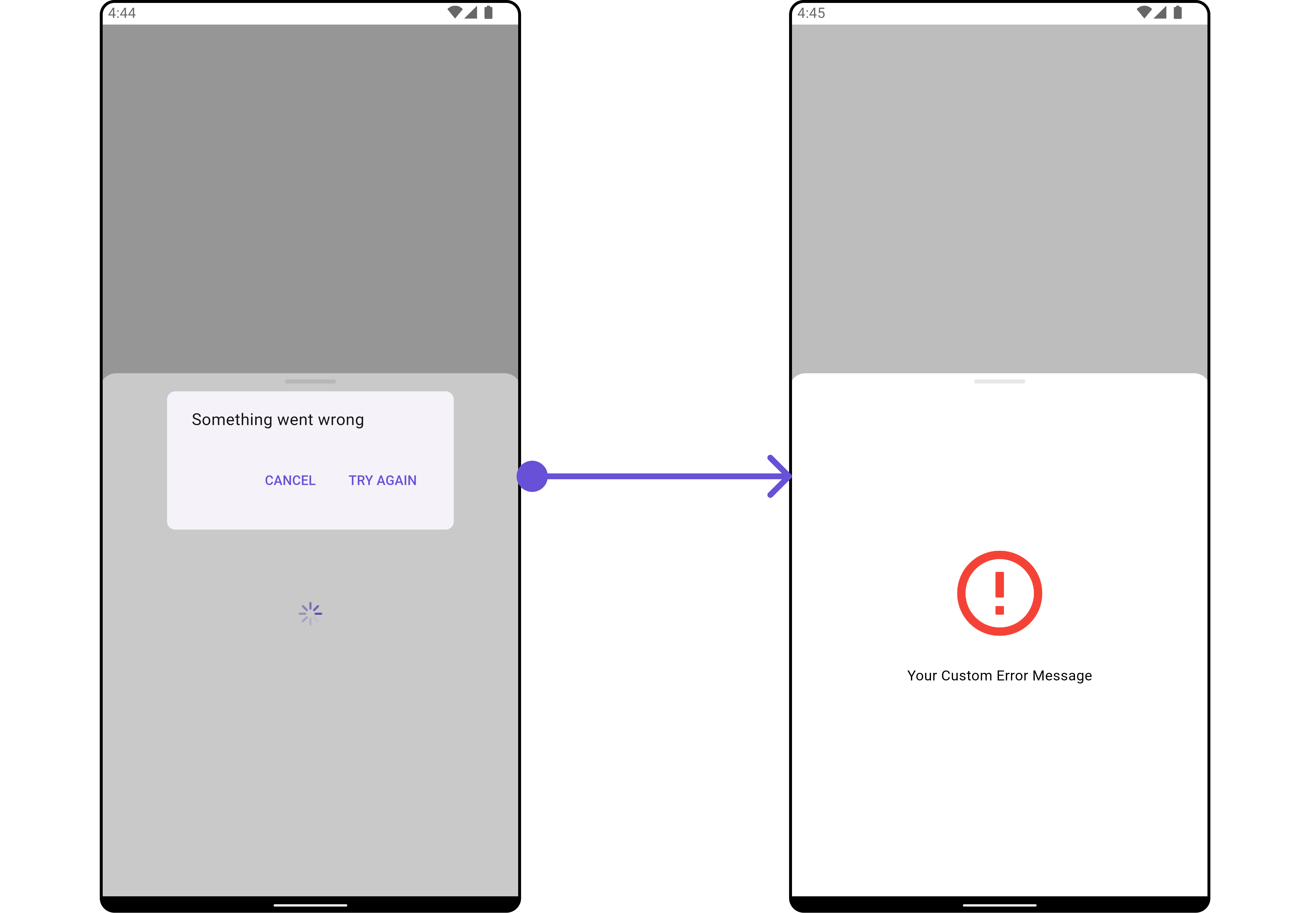
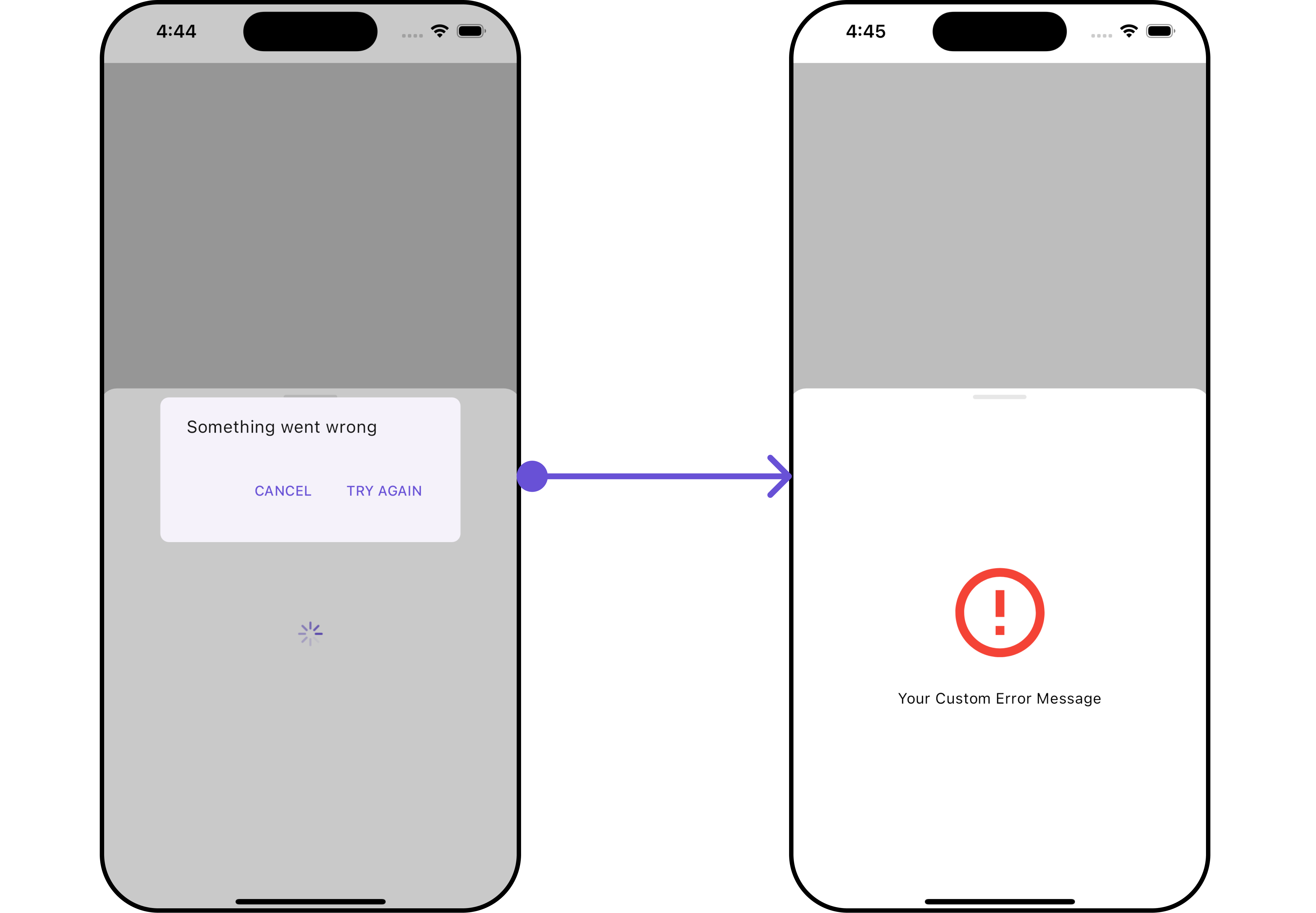
ErrorStateView
You can customize the error state widget in yourCometChatReactionList by using the “ method. This method allows you to set a custom error widget that will be displayed when there’s an error in loading the reaction list. It’s important to note that using this method will override the default error state functionality of the widget.
- Dart
- Android
- iOS