Overview
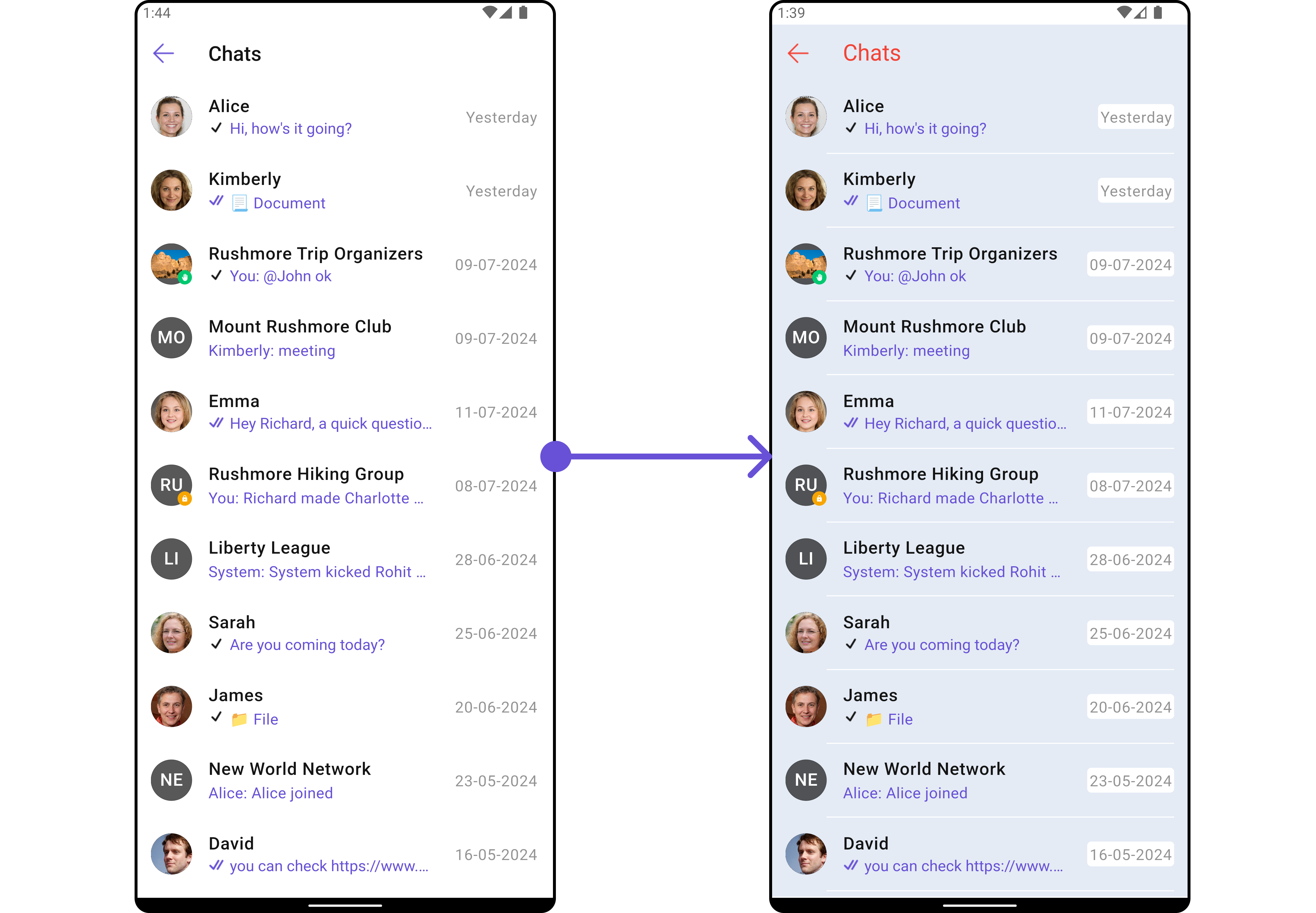
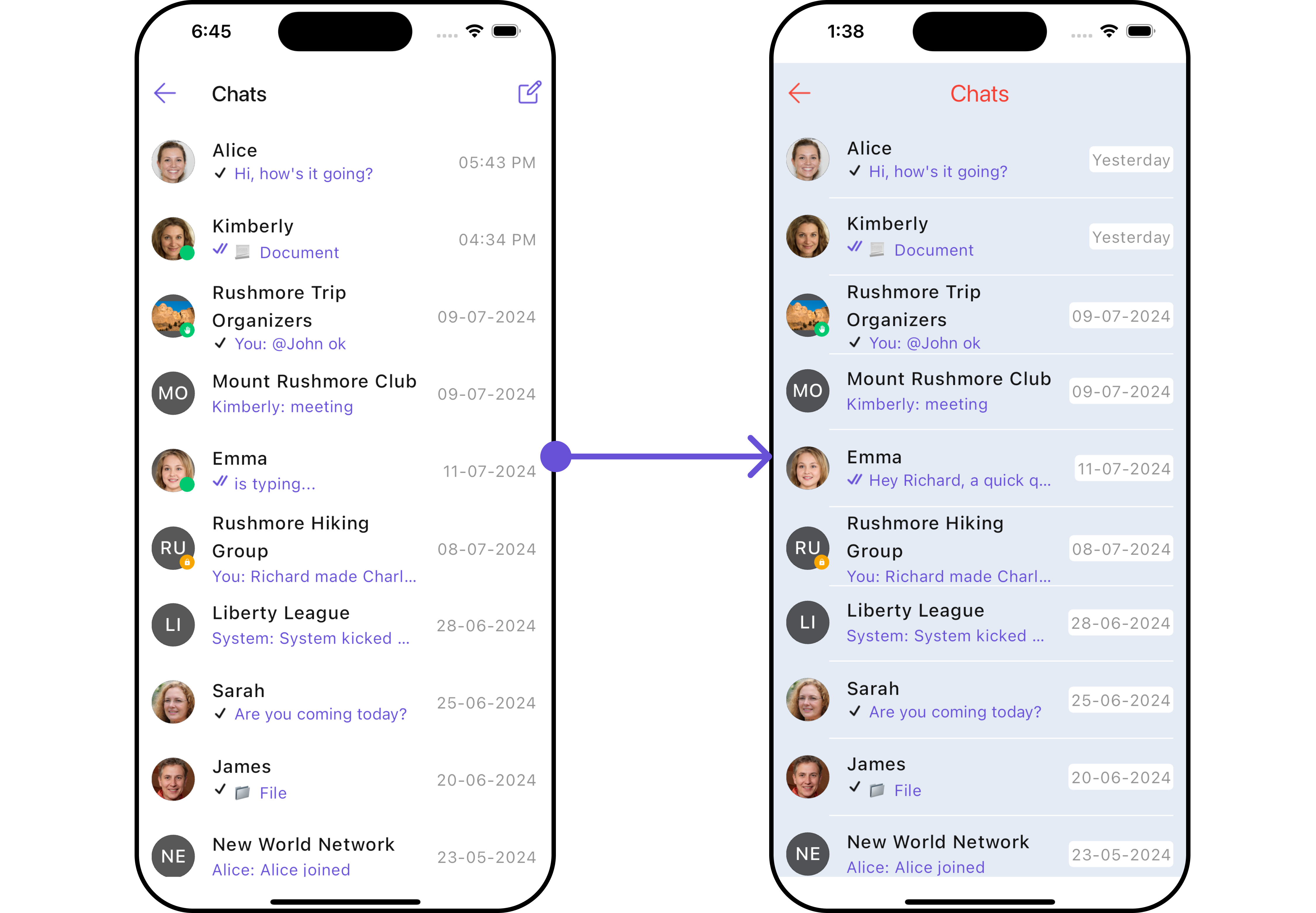
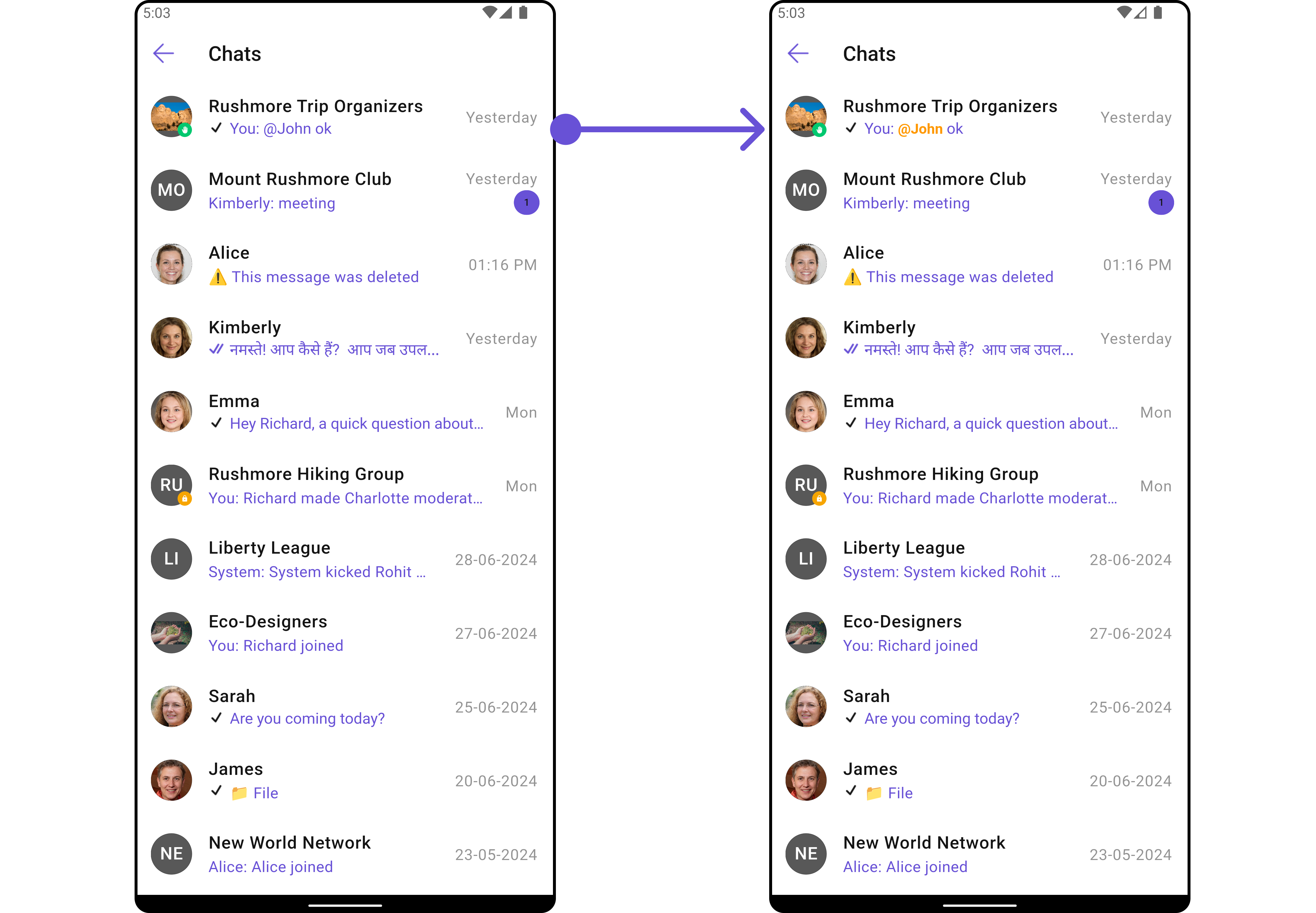
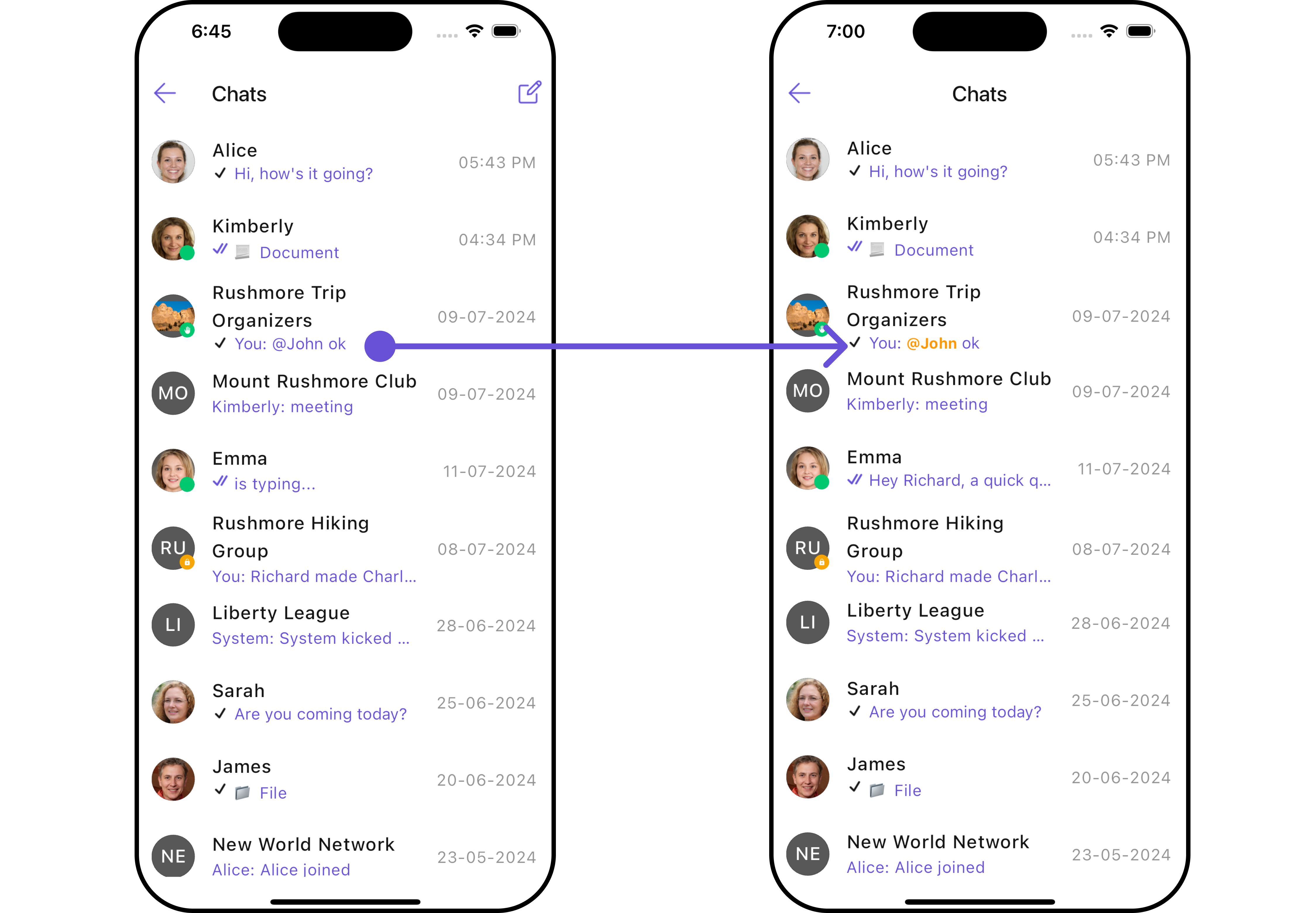
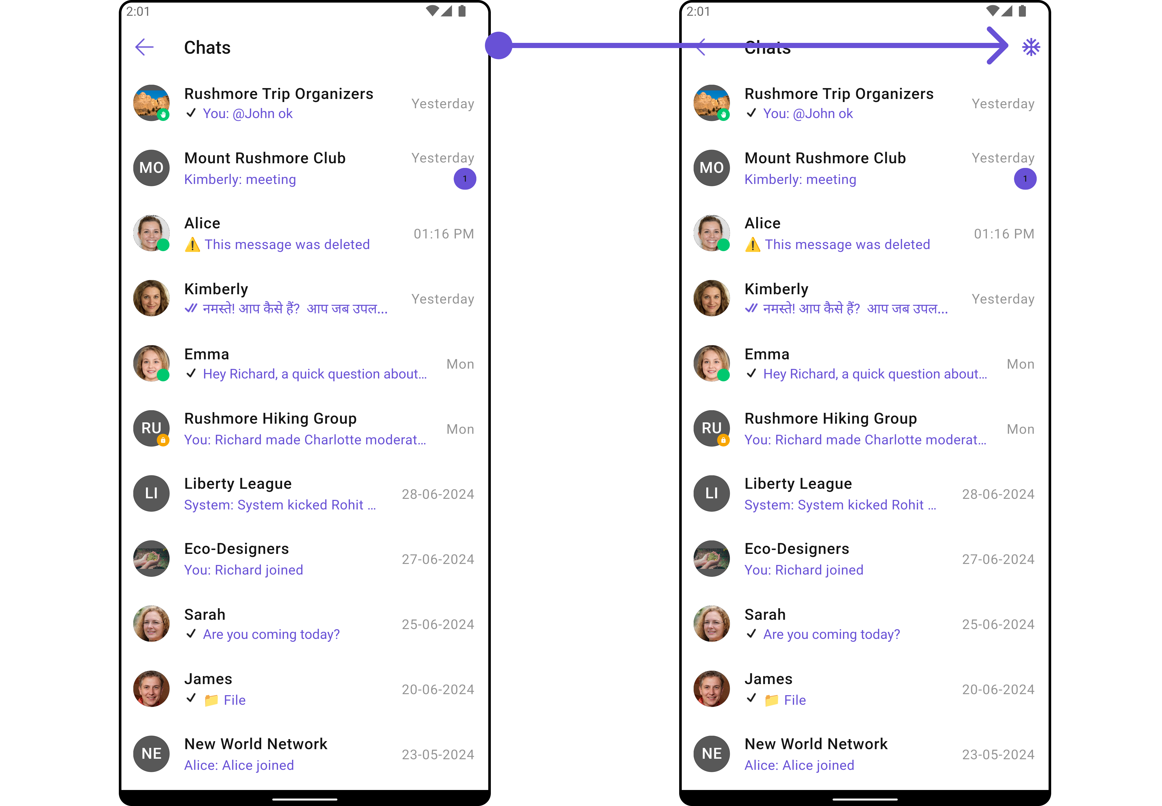
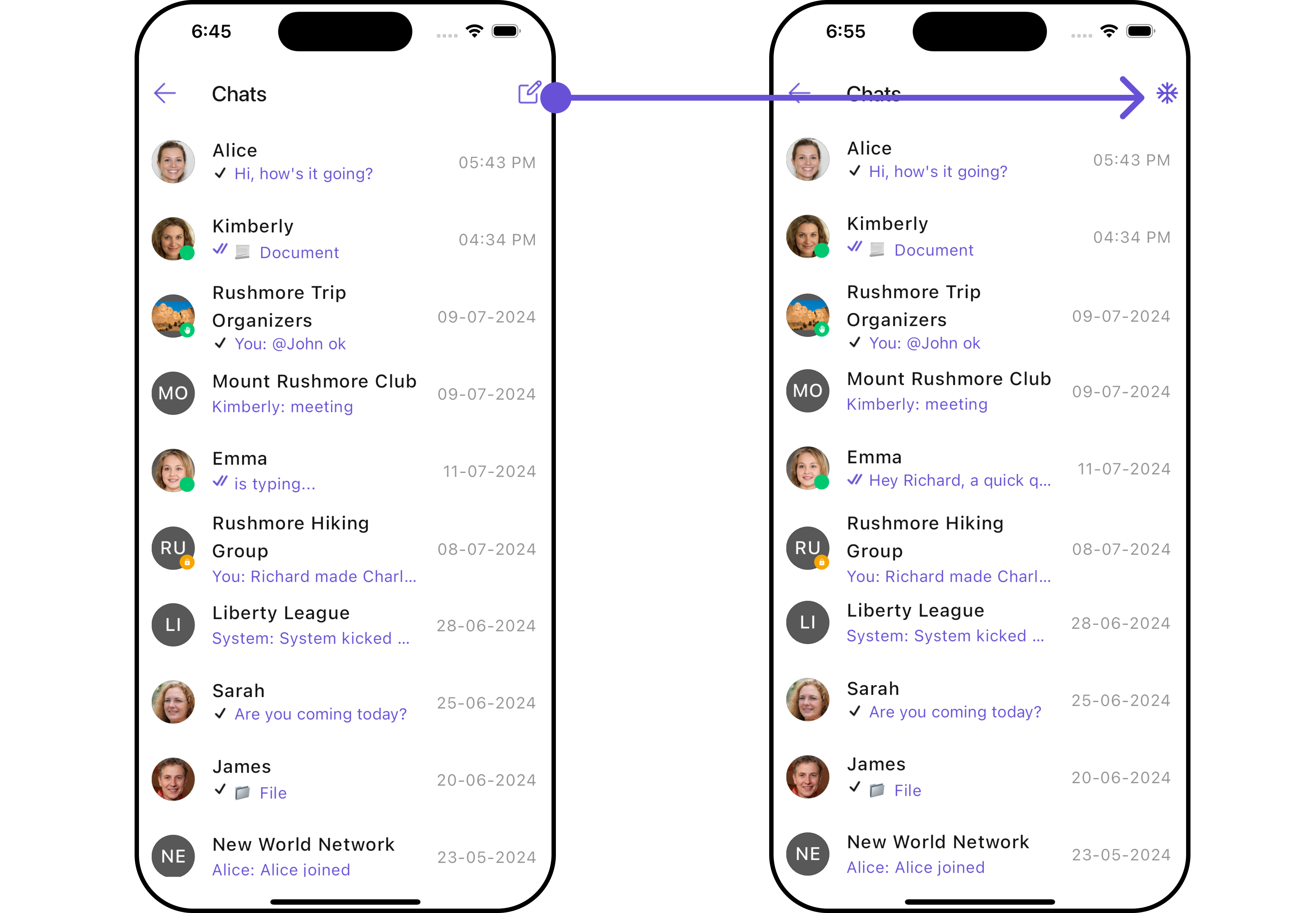
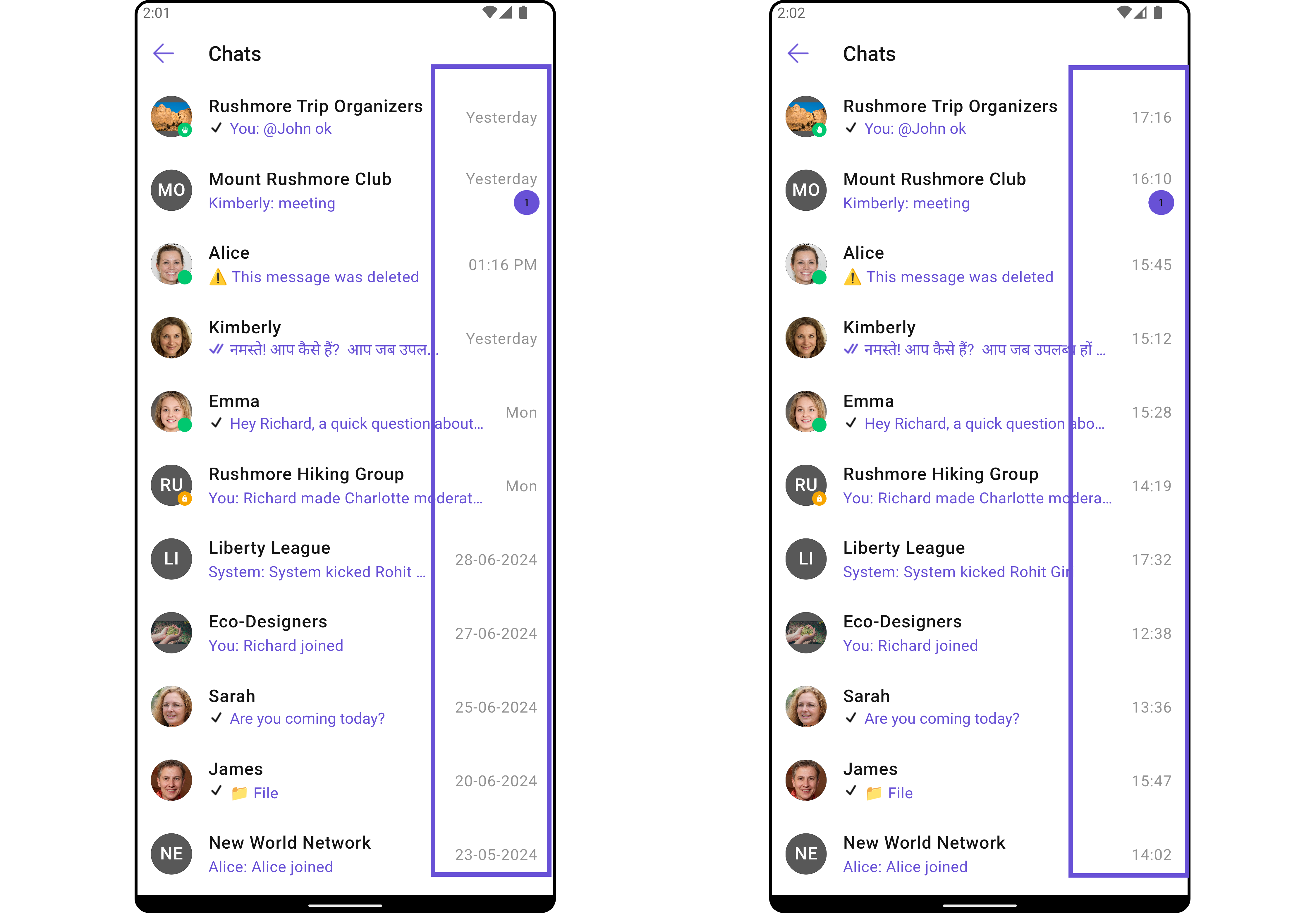
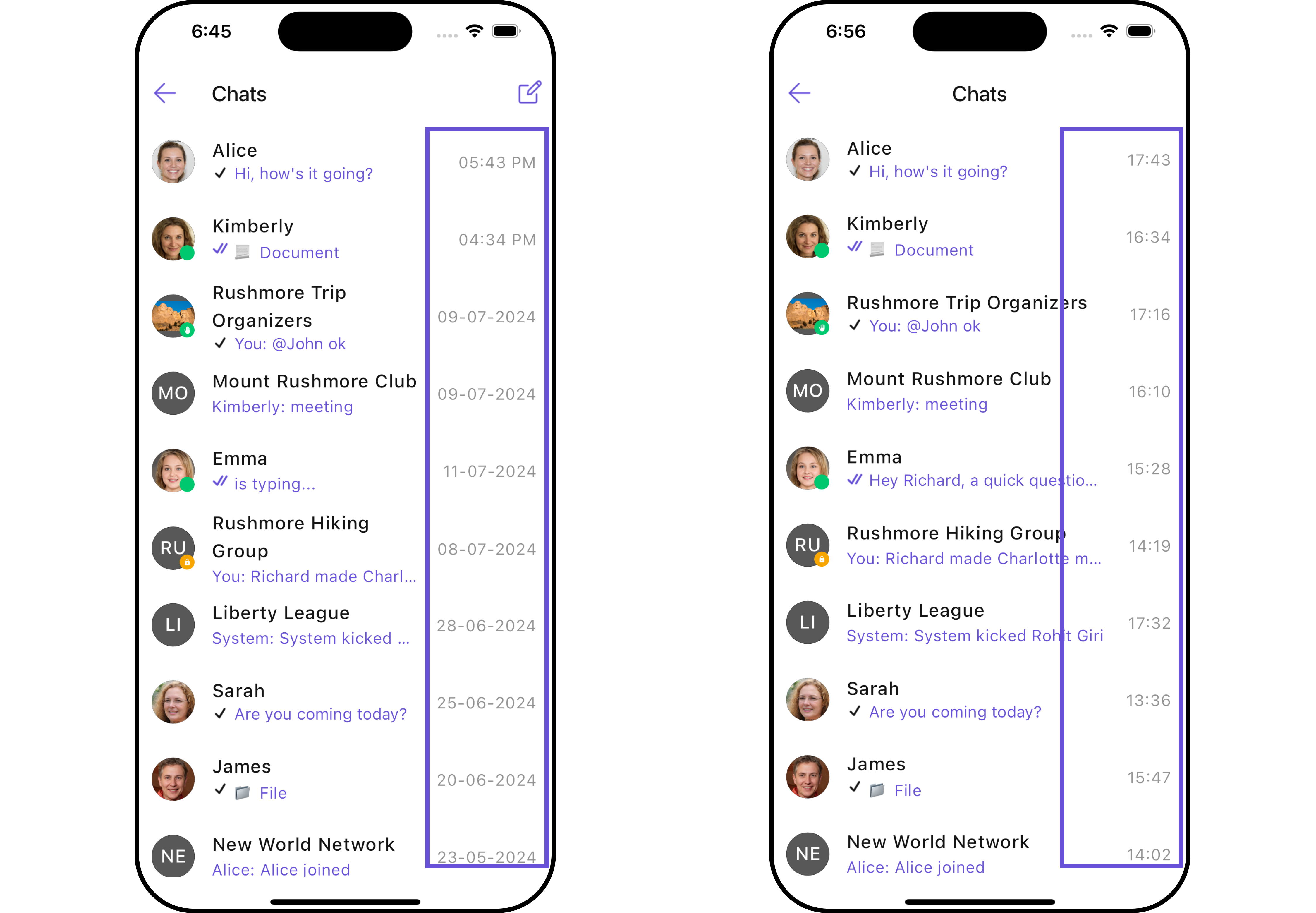
TheCometChatConversations is a Widget, That shows all conversations related to the currently logged-in user,
- Android
- iOS
Usage
Integration
AsCometChatConversations is a widget, it can be initiated either by tapping a button or through the trigger of any event. It offers multiple parameters and methods for tailoring its user interface.
You can launch CometChatConversations directly using Navigator.push, or you can define it as a widget within the build method of your State class.
1. Using Navigator to Launch CometChatConversations
- Dart
2. Embedding CometChatConversations as a Widget in the build Method
- Dart
Actions
Actions dictate how a widget functions. They are divided into two types: Predefined and User-defined. You can override either type, allowing you to tailor the behavior of the widget to fit your specific needs.-
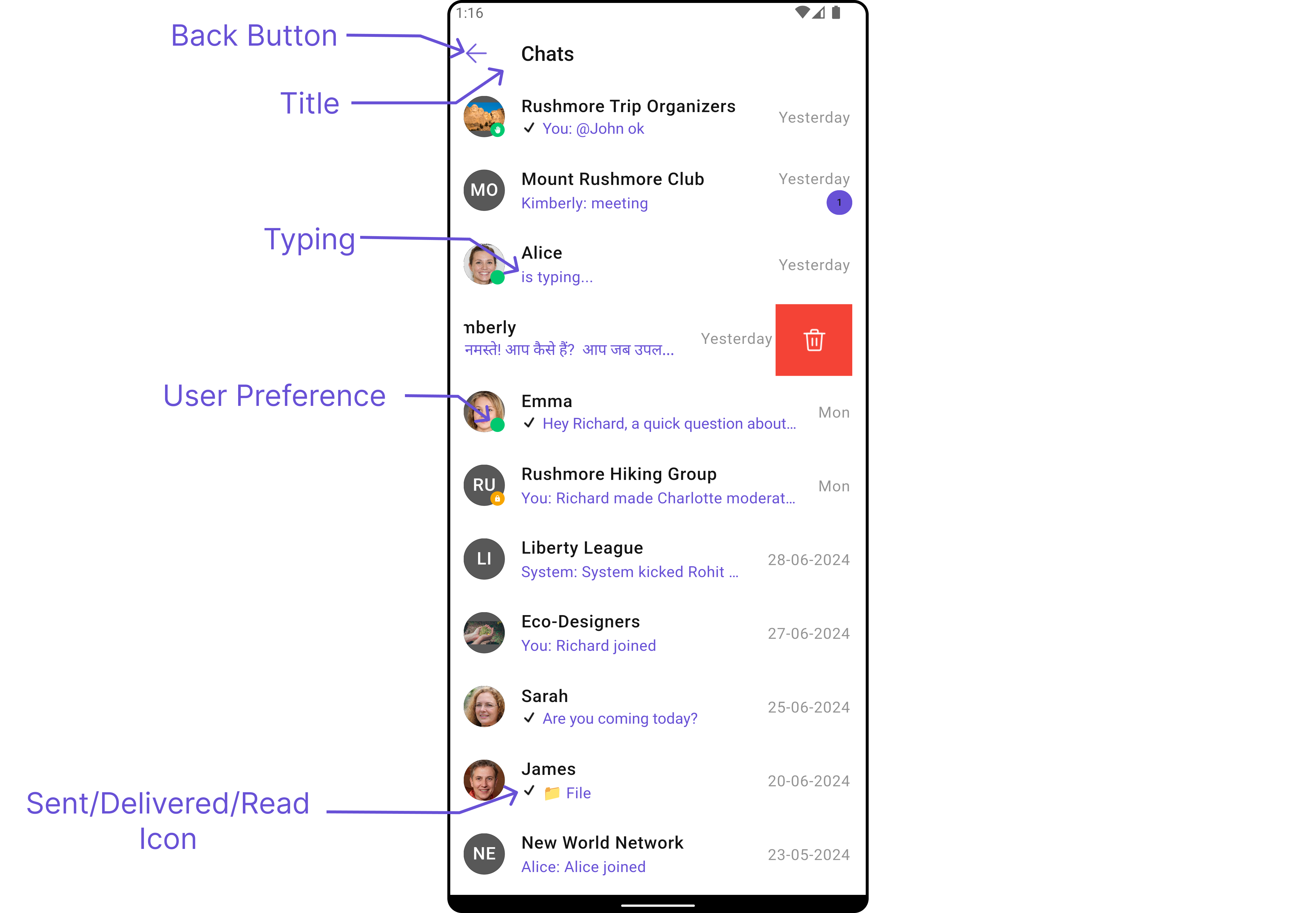
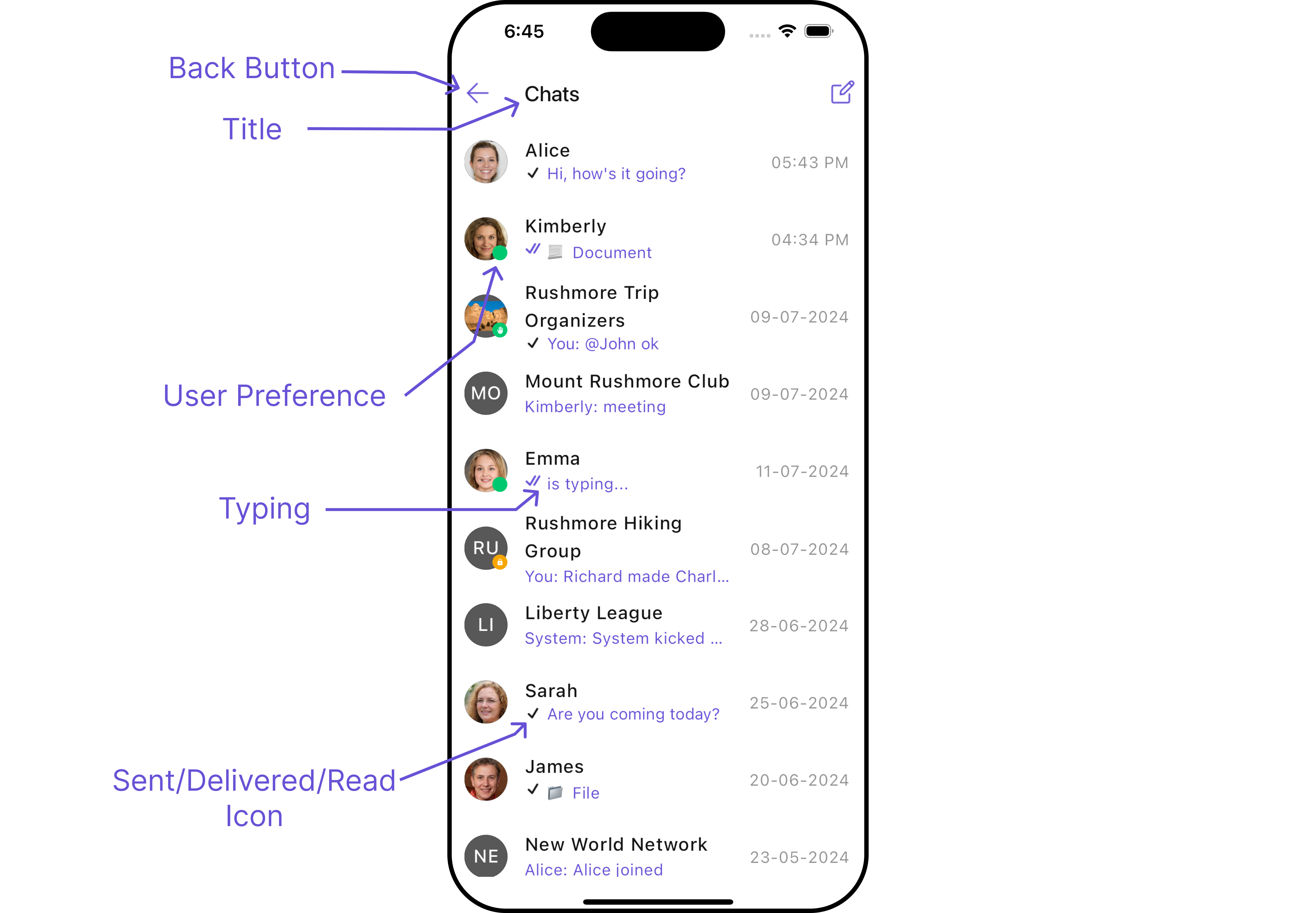
onItemTap
onItemTap is triggered when you click on a ListItem of the CometChatConversations widget. This onItemTap method proves beneficial when a user intends to customize the click behavior in CometChatConversations.
- Dart
2. onBack
ThisonBack method becomes valuable when a user needs to override the action triggered upon pressing the back button in CometChatConversations.
- Dart
3. setOnSelection
TheonSelection feature enables selection with modes: SelectionMode.single and SelectionMode.multiple.
The onSelection event is triggered upon the completion of a selection in onSelection. This returns the selected conversations list when the callback is triggered. It can be executed with any button or action.
- Dart
4. onError
This method proves helpful when a user needs to customize the action taken upon encountering an error in CometChatConversations.- Dart
Filters
You can setConversationsRequestBuilder in the CometChatConversations widget to filter the conversation list. You can modify the builder as per your specific requirements with multiple options available to know more refer to ConversationsRequestBuilder.
- Dart
| Property | Description | Code |
|---|---|---|
| Build | Builds and returns an ConversationsRequest object. | build(): ConversationsRequest |
| Conversation Type | Type of the conversation. | conversationType: String? |
| Limit | Number of results to limit the query. | limit: int? |
| Tags | Tags for filtering. | tags: List<String>? |
| With Tags | Flag to include tags. | withTags: bool? |
| With User And Group Tags | Flag to include user and group tags. | withUserAndGroupTags: bool? |
Events
Events are emitted by aWidget. By using event you can extend existing functionality. Being global events, they can be applied in Multiple Locations and are capable of being Added or Removed.
1. Conversation Deleted
ThisccConversationDeleted will be emitted when the user deletes a conversation
- Dart
Customization
To align with your app’s design specifications, you have the flexibility to customize the appearance of the conversation widget. We offer accessible methods that empower you to tailor the experience and functionality to meet your unique requirements.Style
Using Style you can customize the look and feel of the widget in your app, These parameters typically control elements such as the color, size, shape, and fonts used within the widget.1. Conversation Style
You can set theConversationsStyle to the CometChatConversations Widget to customize the styling.
- Dart
- Android
- iOS
| Property | Description | Code |
|---|---|---|
| Back Icon Tint | Used to set the color of the back icon in the app bar. | backIconTint: Color |
| Background | Used to set background color. | background: Color |
| Border | Used to set border. | border: BoxBorder |
| Border Radius | Used to set border radius. | borderRadius: double |
| Empty Text Style | Used to set the style of the response text shown when fetching the list of conversations is empty. | emptyTextStyle: TextStyle |
| Error Text Style | Used to set the style of the response text shown when an error occurs while fetching conversations. | errorTextStyle: TextStyle |
| Gradient | Used to set a gradient background. | gradient: Gradient |
| Height | Used to set height. | height: double |
| Last Message Style | Used to customize the appearance of the last message in the conversation item’s subtitle. | lastMessageStyle: TextStyle |
| Loading Icon Tint | Used to set the color of the loading icon shown during conversations fetching. | loadingIconTint: Color |
| Online Status Color | Used to set the color of the status indicator if a user is online. | onlineStatusColor: Color |
| Password Group Icon Background | Used to set the color of the icon shown as a status indicator if the group is password protected. | passwordGroupIconBackground: Color |
| Private Group Icon Background | Used to set the color of the icon shown as a status indicator if the group is private. | privateGroupIconBackground: Color |
| Separator Color | Used to set the color of the divider separating conversation items. | separatorColor: Color |
| Thread Indicator Style | Used to customize the appearance of the subtitle if the last message was made inside a thread. | threadIndicatorStyle: TextStyle |
| Title Style | Used to set the style of the title in the app bar. | titleStyle: TextStyle |
| Typing Indicator Style | Used to customize the appearance of the response text when participants are typing in a conversation. | typingIndicatorStyle: TextStyle |
| Width | Used to set width. | width: double |
2. Avatar Style
To apply customized styles to theAvatar widget in the CometChatConversations Widget, you can use the following code snippet. For more information, visit Avatar Styles.
- Dart
3. StatusIndicator Style
To apply customized styles to theStatusIndicator widget in the CometChatConversations Widget, you can use the following code snippet. For more information, visit Indicator Styles.
- Dart
4. Date Style
To apply customized styles to theDate widget in the Conversations Widget, you can use the following code snippet. For more information, visit Date Styles.
- Dart
5. Badge Style
To apply customized styles to theBadge widget in the Conversations Widget, you can use the following code snippet. For more information, visit Badge Styles
- Dart
6. LisItem Style
To apply customized styles to theList Item widget in the Conversations Widget, you can use the following code snippet. For more information, visit List Item Styles.
- Dart
Functionality
These are a set of small functional customizations that allow you to fine-tune the overall experience of the widget. With these, you can change text, set custom icons, and toggle the visibility of UI elements.- Android
- iOS
- Dart
- Android
- iOS
CometChatConversations
| Property | Description | Code |
|---|---|---|
| Activate Selection | Used to specify if the listed conversations can be selected, selection can be activated on tap or on long press | activateSelection: ActivateSelection |
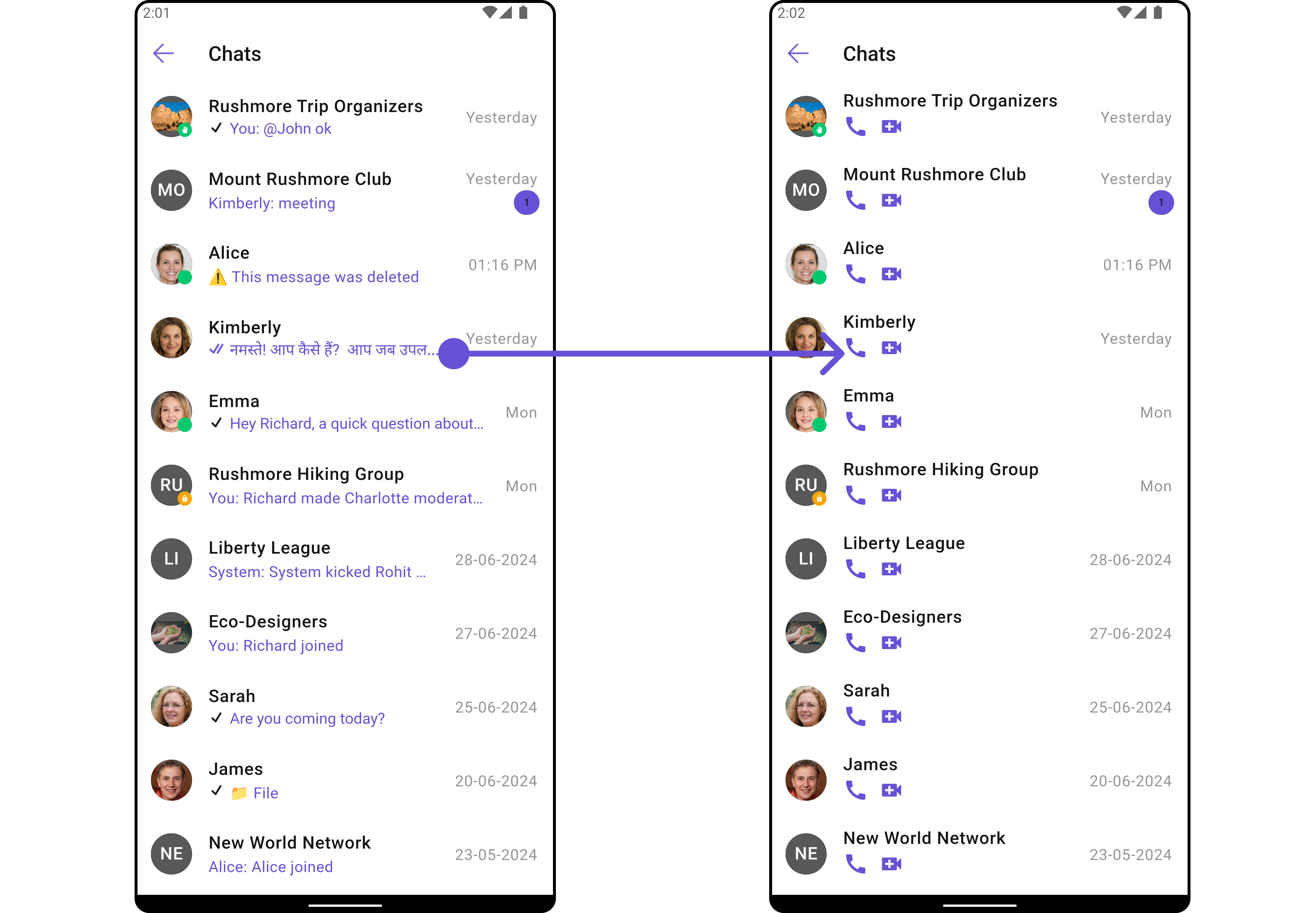
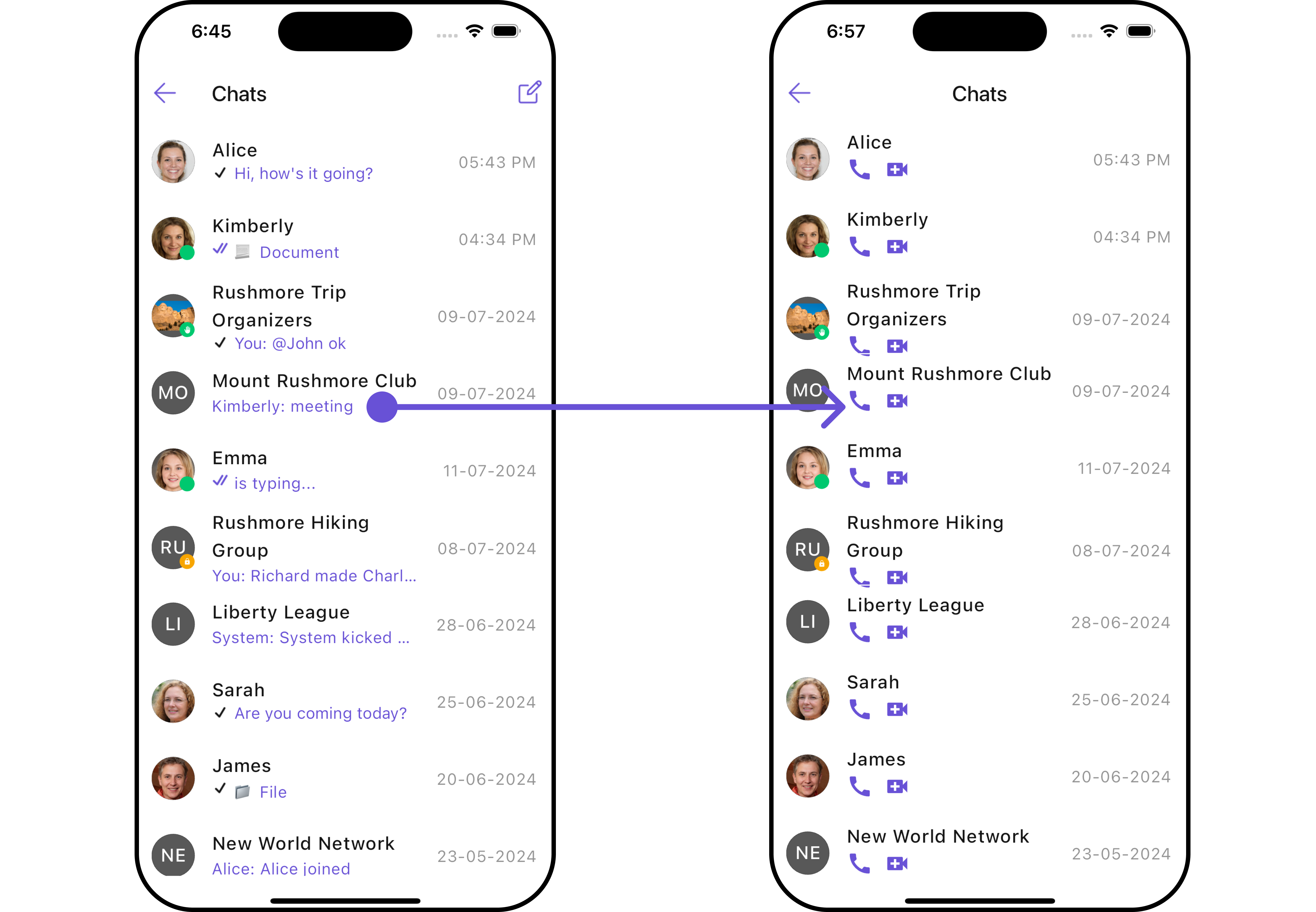
| AppBar Options | Used to set the options available in the app bar | appBarOptions: List<Widget> |
| Back Button | Used to set back button located in the app bar | backButton: Widget |
| Controller | Used to programmatically update the scroll physics of list containing the conversations | controller: ScrollController |
| Date Pattern | Used to display a custom string instead of the timestamp show at the tail of the conversation item | datePattern: String Function(Conversation conversation) |
| Disable Mentions | Disables mentions formatter if true | disableMentions: bool |
| Disable Typing | If true stops indicating if a participant in a conversation is typing | disableTyping: bool |
| Empty State Text | Used to set a custom text response when fetching the conversations has returned an empty list | emptyStateText: String |
| Error State Text | Used to set a custom text response when some error occurs on fetching the list of conversations | errorStateText: String |
| Hide Appbar | Toggle visibility for app bar | hideAppbar: bool |
| Hide Error | Used to hide error on fetching conversations | hideError: bool |
| Hide Receipt | Used to toggle visibility of message receipts shown in the subtitle of the conversation | hideReceipt: bool |
| Hide Search | Used to toggle visibility for search box | hideSearch: bool |
| Hide Separator | Used to hide the divider separating the conversation items | hideSeparator: bool |
| Hide Section Separator | Used to hide the text separating grouped conversation items | hideSectionSeparator: bool |
| Private Group Icon | Used to set icon shown in place of status indicator if the conversation is taking place in a private group | privateGroupIcon: Widget |
| Protected Group Icon | Used to set icon shown in place of status indicator if the conversation is taking place in a password protected group | protectedGroupIcon: Widget |
| Search Box Icon | Used to set search Icon in the search field | searchBoxIcon: Widget |
| Search Placeholder | Used to set placeholder text for the search field | searchPlaceholder: String |
| Selection Icon | Change selection icon | selectionIcon: Widget |
| Sent Icon | Used to customize the receipt icon shown in the subtitle of the conversation item if hideReceipt is false and if the status of the last message in the conversation is sent | sentIcon: Widget |
| Show Back Button | Used to toggle visibility for back button | showBackButton: bool |
| Theme | Used to set custom theme | theme: CometChatTheme |
| Title | Used to set the title in the app bar | title: String |
| Typing Indicator Text | Used to customize the text response shown in the subtitle of the conversation item if a participant of a conversation is typing | typingIndicatorText: String |
Advanced
For advanced-level customization, you can set custom views to the widget. This lets you tailor each aspect of the widget to fit your exact needs and application aesthetics. You can create and define your own widget and then incorporate those into the widget.ListItemView
With this function, you can assign a custom ListItem view to theCometChatConversations Widget.
- Dart
- Android
- iOS
- Dart
custom_list_item.dart
- Dart
main.dart
TextFormatters
Assigns the list of text formatters. If the provided list is not null, it sets the list. Otherwise, it assigns the default text formatters retrieved from the data source. To configure the existing Mentions look and feel check out CometChatMentionsFormatter Example Here is the complete example for reference:- Dart
- Android
- iOS
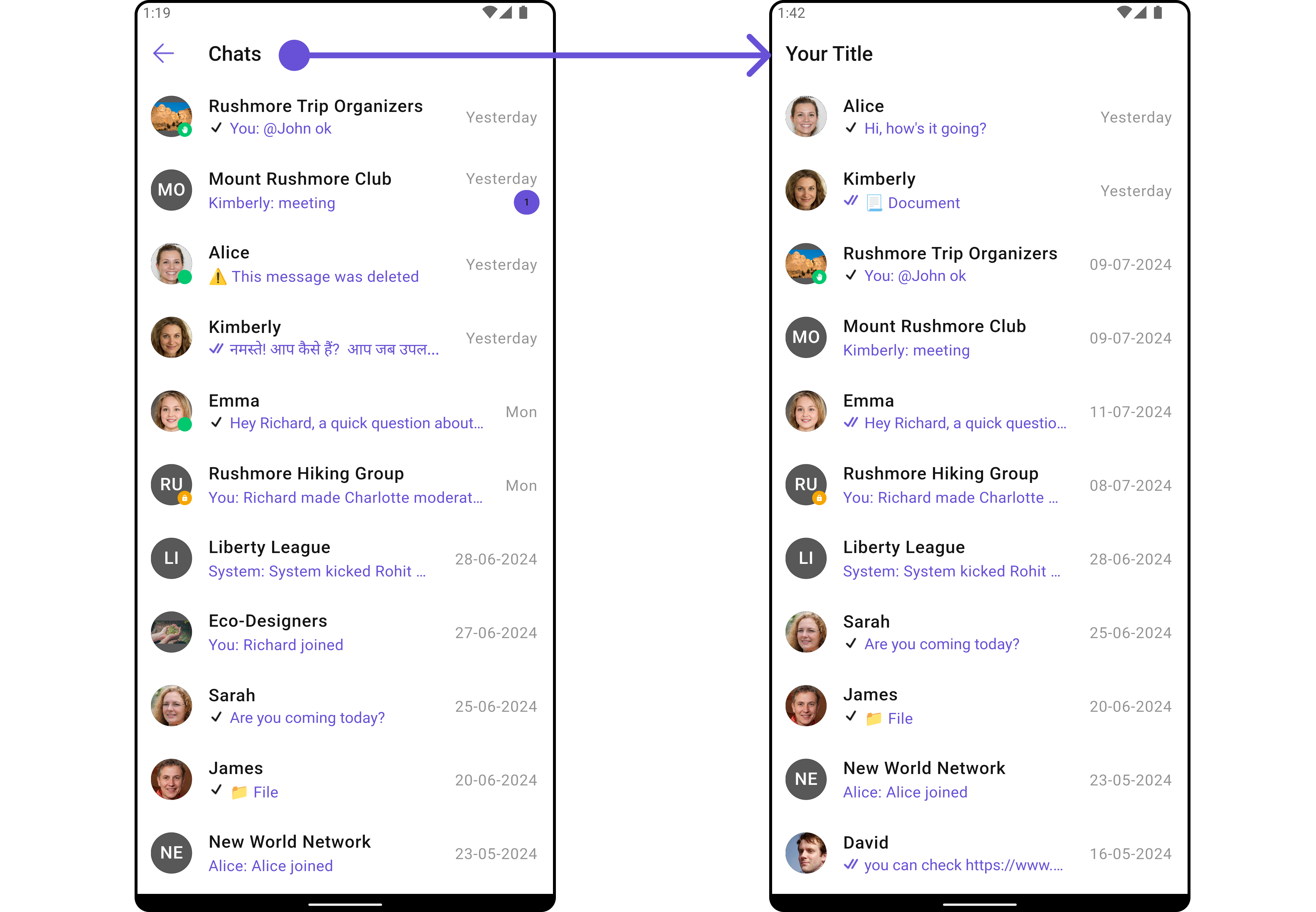
AppBarOptions
You can set the Custom AppBarOptions to theCometChatConversations widget.
- Android
- iOS
- Dart
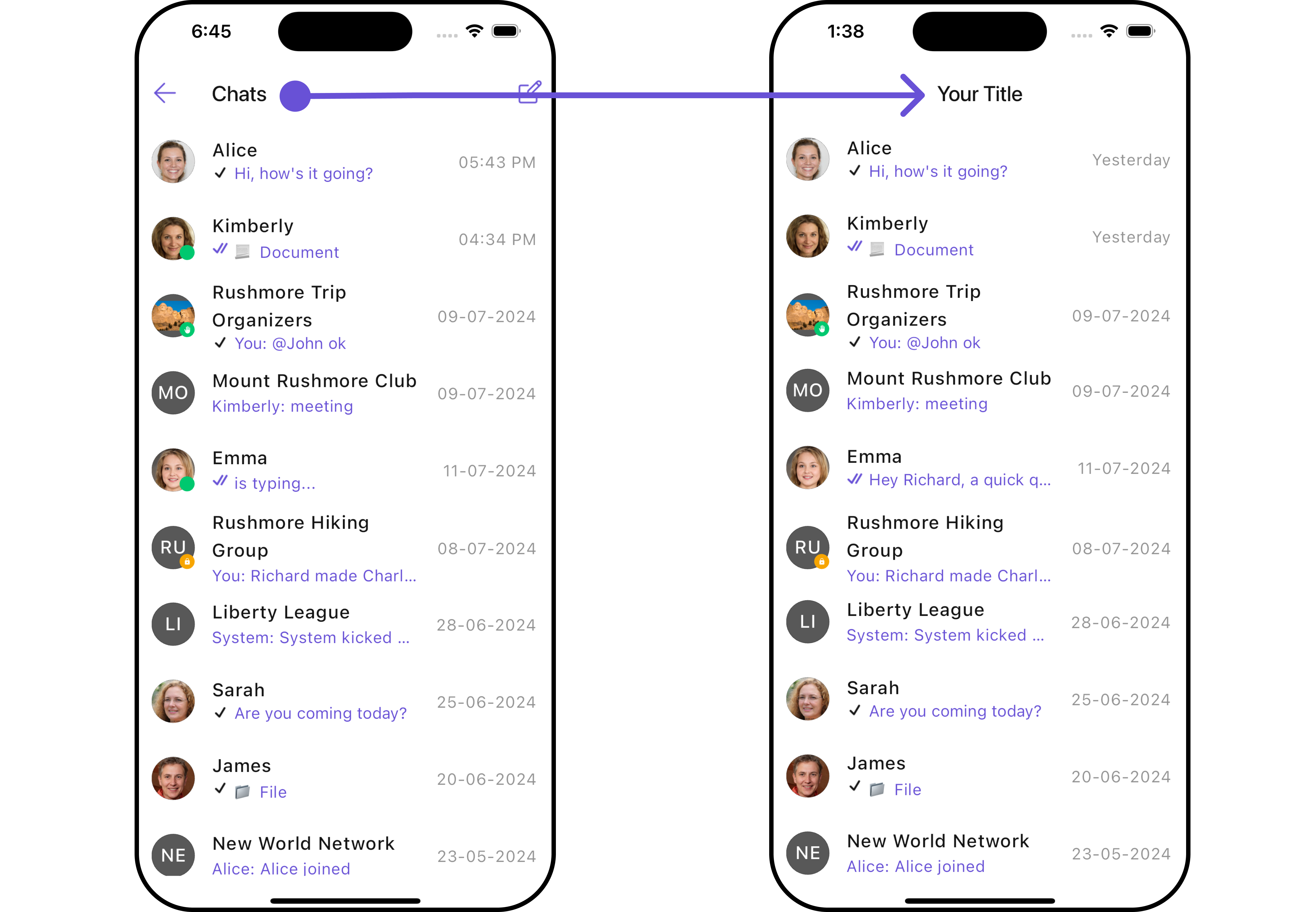
DatePattern
You can modify the date pattern to your requirement usingdatePattern. This method accepts a function with a return type String. Inside the function, you can create your own pattern and return it as a String.
- Android
- iOS
- Dart
SubtitleView
You can customize the subtitle view for each conversation item to meet your requirements- Android
- iOS
- Dart
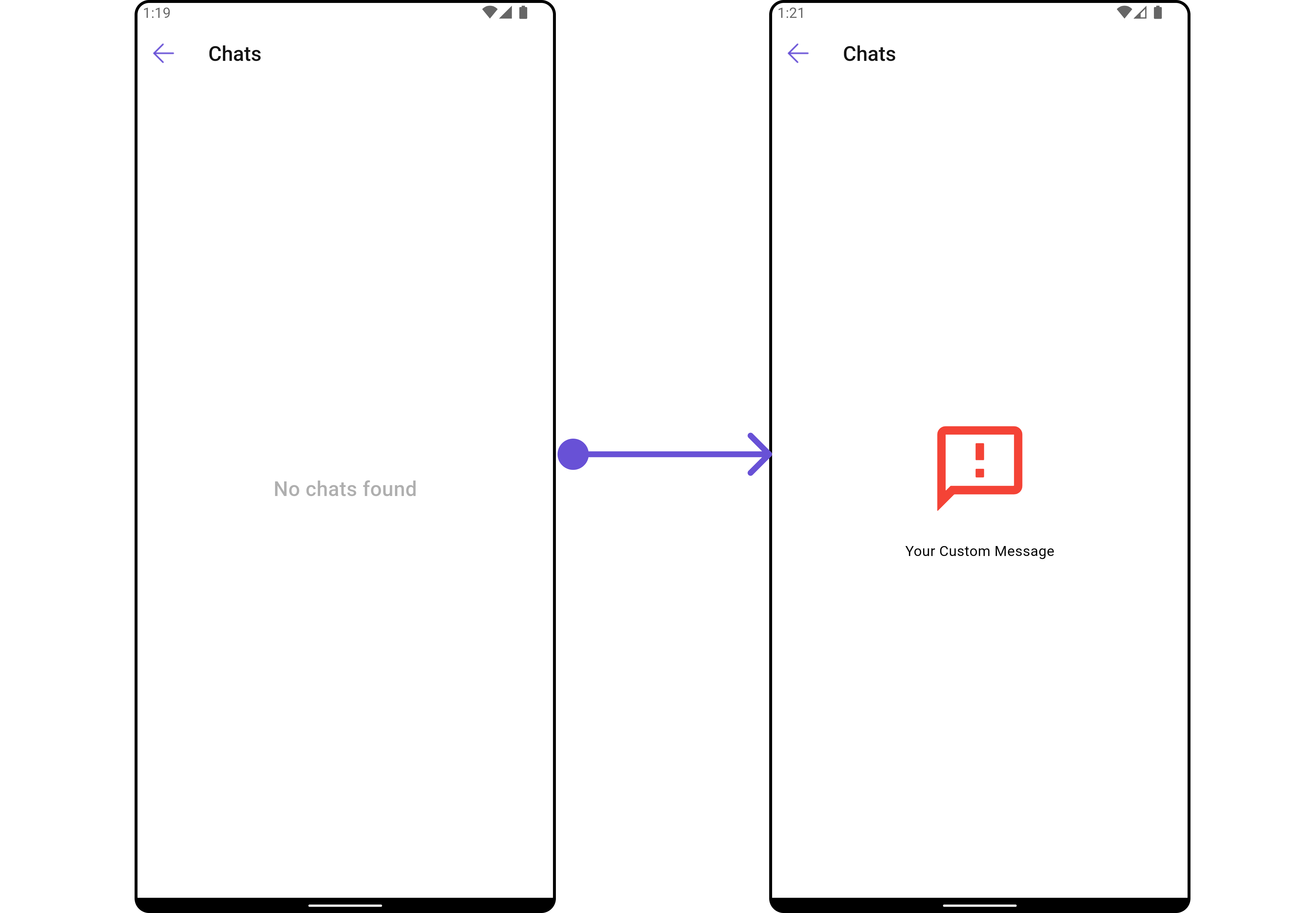
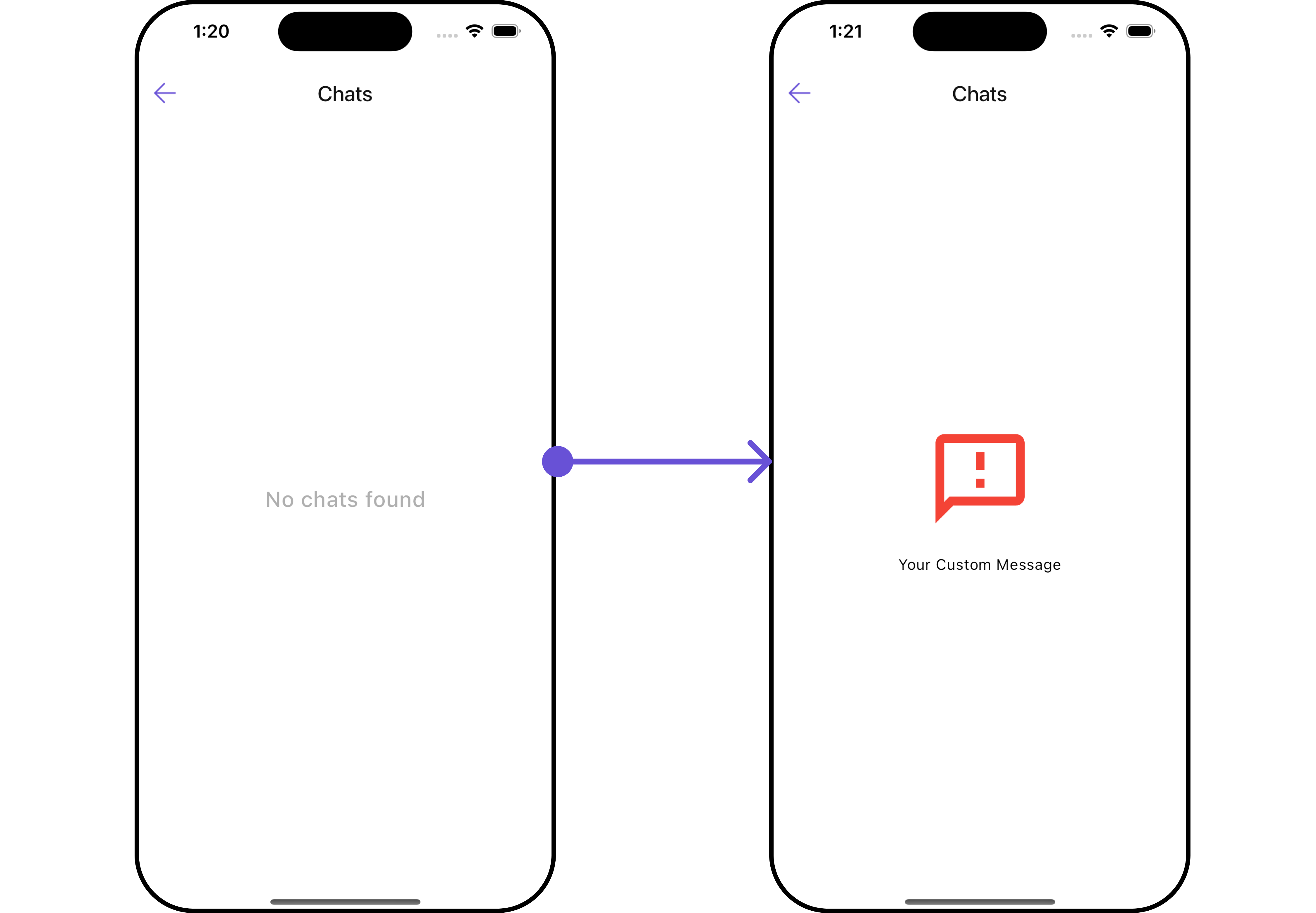
EmptyStateView
You can set a customEmptyStateView using emptyStateView to match the empty UI of your app.
- Dart
- Android
- iOS
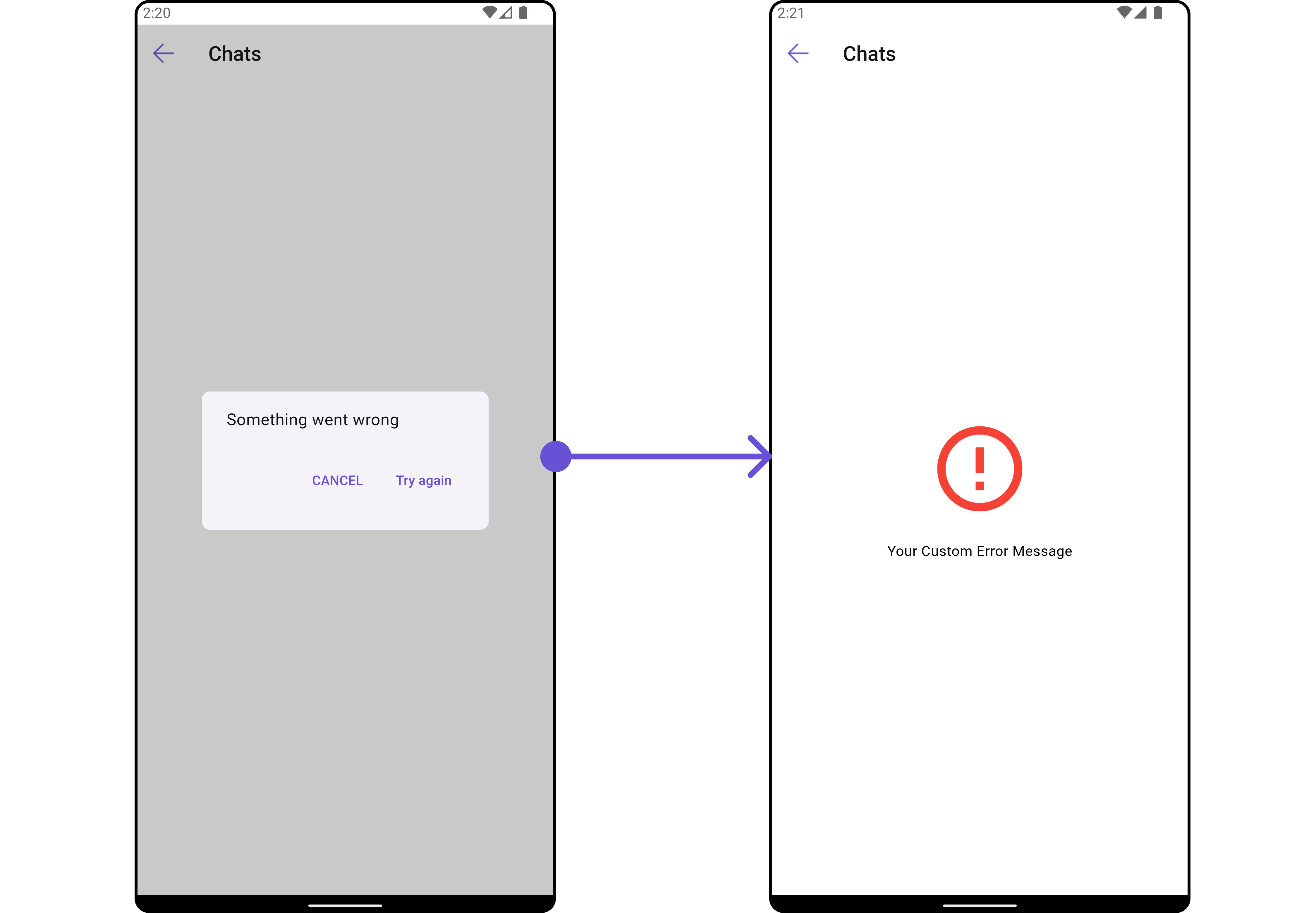
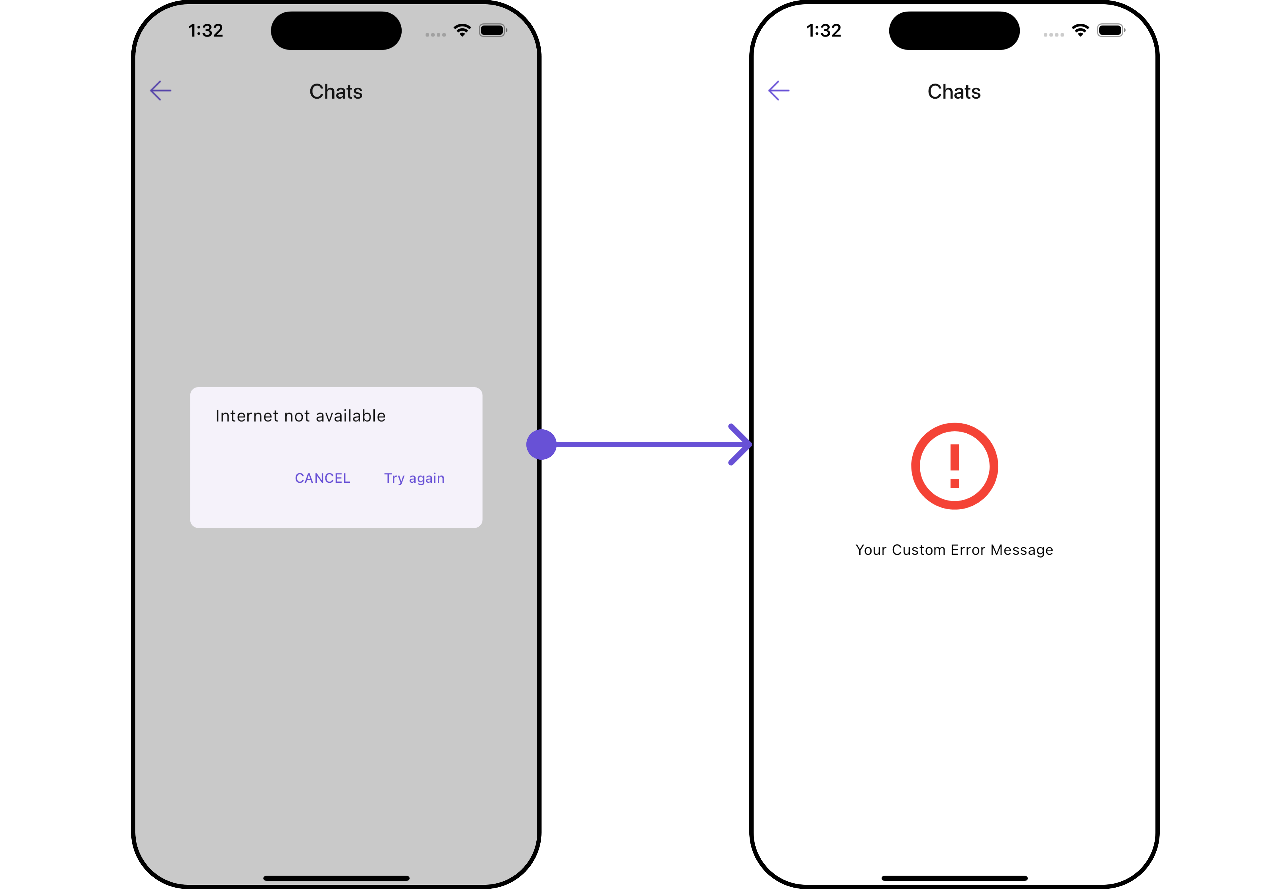
ErrorStateView
You can set a customErrorStateView using errorStateView to match the error view of your app.
- Android
- iOS
- Dart
Options
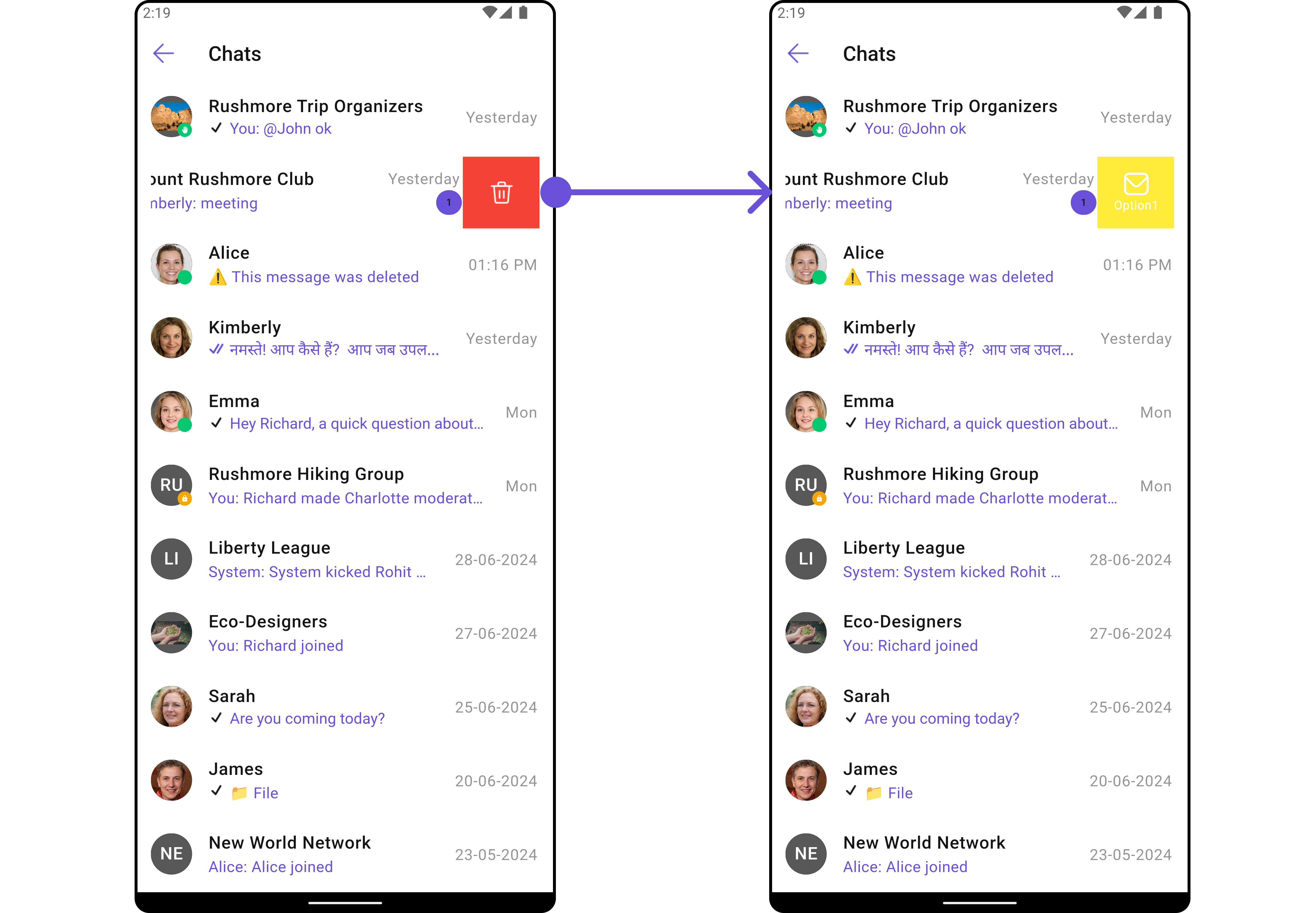
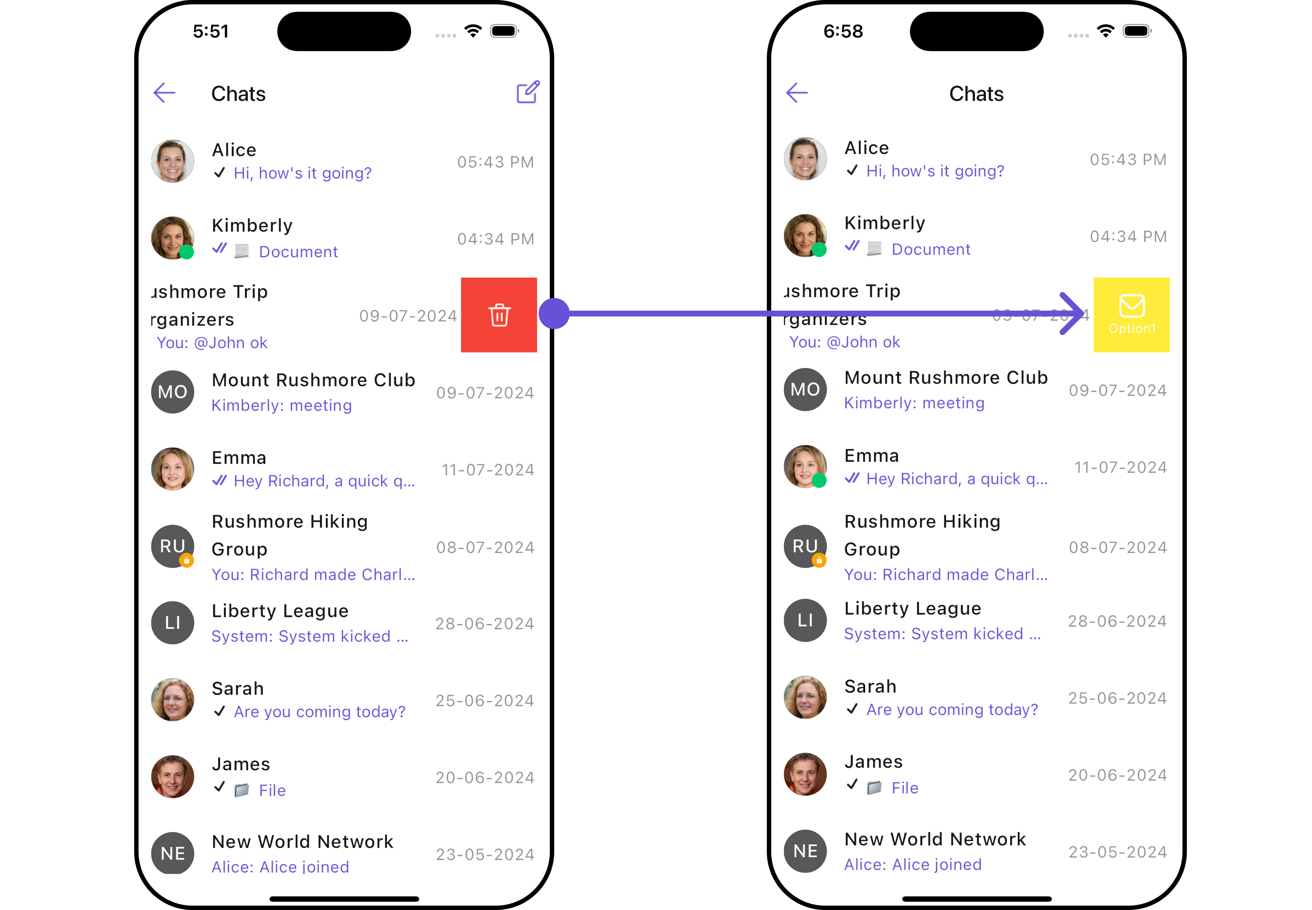
You can set a List of ‘CometChatOption’ for a conversation item to add your custom actions to the conversation. These options will be visible when swiping any conversation item. Here is the complete example for reference: Example- Dart
main.dart
- Android
- iOS