Documentation Index Fetch the complete documentation index at: https://www.cometchat.com/docs/llms.txt
Use this file to discover all available pages before exploring further.
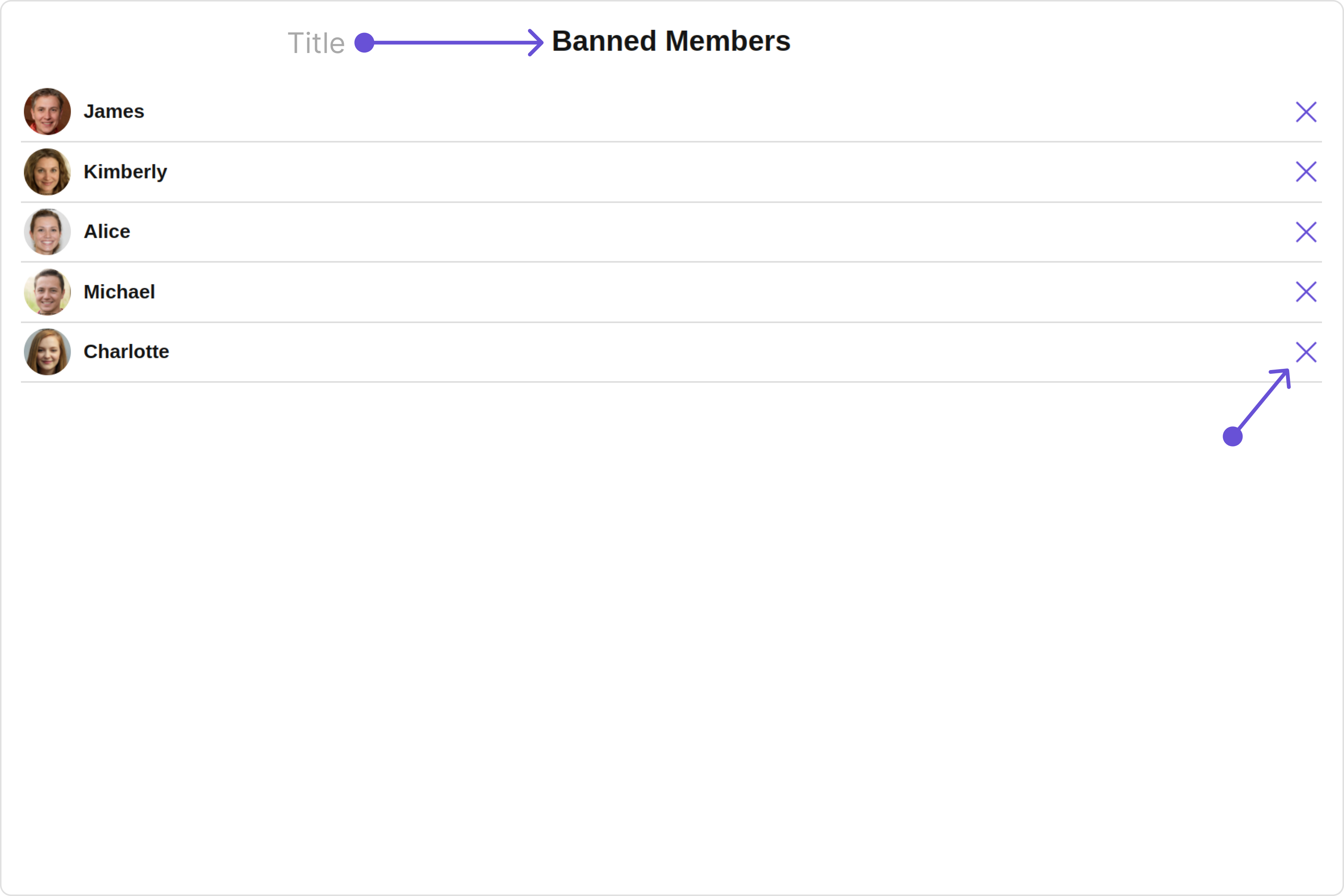
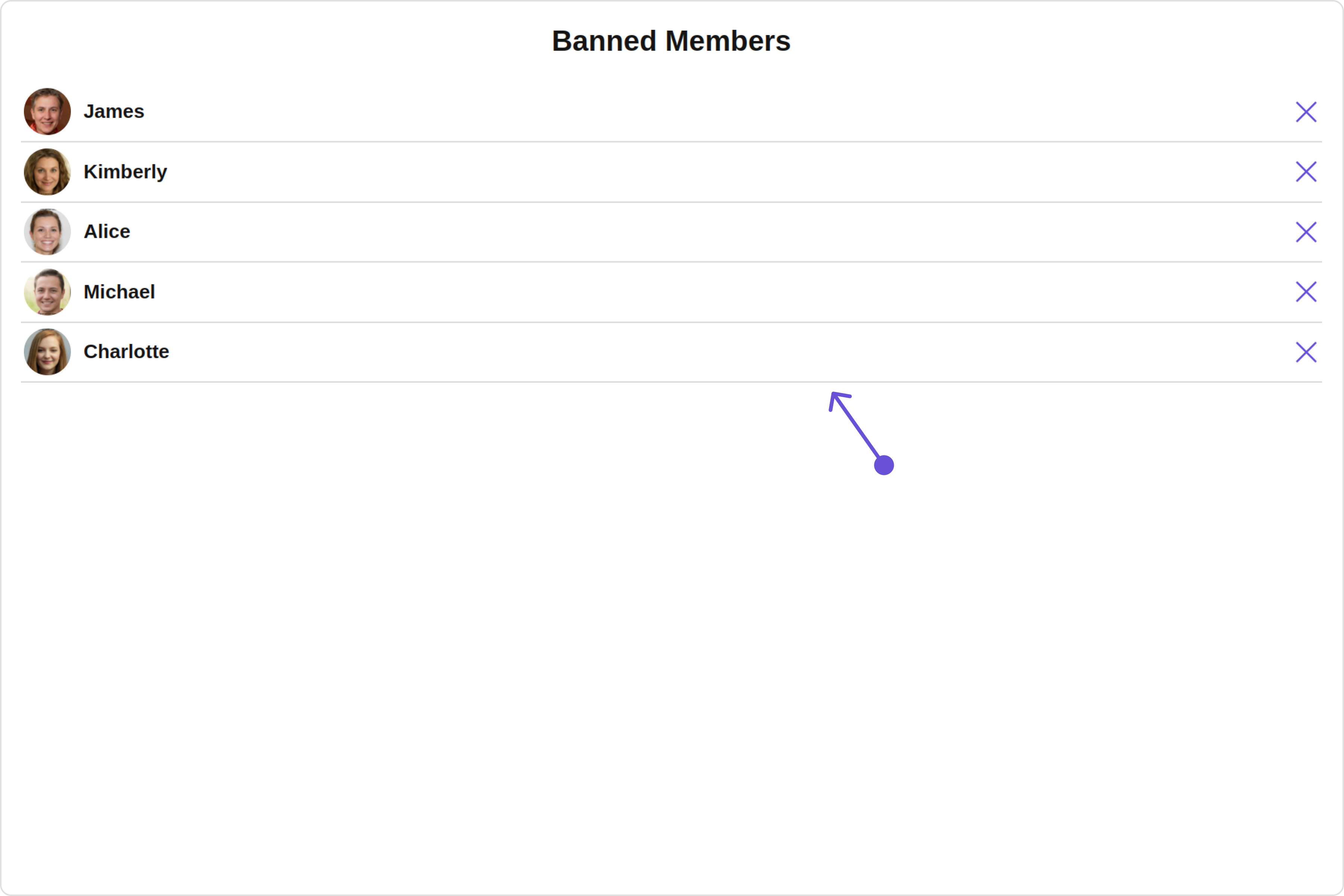
Overview CometChatBannedMembers is a Component that displays all the users who have been restricted or prohibited from participating in specific groups or conversations. When the user is banned, they are no longer able to access or engage with the content and discussions within the banned group. Group administrators or owners have the authority to ban members from specific groups they manage. They can review user activity, monitor behavior, and take appropriate actions, including banning users when necessary.Usage Integration The following code snippet illustrates how you can directly incorporate the Banned Members component into your Application.
app.module.ts
app.component.ts
app.component.html
import { CUSTOM_ELEMENTS_SCHEMA , NgModule } from "@angular/core" ; import { BrowserModule } from "@angular/platform-browser" ; import { CometChatBannedMembers } from "@cometchat/chat-uikit-angular" ; import { AppComponent } from "./app.component" ; @ NgModule ({ imports: [ BrowserModule , CometChatBannedMembers ], declarations: [ AppComponent ], providers: [], bootstrap: [ AppComponent ], schemas: [ CUSTOM_ELEMENTS_SCHEMA ], }) export class AppModule {}
import { CometChat } from '@cometchat/chat-sdk-javascript' ; import { Component , OnInit } from '@angular/core' ; import { CometChatThemeService , CometChatUIKit } from '@cometchat/chat-uikit-angular' ; import "@cometchat/uikit-elements" ; @ Component ({ selector: 'app-root' , templateUrl: './app.component.html' , styleUrls: [ './app.component.css' ] }) export class AppComponent { public groupObject !: CometChat . Group ; ngOnInit () : void { CometChat . getGroup ( "guid" ). then (( group : CometChat . Group ) => { this . groupObject = group ; }); } constructor ( private themeService : CometChatThemeService ) { themeService . theme . palette . setMode ( "light" ) themeService . theme . palette . setPrimary ({ light: "#6851D6" , dark: "#6851D6" }) } onLogin ( UID ?: any ) { CometChatUIKit . login ({ uid: UID }). then ( ( user ) => { setTimeout (() => { window . location . reload (); }, 1000 ); }, ( error ) => { console . log ( "Login failed with exception:" , { error }); } ); } }
< div class = "fullwidth" > < cometchat-banned-members *ngIf = "groupObject" [group] = "groupObject" ></ cometchat-banned-members > </ div >
Actions Actions dictate how a component functions. They are divided into two types: Predefined and User-defined. You can override either type, allowing you to tailor the behavior of the component to fit your specific needs.1. onSelect
The onSelect action is activated when you select the done icon while in selection mode. This returns a list of all the banned members that you have selected.
This action does not come with any predefined behavior. However, you have the flexibility to override this event and tailor it to suit your needs using the following code snippet.
app.component.ts
app.component.html
import { CometChat } from '@cometchat/chat-sdk-javascript' ; import { Component , OnInit } from '@angular/core' ; import { CometChatThemeService , CometChatUIKit } from '@cometchat/chat-uikit-angular' ; import "@cometchat/uikit-elements" ; @ Component ({ selector: 'app-root' , templateUrl: './app.component.html' , styleUrls: [ './app.component.css' ] }) export class AppComponent { public groupObject !: CometChat . Group ; ngOnInit () : void { CometChat . getGroup ( "guid" ). then (( group : CometChat . Group ) => { this . groupObject = group ; }); } public handleOnSelect = ( member : CometChat . GroupMember , selected : boolean ) => { console . log ( "your custom on select actions" , member , selected ); }; constructor ( private themeService : CometChatThemeService ) { themeService . theme . palette . setMode ( "light" ) themeService . theme . palette . setPrimary ({ light: "#6851D6" , dark: "#6851D6" }) } onLogin ( UID ?: any ) { CometChatUIKit . login ({ uid: UID }). then ( ( user ) => { setTimeout (() => { window . location . reload (); }, 1000 ); }, ( error ) => { console . log ( "Login failed with exception:" , { error }); } ); } }
< div class = "fullwidth" > < cometchat-banned-members *ngIf = "groupObject" [group] = "groupObject" [onSelect] = "handleOnSelect" ></ cometchat-banned-members > </ div >
2. OnBack
OnBack is triggered when you click on the back button of the Banned Members component. You can override this action using the following code snippet. app.component.ts
app.component.html
import { CometChat } from '@cometchat/chat-sdk-javascript' ; import { Component , OnInit } from '@angular/core' ; import { CometChatThemeService , CometChatUIKit } from '@cometchat/chat-uikit-angular' ; import "@cometchat/uikit-elements" ; @ Component ({ selector: 'app-root' , templateUrl: './app.component.html' , styleUrls: [ './app.component.css' ] }) export class AppComponent { public groupObject !: CometChat . Group ; ngOnInit () : void { CometChat . getGroup ( "guid" ). then (( group : CometChat . Group ) => { this . groupObject = group ; }); } public handleOnBack = () => { console . log ( "Your custom on back action" ); } constructor ( private themeService : CometChatThemeService ) { themeService . theme . palette . setMode ( "light" ) themeService . theme . palette . setPrimary ({ light: "#6851D6" , dark: "#6851D6" }) } onLogin ( UID ?: any ) { CometChatUIKit . login ({ uid: UID }). then ( ( user ) => { setTimeout (() => { window . location . reload (); }, 1000 ); }, ( error ) => { console . log ( "Login failed with exception:" , { error }); } ); } }
< div class = "fullwidth" > < cometchat-banned-members *ngIf = "groupObject" [group] = "groupObject" [onBack] = "handleOnBack" ></ cometchat-banned-members > </ div >
3. onClose
onClose is triggered when you click on the close button of the Banned Members component. You can override this action using the following code snippet. app.component.ts
app.component.html
import { CometChat } from '@cometchat/chat-sdk-javascript' ; import { Component , OnInit } from '@angular/core' ; import { CometChatThemeService , CometChatUIKit } from '@cometchat/chat-uikit-angular' ; import "@cometchat/uikit-elements" ; @ Component ({ selector: 'app-root' , templateUrl: './app.component.html' , styleUrls: [ './app.component.css' ] }) export class AppComponent { public groupObject !: CometChat . Group ; ngOnInit () : void { CometChat . getGroup ( "guid" ). then (( group : CometChat . Group ) => { this . groupObject = group ; }); } public handleOnClose = () => { console . log ( "Your custom on close actions" ); } constructor ( private themeService : CometChatThemeService ) { themeService . theme . palette . setMode ( "light" ) themeService . theme . palette . setPrimary ({ light: "#6851D6" , dark: "#6851D6" }) } onLogin ( UID ?: any ) { CometChatUIKit . login ({ uid: UID }). then ( ( user ) => { setTimeout (() => { window . location . reload (); }, 1000 ); }, ( error ) => { console . log ( "Login failed with exception:" , { error }); } ); } }
< div class = "fullwidth" > < cometchat-banned-members *ngIf = "groupObject" [group] = "groupObject" [onClose] = "handleOnClose" ></ cometchat-banned-members > </ div >
4. onError
This action doesn’t change the behavior of the component but rather listens for any errors that occur in the Banned Members component.
app.component.ts
app.component.html
import { CometChat } from '@cometchat/chat-sdk-javascript' ; import { Component , OnInit } from '@angular/core' ; import { CometChatThemeService , CometChatUIKit } from '@cometchat/chat-uikit-angular' ; import "@cometchat/uikit-elements" ; @ Component ({ selector: 'app-root' , templateUrl: './app.component.html' , styleUrls: [ './app.component.css' ] }) export class AppComponent { public groupObject !: CometChat . Group ; ngOnInit () : void { CometChat . getGroup ( "guid" ). then (( group : CometChat . Group ) => { this . groupObject = group ; }); } public handleOnError = ( error : CometChat . CometChatException ) => { console . log ( "your custom on error action" , error ); }; constructor ( private themeService : CometChatThemeService ) { themeService . theme . palette . setMode ( "light" ) themeService . theme . palette . setPrimary ({ light: "#6851D6" , dark: "#6851D6" }) } onLogin ( UID ?: any ) { CometChatUIKit . login ({ uid: UID }). then ( ( user ) => { setTimeout (() => { window . location . reload (); }, 1000 ); }, ( error ) => { console . log ( "Login failed with exception:" , { error }); } ); } }
< div class = "fullwidth" > < cometchat-banned-members *ngIf = "groupObject" [group] = "groupObject" [onError] = "handleOnError" ></ cometchat-banned-members > </ div >
Filters Filters allow you to customize the data displayed in a list within a Component. You can filter the list based on your specific criteria, allowing for a more customized. Filters can be applied using RequestBuilders of Chat SDK.1. BannedMembersRequestBuilder
The BannedMembersRequestBuilder enables you to filter and customize the Banned Members list based on available parameters in BannedMembersRequestBuilder. This feature allows you to create more specific and targeted queries when fetching banned members. The following are the parameters available in BannedMembersRequestBuilder
Methods Type Description setLimit number sets the number of banned members that can be fetched in a single request, suitable for pagination setSearchKeyword String used for fetching banned members matching the passed string setScopes Array<String> used for fetching banned members based on multiple scopes
Example In the example below, we are applying a filter to the banned members by setting the limit to 2 and setting the scope to show only the moderator.
app.component.ts
app.component.html
import { CometChat } from '@cometchat/chat-sdk-javascript' ; import { Component , OnInit } from '@angular/core' ; import { CometChatThemeService , CometChatUIKit } from '@cometchat/chat-uikit-angular' ; import "@cometchat/uikit-elements" ; @ Component ({ selector: 'app-root' , templateUrl: './app.component.html' , styleUrls: [ './app.component.css' ] }) export class AppComponent { public groupObject !: CometChat . Group ; ngOnInit () : void { CometChat . getGroup ( "guid" ). then (( group : CometChat . Group ) => { this . groupObject = group ; }); } bannedMembersRequestBuilder = new CometChat . BannedMembersRequestBuilder ( "guid" ). setLimit ( 2 ). setScopes ([ "moderator" ]) constructor ( private themeService : CometChatThemeService ) { themeService . theme . palette . setMode ( "light" ) themeService . theme . palette . setPrimary ({ light: "#6851D6" , dark: "#6851D6" }) } onLogin ( UID ?: any ) { CometChatUIKit . login ({ uid: UID }). then ( ( user ) => { setTimeout (() => { window . location . reload (); }, 1000 ); }, ( error ) => { console . log ( "Login failed with exception:" , { error }); } ); } }
< div class = "fullwidth" > < cometchat-banned-members *ngIf = "groupObject" [group] = "groupObject" [bannedMembersRequestBuilder] = "bannedMembersRequestBuilder" ></ cometchat-banned-members > </ div >
2. SearchRequestBuilder
The SearchRequestBuilder uses BannedMembersRequestBuilder enables you to filter and customize the search list based on available parameters in BannedMembersRequestBuilder. This feature allows you to keep uniformity between the displayed Banned Members list and searched Banned Members.
Example app.component.ts
app.component.html
import { CometChat } from '@cometchat/chat-sdk-javascript' ; import { Component , OnInit } from '@angular/core' ; import { CometChatThemeService , CometChatUIKit } from '@cometchat/chat-uikit-angular' ; import "@cometchat/uikit-elements" ; @ Component ({ selector: 'app-root' , templateUrl: './app.component.html' , styleUrls: [ './app.component.css' ] }) export class AppComponent { public groupObject !: CometChat . Group ; ngOnInit () : void { CometChat . getGroup ( "guid" ). then (( group : CometChat . Group ) => { this . groupObject = group ; }); } searchRequestBuilder = new CometChat . BannedMembersRequestBuilder ( "cometchat-guid-1" ). setLimit ( 2 ). setSearchKeyword ( "**" ) constructor ( private themeService : CometChatThemeService ) { themeService . theme . palette . setMode ( "light" ) themeService . theme . palette . setPrimary ({ light: "#6851D6" , dark: "#6851D6" }) } onLogin ( UID ?: any ) { CometChatUIKit . login ({ uid: UID }). then ( ( user ) => { setTimeout (() => { window . location . reload (); }, 1000 ); }, ( error ) => { console . log ( "Login failed with exception:" , { error }); } ); } }
< div class = "fullwidth" > < cometchat-banned-members *ngIf = "groupObject" [group] = "groupObject" [searchRequestBuilder] = "searchRequestBuilder" ></ cometchat-banned-members > </ div >
Events Events are emitted by a Component. By using event you can extend existing functionality. Being global events, they can be applied in Multiple Locations and are capable of being Added or Removed.The Banned Members component does not produce any events.
Customization To fit your app’s design requirements, you can customize the appearance of the Groups component. We provide exposed methods that allow you to modify the experience and behavior according to your specific needs.
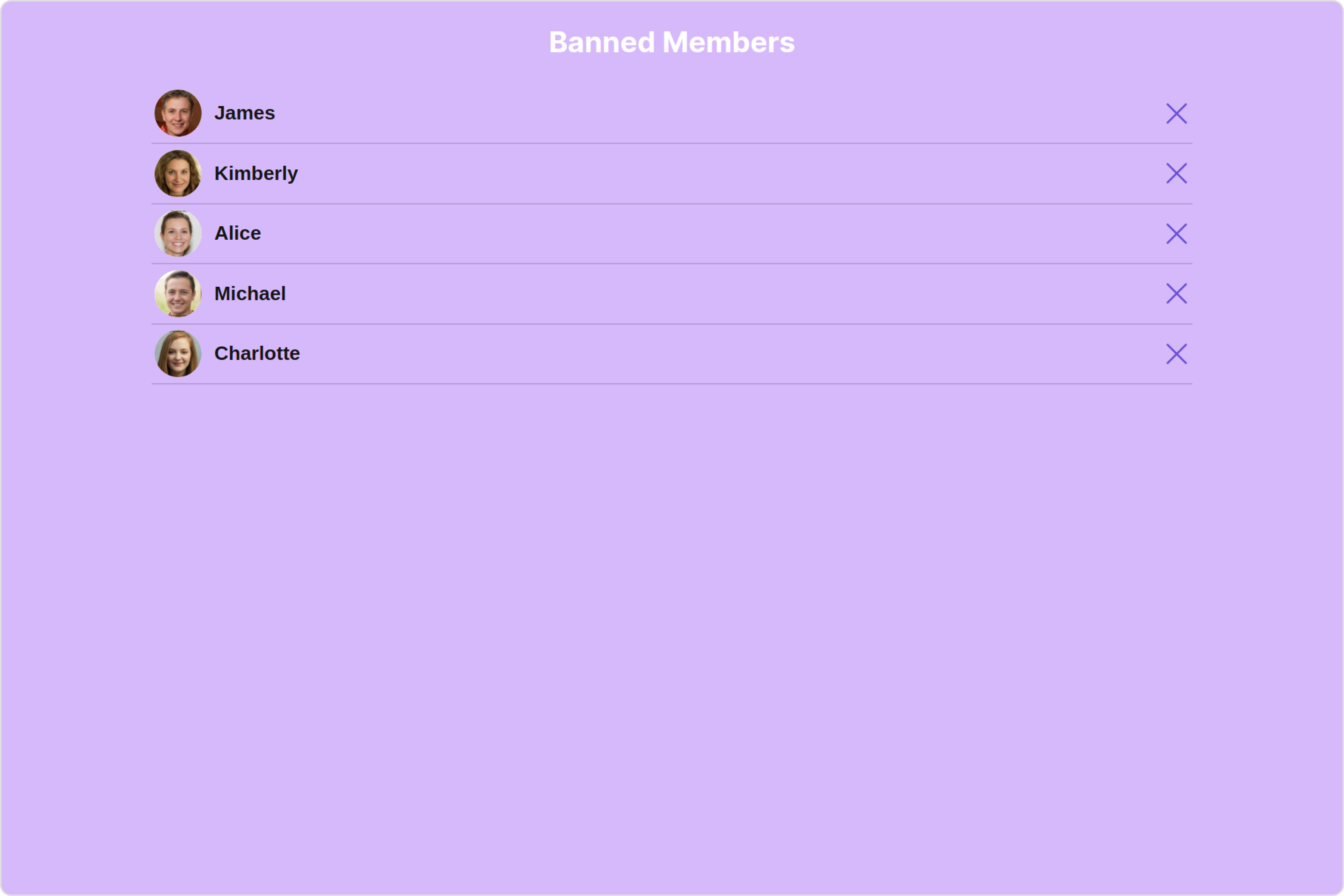
Style Using Style you can customize the look and feel of the component in your app, These parameters typically control elements such as the color , size , shape , and fonts used within the component.
1. BannedMembers Style
You can set the BannedMembersStyle to the Banned Members Component to customize the styling.
app.component.ts
app.component.html
import { CometChat } from '@cometchat/chat-sdk-javascript' ; import { Component , OnInit } from '@angular/core' ; import { CometChatThemeService , CometChatUIKit } from '@cometchat/chat-uikit-angular' ; import { BannedMembersStyle } from '@cometchat/uikit-shared' ; import "@cometchat/uikit-elements" ; @ Component ({ selector: 'app-root' , templateUrl: './app.component.html' , styleUrls: [ './app.component.css' ] }) export class AppComponent { public groupObject !: CometChat . Group ; ngOnInit () : void { CometChat . getGroup ( "guid" ). then (( group : CometChat . Group ) => { this . groupObject = group ; }); } bannedMembersStyle = new BannedMembersStyle ({ background: "#d6b9fa" , titleTextColor: "#ffffff" , separatorColor: "#6d1fcf" , onlineStatusColor: "#b1f029" , }); constructor ( private themeService : CometChatThemeService ) { themeService . theme . palette . setMode ( "light" ) themeService . theme . palette . setPrimary ({ light: "#6851D6" , dark: "#6851D6" }) } onLogin ( UID ?: any ) { CometChatUIKit . login ({ uid: UID }). then ( ( user ) => { setTimeout (() => { window . location . reload (); }, 1000 ); }, ( error ) => { console . log ( "Login failed with exception:" , { error }); } ); } }
< div class = "fullwidth" > < cometchat-banned-members *ngIf = "groupObject" [group] = "groupObject" [bannedMembersStyle] = "bannedMembersStyle" ></ cometchat-banned-members > </ div >
List of properties exposed by BannedMembersStyle
Property Description Code border Used to set border border?: string,borderRadius Used to set border radius borderRadius?: string;background Used to set background colour background?: string;height Used to set height height?: string;width Used to set width width?: string;titleTextFont Used to set title text font titleTextFont?: string,titleTextColor Used to set title text color titleTextColor?: string;searchPlaceholderTextFont Used to set search placeholder font searchPlaceholderTextFont?: string;searchPlaceholderTextColor Used to set search placeholder color searchPlaceholderTextColor?: string;searchTextFont Used to set search text font searchTextFont?: string;searchTextColor Used to set search text color searchTextColor?: string;emptyStateTextFont Used to set empty state text font emptyStateTextFont?: string;emptyStateTextColor Used to set empty state text color emptyStateTextColor?: string;errorStateTextFont Used to set error state text font errorStateTextFont?: string;errorStateTextColor Used to set error state text color errorStateTextColor?: string;loadingIconTint Used to set loading icon tint loadingIconTint?: string;searchIconTint Used to set search icon tint searchIconTint?: string;searchBorder Used to set search border searchBorder?: string;searchBorderRadius Used to set search border radius searchBorderRadius?: string;searchBackground Used to set search background color searchBackground?: string;onlineStatusColor Used to set online status color onlineStatusColor?: string;separatorColor Used to set separator color separatorColor?: string;boxShadow Used to set box shadow boxShadow?: string;backButtonIconTint Used to set back button icon tint backButtonIconTint?: string;closeButtonIconTint Used to set close button icon tint closeButtonIconTint?: string;unbanIconTint Used to set unban icon tint unbanIconTint?: string;padding Used to set padding padding?: string;
2. Avatar Style
To apply customized styles to the Avatar component in the Banned Members Component, you can use the following code snippet. For further insights on Avatar Styles refer
app.component.ts
app.component.html
import { CometChat } from '@cometchat/chat-sdk-javascript' ; import { Component , OnInit } from '@angular/core' ; import { CometChatThemeService , CometChatUIKit , AvatarStyle } from '@cometchat/chat-uikit-angular' ; import "@cometchat/uikit-elements" ; @ Component ({ selector: 'app-root' , templateUrl: './app.component.html' , styleUrls: [ './app.component.css' ] }) export class AppComponent { public groupObject !: CometChat . Group ; ngOnInit () : void { CometChat . getGroup ( "guid" ). then (( group : CometChat . Group ) => { this . groupObject = group ; }); } avatarStyle = new AvatarStyle ({ backgroundColor: "#cdc2ff" , border: "2px solid #6745ff" , borderRadius: "10px" , outerViewBorderColor: "#ca45ff" , outerViewBorderRadius: "5px" , nameTextColor: "#4554ff" }); constructor ( private themeService : CometChatThemeService ) { themeService . theme . palette . setMode ( "light" ) themeService . theme . palette . setPrimary ({ light: "#6851D6" , dark: "#6851D6" }) } onLogin ( UID ?: any ) { CometChatUIKit . login ({ uid: UID }). then ( ( user ) => { setTimeout (() => { window . location . reload (); }, 1000 ); }, ( error ) => { console . log ( "Login failed with exception:" , { error }); } ); } }
< div class = "fullwidth" > < cometchat-banned-members *ngIf = "groupObject" [group] = "groupObject" [avatarStyle] = "avatarStyle" ></ cometchat-banned-members > </ div >
3. LisItem Style
To apply customized styles to the List Item component in the Banned Members Component, you can use the following code snippet. For further insights on List Item Styles refer
app.component.ts
app.component.html
import { CometChat } from '@cometchat/chat-sdk-javascript' ; import { Component , OnInit } from '@angular/core' ; import { CometChatThemeService , CometChatUIKit , ListItemStyle } from '@cometchat/chat-uikit-angular' ; import "@cometchat/uikit-elements" ; @ Component ({ selector: 'app-root' , templateUrl: './app.component.html' , styleUrls: [ './app.component.css' ] }) export class AppComponent { public groupObject !: CometChat . Group ; ngOnInit () : void { CometChat . getGroup ( "guid" ). then (( group : CometChat . Group ) => { this . groupObject = group ; }); } listItemStyle : ListItemStyle = new ListItemStyle ({ background: "transparent" , padding: "5px" , border: "1px solid #e9b8f5" , titleColor: "#8830f2" , borderRadius: "20px" , width: "100% !important" }); constructor ( private themeService : CometChatThemeService ) { themeService . theme . palette . setMode ( "light" ) themeService . theme . palette . setPrimary ({ light: "#6851D6" , dark: "#6851D6" }) } onLogin ( UID ?: any ) { CometChatUIKit . login ({ uid: UID }). then ( ( user ) => { setTimeout (() => { window . location . reload (); }, 1000 ); }, ( error ) => { console . log ( "Login failed with exception:" , { error }); } ); } }
< div class = "fullwidth" > < cometchat-banned-members *ngIf = "groupObject" [group] = "groupObject" [listItemStyle] = "listItemStyle" ></ cometchat-banned-members > </ div >
4. StatusIndicator Style
To apply customized styles to the Status Indicator component in the Banned Members Component, You can use the following code snippet. For further insights on Status Indicator Styles refer
app.component.ts
app.component.html
import { CometChat } from '@cometchat/chat-sdk-javascript' ; import { Component , OnInit } from '@angular/core' ; import { CometChatThemeService , CometChatUIKit } from '@cometchat/chat-uikit-angular' ; import "@cometchat/uikit-elements" ; @ Component ({ selector: 'app-root' , templateUrl: './app.component.html' , styleUrls: [ './app.component.css' ] }) export class AppComponent { public groupObject !: CometChat . Group ; ngOnInit () : void { CometChat . getGroup ( "guid" ). then (( group : CometChat . Group ) => { this . groupObject = group ; }); } statusIndicatorStyle : any = ({ height: '20px' , width: '20px' , backgroundColor: 'red' }); constructor ( private themeService : CometChatThemeService ) { themeService . theme . palette . setMode ( "light" ) themeService . theme . palette . setPrimary ({ light: "#6851D6" , dark: "#6851D6" }) } onLogin ( UID ?: any ) { CometChatUIKit . login ({ uid: UID }). then ( ( user ) => { setTimeout (() => { window . location . reload (); }, 1000 ); }, ( error ) => { console . log ( "Login failed with exception:" , { error }); } ); } }
< div class = "fullwidth" > < cometchat-banned-members *ngIf = "groupObject" [group] = "groupObject" [statusIndicatorStyle] = "statusIndicatorStyle" ></ cometchat-banned-members > </ div >
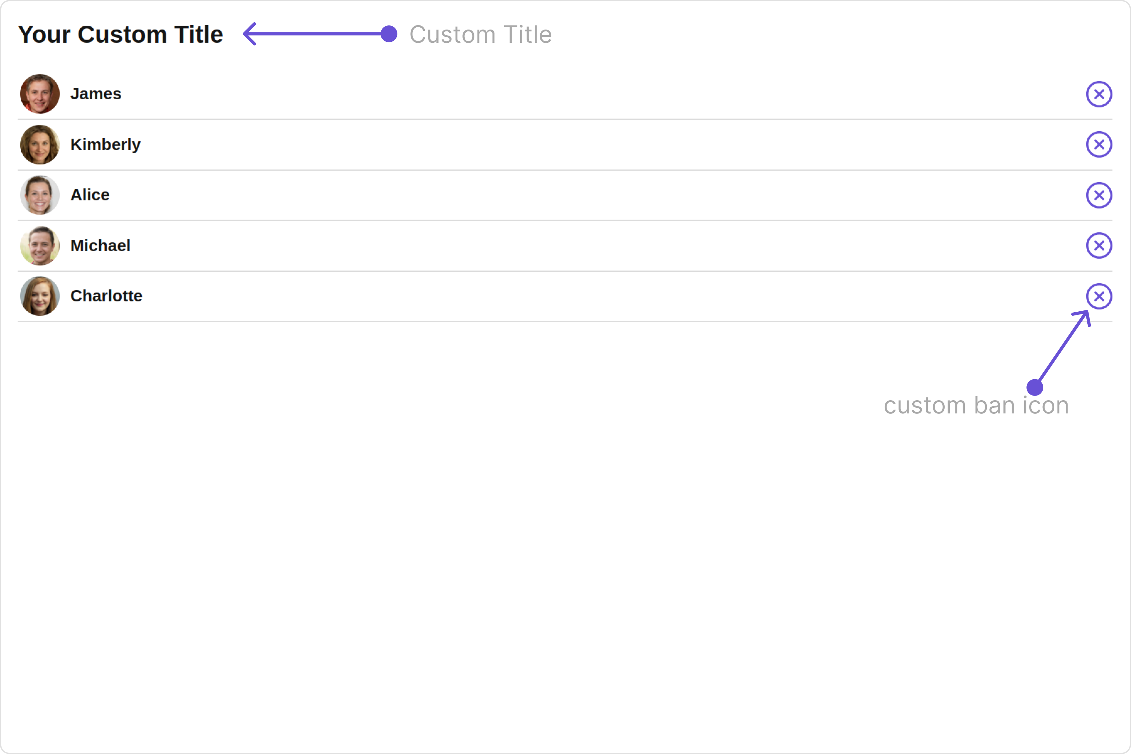
Functionality These are a set of small functional customizations that allow you to fine-tune the overall experience of the component. With these, you can change text, set custom icons, and toggle the visibility of UI elements.
app.component.ts
app.component.html
import { CometChat } from '@cometchat/chat-sdk-javascript' ; import { Component , OnInit } from '@angular/core' ; import { CometChatThemeService , CometChatUIKit } from '@cometchat/chat-uikit-angular' ; import { TitleAlignment } from '@cometchat/uikit-resources' ; import "@cometchat/uikit-elements" ; @ Component ({ selector: 'app-root' , templateUrl: './app.component.html' , styleUrls: [ './app.component.css' ] }) export class AppComponent { public groupObject !: CometChat . Group ; ngOnInit () : void { CometChat . getGroup ( "guid" ). then (( group : CometChat . Group ) => { this . groupObject = group ; }); } titleAlignment = TitleAlignment . left ; myCustomIcon = "your custom icon url" constructor ( private themeService : CometChatThemeService ) { themeService . theme . palette . setMode ( "light" ) themeService . theme . palette . setPrimary ({ light: "#6851D6" , dark: "#6851D6" }) } onLogin ( UID ?: any ) { CometChatUIKit . login ({ uid: UID }). then ( ( user ) => { setTimeout (() => { window . location . reload (); }, 1000 ); }, ( error ) => { console . log ( "Login failed with exception:" , { error }); } ); } }
< div class = "fullwidth" > < cometchat-banned-members *ngIf = "groupObject" [group] = "groupObject" [title] = "'Your Custom Title'" [titleAlignment] = "titleAlignment" [unbanIconURL] = "myCustomIcon" ></ cometchat-banned-members > </ div >
Default:
Custom:
Below is a list of customizations along with corresponding code snippets
Property Description Code title 🛑 Used to set title in the app heading [title]="'Your Custom Title'"errorStateText 🛑 Used to set a custom text response when some error occurs on fetching the list of banned members [errorStateText]="'your custom error state text'"emptyStateText 🛑 Used to set a custom text response when fetching the banned members has returned an empty list [emptyStateText]="'your custom empty state text'"searchPlaceholder 🛑 Used to set custom search placeholder text [searchPlaceholder]="'Custom Search PlaceHolder'"unbanIconURL Used to set the Unban button Icon in the banned user lists [unbanIconURL]="unbanIconURL"searchIconURL Used to set search Icon in the search field [searchIconURL]="searchIconURL"loadingIconURL Used to set loading Icon [loadingIconURL]="loadingIconURL"closeButtonIconURL Used to set close button Icon [closeButtonIconURL]="closeButtonIconURL"backButtonIconURL Used to set the back button Icon [backButtonIconURL]="backButtonIconURL"hideError Used to hide error on fetching banned members [hideError]="true"hideSearch Used to toggle visibility for search box [hideSearch]="true"hideSeparator Used to hide the divider separating the banned member items [hideSeparator]="true"disableUsersPresence Used to toggle functionality to show user’s presence [disableUsersPresence]="true"showBackButton Hides / shows the back button as per the boolean value [showBackButton]="true"selectionMode set the number of banned members that can be selected, SelectionMode can be single, multiple or none. [selectionMode]="selectionMode"titleAlignment Alignment of the heading text for the component [titleAlignment]="titleAlignment"group 🛑 Used to pass group object of which group members will be shown [group]="groupObject"
Advance For advanced-level customization, you can set custom views to the component. This lets you tailor each aspect of the component to fit your exact needs and application aesthetics. You can create and define your views, layouts, and UI elements and then incorporate those into the component.
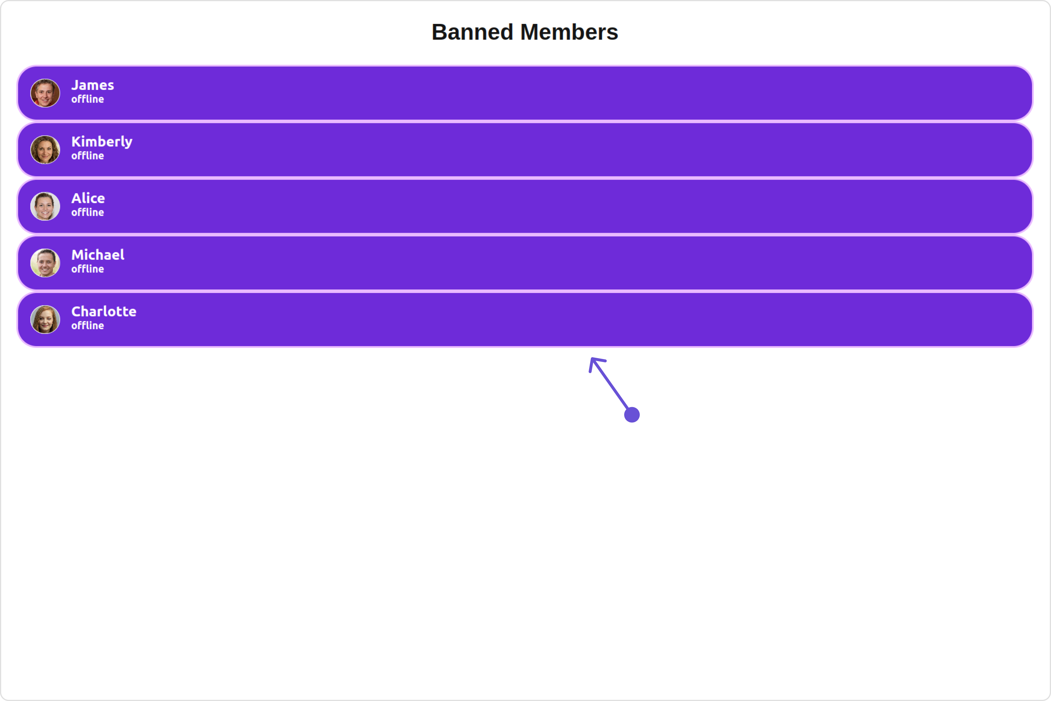
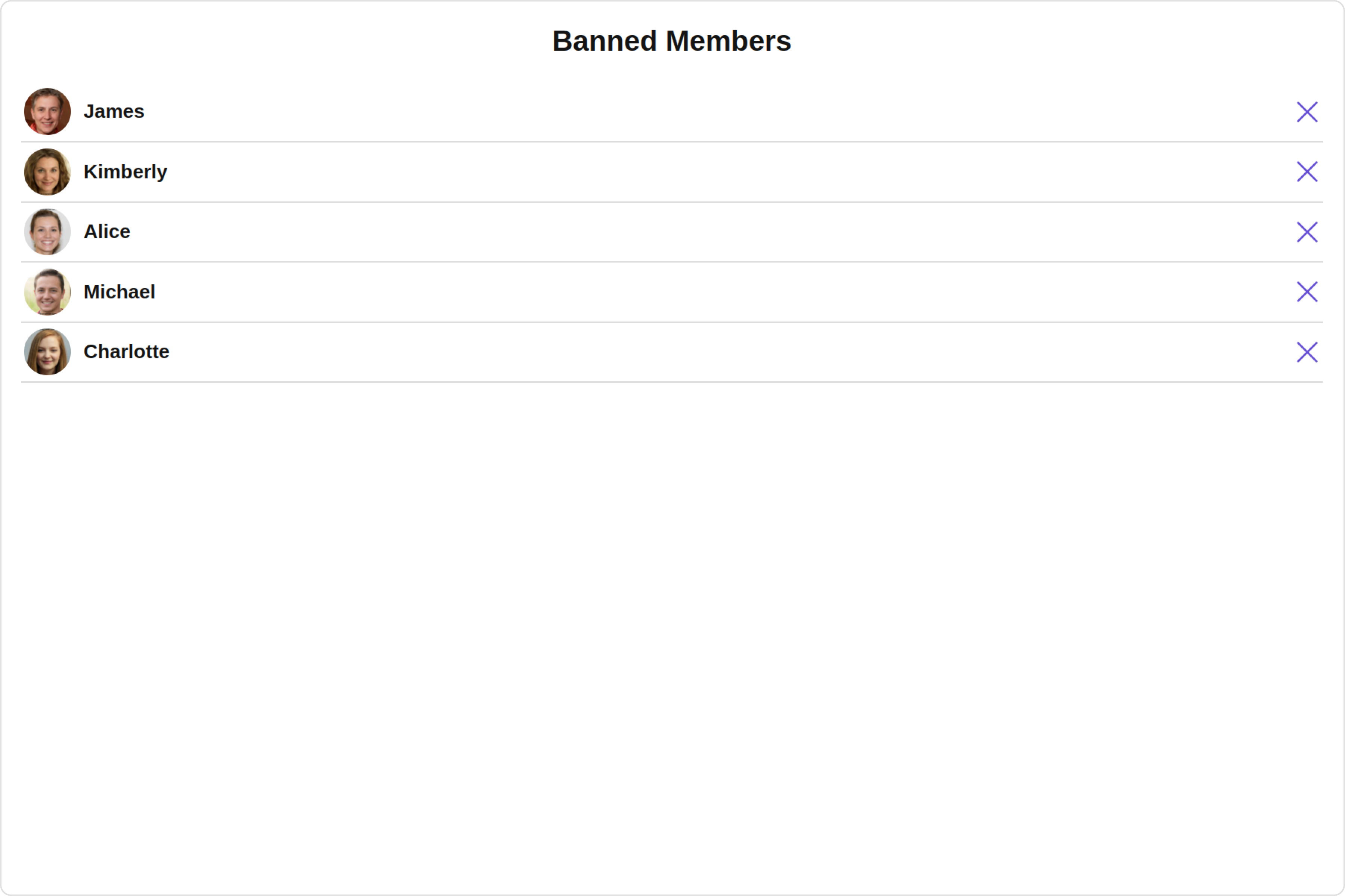
ListItemView With this property, you can assign a custom ListItem to the Banned Members Component.
Example Default:
Custom:
app.component.ts
app.component.html
import { CometChat } from '@cometchat/chat-sdk-javascript' ; import { Component , OnInit } from '@angular/core' ; import { CometChatThemeService , CometChatUIKit } from '@cometchat/chat-uikit-angular' ; import "@cometchat/uikit-elements" ; @ Component ({ selector: 'app-root' , templateUrl: './app.component.html' , styleUrls: [ './app.component.css' ] }) export class AppComponent { public groupObject !: CometChat . Group ; ngOnInit () : void { CometChat . getGroup ( "guid" ). then (( group : CometChat . Group ) => { this . groupObject = group ; }); } constructor ( private themeService : CometChatThemeService ) { themeService . theme . palette . setMode ( "light" ) themeService . theme . palette . setPrimary ({ light: "#6851D6" , dark: "#6851D6" }) } onLogin ( UID ?: any ) { CometChatUIKit . login ({ uid: UID }). then ( ( user ) => { setTimeout (() => { window . location . reload (); }, 1000 ); }, ( error ) => { console . log ( "Login failed with exception:" , { error }); } ); } }
< div class = "fullwidth" > < cometchat-banned-members *ngIf = "groupObject" [group] = "groupObject" [listItemView] = "listItemViewTemplate" ></ cometchat-banned-members > </ div > < ng-template #listItemViewTemplate let-user > < div [ngStyle] = "{ display: 'flex', alignItems: 'left', padding: '10px', border: '2px solid #e9baff', borderRadius: '20px', background: '#ffffff' }" > < cometchat-avatar [image] = "user.getAvatar()" [name] = "user.getName()" ></ cometchat-avatar > < div [ngStyle] = "{ display: 'flex', paddingLeft: '10px' }" > < div [ngStyle] = "{ fontWeight: 'bold', color: '#937aff', fontSize: '14px', marginTop: '5px' }" > {{ user.getName() }} < div [ngStyle] = "{ color: '#cfc4ff', fontSize: '10px', textAlign: 'left' }" > {{ user.getStatus() }} </ div > </ div > </ div > </ div > </ ng-template >
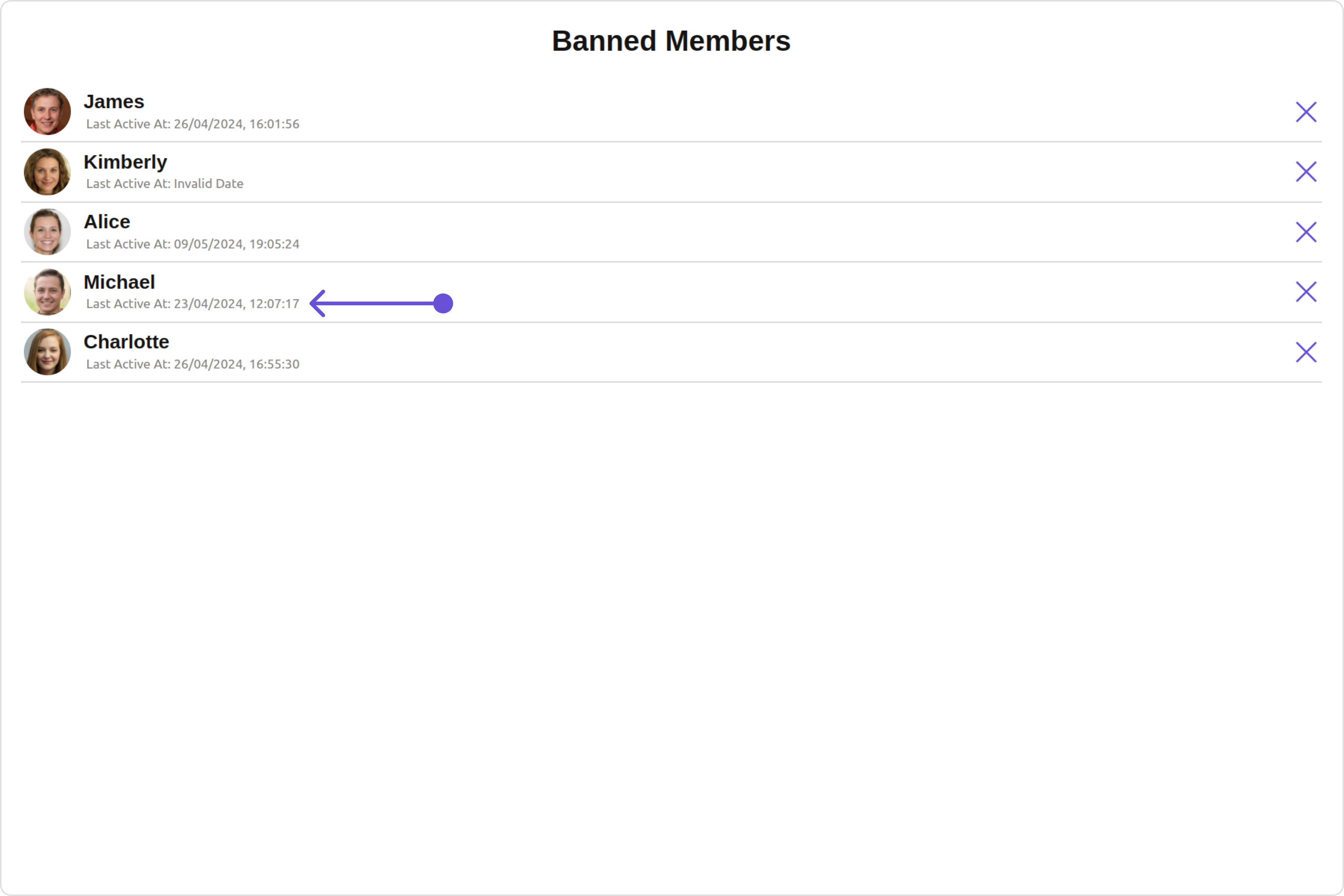
SubtitleView You can customize the subtitle view for each banned members to meet your requirements
Default:
Custom:
app.component.ts
app.component.html
import { CometChat } from '@cometchat/chat-sdk-javascript' ; import { Component , OnInit } from '@angular/core' ; import { CometChatThemeService , CometChatUIKit } from '@cometchat/chat-uikit-angular' ; import "@cometchat/uikit-elements" ; @ Component ({ selector: 'app-root' , templateUrl: './app.component.html' , styleUrls: [ './app.component.css' ] }) export class AppComponent { public groupObject !: CometChat . Group ; ngOnInit () : void { CometChat . getGroup ( "guid" ). then (( group : CometChat . Group ) => { this . groupObject = group ; }); } constructor ( private themeService : CometChatThemeService ) { themeService . theme . palette . setMode ( "light" ) themeService . theme . palette . setPrimary ({ light: "#6851D6" , dark: "#6851D6" }) } onLogin ( UID ?: any ) { CometChatUIKit . login ({ uid: UID }). then ( ( user ) => { setTimeout (() => { window . location . reload (); }, 1000 ); }, ( error ) => { console . log ( "Login failed with exception:" , { error }); } ); } }
< div class = "fullwidth" > < cometchat-banned-members *ngIf = "groupObject" [group] = "groupObject" [subtitleView] = "subtitleTemplate" ></ cometchat-banned-members > </ div > < ng-template #subtitleTemplate > < div style = "display: flex; align-items: left; padding: 10px; font-size: 10px;" > your custom subtitle view </ div > </ ng-template >
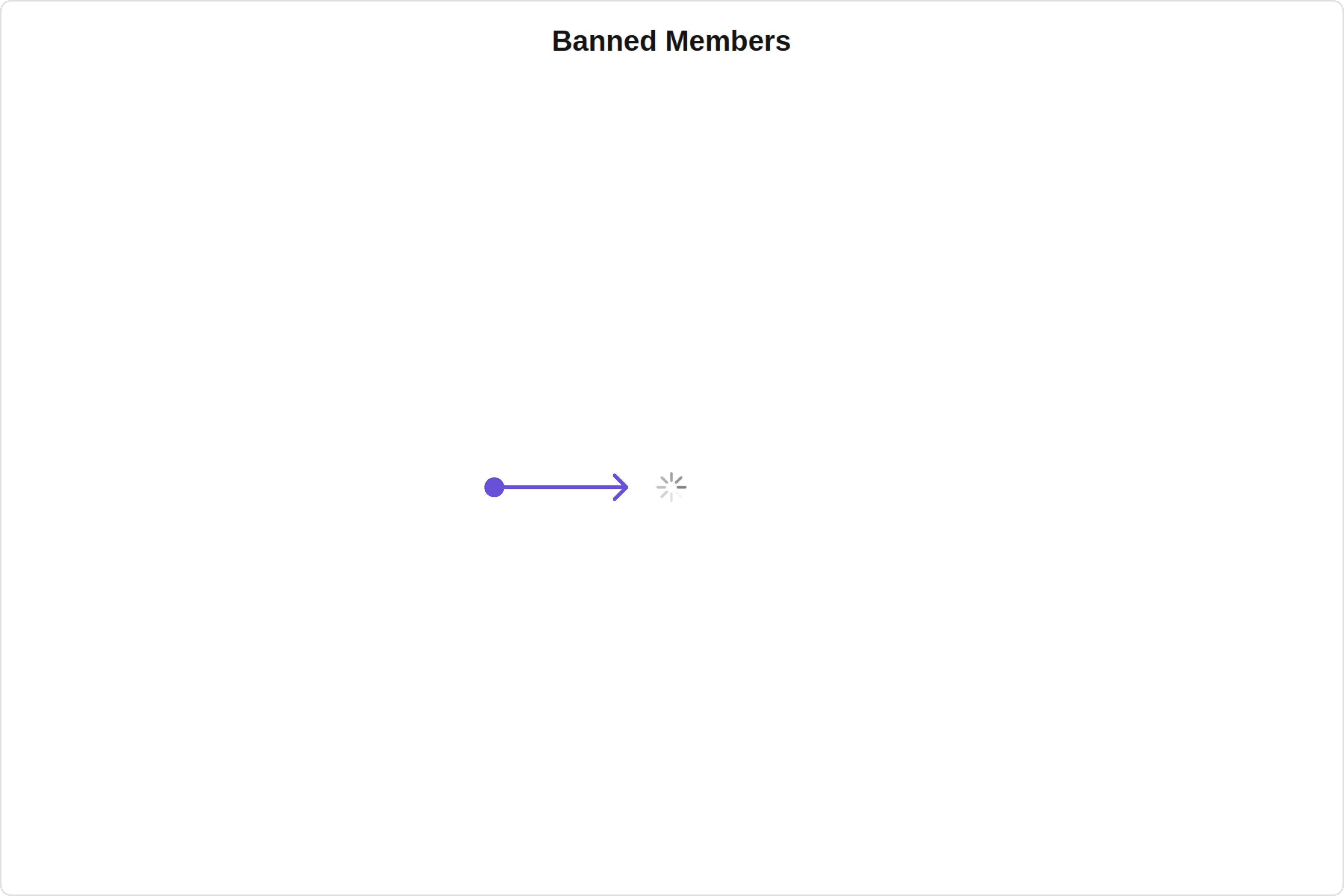
LoadingStateView You can set a custom loader view using loadingStateView to match the loading view of your app.
Default:
Custom:
app.component.ts
app.component.html
import { CometChat } from '@cometchat/chat-sdk-javascript' ; import { Component , OnInit } from '@angular/core' ; import { CometChatThemeService , CometChatUIKit , LoaderStyle } from '@cometchat/chat-uikit-angular' ; import "@cometchat/uikit-elements" ; @ Component ({ selector: 'app-root' , templateUrl: './app.component.html' , styleUrls: [ './app.component.css' ] }) export class AppComponent { public groupObject !: CometChat . Group ; ngOnInit () : void { CometChat . getGroup ( "guid" ). then (( group : CometChat . Group ) => { this . groupObject = group ; }); } getLoaderStyle : LoaderStyle = new LoaderStyle ({ iconTint: "red" , background: "transparent" , height: "20px" , width: "20px" , border: "none" , borderRadius: "0" , }); constructor ( private themeService : CometChatThemeService ) { themeService . theme . palette . setMode ( "light" ) themeService . theme . palette . setPrimary ({ light: "#6851D6" , dark: "#6851D6" }) } onLogin ( UID ?: any ) { CometChatUIKit . login ({ uid: UID }). then ( ( user ) => { setTimeout (() => { window . location . reload (); }, 1000 ); }, ( error ) => { console . log ( "Login failed with exception:" , { error }); } ); } }
< div class = "fullwidth" > < cometchat-banned-members *ngIf = "groupObject" [group] = "groupObject" [loadingStateView] = "loadingStateView" ></ cometchat-banned-members > </ div > < ng-template #loadingStateView > < cometchat-loader iconURL = "icon" [loaderStyle] = "getLoaderStyle" ></ cometchat-loader > </ ng-template >
EmptyStateView You can set a custom EmptyStateView using emptyStateView to match the empty view of your app.
Default:
Custom:
app.component.ts
app.component.html
import { CometChat } from '@cometchat/chat-sdk-javascript' ; import { Component , OnInit } from '@angular/core' ; import { CometChatThemeService , CometChatUIKit } from '@cometchat/chat-uikit-angular' ; import "@cometchat/uikit-elements" ; @ Component ({ selector: 'app-root' , templateUrl: './app.component.html' , styleUrls: [ './app.component.css' ] }) export class AppComponent { public groupObject !: CometChat . Group ; ngOnInit () : void { CometChat . getGroup ( "guid" ). then (( group : CometChat . Group ) => { this . groupObject = group ; }); } constructor ( private themeService : CometChatThemeService ) { themeService . theme . palette . setMode ( "light" ) themeService . theme . palette . setPrimary ({ light: "#6851D6" , dark: "#6851D6" }) } onLogin ( UID ?: any ) { CometChatUIKit . login ({ uid: UID }). then ( ( user ) => { setTimeout (() => { window . location . reload (); }, 1000 ); }, ( error ) => { console . log ( "Login failed with exception:" , { error }); } ); } }
< div class = "fullwidth" > < cometchat-banned-members *ngIf = "groupObject" [group] = "groupObject" [emptyStateView] = "emptyStateView" ></ cometchat-banned-members > </ div > < ng-template #emptyStateView > < div > Your Custom Empty State </ div > </ ng-template >
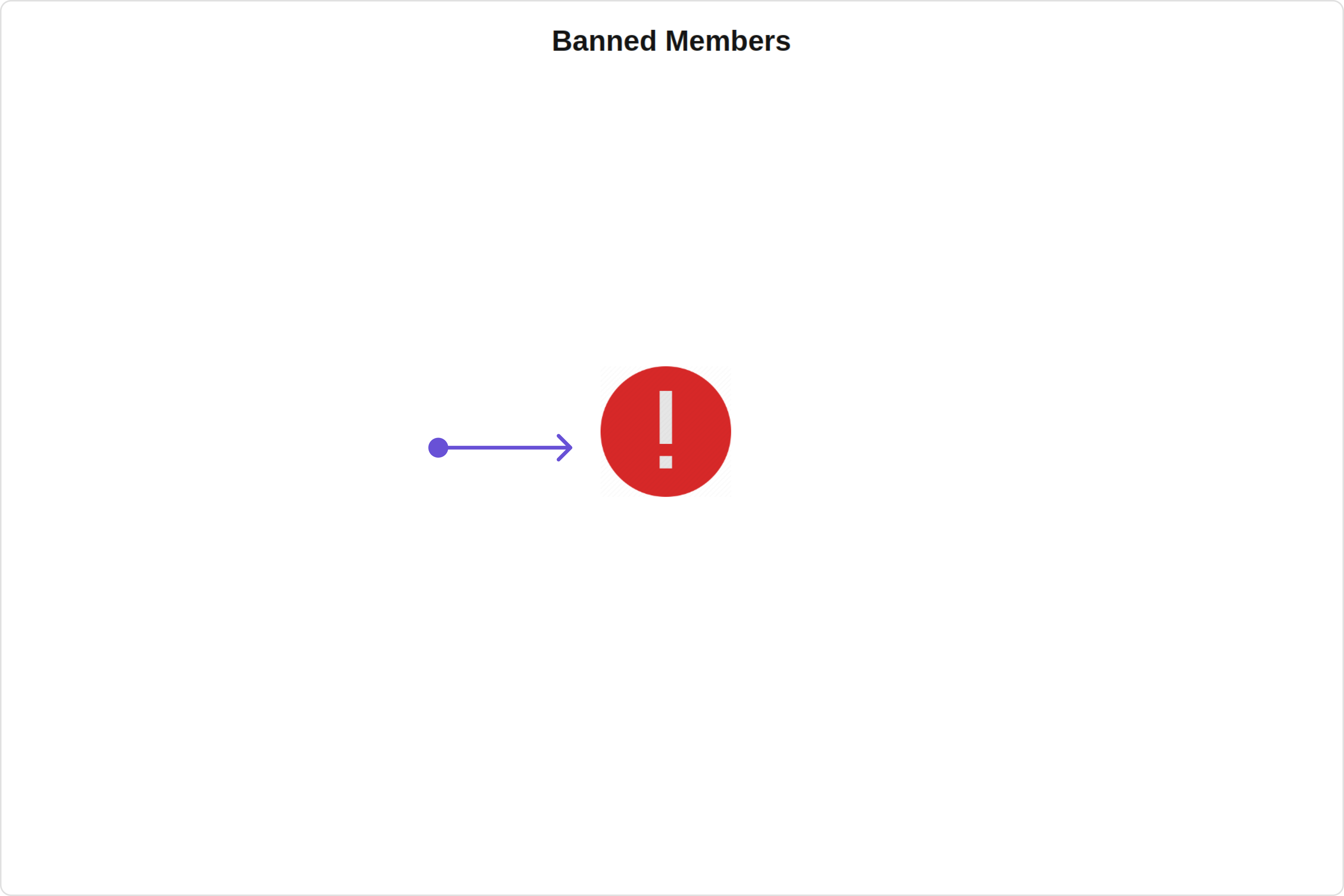
ErrorStateView You can set a custom ErrorStateView using errorStateView to match the error view of your app.
Default:
Custom:
app.component.ts
app.component.html
import { CometChat } from '@cometchat/chat-sdk-javascript' ; import { Component , OnInit } from '@angular/core' ; import { CometChatThemeService , CometChatUIKit } from '@cometchat/chat-uikit-angular' ; import "@cometchat/uikit-elements" ; @ Component ({ selector: 'app-root' , templateUrl: './app.component.html' , styleUrls: [ './app.component.css' ] }) export class AppComponent { public groupObject !: CometChat . Group ; ngOnInit () : void { CometChat . getGroup ( "guid" ). then (( group : CometChat . Group ) => { this . groupObject = group ; }); } constructor ( private themeService : CometChatThemeService ) { themeService . theme . palette . setMode ( "light" ) themeService . theme . palette . setPrimary ({ light: "#6851D6" , dark: "#6851D6" }) } onLogin ( UID ?: any ) { CometChatUIKit . login ({ uid: UID }). then ( ( user ) => { setTimeout (() => { window . location . reload (); }, 1000 ); }, ( error ) => { console . log ( "Login failed with exception:" , { error }); } ); } }
< div class = "fullwidth" > < cometchat-banned-members *ngIf = "groupObject" [group] = "groupObject" [errorStateView] = "errorStateView" ></ cometchat-banned-members > </ div > < ng-template #errorStateView > < div style = "height: 100vh; width: 100vw" > < img src = "icon" alt = "error icon" style = "height:100px; width: 100px; justify-content: center; margin-top: 250px; margin-right: 700px;" /> </ div > </ ng-template >
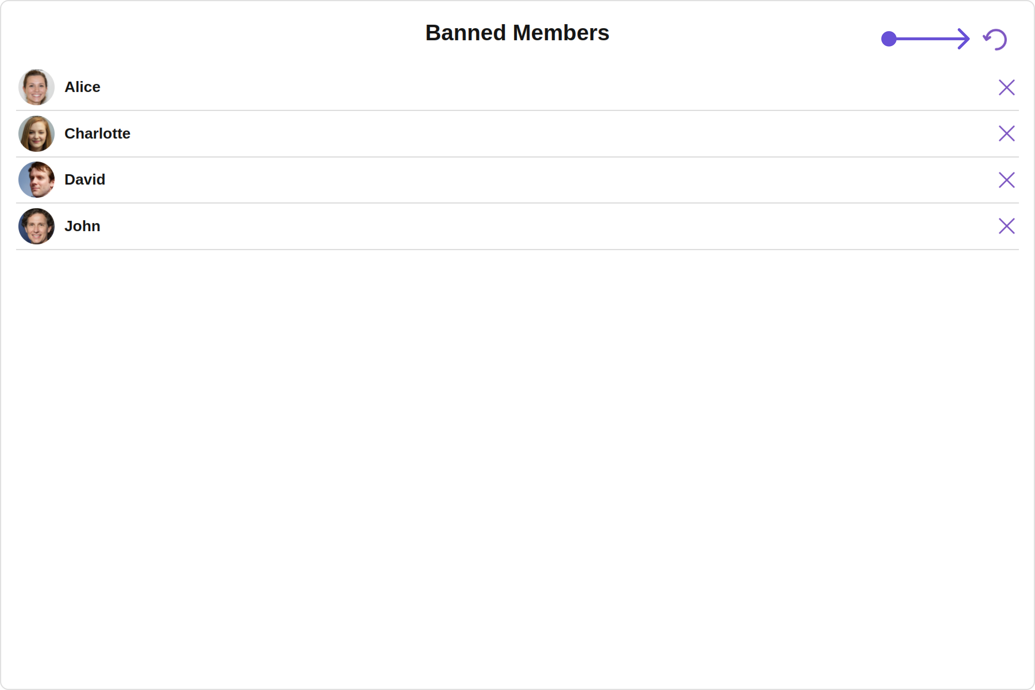
You can set the Custom Menu view to add more options to the Banned Members component.
app.component.ts
app.component.html
import { CometChat } from '@cometchat/chat-sdk-javascript' ; import { Component , OnInit } from '@angular/core' ; import { CometChatThemeService , CometChatUIKit } from '@cometchat/chat-uikit-angular' ; import "@cometchat/uikit-elements" ; @ Component ({ selector: 'app-root' , templateUrl: './app.component.html' , styleUrls: [ './app.component.css' ] }) export class AppComponent { public groupObject !: CometChat . Group ; ngOnInit () : void { CometChat . getGroup ( "guid" ). then (( group : CometChat . Group ) => { this . groupObject = group ; }); } handleReload () : void { window . location . reload (); } getButtonStyle () { return { height: '20px' , width: '20px' , border: 'none' , borderRadius: '0' , background: 'transparent' }; } getButtonIconStyle () { return { color: '#7E57C2' }; } constructor ( private themeService : CometChatThemeService ) { themeService . theme . palette . setMode ( "light" ) themeService . theme . palette . setPrimary ({ light: "#6851D6" , dark: "#6851D6" }) } onLogin ( UID ?: any ) { CometChatUIKit . login ({ uid: UID }). then ( ( user ) => { setTimeout (() => { window . location . reload (); }, 1000 ); }, ( error ) => { console . log ( "Login failed with exception:" , { error }); } ); } }
< div class = "fullwidth" > < cometchat-banned-members *ngIf = "groupObject" [group] = "groupObject" [menu] = "menuTemplate" ></ cometchat-banned-members > </ div > < ng-template #menuTemplate > < div style = "margin-right: 20px;" > < button [ngStyle] = "getButtonStyle()" (click) = "handleReload()" > < img src = "img" [ngStyle] = "getButtonIconStyle()" alt = "Reload Icon" /> </ button > </ div > </ ng-template >
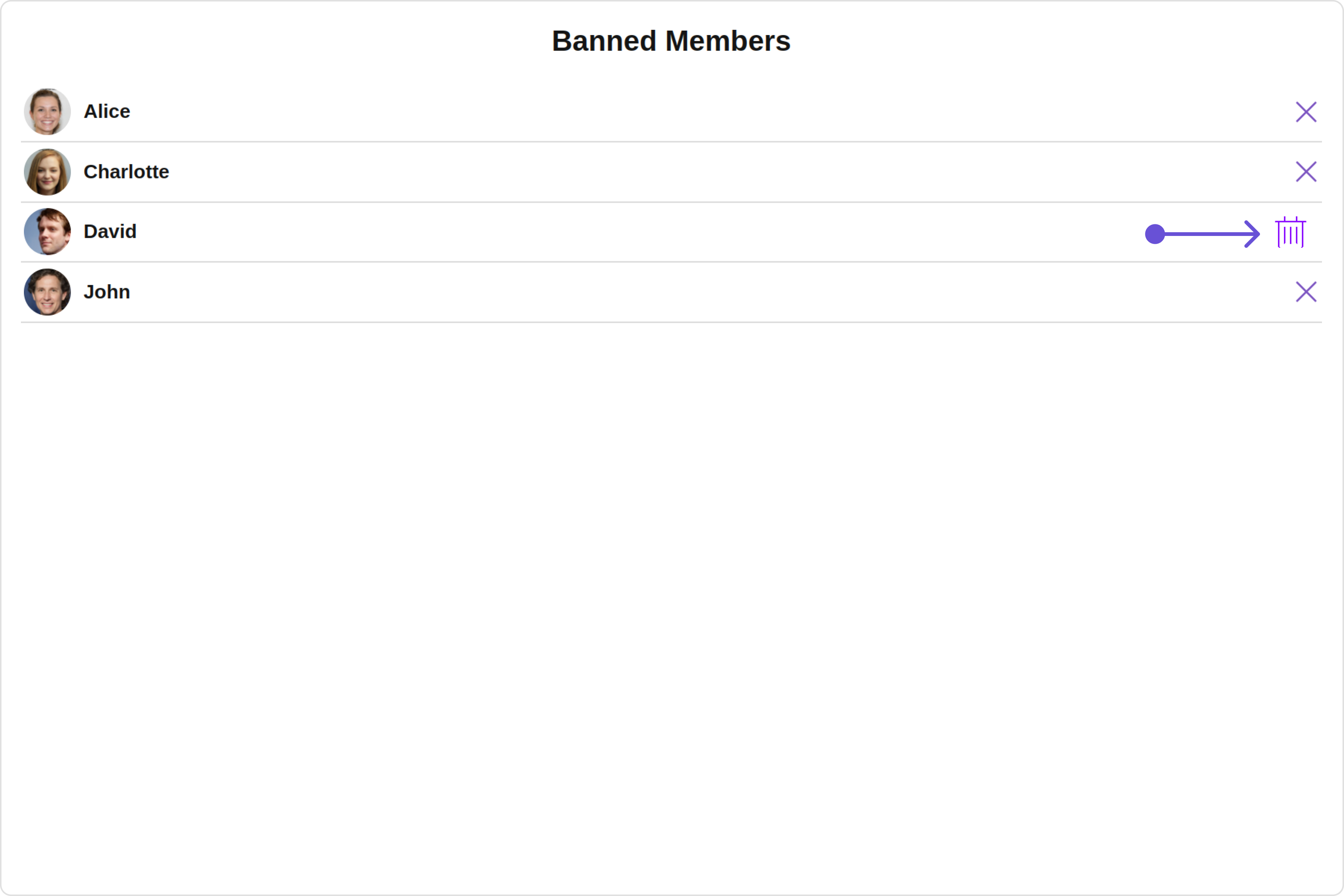
Options You can set the Custom options to the Banned Members component.
app.component.ts
app.component.html
import { CometChat } from '@cometchat/chat-sdk-javascript' ; import { Component , OnInit } from '@angular/core' ; import { CometChatThemeService , CometChatUIKit } from '@cometchat/chat-uikit-angular' ; import { CometChatOption } from '@cometchat/uikit-resources' ; import "@cometchat/uikit-elements" ; @ Component ({ selector: 'app-root' , templateUrl: './app.component.html' , styleUrls: [ './app.component.css' ] }) export class AppComponent { public groupObject !: CometChat . Group ; ngOnInit () : void { CometChat . getGroup ( "guid" ). then (( group : CometChat . Group ) => { this . groupObject = group ; }); } getOptions = ( user : any ) => { const customOptions = [ new CometChatOption ({ id: "1" , title: "Title" , iconURL: icon , iconTint: 'green' , backgroundColor: "transparent" , onClick : () => { console . log ( "Custom option clicked for user:" , user ); }, }), ]; return customOptions ; }; constructor ( private themeService : CometChatThemeService ) { themeService . theme . palette . setMode ( "light" ) themeService . theme . palette . setPrimary ({ light: "#6851D6" , dark: "#6851D6" }) } onLogin ( UID ?: any ) { CometChatUIKit . login ({ uid: UID }). then ( ( user ) => { setTimeout (() => { window . location . reload (); }, 1000 ); }, ( error ) => { console . log ( "Login failed with exception:" , { error }); } ); } }
< div class = "fullwidth" > < cometchat-banned-members *ngIf = "groupObject" [group] = "groupObject" [options] = "getOptions" ></ cometchat-banned-members > </ div >

