Overview
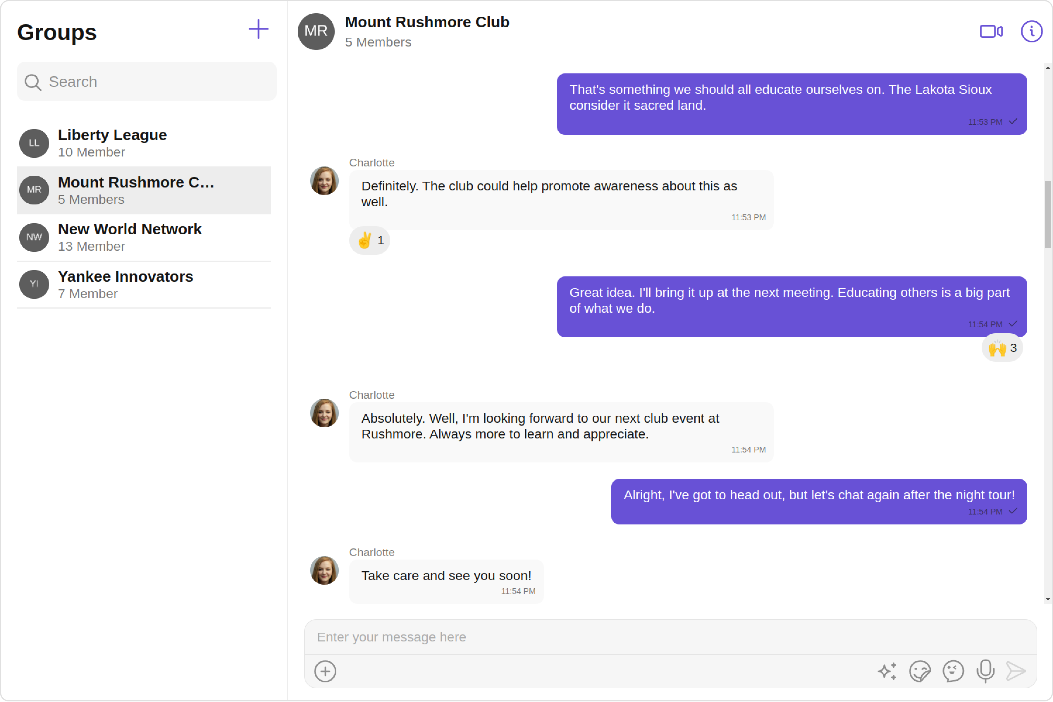
The GroupsWithMessages is a Composite Component encompassing components such as Groups and Messages. Both of these component contributes to the functionality and structure of the overall GroupsWithMessages component.
| Components | Description |
|---|
| Groups | The Groups component is designed to display a list of Groups. This essentially represents the recent conversation history. |
| Messages | The Messages component is designed to manage the messaging interaction for Group's conversations. |
Usage
Integration
app.module.ts
app.component.ts
app.component.html
import { CUSTOM_ELEMENTS_SCHEMA, NgModule } from "@angular/core";
import { BrowserModule } from "@angular/platform-browser";
import { CometChatGroups } from "@cometchat/chat-uikit-angular";
import { AppComponent } from "./app.component";

@NgModule({
  imports: [BrowserModule, CometChatGroups],
  declarations: [AppComponent],
  providers: [],
  bootstrap: [AppComponent],
  schemas: [CUSTOM_ELEMENTS_SCHEMA],
})
export class AppModule {}
import { Component, OnInit } from '@angular/core';
import {  CometChatThemeService, CometChatUIKit } from '@cometchat/chat-uikit-angular';
import "@cometchat/uikit-elements";

@Component({
  selector: 'app-root',
  templateUrl: './app.component.html',
  styleUrls: ['./app.component.css']
})
export class AppComponent {

  title = 'angular-app';
  constructor(private themeService:CometChatThemeService) {
    themeService.theme.palette.setMode("light")
    themeService.theme.palette.setPrimary({ light: "#6851D6", dark: "#6851D6" })
  }

  onLogin(UID?: any) {
    CometChatUIKit.login({ uid: UID }).then(
      (user) => {
        setTimeout(() => {
          window.location.reload();
        }, 1000);
      },
      (error) => {
        console.log("Login failed with exception:", { error });
      }
    );
  }
}
<div class="fullwidth">
  <cometchat-groups-with-messages></cometchat-groups-with-messages>
</div>
Actions
Actions dictate how a component functions. They are divided into two types: Predefined and User-defined. You can override either type, allowing you to tailor the behavior of the component to fit your specific needs.
1. onError
This action doesn’t change the behavior of the component but rather listens for any errors that occur in the GroupsWithMessages component.
app.component.ts
app.component.html
import { CometChat } from '@cometchat/chat-sdk-javascript';
import { Component, OnInit } from '@angular/core';
import {  CometChatThemeService, CometChatUIKit } from '@cometchat/chat-uikit-angular';
import "@cometchat/uikit-elements";

@Component({
  selector: 'app-root',
  templateUrl: './app.component.html',
  styleUrls: ['./app.component.css']
})
export class AppComponent {

  public handleOnError = (error: CometChat.CometChatException) => {
    console.log("your custom on error action", error);
  };
  constructor(private themeService:CometChatThemeService) {
    themeService.theme.palette.setMode("light")
    themeService.theme.palette.setPrimary({ light: "#6851D6", dark: "#6851D6" })
  }

  onLogin(UID?: any) {
    CometChatUIKit.login({ uid: UID }).then(
      (user) => {
        setTimeout(() => {
          window.location.reload();
        }, 1000);
      },
      (error) => {
        console.log("Login failed with exception:", { error });
      }
    );
  }
}
<div class="fullwidth">
  <cometchat-groups-with-messages
    [onError]="handleOnError"
  ></cometchat-groups-with-messages>
</div>
app.component.ts
app.component.html
import { CometChat } from '@cometchat/chat-sdk-javascript';
import { Component, OnInit } from '@angular/core';
import {  CometChatThemeService, CometChatUIKit } from '@cometchat/chat-uikit-angular';
import { MessagesConfiguration, MessageHeaderConfiguration, GroupsConfiguration } from '@cometchat/uikit-shared';
import "@cometchat/uikit-elements";

@Component({
  selector: 'app-root',
  templateUrl: './app.component.html',
  styleUrls: ['./app.component.css']
})
export class AppComponent {

  public handleOnItemClickGroup = (group: CometChat.Group)=> {
    console.log("your custom on item click action", group);
  };
  public handleOnBack = () => {
    console.log("Your custom on back action");
  };
  groupsConfiguration = new GroupsConfiguration({
    onItemClick: this.handleOnItemClickGroup
  });
  public messagesConfiguration = new MessagesConfiguration({
    messageHeaderConfiguration: new MessageHeaderConfiguration({
      onBack:this.handleOnBack
    })
  });
  constructor(private themeService:CometChatThemeService) {
    themeService.theme.palette.setMode("light")
    themeService.theme.palette.setPrimary({ light: "#6851D6", dark: "#6851D6" })
  }

  onLogin(UID?: any) {
    CometChatUIKit.login({ uid: UID }).then(
      (user) => {
        setTimeout(() => {
          window.location.reload();
        }, 1000);
      },
      (error) => {
        console.log("Login failed with exception:", { error });
      }
    );
  }
}
<div class="fullwidth">
  <cometchat-groups-with-messages
    [groupsConfiguration]="groupsConfiguration"
    [messagesConfiguration]="messagesConfiguration"
  ></cometchat-groups-with-messages>
</div>
- OnItemClick : By overriding the
OnItemClick of the Groups Component, GroupsWithMessages achieves navigation from Groups to Messages component.
Fliters
Filters allow you to customize the data displayed in a list within a Component. You can filter the list based on your specific criteria, allowing for a more customized. Filters can be applied using RequestBuilders of Chat SDK.
While the GroupsWithMessages component does not have filters, its components do, For more detail on individual filters of its component refer to Groups Filters and Messages Filters.
By utilizing the Configurations object of its components, you can apply filters.
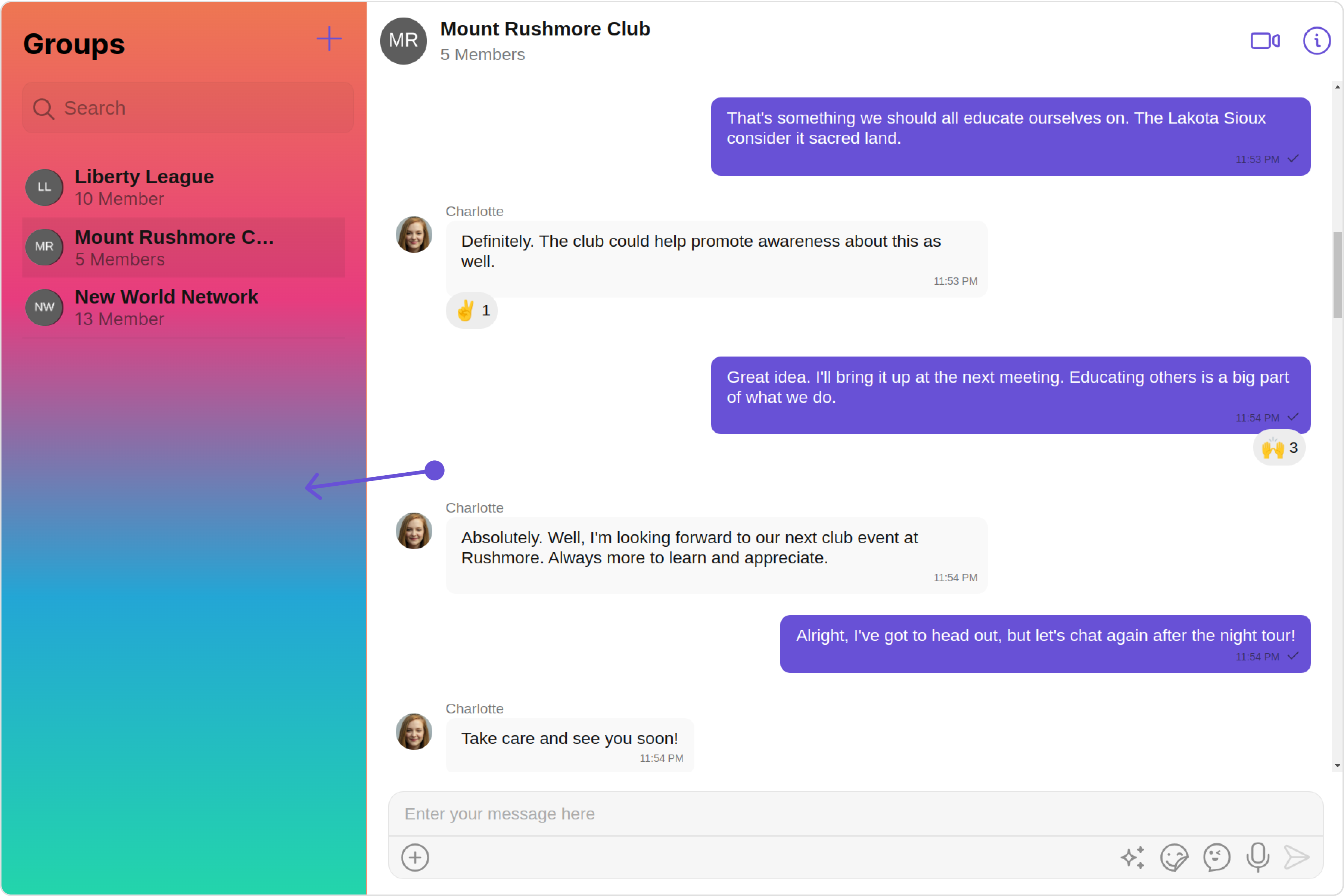
In the following example, we are applying a filter to the Group List based on only joined groups and setting the limit to 3 using the groupsRequestBuilder.
app.component.ts
app.component.html
import { CometChat } from '@cometchat/chat-sdk-javascript';
import { Component, OnInit } from '@angular/core';
import {  CometChatThemeService, CometChatUIKit } from '@cometchat/chat-uikit-angular';
import { GroupsConfiguration } from '@cometchat/uikit-shared';
import "@cometchat/uikit-elements";

@Component({
  selector: 'app-root',
  templateUrl: './app.component.html',
  styleUrls: ['./app.component.css']
})
export class AppComponent {

  groupsRequestBuilder = new CometChat.GroupsRequestBuilder().setLimit(4).joinedOnly(true);
  groupsConfiguration = new GroupsConfiguration({
    groupsRequestBuilder:this.groupsRequestBuilder
  });
  constructor(private themeService:CometChatThemeService) {
    themeService.theme.palette.setMode("light")
    themeService.theme.palette.setPrimary({ light: "#6851D6", dark: "#6851D6" })
  }

  onLogin(UID?: any) {
    CometChatUIKit.login({ uid: UID }).then(
      (user) => {
        setTimeout(() => {
          window.location.reload();
        }, 1000);
      },
      (error) => {
        console.log("Login failed with exception:", { error });
      }
    );
  }
}
<div class="fullwidth">
  <cometchat-groups-with-messages
    [groupsConfiguration]="groupsConfiguration"
  ></cometchat-groups-with-messages>
</div>
Events
Events are emitted by a Component. By using event you can extend existing functionality. Being global events, they can be applied in Multiple Locations and are capable of being Added or Removed.
The GroupsWithMessages does not produce any events but its component does.
Customization
To fit your app’s design requirements, you have the ability to customize the appearance of the GroupsWithMessages component. We provide exposed methods that allow you to modify the experience and behavior according to your specific needs.
Style
Using Style you can customize the look and feel of the component in your app, These parameters typically control elements such as the color, size, shape, and fonts used within the component.
1. GroupsWithMessages Style
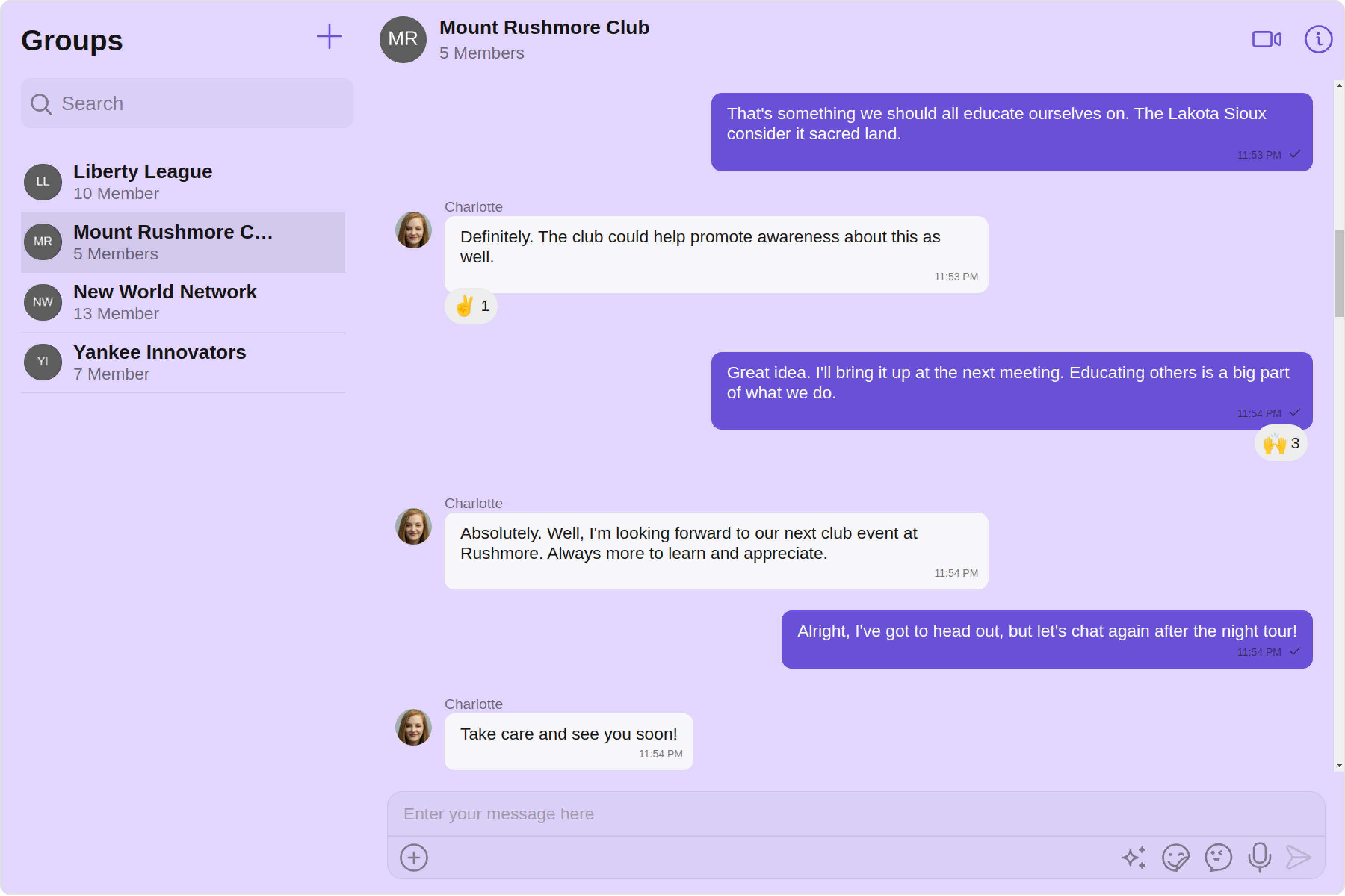
You can set the groupsWithMessagesStyle to the GroupsWithMessages Component to customize the styling.
app.component.ts
app.component.html
import { CometChat } from '@cometchat/chat-sdk-javascript';
import { Component, OnInit } from '@angular/core';
import {  CometChatThemeService, CometChatUIKit } from '@cometchat/chat-uikit-angular';
import { WithMessagesStyle } from '@cometchat/uikit-shared';
import "@cometchat/uikit-elements";

@Component({
  selector: 'app-root',
  templateUrl: './app.component.html',
  styleUrls: ['./app.component.css']
})
export class AppComponent {

  groupsWithMessagesStyle = new WithMessagesStyle({
    background: "#e2d6ff",
    messageTextColor: "#000000",
    borderRadius: "12px",
  });
  constructor(private themeService:CometChatThemeService) {
    themeService.theme.palette.setMode("light")
    themeService.theme.palette.setPrimary({ light: "#6851D6", dark: "#6851D6" })
  }

  onLogin(UID?: any) {
    CometChatUIKit.login({ uid: UID }).then(
      (user) => {
        setTimeout(() => {
          window.location.reload();
        }, 1000);
      },
      (error) => {
        console.log("Login failed with exception:", { error });
      }
    );
  }
}
<div class="fullwidth">
  <cometchat-groups-with-messages
    [groupsWithMessagesStyle]="groupsWithMessagesStyle"
  ></cometchat-groups-with-messages>
</div>
You can also customize its component styles. For more details on individual component styles, you can refer Groups Styles and Messages Styles.
Styles can be applied to SubComponents using their respective configurations.
Example
app.component.ts
app.component.html
import { CometChat } from '@cometchat/chat-sdk-javascript';
import { Component, OnInit } from '@angular/core';
import {  CometChatThemeService, CometChatUIKit } from '@cometchat/chat-uikit-angular';
import { MessagesConfiguration, MessagesStyle, GroupsStyle, GroupsConfiguration } from '@cometchat/uikit-shared';
import "@cometchat/uikit-elements";

@Component({
  selector: 'app-root',
  templateUrl: './app.component.html',
  styleUrls: ['./app.component.css']
})
export class AppComponent {

  groupsStyle = new GroupsStyle({
    background: "#f7f2ff",
    titleTextColor: "#6414fa",
    searchTextColor: "#940be3",
    separatorColor: "#ffffff",
  });
  groupsConfiguration = new GroupsConfiguration({
    groupsStyle:this.groupsStyle
  });
  public messagesConfiguration = new MessagesConfiguration({
    messagesStyle: new MessagesStyle({
    width: "100%",
    height: "100%",
    border: "3px solid #cb1fff",
    background: "#f7f2ff",
    }),
  });
  constructor(private themeService:CometChatThemeService) {
    themeService.theme.palette.setMode("light")
    themeService.theme.palette.setPrimary({ light: "#6851D6", dark: "#6851D6" })
  }

  onLogin(UID?: any) {
    CometChatUIKit.login({ uid: UID }).then(
      (user) => {
        setTimeout(() => {
          window.location.reload();
        }, 1000);
      },
      (error) => {
        console.log("Login failed with exception:", { error });
      }
    );
  }
}
<div class="fullwidth">
  <cometchat-groups-with-messages
    [groupsConfiguration]="groupsConfiguration"
    [messagesConfiguration]="messagesConfiguration"
  ></cometchat-groups-with-messages>
</div>
Functionality
These are a set of small functional customizations that allow you to fine-tune the overall experience of the component. With these, you can change text, set custom icons, and toggle the visibility of UI elements.
you can utilize the group method with a Group object as input to the GroupsWithMessages component. This will automatically direct you to the Messages component for the specified Group.
1. Group
app.component.ts
app.component.html
import { CometChat } from '@cometchat/chat-sdk-javascript';
import { Component, OnInit } from '@angular/core';
import {  CometChatThemeService, CometChatUIKit } from '@cometchat/chat-uikit-angular';
import { WithMessagesStyle } from '@cometchat/uikit-shared';
import "@cometchat/uikit-elements";

@Component({
  selector: 'app-root',
  templateUrl: './app.component.html',
  styleUrls: ['./app.component.css']
})
export class AppComponent {

  public groupObject!: CometChat.Group;
  ngOnInit(): void {
    CometChat.getGroup("guid").then((group: CometChat.Group) => {
      this.groupObject = group;
    });
  }
  constructor(private themeService:CometChatThemeService) {
    themeService.theme.palette.setMode("light")
    themeService.theme.palette.setPrimary({ light: "#6851D6", dark: "#6851D6" })
  }

  onLogin(UID?: any) {
    CometChatUIKit.login({ uid: UID }).then(
      (user) => {
        setTimeout(() => {
          window.location.reload();
        }, 1000);
      },
      (error) => {
        console.log("Login failed with exception:", { error });
      }
    );
  }
}
<div class="fullwidth">
  <cometchat-groups-with-messages
    [group]="groupObject"
  ></cometchat-groups-with-messages>
</div>
| Property | Description | Code |
|---|
| isMobileView | A boolean indicating if the component should render in mobile view for optimized display on mobile devices. | [isMobileView]= "false" |
| group | Use the group property with a Group object as input for the GroupsWithMessages component to navigate directly to the Messages component for the specified Group. | [group]="groupObject" |
| messageText | It represents the textual content which will be replaced with the messages component when user clicks on a particular group chat. | [messageText]="'Your Custom Message Text'" |
Components
Nearly all functionality customizations available for a Component are also available for the composite component. Using Configuration, you can modify the properties of its components to suit your needs.
You can find the list of all Functionality customization of individual components in Groups and Messages.
Example
app.component.ts
app.component.html
import { CometChat } from '@cometchat/chat-sdk-javascript';
import { Component, OnInit } from '@angular/core';
import {  CometChatThemeService, CometChatUIKit } from '@cometchat/chat-uikit-angular';
import { MessagesConfiguration, GroupsConfiguration } from '@cometchat/uikit-shared';
import "@cometchat/uikit-elements";

@Component({
  selector: 'app-root',
  templateUrl: './app.component.html',
  styleUrls: ['./app.component.css']
})
export class AppComponent {

  groupsConfiguration = new GroupsConfiguration({
    hideSearch:true
  });
  public messagesConfiguration = new MessagesConfiguration({
    disableTyping: true,
    hideMessageHeader: true,
  });
  constructor(private themeService:CometChatThemeService) {
    themeService.theme.palette.setMode("light")
    themeService.theme.palette.setPrimary({ light: "#6851D6", dark: "#6851D6" })
  }

  onLogin(UID?: any) {
    CometChatUIKit.login({ uid: UID }).then(
      (user) => {
        setTimeout(() => {
          window.location.reload();
        }, 1000);
      },
      (error) => {
        console.log("Login failed with exception:", { error });
      }
    );
  }
}
<div class="fullwidth">
  <cometchat-groups-with-messages
    [groupsConfiguration]="groupsConfiguration"
    [messagesConfiguration]="messagesConfiguration"
  ></cometchat-groups-with-messages>
</div>
Advanced
For advanced-level customization, you can set custom views to the component. This lets you tailor each aspect of the component to fit your exact needs and application aesthetics. You can create and define your own views, layouts, and UI elements and then incorporate those into the component.
By utilizing the Configuration object of each component, you can apply advanced-level customizations to the GroupsWithMessages.
Example
app.component.ts
app.component.html
import { CometChat } from '@cometchat/chat-sdk-javascript';
import { Component, OnInit } from '@angular/core';
import {  CometChatThemeService, CometChatUIKit } from '@cometchat/chat-uikit-angular';
import { GroupsConfiguration } from '@cometchat/uikit-shared';
import "@cometchat/uikit-elements";

@Component({
  selector: 'app-root',
  templateUrl: './app.component.html',
  styleUrls: ['./app.component.css']
})
export class AppComponent {

  public groupsConfiguration!: GroupsConfiguration;
  @ViewChild('errorStateView', { static: true }) errorStateView!: TemplateRef<any>;
  ngOnInit(): void {
    this.groupsConfiguration = new GroupsConfiguration({
      errorStateView:this.errorStateView,
    });
  }
  constructor(private themeService:CometChatThemeService) {
    themeService.theme.palette.setMode("light")
    themeService.theme.palette.setPrimary({ light: "#6851D6", dark: "#6851D6" })
  }

  onLogin(UID?: any) {
    CometChatUIKit.login({ uid: UID }).then(
      (user) => {
        setTimeout(() => {
          window.location.reload();
        }, 1000);
      },
      (error) => {
        console.log("Login failed with exception:", { error });
      }
    );
  }
}
<div class="fullwidth">
  <cometchat-groups-with-messages
    [groupsConfiguration]="groupsConfiguration"
  ></cometchat-groups-with-messages>
</div>
<ng-template #errorStateView>
  <div style="height: 100vh; width: 100vw">
    <img
      src="icon"
      alt="error icon"
      style="height:100px; width: 100px; justify-content: center; margin-top: 250px; margin-right: 700px;"
    />
  </div>
</ng-template>
To find all the details on individual Component advance customization you can refer, Groups Advance and Messages Advance.
GroupsWithMessages uses advanced-level customization of both Groups & Messages components to achieve its default behavior.
- GroupsWithMessages utilizes the onItemClick property of the
Groups subcomponent to navigate the group from Groups to Messages
- GroupsWithMessages utilizes the menus of the
Messages subcomponent to navigate from Messages to Details
When you override onItemClick and menus, the default behavior of GroupsWithMessages will also be overridden.
Configurations
Configurations offer the ability to customize the properties of each component within a Composite Component.
GroupsWithMessages has Groups and Messages component. Hence, each of these components will have its individual `Configuration“.
Configurations expose properties that are available in its individual components.
Groups
You can customize the properties of the Groups component by making use of the groupsConfiguration.
All exposed properties of GroupsConfiguration can be found under Groups. Properties marked with the 🛑 symbol are not accessible within the Configuration Object.
Example
Let’s say you want to change the style of the Groups subcomponent and, in addition, you only want to display the Group List based on only joined groups and setting the limit to 3.
You can modify the style using the groupsStyle property and filter the list with the groupsRequestBuilder property.
app.component.ts
app.component.html
import { CometChat } from '@cometchat/chat-sdk-javascript';
import { Component, OnInit } from '@angular/core';
import {  CometChatThemeService, CometChatUIKit } from '@cometchat/chat-uikit-angular';
import { GroupsStyle, GroupsConfiguration } from '@cometchat/uikit-shared';
import "@cometchat/uikit-elements";

@Component({
  selector: 'app-root',
  templateUrl: './app.component.html',
  styleUrls: ['./app.component.css']
})
export class AppComponent {

  public groupsConfiguration!: GroupsConfiguration;
  groupsRequestBuilder = new CometChat.GroupsRequestBuilder().setLimit(3).joinedOnly(true)
  groupsStyle = new GroupsStyle({
    background: "#f7f2ff",
    titleTextColor: "#6414fa",
    searchTextColor: "#940be3",
    separatorColor: "#ffffff",
  });
  ngOnInit(): void {
    this.groupsConfiguration = new GroupsConfiguration({
      groupsRequestBuilder:this.groupsRequestBuilder,
      groupsStyle:this.groupsStyle,
    });
  }
  constructor(private themeService:CometChatThemeService) {
    themeService.theme.palette.setMode("light")
    themeService.theme.palette.setPrimary({ light: "#6851D6", dark: "#6851D6" })
  }

  onLogin(UID?: any) {
    CometChatUIKit.login({ uid: UID }).then(
      (user) => {
        setTimeout(() => {
          window.location.reload();
        }, 1000);
      },
      (error) => {
        console.log("Login failed with exception:", { error });
      }
    );
  }
}
<div class="fullwidth">
  <cometchat-groups-with-messages
    [groupsConfiguration]="groupsConfiguration"
  ></cometchat-groups-with-messages>
</div>
MessagesConfiguration can be found under Messages. Properties marked with the 🛑 symbol are not accessible within the Configuration Object.
Example
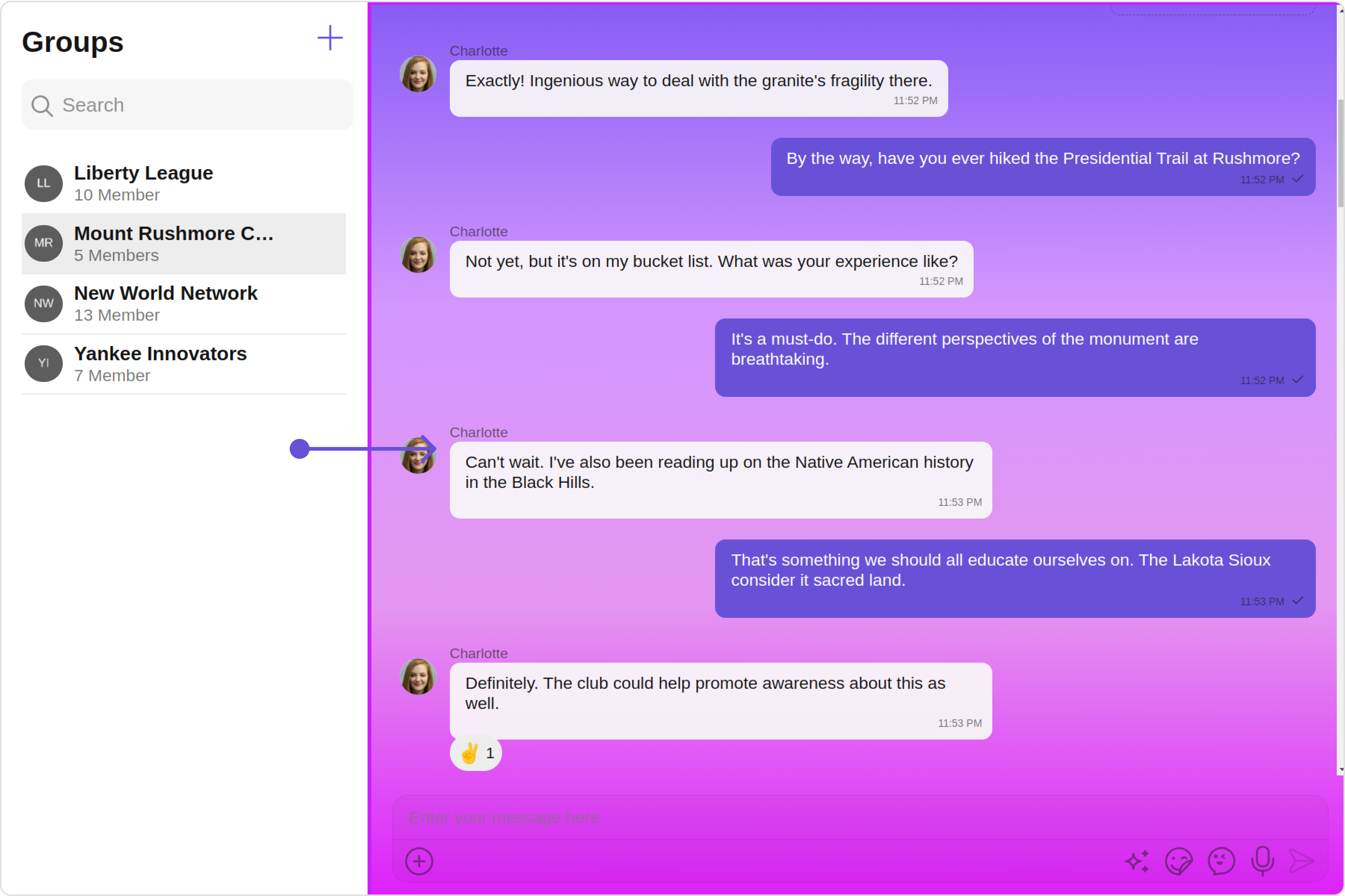
Let’s say you want to change the style of the Messages subcomponent and, in addition, you only want to hide message header.
You can modify the style using the messagesStyle property and hide the message header with the hideMessageHeader property.
app.component.ts
app.component.html
import { CometChat } from '@cometchat/chat-sdk-javascript';
import { Component, OnInit } from '@angular/core';
import {  CometChatThemeService, CometChatUIKit } from '@cometchat/chat-uikit-angular';
import { MessagesStyle, MessagesConfiguration } from '@cometchat/uikit-shared';
import "@cometchat/uikit-elements";

@Component({
  selector: 'app-root',
  templateUrl: './app.component.html',
  styleUrls: ['./app.component.css']
})
export class AppComponent {

  public messagesConfiguration = new MessagesConfiguration({
    hideMessageHeader: true,
    messagesStyle: new MessagesStyle({
    width: "100%",
    height: "100%",
    border: "3px solid #cb1fff",
    background: "linear-gradient(#885df5, #d396ff, #e497f0, #dd20fa)",
    }),
  });
  constructor(private themeService:CometChatThemeService) {
    themeService.theme.palette.setMode("light")
    themeService.theme.palette.setPrimary({ light: "#6851D6", dark: "#6851D6" })
  }

  onLogin(UID?: any) {
    CometChatUIKit.login({ uid: UID }).then(
      (user) => {
        setTimeout(() => {
          window.location.reload();
        }, 1000);
      },
      (error) => {
        console.log("Login failed with exception:", { error });
      }
    );
  }
}
<div class="fullwidth">
  <cometchat-groups-with-messages
    [messagesConfiguration]="messagesConfiguration"
  ></cometchat-groups-with-messages>
</div>
Join Group
You can customize the properties of the Join Group component by making use of the JoinGroupConfiguration. You can accomplish this by employing the joinGroupConfiguration props as demonstrated below:
All exposed properties of JoinGroupConfiguration can be found under Join Group. Properties marked with the 🛑 symbol are not accessible within the Configuration Object.
Example
Let’s say you want to change the style of the Join Group subcomponent.
You can modify the style using the joinGroupStyle property.
app.component.ts
app.component.html
import { CometChat } from '@cometchat/chat-sdk-javascript';
import { Component, OnInit } from '@angular/core';
import {  CometChatThemeService, CometChatUIKit, JoinGroupStyle } from '@cometchat/chat-uikit-angular';
import { JoinGroupConfiguration } from '@cometchat/uikit-shared';
import "@cometchat/uikit-elements";

@Component({
  selector: 'app-root',
  templateUrl: './app.component.html',
  styleUrls: ['./app.component.css']
})
export class AppComponent {

  joinGroupConfiguration = new JoinGroupConfiguration({
    joinGroupStyle: new JoinGroupStyle({
      background: "#e2d6ff",
      joinButtonBackground: "#cb1fff",
      joinButtonTextColor: "#000000",
    })
  });
  constructor(private themeService:CometChatThemeService) {
    themeService.theme.palette.setMode("light")
    themeService.theme.palette.setPrimary({ light: "#6851D6", dark: "#6851D6" })
  }

  onLogin(UID?: any) {
    CometChatUIKit.login({ uid: UID }).then(
      (user) => {
        setTimeout(() => {
          window.location.reload();
        }, 1000);
      },
      (error) => {
        console.log("Login failed with exception:", { error });
      }
    );
  }
}
<div class="fullwidth">
  <cometchat-groups-with-messages
    [joinGroupConfiguration]="joinGroupConfiguration"
  ></cometchat-groups-with-messages>
</div>
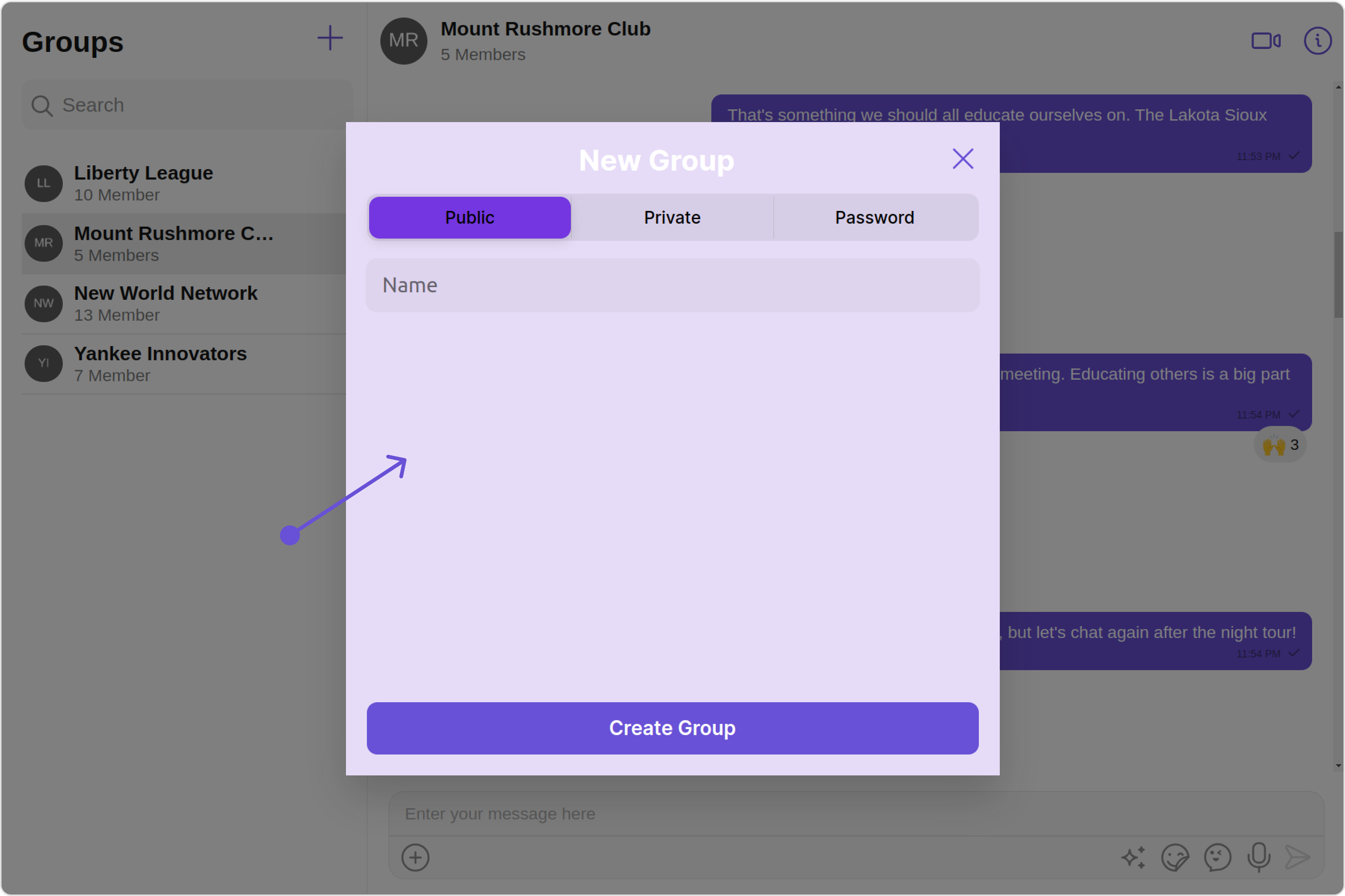
Create Group
You can customize the properties of the Create Group component by making use of the CreateGroupConfiguration. You can accomplish this by employing the createGroupConfiguration props as demonstrated below:
All exposed properties of CreateGroupConfiguration can be found under Create Group. Properties marked with the 🛑 symbol are not accessible within the Configuration Object.
Example
Let’s say you want to change the style of the Create Group subcomponent.
You can modify the style using the createGroupStyle property.
app.component.ts
app.component.html
import { CometChat } from '@cometchat/chat-sdk-javascript';
import { Component, OnInit } from '@angular/core';
import {  CometChatThemeService, CometChatUIKit, CreateGroupStyle } from '@cometchat/chat-uikit-angular';
import { CreateGroupConfiguration } from '@cometchat/uikit-shared';
import "@cometchat/uikit-elements";

@Component({
  selector: 'app-root',
  templateUrl: './app.component.html',
  styleUrls: ['./app.component.css']
})
export class AppComponent {

  createGroupConfiguration = new CreateGroupConfiguration({
    createGroupStyle: new CreateGroupStyle({
      background: "#e6dcf7",
      activeGroupTypeBackground: "#7436e0",
      titleTextColor: "#ffffff",
      height: "500px",
      width: "500px",
    })
  });
  constructor(private themeService:CometChatThemeService) {
    themeService.theme.palette.setMode("light")
    themeService.theme.palette.setPrimary({ light: "#6851D6", dark: "#6851D6" })
  }

  onLogin(UID?: any) {
    CometChatUIKit.login({ uid: UID }).then(
      (user) => {
        setTimeout(() => {
          window.location.reload();
        }, 1000);
      },
      (error) => {
        console.log("Login failed with exception:", { error });
      }
    );
  }
}
<div class="fullwidth">
  <cometchat-groups-with-messages
    [createGroupConfiguration]="createGroupConfiguration"
  ></cometchat-groups-with-messages>
</div>
