

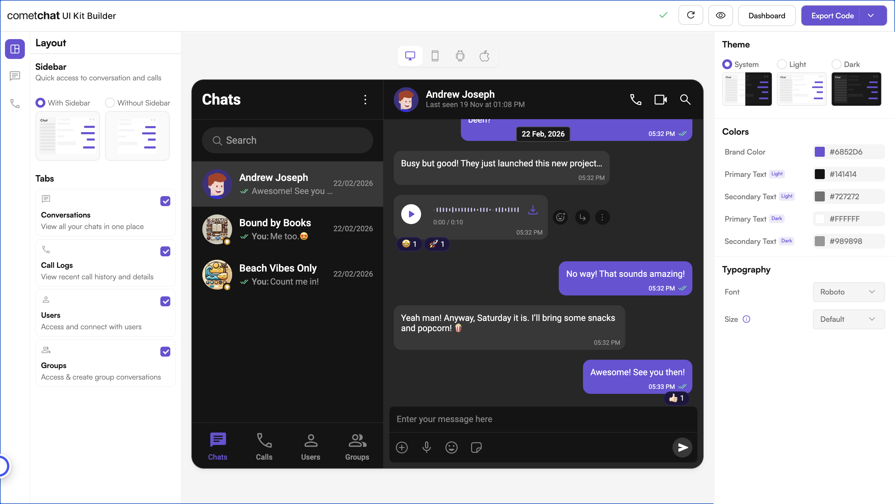
Complete Integration Workflow
- Design Your Chat Experience - Use the UI Kit Builder to customize layouts, features, and styling.
- Review and Export - Review which features will be enabled in your Dashboard, toggle them on/off, and download the generated code package.
- Preview Customizations - Optionally, run the export on its own before integrating it into your project.
- Integration - Integrate into your existing application.
- Customize Further - Explore advanced customization options to tailor the chat experience.
Launch the UI Kit Builder
- Log in to your CometChat Dashboard.
- Select your application from the list.
- Navigate to Chat & Messaging → Get Started.
- Choose Angular and click Launch UI Kit Builder.
Review Your Export
When you click Export, a “Review Your Export” modal appears (Step 1 of 3). This lets you:- Review features — See which features will be enabled in your CometChat Dashboard based on your UI Kit configuration
- Toggle features — Turn individual features on/off before export
- AI User Copilot — Requires an OpenAI API key (you’ll configure this in the next step)
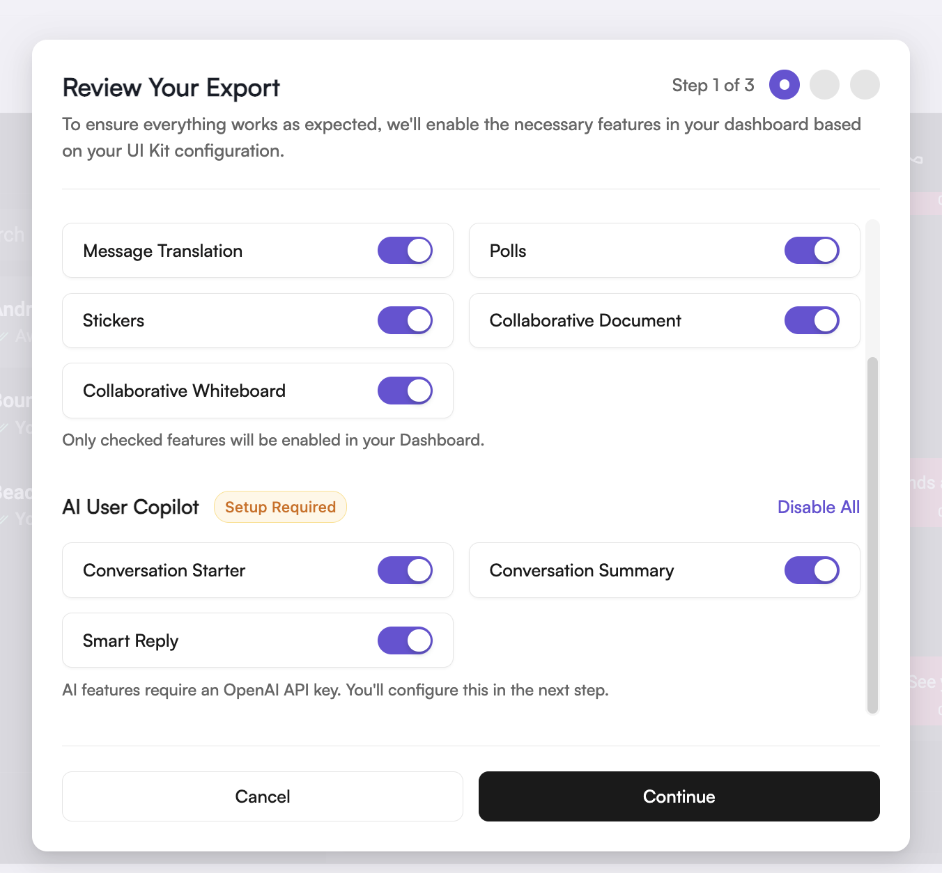
Only checked features will be enabled in your Dashboard. You can always modify
these settings later in the CometChat Dashboard.
Requirements
Preview Customizations (Optional)
The export is a complete, standalone Angular application. You can run it before integrating anything — this step is optional and can be skipped if you want to go straight to integration.
- Unzip the export (
cometchat-builder-angular.zip) into a new folder and open it. The archive is packed flat —package.jsonandsrc/are at the top level.- Install dependencies:
- Run the app:
The app starts onhttp://localhost:4200. Sign in with one of the sample users on the login screen, or enter a UID from your own app. Your app credentials are already prepopulated in the exported code.
Integrate into Your Project
If you already have an Angular application, you do not need the export’s shell — only the chat. The whole experience is one standalone component,<cometchat-app />.
Step 1: Install Dependencies
package.json.
Step 2: Copy the App Code
Copy these from the export into your project, keeping the paths:If your app already has an
environment.ts, add the appId, region and authKey keys to it instead of replacing it. config/credentials.ts imports it from src/environments/environment, so keep that path or update the import.Step 3: Register the Styles and Assets
In yourangular.json, add the UI Kit’s CSS variables ahead of your own stylesheet, and copy both asset folders:
src/styles.css into your global stylesheet:
- UIKit Host Element Layout Fixes — the
display: flex/flex: 1rules forcometchat-selector,cometchat-tabs,cometchat-messages,cometchat-threaded-messages,cometchat-message-list,cometchat-message-composerand the other host elements - Thread panel — the
.cometchat-threaded-messagesbackground override - Skip Navigation Link — the
.cometchat-skip-linkrules, if you keep the skip link
html, body and focus-ring rules in the same file are the standalone app’s own page styles. Your app likely has its own, so they’re optional.
Step 4: Apply Your Builder Settings at Startup
In yourapp.config.ts:
app.config.ts
SettingsService applies the feature toggles and ThemeStylesService applies the appearance settings. If you omit the second, the app still runs, but the Builder’s brand color, text colors, theme and typography are silently ignored.
This is synchronous — the settings are bundled rather than fetched, so there is no window in which the first screen renders against defaults.
Angular 18:
provideAppInitializer was added in Angular 19. On 18, use the APP_INITIALIZER token with the same two injections:Step 5: Initialize CometChat and Log In
The UI Kit needs two calls before the component renders. In yourmain.ts:
main.ts
await. Top-level await does not build in an app that uses zone.js, which is the default for existing Angular 18–20 apps. It fails with Top-level await is not available in the configured target environment. The export’s own src/main.ts chains them the same way.
Your app credentials (
appId, region, authKey) are prepopulated in the export’s src/environments/environment.ts, which you copied in Step 2. If you need different credentials, you can find them in the Credentials block of your app’s Overview section on the CometChat Dashboard.- Create new users on the CometChat Dashboard, via a UI Kit method, or via the API.
- Use pre-generated test users:
cometchat-uid-1throughcometchat-uid-5
login step in the chain above with a check:
main.ts
Auth Key vs Auth TokenAuth Key is perfect for prototyping. For production apps, switch to Auth Token for secure authentication and call
CometChatUIKit.loginWithAuthToken(authToken) instead of CometChatUIKit.login(uid). See Authentication and User Management for details.Step 6: Render the Component
src/app/app.component.ts
Open Straight Into a Conversation
Three optional inputs let you choose what the chat opens on:When both
user and group are bound, the Builder’s chatType setting decides which one wins.Without Sidebar Mode
When the sidebar is hidden via the Without Sidebar option in UI Kit Builder, the component renders a single chat type based on thechatType setting:
Pass the
user or group input to specify which conversation opens by default.
Step 7: Run the App
Troubleshooting
For issues with the UI Kit itself, see Angular UI Kit Troubleshooting.
Next Steps
You can continue customizing by editing the exported code directly — or return to the UI Kit Builder to adjust your configuration and re-export a fresh code package.Customize in Code
Modify the exported components, inputs, and styling directly in your project.Customizations
Adjust component inputs, behavior, and UI elements.
UI Kit Builder Settings
Understand the settings file and feature toggles.
Directory Structure
See how the exported code is organized.
Advanced Theming
Customize colors, typography, and styling to match your brand.
Customize via UI Kit Builder
Return to the Builder to update your configuration, then re-export and replace the code package. Any changes made in the UI Kit Builder will require you to re-export the code and follow the same integration steps above to integrate into your project.Launch UI Kit Builder
Open the CometChat Dashboard to reconfigure and re-export.