Base Components | Description |
---|---|
List Item | This renders common components used across Conversations , Groups & Users . |
onClose
event is typically triggered when the close button is clicked and it carries a default action. However, with the following code snippet, you can effortlessly override this default operation.
messageInformationStyle
property.
Property | Description | Code |
---|---|---|
titleTextFont | Sets the font for the title | titleTextFont?: string; |
titleTextColor | Sets the font for the title | titleTextColor?: string; |
subtitleTextColor | Sets the text color for the subtitle | subtitleTextColor?: string; |
subtitleTextFont | Sets the text font for the subtitle | subtitleTextFont?: string; |
emptyStateTextColor | Sets the color for the empty state text | emptyStateTextColor?: string; |
emptyStateTextFont | Sets the font for the empty state text | emptyStateTextFont?: string; |
errorStateTextFont | Sets the text font for the error state text | errorStateTextFont?: string; |
errorStateTextColor | Sets the text font for the error state text | errorStateTextColor |
captionTextFont | Sets the text font for the caption | captionTextFont?: string; |
captionTextColor | Sets the text color for the caption | captionTextColor?: string; |
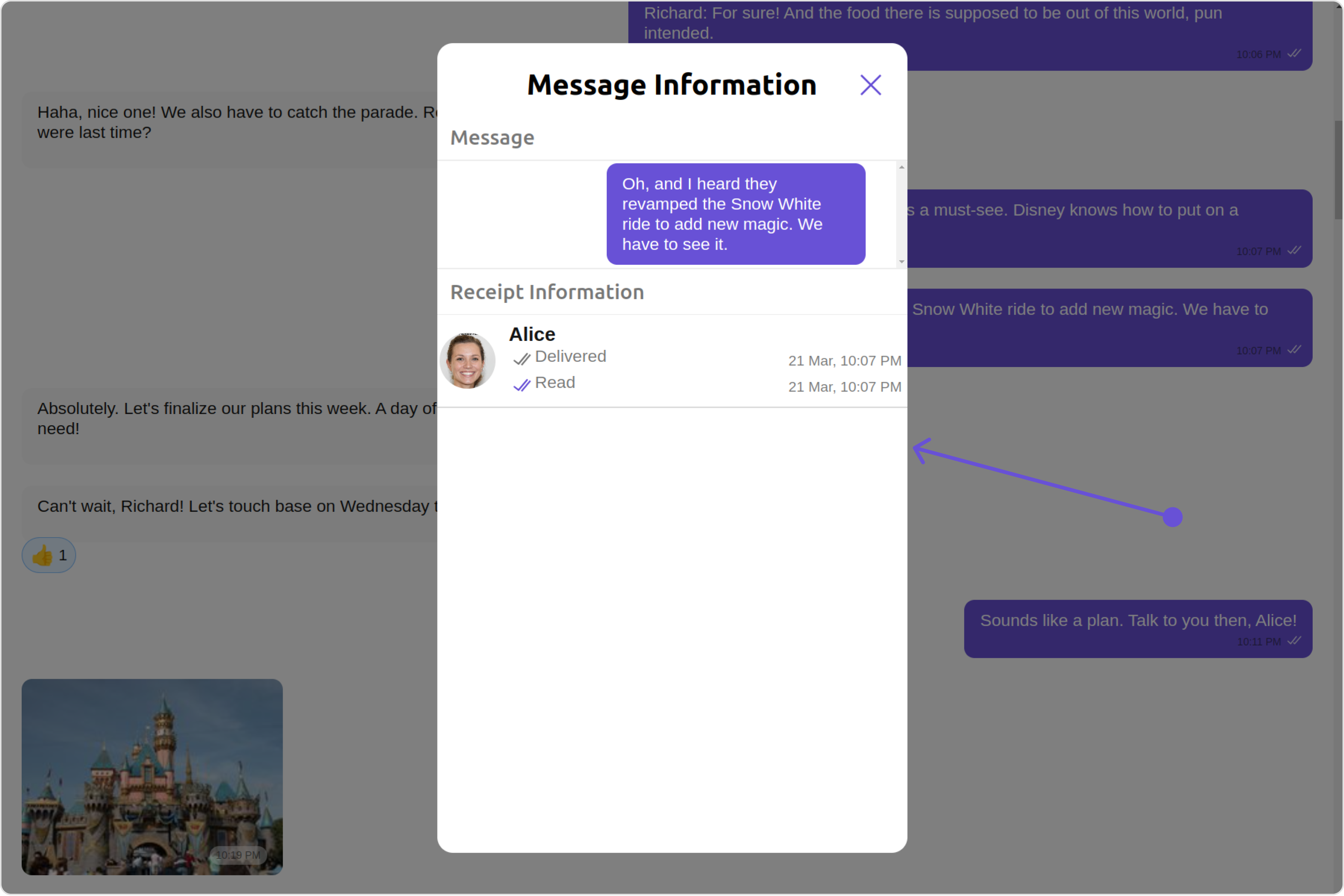
sendIconTint | Sets the icon color for the send Icon | sendIconTint?: string; |
loadingIconTint | Sets the icon color for the loading Icon | loadingIconTint?: string; |
readIconTint | Sets the icon color for the read Icon | readIconTint?: string; |
deliveredIconTint | Sets the icon color for the delivered Icon | deliveredIconTint?: string; |
dividerTint | Sets the icon color for the separator | dividerTint?: string; |
border | Used to set border | border?: string, |
borderRadius | Used to set border radius | borderRadius?: string; |
background | Used to set background colour | background?: string; |
height | Used to set height | height?: string; |
width | Used to set width | width?: string; |
ListItemStyle
component in the MessageInformation Component, you can use the following code snippet. For further insights on ListItemStyle
Styles refer
Property | Description | Code |
---|---|---|
message | Sets the message to be displayed in the message information view. | message={getMessage} |
errorStateView | used to show the error state view in case of an error occurred | errorStateView={getErrorStateView} |
deliveredIcon | It is used to pass user defined image in to the MessageReceipt, to change the icon When Message is delivered. | deliveredIcon='your custom delivered icon' |
readIcon | It is used to pass user defined image in to the MessageReceipt, to change the icon When Message is read. | readIcon='your custom read icon' |
receiptDatePattern | used to set the date pattern for delivered and read date time | receiptDatePattern={getReceiptDatePattern} |
emptyStateText | used to set a custom text response when fetching the users has returned an empty list | emptyStateText='custom empty state text' |
CometChatMesssageInformation
is a component, it can be added directly to your application.
property | type | Description |
---|---|---|
template | CometChatMessageTemplate | Sets a custom message template for the message information view. |
message | BaseMessage | Sets the message to be displayed in the message information view. |
title | String | Sets the title that will be displayed at the top of the message information . |
listItemView | ((messageObject: BaseMessage, messageReceipt?: MessageReceipt | undefined) => JSX.Element) | Sets a custom list item view for individual entries in the message information view. |
subtitleView | ((messageObject: BaseMessage, messageReceipt?: MessageReceipt | undefined) => JSX.Element) | Sets a custom subtitle view for individual entries in the message information view. |
receiptDatePattern | ((timestamp: number) => string) | Sets a custom date pattern for formatting receipt dates in the message information view. |
messageInformationStyle | MessageInformationStyle | Sets the overall style and appearance for the message information view. |
readIcon | string | Sets the custom icon resource for read receipts in the message information view. |
deliveredIcon | string | Sets the custom icon resource for delivered receipts in the message information view. |
listItemStyle | ListItemStyle | Sets the style for list items in the message information view. |
onError | ((error: CometChatException) => void) | Sets the error callback to handle any errors that may occur within the message information view. |
emptyStateText | String | Sets the text to be displayed in the empty state view of the message information view. |
errorStateText | String | Sets the error message to be displayed in the error state view of the message information view. |
emptyStateView | () => JSX.Element | Sets the custom layout resource for the empty state view of the message information view. |
errorStateView | () => JSX.Element | Sets the custom layout resource for the error state view of the message information view. |
loadingStateView | () => JSX.Element | Sets the custom layout resource for the loading state view of the message information view. |