CometChatUI
CometChatUI is an option to launch a fully functional chat application using the UI Kit. In CometChatUI all the UI Components are interlinked and work together to launch a fully functional chat on your application.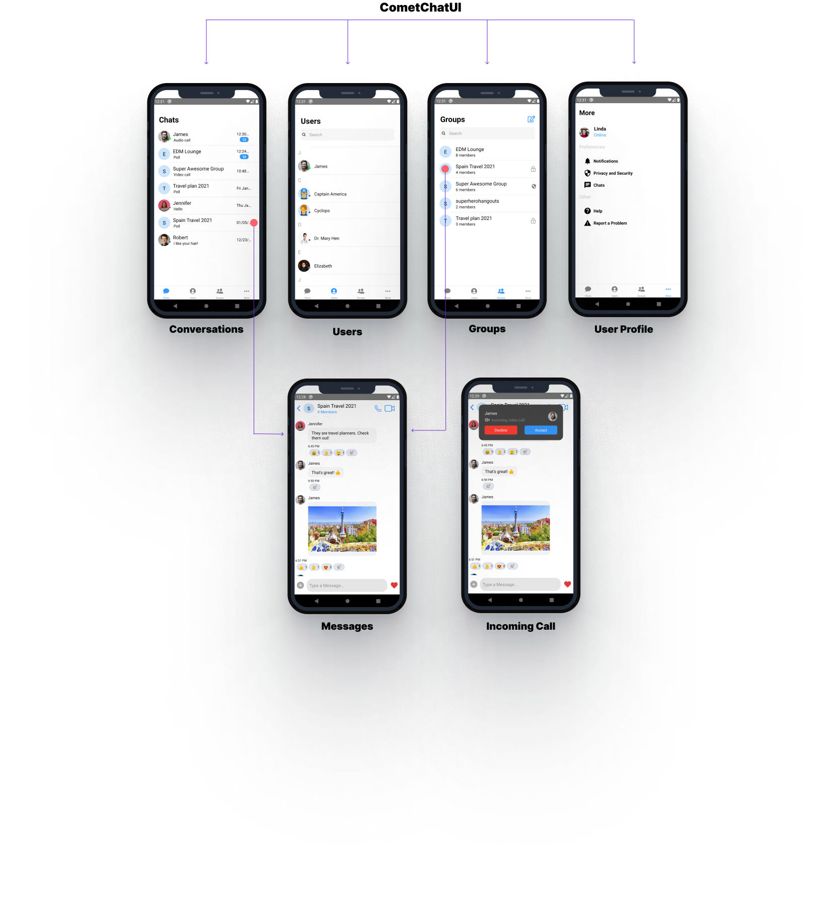
- JavaScript
CometChatUserListWithMessages
TheCometChatUserListWithMessages is a component with a list of users. The component has all the necessary listeners and methods required to display the user’s list and shows the set of the messages/chats of the selected user
- JavaScript
{ hasBlockedMe: false,
blockedByMe: false,
uid: ‘cometchat-uid-3’,
name: ‘Nancy Grace’,
avatar: ‘https://data-us.cometchat.io/assets/images/avatars/cometchat-uid-3.webp’,
lastActiveAt: 1614597611,
role: ‘default’,
status: ‘offline’,
} | Required | | loggedInUser | Value should be Object. This props takes the details of current logged in user, | Required | | actionGenerated | Value should be function. Tis is a callback function called when user perform certain actions on screen. List of actionType are as follow:
1)groupDeleted: This is called when user deletes the group.
2) membersUpdated: This is called when members of group are updated.
3)messageRead : This is called when last message is read.
4)messageComposed: is called when new message is composed.
5)messageDeleted: This is called when message is been deleted.
6)viewActualImage: This is called when user clicks on Image.
7)menuClicked: This is called when the menu in header has been clicked.
8)threadMessageComposed: This is called when new thread message has been composed
9)blockUser: This is called when user is blocked
10)updateThreadMessage: This is called when thread message is updated.
11)messageEdited: This is called when a message is edited.
12)groupUpdated: This is called when a group property has been updated. | Required | then use the below code.
- JavaScript
CometChatGroupListWithMessages
TheCometChatGroupWithMessages is a component with a list of groups. The component has all the necessary listeners and methods required to display the group’s list and shows the set of the messages/chats of the selected group

- JavaScript
- JavaScript
CometChatMessages
TheCometChatMessages is a component with a list of messages/chats and shows the message component header and message composer.
- JavaScript
| Parameter | Description | Type |
|---|---|---|
| type | Value should be string. defines the type of chat. Its value can be user or “group”. | Optional |
| item | Value should be Object. The object will be of user or group depending on type. This is an example object for user { hasBlockedMe: false, blockedByMe: false, uid: ‘cometchat-uid-3’, name: ‘Nancy Grace’, avatar: ‘https://data-us.cometchat.io/assets/images/avatars/cometchat-uid-3.webp’, lastActiveAt: 1614597611, role: ‘default’, status: ‘offline’, } | Required |
| loggedInUser | Value should be Object. This props takes the details of current logged in user, | Required |
| actionGenerated | Value should be function. Tis is a callback function called when user perform certain actions on screen. List of actionType are as follow: 1)groupDeleted: This is called when user deletes the group. 2) membersUpdated: This is called when members of group are updated. 3)messageRead : This is called when last message is read. 4)messageComposed: is called when new message is composed. 5)messageDeleted: This is called when message is been deleted. 6)viewActualImage: This is called when user clicks on Image. 7)menuClicked: This is called when the menu in header has been clicked. 8)threadMessageComposed: This is called when new thread message has been composed 9)blockUser: This is called when user is blocked 10)updateThreadMessage: This is called when thread message is updated. 11)messageEdited: This is called when a message is edited. 12)groupUpdated: This is called when a group property has been updated. | Required |
CometChatConversationListWithMessages
TheCometChatConversationListWithMessages is a component with a list of recent conversations. The component has all the necessary listeners and methods required to display the recent conversation list and shows the set of the messages/chats of the selected recent conversation
- JavaScript
- JavaScript
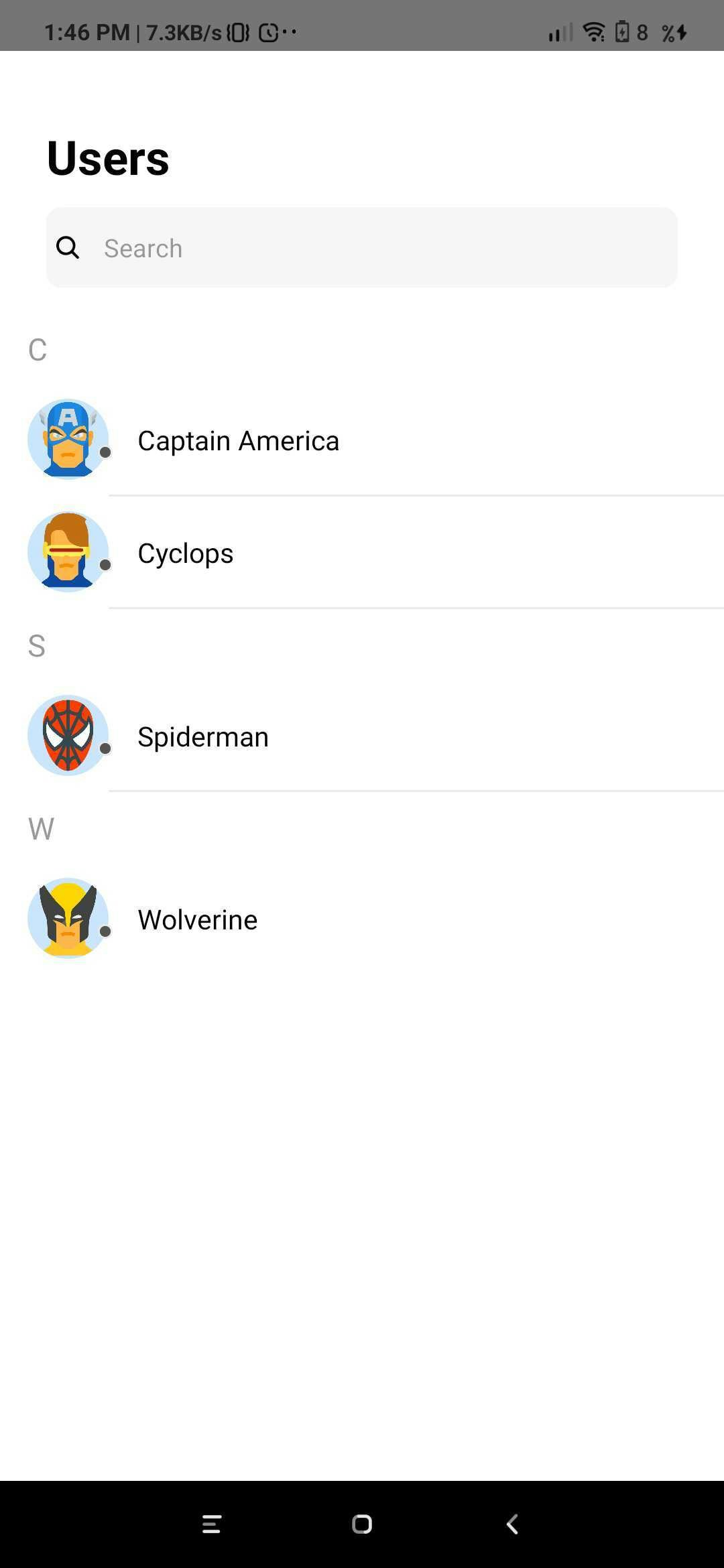
CometChatUserList
TheCometChatUserList is a component that displays the list of users available to chat. You can use this component within your app if you wish to display the list of users.
- JavaScript
| Parameter | Description | Type |
|---|---|---|
| friendsOnly | Value could be Object or Number This property when set to true will return only the friends of the logged-in user Default value is false | Optional |
| onItemClick | Value should be function This is a callback called when a user is clicked on user list | Optional |
| navigation | Value should be Object. Pass the navigation object, if you want to refresh list on focus | Optional |
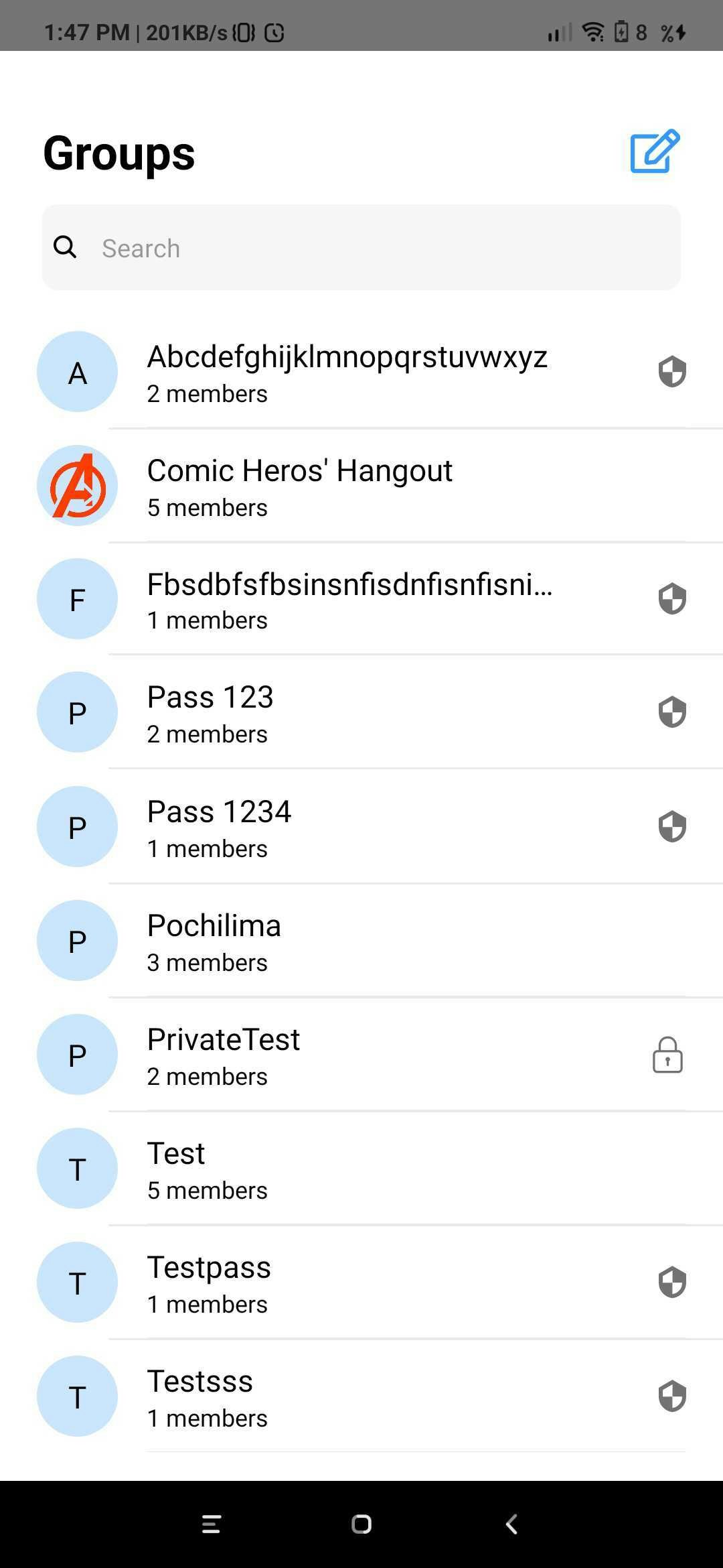
CometChatGroupList
TheCometChatGroupList is a component that displays the list of groups available. You can use this component within your app if you wish to display the list of groups.
- JavaScript
- JavaScript
CometChatConversationList
You can use theCometChatConversationList component to display the list of recent conversations that the logged-in user was a part of.

- JavaScript
- JavaScript
CometChatAvatar
This is an image view customize only to display Avatar.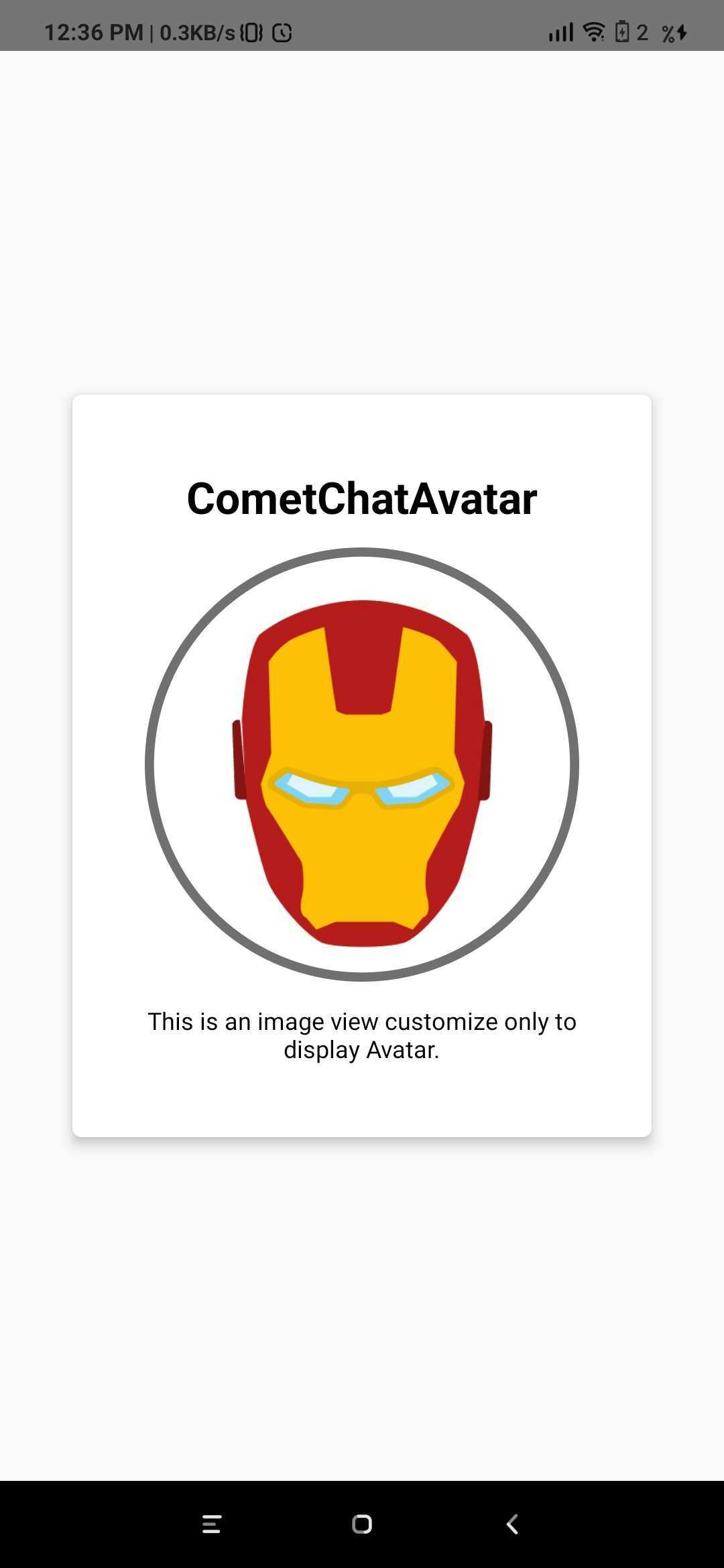
- JavaScript
| Parameter | Description | Type |
|---|---|---|
| image | Value could be Object or Number This property sets the source of avatar image. | Optional |
| name | Value should be String This property sets the user name in avatar. | Optional |
| borderWidth | Value should be Number. This property sets the width of the component’s four borders. Default value is 1 | Optional |
| cornerRadius | Value should be Number. This property sets border radius of the component. Default value is 1000. | Optional |
| textColor | Value should be Color. This property sets the text color of component. Default value is *black * | Optional |
CometChatUserPresence
This component will be used to show the user’s online or offline status. This component will show the color based on the user’s status.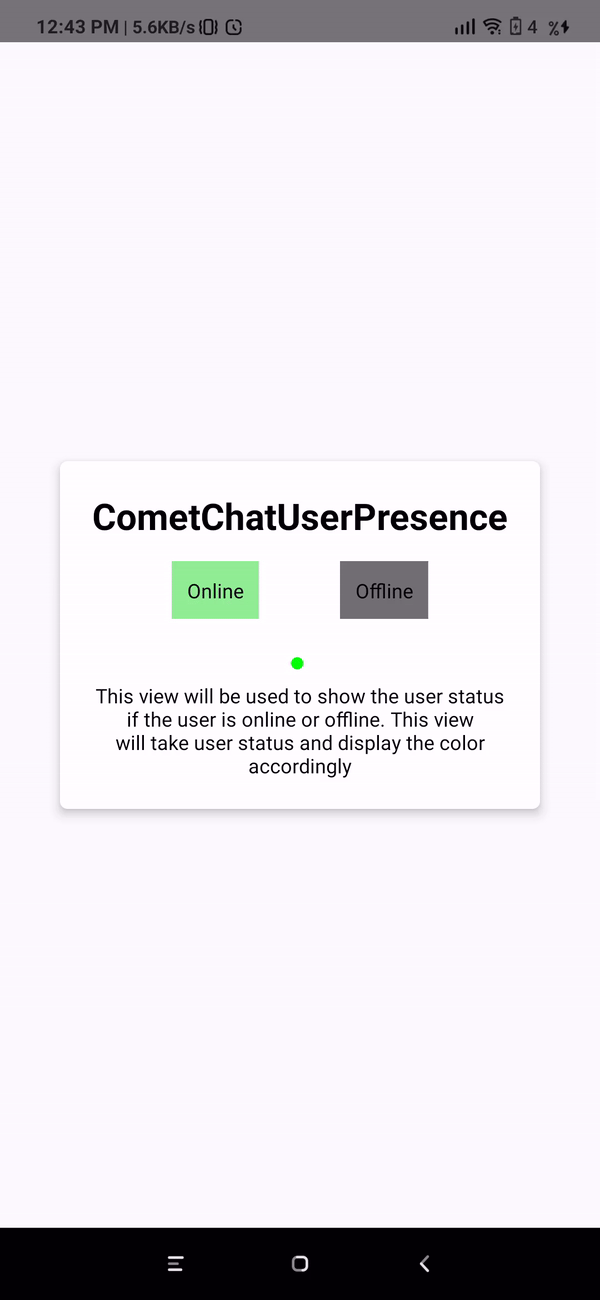
- JavaScript
| Parameter | Description | Type |
|---|---|---|
| borderWidth | Value should be Number This property sets the width of the component’s four borders Default value is 1 | Optional |
| borderColor | Value should be Color This property sets the border colour of the component. Default value is #AAA | Optional |
| cornerRadius | Value should be Number. This property sets border radius of the component Default value is 4.5 | Optional |
| status | Value should be String Takes the status of user | Optional |
CometChatBadgeCount
The CometChatBadgeCount component can be used to show an unread count. You can use it in different scenarios according to their use case.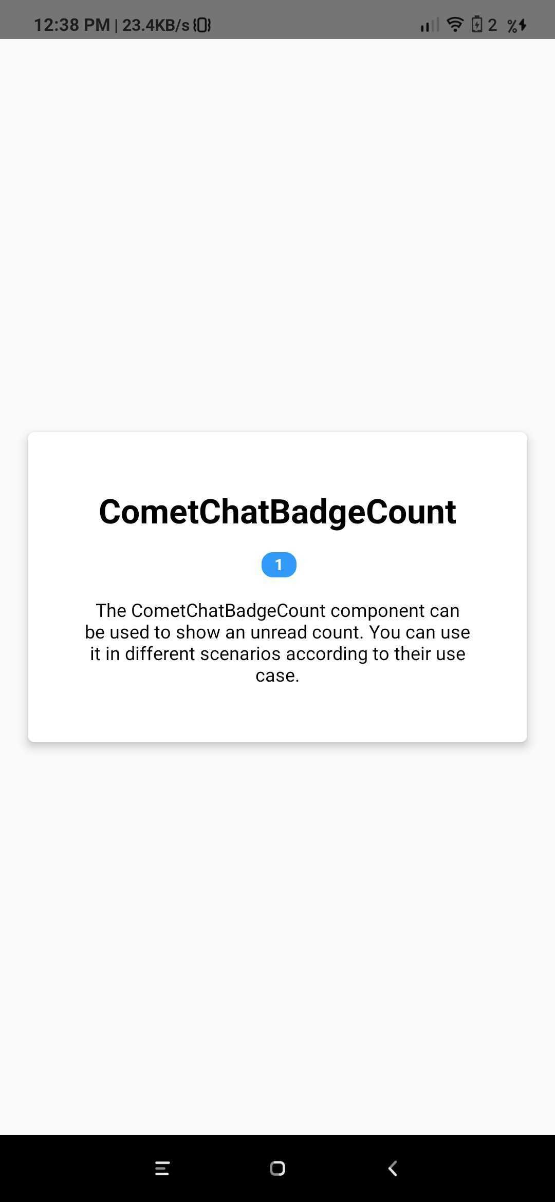
- JavaScript
| Parameter | Description | Type |
|---|---|---|
| count | Value should be String. This property sets the count on the badge | Optional |