AI Integration Quick Reference
AI Integration Quick Reference
| Field | Value |
|---|---|
| Component | CometChatMessageComposer |
| Package | CometChatUIKitSwift |
| Inherits | UIView |
CometChatMessageComposer component enables users to write and send messages including text, images, videos, audio, files, and custom messages. It supports attachments, voice recording, stickers, mentions, and AI-powered features.

Where It Fits
CometChatMessageComposer provides a rich text input with attachment, emoji, voice recording, sticker, and send controls. Wire it alongside CometChatMessageHeader and CometChatMessageList to build a standard chat view.
Minimal Render
Actions and Events
Callback Props
onSendButtonClick
Fires when the send button is clicked. Overrides the default send behavior.onTextChangedListener
Fires as the user types in the composer input.onError
Fires on internal errors.SDK Events (Real-Time, Automatic)
The component internally handles typing indicators and message sending. No manual SDK listener attachment needed.Custom View Slots
| Slot | Signature | Replaces |
|---|---|---|
headerView | (User?, Group?) -> UIView | Area above the composer input |
footerView | (User?, Group?) -> UIView | Area below the composer input |
sendButtonView | (User?, Group?) -> UIView | Send button |
auxillaryButtonView | (User?, Group?) -> UIView | Sticker and AI button area |
attachmentOptions | (User?, Group?, UIViewController?) -> [CometChatMessageComposerAction] | Default attachment options list |
headerView
Custom view above the composer input.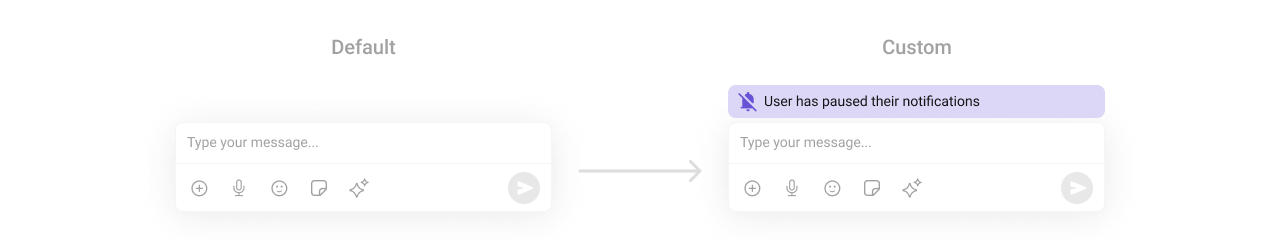
footerView
Custom view below the composer input.sendButtonView
Replace the send button.auxillaryButtonView
Replace the sticker and AI button area.attachmentOptions
Override the default attachment options.Common Patterns
Thread composer
Minimal composer — text only
Pre-filled text
Disable typing indicators
Disable mentions
Custom send button action
Styling
Style Hierarchy
- Global styles (
CometChatMessageComposer.style) apply to all instances - Instance styles override global for specific instances
Global Level Styling
Instance Level Styling

Key Style Properties
| Property | Type | Description |
|---|---|---|
backgroundColor | UIColor | Background color |
borderWidth | CGFloat | Border width |
borderColor | UIColor | Border color |
cornerRadius | CometChatCornerStyle? | Corner radius |
placeHolderTextFont | UIFont | Placeholder font |
placeHolderTextColor | UIColor | Placeholder color |
textFiledColor | UIColor | Input text color |
textFiledFont | UIFont | Input text font |
sendButtonImage | UIImage? | Send button icon |
sendButtonImageTint | UIColor | Send button tint |
activeSendButtonImageBackgroundColor | UIColor | Active send button background |
inactiveSendButtonImageBackgroundColor | UIColor | Inactive send button background |
composeBoxBackgroundColor | UIColor | Compose box background |
composeBoxBorderColor | UIColor | Compose box border color |
composeBoxBorderWidth | CGFloat | Compose box border width |
attachmentImage | UIImage? | Attachment button icon |
attachmentImageTint | UIColor | Attachment icon tint |
voiceRecordingImage | UIImage? | Voice recording icon |
voiceRecordingImageTint | UIColor | Voice recording tint |
Sub-Component Styles
| Property | Type | Description |
|---|---|---|
mediaRecorderStyle | MediaRecorderStyle | Voice recording interface |
attachmentSheetStyle | AttachmentSheetStyle | Attachment options sheet |
suggestionsStyle | SuggestionsStyle | Mentions suggestions view |
aiOptionsStyle | AIOptionsStyle | AI options menu |
mentionStyle | MentionStyle | Mentions appearance |
Customization Matrix
| What to change | Where | Property/API |
|---|---|---|
| Override send behavior | Callback | set(onSendButtonClick:) |
| Track text input | Callback | set(onTextChangedListener:) |
| Toggle visibility | Props | hide<Feature> boolean props |
| Custom attachments | View Slot | set(attachmentOptions:) |
| Replace UI sections | View Slot | set(headerView:), set(sendButtonView:) |
| Change colors, fonts | Style | MessageComposerStyle properties |
Props
All props are optional. Sorted alphabetically.| Property | Type | Default | Description |
|---|---|---|---|
disableMentions | Bool | false | Disables the @mention feature |
disableSoundForMessages | Bool | false | Disables sound when sending messages |
disableTypingEvents | Bool | false | Disables sending typing indicators |
hideAIButton | Bool | false | Hides the AI button |
hideAttachmentButton | Bool | false | Hides the attachment button |
hideAudioAttachmentOption | Bool | false | Hides the audio attachment option |
hideCollaborativeDocumentOption | Bool | false | Hides the collaborative document option |
hideCollaborativeWhiteboardOption | Bool | false | Hides the collaborative whiteboard option |
hideFileAttachmentOption | Bool | false | Hides the file attachment option |
hideFooterView | Bool | false | Hides the footer view |
hideHeaderView | Bool | false | Hides the header view |
hideImageAttachmentOption | Bool | false | Hides the image attachment option |
hidePollsOption | Bool | false | Hides the polls option |
hideSendButton | Bool | false | Hides the send button |
hideStickersButton | Bool | false | Hides the stickers button |
hideVideoAttachmentOption | Bool | false | Hides the video attachment option |
hideVoiceRecordingButton | Bool | false | Hides the voice recording button |
maxLine | Int | 5 | Maximum lines before scrolling |
placeholderText | String | "Type a message..." | Placeholder text |
textFormatters | [CometChatTextFormatter] | [] | Custom text formatters |
Methods
set(textFormatter:)
Sets a custom text formatter for the composer input.setDisableMentionAll(_:)
Disables or enables the @all mention feature that notifies all group members.setMentionAllLabel(::)
Customizes the label displayed for @all mentions in the suggestions list.Related Components
- Message List — Display messages in a conversation
- Message Header — Display user/group details
- Mentions Formatter — Configure @mention formatting