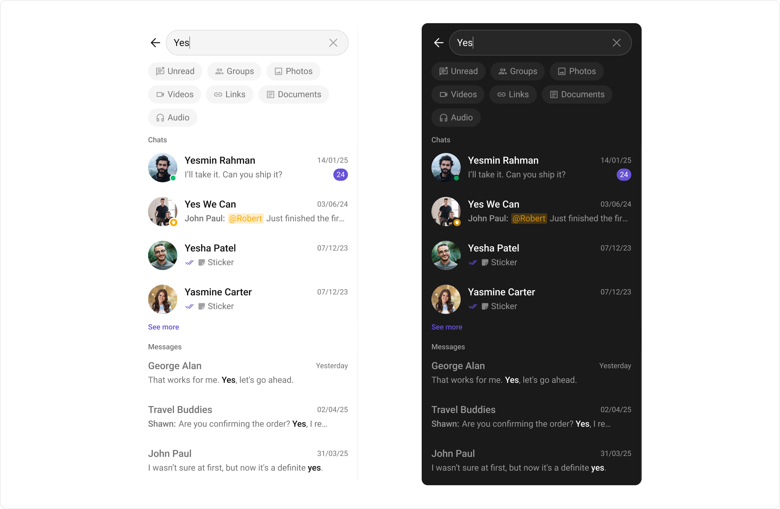
CometChatSearch provides unified search functionality across conversations and messages. In V6, it uses a single consolidated SearchBloc replacing the three separate controllers from V5.
Where It Fits
CometChatSearch is typically launched from a search button in the conversations list or message header. It searches across both conversations and messages, displaying results in categorized sections.
- Dart
Quick Start
Using Navigator:- Dart
- Dart
- Dart
CometChatUIKit.init() and a user logged in.
Actions and Events
Callback Methods
onConversationItemClick
Fires when a conversation result is tapped.
- Dart
onMessageItemClick
Fires when a message result is tapped.
- Dart
onBack
Fires when the user presses the back button.
- Dart
onError
Fires on internal errors.
- Dart
Functionality
| Property | Type | Default | Description |
|---|---|---|---|
showBackButton | bool? | true | Toggle back button visibility |
placeholder | String? | null | Search input placeholder text |
hideConversationResults | bool? | false | Hide conversation search results |
hideMessageResults | bool? | false | Hide message search results |
Custom View Slots
Conversation Item View
Replace the conversation result item.- Dart
Message Item View
Replace the message result item.- Dart
State Views
- Dart
Advanced
BLoC Access
The search widget usesSearchBloc internally:
| Component | Description |
|---|---|
SearchBloc | Single consolidated BLoC for all search types |
SearchEvent | Events: SearchTextChanged, ClearSearch, LoadMoreConversationResults, LoadMoreMessageResults |
SearchState | Search state with conversation and message results |
V5 → V6 Migration
| V5 | V6 |
|---|---|
CometChatSearchController | SearchBloc |
CometChatConversationsSearchController | Merged into SearchBloc |
CometChatMessagesSearchController | Merged into SearchBloc |
SearchUtils | Inlined into SearchBloc |
| 3 separate controllers | 1 unified BLoC |
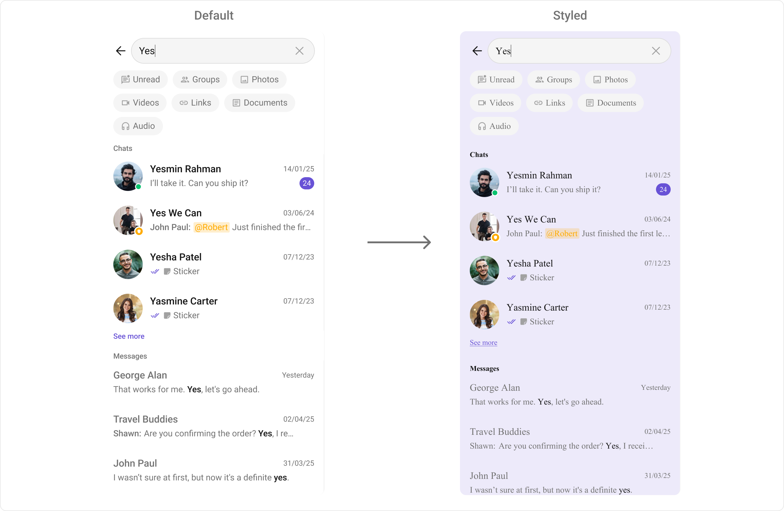
Style
- Dart
Next Steps
Conversations
Browse recent conversations
Message List
Display messages in a conversation
Component Styling
Detailed styling reference
Users
Browse available users